10,000 search results
(0.035 seconds)
- Fanky Bubble by Fitrah Type,
$12.00 Fanky Bubble is the newest typeface with a bubble graffiti style. There are three styles of font. Regular, line, and extrude styles Inspired by a throwup of graffiti. The entire typography has been designed to work on large sizes. This font is good to use on posters, zines, hero websites, stickers, and t-shirts. Features : - Lowercase & Uppercase ( All Caps ) - numbers and punctuation - Alternate & Ligature - multilingual - PUA encoded Please contact us if you have any questions.
 - SF Solo by Sultan Fonts,
$19.99 Solo is a renovation of an Arabic font designed by Sultan Maqtari in 2012 Solo is distinguished by its single and unconnected letters, as is the case with other Arabic fonts. Its letters are contemporary and do not dispense with the features of Arabic letters that are clear, legible and simple. But it gives user different creative possibilities, This font can be used in all artistic and creative projects in print and screen.
 - Dramatic Style by Juncreative,
$19.00 Dramatic Style is a delicate, elegant and flowing handwritten font. It has beautiful and well balanced characters and as a result, it matches a wide pool of designs. Add it to your most creative ideas and notice how it makes them come alive! This font is PUA encoded which means you can access all of the glyphs and swashes with ease! It features a varying baseline, smooth lines, gorgeous glyphs and stunning alternates.
 - Mochalosta by Almarkha Type,
$23.00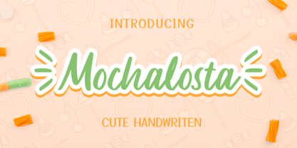 Mochalosta - Cute Handwritten font with a natural handwritten feel. This handmade font will make your design has a beautiful natural touch for each details. It is perfect for any design project as Invitation,logo, book cover, craft or any design purposes. This font is PUA encoded which means you can access all of the magical glyphs and swashes with ease! It also features a wealth of special features including alternate glyphs and ligatures.
 - Emjay by A New Machine,
$19.00 Emjay is a whimsical hand drawn all caps serif font. It has 4 glyphs per letter - upper and lowercase as well as 2 more sets of glyphs - that make for a more unnatural handmade feel. Any user can interchange letters using caps and lowercase. With contextual alternates on, opentype programs will place different glyphs automatically. Also includes a number of ligatures for even more unique type setting. Great for use in posters, headlines, invitations, etc.
 - Xanakee by Chank,
$39.00 Xanakee is a curvacious bubbly fun font, with equal parts pleasant approachableness and a swaggerish strut. Xanakee features large, leisurely curves controlled by the consistency of the monoline stroke. All with a friendly, human voice and confident gait. OpenType versions have a few special features, like some smallcaps and some fanciful swash figures. Purchase it from MyFonts and you'll get TrueType format in your download as well. Also available as web type, too, of course.
 - Debora Celina Script by Gatype,
$5.00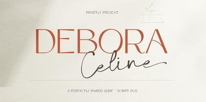 Debora Celina is a font Duo Script and Serif that is simple and unique looking.This customizable font will look great on a variety of design ideas such as Christmas themes,valentines, posters, invitations, weddings, branding projects, social media posts, magazines, book covers and more. This will add a fun and friendly touch to any of your projects.This font is PUA encoded which means you can access all the glyphs and sweeps easily.
 - ITC Mona Lisa by ITC,
$29.99ITC Mona Lisa was designed by Pat Hickson, a stark and elegant typeface originally drawn in the 1930s by Albert Auspurg. The original drawings were long gone and the surviving metal type was already severely worn when Hickson studied Auspurg's design for his recreation. The result is a typeface which melds the flavor of the 1930s with current design standards. ITC Mona Lisa displays all the suave sophistication of Fred Astaire and Greta Garbo. - Shooting Star by Stefani Letter,
$10.00 Shooting star is a cool and playful handwritten font. It is defined by smooth curves and is perfect for kids theme or cheerful designs. but also It’s ideal for book, packaging and logo projects. Add this lettered font to your designs and notice how it makes them come alive!. This font is PUA encoded which means you can access all of the cute glyphs with ease! It also features a wealth of including ligatures.
 - Olimpico by MAC Rhino Fonts,
$59.00 The name of this typeface is a hymn to the Stadio Olimpico in Rome. The home arena to the World's most beautiful football club – AS ROMA. A club with many great players through the years. The biggest of them all, is already a living legend… Francesco Totti. The design is a 2-weight family perfect for elegant display work. The regular weight is more even in blackness while the bold weight carry more contrast.
 - Jerhiyof by Stringlabs Creative Studio,
$29.00 Jerhiyof is a delicate, elegant and flowing handwritten font. It has beautiful and well balanced characters and as a result, it matches a wide pool of designs. Add it to your most creative ideas and notice how it makes them come alive! This font is PUA encoded which means you can access all of the glyphs and swashes with ease! It features a varying baseline, smooth lines, gorgeous glyphs and stunning alternates.
 - Autumnilla by Almarkha Type,
$29.00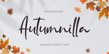 Autumnilla – Elegant Script font with a natural handwritten feel. This handmade font will make your design has a beautiful natural touch for each details. It is perfect for any design project as Invitation,logo, book cover, craft or any design purposes. This font is PUA encoded which means you can access all of the magical glyphs and swashes with ease! It also features a wealth of special features including alternate glyphs and ligatures.
 - The Saroja by Jolicia Type,
$29.00 The Saroja is a meticulously crafted display font type that brings captivating aesthetics to every design project. With distinctive characteristics and various artistic elements, this font breathes new life into your text. With The Saroja you have access to a creative tool that allows you to bring aesthetic beauty to all your design projects. It's the perfect blend of art and typography, ready to transform every word into a captivating work of art.
 - Lazy Kids by Gassstype,
$22.00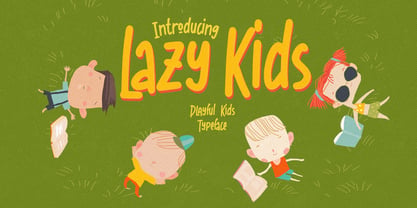 Hello Everyone, introduce our new product Lazy Kids is a Playful Kids Typeface with a natural feel. This handmade font will make your design has a beautiful natural touch for each details. It is perfect for any design project as Invitation,logo, book cover, craft or any design purposes. This font is PUA encoded which means you can access all of the magical glyphs. It also features a wealth of special features including ligatures glyphs.
 - Britania Vintage by Max.co Studio,
$15.00 Britania Vintage is a mix of retro and modern serif font styles, with these tight curves giving traditional groovy, luxury and versatility. Britania Vintage is made with a high degree of legibility and is perfect for nostalgic projects, vintage logos, wedding designs, social media posts, advertisements, product packaging, product designs, labels, photography, watermarks, invitations, stationery and more. Features · All Uppercase and Lowercase · Number & Symbol · Supported Languages · Alternates and Ligatures · PUA Encoded Thank you, Max.co Studio
 - Massillo by Nissa Nana,
$23.00 Massillo is a delicate, elegant and flowing handwritten font. It has beautiful and well balanced characters and as a result, it matches a wide pool of designs. Add it to your most creative ideas and notice how it makes them come alive! This font is PUA encoded which means you can access all of the glyphs and swashes with ease! It features a varying baseline, smooth lines, gorgeous glyphs and stunning alternates.
 - Cheer Forever by Ditatype,
$29.00 Cheer Forever is a delightful display font that merges the timeless simplicity of a sans serif with playful brush-style accents. With its uppercase letterforms and unique design, this typeface adds a touch of cheerfulness and character to your projects. The defining feature of Cheer Forever lies in its combination of a clean and geometric sans serif base with brush-inspired accents. The uppercase letters maintain a sleek and straightforward appearance, while the brush-style elements bring an element of spontaneity and liveliness. This fusion of styles creates a harmonious balance, resulting in a font that is both contemporary and playful. Inspired by the joyful nature of brush calligraphy, Cheer Forever captures the essence of creativity and self-expression. The brush-inspired accents add a touch of whimsy and personality to each letter, as if they were hand-drawn with a brushstroke. This unique style injects a sense of fun and positivity into your designs. Enjoy the various features available in this font. Features: Ligatures Multilingual Supports PUA Encoded Numerals and Punctuations Cheer Forever fits in logos, titles, headlines, and any design that aims to make a bold statement with a touch of playfulness. It is also particularly well-suited for designs related to children's products, event promotions, and any theme that calls for a touch of creativity. Find out more ways to use this font by taking a look at the font preview. Thanks for purchasing our fonts. Hopefully, you have a great time using our font. Feel free to contact us anytime for further information or when you have trouble with the font. Thanks a lot and happy designing.
 - Private Eye JNL by Jeff Levine,
$29.00 From 1958 to 1964, one of ABC-TV’s popular shows was the detective series “77 Sunset Strip”. Based in Los Angeles, the fictional detective agency was located next door to Dino’s Lodge, (partly owned by Dean Martin and actually located at 8532 Sunset). It was originally known as the Alpine Lodge. The adjacent building where Stuart Bailey and Jeff Spencer’s private detective service was located in fact housed a popular modeling agency. The ‘77’ address did not exist outside of the realm of the series. However, a wonderful sign with Art Deco-influenced lettering graced the set (on the wall of the office foyer) saying “Bailey & Spencer Private Investigators Suites 101-102”. A screen capture of this sign served as the working model for Private Eye JNL, which is available in both regular and oblique versions.
 - Ducatus by Scriptorium,
$12.00We wanted to make an ultra-thin, tall font with a rough, hand-drawn look and ended up with more than we bargained for. To get the font we wanted we started by developing a source font for the basic letter shapes and we ended up with a whole bunch of variations of the basic style. Thus was born the new Ducatus family of fonts, starting with Ducatus Light which developed into the Medium and Heavy versions, and the Medium weight was ultimately used as the basis for the Ducatus Rough font, which was the goal of the project in the first place. Ducatus Rough was created by modifying Ducatus Medium in Photoshop using Gallery Effects and several other filter packages, and then redoing the outlines from scratch in Fontographer. A lot of work, but the result is just what we wanted. - Grund by SIAS,
$29.90 GRUND is a new fontographic adaption of a remarkable 1920s epigraphical find in the city of Leipsic. This old well-known European trade fair hotspot struggled with a severe shortage of exhibition space around 1920. The solution was to dig deeper into the matter – literally – and 1924 the world’s first underground trade fair exhibition hall was opened right under the city’s central market square. After several changes of use during the past decades the sophisticated Art Deco entrance structure (architect: Otto Droge) was re-opened in December 2013 as a gateway to a new subway rail track. – The original brass lettering of the UNTERGRUNDMESSHALLE MARKT has been retrieved – and served as the inspiration for this new and unique font. If you’d like to see more exceptional Art Deco type, have a look at my Arthur series. __________________________________________________________________________________________
 - Matchmaker by Angie Makes,
$30.00 Matchmaker, a modern calligraphy typeface, was inspired by the various works of modern day calligraphers. Its tall, quirky, and juxtaposed letterforms provide a deviation from traditional calligraphy-inspired typefaces. Matchmaker features smart contextual alternates and swashes that add to the front and beginnings of letters (using lowercase letters, enter === before the word then +++ after the word to see the feature in action). Also watch as letters on the end of words magically receive a shortened tail. This font works best in OpenType aware software so that you can take advantage of its many tricks and features. Comes as an .otf (OpenType font) file. Here is a great article on open type aware software: http://www.myfonts.com/info/opentype-support-in-applications/ Chocked full of swashes, alternates, and ordinals, Matchmaker just might be the perfect match for your next project.
 - Alius by Lucas Tillian,
$18.00 Alius is something else. Experimental shapes combined with traditional ones result in an extremely legible typeface that—because of its economically spaced characters—works extraordinarily well for copy texts as well as big striking headings. Alius has been created with great attention to detail which is particularly noticeable in smaller sizes where proportions and shapes remain intact. The Typeface includes stylistic alternates that provide the designer with endless possibilities for combinations and variations. Alius contains PS-Hinting and is therefore as legible on screen as it is on paper. The typeface comes with powerful OpenType features that will satisfy even the most demanding of designers. With more than 680 Glyphs and a coverage of over 130 languages, Alius is as versatile as it is beautiful. The development of the typeface started in the summer and concluded in the fall of 2021.
 - Jeles by Tour De Force,
$25.00 Inheriting the beauty and style of old type classics from this genre, Jeles is blended with very elegant modern approach featuring soft corners, round slab serifs and tasty ball terminals. Jeles is designed mostly for display use and it is highly recommended to get the whole family if you want to get the best result. It is designed in two styles Condensed and Normal. The Condensed version is developed in two weights each coming with corresponding italics. While the Normal styles are three ranging from Regular, Bold and Black. The total of 7 separate fonts inside the family are quite enough if you look for diversity and flexibility at one place. You could use the uprights for more serious and strong headlines while the Italics work perfectly for more fresh and live subheads. Of course editorial design is only one of the many directions where Jeles family could be used successfully as we all know typefaces with so visible contrast between thin and thick and combined with classic elegance, could be easily used in every design of cosmetic industry, fashion, food, jewelry, etc. Try to design a stylish boutique shop signboard and you will surely discover its beauty and potential. Easy-to-read, it is good for print design, revealing its authentic letterpress-like character as well as perfect for screen use note that the thin strokes and serifs are not that thin to vanish on a low resolution monitor. Professionally designed, they are solid enough yet very elegant and even gentle making Jeles a desired family design of attractive web banners, web sites, apps and e-books.
 - Auberge Script by Sudtipos,
$79.00 It took me a long time, but I think I now understand why people of my generation and older feel the need to frame current events in an historical context or precedents, while most of the young couldn't care less about what happened ten years ago, let alone centuries back. After living for a few decades, you get to a point when time seems to be moving quite fast, and it’s humbling to see that your entire existence so far can be summed up in a paragraph or two which may or may not be useful to whoever ends up reading the stuff anyhow. I suppose one way to cope with the serenity of aging is trying to convince yourself that your life and work are really an extension of millenia of a species striving to accept, adapt to, and improve the human condition through advancing the many facets of civilization -- basically making things more understandable and comfortable for ourselves and each other while we go about doing whatever it is we are trying to do. And when you do finally convince yourself of that, history becomes a source of much solace and even a little premonition, so you end up spending more time there. Going far back into the history of what I do, one can easily see that for the most part it was ruled by the quill. Western civilization’s writing was done with quill pens for more than thirteen centuries and with newer instruments for about two. By the mid-18th century, the height of the quill experience, various calligraphy techniques could be discerned and writing styles were arranged in distinct categories. There are many old books that showcase the history of it all. I recommend looking at some whenever the urge comes calling and you have to get away from backlit worlds. Multiple sources usually help me get a better perspective on the range of a specific script genre, so many books served as reference to this quill font of mine. Late 17th century French and Spanish professional calligraphy guides were great aides in understanding the ornamental scope of what the scribes were doing back then. The French books, with their showings of the Ronde, Bâtarde and Coulée alphabets, were the ones I referenced the most. So I decided to name the font Auberge, a French word for hotel or inn, because I really felt like a guest in different French locales (and times) when I going through all that stuff. Because it is multi-sourced, Auberge does not strictly fit in a distinct quill pen category. Instead, it shows strong hints of both Bâtarde and Coulée alphabets. And like most of my fonts, it is an exercise in going overboard with alternates, swashes, and ornamental devices. Having worked with it for a while, I find it most suitable for display calligraphic setting in general, but it works especially well for things like wine labels and event invitations. It also shines in the original quill pen application purpose, which of course was stationery. Also, as it just occurred to me, if you find yourself in a situation where you have to describe your entire life in 50 words or less, you may as well make it look good and swashy, so Auberge would probably be a good fit there as well. This is one quill script that no large bird had to die for. A few technical notes The Auberge Script Pro version includes 1800 glyphs, everything is included there. Also latin language support. We recommend you to use the latest design application to have full access to alternates, swashes, small caps, ornaments, etc. The images from the gallery uses this version. For better results use the fonts with “liga” feature on. Awards During 2014 the early develop of Auberge Script was chosen to be part of Tipos Latinos, the most important type exhibition in South America.
 - Yackien by Java Pep,
$13.00 Introducing the logo font called Yackien. This font is made for branding and logo font purposes, but still elegant for other design projects. In the Indonesian language Yackien (yakin) means believing, trust, and convincing. So Yackien can give off an aura of trust, believe, convincing in your brand's logo and designs. What's the included: - Yackien font and swash - Yackien logo doodles - Multilingual, support 27 languages - PUA encoded - Opentype features I hope you enjoy using Yackien. Please let me know at java.indonesian@yahoo.com if you have any questions.
 - Azero by Mysterylab,
$15.00 Azero is a extra heavy sans serif font with four style variations. The uppercase alphabet in particular is stylized to feature a wavy baseline on many of the characters, for a unique look that's just enough to add some unusual vibe and uniqueness. When your layout calls for heavy type with a wide (but not too wide) look, Azero is a strong choice. Great for bold headlines, logos, branding, wide horizontal banners, themes with a Hispanic flair, fitness products, food packaging, or retro poster styles.
 - Himawari Script by Hanoded,
$10.00 Himawari means ‘Sunflower’ in Japanese. It was raining while I worked on this font, so I needly something to cheer me up - like bright yellow sunflowers! Himawari Script is a nice and neat handmade font, which was (more or less) inspired by an older font of mine, called mama Bear and, like the font it was modeled on, was made with a bamboo pen and Chinese ink. Himawari Script comes with some swashes and a cute smiling sunflower (just enable Stylistic Alternates and hit *).
 - MFC Triangulus Monogram by Monogram Fonts Co.,
$69.00 The inspiration source for Triangulus Monogram is a vintage publication called “Bibliotheque D.M.C: Alphabets et Monogrammes 2nd Series”. Found in that specimen book, is an alternative to the traditionally seen diamond monogram style. A triangular form, this monogram style is now digitally recreated and revived for modern use in Triangulus Monogram, with two letter monograms and a selection of additional frame styles for a final classy touch! Download and view the MFC Triangulus Monogram Guidebook if you would like to learn a little more.
 - Sunbathe by Java Pep,
$13.00 Introducing an elegant script font called Sunbathe, every shape of this font is made by the natural strike. To customize, Sunbathe comes with some features like alternate and ligature. It's perfect for branding, magazines, greeting card, wedding invitation, social media stories, etc. What you will get : - Opentype features - Multilingual, support 16 languages ( Afrikaans, Albanian, Catalan, Danish, Dutch, English, Estonian, Finnish, French, German, Icelandic, Italian, Norwegian, Portuguese, Spanisch, Swedish, Zulu ) If you have any questions or need technical support, don't hesitate to comment, message or contact java.indonesian@yahoo.com.
 - Atyp BL by Suitcase Type Foundry,
$39.00 The sources of inspiration for the Atyp typeface are spread out widely both stylistically and chronologically. The basic proportions of the uppercase refer to the elementary geometric constructions of the Bauhaus. The subtle details in the drawing of the characters and the microscopic adjustments, which evoke the illusion of uniformity and mechanical purity, pay homage to the rationalism of the typefaces popular in the International Style. The increased contrast of the joints of the bowls and shoulders in the Display weight, which in certain diagonal curves transition into almost deconstructive permutations. For a change these take delight in doing things on purpose, teasing readability and breaking the rules of the new millennium's typography. Atyp was created by adapting a typeface originally made for a commercial television station. The potential of the neutral grotesque, proven by its excellent readability on screens, gave the impetus for its preparation into an extremely wide character set. Coherence across all eight key masters lays the groundwork ideally for using the variable font format. The key benefits of this technology are a significant reduction in data consumption in the case of web fonts, as well as an unlimited access to the full range of styles, which in turn is a significant benefit in the area of responsive design.
 - ITC Outpost by ITC,
$29.99Hal Taylor's ITC Outpost was not the result of a detailed design brief, nor was there a methodical development of key concepts or characters. Outpost just seemed to emerge all at once during a brief sketching session," says Taylor. "I guess what I was thinking of was an antiquated Western perception of some sort of Middle Eastern hand lettering - a 'mysterious East' sort of thing." ITC Outpost's sense of the exotic has an almost Art Nouveau quality, with its sensuous curves and sweeping strokes. The open bowls and opposing weight bias in many of the characters add to the design's striking personality. A suite of alternate and swash letters enables the setting of distinctive display copy. ITC Outpost's family of roman, italic, and swash characters is compact but versatile. The caps have the grace and authority of a titling face. Add in the lowercase and swash letters and copy is transformed into something lighthearted and full of verve. ITC Outpost creates dramatic headlines and adds a flourish to invitations, menus, logos and packaging An accomplished designer, Taylor has spent most of his career in the lettering and typographic arts. He began as a photo-lettering typographer, setting headlines and creating custom lettering, and now works in the publishing industry. " - Bestiario by Intellecta Design,
$27.50 John Seddon (1644-1700), was a famous english writing master, the leading calligrapher of his time, and master of Sir John Johnson’s Free Writing School in Priest’s Court, Foster Lane. His portrait was drawn by William Faithorne and was engraved by John Sturt as the frontispiece for his copy-books, such as ‘The Ingenious youth’s companion’ of c.1690 and 'The pen-man’s paradise' of c.1695. These were engraved after his work by others. Your extra-rare book - "The Pen-mans Paradise Both pleasent & Profitable OR Examples of all ye usuall hands of this Kingdome. Adorn'd with variety of ffigures an Flourishes done by Command of hand. Each ffigure being one continued & entire Track of the pen most where of may be struck as well Reverse (or to answer bothwayes) as Forward", London (1965). - YES (that is the title of the book) was the starting point to these new extra accurated works of Iza W, a series of revivals of the penmanship Seddon’s artworks, animal and human kingdon inspired penmanship forms in the Bestiario font. On the other hand, his highly ornamented animal kingdon inspired capitals and alphabets in the Seddon Penmans Paradise Capitals typeface. The “SeddonsFleurons” completes the collection. Fantastic choice to elaborated barocque/renaissance inspired and historical accurated layouts.
 - Eskorte Latin by Rosetta,
$60.00 Eskorte is a diligently designed Latin type family with an uncomplicated, engaging poise that conveys a crisp, businesslike tone. Its precise range of styles looks to no-nonsense efficiency and ease of use by non-designers in the office and text-intensive professional environments. Eskorte supports over ninety languages in a full range of weights, with both upright and matching italics. The italics are lively, fluid forms that infuse their charms into text settings or take on their own personality in large, dominant headlines. In concert with the hardworking upright styles, the two fit smartly into a range of publications, from corporate to casual. All of the weights and styles offer an adept set of features like small caps, case-sensitive punctuation, and both tabular and proportional figures to make short work of any typographic task. Whether employed in enterprise reports, lifestyle publications, or identity work, Eskorte is ready for business.
 - Fenomen Slab by Signature Type Foundry,
$35.00 The geometrical drawing of Fenomen Slab follows the guidelines set by our other font family Fenomen Sans. It is a perfect companion of Fenomen Sans, as well as being a standalone font family capable of delivering its own expression and aesthetics. The set contains four width proportions – Normal, SemiCondensed, Condensed and ExtraCondensed in eight weights ranging from Hairline to Black. Every font of the family contains four types of numerals, small caps, ligatures and contextual alternates. The typeface was developed between the years 2014–2017 and was subjected to a series of tests for the fluent legibility of all fonts even in extreme conditions. Narrow fonts provide this set with the maximum use including newspaper typesetting. The typeface has an elegant, delicate design in thin fonts and sufficient legibility in bold. Mutual contrast produces great creative tension. Font name acronyms described: SCN = SemiCondensed CN = Condensed XCN = ExtraCondensed
 - Ico Weather by Setup,
$19.95 Ico Weather is a set of 115 symbols depicting weather, temperature, weather forecast and astronomy. To name a few, there are sun, clouds, rain, snow, thermometers, wind socks, tornados, volcanoes, weather warnings as well as symbol for raining fish. The style of Ico is inspired by the look of symbols used on the classic monochrome LCD displays. The symbols are monolinear with rounded corners, composed of a smallest possible number of elements. In addition, the rounded style is accompanied by a second style with sharp corners and more detailed drawing. All symbols of Ico share the same width, making the font compatible with the LCD typeface ION. Together, they are the perfect sollution for LCD style typography. Ico Weather is a part of a larger set. Have a look at the other available Ico fonts and don't forget to check back soon for even more additions.
 - Reserve by Positype,
$29.00 First and foremost, Reserve is a companion typeface developed to complement the Scotch Suite of typefaces. With a focus on producing simpler forms with less contrast, Reserve evolved into a fantastic serif typeface for long-form text settings, exceptional clarity at low resolutions—for print and screen. Friendly and functional, Reserve is replete with features intended to make you feel comfortable going back to again and again, and with a complete set of condensed fonts, this typeface becomes more of a surprise. Small Caps, 4 sets of numerals, Case-Sensitive forms, Stylistic, Swash and Titling Alternates, Fractions, language support, and more… it’s all there, ready for you to use. The term ‘Reserve’ as it applies to the words of wine and spirits is typically used to alert a consumer of a higher quality, exceptional vintage, or special production of wine or whisky… it’s no different for this typeface’s name. Cheers.
 - Ico Time by Setup,
$19.95 Ico Time is a set of 115 symbols depicting time, clocks, watches and rhythm. To name a few, there are alarm clocks, binary watch, moon phases, calendars, 7-segments digits, hourglasses, sun dial as well as infinity symbol. The style of Ico is inspired by the look of symbols used on the classic monochrome LCD displays. The symbols are monolinear with rounded corners, composed of a smallest possible number of elements. In addition, the rounded style is accompanied by a second style with sharp corners and more detailed drawing. All symbols of Ico share the same width, making the font compatible with the LCD typeface ION. Together, they are the perfect solution for LCD style typography. Ico Time is a part of a larger set. Have a look at the other available Ico fonts and don't forget to check back soon for even more additions.
 - Chamberí by Extratype,
$40.00 Chamberí is designed to be Vogue España's bestpoke typeface. An ambitious typographic branding project made for one of the most iconic magazine headers of the world, it defines the Spanish edition’s personality through a blending of the functionality of XIX Century Modern Romans (also known as “Scotch" typefaces) and the gestural expressiveness of typographic Baroque. Chamberí is a peculiar combination of the rational and the delicate, the sturdy and the feminine. The family is organised in a broad spectrum of 56 variants in which the transition from the restrained text version to the flamboyant, elegant display is modulated by contrast. The family is organised in seven weights: from Extra Light to Black, plus four optical sizes : Text, Headline, Display and Superdisplay. All this with its own Italics, Small Caps and Old Style Figures, besides the due refinement to resolve any editorial and communicative requirement.
 - Knoedel by PabType,
$12.00 Knoedel is a display typeface with three front-weights: light, regular and bold. Although a conjunction of different styles were a reference during the design process; the art deco style left a more noticeable influence in the final design. Knoedel, also has clear references to geometric and slab serif fonts. The design is intended to be applied on headlines or short text fragments. Knoedel offers full coverage for all languages using Latin alphabet: whole Europe, America, Oceania and on a big number of African and Asian countries. Besides the standard ligatures, Knoedel, additionally, has more than 200 discretionary ligatures and a generous number of borders and ornaments. Knödel (Knoedel) is a traditional dish from Austria and the southeast of Germany; made of dumplings of different ingredients usually boiled in salted water. It is not high-end cuisine but still, it accomplishes its aim of soothing hunger.
 - Braga Huis by Juru Rancang Studio,
$15.00 Braga Huis typeface is a font family that is inspired by the famous street in Bandung that was made to embodies the atmosphere and the environment of Netherland-Indie city at its golden time, whereby all the elements were designed to give the impression of structural, artistic, and advance. Braga Huis typeface has a strong Art Deco character, where the impression is depicted from the strong lines, curvy passion so it is very appropriate to describing the future atmosphere from the perspective of the 19th century. Braga Huis typeface has 3 font styles consisting of uppercase, lowercase and various alternative options that can be customize to your taste, poster is one of the media form of presentation that we believe is very appropriate for this type of font. But whatever the medium is, honestly we say; using Braga Huis typeface will make your artwork will never be cracked by time.