10,000 search results
(0.034 seconds)
- Eurostile Round by URW Type Foundry,
$89.99 Eurostile, created in 1962 by Aldo Novarese for the Nebbiolo type foundry, is one of the most popular sans serif fonts of all, and has been for about 50 years. Originally designed as a screen font it was very popular from the beginning, even though it is only a slightly modified version of the 10-year-older Microgramma, but completed with lower case characters. On public demand, URW++ has expanded its range of Eurostile with Eurostile Round with 19 additional styles. Quite like Futura Round by URW++, Eurostile Round works perfectly well as webfont.
 - Harp by Designova,
$15.00 Harp is a cute and lovely display typeface, perfect for making a variety of designs, from branding materials to social media graphics. It's perfect for creating logos, headlines, posters, and more. This all-caps font is designed to be bold and attention-grabbing, and your viewers will notice it at the first glance itself. Please see the design examples shown above to get an idea of the capability of this typeface. Harp comes with extended language support including Western European, Central European, and South-Eastern European character sets (total of 279 glyphs).
 - Cloudbusting by Ana's Fonts,
$15.00 Cloudbusting is a playful sans serif font with a bubble letters look, lots of variations and an extra set of drawings. Perfect for any design that needs a bold font, such as logotypes, quotes and social media posts, website and magazine layouts, and poster designs. Cloudbusting includes: An outline font A filled font A set of 62 outline drawings A set of 62 filled drawings Cloudbusting is an all caps font, with two versions for each letter, which makes it fun to use in animations and designs with a handmade look.
 - Mayburn by Letterhend,
$19.00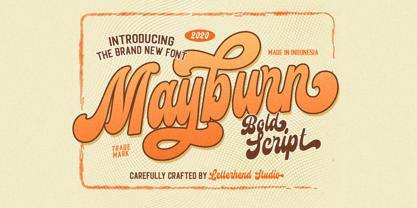 Introducing, Mayburn Script - a bold script with a touch of retro feel. This type of font perfectly made to be applied especially in logo, and the other various formal forms such as invitations, labels, logos, magazines, books, greeting / wedding cards, packaging, fashion, make up, stationery, novels, labels or any type of advertising purpose. Features : uppercase & lowercase numbers and punctuation multilingual alternates and ligatures PUA encoded We highly recommend using a program that supports OpenType features and Glyphs panels like many of Adobe apps and Corel Draw, so you can see and access all Glyph variations.
 - Kyhota by Ingrimayne Type,
$14.95 The six typefaces of the Kyhota group all have an “Old West” look to them. KyhotaOne has very thick slab serifs compared to KyhotaTwo. KyhotaBarbed is more condensed than either and has little barbs on the verticals, something that was a feature of a number of nineteenth century typefaces in this style. KyhotaFezdaz is condensed, without barbs, and with the slab serifs replaced with a flare serif. KyhotaBigBottom and KyhotaBigTop play with the weighting of the serifs, with one (either top or bottom) very thin and the other very thick.
 - Tompouce by Hanoded,
$15.00 A Tompouce (also know as Tompoes) is a typical Dutch pastry. It consists of a thick layer of pastry cream, sandwiched between two layers of puff pastry. It usually comes with pink icing, except on the king’s birthday, when the icing is orange. Tompouce is also a very nice connected script, with a lot of curly letters, some double letter ligatures and all the diacritics you can throw a pastry at. If it is an elegant, yet fun connected script you’re looking for, well… Tompouce may just be what you need!
 - Peanut Ache by PizzaDude.dk,
$17.00 I don't know what it is with me and peanuts. I simply love it! I like peanuts in all kinds of meals: breakfast, lunch, dinner and even in desserts! But with an addiction like this, an overload of peanuts sometimes appear...and I guess that's where the name of this font comes from :) The Peanut Ache font is super clean, and super steady - use it for anything that needs a clean look! I've added 5 slightly different versions of each letter, and this really helps making your text to look even more fresh and lively!
 - Mayari by Lurinzu Studios,
$16.00 “Mayari" is an elegant and expressive display typeface that is inspired by the characteristic and vibes of female warrior in Filipino Mythology named: Mayari. Mayari is the “goddess of moon”. This typeface holds the perfect balance of expressiveness as a display whilst also holds well of being a body type. This typeface is best used when you want to express elegance, class and sophistication in your designs. *This font includes letters, numbers, multi-language, and all essential marks needed. * Two(2) weights are currently available for this typeface: Regular and Italic
 - Jarvis by Alan Smithee Studio,
$9.00 Jarvis is a hybrid. Not a pure grotesque, not a humanist sans, but the best of both worlds. Its open counters and strong geometry, coupled with smooth curves and features give it a unique personality. Very legible even at small sizes, instantly recognisable at large sizes, it is an ideal candidate for corporate identity as well as print and digital communications of all kind. Its wide range of weights (from Thin to Black), extensive OpenType features, circled numbers, and extended character-set are the hallmark of the highest technical level.
 - Artificial Flavour by Kitchen Table Type Foundry,
$15.00 I do groceries a couple of times a week. When I am shopping for food, I always read the ingredients list; I don’t want too much sugar, nor palm oil, trans fats or a lot of E numbers. It used to be quite hard finding products that didn’t contain artificial flavours or colouring, but it is getting better. Artificial Flavour is an anti-ode to the time we couldn’t get enough of the stuff - it is a handmade, all caps font which comes with extensive language support and a sweet set of alternates.
 - Bamberforth by Greater Albion Typefounders,
$12.95 Bamberforth is a new take on the type of lettering that was often seen on Railway timetables, share certificates and anything else that needed a distinctive heading in the mid-19th Century. This sort of thing was used on both sides of the Atlantic and can carry us back to another time. Bamberforth aims to give a modern clarity to a style of lettering that, in all other particulars, harks straight back to Victorian times. Bamberforth is ideal for giving anything a 19th century feel-especially posters, book headings, dust jackets and invitations.
 - Florati by Proportional Lime,
$19.99 Can you imagine the delight that the printers of the Incunabula era would have had if they had such a tool as this font with a hundred and fifty glyphs of decorative capitals. The printers of that era were lucky to have more than a handful such delights. These Decorated initials and drop caps are all based on early period exemplars, dating to prior to 1525, from a wide range of printers such as Thomas de Blavis to Günther Zainer. Every Proportional Lime Font comes equipped with a complete character map.
 - Cat e Poultry by Proportional Lime,
$19.99 Love them or hate them Cats are one of the most successful animals on the planet. If they had thumbs we would all be in trouble. Fortunately for us these four legged sharks have managed to domesticate us and we are able to coexist peacefully. So this font is to share the joy of being blessed with the presence of such noble animals be it those of the Pantherinae Felidae or the not so humble Felis Catus (Domestic Cat). Why the Turkey? Well... you will have to buy the font to find out.
 - Proza Display by Bureau Roffa,
$39.00 Proza Display is the eye-catching counterpart of Proza, consisting of 12 styles (6 weights + italics). Together, Proza and Proza Display form a large family of 24 styles, which are all equipped with plenty of language support and opentype features. Proza Display was made to function especially well at large sizes, drawing the reader's attention with its beautiful and slightly eccentric shapes. Its large character set (support for 200+ languages) and opentype features make sure that Proza Display doesn't let you down, while its classy design helps you to make a visual impact.
 - Bun Chalk by Storictype,
$12.00 Introducing BunChalk Typeface Here is new product, It's called Bun Chalk. BunChalk inspired by many lettering on menuboard chalk cafe and bistro, and it's specially designed for the resto who use chalk concept,menuboard Chalk up your brand with our one-of-a-kind chalk concept! Leave your mark and get noticed with custom branded chalk that makes a statement. Whether you're a hip cafe, a stylish boutique, or a savvy startup, our branding chalk is the perfect way to spread the word about your business. Write inspirational quotes, menu specials, sales announcements, or just your logo all over your windows and sidewalks. Made from handmade quality chalk texture that goes on clean and texture typeface, it's ideal for businesses who want to grab attention and stand out from the crowd. Let potential customers know you're there with playful, eye-catching branded chalk that gets your name seen.
 - Today Sans Now by Elsner+Flake,
$59.00 With the publication of the “Today Sans Now” Elsner+Flake extends its offering of the “Today Sans Serif” type family, developed in 1988 by Volker Küster for Scangraphic, by another cut so that the gradation of the stroke width can now be more finely calibrated. The type complement is available for 72 Latin-based languages as well as Cyrillic. Where available, small caps were integrated, and mathematical symbols as well as fractions were included. In order to make the symbols for text applications in regard to headlines more flexible, the insertions which were formerly added, for technical reasons in order to sharpen the corners, were eliminated, and the optical size adjustments of the vertical and diagonal stem endings (I, v, H, V) to the horizontal bars (z, Z) were scaled back. Already since the end of 1984, Volker Küster experimented with broad sticks of chalk and a broad felt pen in order to develop a new sans serif typeface which, in the interest of easy legibility, would be built on the basic structures and proportions of the Renaissance-Antiqua. Using a normal angle of writing, his experiments lead to the form structure of the characters: a small contrast between bold and light weights, serif-like beginning and end strokes in some of the lower-case characters, and the typical, left-leaning slant of all round lower-case letters and the typical left-leaning axis of all round letter forms. In this way, a rhythmization of a line of type was achieved which created a lively image without being “noisy”. With this concept, Volker Küster has enlarged the Sans Serif by a distinctive, trend-setting form variation.
 - Gold by FontMesa,
$29.00 Gold is all new for 2021, the complete family has been rebuilt using the multiple masters technique. In this new version we've removed any alternatives that could not be shared across all weights in the family and we've trimmed a few others that just were not practical in keeping a consistent look to the whole font. All the alternates now have matching accented glyphs across all weights. Case sensitive forms have also been added to all weights. With 14 weights the difference between weights are closer together which may give you the effect of a variable font where variable fonts are not supported. For technical reasons the original Gold family has now been split into two families with Gold having ten weights and the four heavier weights under the Gold Magnum family. The Gold and Gold Magnum font families support accented characters for western, central and eastern European countries. Gold comes with OpenType features to access the alternate glyphs however you will need an application such as Adobe Creative Suite to take advantage of alternate glyphs.
 - Lamebrain BRK Pro by CheapProFonts,
$10.00 The first handwritten font from CheapProFonts - and what a beauty it is! The original font had no diacritics at all, so all have been designed to fit. This friendly looking font is ready to scribble some notes or something. ALL fonts from CheapProFonts have very extensive language support: They contain some unusual diacritic letters (some of which are contained in the Latin Extended-B Unicode block) supporting: Cornish, Filipino (Tagalog), Guarani, Luxembourgian, Malagasy, Romanian, Ulithian and Welsh. They also contain all glyphs in the Latin Extended-A Unicode block (which among others cover the Central European and Baltic areas) supporting: Afrikaans, Belarusian (Lacinka), Bosnian, Catalan, Chichewa, Croatian, Czech, Dutch, Esperanto, Greenlandic, Hungarian, Kashubian, Kurdish (Kurmanji), Latvian, Lithuanian, Maltese, Maori, Polish, Saami (Inari), Saami (North), Serbian (latin), Slovak(ian), Slovene, Sorbian (Lower), Sorbian (Upper), Turkish and Turkmen. And they of course contain all the usual "western" glyphs supporting: Albanian, Basque, Breton, Chamorro, Danish, Estonian, Faroese, Finnish, French, Frisian, Galican, German, Icelandic, Indonesian, Irish (Gaelic), Italian, Northern Sotho, Norwegian, Occitan, Portuguese, Rhaeto-Romance, Sami (Lule), Sami (South), Scots (Gaelic), Spanish, Swedish, Tswana, Walloon and Yapese.
 - White Rabbit - Unknown license

- SF Square Head Pro by CheapProFonts,
$10.00 A completely square typeface. And wide. It is all futuristic and fast. I have redesigned the uppercase D (which was identical to the O), V and Y - and also a couple of the lowercase letters: a narrower r, a more identifiable t and f and weight corrections to the v, x and z. This font only had a very basic ASCII character set, so I have created a large amount of glyphs, and expanded it with the usual multilingual support. The future is now. ALL fonts from CheapProFonts have very extensive language support: They contain some unusual diacritic letters (some of which are contained in the Latin Extended-B Unicode block) supporting: Cornish, Filipino (Tagalog), Guarani, Luxembourgian, Malagasy, Romanian, Ulithian and Welsh. They also contain all glyphs in the Latin Extended-A Unicode block (which among others cover the Central European and Baltic areas) supporting: Afrikaans, Belarusian (Lacinka), Bosnian, Catalan, Chichewa, Croatian, Czech, Dutch, Esperanto, Greenlandic, Hungarian, Kashubian, Kurdish (Kurmanji), Latvian, Lithuanian, Maltese, Maori, Polish, Saami (Inari), Saami (North), Serbian (latin), Slovak(ian), Slovene, Sorbian (Lower), Sorbian (Upper), Turkish and Turkmen. And they of course contain all the usual "Western" glyphs supporting: Albanian, Basque, Breton, Chamorro, Danish, Estonian, Faroese, Finnish, French, Frisian, Galican, German, Icelandic, Indonesian, Irish (Gaelic), Italian, Northern Sotho, Norwegian, Occitan, Portuguese, Rhaeto-Romance, Sami (Lule), Sami (South), Scots (Gaelic), Spanish, Swedish, Tswana, Walloon and Yapese.
 - Lombardia Script by Mans Greback,
$69.00 Lombardia Script is a creative and decorative script font that exudes vividness and elegance. This font is perfect for designing logotypes, tattoos, and other projects that require a signature-like quality. Designed with the art of calligraphy in mind, Lombardia Script features a delicate and expressive stroke that gives it a natural and authentic look. Its ink and brush-like appearance adds to its creativity and uniqueness, making it a great choice for any project that requires a touch of sophistication. Lombardia Script comes in four styles: Regular, Italic, Bold, and Bold Italic. This range of styles provides versatility and allows for dynamic and creative designs. With its beautiful and flowing letterforms, Lombardia Script is the perfect choice for adding a touch of elegance and creativity to any project. Use underscores _ anywhere in a word to make a swash. Example: Wonder_woman Use multiple underscores to make different swashes. Example: Extra__vagant The font is built with advanced OpenType functionality and has a guaranteed top-notch quality, containing stylistic and contextual alternates, ligatures and more features; all to give you full control and customizability. It has extensive lingual support, covering all Latin-based languages, from Northern Europe to South Africa, from America to South-East Asia. It contains all characters and symbols you'll ever need, including all punctuation and numbers.
 - Allioideae by URW Type Foundry,
$49.99 This fine lined display type face was named Allioideae because of the ascenders of the lower cases. They are rising upright with a single stroke and are ending - depending on the font style - into a spherical blossom. The name was chosen concerned to the plant allium, that forms an umbel at the top of a leafless stalk, when it is blooming. Allioideae is the name of a subfamily of monocot flowering plants in the family Amaryllidaceae. The name is derived from the generic name of the type genus, Allium. The wide and round capital letters are showing a nice contrast to the lower cases and giving the font a kind of female feeling. That provides a functional and lovely use in headlines for all beauty and cosmetics issues.The typeface appears in 4 different styles. a plain style – Allioideae, a stencil style - Allioideae Stencil, a (dotted) style for both - Allioideae Dot and Allioideae Stencil Dot. It supports multi language as it covers all the latin diacritics and a cyrillic character set. Lots of numbers as monospaced, lining figuers, old styles, sub- and superscript and many fractions in two different styles are giving a nice finish to that font. Also some matching ornaments are included.
 - Idiom by Reserves,
$39.99 Idiom is an extra-condensed, tightly spaced display face with congruent forms exuding a strong sense of rhythm and elevation. The basic stenciled geometric shapes are reminiscent of the decorative style found with P22 Albers and Futura Black. Careful consideration of each letter's construction, relative to all characters, lends Idiom a decided sense of cohesion and sophistication. The included non-traditional 'weights' (Medium and Bold) are completely blacked out, creating entirely new letterforms that exhibit a very stark, contemporary sense. Increasing the versatility of the Idiom family, a selection of OpenType features allow access to a set of contrasting linear punctuation forms, unconventional ligatures, case-sensitive punctuation and more. Features include: Basic Ligature set including 'f' ligatures (ae, oe, fi, fl, ff, fh, fj, ft, fa, ct, st, rt, ot, ta, sa, mi, si, vi, su, oc, oo, ru, ib) Alternate characters (M, W, T, ß, _, $, @, (), {}, [], /, \, |, -, –, —, +, -, ±, ≤, ≥, , «, », and more) Case forms (shifts various punctuation marks vertically to a position that works better with all-capital sequences, in this case the numerals or letters with ascenders) Slashed zero Full set of numerators/denominators and superscript/subscript Automatic fraction feature (supports any fraction combination) Extended language support (Latin-1 and Latin Extended-A) *Requires an application with OpenType and/or Unicode support.
 - Kokomo Breeze by Nicky Laatz,
$35.00 Say hello to Kokomo Breeze - A deliciously bold and nonchalant casual marker font. Kokomo Breeze was designed to keep a naturally handwritten marker-style look , while still maintaining some subtle inky marker imperfections on its edges , to keep in line with a more realistic, yet very legible look. Great for headlines, bold branding, classy packaging, eye-catching callouts and stand-out advertising, Kokomo Breeze is designed to be your jack of many trades. Be sure to turn on your OpenType features when type with Kokomo Breeze - it’s packed with natural-looking ligatures and alternate characters for both upper and lower case - all of these opentype extras make your type design look mush less mechanical, and much more like naturally formed words as you type. Pair it with a bold tall sans serif font, or a classy serif to add another whole new dimension to this very versatile marker font. Great as large and small sizes, Kokomo Breeze is perfect for any size design.
 - Between The Lines BF by Bomparte's Fonts,
$29.00 The famous Catalan architect, Antoni Gaudí, used to say “there are no straight lines or sharp corners in nature…” However, with Between The Lines that’s exactly what you’ll find: straight lines, parallel and perpendicular, all in a glorious display of Art Deco style. Here the verticals and horizontals dominate while the diagonals “sit this one out”. Curvilinear lines also run free here: they serve as refreshing counterpoints to prominent straights. These forms suggest a somewhat expressive script-like characteristic, (especially in lowercase) wherever the font’s many initials, terminals and contextual alternates are employed. Between The Lines offers many options for alternate letterforms (ligatures, stylistic alternates, contextual alternates, etc.). When these OpenType features are used judiciously and selectively, your typography will be greatly heightened. You’ll find BTL right at home in a number of environments: music album covers, snack food packaging, magazine headlines, cosmetics, signage and more. PLEASE NOTE: due to its very tall ascenders, Between The Lines benefits from generous leading (line spacing). Multilingual support included.
 - CarlMarx by Adobe,
$29.00This typeface is based on lettering by Carl Marx (1911?1991), designed during his first semester at the Bauhaus in Joost Schmidt?s class, in 1932. Although the letter proportions are based on Schmidt?s teachings, the forms are not constructed from compass and ruler, but drawn with brush and marker, lending the words a warm and lively touch. Hidetaka Yamasaki redrew the letters from scratch and added all missing characters for today?s needs. A set of hanging figures, alternates for some critical letterforms (such as f, r, and t) as well as several ligatures make CarlMarx especially suitable for use in body text. As suggested by Marx, Yamasaki captured two weights from the original drawing and perfectly adjusted light and bold to highlight words and create hierarchy in headlines ? without losing or adding space. True to the original, Yamasaki captured the wobbly contour in CarlMarx, preserving warmth in the condensed geometric style of the early 1930s. - P22 Mystic Font by IHOF,
$24.95 The P22 Mystic font knows all. Aside from allowing for type design in a faux eastern script, this font peers into the world of the spirits for guidance and enlightenment. Sure it has small caps and ligatures as OpenType features, but it also has a special “oracle” feature which will answer your most mystifying questions. The design itself was based on an actual Ouija board. Somehow the spirits became embedded into the font itself and now when a question is typed, an answer is revealed—provided the Contextual Alternates feature is enabled. It is not known how the otherworldly harbinger was able to integrate into OpenType scripting, but who are we mere mortals to question this power? Ask and ye shall be amazed! Only the Opentype Pro version will offer the “Magic Eight-Ball” feature. It also contains the small caps and old style figures as found in both TT and PS versions of the fonts.
 - Mantika Sans Paneuropean by Linotype,
$67.99With its well-defined characters that are readily legible even in the small font sizes, Mantika Sans by Jürgen Weltin is ideal for typesetting. The elaborately designed and highly individual set of italics enhances the attractiveness of the font.Jürgen Weltin developed the Mantika™ Sans sans serif font using older designs for an serif font as his inspiration. Nothing more than the merest suggestion of the original serifs has survived. Bevelled line endings and the slight variation in thickness of verticals, in particular, provide Mantika Sans with a very dynamic character that evokes manuscript. Short ascenders and descenders give the font a compact appearance that is also underscored by its condensed proportions. Weltin has achieved his aim of producing a typeface with excellent legibility even in small sizes not just by means of the x-height, which is tall in comparison with the capital letters, but also by using clearly defined and well differentiated designs for critical letters, such as i", "I" and "l". Lower case "i", for example, has a serif while the "l" has a curved base.In addition to uppercase numerals, Mantika Sans also has lowercase or old style numerals that have been designed so that they can be used in both tabular and proportional settings. The uppercase numerals are slightly shorter than the uppercase letters, ensuring that the latter can be sympathetically incorporated within continuous text.The Mantika Sans italics are very unusual. They are inclined at only 4.5° (the usual angle for italics is 10 - 12°) and so appear to be almost upright. In addition, they also have quite distinctive forms. The overall effect calls attention to their curvilinear, manuscript character, enhances contrasts and further emphasizes the terminals. Weltin explains: "Within the variety of forms of the italics there are many contrasting terminal elements that create dynamism. The result is a diversity of interaction between the rounded and angular forms". Mantika Sans Italic thus has all the features of a display typeface, but can also be happily used on its own to set longer text passages. Mantika Sans is available in two weights; Regular and Bold, both of which have corresponding italics sets. Mantika Sans has been designed so that the widths of the four related cuts are identical, meaning that a change of font within a single layout will have no effect on justification. In addition, the members of the Mantika Informal font family, designed by Jürgen Weltin in 2010, also have the same thickness. Other font families having weights with equal thickness can be found in the "Linotype Office Alliance series".The Mantika Sans character sets are paneuropean. There are characters for setting texts in Eastern European languages, Greek and Cyrillic. There is also a range of special symbols, including right-angled brackets, subscript and superscript lower case letters, together with numerals, arrows and many different bullet points.As a vibrant and highly legible text font, Mantika Sans has a broad spectrum of potential applications. Its unusual italics are not just perfect for use in display text. The fact that it has only four cuts means that Mantika Sans is particularly suitable for office use or for the setting of business reports. Its excellent legibility even in the small font sizes also makes it ideal as a text for electronic reading devices; this also applies to Mantika Informal.At the 3rd International Eastern Type Design Competition Granshan 2010, Mantika Sans was awarded in the category Greek text typefaces." - Mantika Sans by Linotype,
$50.99 With its well-defined characters that are readily legible even in the small font sizes, Mantika Sans by Jürgen Weltin is ideal for typesetting. The elaborately designed and highly individual set of italics enhances the attractiveness of the font.Jürgen Weltin developed the Mantika™ Sans sans serif font using older designs for an serif font as his inspiration. Nothing more than the merest suggestion of the original serifs has survived. Bevelled line endings and the slight variation in thickness of verticals, in particular, provide Mantika Sans with a very dynamic character that evokes manuscript. Short ascenders and descenders give the font a compact appearance that is also underscored by its condensed proportions. Weltin has achieved his aim of producing a typeface with excellent legibility even in small sizes not just by means of the x-height, which is tall in comparison with the capital letters, but also by using clearly defined and well differentiated designs for critical letters, such as i", "I" and "l". Lower case "i", for example, has a serif while the "l" has a curved base.In addition to uppercase numerals, Mantika Sans also has lowercase or old style numerals that have been designed so that they can be used in both tabular and proportional settings. The uppercase numerals are slightly shorter than the uppercase letters, ensuring that the latter can be sympathetically incorporated within continuous text.The Mantika Sans italics are very unusual. They are inclined at only 4.5° (the usual angle for italics is 10 - 12°) and so appear to be almost upright. In addition, they also have quite distinctive forms. The overall effect calls attention to their curvilinear, manuscript character, enhances contrasts and further emphasizes the terminals. Weltin explains: "Within the variety of forms of the italics there are many contrasting terminal elements that create dynamism. The result is a diversity of interaction between the rounded and angular forms". Mantika Sans Italic thus has all the features of a display typeface, but can also be happily used on its own to set longer text passages. Mantika Sans is available in two weights; Regular and Bold, both of which have corresponding italics sets. Mantika Sans has been designed so that the widths of the four related cuts are identical, meaning that a change of font within a single layout will have no effect on justification. In addition, the members of the Mantika Informal font family, designed by Jürgen Weltin in 2010, also have the same thickness. Other font families having weights with equal thickness can be found in the "Linotype Office Alliance series".The Mantika Sans character sets are paneuropean. There are characters for setting texts in Eastern European languages, Greek and Cyrillic. There is also a range of special symbols, including right-angled brackets, subscript and superscript lower case letters, together with numerals, arrows and many different bullet points.As a vibrant and highly legible text font, Mantika Sans has a broad spectrum of potential applications. Its unusual italics are not just perfect for use in display text. The fact that it has only four cuts means that Mantika Sans is particularly suitable for office use or for the setting of business reports. Its excellent legibility even in the small font sizes also makes it ideal as a text for electronic reading devices; this also applies to Mantika Informal.At the 3rd International Eastern Type Design Competition Granshan 2010, Mantika Sans was awarded in the category Greek text typefaces."
 - Narrow Path by Ingrimayne Type,
$9.00 NarrowPath is a family of 18 condensed and ultra-condensed sans-serif typefaces. The family was derived from the font family NarrowWay by adding true lower-case letters. Some alternative letters forms can be reached with the OpenType feature of stylistic sets. The character spacing in most of the styles is quite loose and it can be tightened with an application's character spacing if needed. These typefaces are display faces that can be useful for squeezing tall lettering into tight spaces. Uses may include packaging, signage, and titles.
 - Destructive Decisions by Chank,
$99.00 Destructive Decisions is a font based upon the inherent flaws of human nature—presented under the guise of complete legibility. At first impression this font is very readable, but upon closer examination you'll notice the edges are fuzzy and some of the lines are off-kilter. You can read it, but it is also a bit foggy. No matter how hard it strives for perfection. This font was originally designed for a cable tv show about substance abuse, but is now available for use in your web and print designs, too.
 - Lemony Crumpet by Kitchen Table Type Foundry,
$10.00 A crumpet is a small griddle bread, mostly enjoyed in the UK, North America, Australia and New Zealand. I have never had one, but I have heard of them and I like the name - which is probably Welsh in origin. Lemony Crumpet is a whimsical, handmade font. It is tall & thin, shaky and jumpy and I wouldn’t use it as a poster font because of its delicate properties, but it would look fantastic on book covers, product packaging and websites. Comes with extensive language support and a set of alternates for the lower case letters.
 - Morningstar JNL by Jeff Levine,
$29.00 Her father named her Estella Dawn, or morning star. She truly shines bright, for as the owner of Stella Roberts Fonts, she has dedicated part of her net profits to helping her siblings pay for their medication; they both suffer from Cystic Fibrosis and diabetes. Calm in spirit, loyal to friends and family, nurturing and caring-- Stella has been a friend of Jeff Levine's for years. His Estella JNL font was dedicated to her, as is this other namesake font, Morningstar JNL. The design is a cross between retro-techno and a slight calligraphic touch.
 - Embassy by Bitstream,
$29.99The English roundhand has always occupied the central position in the group of faces appropriate to the social printing handled by engravers, and their contemporary imitators, thermographers. At the end of the nineteenth century when engraving was mechanised by the pantographic engraving machine, the traditional roundhands found their way onto pantographic pattern plates. Embassy is a traditional roundhand of vigorous contrast with straightforward capitals with ball terminals; it was transferred from such an engravers’ pattern plate to the Fotosetter at Intertype about 1955. Alphatype’s Yorktown is similar, but appears to have less contrast. - Neutraface Condensed by House Industries,
$33.00 Richard J. Neutra became an icon of Modern architecture as an artistic visionary, social commentator and outspoken defender of the environment. He refined his unique approach to design, for which he coined the term biorealism, over half a century ago. Regarding humankind and its surroundings as two inseparable halves to a greater whole, Neutra created habitats with the welfare of man and nature as his utmost concern. His ideas of evolutionary growth and adaptability compelled House Industries to develop Neutraface Condensed, built upon the original typeface and driven by the enduring spirit of the revolutionary who inspired it. “I have tried to be a feeling observer of life in all its manifestations, not a cold rationalist.” House Industries adopted this precept of Neutra as the guiding principle when the foundry commissioned Christian Schwartz to draw Neutraface Condensed. Instead of being exactingly compressed, the new companion fonts were composed around a complementary structural framework in order to better reflect the sensibilities of their predecessor. The result is an individualistic design with a restrained exuberance that shuns stylistically ersatz imitation. This compact yet lively presence allows Neutraface Condensed to lend flexibility and economy to headlines without sacrificing the simplicity and charm of the original. Like all good subversives, House Industries hides in plain sight while amplifying the look, feel and style of the world’s most interesting brands, products and people. Based in Delaware, visually influencing the world.
 - Madurai by insigne,
$24.75 The rounded forms found in Chennai have proven to be one of insigne's more popular designs for web-based company logotypes. Now, insigne's new superfamily Madurai takes its popular predecessor to a new level, offering a wide range of complementary fonts. Madurai removes Chennai's rounded stems and then adjusts the character width to account for its reduction in geometry, resulting in a balanced sans-serif face with humanist touches that works well for extended text. The Madurai family has a full range of six weights from thin to black and includes Condensed and extended options for a total of 36 fonts. All members of the Madurai series include a wide variety of OpenType alternates. Madurai is equipped for complex professional typography, including alternates, small caps and plenty of alts, including "normalized" capitals and lowercase letters that include stems. The face also has a number of numeral sets, including fractions, old-style and lining figures with superiors and inferiors. OpenType-capable applications such as Quark or the Adobe suite can take full advantage of automatically replacing ligatures and alternates. You can find these features demonstrated in the .pdf brochure. Madurai also includes the glyphs to support a wide range of languages, including Central, Eastern and Western European languages. In all, Madurai supports over 40 languages that use the extended Latin script, making the new addition a great choice for multi-lingual publications and packaging. For your next project, explore the fantastic potential of Madurai.
 - Minea by Bistatype,
$35.00 A characteristic of the Minea font family is the achievement of the calligraphic handwriting effect. In addition to basic, simple letter forms, it contains a large number of additional stylistic alternatives and ligatures that, by combining and changing without repetition, give the effect of calligraphic writing. Some of these characters can be changed by automatically turning on a particular OpenType function, when ligatures replace the combination of letters that are part of them, the letter is replaced by a certain alternative when found in a given context, and capital letters are replaced with decorative initials. Letter swap functions can be used in all programs that support OpenType programming. Minea is an attractive font that is sleek, clean, feminine, sensual, glamorous, simple and very easy to read. The Minea font family, based on original calligraphic sketches, contains a total of six weights. Thin, regular and medium weights have ligatures and alternate letter shapes, which help make the syllable look like an authentic calligraphic print. Semi-bold, bold, and black weights contain only basic letter shapes. The font family contains Latin and Cyrillic. Includes Russian and Serbian alternative letter forms. The family of calligraphic fonts Minea can be used on various occasions, and is intended for use in print and online. Can be used in the realization of certain tasks, unusual advertisements, packaging and invitations, diplomas ... as well as for all purposes where this type of letter is needed.
 - Quarca by insigne,
$24.75 Quarca's masculine power runs strong across the page with bold self-assurance and a raw energy that courses through its thick veins. Don't think the continuous, smooth geometry of this semi-modular face is captively chained to the grid, though. Quarca has been cautiously optimized to engage the reader's eye. Achieving an attractive balance to its sturdy design, the open forms of this "rounded square" geometric sans -together with a tall x-height- make the font legible even when using the compact widths. This high-impact typeface definitely doesn't sacrifice versatility for style. These compact widths, with their raw heart and strength, are perfect for callouts, while the extended widths provide you with the platform for a punchy and extremely efficient headline. The font has a thinner weight and transcends to an intense bold. The face's geometric or technological construction also tends to make it right at home on the web. The family consists of 36 fonts -six weights plus italics. Where Quarca truly stands out, though, is its wide number of OpenType typographic choices and optional glyphs, allowing you to design your piece with a personal, one-of-a-kind variant touch. These variations consist of Experimental Capitals, Angled Capital Terminals, and "Future Stencil". In all, you can find more than one hundred of these alternate glyphs. Quarca is well-suited for anything you are able to throw at it. Devised for today's multi-disciplined designer, this clear and infinitely versatile family provides tremendous value to your toolbox.
 - Tabac Glam by Suitcase Type Foundry,
$75.00 A special category of typefaces, combining together principles of both serif and sans-serif, is sometimes described as Linear-Antiqua by German typographers. This concept catches the eye wherever it appears and this is also the case of Tabac Glam — a highly contrasting display typeface, expanding the wide expressive spectrum of our Tabac super-family through a new characteristic hue. Tabac Glam is naturally a great complement to the serif Tabac. It’s however only in conjunction with other styles of the superfamily — Sans, Slab and Mono, that you’ll be able to unleash the enormous potential of the wide range of combinations, and the family’s 112 styles will certainly satisfy all needs of both elegant and technical typesetting. Tabac Glam will best stand out in huge grades, on the covers of thick magazines under glossy layers of UV coating, or on snow-white surfaces of displays.
 - Jack Stanislav by deFharo,
$22.00 Very condensed typography, thick line and fun look for headlines and advertising where you are looking for saving space and originality at the same time. The upper inclination of the letters, the combination of horizontal with inclined forms, the ascending and descending short, and the lower elongation of some antlers will allow you to print varied styles with a lot of movement according to the context of the design. I started drawing this font with the intention of creating a new decorative typeface Blackletter style but modernizing the strokes, after drawing several letters imitating the ductus of this type of fonts trying to simplify them, emerged all the DNA of the current Jack Stanislav, finally a retro typography without Serif of linear strokes that mimic the angle of a thick pen. Use the following keys to write the bitcoin symbol and the Jack icon: b #, a #
