10,000 search results
(0.047 seconds)
- Lastari by Mantra Naga Studio,
$20.00 Lastari – a Bold Slab Serif Display Typeface. This typeface has many alternatives with swashes that can make your lettering/logotype more attractive. This font is suitable for logos and various other formal forms, such as invitations, labels, logos, magazines, books, greeting/wedding cards, packaging, fashion, makeup, stationery, novels, labels, or advertising. This font is PUA encoded, which means you can access all of the glyphs and swashes with ease!
 - Salty Feathers by Sans And Sons,
$19.00 Salty Feathers includes full set of uppercase and lowercase letters, multilingual symbols, numerals, punctuation, alternates, swash and ligatures. The font has organic smooth wet ink texture with Modern Elegant Style this is perfect for branding, logos, invitation, masterheads and more. Salty Feathers Features : Multilanguange Ligatures Alternates Swash PUA Encoded Language Support: All fonts support English, French, Italian, Spanish, Portuguese, German, Swedish, Norwegian, Danish, Dutch, Finnish, Indonesian, Malay, Hungarian, Polish, Turkish, Slovenian.
 - Caseopia by Letteralle,
$29.00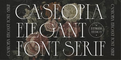 Caseopia is a modern font that takes a classic style. Designed to give the impression of elegance and luxury with a classic feel. Contains uppercase-only characters, all punctuation & numerals. There are also ligatures that will bring a unique style. Perfect for editorial projects, Logo design, Wedding, Clothing Branding, product packaging, magazine headers, or simply as a stylish text overlay to any background image. Enjoy the font, Thank You!
 - Maulysia by Gatype,
$12.00 Maulysia is a modern Signature font created in an elegant and professional style with alternate characters. perfect font for creating signature logos and watermarks for photography studios or personal photography logos, best for initial logos or brand signatures. Maulysia includes a full set of beautiful handwritten upper and lower case letters, numbers, assorted punctuation marks. All lowercase letters include starting and ending strokes, providing a realistic handwriting style.
 - Sagasti by Eurotypo,
$32.00 Sagasti is a font family that contains two weights: Regular and Bold, with their corresponding Italics style. These fonts are characterized by a straight and generous serif that provides consistent stability. We have focused on controlling vertical, horizontal and oblique strokes thicknesses, as well as curved strokes. All glyphs were carefully drawn and precise kerning control has been made, providing optimal readability for texts and the beauty of the headlines.
 - Falansia by Crowntype Studio,
$14.00 Falansia is a modern Calligraphy font created in an elegant and professional style with alternate characters. perfect font for creating signature logos and watermarks for photography studios or personal photography logos, best for initial logos or brand signatures. Falansia includes a full set of beautiful handwritten upper and lower case letters, numbers, assorted punctuation marks. All lowercase letters include starting and ending strokes, providing a realistic handwriting style.
 - Black Home by Linecreative,
$14.00 Black Home Inspiring from vintage playful style typography. This font is perfect for a design that makes it more attractive and playful. made with a very good level of aesthetics making this font suitable for book cover, poster, packging, merchandise, logotype and much more. What you get dear, you will get : Black Home- including Upper & Lowercase characters(ALL CAPS), Numbers and Punctuation Supports Multi linguage (Latin Western Europe)
 - PAG Bankas by Prop-a-ganda,
$19.99Prop-a-ganda offers retro-flavored fonts inspired by lettering on retro propaganda posters, retro advertising posters, retro packages all the world over. This is perfect font for your retrospective project. PAG Bankas is a vintage and old-fashioned that we can find in the posters of old silent film. Bankas’s retro forms lend itself to many design projects from branding to packaging, magazine headlines and so on. - Kinghorn 205 by Talbot Type,
$19.50 Kinghorn 205 is an Egyptian style slab-serif. The strokes are all of a roughly equal weight for an even, geometric look. Although original Egyptian slabs date from the early 19th century, the even look gives the font a balanced, contemporary look. It's intended mainly as a display font, but it's even strokes mean it remains legible even at smaller sizes. It's also available with some character variations as Kinghorn 105.
 - Everglow Script by Seniors Studio,
$29.00 Everglow Script is retro signage font, bold and clean. There are so many variations on each character. Include Opentype stylistic alternates, standard ligatures and multilingual support. You are able to create so many different typographical layouts easily and quickly. Make sure you use OpenType savvy program and simply open Glyph Palette to access all of the glyphs. This font is suitable for t-shirts, signage, logos, branding, packaging etc.
 - Octavus Caps Black - Personal use only

- Octavus Black - Personal use only

- Holofernes NF by Nick's Fonts,
$10.00The raw emotional energy of German Expressionism is evident in this font, based on Judith Type, designed by C. H. Kleukens in 1923. This version takes its name from the Biblical character who lost his head to the original font’s namesake. Both versions of the font include 1252 Latin, 1250 CE (with localization for Romanian and Moldovan). - Sqwared by Monotype,
$25.00 Sqwared is a square sans serif type family... with flares! This typeface has a retro, hand-painted quality – the slight flaring of its verticals evoke the steady brush of a signwriter. Sqwared benefits from large, open counters and a generous x-height that aids clarity and legibility, while a wide footprint gives these fonts a degree of stature and an air of confidence. Each character was drawn while immersed in a late sixties/early seventies vibe, but there’s no reason why Sqwared can’t be used for your contemporary designs. There are 16 fonts altogether, ranging from Thin to Ultra weights in both roman and italic. It has a Latin character set that covers all Latin European languages. Sqwared will dazzle in headlines, add flair and distinction to your logo designs, bring flamboyance to your branding material, and your body text will most definitely be unique! Variable fonts are included in this family, so you can tune the weight of each font to your exact preference. Key features: 8 weights in Roman and Italic Old Style Figures included Full European character set (Latin only) 440 glyphs per font.
 - Eclectic Two by Altered Ego,
$45.00STF Eclectic Two contains more of the useful and the sublime. Alarm clock time icons and many characters which connect add extra usefulness to this dingbat font. Stuff you'll need someday for a graphic element, bullet or dingbat application. Perfect for website icons! The Eclectic family is legendary, with a cult-like following among the inititated. With over 100 characters in the complete set, you'll find yourself using Eclectic Two almost daily to add spice to your otherwise san-serif typographic existence. This font is essentially a soap opera of typographic image elements, created for projects when I couldn't find the "thingbat" I needed. Almost more of a collection of illustrations, there are many characters which connect to form patterns, and of course it's like a "small neutral European country" army knife for the creative community. EcTwo features an complete architecturally-inspired alphabet, more of those smiley face variations, the eight ball, alarm clocks for the hours, the bouncing ball (with connecting dotted lines!), the paper airplane (flying and crashed!), the work dog, the chainsaw, Dorothy's slippers, the sideways arrows again, a handicapped symbol, chicken feet tracks, male/female symbols, gears, polynesian-inspired ornaments for patterns, a lighthouse, a torch, and more. Sounds twisted, eh? Make your own juxtapositionsof characters for funky borders. Available in Mac and PC formats. License it today! - Fibra One by Los Andes,
$26.00 Fibra One looks like a “soft” version of the Fibra font, but it is actually more than that—the second part of its name suggests that it is a reinterpretation of the original typeface. While this new version maintains the overall structure of Fibra and influence of the Avant Garde font, its shapes are different from those found in its predecessor—Fibra One features both soft corners and smooth transition between curved and straight sections. This gives the font a more dynamic and playful personality. Fibra One keeps the original contrast between curves and straight lines in glyphs such as ’n’ and ‘h’ (not found in rounded glyphs such as ‘a’ and ‘d’); details of display characters (e.g. three upper terminals in ‘W’ and projection off the stem in ‘A’); and exaggerated terminal in ‘R’. All these features give Fibra One a strong personality—a typeface that ‘gives you the chills’. Fibra One was specially designed for display use. The font has a very generous x-height that allows for use in corporate text, thanks to its good readability. Fibra One comes with 2 subfamilies—a more ’normal’ Basic family, with a smaller amount of stylistic features, for use in subheadings or any other type of text that requires formality, and an Alt family that shows off the true potential of the font, making it the perfect choice for magazine headlines, posters and logotypes.
 - Cherry Blossoms by Positype,
$15.00 It’s spring and the Cherry Blossoms are in bloom… and so is the new typeface by Neil Summerour and Positype. Cherry Blossoms is the new relaxed script family in the same vein as Good Karma. Produced from hand and sumi brush of Neil Summerour, Cherry Blossoms is a natural brush textured font family. Cherry Blossoms is blooming with personality, reliable and genuine movements, and a wide range of letter options to befit any project needing an honest hand-lettered look. Each typeface comes with an expansive set of stylistic alternates (upper AND lowercase), that harmonize wonderfully when you have the Opentype Ligature feature active. Additionally, special double-letter smart ligatures have been produced for specific combinations in need of more expressive flair, as well as a few swashes that work with the economical strokes originally produced from the sumi brush. To further expand the usefulnesss of this bright script, a separate Caps/Lowercase font has been added that provides the simple contrast needed to bring the script fonts forward. Rather than limit the personality of this script, various styles have been produced to compliment the original Regular… Wide and Tight as well as the afforementioned Simple’ fonts are included in hopes of helping you find the perfect variation needed for your composition. Cherry Blossoms is the second release of the Positype Relaxed Script Collection of typefaces—all focused on fluid, effortless script fonts for simple use.
 - Grenale Slab by insigne,
$- Grenale Slab adds to the new standard of elegance within the Grenale family. Not your typical slab, Grenale has some unique forms that give it a look all its own. This glamourous slab still draws much inspiration from Grenale’s Didone sans and its haute couture influence. Independently attractive, it’s balanced and poised, with well formed strokes. Grenale Slab’s thin weights are simple but vibrant--elegant forms that naturally lend themselves to designer journals and high-end branding along with upscale applications. With added energy and power, the thicker weights give your work a firmer, statlier look. Grenale Slab’s upright versions are also matched by optically adjusted italics. The fashionable typeface includes a multitude of alternates that may be accessed in any OpenType-enabled application. The stylish features include a large group of alternates, swashes, and meticulously refined details with ball terminals and alternate titling caps to accessorize the font. Also included are capital swash alternates, old style figures, and small caps. Peruse the PDF brochure to see these features in action. OpenType enabled applications such as the Adobe suite or Quark can take full advantage of the automatic replacing ligatures and alternates. This family also offers the glyphs to support a wide range of languages. Any of Slab’s weights also provide a well-matched companion to its original counterparts, Grenale #2 and the original Grenale. It’s time to think high-class. Graceful and assured, the carefully crafted forms of Grenale Slab step pleasantly onto each page with elegant charm. Include its range of alternate glyphs, and this chic font is a superb choice for bringing a far more refined look to your copy.
 - Vertrina by Greater Albion Typefounders,
$8.95 Vertrina marries four virtues: elegance, simplicity, character and usefulness. It started as an idea to combine two things: the elegance of classical Roman typefaces and of classical Roman architecture. The result is that rarest of all things - a truly new face that is elegant yet characterful but not so obtrusive as to be restricted to display work. All the faces' uprights mirror the elegant taper of Roman columns, as used in the most simple and elegant form of Roman architecture. The serifs are a subtle shape that mirrors the pediments and corbels of that same order of architecture. Vertrina is a family of eight faces, four upper and lower case faces, suitable for the elegant setting out of text, and four small capitals faces ideal for headings and titles. You'll find regular and bold weights and normal and condensed width, as well as a range of Opentype ligatures. All faces are offered individually and in family groups. Bring some simple elegance to your work.
 - TT Ricks by TypeType,
$19.00 Attention! Important information! There is no Cyrillic support in TT Ricks! TT Ricks useful links: Specimen | Graphic presentation | Customization options About TT Ricks: We are glad to present you the new font TT Ricks, which continues the line of trendy and yet affordable TypeType Starter Kit fonts. TT Ricks is a flamboyant elzevir-type serif, for which the words “cute” or “calm” are not a fitting definition. TT Ricks can be classified as a display title typeface that works especially well at large and medium sizes in packaging design, book graphics and posters. The typeface is inspired by the pre-digital font “De Vinne”, which was designed in 1892 by the designer Gustav F. Schroeder. We liked certain aspects of the historical prototype, but at the same time, when creating TT Ricks, we did not want to limit ourselves—on the contrary, we were eager to discover a completely new spirit and bring bright details to the font. The TT Ricks typeface stands out for its strong contrast, noticeable sharp serifs, narrow letterforms with a pronounced displacement of flows in the arches. The typeface has very dense spacing, and in the bold style, the text set begins to resemble Gothic by its richness and tension. Important visual features of TT Ricks are the dashing shapes of ascenders and descenders, the thin and sharp stroke endings, and the “elzevier legs” of the letters R K k. In the lowercase round characters c e s, you can notice the pronounced slope of the oval, which contrasts with the general set of the font. These "slanted" signs and ascenders and descenders of the letters f and y are designed to cut the monotony of a set and to entertain the reader's eyes. The TT Ricks typeface consists of three weights (Regular, Medium, Bold) and one variable font. Each style consists of 553 glyphs and contains 18 OpenType features. The most interesting features are stylistic alternates for the letters R K k with alternative short leg shapes, two sets of figures for working with upper and lower case characters, and a set of original icons that further reveal the spirit of the family. Please note! If you need OTF versions of the fonts, just email us at commercial@typetype.org Attention! Important information! There is no Cyrillic support in TT Ricks! TT Ricks OpenType features: aalt, ccmp, locl, numr, ordn, tnum, onum, lnum, pnum, case, liga, calt, ss01, ss02, ss03, ss04, ss05, ss06 TT Ricks language support: Acehnese, Afar, Albanian+, Aleut (lat), Alsatian, Aragonese, Arumanian+, Asu, Aymara, Azerbaijani +, Banjar, Basque +, Belarusian (lat), Bemba, Bena, Betawi, Bislama+, Boholano+, Bosnian (lat), Breton +, Catalan+, Cebuano+, Chamorro+, Chichewa, Chiga, Colognian+, Cornish, Corsican +, Cree, Croatian, Czech+, Danish, Dutch+, Embu, English+, Esperanto, Estonian+, Faroese+, Fijian, Filipino+, Finnish, French, Frisian, Friulian+, Gaelic, Gagauz (lat), Galician+, Ganda, German+, Gikuyu, Guarani, Gusii, Haitian Creole, Hawaiian, Hiri Motu, Hungarian+, Icelandic+, Ilocano, Indonesian+, Innu-aimun, Interlingua, Irish,
 - Astor by Lab-Dot,
$24.99 New Eurostile! A redesigned Eurostile font, Astor font, was created inspired of one of most used fonts in the world. Idea was to make new, contemporary design of old Eurostile font which was created 1962. by designer Aldo Novarese. Main characteristics and features of Astor font are: beautiful design and contemporary font. May be used like display font, cargo font, OCR font. Most of glyphs have same thickness and high modularity in combining 2 or more glyphs. Good for architect’s projects, labeling, making environmental typography installations, for use of some interior or exterior designs, furniture designs etc.
 - Shire Script by Bean & Morris,
$35.00 Shire Script includes alternate characters and discretionary ligatures to help you create settings when informality is called for. Variety in the lowercase x heights and connectors give an overall effect of handwritten headings and text. However, by considered drawing, legibility is not compromised.
 - Celtic Knots by Clanbadge,
$20.00 While it is obvious that this is an ornamental style font, it is more than that: it is a Celtic Knotwork design tool! Irish, Scottish, Welsh, even Norse and Viking cultures have used knotwork designs for millenia. These ancient traditional interwoven designs are experiencing a revival as Celtic culture gains exposure in the modern world. Intricate Celtic knots are featured everywhere from jewelry to tattoos. While many enjoy them simply for their beauty and fascinating twists, they can also be used to add an air of myth, magic and mystery to any project. The interlaced lines make them perfect for wedding invitations, borders, dividers and rules, web graphics, and logos. I began using Celtic knotwork designs in my own work as part of my knifemaking and jewelry making hobbies. I read all of the books I could find about Celtic knots and at first I drew them by hand with pencil and paper. Then as I realized how nice it would be to have "undos" I switched over to using Corel Draw. Draw proved to be a natural for this type of artwork with tools like contour and the trim function. But even with these great tools, it was still tedious to create these designs. I noticed that I was able to reuse a lot of parts in repetitive sections. I developed a small library of reusable bits and chunks of Celtic designs. I found them so useful and fun to work with that I began thinking about ways to market my Celtic design kit. I thought about CDR and EPS formats, but then I thought of creating this toolset as a True Type Font. That way anyone with ANY program that uses fonts could easily create Celtic knotwork designs. Word processors, embroidery programs, engraving programs, jewelry design programs, CAD/CAM programs...almost every program can use fonts. I was also interested in CNC work and thought that this font would work well for applications such as laser etching, vinyl signs, and machining. With that in mind, I designed each character of the font with extremes of accuracy. If one character from the font is used at one inch tall, every control point will be placed to an accuracy of better than 0.0001 inch. I wanted every piece to meet exactly with the next, with no possibility for misalignment. The different styles are all very carefully created to fit accurately with each other. So the Filled Style fits exactly into the Outline Style, and the Inverse Style fits precisely around the Outline Style so as to make up the background behind the knotwork. Combining the styles allows you to have complete creative control. By assembling the nearly 200 pieces it is quite easy to produce very complex designs. It is actually a bit like playing with a puzzle and many people really enjoy putting the pieces together to make designs. In fact, I have had many customers tell me of how they love playing with this font and making knots into the wee hours of morning. If you like puzzles then you will absolutely love this font! And creating the patterns is just the beginning of the fun! If you apply your favorite Photoshop tricks on them you can make anything from dazzling chrome knotwork to carved stone. Photoshop plug-ins like SuperBladePro are great for converting knotwork text into corroded bronze or rusted iron. Use your knotwork to add texture to a virtual landscape, or add them as surface embelishments on architecture and furniture. You can also make round knotwork by using this font with "WordArt" (WordArt is included with every copy of Microsoft Word. See http://clanbadge.com/round_knots.htm for a tutorial on how to make round knotwork). For Crafters there are limitless uses for this font. It has been used for embroidery, jewelry, leatherwork, stencils, stained glass, quilting, painting, pyrography, woodcarving and lots more. We have even sold copies to monks for use in decorating handmade books!
 - TessieSpinners by Ingrimayne Type,
$13.95 A tessellation is a shape that can be used to completely fill the plane—simple examples are isosceles triangles, squares, and hexagons. Tessellation patterns are eye-catching and visually appealing, which is the reason that they have long been popular in a variety of decorative situations, such as quilting. Most of the shapes in TessieSpinners suggest a spinning motion. Most do not resemble real world objects. The TessieSpinners fonts contain shapes that can be used to construct tessellation patterns. It has two styles, an outline style and a filled or black style. The black style can be used to construct colored patterns. To see how patterns can be constructed, see the “Samples” file here. Most or all of these shapes were discovered/created by the font designer during the past twenty years in the process of designing maze books, coloring books, and a book about tessellations.(Earlier tessellation fonts from IngrimayneType, the TessieDingies fonts, lack a black or filled version so cannot do colored patterns. Make sure the leading is the same as font size or the rows will not line up.)
 - Yaungtinai by IM Studio,
$18.00 Yaungtinai is actually a unique font, I made it with the relaxed spontaneity of my hands. designing formal fonts but with a classic elements, which makes it very suitable for wedding media, book covers, greeting cards, logos, branding, business cards and certificates, even for any design work that requires a classic, formal or fancy appearance. Try Yaungtinai, enjoy the wealth of OpenType features and let the powerful yet elegant excitement delight you and increase your creativity! You can use this font very easily. There are many features in it. Yaungtinai contains the full set of lowercase and uppercase letters, punctuation, numbers, and multilingual support. This font also includes several alternative Ligature and Stylistic Set styles for those of you who have software that can work with OpenType (Corel Draw / Photoshop / Illustrator / InDesign). If you don't have a program that supports OpenType features like Adobe Illustrator and CorelDraw X Version, you can access all alternative glyphs using Font Book (Mac) or Character Map (Windows). Don't forget to see, buy, like, and share with friends.
 - Elipses by Lián Types,
$30.00 It all began with an ellipse. Like an artist who goes from a pictorical logic to a more abstract one, in Elipses geometry is stripped of any distractive or ornamental detail. The font is naked and it shows that it does not need complex shapes or decisions in order to be very attractive. The font is a compendium of ellipses and stems, with a didone 'pensiero'. It also gets some inspiration from the art-deco letters and architecture, due to obvious reasons. Geometry at its best. Elipses will be useful for magazines, books, ads, or any piece of design that needs elegant letters. Note about the styles The styles named "Alt" (from Alternative) have their swashes with less loops. Use them if you are more into naked geometry. Apart from many alternates and ligatures, I've included some different sized glyphs in all the styles so you can also play on the rhythm! Have fun!
 - Kush by Our House Graphics,
$17.00 Kush is what happens when you let your fonts sit around watching cartoons and eating cake and ice-cream all day�When their vectors are freed from all constraints and allowed to follow their bliss. Kush has filled its insides to just the other side of contentment and comes to you on a sugar high and with a head full of Looney Tunes. And... It�s two ply! A two-layered display face from Our House Graphics with a plush, organic feel, Kush has 370 glyphs, over two dozen standard and discretionary ligatures, stylistic alternates and a few surprises. Kush Fat and Kush Shade work well independently but together they become a two colour, two layer font. Simply type some text in Kush Shade, copy it and paste it back on top of your original text. Then change the top layer to Kush Fat and adjust the colours to your liking. For best results, use default settings for kerning and tracking (letter spacing).
 - Become Display by Brenners Template,
$19.00 BECOME Display Font Family It tries to display playful ideas in well-balanced styles. Hello, designers. We always seek new innovations, but run into the world of forms and frames, presently. This font family presupposes pleasant imagination and provocation, but controls the change of various styles so as not to lose a sense of balance. B, E, M and W glyphs started from the same skeleton, but the detailed correction work for interpolation transformation was all applied differently. It is designed to be well suited to any layout while providing a unique stimulus. It can be a great display for all ages, from kids to seniors, and covers publishing, web, app and graphic design areas. OpenType Features Stylistic Sets(ss01) : C,E,G,H,L,N,O,Q,U,Z(Uppercases), a,b,c,d,e,g,i,j,l,,n,o,p,q,u,z(lowercases) Stylistic Sets(ss02) : ↑↗→↘↓↙←↖↔↕ ligatures : fi,fl oldstyle figures tabular figures fractions
 - Beefcakes by Monotype,
$50.99 Inspired by butcher shop and supermarket window advertising, Beefcakes™ emulates "big brush” style lettering – with a contemporary twist. Not for the typographically timid, this is a design that makes a powerful and friendly statement in print and on screen. Advertising headlines, posters, cover art, menus and packaging are all in Beefcakes’ wheelhouse. While it would be a little crowded on small screens, big type in web sites and games are also part of Beefcakes kit-bag. Drawn by Jim Ford, Beefcakes’ big, sassy and playful shapes are sure to grab attention. Its letterforms are dense and sturdy – yet soft and welcoming as your mom’s old couch. The suite of Beefcakes fonts is available as all-caps designs with small caps, in roman, italic and shadow flavors. As a nod to the typeface’s inspiration, Beefcakes fonts also include a set of decorative abbreviations (lb, oz, kg, in, etc.) for bold signage and showcard-style displays.
 - Pamella by Ahmad Jamaludin,
$13.00 Say hello to a new stylish script, Pamella! This font combines stylish letter shapes with a contemporary twist. It's the perfect fit for all luxury projects, such as elegant logos, printed quotes, lovely wedding invitation cards, social media headers, product packaging and a lot more! It includes full a set of elegant uppercase and lowercase letters, multilingual symbols, numerals, punctuation. The font has smooth wet ink texture, so would be perfect for all types of printing techniques, and you can do embroidery, laser cut, gold foil etc. with it. Language Support : Danish, English, French, German, Italian, Norwegian, Portuguese, Spanish, and Swedish. Included : - More than 200 of glyphs - Ligatures - Works on PC & Mac - Simple Installations - Accessible in the Adobe Illustrator, Adobe Photoshop, Adobe InDesign, even work on Microsoft Word. - PUA Encoded Characters - Fully accessible without additional design software. - Multilingual Support Let me know if you have any other questions. Thanks and have a wonderful day!
 - June by Schriftlabor,
$26.99 June is a contemporary neo-grotesque sans-serif typeface designed to be highly legible, readable, and usable. The clarity and mathematics were inspired by the research into type form by Adrian Frutiger. June was designed by developing a modern and unique approach to his findings. June's legible features include a near uniform stroke width, open apertures and counters, angular cut stems, and a large x-height. Italics are angled at eight degrees and have been redesigned to provide a stylistic difference without reducing legibility. June comes in seven weights, from Thin to Bold, each equipped with OpenType features. June can be used for all print sizes, and has characteristics that are more visible at larger sizes. June was inspired by a close family member of the designer. A part of all sales will be donated to Alzheimer's Society. Free Variable Font: If you buy the full family, you will also receive the Variable Font version of June, without extra charge.
 - Qarmilla by MonoLIne Calligraphy,
$23.00 Qarmilla Font is interesting because the typeface is pleasing to the eye, clean, feminine, sensual, glamorous, simple and very easy to read, because there are many fancy letter connections. I also offer a number of decent stylistic alternatives for multiple letters. Classic styles are very suitable to be applied in various formal forms such as invitations, labels, restaurant menus, logos, fashion, make up, stationery, novels, magazines, books, greeting / wedding cards, packaging, labels or all kinds of advertising purposes . . . Qarmilla has alternative characters, including support for multiple languages. With OpenType features with an alternative style and elegant binding. The OpenType feature does not work automatically, but you can access it manually and for the best results required for your creativity in combining these Glyph / Character variations. Font Features : I heavily use programs that support OpenType features and the Glyphs panel such as Adobe Illustrator, Adobe Photoshop CC, Adobe InDesign, or CorelDraw, so that you can view and access all the variations of the Glyph.
 - Stannard by Greater Albion Typefounders,
$12.95 Stannard speaks to us of the happy days of the inter-war period, of enamel advertising 'street-jewelry' as seen on the railways and in all the best shops, of youngsters' train set boxes and toy catalogues, of traditional magazine mastheads, of a simpler, happier and just maybe better era, when summers lasted for ever and all was well with the world. It's a great family of faces for use in nostalic poster design, for nostalgic packaging design or signage or book covers, or even just for making a bold statement anywhere. Four decorative faces are offered.
 - Lovely Morentia by Mercurial,
$19.00 Lovely Morentia is lovely script calligraphy made with a touch of sweet, lovely and charming attraction that adds to the impression of a beautiful and elegant. a charming typeface and So beautiful on invitation like greeting cards, sublimation, wedding invitation, branding materials, business cards, quotes, posters, aheadings, signature, logos, t-shirt, letterhead, signage, lable, news, posters, badges and more What is interesting? Imagine you get a beautiful and very charming font in the design you make. that would be the answer you wanted right now. Lovely Morentia has a script typeface and extra letters that allows you to be more free in designing. Lovely Morentia come as OTF Files, and requires no special software to use or access the alternate letters. You can even use Lovely Morentia in basic writing apps like Word For those with Opentype capable software ( Photoshop CC or any version of Illustrator/ Indesign), Lovely Morentia also comes with Opentype features such as access to all the alternate letters and double letter ligatures. And this Font has given PUA unicode (specially coded fonts). so that all the alternate characters can easily be accessed in full by a craftsman or designer. Don't forget to check out other cool fonts on our store and wait for new fonts.
 - Breeder by Scratch Design,
$9.00 Introducing Breeder Font Duo it's a handwritten script. Enjoy this playful font in your designs with Breeder Script & Breeder Small Caps! This playful font consists of a natural handwritten and signature style, so this font is perfect for logos, menu design, social media posts, packaging, poster, name card, birthday card, etc. Breeder Script has a natural flow handwritten signature containing upper & lowercase characters, numerals, and punctuation. This font also has a ligature, stylistic alternate, swashes, multi-languages support, and doodles art for the bonus of this font. Breeder Small Caps comes with a natural & simple handwritten all-caps font. Complete with a-z letters, very charming handwritten font, and perfect for combining with Breeder Script. This font also includes multi-language support. Thank you for checking and visiting our store, and feel free to drop me a message if you had any questions! Visit our Instagram :) www.instagram.com/scratchdesignbali
 - Helight by Edignwn Type,
$16.00 The font collection is called "Helight", it is a display font with crafted themes. These collections contain sans serif, script and dingbat. The sans serif comes with 3 style typefaces (regular, inline and outline). This product give more extras illustration pack (13 hand-drawn illustrations). The Helight matches apply in some designs such as the logotype, poster, label, badge, packaging, apparel, branding, and more custom design. Helight features : 3 style typefaces in sans serif (regular, inline and outline) Uppercase, lowercase, numeral, symbol, punctuation, ligatures in script All-caps, numeral, symbol and punctuation in sans serif Multilingual PUA Encoded Helight includes : 5 fonts (script, sans serif and dingbat) 13 hand-drawn illustrations in dingbat Thank you for your support and choosing us.
 - Vendetta by Emigre,
$69.00 The famous roman type cut in Venice by Nicolas Jenson, and used in 1470 for his printing of the tract, De Evangelica Praeparatione, Eusebius, has usually been declared the seminal and definitive representative of a class of types known as Venetian Old Style. The Jenson type is thought to have been the primary model for types that immediately followed. Subsequent 15th-century Venetian Old Style types, cut by other punchcutters in Venice and elsewhere in Italy, are also worthy of study, but have been largely neglected by 20th-century type designers. There were many versions of Venetian Old Style types produced in the final quarter of the quattrocento. The exact number is unknown, but numerous printed examples survive, though the actual types, matrices, and punches are long gone. All these types are not, however, conspicuously Jensonian in character. Each shows a liberal amount of individuality, inconsistency, and eccentricity. My fascination with these historical types began in the 1970s and eventually led to the production of my first text typeface, Iowan Old Style (Bitstream, 1991). Sometime in the early 1990s, I started doodling letters for another Venetian typeface. The letters were pieced together from sections of circles and squares. The n, a standard lowercase control character in a text typeface, came first. Its most unusual feature was its head serif, a bisected quadrant of a circle. My aim was to see if its sharp beak would work with blunt, rectangular, foot serifs. Next, I wanted to see if I could construct a set of capital letters by following a similar design system. Rectangular serifs, or what we today call "slab serifs," were common in early roman printing types, particularly text types cut in Italy before 1500. Slab serifs are evident on both lowercase and uppercase characters in roman types of the Incunabula period, but they are seen mainly at the feet of the lowercase letters. The head serifs on lowercase letters of early roman types were usually angled. They were not arched, like mine. Oddly, there seems to be no actual historical precedent for my approach. Another characteristic of my arched serif is that the side opposite the arch is flat, not concave. Arched, concave serifs were used extensively in early italic types, a genre which first appeared more than a quarter century after roman types. Their forms followed humanistic cursive writing, common in Italy since before movable type was used there. Initially, italic characters were all lowercase, set with upright capitals (a practice I much admire and would like to see revived). Sloped italic capitals were not introduced until the middle of the sixteenth century, and they have very little to do with the evolution of humanist scripts. In contrast to the cursive writing on which italic types were based, formal book hands used by humanist scholars to transcribe classical texts served as a source of inspiration for the lowercase letters of the first roman types cut in Italy. While book hands were not as informal as cursive scripts, they still had features which could be said to be more calligraphic than geometric in detail. Over time, though, the copied vestiges of calligraphy virtually disappeared from roman fonts, and type became more rational. This profound change in the way type developed was also due in part to popular interest in the classical inscriptions of Roman antiquity. Imperial Roman letters, or majuscules, became models for the capital letters in nearly all early roman printing types. So it was, that the first letters in my typeface arose from pondering how shapes of lowercase letters and capital letters relate to one another in terms of classical ideals and geometric proportions, two pinnacles in a range of artistic notions which emerged during the Italian Renaissance. Indeed, such ideas are interesting to explore, but in the field of type design they often lead to dead ends. It is generally acknowledged, for instance, that pure geometry, as a strict approach to type design, has limitations. No roman alphabet, based solely on the circle and square, has ever been ideal for continuous reading. This much, I knew from the start. In the course of developing my typeface for text, innumerable compromises were made. Even though the finished letterforms retain a measure of geometric structure, they were modified again and again to improve their performance en masse. Each modification caused further deviation from my original scheme, and gave every font a slightly different direction. In the lower case letters especially, I made countless variations, and diverged significantly from my original plan. For example, not all the arcs remained radial, and they were designed to vary from font to font. Such variety added to the individuality of each style. The counters of many letters are described by intersecting arcs or angled facets, and the bowls are not round. In the capitals, angular bracketing was used practically everywhere stems and serifs meet, accentuating the terseness of the characters. As a result of all my tinkering, the entire family took on a kind of rich, familiar, coarseness - akin to roman types of the late 1400s. In his book, Printing Types D. B. Updike wrote: "Almost all Italian roman fonts in the last half of the fifteenth century had an air of "security" and generous ease extremely agreeable to the eye. Indeed, there is nothing better than fine Italian roman type in the whole history of typography." It does seem a shame that only in the 20th century have revivals of these beautiful types found acceptance in the English language. For four centuries (circa 1500 - circa 1900) Venetian Old Style faces were definitely not in favor in any living language. Recently, though, reinterpretations of early Italian printing types have been returning with a vengeance. The name Vendetta, which as an Italian sound I like, struck me as being a word that could be taken to signifiy a comeback of types designed in the Venetian style. In closing, I should add that a large measure of Vendetta's overall character comes from a synthesis of ideas, old and new. Hallmarks of roman type design from the Incunabula period are blended with contemporary concerns for the optimal display of letterforms on computer screens. Vendetta is thus not a historical revival. It is instead an indirect but personal digital homage to the roman types of punchcutters whose work was influenced by the example Jenson set in 1470. John Downer.
 - Linotype Bix by Linotype,
$29.99Linotype Bix Plain, from Argentinian designer Victor Luis Garcia, is part of the Take Type Library, chosen from the entries of the 1999 International Digital Type Design Contest for inclusion on the Take Type 3 CD. The font is composed exclusively of capital letters. The figures have constructed basic forms and show the influence of the advertisement types of the 1920s, with all their well-mannered details. The lower sections of the graceful letters are white and set against a black background, the upper sections are black on white. This makes the overall picture look as though written on stripes and gives the delicate letter stability. The nostalgic-modern Linotype Bix Pleain is best for headlines in point sizes of 18 or larger. - Tynne by Our House Graphics,
$17.00 OHG is pleased to announce the release of Tynne 2.0, now with two new out-line, drop-shade fonts which work independently as attractive display faces in their own right or one layer of a two layer, chromatic typeface. In addition, kerning and letter spacing have been adjusted and improved to ensure all characters will line up correctly when layered. Tynne, Is a strong, wedge-serif, condensed display font. Deep �ink traps�, subtly varied forms and open counters bring to its even colour and pleasingly regular rhythm a bit of syncopation and sparkle making it ideal for packaging, elegant yet informal headlines and posters. OpenType features include over 70 standard and discretionary ligatures and digraphs, three sets of figures, alternate characters, small caps and swashes. We are proud to acknowledge the assistance and contributions of fellow type designer, James Arboghast.
 - Jorge Jenks by Colllab Studio,
$14.00 "Hi there, thank you for passing by. Colllab Studio is here. We crafted best collection of typefaces in a variety of styles to keep you covered for any project that comes your way! If you are looking for a font that is perfect to make your designs look hip and fresh, go no further. Jorge Jenks has got it all. It’s simple, organic, versatile, and super modern – but not too futuristic. It will set you above the rest of the market. Jorge Jenks is an urban brush font reflecting the urban freedom and organic flow of city life. it has strokes that are made of multiple connected nodes and his forms are unique and imperfect. This makes him a great match for both display and text typography, as well as logo design. A Million Thanks www.colllabstudio.com

