2,924 search results
(0.009 seconds)
- Dubbo by Factory738,
$15.00 I present to you Dubbo, a new retro serif! Dubbo is a fashionable font that is both retro and bold. Its thick curves give it a 70s groovy vibe, while the serifs bring it back to traditional. Dubbo fits right in with those retro mood boards and vintage logos. It includes a distinct lower and uppercase, as well as numbers, punctuation, and multilingual letters. The Ligature and Alternate fonts are sure to come in handy for whatever your imagination can conjure up! 5 Weights (Light, Regular, Semibold, Bold, Black) Basic Latin A-Z and a-z Numerals & Punctuation Stylistic Alternates & Ligatures Multilingual Support for ä ö ü Ä Ö Ü ... Free updates and feature additions Thanks for looking, and I hope you enjoy it.
 - Straight Edge by HIRO.std,
$25.00 STRAIGHT EDGE – Sans Serif Modern Font Combination STRAIGHT EDGE is a Modern Classic Font Combination STRAIGHT EDGE Regular, STRAIGHT EDGE Extrude, STRAIGHT EDGE Shadow, STRAIGHT EDGE Outline, STRAIGHT EDGE other). STRAIGHT EDGE has more than 637 Glyphs This Font Template contains strong, cool, catchy and easy to use. FEATURES - Ligatures - Stylistic Alternates - Full Uppercase letters - Numbering and Punctuations - Multilingual Support - Works on PC or Mac - Simple Installation - Support Adobe Illustrator, Adobe Photoshop, Adobe InDesign, also works on Microsoft Word USE STRAIGHT EDGE works great in any branding, logos, magazines, films, apparel, poster, and of course your board. The different weights give you full range to explore a whole host of applications, while the outlined fonts give a real modern feel to any project.
 - Western Brother by Nathatype,
$29.00 Ready to enhance your branding? Looking for that “something” that’ll make your audience go WOW and clients get on board immediately? We’ve got JUST the thing for you! Western Brother-A Vintage Font Western Brother is a display typeface. Designed primarily as a captivating font with retro style. This font features thick that easy on the eyes and nice to look while it’s also easy to read at captivating headlines, or large branding text, the font oozes that cute aesthetic that just makes you go “aww!” Our font always includes Multilingual Support to make your branding reach a global audience. Features: Alternates Ligatures Stylistic Sets Swashes Bonus Ornament PUA Encoded Numerals and Punctuation Thank you for downloading premium fonts from Nathatype
 - Aurora Nintendo by FSD,
$2.46 Strong experimental remix at the edge of the typography of a quite old typeface called Aurora.
 - Buckedtalk by LetterStock,
$27.00 Bucked Talk Font This pair was inspired by the vintage design that i saw on my friend's garage. It was crafted by hand specially to add natural handmade feeling in its brand identity than i make it clean with pentool. Opentype feature Bucked Talk font has 209 character set included stylistic alternate and ligature Bucked Talk Font is very good looking in logo with vintage style, labels, t-shirt prints, product packaging, invitations, advertising and others. If you looking for Vintage Blackletter Font, Bucked Talk is a great choice for you to use it on your vintage design or even logotype. This font is full hand drawing decorative. This fonts works with folowing languages: English, Danish, Dutch, Estonian, Faroese, Filipino, Finnish, French, German, Hungarian, Icelandic, Irish, Italian, Norwegian, Polish, Portuguese, Spanish, Swedish. Thank you for using this font. LS
 - Northfork JNL by Jeff Levine,
$29.00Northfork JNL is based on a William H. Page wood type alphabet called Parisian, circa 1857-58. - KG Makes You Stronger by Kimberly Geswein,
$5.00 Crayon-style script handwriting. Can also work as a colored pencil or chalk handwriting. Perfect for teachers!
 - Revx by OneSevenPointFive,
$5.00 • Excellent choice for Logo designing, Main body text, Headings, Titles, etc. • Rounded corners for calm yet attractive typeface.
 - Black Mark by Hanoded,
$15.00 Black Mark is a fat, heavy, grunge-to-the-max marker font. It comes with alternates (calt & salt).
 - ALS Direct by Art. Lebedev Studio,
$63.00 ALS Direct is an open and dynamic typeface with clear-cut letterforms that make it instantly readable. It lends text a neutral, yet agreeable and modern feel. Direct has nine font styles convenient for the purposes of navigation signage. Regular-style letterforms are rather wide, because direction signs are likely to appear before readers at an angle, so the type needs to withstand perspective distortions. And as signs and boards may vary in size, Direct was developed to include several width variations. Condensed fonts can be used where horizontal space is limited, allowing you to keep proper height and readability of the characters. A signage typeface must be easily readable from some distance away and have simple letterfoms with clear-cut features to quickly identify characters. Designing a type for a potentially wide range of purposes calls for a universal approach. If not destined to be used for navigation in a particular building, it shouldn’t incorporate any peculiar elements to agree with certain design or architecture. All of the above determined our choice of a sans serif with large apertures and definite features allowing readers to instantly recognize letters. Descenders are made compact not to interfere with the line below. And the low contrast between thick and thin strokes renders all elements equally perceptible. The x-height is significant, close to the cap height, which inhances readability of the lowercase type. There are two reasons why directions must not be set in all caps. Firstly, lowercase letters are more diverse and include ascenders and descenders identifying some of the letters in the line. And secondly, having learned to read, people recognize word shapes rather than individual letters, which makes lowercase text more readable. With Direct being a signage typeface, first to be developed were its width variations, and different weight styles and italics were added later. Another thing to be kept in mind was that signs often use dark background colors, and black type on a white background appears smaller than white type on a black background. Direct is the first Cyrillic typeface created for navigation purposes. Before that, designers could use the Cyrillic version of Frutiger (Freeset) developed by Adrian Frutiger for the Paris Charles de Gaulle International Airport, and a number of other, mostly body copy, neutral sans serif types. However, signs and boards were dominated by Arial, which Direct would be glad to replace offering elegance and lucidity of form instead of type bluntess. Direct was designed as a signage typeface, but its neutral style and clear-cut letterforms suggest various other ways of application.
 - Sanctum Sanctorum by Comicraft,
$19.00 By the enchanted amulet of the all-seeing eye of Agamotto, by the Seven Moons of Munipoor and the beards of the eternal Vishanti, there are Strange Magicks in the Crimson Circles of Cyttorak that only a Sorcerer Supreme -- a Master of the Mystic Art Nouveau -- can comprehend. This font, transcribed by the Hoary Hand of the Host of Hoggoth, will admit you to the inner sanctum of The Ancient One. Not transferable. Void where Dark Arts prohibited by supernatural law.
 - Nebulous Promise by Kitchen Table Type Foundry,
$16.00 This font was called differently when I started out building it, but after a long and insightful conversation with a good friend, I decided to call it Nebulous Promise. Nebulous Promise was made using a broken satay skewer (I like using those!) and Chinese ink. It comes with a full set of alternates for the lower case letters and extensive language support.
 - Super Bob Triline NF by Nick's Fonts,
$10.00One of countless variations possible from the modular lettering system called "Super Veloz", developed by Spanish type designer Joan Truchut-Blanchard in the 1930s. This particular variant, for whatever reason, was called "Bob" in the style sheet announcing the system, and it seemed particularly apt. Both versions of this font include the complete Unicode 1252 Latin and Unicode 1250 Central European character sets. - FranTique NF by Nick's Fonts,
$10.00The 1905 Barnhart Brothers & Spindler catalog featured an ultrawide face called "French Antique Extended". The letterforms have been faithfully rendered here, but this font’s kerning calls for a lot of overlapping and interlocking that the original cast-metal face wouldn't have been able to duplicate. Both versions of the font include 1252 Latin, 1250 CE (with localization for Romanian and Moldovan). - Neisya by Phoenix Group,
$13.00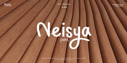 Neisya is a handwriting font with a relaxed and cozy theme, Neisya is closely related to calm and philosophy.
 - Hard Shadow by Kate Brankin,
$27.00 Hard Shadow, the perfect typeface for headlines, logos, posters, and anything else that needs to call attention to itself.
 - Black Rose by FontMesa,
$19.95 Black Rose is the plain version of an old Bruce Type Foundry font called “Black Ornamented” created in 1873.
 - BigNoodleTitling - 100% free

- Just Another Hand Pro by Stiggy & Sands,
$29.00 My personal handwriting has changed a number of times over the years. Just Another Hand is a narrow brush drawn handwriting font, inspired very loosely by the handwriting of my high school days. There's a little artistic license taken with Just Another Hand in the sense that while I never really wrote with a brush in high school, I wanted a cleaner stroke for this interpretation. A little personality, a little restraint... a style that works for all sorts of projects across the board. The Just Another Hand Pro family contains 659 characters per font. The expanded SmallCaps option for gives the typestyle a little extra versatility, expanding on the original typeface inspiration. Opentype features include: A collection of ligatures Smallcaps Limitless Fractions Full set of Inferiors and Superiors Proportional figures and Tabular figure sets
 - Stack Braille by Echopraxium,
$5.00 This is a monospace font for the Braille alphabet. The idea came while exploring new ways to display the regular braille glyph ( 3 rows of 2 dots ). The glyph design is inspired by "stackable multiple board" games like the famous Vulcan chess (from Star Trek series) and the Qubic (3D tic-tac-toe). The stack is made from 3 levels, each level is a 3x3 grid with 2 "playable" cells (South-West and North-East). Each cell can be either empty, filled by a white square token or a black square token. The 3D effect is obtained by means of the classic isometric perspective. Lowercase letters use black tokens, while uppercase letters use white tokens. Most special characters (e.g. digits, *$#@, []{}() etc.. ) are also provided for special usages like program source code (see poster 5).
 - Lavone by Nathatype,
$29.00 Ready to enhance your branding? Looking for that “something” that’ll make your audience go WOW and clients get on board immediately? Maybe you’re looking for the perfect font to use on your wedding invitations or branding? Whatever you need - we’ve got JUST the thing for you! Lavone-A Serif Font Lavone is a elegant serif typeface. Designed primarily as a captivating handcrafted with style. This typeface that is easy on the eyes font that excels at captivating headlines, or large branding text, the font oozes that cute aesthetic that just makes you go “aww!” Our font always includes Multilingual Support to make your branding reach a global audience. Features: Alternates Ligatures Stylistic Sets Swashes PUA Encoded Numerals and Punctuation Thank you for downloading premium fonts from Natha Studio
 - Seria Pro by Martin Majoor,
$49.00 The multi award-winning Seria (1996) is Martin Majoor’s second comprehensive typeface family and the successor to his popular text letter Scala. Seria explores the proportions of classical text typefaces. Its degree of sophistication is perfect to be used for poetry and other refined literature, its eye-catching details however makes Seria also suitable as a display typeface. The first sketches for Seria emerged in the summer of 1996 on the train from Berlin to Warsaw, to be precise, on July 25 – the date Majoor noted on the napkins of the train’s on-board restaurant, which he used for lack of suitable drawing paper. The italics are almost upright which contributes much to Seria’s delicately proportioned appearance. The Seria family consists of Seria Serif and Seria Sans. Combining the two creates countless possibilities of expression.
 - Bougainville by Type Associates,
$29.95 Bougainville was inspired by many of my favorites and has been on the drawing board in excess of ten years. Only this year I decided to expand the original 1994 design to include other weight variants. The quirky Binner Gothic-inspired high axis and its funky g, rounded e, angled stroke endings together with the influence of contemporary designs such as Officina Sans, Din Mittelschrift and MetaPlus, Bougainville exhibits a similar flavor and compactness to Bodega Sans. This typeface family has been named in honor of the renowned eighteen-century French mathematician and explorer Louis-Antoine de Bougainville to whom we owe the naming of South Sea Islands and colorful tropical flora he discovered along his journey. Bougainville makes for effective headings at any size and is equally readable at semi-display sizes.
 - Loving Ambros by Say Studio,
$15.00 Introducing Loving Ambros - Luxury Typeface Loving Ambros typeface is a Luxury beautiful typeface and inspiring mix of classic calligraphy with 50 unique alternates and 69 unique ligatures. come with 2 versions regular & italic. Loving Ambros is made mainly for headlines, titles, and other short texts and is well-suited for advertising, vintage mood board, branding, logotypes, packaging, titles, editorial design, modern logos, websites, social media quotes, wedding branding, modern and vintage design. These a fonts are perfect for designs with the concept of elegant, luxury, romance, fashion and so on. What you get: Accessible in the Adobe Illustrator, Adobe Photoshop, Coreldraw, even work on Microsoft Word. PUA Encoded Characters – Fully accessible Fonts include multilingual support. If you need a custom license or have questions, please email to: romandpio3793@gmail.com
 - Late Frost by Gleb Guralnyk,
$13.00 This calligraphic script font is called Late Frost. It's an elegant decorative font with lots of ligatures and multilingual support.
 - BillieKid by JOEBOB graphics,
$- BillieKid is a so called stencil font. Created by firmly pushing a small marker into the holes of the stencil.
 - Vogue by E-phemera,
$12.00Vogue is extrapolated from some words in a 1930s brochure from Western Union called The Vogue of the Social Telegram. - Mozart by Solotype,
$19.95This font was originally called Mozaik. The lowercase postion has a few alternate characters in place of the basic ones. - Sherbrooke by Eyad Al-Samman,
$- Sherbrooke is a simple and sans serif font. I have chosen the name of this typeface after the "Sherbrooke" Street in Montreal, Canada, that I daily walked in for several months in the late 2005 while I was studying in Montreal, Quebec, Canada. I do adore this street and also I adore the whole city of Montreal. This font comes in two different weights. "Sherbrooke" can be used in wide fields of publications such as the titles of novels, literary texts, short stories, dictionaries, books, newspapers, websites, and magazines. It is suitable for T-shirts, mugs, advertisement light boards in malls, subtitles of movies, logos, cans of foods, and medicines' names. The font is more attractive when it is printed in calendars and for displaying the contents and paragraphs of electronic encyclopedias and different online websites. "Sherbrooke" is specifically designed for educational, journalistic, literary, and social purposes. The main characteristics of "Sherbrooke" Typeface are in its sans serif new designed letters and also in its lowercase special numerals. I think that these characteristics have made "Sherbrooke" exceptionally unique with its alphanumeric combinations. You can enjoy this typeface and use it anywhere at any product or service. It is simply gratuitous for all. The word "Sherbrooke" is a person's name. Sherbrooke Street - officially Rue Sherbrooke - is a major east-west artery at 31.3 kilometers in length and it is the second longest street on the Island of Montreal in Canada. The street is named for John Coape Sherbrooke, the Governor General of British North America from 1816 to 1818.
 - Anacostia NF by Nick's Fonts,
$10.00The 1923 Barnhart Brothers & Spindler specimen book called this typeface "Cardstyle", and suggested its use at small sizes for business cards. It also work quite well in large sizes when a warm, casual antique feeling is called for. Named for a river that flows through Washington, DC. Both versions of the font include the 1252 Latin and 1250 CE character sets (with localization for Romanian and Moldovan). - Pulp Fiction by Comicraft,
$19.00 The name's Heironymous Flask. Some of my acquaintances call me 'Hip.' Those that know me really well don't call me at all. In my game, you don't make friends. You make excuses. Like it says on the door, I'm a private hippopotamus. This is my story. This is my font. Features: Six weights (Regular, Italic, Bold, Bold Italic, Heavy & Heavy Italic) with upper and lowercase alphabets.
 - Slugfest NF by Nick's Fonts,
$10.00A Japanese design firm called Maniackers put together a typeface design in 2001, which they called Snail. This typeface is based on that design, with a few tasty modifications and some industrial-strength kerning, so that the letters literally slither across the page. This font contains the complete Latin language character set (Unicode 1252) plus support for Central European (Unicode 1250) languages as well. - Nobbin by Barmoor Foundry,
$15.00 Nobbin was designed to be used in a children's picture book called "Nothing to do..." written and illustrated by Tracy Sabin.
 - Techari by Letterjuice,
$35.00 Techarí comes from a commission in which the brief consisted of the creation of a typeface family to be used for the design of the third disc of the band called Ojos de Brujo based in Barcelona. This disc was called Techarí, which means “free” in Caló, the language of the Spanish gypsies. The starting point of the design was the music of this band, the meaning of the disc 's name, and three words given by the band as key concepts: ethnic, baroque and graffiti. Techarí is a mixture of lots of influences, which give it its unique personality. From its technical viewpoint designing Techarí was a challenge, on the one hand it had to have lots of personality, and on the other it had to work in text at 9 or 10 pt size. Its goal is precisely that, while keeping a strong personality it works in text size. The typeface also contains a Stencil version for use in display sizes which keeps Techarí's innovative spirit. The way it has been “cut" is unconventional, it has been carefully done to keep the freshness of the typeface by taking advantage of the letterforms' flow. Techarí extra complements the typeface by taking a classical typographic form, the ornament, and making it a contemporary graphic tool, vindicating this wonderful typographic element.
 - Bellanovie by Nurf Designs,
$16.00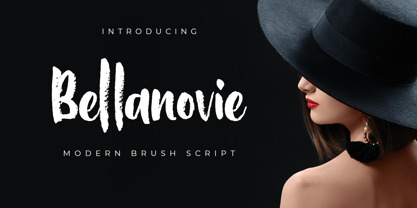 Bellanovie is a handwritten font with a chalk texture. It is suitable for promotional designs, labels, packaging, branding, logotypes and much more.
 - Joyscript by Jonahfonts,
$25.00 Inspired by many hand-lettered European package designs. This script face is suitable for logos, casual headlines and designs calling for attention.
 - Haettenschweiler by Microsoft Corporation,
$39.00Haettenschweiler™ is a very condensed, very bold alphabet. Haettenschweiler was derived from a more condensed typeface, called Schmalfette Grotesk, first shown in the early 1960s in a splendid book called Lettera by Walter Haettenschweiler and Armin Haab. Haettenschweiler became popularized by the Paris Match magazine. Use this distinguished face in large sizes for headlines. Character Set: Latin-1, WGL Pan-European (Eastern Europe, Cyrillic, Greek and Turkish). - Tent Show JNL by Jeff Levine,
$29.00 Call the lettering French Clarendon Condensed, call it circus lettering, wanted poster type or Old West letters, the style of this typeface is one of the most recognizable and evokes all of the above images and more. Tent Show JNL was re-drawn from examples of a vintage set of wood type, and contains all of the eccentricities that are present in these hand-routed classic letter forms.
 - Australian Sunset - Unknown license

- Bea by Autographis,
$39.50 Bea is my Racetrack-Script. I call it that, because it gives the impression of speed. No lingering around with this font. Zaaanggggg!!!

