10,000 search results (0.022 seconds)
  1. BAHAMAS TWO PERSONAL USE - Personal use only
  2. THINK EXTRA PERSONAL USE - Personal use only
  3. BaselBook - Unknown license
  4. BodinSmall - Unknown license
  5. SF Foxboro Script Extended - Unknown license
  6. Bikly - Unknown license
  7. 3x3 dots - 100% free
  8. Ben Hard Life - Unknown license
  9. Sci Fied - 100% free
  10. Mordred - Unknown license
  11. SF Cartoonist Hand SC - Unknown license
  12. Olympus - Unknown license
  13. Redhead Goddess - Unknown license
  14. Gothic by Wooden Type Fonts, $15.00
    Gothic Bold Condensed, first shown in 1889 by Hamilton wooden type founders. With lowercase. Gothic Bold Expanded.
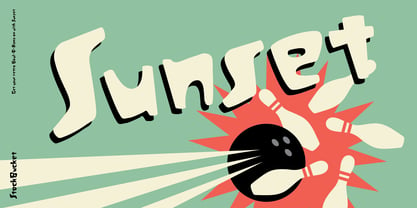
  15. Sunset by Komet & Flicker, $10.00
    Bowl a perfect strike! Sunset was inspired by the retro stylings of the local bowl-o-rama.
  16. Sony Sketch EF - Unknown license
  17. GALLEGA - Unknown license
  18. Arbeka - Unknown license
  19. Gadzoox - Unknown license
  20. Perolet - Unknown license
  21. Woodring - Unknown license
  22. Floopi - Unknown license
  23. Omellons - Unknown license
  24. MunsterMash - Unknown license
  25. Scrapes - Unknown license
  26. 1920 - Unknown license
  27. WHOA SAUCE PERSONAL USE - Personal use only
  28. ho ho ho PERSONAL USE - Personal use only
  29. Morris by HiH, $10.00
    Morris is a four-font family produced by HiH Retrofonts and based on the work of the very English William Morris. William Morris wanted a gothic type drawn from the 14th century blackletter tradition that he admired both stylistically and philosophically. He drew from several sources. His principal inspiration for his lower case was the 1462 Bible by Peter Schoeffer of Mainz; particularly notable for the first appearance of the ‘ear’ on the g. The upper case was Morris’s amalgam of the Italian cursive closed caps popular throughout the 12th through 15th centuries, a modern example of which is Goudy’s Lombardic Capitals. The gothic that Morris designed was first used by his Kelmscott Press for the publication of the Historyes Of Troye in 1892. It was called “Troy Type” and was cut at 18 points by Edward Prince. It was also used for The Tale of Beowulf. The typeface was re-cut in at 12 points and called “Chaucer Type” for use in The Order of Chivalry and The Works of Geoffrey Chaucer. Morris' objective is designing his gothic was not only to preserve the color and presence of his sources, but to create letters that were more readable to the English eye. ATF copied Troy and called it Satanick. Not only was the ATF version popular in the United States; but, interestingly, sold very well in Germany. There was great interest in that country in finding a middle ground between blackletter and roman styles -- one that was comfortable for a wider readership. The Morris design was considered one of the more successful solutions. Our interpretation, which we call Morris Gothic, substantially follows the Petzendorfer model used by other versions we have seen, with the following exceptions: 1) a larger fillet radius on the upper arm of the H, 2) a more typically broadpen stroke in place of the foxtail on the Q, which I do not like, 3) inclusion of the aforementioned ear on the g and 4) a slightly shorter descender on the y. We have included five ornaments, at positions 0135, 0137, 0167, 0172 and 0177. The German ligatures ‘ch’ & ‘ck’ can be accessed using the left and right brace keys (0123 & 0125). Morris Initials One and Morris Initials Two are two of several different styles of decorative initial letters that Morris designed for use with his type. He drew from a variety of 15th century sources, among which were Peter Schoeffer’s 1462 Mainz Bible and the lily-of-the-valley alphabet by Gunther Zainer of Augsburg. Each of the two initial fonts is paired with the Morris Gothic lower case. Morris Ornaments is a collection of both text ornaments and forms from the surrounding page-border decorations.
  30. 1920 My Toy Print by GLC, $38.00
    This family was inspired by a small French "toy print" box, with rubber stamp characters, from the 1920s. The set contained only capital letters, no accented letters and limited punctuation. We have reconstituted a complete modern standard set. The doubling of each usual character in each style (A-Z/a-z and numerals) gives a rich and variously uneven appearance, looking like the results of the real use of those old rubber stamps. The bold style may be used as a reinforcement, mixed with Normal style without disadvantage, allowing four choices for each usual letter... The original size is 6mm (about 17 pts).
  31. Pink Rock by Epiclinez, $18.00
    Get ready to rock your designs with Pink Rock, a bold and edgy display font This bad boy is perfect for grabbing attention and making a statement. Whether you're designing a punk rock-inspired magazine cover, creating a rebellious brand identity, or adding some oomph to your product packaging, Pink Rock will bring your visuals to life. Unleash your inner rebel with the power of typography – choose Pink Rock today and let your designs rule the world! Pink Rock features : Standard Latin Numbers, symbols, and punctuations Multilingual Support. Fully accessible without additional design software Simple Installations Works on PC & Mac Thank You.
  32. Stannard by Greater Albion Typefounders, $12.95
    Stannard speaks to us of the happy days of the inter-war period, of enamel advertising 'street-jewelry' as seen on the railways and in all the best shops, of youngsters' train set boxes and toy catalogues, of traditional magazine mastheads, of a simpler, happier and just maybe better era, when summers lasted for ever and all was well with the world. It's a great family of faces for use in nostalic poster design, for nostalgic packaging design or signage or book covers, or even just for making a bold statement anywhere. Four decorative faces are offered.
  33. Dare by Device, $39.00
    Dare is a bold, single-weight titling font in capitals only. It is built from flat-pen strokes, with looping bowls and sharp, incised darts. It borrows a pinch of the hand-drawn swagger of Bauer's Cartoon (designed in 1936 by H. A. Trafton), used as Dan Dare's signature logo in the British boy's comic Eagle, and also the upward-pointing serifs of machine-moderne typefaces such as Dynamo (designed by K. Sommer for Ludwig & Mayer in 1930). Suitable for book covers, magazines, branding, packaging – any place where an impactful, contemporary statement is required, but still with an undertone of 20th century tradition.
  34. Tioga by Monotype, $29.99
    Tioga is a highly legible typeface designed specifically to display clearly on low-resolution displays. With superior readability even at small sizes, Tioga is an ideal typeface for developers of set-top boxes and digital televisions. Tioga is metrically compatible with Tiresias, a widely-used typeface designed for digital TV applications and adopted by the DVB and MHP standards. Tioga was fine-tuned to be more readable and aesthetically pleasing. Individual characters were adjusted for improved legibility and the letter spacing was revised to improve appearance and readability. Tioga bold was created to make the design more versatile.
  35. Roddy - Unknown license
  36. SF Speedwaystar - Personal use only
  37. SF Wasabi - Unknown license
  38. SF Retroesque - Unknown license
  39. SF Laundromatic - Unknown license
  40. Wallau Zier - Personal use only
Looking for more fonts? Check out our New, Sans, Script, Handwriting fonts or Categories
abstract fontscontact usprivacy policyweb font generator
Processing