10,000 search results
(0.016 seconds)
- Belgique NF by Nick's Fonts,
$10.00Here's another example from the William H. Page Company, originally called French Clarendon XXX Condensed No. 117. This version dials up the contrast, making it suitable for tight headlines in large sizes. Both versions of this font support the Latin 1252, Central European 1250, Turkish 1254 and Baltic 1257 codepages. - Art Class JNL by Jeff Levine,
$29.00 Art Class JNL was re-created from the titling of a lettering booklet called "Drawlet Portfolio", published by the Esterbrook Pen Company in the 1930s. Drawlet pens were Esterbrook's answer to the popular Speedball lettering pens, and the booklet was an instructional manual on hand lettering with the pen nibs.
 - P22 Catalan by IHOF,
$24.95 Catalan is inspired by such influential artists as Antonio Gaudi, Joan Miro, and Salvador Dali with glimmers of the work of Jean Arp and Pablo Picasso. Surrealist shapes and motifs dance in this highly creative alphabet. This new design has a fresh immediacy that makes it perfect for festive occasions.
 - Penny Arcade by Solotype,
$19.95A popular caps-only type of late Victorian times was called Mural, brought out by Boston Type Foundry in 1890. We always liked it, drew a lowercase for it, and then strengthened it by adding a bit of weight. It now has a nice, understated retro look for paragraphs of copy. - Oxe by Tipos do aCASO,
$12.95Distort, expand and shrink. Working the shapes of letters as something fluid, like clay or rubber. The unexpected result leads young designers to bewilderment. Oxe is common expression among people in the northeast of Brazil, a slang that expresses amazement and baptizes the digital type created in 1999 by Buggy. - Pink Lemonade by Typadelic,
$19.95 Pink Lemonade (formerly called Fresh Paint) is just like cool, tart lemonade on a hot summer’s day...refreshing! With varying widths and irregular sizes of the lowercase letters, Pink Lemonade lends a bouncy rhythm to text. Works very well for scrapbooking, invitations, children’s books, recipe books, titling, display purposes, etc.
 - Phi Caps by Cas van de Goor,
$7.00 Phi Caps is a geometric all caps typeface designed on the basis of the golden ratio. Its simple monoline letters come together in a solid font. Note: There is a new and improved version of this typeface called Phi. It includes lowercase letters and supports Central, Eastern and Western European languages.
 - Centralia Depot NF by Nick's Fonts,
$10.00This quintessential nineteenth-century offering is based on a typeface from the 1912 American Type Founders catalog called Lining Central Antique. Quaint, yet crisp and clean, it is equally suitable for headlines or body copy. Both versions of the font include 1252 Latin, 1250 CE (with localization for Romanian and Moldovan). - Extravaganza by Solotype,
$19.95Originally, this 1870s wood type font was called Armenian. We came across a showing of alphabet at the South Street Seaport in New York, bought it and immediately drew the additional characters needed to make the font. We used it for some circus program work that was part of our livelihood. - Diamant Handwriting by 38-lineart,
$14.00 Diamant Handwriting is an upright handwritten font, which looks like a thick pen stroke. Form orientation is generally flowing horizontally, this is a reflection of composure in writing, we set the rhythm of each glyph so that the combination of high and low letters is very soft, try it, whatever you type with this font looks very calm. Activate the OpenType feature, because this font is equipped with ligatures (liga), Stylistic(salt), Contextual(calt) and initial alternates. We present all of this so that your writing is automatically setup, we also provide access to all alternates (aalt) features, this allows you to choose the glyph you like manually. We designed this font only for brand identity. Your brand will look different from other brands. You can also use it for short slogans to further amaze views and attract more customers to see you closer. 'Diamant' is another word of diamond that is often used in Europe, we give this name as a representation of the whole font as a symbol of luxury, brilliance and stability and comfort. We do not extend the theory and philosophy of this font, you better try it yourself, and you will be amazed. thank you
 - Decrypt H1 by Type Innovations,
$39.00 Say hello to Decrypt H1—a geometric typeface that features highly stylized capitals with sharp corners, circular forms and generous proportions. Specifically created for visual impact—use Decrypt H1 when you want your words to stand out from the rest of the crowd. The concept is modern, futuristic and non-traditional. Perfect for display text, logos and headings. The development of Decrypt H1 started in 1997, inspired by Alex Kaczun’s best selling grotesque font family called Contax Pro. Decrypt H1 is specifically introduced here as a bold weight, but Alex plans to expand the design to include many weights, styles and alternative design treatments. Stay tuned! If you like Decrypt H1—check out it’s alternate twins Decrypt 01, Decrypt 02 and all of Type Innovations fonts at: http://www.myfonts.com/person/Alex_Kaczun/
 - Bauhaus Bugler by Breauhare,
$35.00 Bauhaus Bugler’s design never appeared in Harry Warren’s 6th grade class newsletter The Broadwater Bugler but its design came about during that same period in 1975. Because of this, it has been officially designated an honorary Bugler font! Its theme of broad curves that leap over and under conjure visions of fashion and high-end department stores with their dress boxes and shopping bags, plus hair products, cosmetics, couture, and other stylish personal merchandise of the highest caliber. Bauhaus Bugler also has an art deco flavor, especially when all capitals are used. It comes with two alternate versions of the upper and lower Y to give users more freedom of choice. Put Bauhaus Bugler in your “haus” today! Be sure to check out Bauhaus Bugler Soft also! Digitized by John Bomparte.
 - Grit Sans by Baseline Fonts,
$39.00 Grit Sans is a font balanced enough to stand strong on the tippy-toes of its pointed "t" ascenders. Even all caps communicates calm. Dashes of whimsy in the proportionately plump X-Heights tell of the accountant drinking too much sherry at the office Christmas party, but thick, consistent strokes never lets you forget his job title. Ascenders and descenders consistently reach the same heights and depths, further attesting to the reliability of this typeface, at even very small sizes. Available in both regular and bold face, Grit Sans is a faithful complement to thin fonts with a pinch of frivolity such as Heirloom Artcraft. It is ideal in use for titles, subheadings, menus, playbills, custom stamps, logos - anywhere a solid font can speak at a volume just above all others.
 - Provincial Railway by Fabio Ares,
$19.99 Provincial Railway is the first product of argentine typographic archeology project called "Tipografía Histórica Ferroviaria" (Fabio Ares & Octavio Osores, since 2012). Is about the signboards of the stations of the P1 line of the Provincial Railway of Buenos Aires (1907-1977). The letter of this signboards can be described as display type, with a tall box and a constructivist style, with elementary geometric shapes and without line modulation. Although without a doubt, its differential feature is provided by the rectangular shapes that it has towards the ascending and descending lines, which in some cases coincide with the stems, showing a curious rhythm in the composition of the text line. The family is completed with complementary fonts of different styles. The proceeds from the sale of the fonts will be used to finance the project.
 - Cosmic Hippie by Hipfonts,
$9.00 Transport yourself back to the vibrant era of the 1970s with Comisc Hippie, a groovy font that embodies the essence of that extraordinary decade. This typeface is a nostalgic journey through time, with its swirling curves and playful letterforms. Inspired by the counterculture movement, Comisc Hippie exudes a sense of peace, love, and individuality. Its bold and psychedelic style captures the free-spiritedness of the era, making it an ideal choice for adding a touch of retro charm to your designs. Whether you're working on posters, album covers, or any project that calls for a dose of nostalgia, Comisc Hippie will transport you to a groovy world of colorful expression and timeless coolness. Let the spirit of the 70s shine through with this font that embodies the era's iconic aesthetics.
 - Close Together by Ingrimayne Type,
$9.00 Close Together was designed to alternate convex and concave letter sets, with convex letters on the upper-case keys and concave shapes on the lower-case keys. The OpenType feature of contextual alternatives (calt) does this automatically. Individually some of the letter shapes are strange and unsightly. They have the shapes that they have so that they fit snuggly with adjacent letters. The family has three weights: regular, bold, and extrabold. The letter spacing is set very tight and the user may want to loosen it by altering characters spacing. (Either the convex or concave set the letters can be used alone if the character spacing is adjusted.) The typeface has four OpenType stylistic sets of alternates, one for numbers and the others for letters D, T, and Y.
 - TT Squares by TypeType,
$29.00 You are on the page of the old display version of the TT Squares typeface. In 2020, we released an entirely new, completely redesigned, and significantly expanded version of the typeface called TT Octosquares. In addition to 73 styles, TT Octosquares has 3-axis variable version, stylistic alternates, ligatures, old-style figures and many other useful OpenType features. Before you buy the old display version of the font, we suggest that you pay attention to the new superfamily TT Octosquares and study it in more detail. - Squares created for infographics and statistics. This font has both futuristic and techno attributes. Most popular typefaces formula: Thin, Light, Regular, Bold, Black and Italics. Squares are ideal for short inscriptions and long text blocks. Optimized for the websites, mobile applications, and printing materials.
 - und4 by URW Type Foundry,
$39.99 The rasterized square (clear, therefore 4 as part of the font name) was the constructive basis. The intention was to put all characters within this grid and produce a highly structured, yet lively, resting in itself, display font. Relaxed but exciting, just. An absolutely noteworthy detail are the classical construction principles (based on a typography book from the 50's for poster designers), the so-called optical weighting, derived and slightly exaggerated character elements: The characters are not purely symmetrical and the curve shapes do not close justified with the surrounding square. Loops and tongues slightly hang over; the upper bows are slightly less protruding than lower ones, etc. The kerning is tuned to fit these design details: the white space between the characters match the same filling space.
 - Decrypt 02 by Type Innovations,
$39.00 Say hello to Decrypt 02—a geometric typeface that features highly stylized capitals with sharp corners, circular forms and generous proportions. Specifically created for visual impact—use Decrypt 02 when you want your words to stand out from the rest of the crowd. The concept is modern, futuristic and non-traditional. Perfect for display text, logos and headings. The development of Decrypt 02 started in 1997, inspired by Alex Kaczun’s best selling grotesque font family called Contax Pro. Decrypt 02 is specifically introduced here as a bold weight, but Alex plans to expand the design to include many weights, styles and alternative design treatments. Stay tuned! If you like Decrypt 02—check out it’s alternate twin Decrypt 01 and all of Type Innovations fonts at: http://www.myfonts.com/person/Alex_Kaczun/
 - Decrypt He2 by Type Innovations,
$39.00 Say hello to Decrypt He2—a geometric typeface that features highly stylized capitals with sharp corners, circular forms and generous proportions. Specifically created for visual impact—use Decrypt He2 when you want your words to stand out from the rest of the crowd. The concept is modern, futuristic and non-traditional. Perfect for display text, logos and headings. The development of Decrypt He2 started in 1997, inspired by Alex Kaczun’s best selling grotesque font family called Contax Pro. Decrypt He2 is specifically introduced here as a bold weight, but Alex plans to expand the design to include many weights, styles and alternative design treatments. Stay tuned! If you like Decrypt He2—check out it’s alternate twins Decrypt H1, Decrypt 01, Decrypt 02 and all of Type Innovations fonts at: http://www.myfonts.com/person/Alex_Kaczun/.
 - SF Big Whiskey SC - Unknown license

- Stencil Label JNL by Jeff Levine,
$29.00 In the 1943 Three Stooges comedy short “Higher than a Kite”, Curly reaches into a box with the label “hand grenades” painted on its side and pulls out one of the devices. The bold, squared stencil hand lettering on that prop inspired Stencil Label JNL, which is available in both regular and oblique versions.
 - SF Buttacup Lettering - Unknown license

- MohoBis Pro by John Moore Type Foundry,
$36.00 MohoBis is a fancy font based on the multiplication of a source in many strokes way to create a texture called kinetic. This can mean substantial savings in printing ink. Parallel serves to create unusual headlines and prominent texts that provides an attractive modern typeface, ideal for packaging, editorial design and logos.
 - Show Poster JNL by Jeff Levine,
$29.00 In the 1960 edition of Samuel Welo’s “Studio Handbook for Artists and Advertisers” is an example of poster lettering with the accompanying blurb “call this Chrysler”. This casual brushstroke design was slightly modified and then reworked into what is now Show Poster JNL and is now available in both regular and oblique versions.
 - Lalonde by The Thrill of Design,
$29.00 Lalonde Font Family has great readability and can be used for: logos, call outs and headlines for advertising, wedding invitations, t-shirts, signage, scrapbooking, posters, badges, etc. Lalonde is a modern hand-drawn script font and is available with two formats OTF and TTF and with (Latin-1 Supplement) ÀÁÂÃÄÅÆÇÈÉÊËÌÍÎÏÝ ÑÒÓÔÕÖØŒÙÚÛÜ àáâãäåæçèéêëìíîïñòóôõöðøœùúûüýÿ.
 - Balford by Ilham Herry,
$20.00 A new vintage font family and ornaments called Balford. Inspired by vintage labels and packages, this collection of styles with shadow of typeface and vintage scrolls, panels, and ornaments makes it possible to combine and create many options. Create label designs, headlines, logotypes, signage, posters, greeting cards, letterheads, t-shirts and much more.
 - Runaround Sue NF by Nick's Fonts,
$10.00In his book Brushstroke and Free-Style Alphabets, Dan X. Solo called this typeface "Tamarind Script" but, whatever its name, this sparkly little gem will add rollicking retro charm to any project it graces. The Opentype version of this font supports Unicode 1250 (Central European) languages, as well as Unicode 1252 (Latin) languages. - Bamboo by Solotype,
$19.95Even the original founder, Barnhart Bros. & Spindler, thought this was a freaky font, and indeed they called it "Freak" when they introduced it in 1889. It was reintroduced in 1925 under the somewhat more elegant name of "Bamboo," and is one of the prizes that the collectors of antique metal types seek. - Ramadesh by Typotheticals,
$5.00Lightly playful, this font had a lot of influences in its design. I liked the look of this style in three fonts and decided to create my own version. This is it. Included is a version called Italic, but it is not a true Italic, just a variation in some lower case letters. - ITC Forkbeard by ITC,
$29.99ITC Forkbeard is the work of British designer Michael Gills and named after a famous Viking warrior. Gills was inspired by the work of Victor Hammer as well as a lesser known uncial style called Andromaque. Distinguishing characteristics of ITC Forkbeard are its geometric overtones and its distinct capital and lower case letterforms. - Wide Chamfer JNL by Jeff Levine,
$29.00 Inside the pages of an untitled sign painting textbook (circa 1902) was an example of the classic chamfered sans serif alphabets used by tradesmen of the time. This version was wider than most, and perfect for a digital version called Wide Chamfer JNL, which is available in both regular and oblique versions.
 - Balise by NamelaType,
$19.00 Introducing our new product that called �Balise� A retro sans serif influenced from 60s style typeface and coupled with a touch of rounded corners to provide a playful concept with a vintage design style. Balise has 5 weights, and is also equipped with open type features and is supported by various international languages.
 - Geometos Neue by Graphite,
$17.00 Geometos Neue is a geometric sans-serif typeface which comes in seven weights. An all caps display font family, Geometos Neue has a clean, sharp and emphatic form especially suitable for headlines, headings, branding, posters, packaging, titles and logos. There is a soft edged version of Geometos Neue as well, called Geometos Soft.
 - Convero by Liartgraphic,
$30.00 How are you guys doing ? i’m sure that’s nice! Meet our newest product, we call this product Convero font. Convero font are cute typeface font Whit a uniqe touch and assertive Convero font is very nice to use on: fashion magazine, logos, ,and photography, landing page, fliyer, What’s includes - multilingual support - alternate - ligature
 - Mutually Beneficial by Java Pep,
$15.00 Introducing handwritten style font called Mutually Beneficial. For feeling like a handwritten style vibe, this font comes with more than 40+ ligature sets and full alternate in the uppercase characters. Mutually Beneficial font is perfect for branding, headlines, subtitle, wedding invitations, greeting cards, signature name, logotype, handwritten quotes, advertising, social media post, etc.
 - Whirled Peas NF by Nick's Fonts,
$10.00In his book Showcard Alphabets, Dan X. Solo called this little gem "Whitestone Scrawl". This version is beefed up slightly and the letter proportions have been altered somewhat, but it's still LOADS of fun. The Opentype version of this font supports Unicode 1250 (Central European) languages, as well as Unicode 1252 (Latin) languages. - Pixelfy by Crumphand,
$19.00 Introducing new fonts! its called Pixelfy. Pixelfy is hand made pixel font. perfect contour, shape and square. this font its very perfect match for your project. 8bit games, chiptunes music, vaporwave design, digital ads and quotes. What's inside the fonts ? Uppercase Lowercase Numerals & Punctuation Multilinguals Support Opentype Features Stylistic Alternates Thank you!
 - Soulgate by Bluestype Studio,
$16.00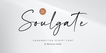 Hello ! This is our newest product font called Soulgate. Soulgate is a handwritten font that is naturally created and looks charming. The font you need is here for your design! This font is suitable for use on branding, social media, business cards, weddings, t-shirt designs, logotype, magazines, quotes, fashion, watermarks, invitations, signatures.
 - Mixed Drinks JNL by Jeff Levine,
$29.00 Mixed Drinks JNL derives its look from a set of gold foil self-adhesive letters made by a company called Cameo for the Schenley distilling company circa the late 1950s or early 1960s. The letters were used to personalize bottles of whiskey for your own bar or to give as a unique gift.

