Marceaux is a sophisticated font with a touch of elegance and modernity. The letterforms are sleek and slender, with clean lines that give this font a refined and graceful appearance. Whether you're creating a logo, a book cover, or a website, Marceaux will bring a touch of class to your project. Marceaux features a complete set of small caps, uppercase, and lowercase letters. The font has been developed in six weights, from light to black, with corresponding true italics and oblique letters, and two styles (serif and sans-serif) for a total of 24 styles, making it versatile enough to use in a variety of design applications. Marceaux includes an expanded character set that supports over a hundred latin-based languages.
A triple threat, Letteria Pro is a typographic trio designed for branding and packaging. With the soul of a broad nib pen and the grace of a brush, it has five weights and a lot of style. In order to achieve a pragmatic contrast between a composition’s communication levels, we have created a mechanical typeface with only capital letters in sans and slab versions that elude to a De Stijl style. Ligatures and swashes provide a plethora of options, including Thin, Light, Regular, Bold and Black weights, while its companions offer a single weight. Together, this Latinotype original covers more than 200 languages within the Latin alphabet. Yet another powerful tool for your arsenal of fonts that command consumer attention.
Flicket is a contemporary display serif font that seamlessly blends sophistication with a touch of whimsy, making it an ideal choice for modern design projects. With its clean lines and subtle flourishes, Flicket exudes a timeless elegance that captures attention while maintaining readability. The typeface strikes a harmonious balance between classic serif elements and a contemporary aesthetic, making it versatile for a range of applications, from editorial design to branding. Flicket’s distinctive letterforms showcase a refined yet approachable style, allowing it to convey both professionalism and creativity in a single glance. This modern display serif font, with its unique personality, adds a distinctive flair to any project, making it a standout choice for those seeking a perfect blend of tradition and innovation in typography.
Boxiest is a stylish cartoon typeface that effortlessly combines playfulness with a touch of modern flair. Its bold and chunky letterforms are reminiscent of cartoon characters, creating a sense of whimsy and fun. With its clean lines and geometric shapes, Boxiest exudes a contemporary aesthetic that adds a dash of style to any design. Each letter is like a carefully constructed box, giving the typeface a unique and distinctive look. Whether used for children's books, comic strips, or vibrant signage, Boxiest injects a lively and energetic vibe, instantly capturing attention and igniting imagination. This versatile typeface brings a delightful and fashionable twist to any project, making it a perfect choice for those seeking a stylish and eye-catching cartoon-inspired font.
A condensed loose brush style. This font has a breezy elegance and casual sophistication, yet in a different context or color, it could be seen as nervous and urban. A weird dichotomy. Set in smallish text blocks, it has a surprisingly even color. This is due to a balace that has been struck between keeping the roughness and idiosyncracies of a hand-drawn face but ensuring an overall regularity.
Keetoowah evolved from a just a few letters in a sketch for a sorority t-shirt design. They loved it and kept asking for more of the same. The only solution was to make a font. These characters were made to be broken up, two toned, rotated, merged and jammed together. But, Keetoowah has a serious side. It has a great Southwestern flavor like smokey BBQ and patterned blankets.
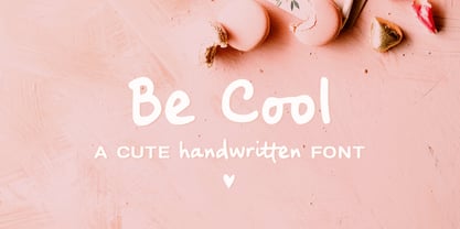
Be Cool is a cute handwritten font with an alternate character set (A-Z, a-z) and an extra set of swashes and ornaments to help decorate your text. This font includes: - A-Z, a-z, numbers and punctuation - Multilingual support - Dozens of ligatures that give it a true handwritten feel Use Be Cool in any design that needs a handwritten feel, such as signatures, notes and quotes, logos and branding.
Originally given life as a wordmark for the Alt-Country band Woodshed Supply Company, the Whistleberry typeface evolved from a few simple letterforms inspired by early 20th Century signage, into a surprisingly functional typeface. With plenty of rustic charm, a robust glyph set, and a variety of alternate characters, Whistleberry will add flare and appeal to your work. Whistleberry comes in two weights; a modest Regular and a beefy Bold
Soul Leo ist a special Version of my font „Soul“ (soul ultra black). For a long Time i want to make a Font like this. Before FL6 that was impossible. I know it is a big File Size for a Font with all the Graphics but i need a Font like this for a LadyProjekt. And so i did it myself. I hope you like it as i do!
North Bergen is a dirty sans serif based on letterforms seen painted on a wall of a magazine store in North Bergen, New Jersey. Its unrefined, quirky forms reflect a typographic naivete and are meant to evoke a sense of hand painted signage.
Boomboyah is a natural dry brush font. This font has a striking look and a good flow that can add a stylish touch to your designs. It’s perfect for logos, quotes, posters, for clothing, and every other design which needs a unique touch.
MBF Archita is a creative font by moonbandit. This typeface takes a funky angle on a digital theme design giving it a non linear flowing dynamic in the overall feel. Archita best use as a title, headline, branding and even typography poster.
Based heavily on Gill especially in the mid weights, Astoria has a subtle top left serif which makes it not quite a Roman and not quite a Sans. Designed specifically as a text face it still works very well as a headline font.
I present to your attention a new font - Scarytale I had a desire to make a vintage style with a cute but scary story. It is a multi-layered, multilingual vintage typeface that works well for fabulous books, T-shirts and logos.
It's a wood type! It's a stencil font! It's BOTH! Clarenwood Stencil JNL was originally designed as a solid alphabet (Clarenwood JNL) modeled from vintage wood type. The stencil treatment was applied to add a fresh look to a classic lettering design.
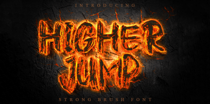
Higher Jump is a natural dry brush font. This font has a striking look and a good flow that can add a stylish personality to your designs. It’s perfect for logos, quotes, posters, clothing, and any design which needs a strong touch.
Roble by Latinotype, $26.00 Roble is a Slab Serif Font, from a mix between Andes and Sanchez, following a harmony with both fonts one sans and one serif with a fresh and dynamic result. Roble is a family of 16 display fonts 8 weights plus italics.
FP Head is a redesign of a corporate typeface for the Danish trade union FOA. Head is a extended display font, with a blurred look and a touch of FF Max: Hard and soft at the same time. Available in two versions.
Koska Esko This is a font with a very bold and elegant look, perfect for designs with a modern look it's time for you to try a new style for a new design include : numeric latin ligatures alternate And Thank you very Much
Frames 1 consists of a series of frames scanned at a low resolution. The result when magnified is a bitmapped image that looks like a black and white mosaic.
Alma Mono is a monospace typeface with a friendly personality. It comes in five weights and its rounded ends convey a more friendly atmosphere then a more mechanical monospace.
Forwardback is a clean and friendly typeface with a large compliment of European characters. Its round & bouncing letters impart a smooth handwritten feel. The font features auto-ligatures for duplicate letters, plus a hefty set of graphical elements & shapes which can be accessed by convenient keyboard shortcuts (a lowercase letter directly followed by a number from 0-9).
Frosted by Great Lakes Lettering, $24.95 Frosted is a font based on a naive, illustrated handwriting that can be used on a daily basis. It is a delicate, handwritten font with a somewhat masculine feel which mimics the natural stroke of pointed pen calligraphy. Paired with structured flourishes and wreaths, Frosted embodies a folksy feel that brings true character to any design.
Klop by Invasi Studio, $19.00 Klop is a display typeface with a bloated and fat appearance. Combining this with round corners and a natural shape, Klop has a quirky and endearing appearance. You can use alternative glyphs to create a different appearance for your design. The Klop font is ideal for branding projects or packaging that need a modern and playful feel.
Cobol by The Northern Block, $12.80 A modern geometric typeface evolved from a systematic grid. The consistency of form lends itself to a wide variety of applications and used at large scale creates a powerful impact. Also the characters have compact widths allowing for a great economy of space across layouts. Details include 4 weights, a complete character set, manually edited kerning and Euro symbol.
Hookward Condensed Hookward is a very cool font for a design with modern display headline: magazine, poster, branding, labels, music, and minimalism styles. With a strong display and clean nodes make a text in a design become more character and great. Inspired by the current trend of sports texts with a very modern and cool headline style.
“Brushfire” is a playful font with a handbrush texture, featuring rough edges and uneven strokes for a rustic and organic look. It adds a bold and edgy feel to any project and creates a sense of depth and dimension with its textured appearance. The font is both legible and expressive, making it perfect for a variety of design projects.
Grim is a display family with a lot of room for application, most obvious being the tightly fitted headlines with impact. It works especially well as a counterpart to a serious, refined serif font. Each family member comes with a set of useful pictograms: arrows, triangles, hands, smilies and a heart. Best suited for poster and editorial usage.
Grim is a display family with a lot of room for application, most obvious being the tightly fitted headlines with impact. It works especially well as a counterpart to a serious, refined serif font. Each family member comes with a set of useful pictograms: arrows, triangles, hands, smilies and a heart. Best suited for poster and editorial usage.
Grim is a display family with a lot of room for application, most obvious being the tightly fitted headlines with impact. It works especially well as a counterpart to a serious, refined serif font. Each family member comes with a set of useful pictograms: arrows, triangles, hands, smilies and a heart. Best suited for poster and editorial usage.
Olpal by Bunny Dojo, $16.00 A Display Serif, a Monoweight Sans, and an Inline form combining the two, Olpal is a versatile companion for your next adventure. With surprising vitality for a workhorse font, Olpal embraces any job – and whistles while it works. Neutral – with a hint of pizzazz – the font's strong legibility and compressed footprint make it a brilliant fit in any environment.
Sure! Picture this: the font Titan by onezero is the typographical equivalent of a superhero landing in the middle of a bustling city. It doesn't just enter a room; it makes a grand, indelible impres...
The Adam font is a hallmark of modern typography, embodying elegance, precision, and timeless appeal. Crafted with a keen eye for detail, its design is a harmonious blend of classic and contemporary ...
The font "Alex" by Keith Bates is a gracefully designed typeface that embodies simplicity, versatility, and a touch of elegance. Created with a deep understanding of typography and design aesthetics,...
Chekhovskoy, designed by the talented Marat Salychow, is a font that carries a distinct aura of refinement mixed with a touch of old-world charm. At first glance, it is immediately apparent that Chek...
Fantique Four by Digital Empires can be described as a font that beautifully merges the charm of antique design elements with a dash of modern flair, making it a unique offering in the landscape of d...
"Getboreg Spare" by ffeeaarr is a font that marries the essence of classical typography with contemporary design sensibilities. It is a testament to the innovative exploration of typeface design that...
Mager, a term often encountered in the realm of typography, refers not to a specific typeface but to a particular weight within a font family. The word "Mager" is of German origin, meaning 'lean' or ...
The font Sekona, carefully crafted by Kimberly Geswein, stands as a testament to the intricacy and passion that can be instilled within the realm of typography. Kimberly Geswein's reputation for crea...
Drummon, crafted by Apostrophic Labs, embodies a remarkable marriage of innovative typographical design with a distinct flair that captures the imagination. This font is a testament to the creative e...