10,000 search results
(0.281 seconds)
- Imagine Font by Jens Isensee,
$15.00 8 nice and simple futuristic fonts for headlines and styles!
 - Artely Inks by Mans Greback,
$59.00 Calligraphic high-quality font, with a fast and firm style.
 - KG Attack Of The Robots by Kimberly Geswein,
$5.00 This squared font is designed to look robotic in style.
 - Munster Gotische by Intellecta Design,
$24.90a gothic font with variations of style ready to use - Pinatas Cottons by Piñata,
$12.00 Original Foundry: TypeType Original typeface name: TT Cottons Pinatas Cottons is a friendly hand-drawn typeface with condensed proportions. Each separate style of Pinatas Cottons was drawn by using different instruments. For instance, the black style was painted with a real brush, and the thin one was created with a pen. We tried to keep this analog feeling of hand drawing while we digitalized each style of the typeface. Pinatas Cottons is your ideal design helper.
 - Hello Molarine by Zeenesia Studio,
$16.00 Hello Molarine is a calligraphic script font that comes with a lovely alternative character. mix of copper calligraphy in a handlettering style. Designed to convey an elegant style. Shocking Script is attractive because it is smooth, clean, feminine, sensual, glamorous, simple and very legible. Its classic style is very suitable to be applied to all types of formal items such as invitations, labels, menus, logos, fashion, make up, stationery, letterpresses, romantic novels, magazines, books, greeting / wedding cards, packaging, labels.
 - Megapolis by Artisticandunique,
$9.00 Megapolis - Sans Serif Font Family - Multilingual support - 16 Styles With its elegant and clean structure with 16 styles and multilingual supports, you can easily use the sans serif font feature in many areas. From body text to big headlines, from classic to modern and bold styles, you can develop your projects. Ideal for books and magazines, magazine covers, editorials, headlines, websites, logos, branding, advertising and more. You can create your unique designs with this font. Have a good time.
 - Ashford by Fenotype,
$20.00 Ashford is a bold serif type and its matching Italic. Ashford packs plenty of timeless charm and elegance. As a display style it works best in headlines, posters and as a logotype. Ashford conveys a message of style and inner knowledge. Ashford is equipped with several OpenType features: Keep Standard Ligatures and Contextual Alternates on to prevent certain characters from colliding and spice up with Swash, Stylistic or Titling Alternates. Both styles come with more than 50 alternate characters.
 - Marida Cole by DYSA Studio,
$18.00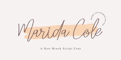 Marida Cole is handwritten script font with brush style. This another collection of script is perfect for your next branding project, excellent for your business. Marida Colehave a smooth edges, so this font gives an authentic handcrafted feel style. Marida Cole is perfect choice for people looking for clean, modern, minimalist, elegant, beauty design styles. Suitable for almost any graphic designs such as logo, branding materials, business cards, gift cards, t-shirt, cover, thumbnail, print, poster, photography, quotes .etc
 - Stereonic by Mint Type,
$30.00 Stereonic is a geometric display sans influenced by Art Deco style. Its 38 fonts across 5 weights offer the possibility to convey numerous moods and styles typical for different decades. As the name suggests, the music posters were considered as the perfect application for this typeface, however using it in magazines and other editorial will definitely add more style. A variety of included ligatures and alternatives will also make Stereonic a perfect choice as the base for logotypes.
 - Arbotek by Type-Ø-Tones,
$60.00 Arbotek has the original skeleton that the author used for the development of his typeface Arboria, a real 'architect typography', with a basic and radical approach to pure geometric forms. The three basic styles - Thin, Light and Light Rounded - try to approach the cartographic technique annotations and their output on plotters. The voluptuous style, Ultra, keeps the same structure of the Light versions, but develops as a historic Art Decó variant of this 20s and 30s graphic style.
 - Abdo Master by Abdo Fonts,
$49.50 Abdo Master is a geometrical style. This is an OpenType Font supporting Arabic, Persian, Urdu, and English. The combination of modern Kufi and Geometrical styles and varying between straight and curved parts made it a beautiful typeface appropriate to the titles and text, and able to meet the desire of the user in the design of ads and modern designs of various types of audio and visual. it comes in fourteen weights from Thin to Black and Outline style.
 - WyomingSpaghetti by Ingrimayne Type,
$12.95 Typefaces with very thin verticals and fat, square serifs were popular in the 19th century for display. Hollywood helped associate this style with the Old West, but reference books identify some of it as Italian style. WyomingSpaghetti, part of an extended family of typefaces, has a name which combines these two associations. Most typefaces of this type are very condensed, but this one is not. The letter o is nearly circular, which is rather unusual in this style.
 - Inhabits by Gassstype,
$23.00 Hello Everyone, introduce our new product Font Inhabits it is Handwritten Brush Font,This is a Textured Natural Style and classy style with a clear style and dramatic movement. This font Inhabits is great for your next creative project such as logos, printed quotes, invitations, cards, product packaging, headers, invitation,advertisements,product designs, stationery, wedding designs,label ,product packaging, special events or anything that need handwritting taste. You can activate 16 Ligatures glyphs and 13 Alternates glyphs OpenType panel.
 - Shining Holiday by Zeenesia Studio,
$15.00 Shining Holiday is a calligraphic script font that comes with a lovely alternative character. mix of copper calligraphy in a handlettering style. Designed to convey an elegant style. Shocking Script is attractive because it is smooth, clean, feminine, sensual, glamorous, simple and very legible. Its classic style is very suitable to be applied to all types of formal items such as invitations, labels, menus, logos, fashion, make up, stationery, letterpresses, romantic novels, magazines, books, greeting / wedding cards, packaging, labels.
 - Kickers by Fype Co,
$13.00 Kickers is a mix of vintage look and serif styles. The combination of beautiful letter and vintage style serif makes Kickers a versatile that can be used in many different themes of design projects. Available in two styles regular and outline are suitable and ready to be used together for your next design! Kickers is well-suited for advertising, magazine, branding, logotypes, packaging, titles, headlines and editorial design. It was definitely fun putting together these laid back vintage vibes.
 - Modern West JNL by Jeff Levine,
$29.00 Presenting… a Western style alphabet from the 1960 edition of Samuel Welo’s “Studio Handbook for Artists and Advertisers”… Extra bold, featuring slab serifs and concave corners, this type style could easily have been found on building signage in the Old West… but in redrawing it digitally, it’s been named Modern West JNL because at one time, this would have been considered a modern style of lettering. Modern West JNL is available in both regular and oblique versions.
 - Terrasick by Gassstype,
$27.00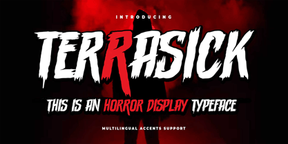 Hello Everyone, introduce our new product Font Terrasick is a Rough Brush Font.This is a Textured Natural Style and classy style with a clear style and dramatic movement. This font Terrasick is great for your next creative project such as logos, printed quotes, invitations, cards, product packaging, headers, Logotype, Letterhead, Poster, Design this font is great for your creative projects such as watermark on photography, and perfect for logos & branding. You can activate Alternate OpenType panel.
 - Mellnik by ParaType,
$25.00Mellnik is a sans serif of humanist style (in a way) that was developed by Oleg Karpinsky for ParaType in 2006. The type family contains nine styles with a number of alternate characters in each ones. For use as a text font in long text passages of advertising booklets, catalogues or magazines, as well as for accident setting. Mellnik may be also applied as a corporate typeface. Five condensed styles were added in 2007 by the same designer. - Florensans by Milan Pleva,
$18.00 Florensans is an all caps display sans serif typeface in elegant & modern style with ligatures, special alternative glyphs and old style figures. The Florensans family contains three weights: Light, Regular and Medium. Florensans is ideal for headlines, headers, logos, labels, packaging, postcards, presentations, magazines, invitations, etc. Features: 3 Weights - Light, Regular and Medium Basic latin alphabet A-Z 64 Ligatures & Alternates 56 Accented characters Numbers, Punctuation, Currency, Symbols, Math symbols & Diacritics Old style figures Enjoy Florensans!
 - Boulevard Sans by takoliko,
$16.00 Boulevard Sans typeface designed by Takoliko Studio. This Sans Serif font inspired by retro geometric style especially the radio and vhs era.The simplicity and geometric style is a timeless choice for your design. It comes with reguler and Bold, also oblique style for a different feel. Its bold characteristics makes it suitable for attention grabbing design projects such as headlines, posters, social media displays and editorials. And You can combine the family to make a larger design concept.
 - Humanism by Prominent and Affluent,
$30.00 Inspired by the urban typography, which later led to a grotesque style. It can be used for bold editorial statements graphic heavy prints or just as a simple logo. This new type will definitely make your designs stand out and unique. Its robust, strong and contemporary form makes it perfect for any project that needs the extra strength. Humanism is available from A to Z in the regular and italic style, developed in an urban style.
 - Bronzier by Arterfak Project,
$13.00 Bronzier is a strong serif display family with 8 different styles. Bronzier was designed with a strong and sharp serif which gives it a more manly look. Sporty, vintage and modern taste at the same time which mean you can use this font family for many design styles. Inspired by old-school typography and modern style. Create a perfect design with Bronzier! Because Bronzier is suitable for logos, logotypes, apparel, jersey, tags, labels, posters, stickers, branding and more.
 - ITC Johnston by ITC,
$29.00ITC Johnston is the result of the combined talents of Dave Farey and Richard Dawson, based on the work of Edward Johnston. In developing ITC Johnston, says London type designer Dave Farey, he did “lots of research on not only the face but the man.” Edward Johnston was something of an eccentric, “famous for sitting in a deck chair and carrying toast in his pockets.” (The deck chair was his preferred furniture in his own living room; the toast was so that he’d always have sustenance near at hand.) Johnston was also almost single-handedly responsible, early in this century, for the revival in Britain of the Renaissance calligraphic tradition of the chancery italic. His book Writing & Illuminating, & Lettering (with its peculiar extraneous comma in the title) is a classic on its subject, and his influence on his contemporaries was tremendous. He is perhaps best remembered, however, for the alphabet that he designed in 1916 for the London Underground Railway (now London Transport), which was based on his original “block letter” model. Johnston’s letters were constructed very carefully, based on his study of historical writing techniques at the British Museum. His capital letters took their form from the best classical Roman inscriptions. “He had serious rules for his sans serif style,” says Farey, “particularly the height-to-weight ratio of 1:7 for the construction of line weight, and therefore horizontals and verticals were to be the same thickness. Johnston’s O’s and C’s and G’s and even his S’s were constructions of perfect circles. This was a bit of a problem as far as text sizes were concerned, or in reality sizes smaller than half an inch. It also precluded any other weight but medium ‘ any weight lighter or heavier than his 1:7 relationship.” Johnston was famously slow at any project he undertook, says Farey. “He did eventually, under protest, create a bolder weight, in capitals only ‘ which took twenty years to complete.” Farey and his colleague Richard Dawson have based ITC Johnston on Edward Johnston’s original block letters, expanding them into a three-weight type family. Johnston himself never called his Underground lettering a typeface, according to Farey. It was an alphabet meant for signage and other display purposes, designed to be legible at a glance rather than readable in passages of text. Farey and Dawson’s adaptation retains the sparkling starkness of Johnston’s letters while combining comfortably into text. Johnston’s block letter bears an obvious resemblance to Gill Sans, the highly successful type family developed by Monotype in the 1920s. The young Eric Gill had studied under Johnston at the London College of Printing, worked on the Underground project with him, and followed many of the same principles in developing his own sans serif typeface. The Johnston letters gave a characteristic look to London’s transport system after the First World War, but it was Gill Sans that became the emblematic letter form of British graphic design for decades. (Johnston’s sans serif continued in use in the Underground until the early ‘80s, when a revised and modernized version, with a tighter fit and a larger x-height, was designed by the London design firm Banks and Miles.) Farey and Dawson, working from their studio in London’s Clerkenwell, wanted to create a type family that was neither a museum piece nor a bastardization, and that would “provide an alternative of the same school” to the omnipresent Gill Sans. “These alphabets,” says Farey, referring to the Johnston letters, “have never been developed as contemporary styles.” He and Dawson not only devised three weights of ITC Johnston but gave it a full set of small capitals in each weight ‘ something that neither the original Johnston face nor the Gill faces have ‘ as well as old-style figures and several alternate characters. - Resist Mono by Groteskly Yours,
$25.00 Resist Mono is a highly functional monospaced type family designed for optimal performance both in print and on the web. Inspired by the distinctive features of the original Resist Sans family, it showcases deep inktraps, angled terminals, and exceptional legibility. With its bold personality and style, Resist Mono remains highly readable even at small sizes. Suitable for coding, UX, web, and graphic design, Resist Mono offers versatility and visual impact for a wide range of applications. Resist Mono comes in 16 styles (14 static fonts) and two variable fonts. Each font contains over 1300 glyphs, including letters, small capitals, numbers, punctuation, symbols, etc. Resist Mono supports more than 200 Latin-based languages and has extensive Cyrillic support for languages like Russian, Bulgarian, Ukrainian, Serbian, and many more. In addition to this, Resist Mono also includes special Powerline symbols for coding. OpenType features in Resist Mono include Small Capitals, Case Sensitive Punctuation, Stylistic Alternates, Fractions, Subscript, Superscript, Ligatures and many more. Resist Mono Type Family Features: - 1300+ characters per font - 14 static fonts - 2 variable fonts - True Italics - Small Capitals - Extensive OpenType features - Supports 200+ Languages (Latin & Cyrillic) - Special Symbols and Features - Free Trial Fonts Available Resist Mono has been meticulously developed to prioritize functionality and legibility, making it an ideal choice for coding. It offers true italics with a calligraphic influence, adding a unique touch to the font. Additionally, users can access the regular slanted letterforms through OpenType by selecting the corresponding stylistic set. With its versatility, Resist Mono can be applied beyond coding, finding relevance in various contexts like product and graphic design, web design, publishing, and more, thanks to its visually appealing features and bold stylistic choices. Explore Resist Mono Dynamic Specimen for more features, type testers, etc.
 - Verdana Pro by Microsoft,
$40.00 The Verdana typeface family was designed specifically to address the challenges of on-screen display. Verdana was originally designed by world-renowned type designer Matthew Carter, and tuned for screen display by the leading TrueType hinting expert, Tom Rickner. The Verdana fonts are unique examples of type designed specifically for the computer screen.The Verdana family received a major update in 2011 as a collaboration between The Font Bureau, Monotype Imaging and Matthew Carter. The original Verdana family included only four fonts: regular, italic, bold and bold italic. The new and expanded Verdana Pro family contains 20 fonts in total. The Verdana Pro and Verdana Pro Condensed families each contain 10 fonts: Light, Regular, Semibold, Bold and Black (each with matching italic styles).Verdana exhibits characteristics derived from the pixel rather than the pen, the brush or the chisel. The balance between straight, curve and diagonal were meticulously tuned to ensure that the pixel patterns at small sizes are pleasing, clear and legible. Commonly confused characters, such as the lowercase i j l, the uppercase I J L and the number 1, have been carefully drawn for maximum individuality - an important characteristic of fonts designed for on-screen use. Another reason for the legibility of the Verdana fonts on the screen is their generous width and spacing.Designed by David Berlow and David Johnathan Ross of the Font Bureau, with typographic consultation by Matthew Carter, the new Verdana Pro includes a variety of advanced typographic features including true small capitals, ligatures, fractions, old style figures, lining tabular figures and lining proportional figures. An OpenType-savvy application is required to access these typographic features. The expanded weights and completely new condensed range of fonts provide designers with an expanded palette of typographic options for use in print and on-screen, in both small text sizes and headlines.
 - Zaftig Pro by Typeco,
$49.00Many current poster artists like to reference the graphic type styles that were popular in the ’60s and ’70s. Zaftig is a contemporary font that takes the geometric and blocky inspiration from that era but then steps off in a modern direction. At first glance, it may appear that the capitals of Zaftig all take up the same amount of space, but certain letters have been designed proportionally for a better flow. However, if the designer would prefer to stack the capital letters in even columns, like blocks, then one can use the Titling Alternates feature. In this feature the metrics of all the capital letters are the same, and certain letters have been designed narrower, allowing for seamless stacking. The space, bullet, asterisk have also been given the same monospaced metrics in this feature to make stacking easy. The Small Caps feature in Zaftig is designed so that the small cap glyphs are the same height as the lowercase. This allows the graphic designer not only the option of small caps, but also the ability to mix and match both kinds of letters to create a distinctive style. There are also alternate numerals in the Small Caps feature that match the height of the small caps. In Stylistic Alternates 1 you will find alternate designs for the Q, A, I, J, L, n, and u glyphs. Or you can find alternates in the Glyph Pallet of your favorite OpenType savvy application. Zaftig is more than it appears on the surface. This OpenType font contains over 1200 glyphs and language support. That makes it an international font which contains letters for most languages that use Latin, Central European, Cyrillic, and Greek scripts. - Entropic Brush by Mans Greback,
$59.00 Entropic Brush is a striking fat brush font that boasts a wild and rustic charm. Its decorative display style makes it perfect for logotypes, headlines, and other eye-catching design elements. The font's heavy, oak-like strokes and thick brush texture give it a bold and distinctive character. Ideal for projects that require a strong, natural presence, Entropic Brush is a versatile font that adds a sense of raw energy and untamed beauty to your designs. Its unique aesthetic makes it a great choice for branding materials that need to convey a sense of rugged, organic elegance. With hundreds of swashy and decorative alternates, Entropic brush is sure to give you a customized appearance – like a truly hand-drawn paintbrush design. Use characters _ ¤ # after any word to make a swash. Example: Spline_ Sonic¤ Brush# Use multiple _ ¤ # to make swashes of different lengths. Example: Superhuman______ (Download required.) The Entropic Brush font family includes four high-quality styles to suit various design needs: Regular: A bold statement with a natural, rustic appearance Bold: An even heavier presence for more impactful designs Italic: Adds an expressive, dynamic touch to your text Bold Italic: Combines the assertiveness of bold with the energy of italic Built with advanced OpenType functionality, Entropic Brush ensures top-notch quality and provides you with full control and customizability. It includes stylistic alternates, ligatures, and other features to make your designs truly unique. The font is built with advanced OpenType functionality and has a guaranteed top-notch quality, containing stylistic and contextual alternates, ligatures and more features; all to give you full control and customizability. It has extensive lingual support, covering all Latin-based languages, from Northern Europe to South Africa, from America to South-East Asia. It contains all characters and symbols you'll ever need, including all punctuation and numbers.
 - FM Bolyar Sans Pro by The Fontmaker,
$29.00 This is Bolyar Sans font family. For us it is a dream-come-true. It took more than 1 year hard work to transform the existing Bolyar Pro from Serif to Sans Serif version. The result really surprised even us from The Fontmaker and we decided to develop it in 9 instead of 7 weights. So at the end we created 7 different styles of Bolyar sans each consisting from 9 precise weights. Bolyar Sans is not just another font family in our portfolio - it is the essence from all our efforts thru the past 5 years to create a powerful type tool that could easily meet very diverse and complex demands of modern design. Furthermore, like all its predecessors, Bolyar Sans is a type concept created by Designers for Designers. If you are in wine and spirits industry, packaging design, or you just love to work with strong headlines that effortlessly could turn into brand logos, then you should definitely try our Bolyar Sans. It is designed for this. Of course there are plenty of different features like multilingual support, ligatures, alternates, we even added adaptive over- and underlining to make it even more complex in its use. Bolyar Sans pairs perfectly with other members of Bolyar Family - Pro , Ornate and Typecraft . So as you see Bolyar is developed as a type platform with own character and style. By using it you could be vintage, classic, modern, soft, even bold, rough and ornate. It is a visual bridge between different typographic periods united under Bolyar name. With our Sans version we aim to be contemporary and to provide powerful type tool to those designers who often love to swim between past and modernity.
 - Cabrito Sans by insigne,
$24.99 It's time to kick off your shoes and feel the "sans" between your toes. Like Cabrito Inverto , its stress-reversing cousin, the new Cabrito Sans serves up something nice and cool in the heat of the project. A quick recap: the original Cabrito is an insigne Design slab serif produced for the kid's book The Clothes Letters Wear. It's been pretty well-received--even more than I expected. I promised to grow the family with a free-standing inverted style that could pair well with Cabrito. (See Cabrito Inverto.) Now, I'm rounding out the family with this well-crafted sans. And so now, Sans is where it's at. Strip away the serifs of Cabrito, and you have a laid back, rounded sans serif alternative served up over easy. This handwriting-inspired creation--like its relatives--is definitely not uptight about its forms (though not afraid to show them off a little). Cabrito Sans' whole pack of alternates is accessible in any OpenType-enabled program. This kiddo consists of a workforce of alternates, swashes, and alternate titling caps to give the font a little extra sweetener to its flavor. Also bundled are swash alternates, old style figures, and compact caps. Check out the interactive PDF brochure to test out each these options. This font family members also consists of the glyphs for 72 various languages. Cabrito Inverto and Cabrito do pair nicely with Cabrito Sans (in case you doubted). Use Sans--or all three of these amigos--to express friendliness on just about anything: food, candy, toys, cars (if you're feeling bold). Don't wait, though. Purchase Cabrito Sans today, and bring a one-of-a-kind look to whatever your computer's next design party is.
 - Sophistic by Redy Studio,
$19.00 Sophistic – Luxurious Script Font Fashion and luxury are the first things that come to mind when you see or hear this font. Sophistic is an authentic and luxurious font that is dynamic with a hand-drawn stroke. It is full of life and movement which will add a modern sensibility to your graphic designs. Think runway shows, model and designer photography, fashion mags, beauty, cosmetics, and jewelry marketing campaigns. See how good it looks in tandem with other script font styles? Watch out because consumer appetite for luxe products is at an all-time high! This curly font can also be used for wedding invitations or to define your blog header. Sophistic features: A full set of upper & lowercase characters Numbers & punctuation 23 Gorgeous ligatures Uppercase beginning swashes Lowercase beginning swashes Lowercase ending swashes Lowercase alternates characters Multilingual symbols PUA Encoded Characters – Fully accessible without additional design software. Feel free to give me a message if you have a problem or question. Thank you so much for taking the time to look at one of our products.
 - Grindel Milk by Nathatype,
$29.00 Looking for a font that’ll make your branding radiate playfulness? Something that’s versatile, stylish, and eternal? If you need to create a big, bold logo for your business, work on a poster for an event, or whatever your project may be. You only need to change one element to engage and convert your clients. Then this is the perfect font for you. Grindel Milk-A Display Font Grindel Milk is a display font designed to bring your branding to life and add a touch of elegance, cheerful, and style. We are hoping that through this playful font, you can maximize your designs! In turn, you’ll communicate the perfect idea to your audiences or clients. The best choice for branding projects, book/magazine cover, fashion designs, quotes, packaging, or even as a stylish text overlay to any background image. Our font always includes Multilingual Support to make your branding reach a global audience. Features: Ligatures Stylistic Sets Swashes PUA Encoded Numerals and Punctuation Thank you for downloading premium fonts from Nathatype
 - Hefuma by Twinletter,
$13.00 Introducing “Hefuma Font” – Where Playfulness Meets Typography! Dive into the world of creativity with Hefuma Font, a playful display font that’s set to infuse charm and imagination into your designs. Hefuma Font adds a delightful twist to your projects, making it ideal for anything from children’s books to eye-catching posters. Its whimsical style captures attention and brings a sense of joy to your work. Crafted with meticulous detail, Hefuma Font’s unique design invites readers to explore your content with curiosity. Its playful appearance radiates creativity, making it the perfect choice for projects that aim to stand out. With Hefuma Font, the possibilities are endless. Use it to inject a sense of fun into your designs and watch as your creations come to life with personality and flair. No matter the creative endeavor, Hefuma Font is your trusted companion for adding a playful touch to your work. Embrace the world of creativity, and let Hefuma Font elevate your designs to new heights. – PUA Encoded Characters – Fully accessible without additional design software.
 - GarciaToons by Victor Garcia,
$40.00GarciaToons is a dingbats type family integrated by 3 styles: GarciaToons Bunny, GarciaToons Cat, and GarciaToons Mouse. GarciaToons can be defined as a type cartoon to read some text situations at a glance. It is a contemporary type tool for seasoning texts in a way that simple words are insufficient to express. GarciaToons is about funny and fresh real-life communication needs, the ones we facing anytime anywhere in our daily writing issues. Aim: To design an easy-to-understand and user-friendly symbol type code, able to combine with –or even to replace– words in a text. Idea: To develop a comic's faces dingbats series starting from the same pattern for the whole variants. The challenge was to represent different cartoon characters with minimal design changes. Designs are framed into a straight and geometric visual structure, just as logotypes themselves are. Face expressions are inspired on the worldwide understandable cartoons aesthetic. The result combines logo sharpness with cartoons flexibility. As it's said: A picture is worth more than a thousand words. - Serene Orchid by Prestige Artsy Studio,
$19.99 Introducing Serene Orchid a revolutionary new sans serif font! This modern and evolutionary font combines sleek, minimalistic design with the latest technological advancements to create a font that is truly one-of-a-kind. Serene Orchid font offers a wide range of stylistic sets, giving designers and creatives ample options to choose from. From elegant to edgy styles, this font can be used to bring any project to life. The design of this font is inspired by the natural evolution of design and typography. It embraces the latest trends while staying true to the fundamental principles of typography, resulting in a font that is both timeless and contemporary. The unique spacing and letter formation of Serene Orchid font ensures perfect readability and legibility for any project, and its compatibility with all major design software ensures ease of use. Whether you are using this font for brand identity, packaging, editorial design or anything else, this modern and evolutionary sans serif font is sure to make your projects stand out. Try it out today and see the difference for yourself!
 - Rodley by Fettle Foundry,
$10.00 Rodley is a geometric sans-serif typeface and a ground-up redrawing of Bairne – the first ever typeface from Fettle Foundry – with a completely new character set that closer resembles the original vision for the typeface. The changes are so substantial that Rodley has taken on a life of its own, becoming a brand new typeface. Inspired by low-contrast Swiss and Modernist grotesque typefaces, with the addition of characterful geometric shapes, Rodley aims to be a more disruptive choice for brands, while retaining the appeal of those popular styles. Based upon a Latin S character set with additional glyphs, Rodley supports many latin-based languages, with a focus on pan-European and South American languages. Thorough kerning has been applied to uppercase/lowercase, uppercase/uppercase, lowercase/lowercase and CamelCase character combinations, with thorough attention paid to an incredibly large number of diacritical combinations. Available in 5 weights, from thin to bold, with matching italics, Rodley has been designed with a wide range of uses and sizes in mind.
 - Paneuropa 1931 by ROHH,
$19.00 Paneuropa 1931™ is a faithful recreation of XX-century Polish classic, made by Idzikowski foundry in Warsaw, 1931. Original Paneuropa was a renowned and highly popular typeface in XX-century Poland, and was widely used in all kinds of design, editorial use and printed materials for decades. Paneuropa is a geometric, clean and versatile font family inspired by Paul Renner's famous Futura - it is a bit narrower, with different proportions and details in drawing, completely different figures and punctuation shapes than Futura. It is an interesting and refreshing alternative to Futura with its own distinct personality and a subtle authentic vintage flavour. Paneuropa 1931 contains separate styles for display and large sizes as well as styles for small text sizes - differing in spacing and the softness of letterforms. The family features an original Paneuropa Double font - a beautiful inline style for headlines and display use. The whole family is completed with added missing inbetween styles as well as italics. The original subfamily set is available for purchase and it contains solely the original Paneuropa styles (Thin, Regular, Bold, Text Regular, Text Italic, Double). Paneuropa 1931 characteristics: letter shapes and proportions are very faithful to the original, keeping its idiosycrasies and inconsistencies spacing and kerning are carefully adjusted in order to achieve the colour of the original fonts, keeping maximum possible consistency - a compromise between authentic vintage feel and legible consistent text colour (for hardcore users: just turn off the kerning) weights precisely matching the original (Thin, Regular, Bold, Text Regular, Text Italic, Double), inbetween weights were added (Light, Demi Bold, as well as missing italic styles) italic angle faithful to the original (8 degrees) softened corners help achieving the character of old imprecise printed display styles for big sizes are sharper and have tight spacing, text styles have softer shapes (recreating small print imperfect print) and broader spacing for use in paragraph text (spacing in both display and text styles matches the original as well) original style names in Polish for devices with Polish set as their primary language The family is very versatile. The Inline style as well as bold and thin weights are perfect for headlines and display use, other styles works wonderfully as paragraph text. Paneuropa 1931 consists of 18 fonts - 5 display weights with corresponding italics + 3 text weights with corresponding italics + 2 inline styles (for big and small print sizes). It has extended support for latin languages, as well as broad number of OpenType features, such as case sensitive forms, fractions, superscript and subscript, ordinals, currencies and symbols.
 - Aon Cari Celtic is a distinctive font that captivates the essence and tradition of Celtic culture through its typography. This font is characterized by its intricate knotwork, stylized animal motifs,...
- Ysans Std by Typofonderie,
$59.00 Fashion style meets typography in 9 styles The Ysans designed by Jean François Porchez is a sanserif influenced by Cassandre lettering pieces and the geometric sanserif style from the inter-war period. Since Chanel logo, the geometric sanserif style is the favorite typographic thing in fashion. Ysans asserts this reference. Not only Haute-Couture houses use these categories of typefaces for their visual identity, but fashion magazines usually strength their layout with these geometric sanserif when a Didot isn’t used. Details of Ysans drawings Nevertheless, Ysans takes its sources in certain details imagined by the graphic designer Adolphe Mouron Cassandre for the monogram then logotype Yves Saint Laurent (1961 …). One thing keeps coming in again and again in Cassandre’s post-war graphic work: the pointed finish and endings, the references to the Roman capitals engraved and unique features such as the open R or other details influenced by Antiqua and calligraphic forms or ductus (you should have in mind that an earlier typeface by Cassandre is the Peignot, a modern uncial based on researches of the palaeographer Jean Mallon.) Certain letters from the Ysans are directly an homage to the Yves Saint Laurent logo, the R, the narrow U, the apex of the N, and all the details of such pointed endings on the f and t lowercases. The Ysans, a typeface between diversity and synthesis There are several ways to approach the design of a new geometric sanserif. The first approach is to follow the Bauhaus philosophy by designing in the most rational way, typographic forms based on simple geometric elements: square, round, triangle. Another approach is to start a revival based on an historical geometric typeface and optimize the original ideas, in order to adapt certain details to the contemporary needs. For Ysans, the approach is somewhat different because this project started in 2011 at ZeCraft as a typeface designed specifically for Yves Saint Laurent Beauty, still in use by the brand under its original name Singulier. The Singulier-Ysans has been conceptualized by ZeCraft, both drawing its sources from Cassandre and various historical geometric typefaces. Some will spot specific traits as in Futura, others in Metro or Kabel. By closely observing the Ysans, the result can also recall the way Eric Gill draw the curves and endings of his typefaces, of which Jean François Porchez is a fervent admirer. In the end, Ysans is like fashion as envisioned by Yves Saint Laurent who constantly revealed multiple references in his new collections, without being recognisable any other than with his unique style. “Fashions pass, style is eternal. Fashion is futile, not style.” Cherry on the cake: Ysans Mondrian Ysans Mondrian, named in reference to the Mondrian dress created by Yves Saint Laurent, is the multi-layer version of the family. Ysans, fashion style meets typography Club des directeurs artistiques, 49e palmarès
 - Lemon Grass by Zain Fahroni is a captivating typeface that embodies the essence of modernity blended with a touch of organic whimsy. Its design is a refreshing departure from the conventional, bringi...