10,000 search results
(0.021 seconds)
- WhallyWhilly - Unknown license

- GhoulyBooly - Unknown license

- Heat Sinks 586 - Unknown license

- Heat Sinks 386 - Unknown license

- Heat Sinks 486 - Unknown license

- VTG Juker by Voltage Ltd,
$35.00 Juker is a sturdy hand-drawn slab serif with proper country manners. Warm, hospitable, and just a little bit rough, Juker will lend its comfortable touch to a variety of projects. Activate the stylistic alternates feature to introduce slight variations in the letterforms.
 - Classic Comics JNL by Jeff Levine,
$29.00 A comic book feature entitled “Foe of the Borgias” appeared in 1937’s New Adventure Comics. The hand lettered title was done in a slab serif Art Deco style and is recreated digitally as Classic Comics JNL in both regular and oblique versions.
 - Joyto Soft by Graphite,
$18.00 Joyto Soft is a slab serif family of five weights. With soft edges and an uneven thickness, it has a quirky, warm and fun character while retaining legibility. It is well suited for display, packaging, restaurant menus, children’s products & books and much more.
 - Town Meeting JNL by Jeff Levine,
$29.00 Town Meeting JNL (available in both regular and oblique versions) is a modified version of Mud Creek JNL (which was based on Tuscan Egyptian – a classic wood type). The side spurs were removed and the split serifs were replaced by slab serifs.
 - Kripke by Haiku Monkey,
$10.00 Kripke is a slab serif with rounded corners. It's readable and soft at small sizes, strong and friendly at large sizes. It's got a Greek and Cyrillic glyphs, as well as a large complement of accented characters. Try it on your designs!
 - Brossard by Greater Albion Typefounders,
$13.95 Brossard is a slab serif face redolent of French atmosphere and the design ethos of the 1920s. Use it for headines and posters that need that distinctive élan or where a Continental feel is called for. Regular and outline faces are offered.
 - FlyHigh by Ingrimayne Type,
$12.95 FlyHigh is a decorative text face with slab serifs. It comes in eight styles: plain, semibold, bold, extrabold, italic, semibold italic, bold italic, and extrabold italic. Its low x-height makes it more appropriate for uses such as invitations than for book text.
 - Mafond by Etewut,
$25.00 Mafond is a fresh slab serif. It supports all european languages. The family is rounded as never before and includes 5 styles. Each of them has alternates for basic latin and a couple of ligatures. In case of success Mafond becomes Yofond.
 - Esfera NF by Nick's Fonts,
$10.00This handy family takes its design cues from Beton, a slab serif designed by Heinrich Jost for Bauersche Gießerei in 1931. A number of characters have been softened by the addition of ball terminals, commonly seen on manual typewriter type in the 1950s. Both versions of this font contain the complete Latin A Extended character set, as well as extended ligatures and fractions. - Bandera Display Cyrillic by AndrijType,
$21.00 This contrast serif typeface is good for display use. Bandera Display Cyrillic has six weights with original italics. It catches attention in headlines of posters and magazines. It works well with Bandera Cyrillic (slab serif), Osnova Cyrillic (sans serif) and Bandera Text Cyrillic (serif) fonts. Bandera is Spanish for 'flag'. And Bandera is a symbol of Ukrainian fighting for freedom for many years.
 - Cyclic by ArtyType,
$29.00 Cyclic is a stylish and modern slab serif in three practical, highly legible weights. The name ‘cyclic’ suits this typeface in several ways. Firstly because I wanted to create an ‘all-round’ typeface (pun intended) that could adapt to most applications, but also, as the dictionary definition explains - “occurring in circles, regularly repeated”. The basis for a lot of the characters did begin with a circle or sections of one; the equally distributed, rounded forms of this font are complemented however by the vertical strokes, and further counter-balanced by angular slab serifs on the remaining glyphs. Curved alternates with a celtic vibe are also included in the fonts and feature on the default slots in the separate Cyclic Uncial set. In summary, the whole Cyclic type family comprises a combined palette of circles and straight lines; something the cubist movement would have been proud of!
 - Cyclic Uncial by ArtyType,
$29.00 Cyclic is a stylish and modern slab serif in three practical, highly legible weights. The name ‘cyclic’ suits this typeface in several ways. Firstly because I wanted to create an ‘all-round’ typeface (pun intended) that could adapt to most applications, but also, as the dictionary definition explains - “occurring in circles, regularly repeated”. The basis for a lot of the characters did begin with a circle or sections of one; the equally distributed, rounded forms of this font are complemented however by the vertical strokes, and further counter-balanced by angular slab serifs on the remaining glyphs. Curved alternates with a celtic vibe are also included in the fonts and feature on the default slots in the separate Cyclic Uncial set. In summary, the whole Cyclic type family comprises a combined palette of circles and straight lines; something the cubist movement would have been proud of!
 - Vaccine by ParaType,
$30.00 Vaccine is a slab serif font family with a mixture of the usual and one-sided serifs. We call it ‘semi semi slab serif’. Serifs and terminals have soft rounded shapes, but stem junctions on the contrary use hard constructions. Such combination of basic design features makes the font distinct and strong in a setting and delicate and soft in appearance. This design peculiarity, together with low contrast and strong serifs, produces the qualities needed for using the font in small sizes, in low quality print, and in bad reading conditions. Vaccine got modern stylish design and has a prominent place in the set of popular faces. The family consists of 10 members - five weights with the corresponding italics. It can be used in a wide range of applications - magazines, advertising, corporate identity, urban navigation, packaging, children books, etc. Design by Manvel Shmavonyan with the help of Gayane Bagdasaryan as a consultant. Released by ParaType in 2013.
 - MC Eafist by Maulana Creative,
$22.00 Eafist is a retro slab serif font. With bold stroke, fun character with a bit of ligatures and alternates. To give you an extra creative work. Eafist font support multilingual more than 100+ language. This font is good for logo design, Social media, Movie Titles, Books Titles, a short text even a long text letter and good for your secondary text font with sans or serif. Make a stunning work with Eafist font. Cheers, Maulana Creative
 - Roklet by Maulana Creative,
$12.00 Roklet is a semi slab serif font. With round bold stroke, fun character with a bit of ligatures and alternates. To give you an extra creative work. Roklet font support multilingual more than 100+ language. This font is good for logo design, Social media, Movie Titles, Books Titles, a short text even a long text letter and good for your secondary text font with sans or serif. Make a stunning work with Roklet font. Cheers, Maulana Creative
 - Broochy by Maulana Creative,
$16.00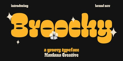 Broochy is a Groovy Slab serif Display font. Heavy and medium contrast stroke, fun character with a bit of ligatures and alternates. To give you an extra creative work. Broochy font support multilingual more than 100+ language. This font is good for logo design, Social media, Movie Titles, Books Titles, a short text even a long text letter and good for your secondary text font with script or serif. Make a stunning work with Broochy font. Cheers, Maulana Creative
 - Wellrythm by Maulana Creative,
$15.00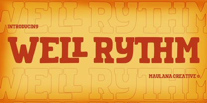 Wellrythm is a fancy display slab serif font. With handwritten medium stroke, fun character with a bit of ligatures and alternates. To give you an extra creative work. Wellrythm font support multilingual more than 100+ language. This font is good for logo design, Social media, Movie Titles, Books Titles, a short text even a long text letter and good for your secondary text font with sans or serif. Make a stunning work with Wellrythm font. Cheers, MaulanaCreative
 - Earmark NF by Nick's Fonts,
$10.00This extra stout slab serif derives its inspiration from two Vincent Pacella designs: Pacella Barrel and Pacella Colossus. Essentially it’s an all-caps font, but there are biform variants of a, e, m, n and u, so you can mix things up to create more interesting headlines. This font contains the complete Latin language character set (Unicode 1252) plus support for Central European (Unicode 1250) languages as well. - Lastari by Mantra Naga Studio,
$20.00 Lastari – a Bold Slab Serif Display Typeface. This typeface has many alternatives with swashes that can make your lettering/logotype more attractive. This font is suitable for logos and various other formal forms, such as invitations, labels, logos, magazines, books, greeting/wedding cards, packaging, fashion, makeup, stationery, novels, labels, or advertising. This font is PUA encoded, which means you can access all of the glyphs and swashes with ease!
 - Counte by NamelaType,
$19.00 This is our first experience of creating serif fonts. It resulted in a modern slab serif family designed with symmetrical bracketed serifs for uprights and cursive serifs for Italics. Crafted with low contrast strokes, it makes this font versatile and can be used for text and printing. Counte contains many International diacritics and OpenType Features. It consists of 9 weight, going from Thin to Black with matching italics.
 - Organic Respect by Bogstav,
$17.00 Organic Respect is my monospaced and organic slab serif font. Although the font is monospaced - which may not lead your mind to something organic - I did my best to make the letters appear vibrant and lively in an organic way. I've added 6 slightly different letters for you to choose from, and they automatically cycle as you type, or you can manually select them from the glyph menu.
 - Geometra by T4 Foundry,
$21.00 Geometra is a new font family from Swedish type designer Bo Berndal and the T4 font foundry. Somewhere between a slab serif and a sans it has a crisp, geometric feel and is both 20’s retro and modern. Its soft curves and openness makes it very readable in smaller print. The powerful serifs give the font lots of character in larger sizes. Geometra comes in three weights, regular, semibold and bold.
 - Pentay Sans by deFharo,
$10.50 Pentay is a Sans Serif typefaces family with 10 styles designed especially for editorial design and publications in general. The proportions of the font as well as the metrics and the kerning have been carefully calculated to obtain maximum readability. The fonts also have a complete set of lowercase alternatives and advanced OpenType features. Pentay fonts are also available in Slab Serif versions that complete a typographic system for editorial and corporate design.
 - Ogilvie Cyr - Unknown license

- PuffedRice - Unknown license

- TOMO Joseph by TOMO Fonts,
$12.00 Joseph is a slab-serif face designed by TOMO. With a wood type look - letterpress print, this fatty comes in handy when is time to design an informal —yet strong—looking communication piece. Imagine this typeface on a T-shirt, even a mug! Sweet.
 - Post Production JNL by Jeff Levine,
$29.00 A title card listing the supporting cast of the 1950 Humphrey Bogart and Gloria Grahame drama “In a Lonely Place” provided the hand lettered slab serif type design that served as the model for Post Production JNL – available in both regular and oblique versions.
 - Artartika by Tour De Force,
$25.00 Artartika contains two Regulars – one Slab and one Sans Serif. Condensed width, geometric shaped, with distinctive stem contrast, Artartika recommends itself for titles, product names, branding, but it's also fully applicable for longer text and paragraph use. Contains Extended Latin character set with Cyrillic support.
 - No Entry JNL by Jeff Levine,
$29.00 The hand lettered titles and credits from the 1958 war film “The Young Lions” command your attention with a bold block slab serif type style. This design has been digitally recreated as No Entry JNL, which is available in both regular and oblique versions.
 - Forward March JNL by Jeff Levine,
$29.00 An ad for the film "Marine Raiders" in the June 16, 1944 issue of Motion Picture Daily features the movie's title hand lettered in a bold, slab serif stencil design. This is now available as Forward March JNL in both regular and oblique versions.
 - Wickenburg by VersusTwin,
$21.99 Wickenburg is a rough and tumble grunge slab typeface that has taken a lickin' but keeps on coming back for more. It is a powerful heavyweight serif that makes a strong design statement. Pick up this bad boy and take him for a ride!
 - Fan Magazine JNL by Jeff Levine,
$29.00 In the December, 1934 issue of Modern Screen magazine, a number of feature article headlines were hand lettered in a condensed slab serif with a relatively uniform stroke weight. This is now available digitally as Fan Magazine JNL, in both regular and oblique versions.
 - Web Serveroff - 100% free

- MACIZA - Personal use only

- SF Big Whiskey - Unknown license


