10,000 search results
(0.296 seconds)
- ITC Ancestor by ITC,
$29.99Canadian Serge Pichii was inspired by decorative lettering produced during the early 1920s by Jan Tschichold to create Ironwork. Similarly, his ITC Ancestor family was influenced by early work, but in this case, much earlier work: the characters carved by native British Columbian people on solid rock. He worked with anthropologists and linguists to produce a series of books dedicated to the history and culture of the people. - Astromonkey by Hanoded,
$15.00 Astromonkey - here he is, all new, all excited to be alive! Astromonkey comes from outer space, where he has rubbed shoulders with the Star Trekkers, the aliens and Major Tom, who is still floating in his tin can. The font is a squarish all caps, with a different set of glyphs for upper and lower case (so they mingle quite well) and Astromonkey himself - disguised as the paragraph glyph. Enjoy.
 - Hardest Style by Mindtype Co.,
$19.00 Hardest Style is a handmade brushes font, designed to combine perfectly and allow you to create stunning hand-lettering design quickly and easily. Hardest Style comes with upper and lowercase characters, a large set of punctuation glyphs, numerals, and supports international languages. Stylistic alternates for several key lower case characters are also available, accessible in the Adobe Illustrator Glyphs panel, or under Stylistic Alternates in the Adobe Photoshop OpenType menu.
 - Christmas Doodles by Outside the Line,
$19.00 The newest addition to the Outside the Line collection of picture Doodle fonts... Christmas Doodles. The perfect font for that quickie Christmas party flyer. It includes gifts, gift tags, gingerbread man, gingerbread house, candy canes, hot cocoa, bow, crackers, 2 kinds of trees, poinsettia, jingle bell, ornaments, snowflakes and a star. This font works well with Holiday Doodles and Holiday Doodles Too which have some Christmas icons in them.
 - Newt Juice by Cool Fonts,
$24.00 Newt Juice is a funky hand drawn font comes in both Outline and Fill styles. Put them both together in your favorite application and you can get some really organic looks. Newt Juice is perfect for kid stuff or grungy graffiti. While it is an all caps font, the upper and lower case characters are position differently to create more randomness. Be the first on your block to juice the newt!
 - Edicia by Tour De Force,
$- Edicia is modern serif family with 5 weights and matching Italics. Distinctive and recognizable, Edicia stands out clearly with charming details. Characterized by asymmetric serifs, Edicia is designed with special care for ink-traps. Contains extended Latin and Cyrillic character set equipped with left & right side Borders, Localised Forms, Denominator & Numerator, OldStyle Figures, Tabular Figures, Tabular OldStyle Figures, Superscript, Subscript, Stylistic Alternates. Thin weight is available for free.
 - Etienne by ParaType,
$30.00 Designed for ParaType in 2002 by Tagir Safayev. Inspired by the letterforms of Antique No. 8 typeface and other similar fonts of the 19th century (Latin Antique, Wide Latin, Etienne Condensed, Wide Renaissance). A face of so-called Latin type has stout triangular serifs and rather unusual curls on several letters in the lower case. Nevertheless it is eminently suitable for a wide variety of settings in advertising and display typography.
 - Majestic Wisteria by Letterhanna Studio,
$19.00 Majestic Wisteria is a a sweet handwritten font that is made with great care in order to produce the expected outcomes. This font can be used for writing various kinds of products according to their respective needs. It will add a luxury spark to any design project that you wish to create! This font is PUA encoded which means you can access all of the amazing glyphs and ligatures with ease!
 - Kticha by Typink,
$11.00 Excellent futuristic font with pretty rounded angles will fit any title or heading. It supports more than 20 European languages. This font is unique for it's elegant and thin letters. Font's idea came to the designer in the late autumn when tender yellow leaves fell to his hands. The combination of straight lines and bows had sparked a thought about the font, that could be used as awesome decoration.
 - Metroland by takoliko,
$15.00 Metroland inspired by urban and modern life on a metropolis city. Metroland have a Subway vibe and a transportation theme that relate to our routine. Metroland is simple and modern sans serif display family font. it has a monoline geometric, and simple atmosphere. Metroland came with 9 weight and 9 italic fonts. It can easily be matched to an incredibly large set of projects, and good for communicating your brands.
 - Kiperman by Harbor Type,
$29.00 🏆 Selected for Tipos Latinos 9. 🏆 Selected for the 13th Biennial of Brazilian Graphic Design. 🏆 Hiii Typography 2018 Merit Award. Kiperman is a text typeface designed in honor of Henrique Leão Kiperman, founder of the publishing house Artmed, now Grupo A. Its forms are simple and straightforward, with no unnecessary embellishments that could disturb the reading. The fonts are slightly narrower than normal, which yields higher efficiency without compromising reading comfort. Besides that, its italics are not just a slanted version of the romans, but rather a separate drawing. With a slope of 8°, its calligraphic structure provides the right amount of emphasis when necessary. The Kiperman typeface works best when setting books, magazines, ebooks and websites. It will also work very well in branding and packaging projects where a sober typeface is needed. The inspiration for the design came from the personality of the honoree. Just as Henrique always wanted to stay away from spotlights, the Kiperman typeface was designed so that it would not call attention to itself or impose any obstacles in the understanding of the text. In this way, the fonts revere Henrique’s legacy by respecting and honoring the published content. Henrique Leão Kiperman began his career in 1958, selling medical books in travels through the interior of the Brazilian states of Paraná and Santa Catarina. In 1973, he opened a bookstore in downtown Porto Alegre, the Artes Médicas Sul, and a few years later edited his first book. Since then, his company has grown to become one of the most important publishers in Brazil in the area of scientific, technical and professional books, with more than 2400 active titles distributed among the McGraw Hill, Bookman, Artmed, Penso and Artes Médicas imprints. Henrique passed away in 2017 at the age of 79. The Kiperman type family has been commissioned by Grupo A and is available for licensing. This was the way found for the fonts to be read by more people, spreading some of his spirit around the world.
 - Smallstep Pro by Evolutionfonts,
$- Smallstep - One geometric sans serif with a free spirit. If we presume that geometric typefaces play with the idea of what typography would look like in the future when all unnecessary elements would disappear, than most of their designers seem to envision the future in a rather metropolisque kind of way. We love geometric faces, but the cold and heartless feelings that most of them leave is just not our cup of tea. That is why we are happy to bring some optimism in that genre with our new typeface. We called it Smallstep. Smallstep is a typeface that follows the traditions of classic geometric sans serifs like “Futura”, but is at the same time friendly and whimsical. We took the liberty to deviate from the standard sans serif glyphs while drawing some characters (such as ”a” and ”r” ), others (“w” “k”) are completely redesigned. Probably the biggest trademark of this typeface is the way vertical lines in most lower case characters are “cut” so they end in a 60 degree angle. Smallstep is over all a expressive face, which means it brings some emotions to your design and feelings in itself, and should be used accordingly. Other than that, it is suitable for both headline and body text, print and web. So what kind of name is “Smallstep”? We view the type design process as a form of evolution: There can be no typeface that differs drastically from the current standards, since its characters would be unrecognizable and thus unreadable. But at the same time there are hundreds of faces that differ a little, and still manage to make a difference by moving with small steps towards better and more refined looks. Smallstep consist of 4 weights, that cover all the features, that are expected of a modern Opentype face: kerning pairs, ligatures, true italics and alternative characters, plus a set of symbols, that will help you start off your designs more easily.
 - Liza Pro by Underware,
$50.00 Lettres d’amour! Flirting, fashionable, provocative, emotional, casual, moderate, extremely sensible & beautiful - Liza Pro covers it all. Liza Pro, Underware’s dear creation, is a live-script typeface. Thanks to its extremely intelligent OpenType architecture, she approaches human hand lettering as closely as technically possible. Liza Pro deeply analyzes the text. Out of a stock of 4000 hand crafted characters, Liza creates the most optimal combination. All of this works automatically. All you need to do is start typing your lettres d’amour, and Liza makes the text always look different. She gives your creative piece the impression par excellence. Erotique mais intelligent. She is as clever as we could imagine. She kept all folks at Underware busy for a couple of years. It all started one rainy night back in May 2004 but quickly changed into a fatal affair exceptionnelle. But now, 5 years later we are quite sure: this is something serious. Yes, we are talking about real love. L’amour pour la vie. Liza Pro has Underware’s world-dominating Latin Plus character set, supporting a total of 219 languages (Latin 1 + 2 and beyond). Liza Pro is a package of 4 fonts which work together. Liza Display Pro rocks the script lettering to the max. The build-in Out-of-ink feature, LetterSwapper and Protoshaper makes this font a realtime-digital-calligrapher. She’ll swash up your text drastically, giving long strokes, loops and swashes to letters if their context allows. Liza Text Pro has a more silent, moderate character - she’s well behaving sister of Liza Display Pro, designed to walk long pieces of text in a lively script style. Liza Caps Pro adds more possibilities and functionality to these two script fonts. It bridges the gap in case running script lettering doesn’t do the job, but it also works perfectly on its own. Every capital letter appears in various shapes to obtain the manual lettering feeling. Liza Ornaments Pro is for extra delicatesse et est plus charme. Four heart winning fonts, pour la langue l’amour!
 - La Macchina by FontMesa,
$20.00 La Macchina is a bold script suitable for logos, letterheads & headlines. It also resembles the lettering used by Lamborghini Automobiles.
 - Bertina by 611 Studio,
$16.00 Bertina, simple and elegant typeface with feminine touch. It's simplicity makes it best for headlines, letterhead, quotes and even logo.
 - Attendance by TanveerType,
$12.00 Attendance is a bold and playful font that can be used for logos, t-shirts, branding and many other projects.
 - Hunterra by Variatype,
$14.00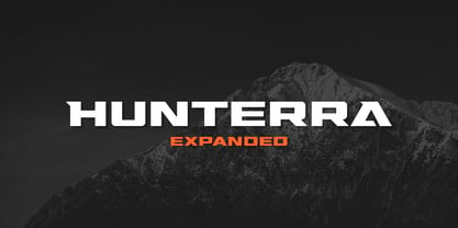 Hunterra is a strong character font that especially designed for identity proeject, very suitable for your branding, and logo design.
 - Margaret River by Epiclinez,
$13.00 Margaret River is a cute, funny handwritten font. It is very cool for use with logos, headlines, branding, and more.
 - Lathinolo by Midtype,
$24.00 Lathinolo is a handwritten font. Perfect for greeting cards, wedding stationery, photographer watermarks logos, modern websites, apparel design and more.
 - Other Side by Epiclinez,
$18.00 Otherside is a bold and playful handwritten font. It's suitable for various kinds of projects, such as logos and packaging.
 - Brilliant Starlight by Silverdav,
$14.00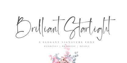 Brilliant Starlight is a very elegant and simple handwritten font, suitable for business cards, signatures, brochures, logos, quotes and more.
 - Harollds by Maulana Creative,
$11.00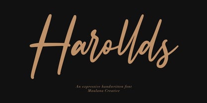 Give your designs an authentic handcrafted feel. Harollds Expressive Handwritten Font is perfectly suited to stationery, logos and much more.
 - Chesta by RahagitaType,
$14.00 Chesta is playful monoline font for a lot of purposes. Such as branding, packaging, logo, craft, fashion, poster, brochure, etc.
 - Umbria by TipografiaRamis,
$29.00 Umbria is a decorative display typeface ideal for use in titles, logos, magazines, posters, as well as short text paragraphs.
 - Chordettes by Maulana Creative,
$10.00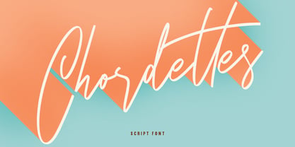 Give your designs an authentic handcrafted feel. Chordette is perfectly suited to stationery, logos and much more. Many Thanks, MaulanaCreative
 - Ameriondela by Maulana Creative,
$21.00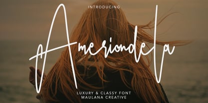 Give your designs an authentic handcrafted feel. "Ameriondela" is perfectly suited to stationery, logos and much more. Thanks for Watching!
 - Tattoo God by Forberas Club,
$16.00 Tattoo God font is good to application for tattoo artist logo, vintage style, and black letter style and many more.
 - Life Mission by Epiclinez,
$18.00 Life Mission is a stylish handwritten script font. It is suitable for logo, branding, packaging, apparel, social media, and more.
 - Livercool by Epiclinez,
$18.00 Livercool is a bold and playful handwritten script font. It is suitable for logo, branding, apparel, social media, and more.
 - Botanika by Suitcase Type Foundry,
$75.00The motivation behind the Botanika family was the desire to create a text version of the Magion font. Although the glyphs were originally drawn using the same proportions, they were subsequently adjusted in order to improve legibility. The font retains certain characteristics of the original, such as the top serif on the “i” and the similar bottom serif on the “l”. Lowering the x-height lent the family a new and original character. The italics are slightly more condensed than the regular weight, without losing the austere grace of the regular weight. They are distinct enough to stand out in the text. Alternative characters can be selected to spice up the setting, or conversely to subdue headlines by using more traditional letter shapes. Small caps are available as well. The monospace version is a 10 pitch font: at 10 pt type size 10 characters fit exactly into the width of one inch, meaning that individual letters Take up 60 % of an em in width. The family is provided with matching italics. The modifications made during the OpenType transition included the addition of missing glyphs to cover the Suitcase Standard set and adding relevant kerning pairs, plus redrawing the bold weight and the accents. Despite its lower x-height, the font is often used for setting medium to long texts. Its slightly archaic feel lends text set in Botanika an air of novelty, which may be the reason why it is so popular in extensive corporate identity systems. If you are looking for an alternative to the cold, neutral sans serifs which are so popular these days, Botanika is the perfect choice. - "Child's Play" isn't just a font; it's a joyride back to the days of yore, when the toughest decision of the day was choosing between crayons or markers. This font mimics the erratic yet sincere hand...
- Pea Jennifer - Unknown license

- Anywhere - Unknown license

- Four More Years - Unknown license

- FZ JAZZY 12 CRACKED - Unknown license

- Zombie Holocaust - Unknown license

- Swily Bright by Jolicia Type,
$19.00 Say Hello to Swily Bright. Trendy, classy & modern style serif font for your fancy projects. Elegant, fashion and classic style on Swily Bright font will be great for any branding project. With 2 style Regular and Italic, alternates and ligatures will help you to create unique letters
 - Wrong by Monotype,
$15.99 Wrong is all about the improv. Made with tape segments this font has a real DIY feel to it. It’s bold, solid and square-jawed. Its modular appearance gives it a constructed strength and it's available with two sets of caps and stacks of attitude as standard.
 - ITC Newtext by ITC,
$40.99ITC Newtext was designed by Ray Baker, who created a well designed and legible typeface and built into it every design refinement which could optimize its usefulness. The expanded shapes are generous and legible and the economical vertical set results in more lines to the page. - Eccentric by Solotype,
$19.95Here's another old-timer that needed a lowercase, so we drew one. Originally issued as a caps-only type by The American Type Founders Company about 1898, this font found its way into Craftsman period design. It was the inspiration for Galadriel, a dry transfer sheet alphabet.


