10,000 search results
(0.04 seconds)
- Nexus Typewriter Pro by Martin Majoor,
$49.00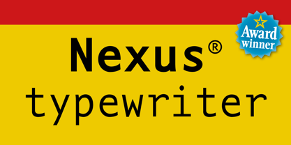 Nexus (2004) consists of three matching variants – a serif, a sans and a slab – which makes it a highly versatile typeface. Nexus started as an alternative to Seria, a typeface Majoor had designed some 5 years earlier. But soon the design developed into a new typeface, with numerous changes in proportions and in details and with a redrawn italic. Besides the three connected versions (Nexus Serif, Nexus Sans, Nexus Mix) Majoor designed a monospaced version called Nexus Typewriter. The Nexus family is a workhorse typeface system like Scala, with features such as small caps in all weights, four different sorts of numbers and an extensive set of ligatures. All fonts in the Nexus family come in regular, italic, bold and bold italic. Free bonus: there are more than 100 elegant Swash italics and dozens of arrows and other icons. The Nexus family was awarded the First Prize at the Creative Review Type Design Awards 2006.
 - Haydes by YdhraStudio,
$20.00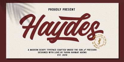 Haydes is a hand brush typeface with authentic clean brush imperfections. Haydes includes many different alternates for each lowercase and uppercase letter. It's extremely fun to use as each word can be transformed to your liking. We also include a bonus swash weight to make your design look more awesome. Haydes also has a standard Multilingual Support. Haydes is great for Branding Design, Logo Design, Digital Lettering Arts, Poster, T-Shirt/Apparel, Magazine, Quotes, Signs, Instagram Designs, Advertising Design, and any other type design needs. You can access all those alternate characters by using a program that supports OpenType features such as Adobe Illustrator CS, Adobe Indesign & CorelDraw X6-X7. Guides to access all alternates glyphs : http://adobe.ly/1m1fn4Y Mix and match the alternate characters to add an attractive message to your design. Need help? Please, Feel free to contact me by e-mail yyudhara@gmail.com for any question about my font, Extended License document and more. Good Luck and Have fun ! YdhraStudio
 - Nexus Mix Pro by Martin Majoor,
$49.00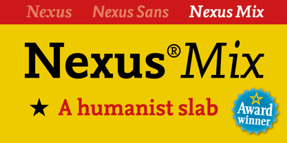 Nexus (2004) consists of three matching variants – a serif, a sans and a slab – which makes it a highly versatile typeface. Nexus started as an alternative to Seria, a typeface Majoor had designed some 5 years earlier. But soon the design developed into a new typeface, with numerous changes in proportions and in details and with a redrawn italic. Besides the three connected versions (Nexus Serif, Nexus Sans, Nexus Mix) Majoor designed a monospaced version called Nexus Typewriter. The Nexus family is a workhorse typeface system like Scala, with features such as small caps in all weights, four different sorts of numbers and an extensive set of ligatures. All fonts in the Nexus family come in regular, italic, bold and bold italic. Free bonus: there are more than 100 elegant Swash italics and dozens of arrows and other icons. The Nexus family was awarded the First Prize at the Creative Review Type Design Awards 2006.
 - Chettos Script by Josstype,
$10.00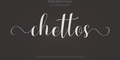 Introduce Chettos Script, Hand Lettered Calligraphy Font with beautiful waves and natural flow. has a unique letter style, with natural handdrawn, and has a softer and smoother character subtly connect all the characters. They have a simple elegant swashes in separate letters, you can use graphic design software to access the alternate letter. Chettos Script is perfect for weddings, invitations, greeting cards, quotations, posters, branding, business cards, stationary, title design, header blog, excerpts of art, the art of typography, letter envelopes modern or design books, occurred styles such as design handdrawn, title , letter marriage, pop vintage design, or purpose to make the project / art design we look beautiful and trendy. Chettos Script comes complete with 259 glyphs. This includes uppercase, lowercase, numbers, fractions, punctuation, multi-language support. and some other flying machines are variations that part of OpenType features such as; Standard ligatures, stylistic set, alternative style. If you have any questions, please feel free to contact me via email: joelpopon@gmail.com
 - Celiya Script by Picatype,
$12.00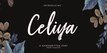 Celiya Script is a modern script with handwritten, decorative characters, and dancing basics! It's very suitable for use such as blog headings, branding, t-shirts, weddings, social media, product design, stationery, advertisements, clothing, book covers, business cards, greeting cards, branding, merchandise, invitations and handmade quotes and more. Celiya Script features alternate alternate OpenType features, binders and international support for most Western languages. To activate the OpenType Stylistic alternative, you need a program that supports OpenType features such as Adobe Illustrator CS, Adobe Indesign & CorelDraw X6-X7, Microsoft Word 2010 or newer versions. Celiya Script is coded with Unicode PUA, which allows full access to all additional characters without having special design software. Mac users can use the Font Book, and Windows users can use the Character Map to view and copy one of the additional characters to paste into your favorite text editor / application. If you have questions, feel free to contact me via email: picatypestudio@gmail.com Thank you!
 - Deus by Renegade Fonts,
$22.00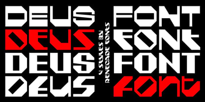 Deus is when type design is brought to extreme. It tries to answer the question whether you can design all glyphs in one axis of stress. It does not try to be all purpose, useful at all sizes, legible or readable and most of all it does not try to be neutral. It has its own style you either accept or not. But if you do so, it has many great stuff inside. Every glyph has the same width across four masters, so you can change the style in one title or even make an animation out of that. It also has some cool animated emojis, so make sure you take all four styles! Deus has two sets of styles. "Deus" that has an expanded glyph set, and "Deus Basic" that comes with a limited glyph set. You can play around with "Deus Basic" since you get it for free, then fall in love with this font family and go for the full version.
 - Brake by Black Studio,
$19.00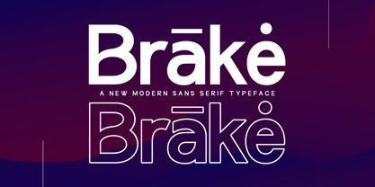 New from Black Studio, presenting Brākė is a typeface that is feminine, adaptable, contemporary aesthetic and creates endless variations for your creative needs. Its striking contrasts and subtle details, together with its sumptuous strokes and voluptuous curves, create a beautiful and powerful statement for any typographic composition, blending glamor with a contemporary aesthetic. Brākė really helps you create unlimited variations for your creative needs in making your project titles: such as Books, fashion, magazines, logos, branding, photography, invitations, wedding invitations, quotes, blog headers, posters, advertisements, postcards, books, websites, etc. WHAT IS INCLUDED • Brākė – Regular • Brākė – Oblique • Brākė – Outline This type of family has become the work of true love, making it as easy and fun as possible. I can't wait to see what you do with Brākė! Feel free to use the #Black Studio tag and the #Brākė font to show what you've been up to, I really hope you enjoy it! Thank You!
 - Nexus Sans Pro by Martin Majoor,
$49.00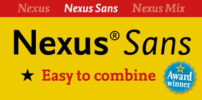 Nexus (2004) consists of three matching variants – a serif, a sans and a slab – which makes it a highly versatile typeface. Nexus started as an alternative to Seria, a typeface Majoor had designed some 5 years earlier. But soon the design developed into a new typeface, with numerous changes in proportions and in details and with a redrawn italic. Besides the three connected versions (Nexus Serif, Nexus Sans, Nexus Mix) Majoor designed a monospaced version called Nexus Typewriter. The Nexus family is a workhorse typeface system like Scala, with features such as small caps in all weights, four different sorts of numbers and an extensive set of ligatures. All fonts in the Nexus family come in regular, italic, bold and bold italic. Free bonus: there are more than 100 elegant Swash italics and dozens of arrows and other icons. The Nexus family was awarded the First Prize at the Creative Review Type Design Awards 2006.
 - Madrea by Craft Supply Co,
$20.00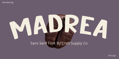 Introducing Madrea – Friendly Sans Serif Unconventional Charm Madrea – Friendly Sans Serif is anything but conventional; it introduces a unique and friendly twist to your designs. Irregular Shapes What sets Madrea apart is its irregular shapes, which establish a welcoming and friendly atmosphere. This makes it the perfect choice for designs seeking to break free from formality and monotony. A Breath of Fresh Air In the realm of sans serif fonts, Madrea is indeed a breath of fresh air. Its non-uniformity and organic feel breathe personality and approachability into your projects. Breaking Formality Madrea excels at breaking the chains of formality. It’s an ideal choice for design projects that demand a friendly and informal touch, effortlessly transforming the mundane into something captivating. In Conclusion In summary, Madrea – Friendly Sans Serif is your gateway to a non-uniform, friendly design experience. Its irregular shapes infuse character, warmth, and a refreshing departure from conventional design, ensuring that your creations are brimming with life and far from monotonous.
 - Bentoga by Black Studio,
$25.00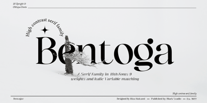 New from Black Studio, presenting bentoga is a typeface that is feminine, adaptable, contemporary aesthetic and creates endless variations for your creative needs. Its striking contrasts and subtle details, together with its sumptuous strokes and voluptuous curves, create a beautiful and powerful statement for any typographic composition, blending glamor with a contemporary aesthetic. Bentoga really helps you create unlimited variations for your creative needs in making your project titles: such as Books, fashion, magazines, logos, branding, photography, invitations, wedding invitations, quotes, blog headers, posters, advertisements, postcards, books, websites, etc. WHAT IS INCLUDED • Bentoga – Regular • Bentoga – Italic This type of family has become the work of true love, making it as easy and fun as possible. I can't wait to see what you do with Bentoga! Feel free to use the #Black Studio tag and the #Bentoga font to show what you've been up to, I really hope you enjoy it! Thank You!
 - Finalist Round Slab by Bülent Yüksel,
$19.00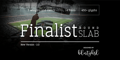 The font was intended primarily to have a stronger body. It has a simple geometrical surface. This font has a strong personality, that makes it perfect for use in headline sizes but means it also works gracefully within text blocks. "Finalist Round Slab" is carefully crafted and a unique slab serif. Use for websites, print, motion graphics, logo design, packaging design, t-shirts and more. The designation “Finalist Round Slab Regular” forms the central point. The first figure of the number describes the stroke thickness: Thin to Black. "Finalist Round Slab" comes 7 weights and italics total 14 types. The family contains a set of 450+ characters. Case-Sensitive Forms, Classes and Features, Fractions, Superior, Inferior, Denominator, Numerator, Old Style Figures just one touch easy In all graphic programs. You can enjoy using it. UPDATES: - 30 December 2015 Opentype Feature (fractions) and some kerning. - 11 June 2018 Solving some UNICODE problems on the internet. - 12 March 2019 Some error has been fixed. - 19 November 2019 Some error has been fixed. - 16 August 2021 New Version - 2.0 Some error has been fixed.
 - Magnat by René Bieder,
$29.00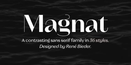 Magnat is a contrasting sans drawing inspiration from designs from the early twenties century and expands them into an elegant and distinctive contemporary design. Playful elements such as the curvy ear on the lowercase g or the long tail on the uppercase Q break the strictness and add character. The combination of closed apertures with the contrasting strokes create an elegant and distinctive overall appearance. The Magnat family is available in 36 weights including matching italics, divided into 3 subfamilies: Poster, Head and Text. Each has been designed for its individual range of text sizes. The Poster and Head styles with their tight spacing and luxurious shapes are made for impactful headlines and short paragraphs, whereas the text weights are either a great addition for small text sizes or, when set in large sizes, perfectly work as a robust standalone font with a lot of character. Each font style is equipped with many opentype features such as alternate characters, different number sets or case sensitive shapes making it a perfect choice for professional type setting in branding, editorial or digital design.
 - Amfibia by ROHH,
$40.00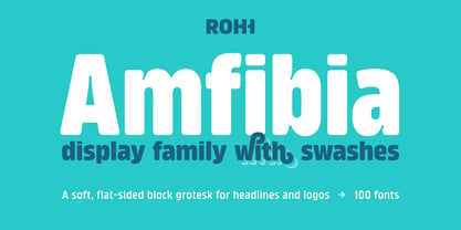 Amfibia™ is a soft, flat-sided geometric grotesk family with a lot of character, equipped with tons of ligatures and swashes. Its main function is display use of all kinds, however it is prepared to serve as paragraph text typeface thanks to its 5 widths, giving total amount of 100 fonts. It is crafted for a broad variety design situations - from posters, magazine editorial use, logo design & branding, to web design, user interfaces and mobile applications. Main features: - 5 widths (Narrow, Condensed, Normal, Expanded, Wide), each consisting 20 fonts - 10 weights for each width (from Hairline to Black) - handdrawn, carefully crafted obliques - over 900 glyphs, full of swashes, initial forms, terminals and ligatures - pronounced ink traps and large x-height improving legibility in small sizes as well as adding strong personality to display sizes - flat-sided letter shapes adding vertical rhythm and elegance to narrow widths - extended latin language support - OpenType features (swashes, initials, terminals, standard and discretionary ligatures, stylistic sets, contextual alternates, case sensitive forms, lining, oldstyle and tabular figures, slashed zero, fractions, superscript and subscript, ordinals, currencies and symbols)
 - Ornable by Casloop Studio,
$16.00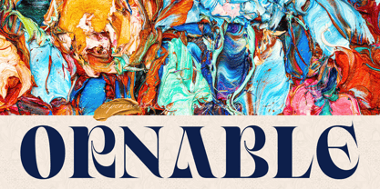 Meet Ornable Typeface, your font of choice for a captivating blend of Renaissance, Art Nouveau, Medieval, and Art Deco vibes. This single-weight typeface is designed for those seeking a font that embodies a rich tapestry of artistic nuances. With 35 meticulously crafted ligatures, Ornable ensures your text is not just seen but experienced. Dive into the charm of fractions for precise numerical representation and case-sensitive forms for a perfect interplay of uppercase and lowercase letters. Stand out effortlessly with the inclusion of a unique arrow symbol, adding a modern touch to your designs. Ornable adapts seamlessly to various themes, from the classic allure of Renaissance to the bold geometry of Art Deco. Whether you're crafting posters or logos, Ornable celebrates your creativity with sharp lines and intricate details. It's the ideal choice for projects that demand a touch of mystique and retro charm. Capture the essence of artistic movements with this typeface and step into a world where past and future converge – embrace Ornable and redefine the boundaries of your creative expression.
 - Magpie by Elster Fonts,
$24.00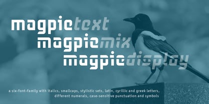 Magpie is a font family consisting of three sub-families with both regular and italic styles. Originally designed on squared paper, over time it has moved further and further away from this rigid grid, although its appearance is still based on it, so it can easily be used for logotypes or headlines with strict grid-based layouts. While Magpie Text is suitable for headlines and short texts, Magpie Display is ideal for logotypes or more playful headlines. Finally, Magpie Mix is a combination of both families. Magpie Text Regular represents stability, Magpie Display Italic is ideal for dynamic logos or headlines. To cover more languages, cyrillic and greek letters were added and Magpie can be used for nearly a hundred languages. In addition to the four common numeral variants, special numerals, punctuations and symbols for all-caps (c2sc) are included. Furthermore case-sensitive punctuations and symbols are available. To expand the typographic possibilities, four stylistic sets, different symbols, forms and standard- and discretionary ligatures have been added. Each Magpie-font contains more than 880 glyphs.
 - Polydot by Christoph Reichelt,
$16.00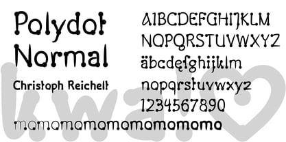 Polydot is an experimental Font, built following its own rules. It has interesting letter shapes, making it a perfect choice for creative packaging and magazine design. At the same time it makes a beautiful, neat but vivid text pattern when used in smaller sizes: Use it for children’s books, food and beverage, cosmetics or health topics. Each Glyph is based on at least one dot on the body line, and has up to two more on the lower case level and the ascender level. Since they have the same size and are on the same height on all letters, no matter what weight and shape, these dots give a strong structure to the typeface, allowing for dynamic and easy letter shapes, inspired by brush strokes. It’s not a hand font but it has the dynamics of one. It has no serifs but provides the structure and readability of a roman type. It has an extensive choice of weights, but it’s characteristic dots have the same size and it has the same tracking through all weights. Try it, it’s special.
 - PB Beneventan XIc by Paweł Burgiel,
$32.00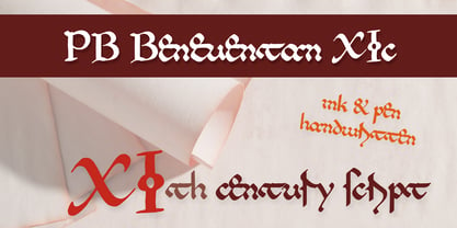 PB Beneventan XIc is a font face designed for imitate Beneventan minuscule (also called Lombardic, Casinense, Langobarda, littera Longobarda, Longobardisca) from southern Italy found in 11th century manuscripts. All characters are handwritten by use ink and pen, scanned, digitized and optimized for best quality without lost its handwritten visual appearance. Character set support codepages: 1250 Central (Eastern) European, 1252 Western (ANSI), 1254 Turkish, 1257 Baltic. Include also additional characters for Cornish, Danish, Dutch and Welsh language, spaces (M/1, M/2, M/3, M/4, M/6, thin, hair, zero width space etc.) and historical characters (mediaeval abbreviations, ligatures, ancient punctuation). OpenType TrueType TTF (.ttf) font file include installed OpenType features: Access All Alternates, Localized Forms, Fractions, Alternative Fractions, Ordinals, Superscript, Tabular Figures, Proportional Figures, Case-Sensitive Forms, Stylistic Alternates, Contextual Alternates, Stylistic Set 1-14, Contextual Ligatures, Historical Ligatures, Standard Ligatures. Include also kerning as single 'kern' table for maximum possible backwards compatibility with older software. Additional glyphs are mapped to Private Use Area codepoints. OpenType features automatically exchange some default glyphs by stylistic alternates and create ligatures for better historical appearance.
 - Bauhaus Bugler Soft by Breauhare,
$35.00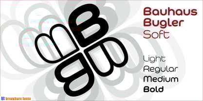 Take Bauhaus Bugler, dip it in chocolate, and what do you get? Bauhaus Bugler Soft, of course! Or dip it in butter! You can achieve all sorts of yummy, appealing images with the softness of Bauhaus Bugler Soft, whether it be food, cosmetics, fabric softener, or any number of other fluffy things! Unlike its fellow Bugler fonts, Bauhaus Bugler Soft’s design never appeared in Harry Warren’s 6th grade class newsletter, The Broadwater Bugler, but its design came about during that same period in 1975. Because of this, it has been officially designated an honorary Bugler font! Its theme of broad curves that leap over and under conjure visions of fashion and high-end department stores with their dress boxes and shopping bags, plus hair products, cosmetics, couture, and other stylish personal merchandise of the highest caliber. Bauhaus Bugler Soft also has an art deco flavor, especially when all capitals are used. It comes with two alternate versions of the upper and lower Y to give users more freedom of choice. Put Bauhaus Bugler Soft in your “haus” today! Digitized by John Bomparte.
 - Morro by Great Scott,
$16.00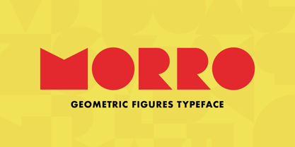 Morro is based on simple geometric shapes – circles, triangles and rectangles. Imagine cutting circles, triangels and rectangles from paper and arranging them into letters where the outer edges form a filled figure. Arranging figures like this to form letters is nothing unique. You can find several beautiful examples of alphabets that inspired the creation of Morro. Everywhere from a 1936 booklet by Draughtsman called ”Modern lettering for all branches of commercial arts” to obvious examples is from the paragon of the design industry - Milton Glaser - with his typeface Baby Teeth. What sets Morro apart from other digitized versions of Glasers' ”Baby teeth”, or other similar designed fonts, is that Morro is expanded into lower case and also supports Basic latin, Western European, Central European, south Eastern European and Pinyin. There are also stylistic alternatives to some of the glyphs. Morro Regular works like a stencil and is accompanied by a block shadow style and an outline. The Morro family of fonts are layered and can be superimposed on each other to create several types of text effects.
 - Pagewalker by Kostic,
$40.00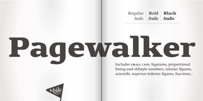 The name of the font is chosen to suggest its main purpose—setting multiple pages of text. All the features in this family were made with that in mind—legibility, distinct italics, small caps and various OpenType features, all make this font a useful tool for typographers. On the other hand, for packaging, posters, logotypes, etc. setting heavier weights in large size brings out its display qualities. Pagewalker is very legible and appears to be larger than other text typefaces. That is because the lower-case characters are made large compared to the capital letters. This means it can be used for setting text in, e.g. 9 pt size—while appearing to be 10 pt, but occupying less space. Pagewalker has a character set to support Western and Central European languages, and an extended set for monetary symbols which, in combination with tabular numbers, is perfect for financial reports. Each weight includes small caps, ligatures, proportional lining and oldstyle numbers, tabular figures, fractions and scientific superior/inferior figures.
 - Interval Next by Mostardesign,
$25.00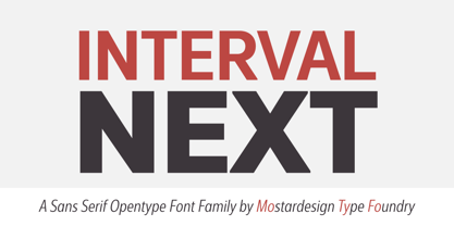 Interval Next is a modern sans serif font family that is the successor of the successful Interval Sans Pro. Designed by Olivier Gourvat, Interval Next typeface consists of 16 fonts in 8 weights — Ultra Light, Light, Book, Regular, Medium, Semi Bold, Bold, Black— and has 4 styles. This super family combines a humanist mind with its contrasted shapes and a modern look with its open counters. With its four versatile styles (Condensed, Narrow, Roman and Wide) Interval Next has a creative palette able to meet the modern typographic demands. Its OpenType features will provide you almost unlimited multilingual support as well as small caps, case sensitive forms, proportional and tabular figures, slashed zero, numerators, superscripts, denominators, scientific inferiors, circled figures, subscript, ordinals, fractions, arrows and f-ligatures. Also extremely functional for professional editorial design, Interval Next has a pro kerning and would be extremely suitable for mobile applications, e-books, web sites, headlines, posters, signage and many more. Interval Next covers a large spectrum of languages such as West European, East European and the Cyrillic.
 - Monarque by The Paper Town,
$27.00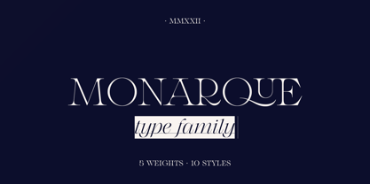 Monarque is an elegant typeface. It is crafted with fine details that would make your typography stand out. Large x-height, high stroke contrast, rounded curves & long sharp serifs create together a dramatic look that would succeed in delivering a strong message with elegance. The true italic’s are designed to work harmoniously with the roman for a striking contrast within a line. Originally created to be an all-caps only, the font includes a lot of uppercase ligatures that are thought to flow in naturally and achieve a legible composition. OpenType features include a stylistic set of alternates, contextual alternates, discretionary and standard ligatures, old style figures, small caps and case-sensitive forms. The type family is available in 5 weights for a total of 10 fonts and supports over 200 Latin-based languages, making Monarque a solid powerful typeface ready for any kind of project from editorial design, branding, magazines, logos and more. As Monarque is only available as a display (for now) its full potential operates at its best with headlines or short to medium-length texts.
 - Absurdies by Typephases,
$25.00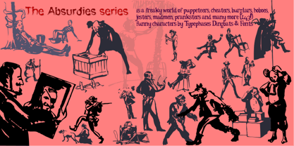 Absurdies is a trilogy of pictorial typefaces with lots of mischief, fun, weirdness, black humour and amusement. It includes 143 digitized illustrations. You will find many inexplicable behaviours, madmen, strange occupations, absurd and chaos-loving characters, and general whimsy. This little crowd can be used in many ways, from spot illustration to big illustration work or graphic designs, taking advantage of the vectorial format of the font file. The characters in Absurdies (together with their kin, the Illustries, Whimsies, Ombres, Bizarries and Genteta dingbats) are drawings from the sketchpad of Joan M. Mas, drawn from imagination and with no reference, except in a handful of cases pulled from historical photography. He wanted an easy-to-use format to collect his hundreds of imaginary ink drawings and he realized a digital typeface was an ideal solution. Having the illustrations gathered in a font file means you can use them instantly in any program you like. You may choose to use the images out of the box, or further customize them with colours and textures. The possibilities are endless.
 - Varp by Kobuzan,
$25.00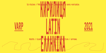 Varp is a rather narrow 2-axis variable geometric typeface with slight reverse contrast inspired by utilitarian and technical design. In Slim and Tight styles, the reverse contrast is enhanced. Typeface is adjustable in width, as if by mechanical deformation of proportions, which is often found in technical and transport markings. The letterforms are based in part on the shapes of DIN fonts, with the deliberate addition of contrasting connections, sharp spurs and massive ink traps for sharpness. With the help of special spacing, selective kerning and adjusted letter width, the effect of a monospaced font is created with no obvious "holes" in the text set, while maintaining a special rhythm. In addition to the width, Varp is adjustable in tilt angle to an extreme 30 degrees and an intermediate 15 degrees in both directions. Features: – Total glyph set: 795 glyphs; – 15 styles (3 widths x 5 italics) + variable; – Support 210+ languages; – Latin Extended; – Cyrillic Basic + Bulgarian letters; – Greek. OpenType features: – Uppercase, lowercase; – Proportional, circled, tabular numerals, superiors, inferiors, fractions; – Punctuations and symbols; – Arrows; – Stylistic sets (ss01-ss04); – Ligatures; – Case-sensitive forms.
 - Glyphic Neue by Typeco,
$29.00Glyphic Neue was inspired by the Op Art style of lettering in the United States that ran rampant in many photo type houses in the 1960's and 1970's. The Glyphic Series from the Franklin Photolettering group was an influence and spring board for this family of fonts, hence it's name. But Glyphic Neue departs from its unicase Franklin influence in several ways. Firstly the designer created both upper and lower case forms. The lowercase has been designed with barley protruding ascenders and descenders and with an x-height equivalent to the cap height, so that upper and lower can be exchanged indiscriminately for a quirky effect. Some of the letters take a cue from the original Glyphic series but many have been redesigned entirely to fit the designers vision. The italic forms differ enough from the upright version making it almost an entirely different display alphabet. Glyphic Neue is a versatile family of 6 fonts -- 3 widths, each with an accompanying italic that look equally at home when used on a party flier or a sports team visual identity. - Kasia by ROHH,
$40.00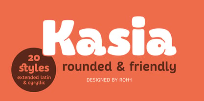 Kasia™ is a unique contemporary sans serif family, full of character and originality. It's soft and rounded shapes give it warm, friendly, playful and dynamic feel. Special ink traps serve as ornamental details in bigger sizes, making Kasia™ a wonderful display font family. In small sizes, Kasia™ is very clean and legible. Its proportions and optimized kerning make it a versatile, friendly and organic text family, that features broad variety of OpenType features. Thanks to its various advantages Kasia™ is a great choice for all kinds of design work, both print and on-screen. It is a great choice for branding, logo design and advertising, as well as all sorts of paragraph text. Kasia™ consists of 20 fonts - 10 weights and their corresponding italics. It has extended language support including cyrillic and true italics, as well as OpenType features, such as small caps, case sensitive forms, ligatures, stylistic alternates, contextual alternates, lining, oldstyle, tabular, small cap and circled figures, slashed zero, fractions, superscript and subscript, ordinals, currencies and symbols.
 - Achtung by Mikołaj Grabowski,
$39.00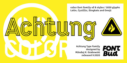 This is an extension of Mikolaj's Grabowski first typeface. Formerly known as EPILEPSJA, now coming as ACHTUNG. Adding lowercase and small caps, as well as additional language support including Cyrillic script and some dingbats. ACHTUNG Color Type Family has a range of application from warnings and safety signage to propaganda posters and anarchist graffiti. Every place where you need an indisputable message, be it in headlines or titles, this font comes in handy. It’s a stencil, it’s layered and impossibly dimensional. Download the specimen HERE. I advise you to do so in order to being aware of how the layers work and how to use color fonts. Total of 1020 glyphs. Languages: Afrikaans, Albanian, Bosnian, Bulgarian, Catalan, Croatian, Czech, Danish, Dutch, English, Estonian, Finnish, French, German, Hungarian, Icelandic, Italian, Latvian, Lithuanian, Macedonian, Maltese, Norwegian, Polish, Portuguese, Romanian, Russian, Serbian, Slovak, Slovenian, Spanish, Swedish, Turkish, Ukrainian, Vietnamese, Zulu. OpenType features: small caps, localizations, superscript, fractions, ordinals, proportional and tabular figures, case sensitive forms, stylistic alternates, contextual alternates, and proper mark attachment.
 - Generous Hospitality by Dear Alison,
$19.00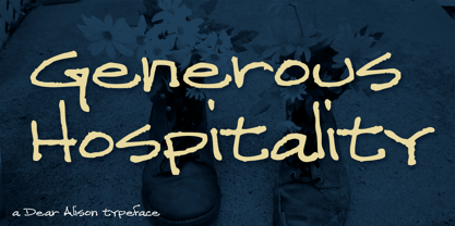 While there can be similar handwriting styles out there, no two handwritings are exactly the same. I like to think that I have the same handwriting style as my father, but I had never seen him write with lowercase letters, only in all capitals, except when signing his name on something in cursive. I recently came across a letter my father had written long ago to a friend. It was returned to sender, yet he kept it intact. The letter primarily thanked his friend for his hospitality when my father unexpectedly dropped in for a visit while traveling. I was so taken by the handwriting, that I decided to make it into a font, not only to remember my father, but also to forever preserve his handwriting. Generous Hospitality not only taps into the character of the person the letter was written to, it also reflects the personality of my father. If you are looking for a masculine handwriting type style for your designs, I think this font could be a nice fit.
 - Caliche by Ahmad Jamaludin,
$13.00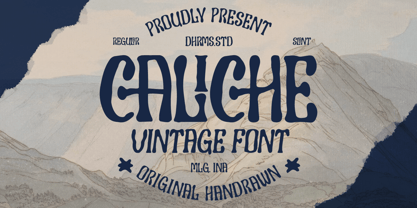 Say hello to CALICHE! The font that's as vintage and handdrawn at the same time! CALICHE's typeface is inspired by the rustic charm of vintage craftsmanship, infused with the laid-back vibes of a tropical summer. This font brings you not one, but two families to choose from: Regular and Slant, offering versatility for your design projects. Whether you're aiming for a rugged look, modern vintage aesthetics, or the essence of summer, CALICHE has got you covered. It's the perfect companion for all your graphic design needs, crafted with care to bring that unique touch to your creations What's Included? Caliche Main File Regular and Slant version Instructions (Access special characters, even in Cricut Design) Unique Letterforms Works on PC & Mac Simple Installations Accessible in Adobe Illustrator, Adobe Photoshop, Microsoft Word even Canva! PUA Encoded Characters. Fully accessible without additional design software. Language Support: Danish, English, Estonian, Filipino, Finnish, French, Friulian, Galician, German, Gusii, Indonesian, Irish, Italian, Luxembourgish, Norwegian Bokmål, Norwegian Nynorsk, Nyankole, Oromo, Portuguese, Romansh, Rombo, Spanish, Swedish, Swiss-German, Uzbek (Latin)
 - Geometron Pro Angular by Marius Mitran,
$39.00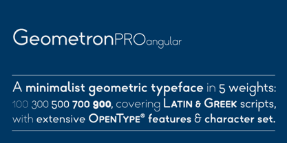 Geometron has its origin in a custom typeface that I was commissioned to design for an architectural project. The concept was a "back to basics", minimalist typeface constructed mainly with straight lines and circles or circular arcs, but without departing from the classical style of Roman & Greek lettering. Notable requirements were: an extensive character set needed for multi-language documentation, as well as a full collection of symbols and alternate glyph forms (e.g. superiors & inferiors) for scientific use. Special care was taken to obviate the almost identical similarities that were prone to appear between letters like uppercase "i" and lowercase "L" or between Latin and Greek letters such as "a" and "alpha". This was also a prerequisite for scientific notation where ambiguity is not acceptable. All in all, the font would have to blend a modern design with a wealth of functional features. Consequently, all of these were made possible by choosing the OpenType format for development, resulting in a comprehensive and feature-rich font family specifically targeted for use in high-end design/typesetting applications.
 - Epilepsja Round by Mikołaj Grabowski,
$29.00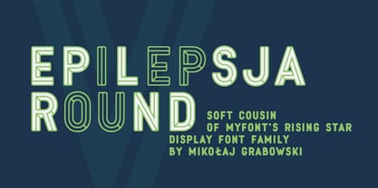 Here I present Round - a type family that is derived form Epilepsja, which was my first alphabet commercially out. After its release I came to think that there should be other fonts of this design that would enrich the variety of choice. Here comes ‘Epilepsja Round’ which is soft and friendly while the Regular family remains firm and sharp. It supports all Latin-based European and African languages and acts as a multicolour layered font. best for headlines, titles and other display uses.. It is an all-caps alphabet of stencil-sprayed and painted letters found in the city space. The glyphs are simple but unordinary. Every letter has something from Escher-like 3D illusion, but is flat simultaneously. Epilepsja Round consists of three styles: Outline, Solid and Fill. Outline is the base from which the other two styles are created. When you mix Solid with Fill, you can create two-color Outline style. You can even mix it with not-Round Epilepsja! Solid is neat and legible in small sizes. Use it for posters, headlines, magazines, websites or anything you like.
 - Marzano by FontMesa,
$35.00 Marzano is a geometric sans serif font that's ideal for headlines, logos, text and advertising, the name comes from the ever so sweet and wonderful San Marzano plum tomato grown in Italy. Marzano includes stylistic alternates, small caps, swash caps, case sensitive forms, old style figures, tabular figures, small caps figures, small caps old style figures, small caps question mark and exclamation point. Since a lot of people today like to type in code using the copyright and trademark symbols in place of a C or R we've decided, the first time to offer two registered trademark symbols, one that's the same size as the copyright symbol and an alternate version that's reduced in size and sits at the caps height. Marzano Slant is set at 6 degrees and is perfect for when you want the look of an italic but don't have the horizontal space in your page design for a full 12 degree italic. At FontMesa all of our italic fonts are cleaned up placing all nodes at extremas.
 - Rubber B by TwelveTimesTwo,
$40.00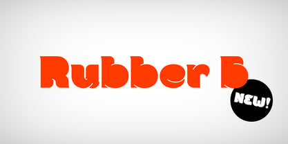 Rubber B is a heavy display typeface with very tight open counters & character spacing and non-existent closed counters. It is an amalgam of styles and influences that demands attention. It is comparable with the highly geometric experimental fonts of the '90s and early '00s, but also heavily inspired by decorative fonts of the '60s and the psychedelic poster art of the '70s. Bold and loud, yet delicate, almost calligraphic in some cases. It works with Latin & Extended Latin, Cyrillic & Extended Cyrillic and Greek. It comes with 1,500+ glyphs, with more than half of them being ligatures. It also contains several Stylistic Alternates as well as Localised forms (available through the Open Type Features and also as ligatures). All these features are available in order to not only make sure that it works with as many languages as possible, but also that depending on the specific glyph or ligature one chooses to use, they have the ability to alter the emotional character of the word(s) they’re setting. Ideal for titles and logos, as it works best in medium and large sizes.
 - Excelsius by Comicraft,
$19.00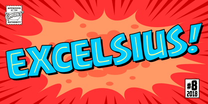 Once upon a midnight dreary, this Comicraftsman pondered, weak and weary, For a name synonymous with Mighty and Marvelous comics lore. Solid, Outline, Inline was the nameless font I'd crafted, I nodded, nearly napping o'er the work I'd grafted When suddenly came a tapping, As of someone gently rapping, rapping at my cubicle door. "'Tis some visitor," I muttered, "tapping at my cubicle door-- Calling out "EXCELSIOR!" Then an Amazing Vision beguiled my sad fancy into smilin', By the Spectacular decorum of the countenance it wore, "Though thy crest be shorn and shaven," he said, "thou art sure no craven, And thy font should not remain nameless here forevermore!" Eagerly I wished the morrow; vainly I had sought to borrow From comic books surcease of sorrow, letters that called out "EXCELSIOR!" Then, upon the velvet sinking, I betook myself to linking Fancy unto fancy, thinking of the nominative neuter singular thing Like Some Silvered Surfer wandering from the Nightly shore-- The Vision shrieked, upstarting--"Tell me what thy lordly name is thus!" Quoth the Craftsman: "EXCELSIUS!"
 - Geometron Pro Radial by Marius Mitran,
$39.00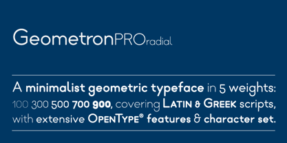 Geometron has its origin in a custom typeface that I was commissioned to design for an architectural project. The concept was a "back to basics", minimalist typeface constructed mainly with straight lines and circles or circular arcs, but without departing from the classical style of Roman & Greek lettering. Notable requirements were: an extensive character set needed for multilanguage documentation, as well as a full collection of symbols and alternate glyph forms (e.g. superiors & inferiors) for scientific use. Special care was taken to obviate the almost identical similarities that were prone to appear between letters like uppercase "i" and lowercase "L" or between Latin and Greek letters such as "a" and "alpha". This was also a prerequisite for scientific notation where ambiguity is not acceptable. All in all, the font would have to blend a modern design with a wealth of functional features. Consequently, all of these were made possible by choosing the OpenTypeÆ format for development, resulting in a comprehensive and feature-rich font family specifically targeted for use in high-end design/typesetting applications.
 - Core Sans CR by S-Core,
$20.00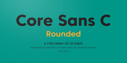 Core Sans CR family is a rounded version of Core Sans C; a part of the Core Sans Series, such as Core Sans N, Core Sans M, Core Sans E, Core Sans A, Core Sans D, Core Sans G, Core Sans R and Core Sans B. Core Sans CR is inspired by classic geometric sans (Futura, Avenir, Avant Garde etc.). It is based on geometric shapes, like near-perfect circle and square. It has a much higher x-height (height of lowercase letters), an effect which promotes readability especially at small print sizes. The Core Sans C Family consists of 9 weights (Thin, Extra Light, Light, Regular, Medium, Bold, Extra Bold, Heavy, Black) and Italics for each format. Core Sans C supports complete Basic Latin, Cyrillic, Central European, Turkish, Baltic character sets. Each font includes proportional figures, tabular figures, oldstyle figures, numerators, denominators, superscript, scientific inferiors, subscript, fractions and case features. Core Sans C is an ideal font family for use in magazines, web pages, screens, displays, and so on.
 - Mestre by Tipotecture,
$19.99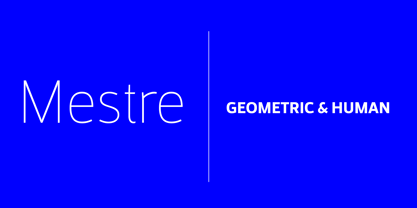 Mestre is a German & Dutch inspired geometric sans-serif designed. Its solid and formal shapes are embedded with a discreet humanist flair resulting in a very versatile contemporary hybrid and a highly functional and flexible font for many of today’s branding & UX requirements. With its rational forms and its large x-height, Mestre is perfect for long texts in small sizes allowing a comfortable reading. Its open forms, moderate & balanced proportions, neutral appearance and solid structure grant a high legibility on paper and on screens. With its extensive 8 weights and corresponding true italics, more than 900 glyphs per font, extended character set to support Central and Eastern European as well as Western European languages and a wide OpenType features set (small caps, case-sensitive forms, lining, tabular & old-style figures, scientific superior/inferior figures, fractions, a set of arrows, etcetera) it is meant to build visual hierarchies of any detail and complexity in editorial design or deliver the best performance for branding purposes. Mestre is a great choice for modern, contemporary and professional typography.
 - Argo Nova by Eliezer Grawe,
$-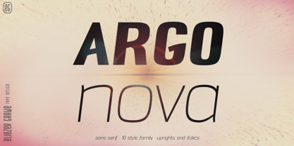 In Greek mythology, Argo was the ship on which Jason and the Argonauts sailed from Iolcos to Colchis to retrieve the Golden Fleece. The Argo Nova font is an adventure though geometric sans universe with a touch of humanistic feel, bringing a different look with curved vertical strokes and high contrast on thicker weights. Designed with OpenType features, it includes extended Latin support, fractions, tabular and old-style figures, ligatures and more. With no excess in mind, it came in 10 styles (5 uprights and is matching italics) and it is a font family ideal for text, branding, signage, editorial, print and web design creations. 5 weights: Thin, Light, Regular, Bold and Black Matching italics Lining and old-style figures with proportional and tabular spacing Ligatures on “f” Alternate characters for a, æ, g and ß Fractions Ordinals Extended language support, designed following the Underware Latin Plus character set, with 534 glyphs, supporting 219 Latin based languages (see https://underware.nl/latin_plus/languages/). * Some features require an application with OpenType support.
 - Bellwood Gothic by Breauhare,
$19.99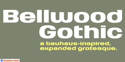 Bellwood Gothic™ is an unorthodox but happy pairing of upper and lowercases that breaks typographic rules: its capitals evoke traditional early 20th century styling and strength. Lowercase displays a softer, more warm and friendly flavor that points to a Bauhaus aesthetic. But for some strange reason they work so well together! Therein lies the mystique of this font. Overall it isn’t strictly uniform in stroke but shows some variation of color. The sofa poster includes a cameo appearance by breauhare’s own popular Daddy’s Hand™ font. Bellwood Gothic’s nostalgic flavor of the 1960s & 1970s still conveys a modern look that lends itself to sports, fashion, lifestyle and more. The wide track of the lettering helps short words easily fill spaces. Includes stylistic alternates for the lowercase a, e, & l (L), plus 13 uppercase letters! Among OpenType features are Stylistic Alternates, Stylistic Sets, Ligatures, Fractions, & Case-sensitive forms. Extended support for Western, Central, and Eastern European languages is included. Use it for headlines, subheads, branding, editorial, packaging, and logos!
 - Sports World - Unknown license

