10,000 search results
(0.018 seconds)
- Agio by Gaslight,
$15.00 Agio - a heavy contrast style font with cuts on the top of the some glyphs and spurs on top left corner of every glyphs. Also Agio has some decorative styles for glyphs and decorative elements.
 - Kis Antiqua Pro by RMU,
$45.00 These Typoart fonts were redesigned and revived for modern use. The italic style got an entire set of swash caps, and both styles contain superior and inferior numerals as well as the historical long s.
 - Liony by Tkachev,
$20.00 Liony is a pixel font with four font styles. Liony is an experiment to convert the script-style calligraphy into bitmap format. It looks great in display sizes and also works well when used smaller.
 - Speedster by Vozzy,
$10.00 Introducing a vintage label font named Speedster. This strong typeface is perfect for lettering on vintage style posters, t-shirts, greeting cards, logo etc. All available characters and styles you can see at the preview.
 - Tkachevica by Tkachev,
$15.00 Tkachevica is a decorative face with four font styles. Tkachevica is an experiment to convert the script-style calligraphy into bitmap format. It looks great in display sizes and also works well when used smaller.
 - Work In Progress by StereoType Fonts,
$39.00 Work In Progress is a smooth script font with a very specific style of connected curves. It brings a unique curly style with the possibility to create dynamic dancing words with it's ligatures and alternates.
 - Metrolite by Jonahfonts,
$39.00 A slab font in 6 styles.
 - Charbonne by TypeArt Foundry,
$45.00 Decorative type in style of 1930s.
 - Cortinado by Intellecta Design,
$22.90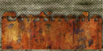 Cortinado is a mixed font style.
 - Dream Lover by TypeArt Foundry,
$45.00 Casual script styled after 1950s signage.
 - LHF Bell Boy by Letterhead Fonts,
$33.00 Authentic 30s style art deco typeface.
 - Steelyard by TypeArt Foundry,
$45.00 Inline styled after retro Luggage Label.
 - MindCrime AOE by Astigmatic,
$19.95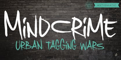 An offbeat graffiti tag-style font.
 - Mondrongo by Intellecta Design,
$22.90a grunge and comic style font - Eucaliptus by TypeArt Foundry,
$45.00Decorative type in style of 1930s. - Black Corps by Pixesia Studio,
$23.00 Introducing Black Corps - Military Serif Font Black Corps is a military serif font that comes in four distinct styles - solid, inline, outline, and stencil. This versatile font is perfect for use in a wide range of design projects, including branding, advertising, and packaging. Its military aesthetic makes it suitable for use in official documents and military communications, and its four different styles allow you to create a wide range of looks. The solid style of Black Corps is bold and straightforward, making it perfect for use in headlines and titles. The inline style adds a touch of elegance, while the outline style is light and airy. And the stencil style is perfect for creating a rough, rugged look. FEATURES - Uppercase and Lowercase letters - Numbering and Punctuations - Multilingual Support - Works on PC or Mac - Simple Installation - Support Adobe Illustrator, Adobe Photoshop, Adobe InDesign, also works on Microsoft Word Hope you Like it. Thanks.
 - Arkham Land by Artisticandunique,
$15.00 Arkham Land - Sans Serif Font Family - Multilingual - 12 Style Arkham Land Sans serif font family helps you create many alternatives in your creative projects with its 12 styles.With its elegant and strong structure, different weights, it is also assertive about being a highly readable font. It provides flexibility in the width of usage areas in your projects, from thin styles to Black styles. It is a timeless font family with is rich styles, multilingual supports and modern structure. You can use Thin styles in elegant and stylish projects, and Black styles in strong titles. This font comes with uppercase, lowercase, punctuation, symbols and numbers, ligatures and multilingual options. Great for books and magazines, editorials, headlines, websites, logos, branding, advertising and more. This font family can meet your needs in all creative projects, modern and classic. With this font you can create your unique designs. If you have a question, please contact me. Have a good time.
 - Chalky Letters by DimitriAna,
$22.00 Chalky Letters is a multilayered font collection, created for the chalk-lettering lovers. Letters and ornaments are carefully hand-drawn to resemble the authentic chalk effect. 4 different vintage typographic styles along with a variety of decorations and shadow effects make endless combinations. The collection gives the designer the freedom to use it in any typographic project he can imagine: greeting cards, labels, large scale prints, branding, packaging, signage, editorial design. Typographic styles: Chalky Letters Heading: All caps, old fashioned, serif, with 2 styles of decoration and shadow effects Chalky Letters Label: All caps, heavy, serif, vintage, solid and outline, with 4 styles of decoration and a shadow effect Chalky Letters Script: Simple modern calligraphic with terminal forms and 2 alternate styles of descenders. Combined with a shadow effect. Chalky Letters Note: All caps, simple, thin, old fashioned, with a shadow effect Chalky Letters Extras: 2 styles of ribbons, frames and ornaments. The font collection supports Central, Eastern, Western European, Baltic, Turkish and Greek languages.
 - Brightland by Pixesia Studio,
$23.00 Introducing Brightland - Condensed Sans Serif Font Brightland is a condensed sans serif font that comes in four distinct styles - solid, solid italic, line, and line italic. This versatile font is perfect for use in a wide range of design projects, including branding, advertising, and packaging. Its clean, modern aesthetic makes it suitable for use in a variety of settings, and its four different styles allow you to create a wide range of looks. The solid style of Brightland is straightforward and uncomplicated, making it perfect for use in headlines and titles. The solid italic style adds a touch of flair, while the line style is light and airy. And the line italic style is perfect for creating a more playful, imaginative look. FEATURES - All Caps - Numbering and Punctuations - Multilingual Support - Works on PC or Mac - Simple Installation - Support Adobe Illustrator, Adobe Photoshop, Adobe InDesign, also works on Microsoft Word Hope you Like it. Thanks.
 - 1543 Humane Petreius by GLC,
$42.00 The regular style of this family was inspired from the typeface used in Nuremberg, Germany, by Johannes Petreius in 1543 to print the famous “De Revolutionibus Orbium Coelestium,” the well-known mathematical and astronomical essay by Nicolaus Copernicus. Petreius was also using an original italic style, as he did for the “De Sculptura” by Gaurico Pomponio, in 1542. Unfortunately, nobody seems to know who was the punchcutter of this Jenson-style font. Also included is a title file, containing initials (without diacritics) and small caps (with diacritics). In our three styles (Regular & Italic + Titling), font faces, kerning and spacing are as closely as possible identical to the original. This Pro font is covering Western, Eastern and Central European, Baltic and Turkish languages, with standard and long-s ligatures in regular and italic styles. Both have twin-letter ligatures, but the italic style has extra (genuine) ligatures for f and t with vowels.
 - Haiku by AcidType,
$12.00 Haiku is a very modern old-style typeface. Inspired by late Renaissance-era typography, and carefully optimised for both display and text, digital and print. Featuring ligatures, old-style numerals, wide language support, and true italics.
 - Heywa by DawnCreative.Id,
$13.00 Heywa is a nature styled, handwritten font with a mixture of ornaments that adds classic and vintage styles to it. It is very well suited to be used for book titles, bands, movies, advertising, and more.
 - Caleuche by RodrigoTypo,
$25.00 Caleuche is a typeface family of 18 styles, from its standard version Light to UltraBold such as Rough and Inline, it is a display typeface that plays with the style of action, mythology, terror and suspense.
 - Normies by Gassstype,
$25.00 Introducing NORMIES It's Sans Display Typeface is a Textured Natural Style and Authentic Classy Style, this font is great for your creative projects such as watermark on photography, You can activate 9 Alternate glyphs OpenType panel.
 - Bakeryhouse by Fractal Font Factory,
$8.00 We present you a vintage type of layered font called "bakeryhouse". This font includes four styles (including effect styles). This font will be clearly visible on any retro design such as poster, packaging label, logo, etc.
 - Glaster by Sulthan Studio,
$14.00 Glaster is a beautiful calligraphy typeface with a distinctive style of its own. It is a bold and elegant script font. Fall in love with its incredibly versatile style and use it to create spectacular designs!
 - Queen Anne Hill by Great Lakes Lettering,
$40.00 Queen Anne Hill is an modern Calligraphy style font with upright strokes and bold flourishes. Revealing the styling of fine artist and calligrapher Alissa Mazzenga, this font communicates refinement with a hint of playful artistic individualism.
 - TOMO Dora Sans by TOMO Fonts,
$15.00 TOMO Dora is a new face designed by TOMO FONTS. Dora is a condensed style-driven sans serif typeface made by hand, adding unique and a sweet touch. A family of 4 styles + awesome icons! Enjoy!
 - Under Weak by Trustha,
$16.00 Under Weak is an amazing and bold script, suitable for a large number of designs. This font has two styles, clean and rough. With two styles, you can choose according to the project you're working on.
 - Hologram by Kazer Studio,
$4.00 Hologram is a font inspired by a combination of the future and the past. The intention was to design a font that was most effective when applied to Largely Displayed text like Headings, rather than for smaller extended bodies of text. There are 3 distinctive styles offered in the Hologram font family. Each style contains over 350+ Glyphs per style with support for up to 26 Languages as well as specialised kerning & spacing. Display Sans: This style is the cleanest of the 3 fonts. There are no serifs attached to the ends of the strokes, although the stroke weight is varied from thick to thin depending on the letters. Display Serif: This style contains modern serifs at the ends of most character strokes that give more structure to the shapes. A majority of the serifs are horizontal in direction with few characters containing vertical serif details. Display Wedge: The most Bold of all is the Wedge Serif style offered. Featuring thick and thin triangular serifs at the ends of character strokes. This style is most effective in Large Displays & Titling uses. Designed by KAZER STUDIO
 - PT Sans Pro by ParaType,
$50.00PT Sans Pro is a comprehensive type family intended for a wide range of applications. It consists of 32 styles: 6 weights (from light to black) with corresponding italics of normal proportions; 6 narrow styles; 6 condensed styles; 6 extra condensed styles and 2 caption styles (regular and bold). The design combines traditional conservative appearance with modern trends of humanistic sans serif and possess enhanced legibility especially in caption styles. These features, besides conventional use in business applications and printed materials, make the fonts usable for direction and guide signs, schemes, screens of information kiosks, and other objects of urban visual communications. The fonts have extended Latin and Cyrillic character sets serving alphabets of all title languages of the national republics of Russian Federation and supporting the most of the languages of neighboring countries. Each font contains about 1400 characters including small caps for all alphabetic characters, 4 sets of figures with lining and old style variations, stressed Cyrillic vowels, indices, fractions and so on. Design -- Alexandra Korolkova with assistance of Olga Umpeleva and supervision of Vladimir Yefimov. The fonts released by ParaType in 2010. - Densit by Adtypo,
$32.00 Densit is a display mega black typeface, containing 6 styles. It aims for a ultimate density with a maximum weight on a minimum place. Glyphs therefore balances on a slim border of touch. The typeface is designed for expressive and short texts at big sizes and is suitable for photography or other visual materials underlaying. The 3 basic styles parodies ordinary type styles. They only differents from each other lays in the lenght of straight thin lines. The stencil style without these lines is intended especially for spray stencils, the sans style is imitating linear sans types and the serif style having stronger contrast and indicated serifs. The typeface contains a large set of special ligatures for playing with aesthetic qualities of text and obtain maximum space saving. Densit contains 34 special forms for members and frequently used short words in various languages. Very short terminals offer compact setting of multi-lines captions. Densit can be used for music posters, eye-catching headlines of art articles and everything in which is possible graphic impression from legibility prefered. • 6 styles (2 alternatives, 3 kinds) • 12 OT features • 1313 glyphs • sophisticated system of ligatures • support of latin languages
 - Finalist Round Slab by Bülent Yüksel,
$19.00 The font was intended primarily to have a stronger body. It has a simple geometrical surface. This font has a strong personality, that makes it perfect for use in headline sizes but means it also works gracefully within text blocks. "Finalist Round Slab" is carefully crafted and a unique slab serif. Use for websites, print, motion graphics, logo design, packaging design, t-shirts and more. The designation “Finalist Round Slab Regular” forms the central point. The first figure of the number describes the stroke thickness: Thin to Black. "Finalist Round Slab" comes 7 weights and italics total 14 types. The family contains a set of 450+ characters. Case-Sensitive Forms, Classes and Features, Fractions, Superior, Inferior, Denominator, Numerator, Old Style Figures just one touch easy In all graphic programs. You can enjoy using it. UPDATES: - 30 December 2015 Opentype Feature (fractions) and some kerning. - 11 June 2018 Solving some UNICODE problems on the internet. - 12 March 2019 Some error has been fixed. - 19 November 2019 Some error has been fixed. - 16 August 2021 New Version - 2.0 Some error has been fixed.
 - Metrisch by Gumpita Rahayu,
$18.00 Metrisch is new sans serif typefamily of seven weights plus seven italics uprights in each weights. The typefaces designed based on traditional geometric construction that have been built with letter size wider, the x-heights taller and short descender that almost proportioned with the basic letter shape. With little details added like clean vertical cuts on the terminals and optimized sharp corners that makes this fonts smooth and refined looks. It was represents the flavor of the most common humanist typefaces style and grotesk feels. The weights comes from extra light to extra bold suitable to make display appearance, and the book and medium weights also works well as small/medium text sizes to accompany your design, such as editorial fashion magazine, solid headline, websites heading, poster, advertising, logo, signage, etc Also, Metrisch type-family fully loaded with OpenType features such as some stylistic alternates, case-sensitive forms, fractions, small capitals,and another most common numerals features such as super & subscript, tabular & oldstyle figures, numerator-denominator, and has more extended latin diacritics characters.
 - Peridot Latin by Foundry5,
$8.00 Peridot is not just another typeface – it's a multifaceted sans serif type system crafted with passion and precision by Foundry5. Painstakingly developed through long hours and a keen focus on every minute detail, this typeface boasts a high-quality 10 weight family with matching italics in 6 widths, and the highly versatile variable format. Brimming with character, Peridot invites you to experiment with its various stylistic variants, allowing you to tailor the typographic tone to fit your creative vision perfectly. The diverse range of widths and styles in Peridot offers a dynamic typographic toolbox, ready to inspire and captivate even the most innovative designers. Peridot Latin covers over 320 languages, including Vietnamese. It includes all required localised variants, tabular numerals and currencies, fractions, clever discretionary ligatures and many more features. Peridot performs in varied environments – from branding, display, corporate use, editorial, advertising, poster, web, screen usage etc. Think of any other use case as well, and Peridot will perform. Peridot comprises 120 static fonts, family packages, and variable support. It is the gem you ought to have in your collection.
 - Hatmaker by ITC,
$29.99Jean Evans' interest in type design dates back to her third-grade fascination with fancy script writing. Years later, work at a sign-painting school she found in the Yellow Pages® cemented her relationship with letterforms. Evans went on to study with master calligraphers and type designers, including the likes of Donald Jackson, Hermann Zapf and Matthew Carter. Evans' designs have been exhibited and collected around the globe, and her distinctive calligraphic style has been lauded by leading trade organizations, annuals and publications. Hatmaker, one of Evans' more popular typefaces, was originally developed for the Boston-based broadcast design firm of the same name. Inspiration for the design came from Ben Shahn's famous hand-constructed alphabet. Shahn's alphabet, however, was limited to capital letters. Daunted by the idea of designing a lowercase that would measure up to Shahn's capitals, I developed a second set of caps-simple, quirky, yet almost classic-to work as 'lowercase' with the Shahn-like caps," explains Evans. Mixing the two in Hatmaker, creates a lively interplay of light and dark." - Honey Beachy Sh by Sohel Studio,
$14.00 Honey Beachy is a retro display serif font that exudes a classic charm and bold character. With its design inspired by retro styles, this font brings an elegant touch and evokes a sense of the past. Each letter is meticulously crafted with careful attention to detail and proportion, resulting in a visually appealing and unique appearance. Honey Beachy is perfect for projects that require a vintage feel, such as posters, logos, packaging, and promotional materials that aim to capture a nostalgic and sophisticated atmosphere. This font will add a special touch to your designs and captivate viewers with its retro allure and distinctiveness. Honey Beachy Features: - Regular And Outline - Uppercase And Lowercase - Alternates And Ligature - Numerals & Punctuation - Accented characters - Multilingual Support - Unicode PUA Encoded While using this product, if you encounter any problem or spot something we may have missed, please don't hesitate to drop us a message. We'd love to hear your feedbacks in order to further fine-tune our products. Thanks and have a wonderful day .
 - Magpie by Elster Fonts,
$24.00 Magpie is a font family consisting of three sub-families with both regular and italic styles. Originally designed on squared paper, over time it has moved further and further away from this rigid grid, although its appearance is still based on it, so it can easily be used for logotypes or headlines with strict grid-based layouts. While Magpie Text is suitable for headlines and short texts, Magpie Display is ideal for logotypes or more playful headlines. Finally, Magpie Mix is a combination of both families. Magpie Text Regular represents stability, Magpie Display Italic is ideal for dynamic logos or headlines. To cover more languages, cyrillic and greek letters were added and Magpie can be used for nearly a hundred languages. In addition to the four common numeral variants, special numerals, punctuations and symbols for all-caps (c2sc) are included. Furthermore case-sensitive punctuations and symbols are available. To expand the typographic possibilities, four stylistic sets, different symbols, forms and standard- and discretionary ligatures have been added. Each Magpie-font contains more than 880 glyphs.
 - FF DIN by FontFont,
$104.99 Dutch type designer Albert-Jan Pool created this sans FontFont between 1995 and 2009. The family has 20 weights, ranging from Light to Black in normal and condensed styles (including italics). It is ideally suited for advertising and packaging, editorial and publishing, logo, branding and creative industries, poster and billboards, small text, wayfinding and signage as well as web and screen design. Looking for the new Thin and Extra Light weights? They are available through fontshop.com, linotype.com and fonts.com. FF DIN provides advanced typographical support with features such as case-sensitive forms, fractions, super- and subscript characters, and stylistic alternates. It comes with a complete range of figure set options – oldstyle and lining figures, each in tabular and proportional widths. As well as Latin-based languages, the typeface family also partly supports the Cyrillic and Greek writing systems. In 2011, FF DIN was added to the MoMA Architecture and Design Collection in New York. This FontFont is a member of the FF DIN super family, which also includes FF DIN Round.
 - Futura Headline EF Pro by Elsner+Flake,
$103.00 The design of Futura seems to be timeless. This typeface family which had been developed in 1926 by Paul Renner for the Bauer Type Foundry in the style of constructivism and as part of the Bauhaus movement, experienced, however, in the course of the past 90 years, repeated time-appropriate revivals which guaranteed its on-going popularity. The version of the Futura EF Pro contains the original character constructions which Dennis Megaw described as the “first designs of Futura” in 1938 in “20th century sans serif types, Typography no. 7” (See: Dr. Christopher Burke: Paul Renner, Princeton Architectural Press, New York 1998). What makes it exceptional is the extension into three weights: “Text”, “Headline” and “Index” which came about as part of a degree dissertation at the Hochschule für Bildende Künste (HFBK) in Hamburg. In this context, the accompanying documentation “Die Kritik der reinen Futura” (“The Critique of the Pure Futura”) by Katharina Strauer was published by the Materialverlag, Hamburg, in 2003. Some copies are still available at Elsner+Flake.