10,000 search results
(0.031 seconds)
- High Summer Cyrillic by Ira Dvilyuk,
$16.00 High Summer Cyrillic playful script font is a pretty hand-drawn monoline font that will look gorgeous on all your designs, wedding stationery, love stories, branding materials, monoline logos, pretty teenage stickers, business and wedding cards, calligraphy Insta quotes, elegant fashion sketches, calligraphy love monograms and much more. High Summer playful script font contains the Cyrillic glyphs too. High Summer playful script font contains a full set of uppercase and lowercase letters and can be used to create a handwritten calligraphy look. Multilingual Support for 31 languages: Latin glyphs for Afrikaans, Albanian, Basque, Bosnian, Catalan, Danish, Dutch, English, Estonian, Faroese, Filipino, Finnish, French, Galician, Indonesian, Irish, Italian, Malay, Norwegian Bokmål, Portuguese, Slovenian, Spanish, Swahili, Swedish, Turkish, Welsh, Zulu. And Cyrillic glyphs support Ukrainian, Belorussian, Bulgarian, and Russian languages. (Does font support more Cyrillic languages just type a message in the text box below and see if all characters you’ll need are there.) Works perfectly on the Canva platform. For Cricut & Silhouette recommended. Thanks!
 - Resort by Los Andes,
$39.00 This font collection includes a contemporary casual Script typeface and a sophisticated all caps Sans that features high contrast between thick and thin strokes. When used together, these fonts offer high versatility—perfect for magazines, blogs, mockups, use with social networking sites, logos and headlines as well as greeting cards, invitations, book covers, posters, and web and on-screen use. Resort is a font collection consisting of 12 styles and 3 variants: Script, Sans and Ornaments. The font set is intended to provide users with a wide range of choices for any design project. The collection comes with a relaxing Script of 5 weights and a classic 6-weight Sans, and includes lively floral ornaments. Resort evokes the feeling of relaxing barefoot walks along the beach while enjoying the sunset and a refreshing cocktail. Resort was designed by Guisela "Coto" Mendoza and Luciano Vergara. Digital editing by Rodrigo Fuenzalida. Photos courtesy of Sarah Loven—a popular beauty, travel and lifestyle blogger.
 - Adore by Canada Type,
$24.95 In 1939 the Stephenson Blake Company bought a very popular script called Undine Ronde and began marketing under the name Amanda Ronde. Although Undine/Amanda was quite popular and can be seen in many advertisements from the 1930s and 1940s, there seems to be no surviving record stating the original foundry or designer. We thought that six and half decades of dust layers over the once-popular typeface were enough, so here and now you have its complete and expanded digital incarnation, Adore. It is quite easy to see why this typeface was popular. A round script with graceful meaty curves is rarely found and can be used in plenty of applications. Wedding paraphernalia, chapter titles, posters, poetry, book covers, religious literature... you name it, Adore can fit it. Aside from its totality being unmatched by currently available designs, Adore also possesses some of the most unique and imaginative letter shapes. The narrow loops on the B, P and R, the minuscule-like Z, the looped b and d, the descending h... all these shapes contribute to a breathtaking and adorable calligraphic work unlike any other. The original design came in a basic alphabet, but we have updated it for current digital technologies, and expanded it to include plenty of alternates and ligatures, as well as some ornaments. The Postscript Type 1 and True Type versions come in two fonts, the second containing the alternates and extras, while the Open Type version is a single font containing all the alternates and extras in conveniently programmed features, easily accessible at the push of a button in OpenType-supporting software. We also encourage you to take a look at Typodermic's Mecheria font, which is further experimentation with the same letter forms, resulting in a quirky, friendly, curly, angular gothic-like creature.
 - Atocha by Sudtipos,
$49.00 It was expected that Joluvian’s third type font would be inspired by the city where he currently resides: Madrid, Spain. His previous creations had originated in Venezuela (Zulia) and The Philippines (Salamat), both, places where he had once lived. Joluvian believes “now is the time to pay tribute and show gratitude towards a city that has bestowed me with so many fortunes.” He considers that Madrid’s people, streets, scents, flavor and sounds are gift enough to awaken the creative urgency in any artist. This time around, it is being expressed through the crafts of the Typographic industry. Since his arrival in Spain, Joluvian has been attached to the city’s central area, specifically to the renowned Atocha Street and its railroad station. It was precisely on that street that Joluvian and Mauco Sosa, his friend and partner, decided to establish the Patera Studio: a charming creative space that birthed the concept for this new font which they proudly named Atocha Script. The artists where still in the final phases of their previous script, Salamat, when the idea for Atocha came about. This dynamic is actually very typical of the artistic process, in which every finished product spawns the need to create its next level offspring. “Working on Atocha and Atocha Caps has been a very pleasant journey. We have given our best efforts, for we wanted to offer a typeface that was both versatile and user-friendly on a number of applications, showing a wide scope of alternatives in our glyphs,” says the artist. The illustrations were created by Mauco, to ensure visual integration that would showcase the work of both members of the Patera Studio and their complementing aesthetic voices. Atocha, as Salamat and Zulia before, was digitized by Alejandro Paul.
 - Charpentier Renaissance Pro by Ingo,
$42.00 A very legible Renaissance Antiqua This typeface is based on the desire to create an Antiqua like those which might have existed at the beginning of the »printing age« — the basic form oriented on the classical Roman and early Middle Ages models, the ductus defined completely by writing with a wide pen and much individual expression in detail. In the spring of 2005 I had the opportunity to closely examine a few pages in the famous book »Hypnerotomachia Poliphili« from 1499. The script used here from Aldus Manutius is exemplary. Most of the book, however, is not very carefully printed. The characters do not stay on the line; the print is at times too strong and at times much too weak. And on these imperfect pages the true character of the letters is recognizable; that is, that they are cut with lively detail which is a result of the patterns provided by full-time writers. After all, around 1499 script was written as a rule and the printed type was oriented on this pattern. I prefer the typeface on the lightly printed pages. The characters are not placed neatly on the line, but the distinct and emerging lively ductus of the individual characters automatically presents harmonious word formations in the eye of the beholder, with the non-perfect line stepping into the background. Also in Charpentier Renaissance, the strokes of the wide pen are still noticeable. The font has very defined softly bent serifs. The forms are powerful and stand solidly on the baseline. Charpentier Renaissance is very legible and yields a solid and yet still lively line formation. The accompanying italic, like its historical models, has almost no inclination. The lower case characters of Charpentier Renaissance Oblique have such idiosyncratic figures that they can also form a font of their own. Please visit www.ingofonts.com
 - Barrista by Typodermic,
$11.95 Welcome to our cozy coffee shop! Come on in, take a seat and savor the aroma of freshly brewed coffee. Speaking of coffee, have you seen our new font? Meet Barrista! Its relaxed, curly script perfectly captures the whirling curls of steam rising from a hot cup of Joe. Barrista is not just any font. Thanks to OpenType ligatures, certain letter combinations will automatically be substituted with customer pairings. This creates a natural, relaxed look that’s perfect for our laid-back atmosphere. Imagine jotting down your order in Barrista, watching as our talented baristas create your perfect cup of coffee. As you wait for your order, you can admire the intricate details of Barrista’s flowing script, which is inspired by the art of coffee-making itself. So, come on down to our coffee shop and experience Barrista for yourself. Most Latin-based European writing systems are supported, including the following languages. Afaan Oromo, Afar, Afrikaans, Albanian, Alsatian, Aromanian, Aymara, Bashkir (Latin), Basque, Belarusian (Latin), Bemba, Bikol, Bosnian, Breton, Cape Verdean, Creole, Catalan, Cebuano, Chamorro, Chavacano, Chichewa, Crimean Tatar (Latin), Croatian, Czech, Danish, Dawan, Dholuo, Dutch, English, Estonian, Faroese, Fijian, Filipino, Finnish, French, Frisian, Friulian, Gagauz (Latin), Galician, Ganda, Genoese, German, Greenlandic, Guadeloupean Creole, Haitian Creole, Hawaiian, Hiligaynon, Hungarian, Icelandic, Ilocano, Indonesian, Irish, Italian, Jamaican, Kaqchikel, Karakalpak (Latin), Kashubian, Kikongo, Kinyarwanda, Kirundi, Kurdish (Latin), Latvian, Lithuanian, Lombard, Low Saxon, Luxembourgish, Maasai, Makhuwa, Malay, Maltese, Māori, Moldovan, Montenegrin, Ndebele, Neapolitan, Norwegian, Novial, Occitan, Ossetian (Latin), Papiamento, Piedmontese, Polish, Portuguese, Quechua, Rarotongan, Romanian, Romansh, Sami, Sango, Saramaccan, Sardinian, Scottish Gaelic, Serbian (Latin), Shona, Sicilian, Silesian, Slovak, Slovenian, Somali, Sorbian, Sotho, Spanish, Swahili, Swazi, Swedish, Tagalog, Tahitian, Tetum, Tongan, Tshiluba, Tsonga, Tswana, Tumbuka, Turkish, Turkmen (Latin), Tuvaluan, Uzbek (Latin), Venetian, Vepsian, Võro, Walloon, Waray-Waray, Wayuu, Welsh, Wolof, Xhosa, Yapese, Zapotec Zulu and Zuni.
 - Rhythm by Positype,
$42.00 I hate the idea of revivals. I have publicly said I choose not to do revivals because they make me uncomfortable. This is as close as I have been to crossing my own line. To be direct, Rhythm is based on the ATF typeface, Ratio (I just recently learned the foundry of origin). I came across this typeface from a printed specimen years ago when I was in school and held onto it. It was unique and I loved how well integrated the inline worked within both the flourish and serif of the glyphs—it was old, but not, reminiscent, but fresh. My specimen was limited in the glyph offering (it was c. 1930ish) and I realized a lot would need to be done to ‘finish’ it and bring it to contemporary expectations. I didn't want to do ‘retro’ and tried to avoid the visual trappings associated with it. What I did want to do is interpret what I had in the specimen and reinterpret it digitally, refining its construction and extending its typographic equity along the way. The ‘One’ and ‘Two’ (and their matching ‘Solids’) styles diverge providing various elaborations that coordinate well between rigid bracketed serifs and compact tails. I further expanded the glyph offering to include a full diacritic set, old style numerals, fractions, stylistic alternates, swashes, titling alternates and controlled flourishes that adhere to the efficient framework of the script. And yes, I refer to it as a ‘script’ because calling it a ‘cutesy serif’ seems wrong :) I hope this is seen less as a slavish revival and more as a championing of a really unique typeface. The Original Typeface was Adastra, designed by Herbert Thannhaeuser for the Foundry D. Stempel AG in Frankfurt, Germany.
 - Eksja by Protimient,
$29.00 Eksja is a modern slab serif available in four weights, each with a corresponding italic. All the fonts in the family have small caps, the extended latin character set, diacritical f-ligatures, enclosed numerals (numbers in circles) and case-sensitive punctuation. The general design of the typeface has been with a strong human touch in mind. The ends of the serifs have been given a subtle rounding, just enough to take the edge off which, when coupled with the largely humanist structure of the design, creates an open, friendly and approachable design, abandoning the usual geometric severity commonly associated with slab serif typefaces. Eksja contains quite a comprehensive numerals system. Obviously, each font has the standard proportionally and tabularly spaced lining and old-style figures but, crucially, the tabular numerals share the exact same width in each font variant. That means that you can choose to use the thin, regular, bold, black and their italic forms all in the same setting and they will always line up. In addition to the 'normal' numerals there are super-script and sub-script numerals and OpenType fractions that can be automatically composed as you type. There are also the enclosed numerals, numbers inside a circle, that are useful for numerically listing items and, thanks to the wizardry of OpenType, they can contain any number of digits (typically, enclosed numerals are precomposed single digits, only encompassing the 0–9 range, the enclosed numerals in Eksja can go to double digits, triple digits or, in fact, any number of digits*). *The automation of the enclosed numerals is accessed via either "Stylistic Set #1" or "Stylistic Alternates" which requires the use of an application that supports OpenType stylistic sets or stylistic alternates, such as Adobe's InDesign or Photoshop.
 - The Kells SD font, designed by Steve Deffeyes, is a unique and intriguing typeface that finds its inspiration in the historical and ornate scripts of the past. Drawing from the rich heritage of the B...
- the american flag - Unknown license

- TrajanusBricks - Unknown license

- Nuovo Deco by Ben Burford Fonts,
$20.00 Following from the continued popularity of the original MB Deco, here is Nuovo Deco, its new and improved big brother. Nuovo Deco comes in three weights, Light, Regular and Bold. A full character set of Caps and lower case letters, alternate characters, plus some very nice Ligatures to give some added art deco style and a much wider scope.
 - Arbuckle Remix NF by Nick's Fonts,
$10.00This cuddly face is based very loosely on Dave Farey's Beesknees. This version is a little more regimented but no less fun, and is notable for the addition of a lower case, not found in Farey's design. This font contains the complete Latin language character set (Unicode 1252) plus support for Central European (Unicode 1250) languages as well. - Short Message by Arendxstudio,
$14.00 Short Message is a 3 font combination that is suitable for all your design projects that aim to convey your message to your loved ones, with the font packages offered will definitely satisfy you Short Message came with opentype features such stylist ligatures good for logotype, poster, badge, book cover, tshirt design, packaging and any more.
 - Emploi by ParaType,
$30.00 The type family includes two decorative designs that combine features of an italic typefaces and calligraphy. The elegant swashes and curls in upper case letters make the fonts rich and showy. Emploi Ingenue has rather developed decorative elements, and Emploi Travesti is more modest. Both fonts are intended for titles, display typography, especially advertising and for initials.
 - Okomito Next by Hanken Design Co.,
$30.00 Okomito Next is a sans serif inspired by the classic typefaces that were imbued with a sense of functionality, boldness and industrial strength. OpenType features: Access All Alternates, Case-Sensitive Forms, Glyph Composition / Decomposition, Discretionary Ligatures, Fractions, Kerning, Standard Ligatures, Localized Forms, Mark Positioning, Mark to Mark Positioning, Ordinals, Proportional Figures, Stylistic Alternates, Stylistic Set 1, Superscript, Tabular Figures
 - FF Fudoni by FontFont,
$41.99 Dutch type designer Max Kisman created this display FontFont in 1991. The family contains 3 weights and is ideally suited for festive occasions, film and tv, music and nightlife as well as poster and billboards. FF Fudoni provides advanced typographical support with features such as ligatures and case-sensitive forms. It comes with proportional lining figures.
 - Atipla ND by Nicolas Deslé,
$20.00 Atipla ND is a contemporary sans serif typeface. It works best at large sizes, with softened ink traps pair legibility with aesthetic, while its strict horizontal and vertical terminals give it a rigid yet friendly appearance. The typeface contains a stylistic set, case sensitive forms, symbols and arrows, and the font covers all Latin Extended-A languages.
 - FF Dome by FontFont,
$41.99 British type designer Neville Brody created this display FontFont in 1993. The family contains 3 weights and is ideally suited for advertising and packaging, film and tv, poster and billboards, software and gaming as well as sports. FF Dome provides advanced typographical support with features such as ligatures and case-sensitive forms. It comes with proportional lining figures.
 - Rock Face by Studio K,
$45.00 Rock Face was inspired by a crude but effective home made sign I came across advertising a garage sale. The lettering was created using sticky black insulation tape which, like a child's drawing, had a certain naive charm. The type design presented here is obviously more considered, but I like to think it has the same raw dynamism.
 - Loathing by Arendxstudio,
$13.00 Loathing is a bold Display Font with its distinctive character that can be easily implemented in your various design projects . Loathing came with opentype features such stylistic alternates, stylistic sets & ligatures good for logotype, poster, badge, book cover, tshirt design, packaging and any more. Features : • Character Set A-Z • Numerals & Punctuations (OpenType Standard) • Accents (Multilingual characters) • Ligature • Alternate
 - Creepy Forest by DawnCreative.Id,
$10.00 Creepy Forest is a hand-written font with a spooky style. It comes with a large range of characters including uppercase, lower-case, numerals, punctuation, currency and accents. It will be a great choice for any display project, Halloween card, t-shirt, pillow, crafting, and much more! Thank you for your purchase! We hope you enjoy our font!
 - Queen Emirates by Zeenesia Studio,
$16.00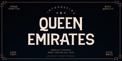 Queen Emirates is a vintage serif font crafted very carefully, Queen Emirates is perfect use for a logo for branding, typography design, badge design, product packaging, invitation, quotes, t-shirt design, label poster, special events and anything that need vintage taste. It came with number & punctuation, stylistic alternate, multilingual support, and PUA encode. Hope you like this product.
 - WIP Macho Man by WIP Fonts,
$49.00WIP Macho Man depicts the handwriting of man with a strong need for independence combined with spontaneity and high potential. The (lower case) characters are joined as it is usual in German speaking countries. Originally designed in 1995 the font has been extended by a lot of new characters such as accented characters, punctuation, symbols and currency symbols. - ITC Deelirious by ITC,
$29.99ITC Deelirious is the first typeface of Dee Densmore-D'Amico and its name comes from the astounding number of D's packed into her name. The design came from her own handwriting. The differences between capital and lowercase letters are sometimes arbitrary, but this characteristic and the many alternate letterforms give ITC Deelirious the spontaneity and naturalness of true handwriting. - Farm Bluster by Zeenesia Studio,
$14.00 Farm Bluster is a sweet and friendly handwritten font. Its natural and unique style makes it incredibly fitting to a large pool of designs. perfect for large design project like Tshirt, Advertising, bags, quotes, food , poster, fashion, custom sticker, magazine, and many others. It completed with numbers and punctuation. Multilingual support, and came with PUA encoded.
 - Cats by Celebrity Fontz,
$24.99 Cats is a whimsical font made up of two different sets of cat alphabets in upper and lower cases. Happy cats are pictured in a variety of poses forming the letters they represent. If you love cats, you will not want to miss having the Cats font in your collection. Includes full set of accented characters.
 - FF Irregular by FontFont,
$41.99 Austrian type designer Markus Hanzer created this display FontFont in 1994. The family has 6 weights, ranging from Light to Black (including italics) and is ideally suited for editorial and publishing and poster and billboards. FF Irregular provides advanced typographical support with features such as ligatures and case-sensitive forms. It comes with proportional lining figures.
 - Plakat by Scriptorium,
$18.00Plakat is based on lettering by 1920s advertising calligrapher Samuel Welo. It is a complete upper and lower case set with a number of alternate characters, all with a rough, decorative look accented by curls and hooks. If you like the look of our popular Scurlock font, Plakat has a similar aesthetic, though it is even bolder. - Fashion by ITC,
$29.99Fashion Compressed and Engraved are the works of British designer Alan Meeks. Fashion Compressed is an elegant modern roman typeface suitable for a variety of advertising styles. The capitals can be used as initials or combined with the lower case letters. Fashion Engraved was produced when Meeks reworked Fashion Compressed, resulting in a beautiful, engraved typeface. - Amike by Letradora,
$15.00 Amike is a natural handwritten font, simulating a very neat, clean handwriting. It works well both as mixed case and all caps. It includes alternates for most characters, that can be used for a random mix using the Contextual Alternates Opentype feature to create a natural written look. It supports a wide character set, including most European languages & Vietnamese.
 - Cirque De La Lune by Dawnland,
$9.00 Once a year Through mist and rain October soon to end Have no fear Beneath the full moon we gather. Welcome to the show! Now - Silence... Cirque de la Lune is an uppercase only poster/display/headline font in two variants - Eclipse (regular) & Fullmoon (outline). Alternate, nudged or slightly rotated uppercase letters are placed on the lower case keys!
 - Mymra by TipografiaRamis,
$35.00 Mymra fonts – an upgraded version of Mymra Forte and Mymra Mono (2009), with a careful re-dress of glyph shapes, and the extension of glyph amounts – which enables support of more Latin languages. One more weight – Black – has been added to the original three of Mymra Forte fonts. Fonts are intended for use in a vast variety of publications.
 - Veggie Spray by PizzaDude.dk,
$16.00 I bet a lot of people would love to have a Veggie Spray - I bet they would use it to turn candy, ice cream, cakes and other fattening products into something more healthy! Well, this font has zero calories and is 100% handmade, and comes with contextual alternates - which means that every letter has 5 different versions!
 - Blue Fires by Ana's Fonts,
$14.00 Blue Fires is a quick and easy handwritten font, with lots of ligatures and a bonus set of swashes, circles, arrows and ornaments. It is a versatile font that looks great in both short bursts and longer texts, in lower case and all caps. Use Blue Fires in logos, quotes and social media posts, branding and packaging, and merchandise.
 - CA Coronado by Cape Arcona Type Foundry,
$19.00 CA Coronado is a nice display font for use in titles, logos and headlines. With its used look it creates a friendly and human feeling. Upper- and lower-case characters differ in details and can be mixed to get a vivid look. For the best authentic look, the ‘Regular’ can be used as filling and complements the Shadow-style.
 - Kampen by Talbot Type,
$19.50 Kampen is a minimal, modular, monospaced font. There are two variants, each available in two styles. The two variants — Block and Pixel — differ considerably in look, however the characters in both are designed using the same 7 x 7 square grid for capital letters, with extra squares above and below for accented characters and lower case descenders.
 - Emporia OT by Bean & Morris,
$42.00 Emporia OT Roman and Italic, a classic, elegant font with upper and lower case, swash alternatives lining and old style figures, ligatures and small caps. Includes more than 500 glyphs supporting more than 80 latin-based languages. Suitable for both display and text settings it will enhance and preserve Roman history with sheer elegance, grace and style.
 - Export Drive by Studio K,
$45.00 Export Drive is a bold condensed stencil font of the kind traditionally used to mark tea chests, packing cases and other goods in transit. Nowadays of course its applications are universal, although it is particularly well suited to branding or publishing projects which strive for a sense of freshness, urgency and immediacy, or a rugged, rough-and-ready feel.
 - Cat Fight by Tour De Force,
$25.00 Cat Fight is small decorative font family containing two "weights". They are not weights in actual meaning, as they differ by style but to secure safe OTF usage in all OS, they are named as Regular and Bold. Cat Fight is ideal for lively and cheerful usages on posters, packages, labels, website titles, book covers and other similar situations.

