10,000 search results
(0.062 seconds)
- Zarlino by Patricia Lillie,
$29.00 Zarlino is an original typeface in the Blackletter style. It does not solidly adhere to any of the historical Blackletter classifications, but draws from all of them, with some characters owing more to the Roman than the Fraktur. Zarlino Delux includes three complete sets of upper case, ranging from the simple to the embellished to the even more embellished, two complete sets of lower case, and two more sets of embellished alternates for selected lower case characters. These alternates are available through Stylisitic Sets in OpenType aware applications. For use in non-OpenType aware applications, Zarlino Delux comes with a set of separate, standard fonts, one for each style. These standard fonts are also available for individual purchase. Zarlino was named by my cousin, a musician. Gioseffo Zarlino was a sixteenth century composer and musical theorist. Among other things, he offered detailed advice on the setting of words to music. With its blends of the old and the new, the simple and the ornate, Zarlino is suitable for many uses, from the elegant to the aggressive.
 - Publica Sans Round by FaceType,
$22.00 Publica Sans Rounded is the rounded version of Publica Sans. A clean geometric typeface, equipped with a variety of OpenType features to give you all you need for great typography: Alternates, arrows, rare currency symbols, case sensitive forms, various sets of figures and discretionary ligatures. Publica Sans Rounded has two other sisters: Publica Play and Publica Slab Take a close look at our gallery (especially ‘OpenType Features 1–6’) to discover the versatility of Publica Sans. Alternates Give your typography a certain spin with the variety of alternate letters provided. Currency You need to set prices in exotic countries? No problem: Publica Sans gives you loads of rare currency symbols. Case Sensitive Forms Sometimes you write in all caps and there are some symbols (e.g. brackets) that need some extra treatment to make it look perfect – that’s what case sensitive forms are for. Figures Publica Sans provides 6 sets of figures, like lining, tabular, oldstyle, numerators ... Discretionary Ligatures Ligatures can make your logo or headline look spicy. So there are plenty of them.
 - Brokve by MKGD,
$13.00 Brokve is a Croatian word used along the Dalmatian coast. It means “nails", as in the; hammer and nails, variety. It’s tall thin strokes and jutting points give it a very spike-like appearance; suitable for any uses that are intense, jarring or just plain edgy. There is no lower case for Brokve as it is a display font. The upper case serves as both the upper and lower case letters. Brokve has a glyph count of 392 and supports the following languages; Afrikaans, Albanian, Asu, Basque, Bemba, Bena, Bosnian, Catalan, Chiga, Colognian, Cornish, Croatian, Czech, Danish, Embu, English, Esperanto, Estonian, Faroese, Filipino, Finnish, French, Friulian, Galician, German, Gusii, Hungarian, Icelandic, Indonesian, Irish, Italian, Kabuverdianu, Kalaallisut, Kalenjin, Kamba, Kikuyu, Kinyarwanda, Latvian, Lithuanian, Low German, Lower Sorbian, Luo, Luxembourgish, Luyia, Machame, Makhuwa-Meetto, Makonde, Malagasy, Malay, Maltese, Manx, Meru, Morisyen, North Ndebele, Norwegian Bokmål, Norwegian Nynorsk, Nyankole, Oromo, Polish, Portuguese, Romanian, Romansh, Rombo, Rundi, Rwa, Samburu, Sango, Sangu, Scottish Gaelic, Sena, Shambala, Shona, Slovak, Slovenian, Soga, Somali, Spanish, Swahili, Swedish, Swiss German, Taita, Teso, Turkmen, Upper Sorbian, Vunjo, Walser, and Zulu.
 - Mosler by Carmel Type Co.,
$19.00 Inspired by the interior of a now defunct Mosler Safe Company bank vault door located inside of what is now an Irish Pub in Stroudsburg, Pennsylvania, Mosler is a typeface that is impenetrability incarnate. This all uppercase, slab-serif brawny beauty comes in four weights - Safe, Strongbox, Vault, and Fortress, and each one is more powerful than the last. Each weight has 450 glyphs included, making for a whopping 1800 glyphs for the full family, complete with small capitals, total support for nearly 80 different languages, decorative word glyphs, and a handful of select alternates. Ranging from the low contrast of the "Safe" weight to the extreme contrast of the "Fortress" weight, Mosler is effective in a wide array of applications but serves best as a titling, headlining, or display face that need to make a mammoth statement. Features Include: 4 Weights Uppercase Only with Small Capitals Numerals, Punctuation & Symbols 450 Characters per Style Stylistic Alternates and Word Glyphs Supports 75+ Latin Languages OTF files Designed and Developed by Jason Carne
 - Alio Text by R9 Type+Design,
$35.00 Alio™ Text is the workhorse of the Alio family . It works beautifully as display type, body copy and anything in between. We redesigned Alio Text with taller x-height, more pronounced accents, and wider letter spacing than its siblings, Alio Pro. We also cut down from 6 weights/12 styles to 4 weights/8 styles. All of these is to ensure the legibility and readability and to maximize the weight contrast at small sizes. Whether your designs call for all caps, title case, sentence case or all lowercase, Alio Text has got you covered with the case-sensitive punctuations. No more baseline shift all your punctuations. Alio Text supports most Latin-based languages and even the Chinese Pin-Yin. This typeface also packs with Open-Type features similar to Alio Pro. For examples, both recognize fractions vs. dates; Both features several alternate positions for the legal symbols (3 in Alio Text; 5 in Alio Pro). If you’re looking for a go-to, versatile typeface for most occasions, Alio Text is for you. (4 weights/8 font styles, 500+ glyphs each).
 - Oman by Par Défaut,
$35.00 With five weights and four contrasts, all grouped in three version : sans-serif, slab, serif and all this doubled by a true italic, Oman regroup 120 different styles declined in four variables. Perfect from headlines to text, Oman will meet your needs with a many languages to support (Latin pro, Cyrillic), 14 OpenType features (Fraction, Numerator, Denominator, Tabular figure, Oldstyle figure, Small capital, Small capital from capital, Ordinal, Stylistic set, Case sensitive, Discretionary ligature, Contextual alternate and All access alternate). • Numerator and Denominator includes numerals and currency • Tabular Figure includes : numerals, currency, OldStyle numerals, small capital numerals, small capital currency. • Small Capital features includes the Latin & Cyrillic alphabet with the accents. • Ordinal feature includes the Latin & Cyrillic alphabet. • Two Stylistic set for “a” & “g” includes accents. • Discretionary Ligature includes “AE”, “AÉ”, “IJ”,“OE”, available in lowercase, small capital and ordinal. • Contextual Alternate includes ligatures for arrows : <-->^|v|<->v^|. Add n, d or +, for numerator, denominator or case arrows. All Case sensitive characters become after the uppercase and number.
 - Vintage Price Tags JNL by Jeff Levine,
$29.00 Vintage Price Tags JNL comprises three sets of numbers in both ribbon, circle and star patterns which, when combined will produce point-of-sale price elements. The designs were re-drawn from examples found in an old wood type catalog, and are now collected in digital format. Ribbon-style numbers are found on the upper case keys. A through J have the large numbers, K through T are the smaller, underlined numbers. The remaining upper case keys contain the dollar sign, cents sign and the phrases "each", "for", "dozen" and "pair". On the lower case, the circle set of combination numbers are on the following keystrokes: The keys a through j are the left side semi-circle numbers and the "k" key is a blank left side semi-circle. The l through u keys are the right side semicircle numbers and the "v" keystroke is a blank right side semi-circle. The star set is on the standard numbers keys for the left side of the star, with the right side characters on the corresponding shift keystrokes for the number keys. In following the original design examples, a cents sign follows the numbers on the right side of the circle or star sets. The lower case w through z contain a left side star blank, a left side star with $1, a right side star blank and a right side star with small double zeros (to comprise a star shaped price tag for $1.00).
 - Caltic by Ingrimayne Type,
$12.95 Caltic-Holiday, Caltic-Festival, and Caltic-Straight are three eye-catching, very bold typefaces that are suitable for posters and signage. Caltic-Holiday and Caltic-Festival base letter shapes on trapezoids with curved sides but with curves that are reversed going from one to the other. Caltic-Straight has letters based on trapezoids with straight sides. None are suited for text and with their built-in spacing will not work as all upper-case or all lower-case. All three come in two widths, regular and wide, giving the Caltic family six members. Caltic has nothing to do with Celts. The Calt refers to the calt or contextual alternative OpenType feature that makes this typeface work. When the letters on the upper-case keys alternate with the letters on the lower-case keys, they fit snuggly together. As long as the user has a word processor that supports the contextual alternatives feature, there is no need for the user to alternate letters; the calt feature does it automatically. Although the fonts seem similar to hand-drawn lettering that was done on posters and signs during the hippie era of the 1960s and 1970s, I can find nothing quite like them. My inspiration for them is older, in a newspaper from 1932 that led to the typeface family PoultySign. Caltic (and Lentzers) are the result of seeing what else I could do with the inspiration that sprang from that 1932 newspaper.
 - Lagarto by Sudtipos,
$39.00 Some years ago, a good friend and typophile, Gonzalo García Barcha, approached me with the idea of designing a typeface for his editorial project Blacamán Ediciones. He had just came across an hitherto unknown manuscript by Luis Lagarto, a colonial illuminator and scribe, working in Mexico City and Puebla in the late 1500s. The manuscript calligraphy was incredible and stunningly original. It featured three different hands by the scribe, intermingled in the text: a kind of baroque «Roman» roundhand; a very ornate, lively «Italic»; and some sort of irregular, playful, even funny «small caps». All imbued with an eccentric, convoluted zest and vivacious rhythm. Lagarto is the final result of translating these extraordinary hands into a digital type family. Since the manuscript had no numerals, math signs and many other characters now in use, part of the fun of the job was to infer them from the stylistic peculiarities of Luis Lagarto's calligraphy. Lagarto received an Award of Excellence at the Type Directors Club of New York annual competition.
 - Sendica by RahagitaType,
$14.00 Sendica delivers a playful and charming script experience. It’s the ideal font for adding a dash of elegance to your next design project.
 - Ongunkan Greek Ionien by Runic World Tamgacı,
$45.00 It is the Ionian version of the ancient Greek script. Ancient Greek numerals are included. It's not Unicode, it's a Latin based font.
 - Blinked by Epiclinez,
$18.00 Blinked is a stylish handwritten script font. It is suitable for your crafting projects, but also for logos, quotes and so much more.
 - Valuxe by Gholib Tammami,
$14.00 Valuxe — modern and minimalist sans serif. This font pairs well with a basic font like Arial and any script with an elegant style.
 - Shadowy by Kavoon,
$15.00 Shadowy Script is modern calligraphy font. It is perfect for branding, cards, gorgeous logos, posters, wedding invitations, blog posts, social media, and more!
 - Concinnitas by Corien’s Handwritingfonts,
$24.00 Concinnitas (Latin for 'neatness') is a very neat print handwriting script. It's a light weight very easy to read, yet elegant handwritten font.
 - Reindeer by Letterara,
$12.00 Reindeer is a bold script font with many features, make great your Christmas and winter designs. Get inspired by the deer antler style!
 - Bea by Autographis,
$39.50 Bea is my Racetrack-Script. I call it that, because it gives the impression of speed. No lingering around with this font. Zaaanggggg!!!
 - Mondaine by StereoType Fonts,
$39.00 Mondaine is a clean script font with a touch of lettering style. Have fun with a ton of special endings and contextual ligatures!
 - Ultimate Victory by Epiclinez,
$18.00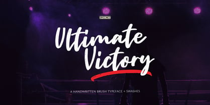 Ultimate Victory is an authentic handwritten brush typeface. This textured script font is suitable for posters, magazines, apparels, movie headlines, packaging and more.
 - Brownies by DawnCreative.Id,
$9.99 Brownies script will be a good thing for your design and matches well for uses ranging from wedding invitation, bakeries, and much more.
 - Ivy Ivy by Daylight Fonts,
$150.00 This is a groundbreaking font that combines Caslon Italic and script. You can achieve an advanced typography that is elegant, delicate and powerful.
 - Something Beautiful by IRF Lab Studio,
$11.00 Galista is a modern and casual script font. It has beautiful swashes and it’s perfect for logos, wedding invitations, branding and much more.
 - Cabriolet V8 by JVB Fonts,
$35.50 Cabriolet V8 is a vertical version of the Cabriolet family, a geometric script fontface re-interpretation inspired by old chromed emblems of 1950s.
 - Gathenbury by Viswell,
$14.00 Gathenbury is a playful and fancy script font with a serious vibe. Use it to add an authentic charm to any design project!
 - Xesy by Dharma Type,
$19.99 Odd and funny script for happy, fun time. There are two other fonts designed by in the same concept. -Ekistra -Deluta Black -Xesy
 - Laudiea by Nissa Nana,
$19.00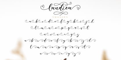 Laudiea is a beautiful script font with a classy, elegant, and modern look. It will add a handwritten touch to any design project!
 - joeHand 1 by JOEBOB graphics,
$- JoeHand was one of the first scripts by JOEBOB graphics. A complete character set with numbers and most (but not all) special signs.
 - Sunfort by Maulana Creative,
$14.00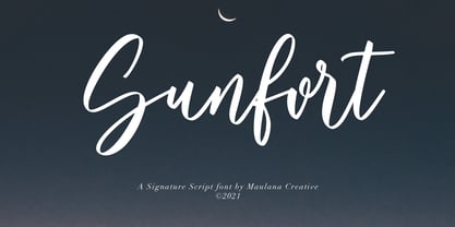 Give your designs an authentic handcrafted feel. Sunfort Signature Script Font is perfectly suited to stationery, logos and much more. Many Thanks! MaulanaCreative
 - Buttersoy by Maulana Creative,
$15.00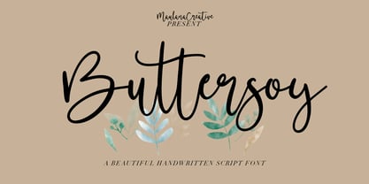 Give your designs an authentic handcrafted feel. Buttersoy Beautiful Handwritten Script Font is perfectly suited to stationery, logos and much more. Maulana Creative
 - Schoko by Hubert Jocham Type,
$29.90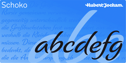 Schoko is a brush script headline typeface. It is elegant and still clear and self-confident. Ideal for food packaging and product branding.
 - Butter Bold by Jackson's Lettering,
$19.95 Use your imagination. Butter Bold Brush Script is a fun universal font that will work with almost anything you want it to do!
 - Thefrost by Maulana Creative,
$11.00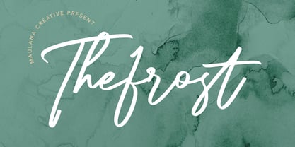 Give your designs an authentic handcrafted feel. Thefrost Modern Script Font is perfectly suited to stationery, logos and much more. Many Thanks! MaulanaCreative
 - Ongunkan Greek Athen by Runic World Tamgacı,
$45.00 It is the athenian version of the ancient Greek script. Ancient Greek numerals are included. It's not Unicode, it's a Latin based font.
 - Julio by Authentic,
$39.50 Julio is designed in the best tradition of English scripts. It comes in very handy if you want to have an elegant touch.
 - Vacation Monogram by Selvia Design,
$15.00 “Vacation Monogram” is a script font combined with a monogram. This monogram is decorated with forms of tourism and traveling around the world.
 - Jess by Epiclinez,
$18.00 Jess is an authentic stylish script font. This handwritten beauty is suitable for high-end, sophisticated branding or for simple, memorable Instagram quotes.
 - Gradl Initialen ML by HiH,
$12.00 Max Joseph Gradl designed Art Nouveau jewelry in Germany. At least some of his designs were produced by Theodor Fahrner of Pforzheim, Germany -- one of the leading manufacturers of fine art jewelry on the Continent from 1855 to 1979. I don't know if he designed for Fahrner exclusively, but every example I found was produced by that firm. I assume it was also the same M.J, who edited a book, Authentic Art Nouveau Stained Glass which was reissued by Dover and is still available. For an artist as accomplished as Gradl was, he is very tough to research. There just does not seem to have been much written about him. The jeweler is visible in most of his typeface designs. They exhibit a sculptural quality as if they were modeled in clay (or gold) rather than drawn on paper. His monograms, especially, reflect that quality. Those shown in plates 112 through 116 in Petzendorfer actually appear to have been designed specifically for fabricating in the form of gold or silver pendents. Of the initial letters that came out of Germany during this period, these by Gradl seem unusually open and lyrical. They seem to be dancing on the page, rather than sitting. Please note that Gradl designed only the decorated initials. All other characters supplied were extrapolated by HiH, including the accented initials. Orn.1 (unicode E004) is based on a jeweled gold clasp designed by Gradl (please check out Gallery Image on Myfonts.com). Also included are an art nouveau girl’s face, a swan and the face from Munch’s “Scream”, from scans of old printer’s ornaments. Gradl Initialen M represents a major extension of the original release, with the following changes: 1. Added glyphs for the 1250 Central Europe, the 1252 Turkish and the 1257 Baltic Code Pages. Added glyphs to complete standard 1252 Western Europe Code Page. Special glyphs relocated and assigned Unicode codepoints, some in Private Use area. Total of 341 glyphs. Both upper & lower case provided with appropriate accents. 2. 558 Kerning Pairs. 3. Added OpenType GSUB layout features: salt, dlig, ornm and kern. 4. Revised vertical metrics for improved cross-platform line spacing. 5. Refined various glyph outlines. 6. Alternative characters: 16 upper case letters (with gaps in surrounding decorations for accents above letter). 8. Four Ornaments: face1, face2, swan and orn1 (silhouette of Gradl clasp) The zip package includes two versions of the font at no extra charge. There is an OTF version which is in Open PS (Post Script Type 1) format and a TTF version which is in Open TT (True Type)format. Use whichever works best for your applications.
 - Brassens by Typorium,
$53.00 Le Typorium présente une nouvelle famille de caractères calligraphiques basés sur une écriture étudiée à travers les manuscrits et autographes de Georges Brassens, poète et musicien (1921-1981). Son tracé, rigoureux et appliqué, souvent minutieux, est à l’image d’une œuvre unique et singulière, immédiatement reconnaissable. Le script Brassens offre des fonctionnalités OpenType telles que des caractères alternatifs pour les majuscules et les minuscules afin de renforcer la fluidité d’une écriture manuelle, des chiffres alternatifs, des fractions et un jeu de caractères accentués étendu pour prendre en charge de nombreuses langues étrangères. Trois graisses ont été créées afin d’offrir une large palette de possibilités graphiques. 60 images d’un poète qui a cassé sa pipe à l’âge de 60 ans., classées en trois séries de vignettes (pictogrammes, symboles, portraits), elles illustrent l’univers imagé et la richesse symbolique de la poésie de Georges Brassens où les représentations mythologiques et allégoriques y tiennent une part importante. Georges Brassens est un poète, auteur-compositeur-interprète né à Sète le 22 octobre 1921, mort à Saint-Gély-du-Fesc le 29 octobre 1981 et enterré au cimetière Le Py de Sète. Auteur de plus de deux cents chansons populaires, il met en musique et interprète ses poèmes en s’accompagnant à la guitare. Outre ses propres textes, il met également en musique des poèmes de François Villon, Victor Hugo, Paul Verlaine, Paul Fort, Antoine Pol, ou encore Louis Aragon. Il reçoit le Grand Prix de Poésie de l’Académie Française e 1967. Un grand nombre d’écoles, salles de spectacle, voies, parcs et jardins portent également son nom, dont à Paris le parc Georges-Brassens, tout proche de l’impasse Florimont où il vécut ses premières années parisiennes, de sa maison de la rue Santos-Dumont et du café Les Sportifs Réunis – Chez Walczak – rue Brancion qui lui inspira « Le Bistrot ». À Sète, l’Espace Georges Brassens ainsi que de nombreux festivals et associations redonnent vie au poète et à son œuvre. The Typorium presents a new calligraphic typeface family based on a writing studied through the manuscripts and autographs of Georges Brassens, poet and musician (1921-1981). Its layout, rigorous and applied, often meticulous, is in the image of a unique and singular work, immediately recognizable. Brassens script offers OpenType features such as alternate characters for upper and lower case to enhance the fluency of handwriting, alternate numbers, fractions and an extended accented character set to support many foreign languages. Three weights have been created to offer a wide range of graphic possibilities. 60 images of a poet who broke his pipe (French expression for passing away) at the age of 60, classified into three series of vignettes (pictograms, symbols, portraits), they illustrate the imagery world and the symbolic richness of Georges Brassens poetry where mythological and allegorical representations hold an important part. Georges Brassens is a poet, singer-songwriter born in Sète on October 22, 1921, died in Saint-Gély-du-Fesc on October 29, 1981 and buried in Le Py cemetery of Sète. Author of more than two hundred popular songs, he sets to music and performs his poems, accompanying himself on the guitar. In addition to his own texts, he also sets to music poems by François Villon, Victor Hugo, Paul Verlaine, Paul Fort, Antoine Pol, or Louis Aragon. He received the Grand Prix of Poetry from the Académie Française in 1967. A large number of schools, theaters, streets, parks and gardens also bear his name, including in Paris the Georges-Brassens park, very close to the impasse Florimont where he lived his first years in Paris, his house in the rue Santos-Dumont and the café Les Sportifs Réunis - Chez Walczak - rue Brancion which inspired "Le Bistrot". In Sète, the Espace Georges Brassens as well as numerous festivals and associations bring the poet and his work back to life.
 - Drowsy Lunch by PizzaDude.dk,
$15.00 The inspiration for this font (as well as the name!) comes from a London cafe I visited years ago. I was fascinated with the handwritten menu - irregular and awkward, yet refreshingly charming. I did my best to recall that particular look by adding 4 slightly different versions of each lowercase letter. The name of the font comes from the speed of the waiter...or the lack of it! But luckily he took his time, otherwise I wouldn't have had the time to really look at the handwritten menu! :)
 - Qweny Check by Ergibi Studio,
$18.00 Qweny Check is a font liquid shaped, with a classic modern feel mouthwatering delights. This liquid font, which was meticulously crafted, is the ideal option for your vintage products. The many ligature in this font add a unique style making this typeface stand out from the usual display fonts, perfect for headlines, logos, posters, packaging, T-shirts, coffee shops, restaurants, magazine headers, signs or gift/post cards, cafe and wedding or any kind of advertising purposes. If there is a problem, question, or anything about my fonts, don't hesitate to ask! Big Thanks ~ Ergibi Studio