8,282 search results
(0.019 seconds)
- Smooth Brushings by Hanoded,
$20.00 When I was painting this font, I suddenly had the movie Cool Runnings (1993, directed by Jon Turteltaub) in my head. I had to name the font, so I came up with Smooth Brushings. Of course, this font has nothing to do with the movie. Smooth Brushings is an all caps brush font, which was made with a stiff brush and some China Ink. Upper and lower case glyphs can be mixed. It is a very legible and clear font, ideally suited for posters, product packaging and book covers.
 - Monkton by Club Type,
$36.99 The inspiration for this typeface family came from my childhood experiences at West Monkton, amidst an historic part of the South West of England. Studies of the original incised capitals of the Trajan column in Rome were analysed and polished for this modern version. The lower case letterforms and numerals were then created in sympathy, taking their proportions from the incised letters of local gravestones. Its name honours not only the area where the original alphabet was conceived and drawn, but also the people responsible for fostering my initial interest in letters.
 - ITC Ludwig by ITC,
$29.99ITC Ludwig has an edge. It's nervous, tense - maybe even a little scary. Drawn by Italian designer Giuseppe Errico, ITC Ludwig refuses to be confined to a traditional baseline. Its twisted lowercase g" and an "e" that could double as an upside-down "a" both add to the design's spooky personality. As a young man, Errico studied to be a fine artist. He became a graphic designer only after a “long reflection period,” he says. His early training is evident in many of ITC Ludwig's suggestive qualities. There is far more to this face than cranking up the “distort” knob in Fontographer. Reflection and personal expression are at its core." - The Cheelaved by Almarkha Type,
$35.00 Introducing our latest display typeface called The Cheelaved - Display Vintage Serif with 19 Ligatures and 8 Alternate Glyphs can make your logotype become more interesting. Best Vintage font with special alternative glyphs, and multilingual support. inspired by the decorative arts and architecture movement The Cheelaved fonts is perfect for your project and allows you to create designs, headlines, posters, logos, badges, t-shirts and many more that are beautiful. It is also best used for posts, logos, posters, certificates, labels and more.
 - Scholz Secession by HiH,
$8.00 We named this font Scholz Secession. Fin-de-siecle Vienna, Austria is the source of this Jugendstil design from Schriftgiesserei Eduard Scholz. The original release was under the name Reklameschrift Secession. Most of the curve strokes look like commas to me. The letters are as soft and plump as the comforter on the bed I slept on in a Salzburg B&B many years ago. I was traveling with a college buddy and our next stop was Vienna. There a kind, young student named Hanna and her boyfriend took us under their wing. One of the places Hanna proudly showed us was Otto Wagner’s Majolika Haus, built in 1898, and only about 8 blocks from Secession Hall. Hanna explained to us that the style was called Jugendstil and represented Art Nouveau as interpreted within the framework of their culture. I even took a picture. After all, memories are part of who we are. Figures are old-style for text use. This font would not be my first choice for a spread sheet. Included are German ligatures ch (alt-0123) & ck (125), two period ornaments (135, 175) and lower case o and u with Hungarian long umlaut (215, 247)). A very likeable and easy-to-use font.
 - Augsburger by HiH,
$12.00 The Augsburger Family is a product of the Art Nouveau period in Germany and Austria, reflecting the darker, heavier Jugendstil approach typical of the Secession movement in these two countries. Originally released by H. Berthold AG of Berlin and Bauer & Co. of Stuttgart in 1902, Augsburger has been attributed to the designer Peter Schnorr. This current version represents a year-long revision of the Augsburger Family. All three fonts have been updated to eliminate duel encoding, harmonize metrics, and review all glyphs. In addition, the following features have been included in the individual fonts: Augsburger Schrift: a total of 249 glyphs have been added, for a total of 467 and an increase of 114%. New are Tabular Numbers, Small Caps, a variety of Ligatures and the refinement of all accents. Augsburger Initials: complete redesign of upper case, inclusion of upper case from Schrift instead of lower case, plus inclusion of small caps and a selection of appropriate ligature. Augsburger Ornamente: includes some additional glyphs. Augsburger may be purchased as a complete family or as individual fonts. Each font package includes both TTF and OTF versions to allow you to select what is most useful to you.
 - 1509 Leyden by GLC,
$49.00 This script font was inspired by the type used in Leyden by Jan Seversz to print Breviores elegantioresque epistolae [...], author Francesco Filfelo, circa 1509. The original font contains all lower case characters, except w, eth, thorn, lslash, oslash and so... and almost upper case. In addition, one set of small lombardic initials were also nearly complete. It take place instead of the Bold style (in only one package)offering a real and rare complete historical printing set... The original small "a" hight was 2,8 mm !, the upper case hight no more than nearly 5 mm, the initials hight almost 15 mm, covering nearly two lines. This font includes "long s", naturally, as typically medieval and also a few ligatures, but not any variants. We have entirely recreated some characters, upper, lower and initials, to fill gaps. It is used as variously as web-site titles, posters and fliers design, publishing texts looking like ancient ones, or greeting cards, all various sorts of presentations, menus, certificates, as a very decorative, elegant and unusual font, besides its historical scrupulous reality... This font supports enlargement as well as small size.
 - Ariana Pro by Mostardesign,
$25.00 Ariana Pro is a geometric font family. It provides advanced typographical support with features such as case sensitive forms, small caps, ligatures, alternate characters, fractions, circled gures, pro kerning…This typeface comes with a complete range of ligature set options. It comes in 9 weights with corresponding italics and it’s suited for multiple purposes including editorial use, web font, apps, digital ads and also for advertising, long text and branding. As a modern sans serif font family, Ariana Pro has also an extended character set to support Central and Eastern European as well as Western European languages.
 - Brochette by Hanoded,
$15.00 A ‘Brochette’ in French is a skewer. I used to be a tour guide and some years ago, I guided a couple of tours in Mali. Every night at dinner we had the choice of a ‘Brochette de Capitaine’ (grilled Nile perch on a skewer) or a ‘Brochette de Bœuf’ (grilled beef on a skewer). Of course, every night the Brochette came with French fries and ‘petits pois’ (peas). It was really nice, but after 4 months of eating Brochettes, I longed for something different! Brochette is a very nice rounded font. It comes with curls, swirls and swashes.
 - Mato Sans by Picador,
$29.00 Legible and dynamic shape, tons of OpenType options, different scripts – that’s Mato Sans. Difficult small size, long text in Vietnamese, huge heading in Russian or table full of figures to create? It’s not a problem with this family. There are over 2000 glyphs in every weight with such features: superscript and subscript characters, tabular lining and old style figures, small caps, fractions, arrows or even case sensitive parenthesis. Mato Sans was designed for use in Latin as well as in Cyrillic script. Every font contains an extended set of Cyrillic characters including special, local glyphs for Bulgarian, Macedonian and Serbian.
 - Glitter Girl by Comicraft,
$19.00 Glitter Girl is a naive but romantic and flirty face with fragments of tinsel in its hair. Here's a font with a fresh attitude dressed in frilly flowing flower child fabrics sparkling with sequins. If you're looking for a light feminine aesthetic to grace your chic fashionista blog or livejournal, give it a little Glitter Girl Gossip, a safe text with long legs that will treat your thoughts with a twinkle and a touch of magic. These chic, cozy, clean, warm and fuzzy fonts are BFF -- Best Fonts for Facebook statements you want to share with your social network!
 - Chippewa Falls by Chank,
$49.00 In the spirit of the old days, before water sparkled and before typefaces were known as fonts, Chank is proud to introduce Chippewa Falls the font. This font comes with fancy swirly uppercase letters and stout small caps for lowercase, as well as a heart-warming story. Chank rescued this former custom font from an abandoned design proposal. He gave it some TLC and before long a retro typeface emerged, with lettering worthy of good old fashioned sleigh rides and candy canes. Enjoy this font as you would a cup of hot cocoa next to a potbelly stove on a snowy day.
 - Coats by Piñata,
$9.90 We've created a lively antiqua that is perfect for short emotional inscriptions. Coats will warm you up on a cold day and add a little kindness and easiness into any layout. Lines typed with this typeface start “trembling” in long texts, so be careful to use this family for special occasions and in small amounts. Imagine: on a cold day, you've just arrived home from a frosty walk to be rewarded with a cup of hot cocoa topped with marshmallows. We call this feeling the Coats effect. Add to your collection this unique font family that works perfectly in the contemporary digital age.
 - Habano ST by Sudtipos,
$39.00 Habano is an eleganty flowing bold script with some very surprising traits. Taking its roots in both the art deco style and the kind of lettering used for pop culture, its minuscules are classy yet obedient, and its majuscules and figures are playfully round and memorable. This contrast in character between cases makes for an appealing display face that can turn simple words into images that are hard to forget. Once again, the unique lettering talent of Angel Koziupa makes itself evident through an alphabet that leaves the memory of its soft touch for long after it is initially perceived.
 - TT Trailers by TypeType,
$39.00 Meet the new TT Trailers! The first version of TT Trailers was conceived as a font suitable for the film industry. The font harmoniously looks in posters, it is ideally suited for setting titles. However, the font has gained wide popularity among designers, and now you can find TT Trailers on the covers of magazines, on restaurant signs and on the main pages of websites. TT Trailers useful links: Specimen | Graphic presentation | Customization options Since 2019 when we released the first version, the TypeType studio team has released dozens of fonts, constantly improving our skills. In 2022, we decided to look at TT Trailers again, improving and expanding the font. In the new TT Trailers, we expanded the character set, corrected the contours, and improved the technical content. We have added extended Latin and Cyrillic characters, new symbols, and additional sets of numbers. The number of glyphs in one style has increased from 1081 to 1242. The inclined styles were long-awaited. The italics in TT Trailers are as eccentric as the upright fonts. The 15-degree tilt looks absolutely harmonious, complementing the character of the font family. We added italics to the variable font, so the new font changes along two axes at once, weight and slant. From the technical point of view, TT Trailers has become more modern and correct, and the number of OpenType features has increased from 29 to 42. We have added new alternative versions of glyphs and created a large number of localized features. The font retained all the qualities thanks to which designers fell in love with it, but became even more convenient. TT Trailers in the new version is suitable for titles and posters, for websites and printed materials. The font will embellish in restaurant and cafe signs and look beautiful in posters. There are 19 styles in TT Trailers: 9 upright, 9 italic and 1 variable font.
 - Desert Sands JNL by Jeff Levine,
$29.00 The February 19, 1923 issue of The Film Daily contained an ad for Mack Sennett's new Ben Turpin comedy entitled "The Shriek of Araby". No doubt this was a spoof of the popular Rudolph Valentino film "The Sheik". The ad tries to emulate Mideastern or Arabic typography via a standard Western alphabet. It somewhat captures the flavor, but its free-form hand lettering comes off as more of a novelty-type style. This is now available digitally as Desert Sands JNL in both regular and oblique versions.
 - Silent Drama JNL by Jeff Levine,
$29.00 An ad in the April 19, 1919 edition of Motion Picture News for the (now lost) silent drama "Josselyn's Wife" featured some wonderfully stylized Art Nouveau hand lettering. Primarily a condensed character set with rounded serifs, there are a number of letters that take liberties in both width and character shape. Adding to this, [mostly vertical] parallel lines are cut through the characters to create a "striped' type of "double engraved' effect. Silent Drama JNL is available in both regular and oblique versions. **Uppercase
 - Fracture by Scholtz Fonts,
$21.00 Fracture is a broken font -- broken into many pieces -- yet it still conveys a powerful and modern message. It is a funky, in-your-face font that has strong overtones of modern rap and hip-hop culture. Its fragmented look brings to mind graffiti, contemporary youth culture, kids-on-the-move. Fracture is a must for movie posters, event posters, CD & DVD covers, clothing ads & swing tags, funky magazines, in fact, any product aimed at the young, trendy market. The font is letterspaced and kerned and has a complete character set (all upper and lower case, numerals and mathematical symbols and a complete set of accented and special characters).
 - Ongunkan Younger Futhark One by Runic World Tamgacı,
$40.00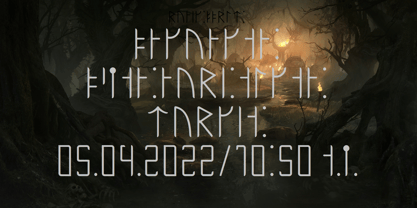 A variant of the young futhark runic script.
 - Giambattista by Wiescher Design,
$39.50 Giambattista is a long-time project of mine finally come to an end. After redesigning all of Giambattista Bodoni's work and then some additional cuts I started a long time ago with this Non-Bodoni Bodoni. The idea came to me while redesigning the original Chancellerosa (chancery). I thought Bodoni just didn't have the right approach to a chancery, this was just not his cup of tea! Maybe that is why he never used the Chancellerosa very much for his own printshop in Parma. So I thought someone has to design a script, that looks like Bodoni could have designed it but is more lively than his. Over the years I have been working on and off on the face and it turned out to become three typefaces which can be freely mixed. Here is my modern version of a script in the style of Giambattista, meant as an hommage, I called it Giambattista. Your modern scribe Gert Wiescher
 - Cross Stitch Cursive by Gerald Gallo,
$20.00 Cross Stitch Cursive is based on upper case characters 16 stitches tall and contains the upper case characters A-Z, lower case characters a-z, small numbers 0-9, ampersand, exclamation and question marks, comma, and period.
 - Twigglee by Ingrimayne Type,
$9.95 Twigglee was inspired by the hand lettering on the plates in a 19th century book on ornaments by Owen Jones. It has no lower-case letters; the upper-case letters are simply repeated on the lower-case keys.
 - Cross Stitch Simple by Gerald Gallo,
$20.00 Cross Stitch Simple is based on upper case characters 8 stitches tall and contains upper case characters A-Z, lower case characters a-z, numbers 0-9, ampersand, exclamation and question marks, comma, period, colon, and semi-colon.
 - European Soft Pro Variable by Bülent Yüksel,
$99.00 EUROPEAN SOFT PRO VARIABLE ABOUT FAMILY: What makes "European Soft Pro Variable" elegant, friendly and contemporary is its very rounded curves with very open terminals. "European Soft Pro Variable" has been designed with a higher "x-height" than other fonts in its class to make tiny readability more obvious in any use situation. It will be ideal for use in small sizes such as business cards or mobile applications. This typeface is also equipped with powerful OpenType features to satisfy the most demanding professionals. It has solid features like case sensitivity, small, true capitals, full ligatures, tabular figures for tables, old style figures to elegantly insert numbers into your sentences and more alternative characters to give personality to your projects. The extended, "European Soft Pro Variable" supports around 85 languages in the Latin, Cyrillic and Greek scripts, and its non-Latin components were developed with native consultants. With over 1200+ glyphs per style, "European Soft Pro" cares about localised letterforms and has the OpenType features to match. FEATURE SUMMARY: - 9 weights: Thin, ExtraLight, Light, Book, Regular, Medium, Bold, ExtraBold, and Black. - 4 widths: Normal, Narrow, Condensed, and Extra Condensed. - Matching italics (12º) for all weights and widths . - Matching small caps for all weights and widths. - Lining and old style figures (proportional and tabular). - Alternate characters (A, G, M, N, R, U, a, g, l, m, n, u, y). - Unlimited fractions. - Automatic ordinals (1st, 2nd, 3rd, etc.). - 24 Dingbats + 19 Social Media and Block Chain icons. - Extended language support: Most Latin-based scripts (including Vietnamese), Cyrillic, and Greek. - Extended currency support. You can contact me at buyuksel@hotmail.com, pre-purchase and post-purchase with questions and for technical support. You can enjoy using it.
 - European Sans Pro Variable by Bülent Yüksel,
$99.00 EUROPEAN SANS PRO VARIABLE ABOUT FAMILY: What makes "European Sans Pro Variable" elegant, friendly and contemporary is its very rounded curves with very open terminals. "European Sans Pro Variable" has been designed with a higher "x-height" than other fonts in its class to make tiny readability more obvious in any use situation. It will be ideal for use in small sizes such as business cards or mobile applications. This typeface is also equipped with powerful OpenType features to satisfy the most demanding professionals. It has solid features like case sensitivity, small, true capitals, full ligatures, tabular figures for tables, old style figures to elegantly insert numbers into your sentences and more alternative characters to give personality to your projects. The extended, "European Sans Pro Variable" supports around 85 languages in the Latin, Cyrillic and Greek scripts, and its non-Latin components were developed with native consultants. With over 1200+ glyphs per style, "European Sans Pro" cares about localised letterforms and has the OpenType features to match. FEATURE SUMMARY: - 9 weights: Thin, ExtraLight, Light, Book, Regular, Medium, Bold, ExtraBold, and Black. - 4 widths: Normal, Narrow, Condensed, and Extra Condensed. - Matching italics (12º) for all weights and widths . - Matching small caps for all weights and widths. - Lining and old style figures (proportional and tabular). - Alternate characters (A, G, M, N, R, U, a, g, l, m, n, u, y). - Unlimeted fractions. - Automatic ordinals (1st, 2nd, 3rd, etc.). - 24 Dingbats + 19 Social Media and Block Chain icons. - Extended language support: Most Latin-based scripts (including Vietnamese), Cyrillic, and Greek. - Extended currency support. You can contact me at buyuksel@hotmail.com, pre-purchase and post-purchase with questions and for technical support. You can enjoy using it.
 - Caltic by Ingrimayne Type,
$12.95 Caltic-Holiday, Caltic-Festival, and Caltic-Straight are three eye-catching, very bold typefaces that are suitable for posters and signage. Caltic-Holiday and Caltic-Festival base letter shapes on trapezoids with curved sides but with curves that are reversed going from one to the other. Caltic-Straight has letters based on trapezoids with straight sides. None are suited for text and with their built-in spacing will not work as all upper-case or all lower-case. All three come in two widths, regular and wide, giving the Caltic family six members. Caltic has nothing to do with Celts. The Calt refers to the calt or contextual alternative OpenType feature that makes this typeface work. When the letters on the upper-case keys alternate with the letters on the lower-case keys, they fit snuggly together. As long as the user has a word processor that supports the contextual alternatives feature, there is no need for the user to alternate letters; the calt feature does it automatically. Although the fonts seem similar to hand-drawn lettering that was done on posters and signs during the hippie era of the 1960s and 1970s, I can find nothing quite like them. My inspiration for them is older, in a newspaper from 1932 that led to the typeface family PoultySign. Caltic (and Lentzers) are the result of seeing what else I could do with the inspiration that sprang from that 1932 newspaper.
 - Cross Stitch Basic by Gerald Gallo,
$20.00 Cross Stitch Basic is based on upper case characters 7 stitches tall and contains the upper case characters A-Z, lower case characters a-z, numbers 0-9, ampersand, exclamation and question marks, comma, period, colon, and semi-colon.
 - Bowling by Ingrimayne Type,
$14.95 Bowling has letters on bowling pins. On the upper-case keys, the bowling pins are white with black letters and on the lower-case keys the pins are black with white letters. The lower-case letters can be colored and placed behind the upper-case letters to give two-color lettering. (The letters on the pins are from the typeface InsideLetters.)
 - Holland Gothic by URW Type Foundry,
$39.99 Blackletter fonts are timelessly beautiful and still very popular. At some point, it seems that every type designer discovers the beauty of these forms and the great pleasure in creating blackletter characters. Like also Dutch designer Coen Hofmann who, after designing Caxtonian Gothic, has designed yet another Blackletter font: Holland Gothic. Holland Gothic reminds of the 18th century »Duytsch« typefaces of Joan Michael Fleischmann and Christoffel Van Dyck. But Hofmann was mainly inspired by the Dutch calligraphers from the 17th and 18th century. Holland Gothic develops its full charm and beauty at larger sizes because of the hairlines in the upper case characters. To enable users composing texts in the style of our ancestors, Coen Hofmann added a series of pre-composed ligatures, also in combination with the long s, plus an alternate form for the lower case r which was used in combination with letters b, d, g, o, p, v, and w.
 - Spiraltwists by Aah Yes,
$0.75Spiraltwists is a family of 2 fonts giving assorted spiral shapes. In each font they're grouped in fours - the same basic spiral in 4 different orientations (N S E W almost), and Spiraltwists has solid lines making up the spirals, Spiraltwists Antique has dotted lines making up the spirals, giving them an antique or rustic appearance. Spiraltwists has heavier spirals on Upper Case, lighter spirals on lower case; plus a group of spirals with a straightened outer end and connecting lines so you get two spiral scrolls joined together by a long line at the top or bottom. (inputting UVWXYZ into the text-box on this webpage will show it). The big example on the webpage shows it all more clearly than any explanation. A fuller description, plus the above example, are included in the zipfile. Please note: for the avoidance of doubt, the font does not contain any letters, the text in these 2 examples is not Spiraltwists but Luzaine. - Eezyl by Partu Haodis,
$25.00 A title font that looks better as larger the font size. First of all, it is designed for use in the upper-case format. Feature style: futurism, space, modernism, glyph variety (uniqueness (minimum automatic generation)). A kind of „s‟ in the lower-case format sets the tone and emphasizes the character, formed in the Prime Numbers Nebula — they determined its appearance, and influenced the style as a whole. Particular attention is paid to the kern: the kern table is formed manually, taking into account absolutely all the glyphs included in the font-family. Two types of stress (grave, acute) for all letter glyphs. The font contains basic Latin and several additional tables, as well as three types of quotation marks, a non-breaking space and a hyphen, a short, medium, and long dash. For a set of mathematical expressions there are centrifugal signs: equal, minus (not a hyphen or minus-hyphen), plus, multiplication (X-shaped and dot), plus-minus, division. The font was made for 3 years.
 - Overnight Oats by Hanoded,
$11.00 I recently walked part of the South West Coast Path in the UK. A couple of days in the hike, I came across a small cafe and I decided to have an oat latte (I am lactose intolerant). Since it was early in the morning, the breakfast menu was out and one of the items I noticed was ‘Overnight Oats’. I normally cook my oats with some lactose free milk and water, but apparently you can soak them overnight, add fruit and nuts and eat it like that. I tried it, it’s ok, but I think I prefer the cooked version. Overnight Oats is a bit of an odd font: it is very higgledy piggledy, yet legible and unique. If you want something out of the ordinary, then this may be your font!
 - Satellite by Dingbatcave,
$15.00Cool doodads from the cold war...spaceships, moderne coffee pots, boomerangs, cocktail glasses, etc. A must for decorating your cyber-bachelor pad; a requirement for the retro lounge crowd. Don't be a square, daddio, get Satellite today! - Icklips - Unknown license

- Bouncer by Ingrimayne Type,
$6.95 The letters in Bouncer are round because they all begin as a ball and then have parts of the ball cut away. Bouncer was one of the earliest typefaces from Ingrimayne Type. Lower-case letters are smaller versions of the upper-case letters. BouncerTwo, designed twenty years after the original Bouncer, continues playing with the idea of making letters by cutting out parts of a circle, but in this case the circles are interlocking. All letters are upper-case but some of those on the lower-case keys differ from those on the upper-case keys. BouncerTwo is eye-catching but not highly legible.
 - Nixin by Kinobrand,
$33.00 A nixie tube is a technology from the 50’s used to display numerals that are composed by metal filaments that light up much like a lamp bulb. Due to their beauty these little numerals (0-9) are a love case for any designer, and formally it’s where the inspiration for the Nixin typeface came from. All the other typeface characters and weights are an interpretation from the original 10 numerals, always keeping the same minimalistic spirit and formal elegance. Nixin is a geometric and regular typeface, with a vintage touch and a bit of modernism.
 - Fully Automatic by Hanoded,
$15.00 I raise chickens for eggs and meat. I usually buy fertilised eggs online and place them in my incubator, which says that it is 'fully automatic'. Of course I added that rather random introduction to tell you how I came up with the name for this new font... Fully Automatic is a handmade cartoon font: I used a sharpie pen to draw the glyphs onto rough paper. The result is a wobbly, yet quite clean cartoon font. Fully automatic comes with extensive language support and two sets of alternates for the lower case glyphs that cycle as you type.
 - Pistol Twelve JNL by Jeff Levine,
$29.00Pistol Twelve JNL is a novelty version of Jeff Levine's Twelve Oaks JNL wood type font, with the addition of random bullet holes in the upper case characters. The font design was suggested by fellow type designer Ray Larabie. Pistol Twelve JNL is a two-fold pun. Initially, this conveys the obvious fact that the design is a variation of Twelve Oaks JNL with bullet holes... but the name is also a play on an old, old joke. One person asks the other: "Would you care to join the Pistol Club? You drink 'til twelve and..." Well, you get the picture! - Jonathan Andrea by Ergibi Studio,
$20.00 JONATHAN ANDREA A font combination, Modern signature and elegant Sans, we made this font with care and detail touchwhich makes the perfect font combination that you can apply for your design that needs an elegant touch, classy looks, and minimalist. perfectly for headlines, wedding, social media, logos, posters, packaging, T-shirts,coffee shops, restaurants, magazine’s headers, signs or gift/post cards,cafe’s and weddings or any type of advertising purpose. What's Included : Standard glyphs Ligatures International Accent Works on PC & Mac Simple installations If there is a problem, question, or anything about my fonts, don't hesitate to ask! Big Thanks ~ Ergibi Studio
 - CA Segundo by Cape Arcona Type Foundry,
$29.00 The inspiration for this font came from a wall-writing in Cuba. At first glance we thought: "There is something wrong with the wall-writing." But a closer look revealed, that it just mixed up different stroke-styles. That "feature" became the designing principle behind CA Segundo: Round characters like O, U or C are available either with a fat or a thin stroke, whereas other characters with orthogonal lines come in two different styles – uppercase characters emphasize the vertical strokes, while lower cases emphasize the horizontal strokes. This gives you the opportunity to design just while you type.
