9,276 search results
(0.059 seconds)
- Fansi Pensle by Ingrimayne Type,
$5.00 FansiPensle is a set of four decorative scripts. The capitals are fussy and ostentatious and a little weird with strange flourishes. The lower-case letters are neat and simple. Lower-case letters have the shapes of a cursive alphabet and they are connected in the cursive and cursive-bold styles but not in the plain and bold styles.
 - Body Art by Celebrity Fontz,
$24.99Body Art is a unique font whose upper-case and lower-case characters are formed by combining the silhouettes of two to four men and women of different figures and sizes to form the letters of the alphabet. Each of these carefully orchestrated combinations of human silhouettes is its own unique example of inspired typographic body art. - Carinthia by Scriptorium,
$18.00Carinthia is derived from the style of Roman calligraphy known as Rustica, but with some features of Roman uncial added to form a complete upper and lower case character set, including variant upper case characters with decorative spurs. The result is a rather vertical, but quite stylish font which has an antique calligraphic look and good readability. - Reading by Atlantic Fonts,
$26.00 Reading is fun; legible with a playful wiggle, a bit of texture, and a lively set of double-letter ligatures. Reading wants to be read aloud and sounded out - lightened by comic relief and sweetened by a bit of style. The upper case is relatively straight, the lower case - slightly jumbled, and Reading’s numbers have excellent curls.
 - CA Fourty Open by Cape Arcona Type Foundry,
$29.00 CA Fourty Open is another take on the idea of a double-line font. It reminds us of neon-sings, but lifts the 50s aesthetics to a contemporary level. Although it’s an all-caps font, upper and lower cases differ a little bit. The upper cases are more open. CA Forty Open has a full Central European letterset.
 - Night Life JNL by Jeff Levine,
$29.00 Night Life JNL follows the classic lettering forms of the Art Deco era of the 1930s and 1940s. On the upper case letters, the A,B,E,F,H,K,P and R have extended horizontals, while the lower case a,b,e,f,h,k,p and r have those extensions removed and are more traditional in design.
 - Pencil by Ingrimayne Type,
$9.95 Imagine that you had a bunch of pencils of various sizes and you wanted to make a set of letters with them. You would probably come up with something similar to one of these three typefaces. It is caps only, but some of the characters on the lower-case keys are different from those on the upper-case keys.
 - Stamper RS by Ingrimayne Type,
$5.00 In StamperRS all the letters are on little stamps. The upper-case letters are have black letters on white stamps and the lower-case letters have white letters on black stamps. The character set is limited. The letters are from the typeface Myhota, also by Ingrimayne Type. StamperRS was first released in 1995 with the name Stamper.
 - College Tantrum by David Engelby Foundry,
$28.00 College Tantrum is my take on the college font tradition – an edgy, hard working attitude and a proud statement. The font comes with both lower case and upper case letters – plus a bundle of ligatures, alternate glyph sets and college sport dingbats. It’s also versatile as a poster font, for websites and for infographics. Play ball!
 - Caslon Graphique by ITC,
$29.99 The Englishman William Caslon punchcut many roman, italic, and non-Latin typefaces from 1720 until his death in 1766. At that time most types were being imported to England from Dutch sources, so Caslon was influenced by the characteristics of Dutch types. He did, however, achieve a level of craft that enabled his recognition as the first great English punchcutter. Caslon's roman became so popular that it was known as the script of kings, although on the other side of the political spectrum (and the ocean), the Americans used it for their Declaration of Independence in 1776. The original Caslon specimen sheets and punches have long provided a fertile source for the range of types bearing his name. Identifying characteristics of most Caslons include a cap A with a scooped-out apex; a cap C with two full serifs; and in the italic, a swashed lowercase v and w. Caslon's types have achieved legendary status among printers and typographers, and are considered safe, solid, and dependable. Caslon Antique was designed by Berne Nadall and brought out by the American type foundry Barnhart Bros & Spindler in 1896 to 1898. It doesn't bear any resemblance to Caslon, but has the quaint crudeness of what people imagine type looked like in the eighteenth century. Use Caslon Antique for that old-timey" effect in graphic designs. It looks best in large sizes for titles or initials. Caslon Black was designed by David Farey in the 1990s, and consists of one relatively narrow and very black weight. It is intended exclusively for titles or headlines. Caslon Black has a hint of the original Caslon lurking in the shadows of its shapes, but has taken on its own robust expression. Caslon Graphique was designed by Leslie Usherwood in the 1980s. The basic forms are close to the original Caslon, but this version has wide heavy forms with very high contrast between the hairline thin strokes and the fat main strokes. This precisely drawn and stylized Caslon has verve; it's ideal for headlines or initials in large sizes."
 - Bad Girl by Scholtz Fonts,
$21.00Bad Girl was designed to appeal to the young consumer and the young-at-heart. While clearly feminine, it manages to combine a charming naïveté with in-your-face rebelliousness. The awkward, rather self-involved character shapes have a definite gauche appeal. Bad Girl has a gamine-like insouciance with a touch of wickedness. In contrast to its naive appearance, Bad Girl has been carefully crafted, letterspaced and kerned and contains a full character set of 237 characters. The font comes in two styles, regular and light. - Praha Nouveau by Matt Frost,
$30.00 I found this type specimen on the statue of Jan Hus in Prague’s Old Town Square. The statue was designed in 1903 by Ladislav Saloun, and its writing is the cutest Nouveau font I've ever seen. Filling in the blanks, I realized the need for a standard lower case because the caps are so wild. The result is a very type-able and dynamic Nouveau. I encourage you to mix up your upper and lower cases for curious results. Use the lower case for running type. Go to http://facebook.com/frostfoundry to share this and see more!
 - Nostalgic Notes by Prestige Artsy Studio,
$14.99 Nostalgic Notes is a powerful handwritten and complex emotional font that associates your feelings with a longing for the past. Nostalgic Notes works and matches perfectly with Le Charisme or any thin modern serif. Nostalgic Notes is a powerful and complex emotional font that associates your feelings with a longing for the past. Nostalgic Notes is perfect for quotes, social media, logos, titles, magazines, packaging and much more.
 - White Rose by The Good Type,
$10.00 White Rose is an original hand-drawn typeface that was made for the White Rose Catholic Worker house in Chicago. White Rose (the Catholic Worker house) follows a long tradition of providing hospitality, being active and involved in the community and living a sustainable lifestyle. In the same way, White Rose (the typeface) follows a long tradition of typefaces, mimicking Old Style and Transitional forms while retaining an element of style.
 - Enge Journal Antiqua by RMU,
$30.00 Hermann Zehnpfundt’s Enge Journal Antiqua, released by the Emil Gursch Foundry, Berlin, in 1910, revived and redesigned. This font contains also a long s, which can be reached by typing option + b, or turning the round s into the long one by using the OT feature historical forms. It is recommended to also use the OT feature discretionary ligatures to get access to all ligatures in this font.
 - Broadway Poster by GroupType,
$15.00 Originally designed by Morris Fuller Benton in 1925, FontHaus's 1995 revival is based on a design named "Novelty Broadway". Characters were referenced from "Commercial Art of Show Card Lettering" by James Eisenberg, published by D. Van Nostrand Company in 1945. This Broadway is classic Broadway but with some charming differences such as a slanted lower case "f" a remarkable lower case "g" and a high-waisted upper case case "R", as only a few examples. It was named "Novelty" because the alphabet incorporated a concave design feature in the tops and bottoms of each letter. These differences allow this version to possess much more personality than that of all other Broadway designs on the market. It looks almost hand brushed, has soft edges and is no where near as sterile looking as all the other digital versions. It feels very 1925!
 - MonogramsToolbox - 100% free

- Dublin by Alan Meeks,
$45.00 Classic Celtic style of lettering with an alternative set of capitals and a few alternative lower case.
 - Jenna Sue Pro by Jenna Sue Design,
$20.00 The full extended version of the popular 'Jenna Sue' font. A casual handwritten font, handmade with care.
 - Prehysteric JNL by Jeff Levine,
$29.00Prehysteric JNL is the right font for cave dwellers, forest denizens or Cro-Magnon artists. It rocks! - Tobacco by Suomi,
$29.00 Tobacco came about from the drawing programs and the way they display a line with control points.
 - Tascinorm by Abdullah Tasci,
$40.00 Specially designed to improve legibility in long texts, Tascinorm is a unique, modern typeface which will meet the needs of a vast audience.
 - Glosta by TRF,
$23.00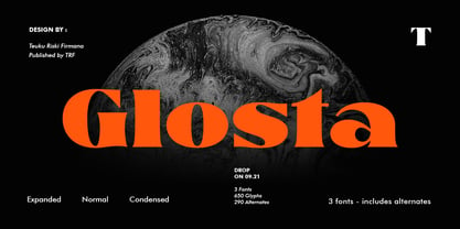 Glosta is a serif font that comes with a very beautiful change character that will bring a touch of luxury and style to your projects. Glosta is perfect for editorial design, branding, headings, logos, magazines and more. Glosta has 650 glyphs and 290 alternate characters, including multiple language support. With OpenType features with an elegant alternative style.
 - La Rose Display by Masa Type,
$15.00 La Rose is Display Sans, designed to look modern & minimal in any setting. Designed for optimal readability, its clean geometric look is perfect for things like fashion, magazine, logo, branding, headers, titles, corporate brochure designs. Typeface also supports Latin-based languages. Other details include 4 font weights, 290 characters, manually edited kerning and an Opentype alternative feature.
 - Tattoo Scratch by Ech000,
$10.99 Tattoo scratch is a carefully constructed abstract and artistic font made with over 190 different glyphs for latin and extended latin usage. Useable in English and latin based languages. The font is inspired by ignorant tattoo style art and by the "chicken scratch" style of hand writing. Each letter is individually crafted to make the font overall highly unique.
 - Walls by Piñata,
$8.00 What do you use to write a price tag at a store or to design a wall menu in a cafe? What to choose – a marker or chalk? Now it makes no more sense to be torn apart by the choice – use both techniques for your design. Walls fontfamily allows to perfectly combine an eco-friendly style with contemporary motives. Walls fontfamily supports over 70 languages and consists of 10 typefaces in 5 popular weights (Thin, Light, Regular, Bold, Black). Initially we wanted to create a font that would imitate an inscription made by a square tip marker which is usually used to write price tags at supermarkets, shops and cafes. During the working process we've decided to extend the conceptual boundaries of the Walls fontfamily and added 5 rough typefaces that imitate the style of ecologic chalk writing
 - Publishing Script by Fontscafe,
$39.00 Publishing script pack combines the sensuality and elegance of Tango Argentino, evocative of special moments, of the new avant-garde font "Publishing Script" with the wildness and daring of "Publishing Draft Script". Two handmade new script fonts with 105 variations, between alternatives and swashes, plus 32 exclusive stylistic Ligatures that convey unequivocally fluidity and audacity. The distinction and vintage-contemporary approach of "Publishing Script", from the handmade character of the universe of the Fonts Café creations, which conserves the depth of the vintage/retro style mixed with an avant-garde stylish look. The authenticity and the self-confident approach of the "Publishing Draft Script", as a tool to rediscover the most intimate human being feelings, which introduces the new Fonts Café concept of Bio-write script! A perfect combination of style, readability and flexibility, a "must have" for your next Publishing projects!
 - Ah, Berlin Email by Peter Wiegel, a font that dons its typographic trench coat and stylishly strides through the digital streets of Berlin, casting an air of retro-yet-futuristic sophistication. Craf...
- Archeron Pro by Mostardesign,
$25.00 Archeron Pro is a modern serif font family with 18 fonts ranging from light to Heavy with the corresponding italics. This new font family revisits the neo-classical style of highly contrasted serifs and brings a resolutely contemporary touch to graphic or editorial projects. Archeron Pro has also been designed with high-contrast character ratios and a high x-height to give sentences more rhythm and legibility to long texts for on-screen display or printed materials. The italic styles of this family of characters are voluntarily removed from the calligraphic style to bring modernity to the italicized style, thus giving more of a typographic style. With these features, Archeron Pro is an elegant and contemporary serif specially adapted for modern communication as well as complex typographic projects. Archeron Pro also has a complete set of real small capitals with a little more tension than uppercase and generous proportions to give more emphasis to the texts you want to highlight. In terms of features, Archeron Pro is equipped with professional features such as case sensitivity, alternative glyphs, F-ligatures, circled numbers, localized letters, ordinals, or “Pro Kerning” with more than 5,000 pairs of glyphs which brings more clarity when reading long paragraphs. Archeron Pro also has a complete set of proportional and tabular numbers, fractions, and circled numbers for complex realizations such as tables or numerical lists.
 - Nouveau Showcard JNL by Jeff Levine,
$29.00 The 1920 song “Noah’s Wife Lived a Wonderful Life (‘Cause Noah Had to Stay Home)” is another example of one of those overly-worded song titles from early 20th Century composers. What’s more important for type enthusiasts is that the title was hand lettered with a round nib pen in a slightly ragged Art Nouveau style. Cleaning up the ragged design, the end result became Nouveau Showcard JNL, which is available in both regular and oblique versions.
 - Rocking the Kasbah NF by Nick's Fonts,
$10.00This lively script is based on a handlettered offering from The Hunt Brothers, which they called simply "Ornamental Italic". Ornamental, yes, but there’s also a lot of action and attitude in this typeface. Please note that, due to the extreme slant of the characters, spacing in the font has been optimized for upper- and lowercase use. Both versions of this font contain complete Unicode 1252 (Latin) and Unicode 1250 (Central European) character sets, with localization for Romanian and Moldovan. - Starlight Ballroom NF by Nick's Fonts,
$10.00Cross the irrepressible Samuel Welo with a bit of found matchbook art and voilà! You have this retro charmer, proudly found on the kind of neon signs that offered an invitation to dine and dance. To continue the baseline treatment between words—or to extend it on either side—use the _Underscore character. Both versions of the font include complete Latin 1252, Central European 1250 and Turkish 1524 character sets, with localization for Moldovan, Romanian and Turkish. - Premier by ITC,
$29.99Premier font was designed by Colin Brignall. Premier Lightline displays all the elegance and sophistacation of the 1920s and 30s and consists of a refined lowercase with high ascenders and generous capitals which can also be used alone. Premier Shaded is an all caps typeface which provides a robust counterpart to the fine elegance of Premier Lightline. Premier Shaded should be used with close or ever overlapping letter spacing and is ideal for strong, eye-catching headlines. - Linotype Agogo by Linotype,
$40.99Linotype Agogo is part of the Take Type Library, chosen from the contestants of Linotype’s International Digital Type Design Contests of 1994 and 1997. Designed by British artist Ed Bugg, the font is reminiscent of the elegant 1920s and 1930s. It is a calligraphy font with five weights, one regular and four swash. The regular weight alone is clear and legible enough even for longer texts, although when used with swash characters, the texts should be shorter or headlines. - Cine Miroir NF by Nick's Fonts,
$10.00This bold yet elegant script is patterned after the logotype lettering from a 1927 issue of the French film magazine named, not surprisingly, Ciné Miroir. Ornate without being fussy, this font’s large x-height gives it a strong color, a commanding presence and a remarkably contemporary feel, even after more than three-quarters of a century. Both versions of this font contain the Unicode 1252 Latin and Unicode 1250 Central European character sets, with localization for Romanian and Moldovan. - Ye Olde Block NF by Nick's Fonts,
$10.00Lewis F. Day, in his book Alphabets Old and New, offered this typeface as an example from sixteenth-century England of lettering incised in wood. The font is essentially monocase, but there several lowercase letters are alternate letterforms. Please note that, due to the ornate nature of the letterforms, this font does not contain math operators, fractions or superior numbers. Both versions of the font include 1252 Latin and 1250 CE (with localization for Romanian and Moldovan) character sets. - Nimrod by Monotype,
$29.99 An extremely versatile, intelligently restrained design by Robin Nicholas for Monotype in 1980. It works very well at small sizes thanks to its large x-height, sturdy serifs, and lack of ornament; yet it is not characterless. Nimrod has been used successfully in national newspapers and books. (The Guardian, London, from its late-1980s redesign until it was replaced by a Carter interpretation of Miller in 1998; the Concise Oxford English Dictionary in the typographically unsurpassed 1990 edition.)
 - Major Production NF by Nick's Fonts,
$10.00 This typeface was designed specifically for producing movie posters, as well as VHS and DVD packaging for them. The uppercase letters are ultracondensed, and the lowercase letters are small caps, approximately a third the size of the uppercase. Also included are various logos and symbols suitable for the intended use, including those for MPAA ratings, and various audio and video formats. Both versions of this font include the complete Unicode Latin 1252 and Central European 1250 character sets.
 - Evil Ways JNL by Jeff Levine,
$29.00 The April 8, 1932 issue of The Film Daily ran an ad for a film entitled "The Sin of Lena Rivers". Hand lettered in a block style of chamfered characters, it is reminiscent of the 1920s, but still carries a touch of Art Deco influences with the thinner and extended horizontal strokes of the E, F and H. This retro sans serif design is now available digitally as Evil Ways JNL in both regular and oblique versions.
 - Fiddle Sticks NF by Nick's Fonts,
$10.00The roly-poly serifs, inspired by West Banjo, designed by Dave West, add such irrepressible charm to this typeface that you just want to pinch its little cheeks, if you are so inclined. Equally at home in the 1960s, when it was originally released, as the 1860s, from which it drew its inspiration. The PC Postscript, Truetype and Opentype versions contain the complete Latin language character set (Unicode 1252) plus support for Central European (Unicode 1250) languages as well.
