10,000 search results
(0.378 seconds)
- Wild Bunch by Hanoded,
$15.00 The Wild Bunch, also known as the Doolin–Dalton Gang, was a gang of outlaws that terrorized Kansas, Missouri, Arkansas, and Oklahoma Territory during the 1890s. They robbed banks, killed lawmen and held up trains. Of course its members were hunted down and 'wanted' posters, with that typical 'Wild West' font, appeared all over. Wild Bunch is a 'wanted poster' type font. It is an all caps font, but upper and lower case differ slightly. A set of alternate, non-eroded, glyphs for the lower case (including alternate numbers) completes this font.
 - Arrow Callouts JNL by Jeff Levine,
$29.00 Here’s a set of arrow shaped callouts in two varieties within one font. The black-on-white letters are on the upper case keys, and the white-on-black characters are on the lower case keys. The numerals 1 thru 10 in black-on-white are in the standard key positions, while the white-on-black numbers are on the same keys when engaging the “shift” key. The 'zero' key houses the number '10'. For a more dynamic look, the font is also available in an oblique version.
 - Tinkerer by Ingrimayne Type,
$9.00 Tinkerer, TapedUp, and Rumpled are based on the template I used for several letterbat fonts—fonts made of wrenches and bolts, hammers, or paper clips. TapedUp can be thought of as a font made from masking tape, and Rumpled is the same design but the tape pieces are wavy. Tinkerer is the same design but with elements that resemble what might happen if one constructed letters from Tinker Toys. All are caps only, but some of the shapes on the lower-case keys differ from the corresponding shapes on the upper-case keys.
 - Happy Trails by Breauhare,
$35.00 Happy Trails is a font that is based on the lettering (all upper case) used on most Trailways buses from 1936 through the very early 1960s. It also has a newly created set of lower case letters which never existed before. The font was tweaked and digitized by Bob Alonso & John Bomparte. Happy Trails has not only the flavor of the early Trailways buses but also a folksy, Western feel to it, and it’s even a bit silly or goofy, a fun font that has a variety of uses.
 - Ampmosphere by Joey Maul,
$22.00 Ampmosphere, a picture font, contains instruments and components from a 60's rock and roll band. After a friend's request to create a guitar graphic, I decided to start a set. Over time, more instruments were added along with amps, tubes, lights, etc. The glyphs are great to use individually or combined. 65 detailed glyphs in all... A - Z upper and lower case; 0 - 9; comma, period and forward slash. Upper case A, B, C and D are the separate strings for the stringed instruments a, b, c and d.
 - Barefoot by Ingrimayne Type,
$14.95 Suppose you were at a sandy beach and you wanted to write a message by making footprints in the sand. You might end up with letters much like those in Barefoot, a typeface made with bare feet. It is all caps but most of the letters on the lower-case keys differ from those on the upper-case keys. It looks best at large point sizes where the details of the feet are clear. It comes with a large assortment of accented letters to support most European languages.
 - Kitsune Tail by Hanoded,
$15.00 Kitsune means ‘Fox’ in Japanese. It really has nothing to do with Japanese foxes, but I am going to Japan in a few weeks, so I figured a Japan-inspired name would be perfect. Kitsune Tail is a messy brush font with no real baseline. It is an all-caps font, but upper and lower case differ and can be mixed. It comes with a full set of alternates for the lower case glyphs and a really impressive language support! I hope this foxy font will bewitch you. Enjoy!
 - Decart by Par Défaut,
$9.00 Decart is retro display font inspired by "Art Deco" style with more than 1100 characters, covering many languages using latin and cyrillic alphabet. The font also has 15 OpenType features : (All access Alternative (aalt) - Contextual Alternates (calt) - Fraction (frac) - Numerator (numr) - Denominator (dnom) - Superior (sups) - Inferior (sinf) - Tabular Figure (tnum) - Old Style (onum) - Ordinals (ordn) - Small Capital (smcp) - Small Capital From Capital (c2sc) - Case Sensitive Forms (case) - Stylistic Set (ss01 - ss02 - ss03) and Kerning (kern). Decart has, in addition, circled letters (basic latin & cyrillic), figures, fraction and arrows.
 - Garoa by Just in Type,
$20.00 Inspired by the 70's design, specially on Herb Lubalin's work, the typeface Garoa is a rounded mechanical display font without optical compensations, ideal for large bodies. The medium weight has lower case for short texts, and the Bold versions have singular upper case glyphs, with some alternates (at least one alternate per letter – some with OpenType features some using caps on the keyboard). The Garoa Hacker Clube Bold version is free and contains no OpenType features, but the glyphs have the same design as on Garoa Bold.
 - Delaguerra by Scriptorium,
$18.00Delaguerra is based on a lettering style originating in the California Arts & Crafts period commonly associated with 'Mission Style'. It is still in common usage in signage at historical sites in California. This version is a sort of idealized hybrid of several different variations on the style from samples we were sent by a customer who wanted to use the font in a set of invitations. It features a basic character set on the lower case and then relief initial versions of the same characters for the upper case. - RM Albion - 100% free

- Cheese Fontdue - 100% free

- Soft Hits - Unknown license

- Eirinn by Linotype,
$29.99Eirinn was designed by Norbert Reiners for Linotype in 1994. Its forms are based on those of Irish scripts of the 7th and 8th centuries, an example of which can be found in the Book of Kells in Dublin. Characteristic of this style are for example the lower case f with its short cross stroke on the base line and long cross stroke above, the unusual form of the g, and the t, whose form is almost like that of a c. This style consisted of a mixture of lower case and capital letters at the time of its conception, but Eirinn has a full set of both lower case and capital alphabets. At first glance the viewer is reminded of ancient and indecipherable writings of the Celts before the forms of our contemporary letters and words become evident. Eirinn will lend a touch of mysticism and secrecy to any text. - Poultry Sign by Ingrimayne Type,
$5.95 While searching through microfilm of an old, 1932 newspaper, I stumbled on the word "Poultry" written with trapezoidal letters. I did not recall seeing lettering like this and it inspired me to design a typeface that could produce a similar result. Poultry Sign has two widths each with three weights giving the family six styles. It is monoline, monospaced, and all caps. The letters on the lower-case keys reverse the trapezoid of those on the upper-case keys. The designer's expectation is that the most common use for this typeface will alternate upper-case and lower-case keys, and to make this effect easy, included in the font is a contextual alternatives (calt) OpenType feature that automatically produces this result if your word processor supports this feature. To get text with all letters with big bottoms or all letters with with big tops, this feature must be turned off. The spacing of the letters is identical within each width so the styles can be layered to produce bi-colored or tri-colored letters. There is a second set of numbers that can be accessed with an OpenType stylistic alternative. Also accessible with OpenType stylistic alternatives are variations of letters T, N, L, Y, and V.
 - Gens De Baton by HiH,
$10.00 Gens De Baton is based on a charming lower case alphabet that appeared in the Almanach des Enfants pour 1886 (Paris 1886) under the heading “Amusing Grammar Lessons.” Gens De Baton means simply “Stick People.” The unknown designer turned the bare letter forms into drawings of people for the enjoyment of the children for whom the almanac was intended. The letter forms themselves were based on the French Romain du Roi (King’s Roman), except for the ‘g’ and the ‘j’ -- which were based on Baskerville. The letters ‘w’ and ‘y’ were not included, as they are seldom seen in French. We have left the letters somewhat rough, as they appeared in the Almanach des Enfants , resisting the temptation to clean up all the lines and render them with digital perfection. We have used our HiH Firmin Didot to supply an upper case and auxiliary characters, as Didot was originally a modified version of Romain du Roi. It is interesting to observe the contrast between the polished look of the Didot upper case and the rough, hand-drawn look of the lower case. Purchasers of this font have our permission to use it for the amusement of adults as well as children. We recommend setting Gens De Baton at 24 points or larger.
 - Green Dinosaur - Unknown license

- Tuscaloosa by Greater Albion Typefounders,
$7.00 Tuscaloosa is a classic American 'Wild West' Tuscan typeface-we thought it would make a suitable Independence Day tribute to our many American clients. It's ideal for wherever that 'Western' feel is wanted. Posters, signage, the sides of stagecoaches etc... Three faces are offered, a pristine and sharp regular form, a somewhat distressed 'Rustic' face and the rather more distressed 'Extremely Rustic'. So why not mosey on down the saloon with Tuscaloosa!
 - Every by TypeThis!Studio,
$54.00 EVERY is designed to be the most valuable typography equipment in your repertoire! Rich in visions, a wide range of features have been created to master all your typographic challenges par excellence: Italics, small caps, old-style figures, ligatures & arrows are just some of the many possibilities that EVERY offers. 28 Styles in three optical sizes gives you the opportunity to create fascinating design with the scent of iconic elegance. Be exceptional – EVERY day. www.typethis.studio
 - Amber Taste Pro by Gleb Guralnyk,
$14.00 Hi, introducing an Amber Taste Pro font. It's a vintage typeface with classic shape. Seven weights variations from thin to bold is available. Actually this font set is a remastered version of my best selling font Amber Taste with lots of improvements. Pro version has much more characters, including multilingual west european support. All the contours was cleaned up and several glyphs has a new more organic shape. Thank you and have a nice day!
 - Strongs Draughtsman by Nick's Fonts,
$10.00One in the series of fonts celebrating the Halcyon Days of Handlettering. Strongs Draughtsman is a monoline font that evokes the sensibilities of the early twentieth century. Based on a font called "architects' pen strokes" as delineated by Lawrence and Charles Strong in their The Art of Show Card Writing from 1922. Both versions of this font contain the Unicode 1252 (Latin) and Unicode 1250 (Central European) character sets, with localization for Romanian and Moldovan. - Trad by Powerfonts,
$13.99 Trad (Träd is Swedish for tree) is inspired by viking mythology and runic alphabets. Imagine a viking warrior crudely carving a message into a tree stump with his trusty dagger, sipping on a flagon of ale and pondering a hard days slaying. Like the blade of his blood encrusted axe, Trad is ideal for projects requiring a sharp edge, such as the cover of your next thriller, zombie flick, or death metal album.
 - Collected Catchwords JNL by Jeff Levine,
$29.00 For those designers looking for nothing more than a library of familiar catchwords and phrases re-drawn from vintage source material, look no further. Collected Catchwords JNL gathers up ninety-three of them, picked from the dingbat typeface library of Jeff Levine Fonts and placed into one convenient font file. "Free", "Sale", "As Advertised", "Dollar Days", "Look", "New" and dozens of other icons of print advertising are no more than a keystroke away.
 - Violethe by Letterafandi Studio,
$16.00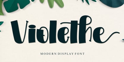 Violethe is a simple and unique-looking display font perfect for a wide variety of products. Use it on your Christmas decorations, Valentine’s Day cards, posters, wedding invitations, branding projects, social media posts, magazines, book covers, and whatever creative project you have in mind, and it will add a fun and friendly touch to your design! This font is PUA encoded, which means you can access all the glyphs and sweeps with ease!
 - Swing Era JNL by Jeff Levine,
$29.00 Hand lettered Art Deco lettering for the title on the cover of the 1930s-era song "And I Still Do" provided the inspiration for Swing Era JNL. A bold, casual and friendly typeface, it features an intersecting inline through some of the characters. One could almost picture the hottest big band of the day promoted on a lobby card with this alphabet, beckoning all to come on in and "cut a rug".
 - Modernista FA by Fontarte,
$39.00 An inspiration for two fonts of FA Modernista was the second page of Polish vanguard magazine "Praesens" Nr 1 from 1926 designed (as the first page) by Henryk Stażewski. The type applied - Baccarat was a sans serif from Polish foundry Jan Idźkowski i S-ka. Fonts FA Modernista imitate the effect of letterpress with spilled printing ink. Letters of two cuts vary in distortion as in the old days of letterpress technology.
 - Sans Andreas by Java Pep,
$11.00 Proudly presenting the newest handwritten font called Sans Andreas. These font made by handwritten style, so all shape looks unique and natural. Sans Andreas is a family font, with 4 styles regular, italic, bold, bold italic. Sans Andreas is also perfect for all your project that has sense fun, playful, art, and .etc If you have any questions or technical support don't hesitate to comment, message or contact java.indonesian@yahoo.com. Have a nice day.
 - Deux Chasses NF by Nick's Fonts,
$10.00American Type Founders released the pattern for this typeface under the name "Thermotype". In the days of cast-metal foundry type, copyfitting headlines could prove problemmatic at times; this typeface, with a wide uppercase and narrower lowercase of exactly the same “color”, allowed stacked lines of type to be composed with uniform width. Clean, crisp and practical. Both versions of the font include 1252 Latin, 1250 CE (with localization for Romanian and Moldovan). - Retro Star by Genetype,
$24.00 Introducing Retro Star Typeface: Unleash Nostalgia in Every Letter! Step into a time capsule with Retro Star, our latest vintage-themed font that oozes old-world charm. Radiating a sense of nostalgia, this typeface takes you back to the elegance pop from days gone by. Retro Star lends an air of authenticity to your designs. Embrace the past and craft designs that resonate with the soul of yesteryears – discover Retro Star today!
 - Altis by Typolar,
$72.00 Altis combines geometric regularity and soulfulness into one font family. It resembles the traditional sanserif from the early 20th century, which communicates friendly and reads extremely well. Bring out its optimistic airiness with light styles or exploit the masculine strength of the bolds. Altis has been developed to fit present-day editorial conditions and publishing models. There are ten optically-balanced weights and practical OpenType features, which make the family versatile and operationally spot-on.
 - Linotype CMC-7 by Linotype,
$29.00Linotype CMC-7 is a MICR barcode font. It contains machine-readable numbers, letters, and punctuation. These characters are used on checks and for other banking needs in several countries. Linotype CMC-7 can also be used like any other font in visual graphic work; like the Universal MICR Pi or OCR A and B typefaces, this is a real" computer fonts, carrying all of the connotations of the days of early technology." - Heart Of Mine by Epiclinez,
$18.00 Heart Of Mine is a fun and cute handwritten font that allows you to add an adorable touch to your projects. This font is perfect for the Valentine's Day season, but also for any other time of the year when you want to add a little love and warmth to your writing. So what’s included : Basic Latin Uppercase and Lowercase Numbers, symbols, and punctuations Multilingual Support. Simple Installations works on PC & Mac
 - Bloomberg Script by Vástago Studio,
$25.00 Bloomberg Script is a typeface designed from the exploration with the different tools we use to write each day on post its, notebooks, etc. But, applying the traditional handwriting repair method in the construction, spacing the glyphs, and giving it texture of fast strokes, ideal for handletters... is more organic. And finally, we have this typeface, a very comfortable letters to read on packaging, poster ads, screen and every display applications; this is Bloomberg Script.
 - Expat by Parker Creative,
$18.00 Expat was designed to be used to make exciting promotional material for most industries. With its rugged and thick narrow body, Expat appears heavy to the eye and draws the eye, which is great for big headlines. Some examples of great uses of the typeface include high energy content seen in sports and apparel advertising, rustic and trendy restaurant materials, even event promotions for concerts or holidays like Independence Day and Oktoberfest.
 - Bertham by Ascender,
$29.99 Bertham Pro Family (4 fonts) is a revival of Frederic W. Goudy’s Bertham typeface. Steve Matteson produced this unique typeface and added bold, italic and openface styles. The fonts include a variety of OpenType features including swash capitals, small capitals and old style figures. It is unmistakably American in appearance recalling a day of quality craftsmanship and hard work. Publishing, branding and packaging materials will draw inspired attention due to its grace and distinctive appearance.
 - Clarified JNL by Jeff Levine,
$29.00 Based on William H. Page’s Clarendon Extended wood type from the 1800s, Clarified JNL is digitally available in both regular and oblique versions. In the days of wood and metal type, foundries often made changes to an existing design to make their font more unique and different from their competitors. Clarified JNL is different from Clarenwood JNL (which is partially based on another wood type Clarendon and features many alternate letter forms).
 - Dekalb by Design is Culture,
$35.00 The idea for the typeface Dekalb was born in 2013 after a day of photographing signage, murals and graffiti around Dekalb and Wyckoff avenues in Bushwick, Brooklyn. The initial drafts of the letterforms were first made into a single ultra-weight font that I used while working as the Creative Director for Sneaker News Magazine. After having made its first appearance in Sneaker News, I decided to expanded Dekalb to an eight style family.
 - RainCity by SRS Type,
$35.00 RainCity is a beautiful contemporary sans-serif font with delicate curves. Inspired by the movement of raindrops on the street, we created this font to evoke the excitement of a rainy day in Paris. Using this font will give you an elegant, dynamic, and unique image. RainCity is suitable for a variety of design work such as branding, poster design, and editorial design. It is a display font available in two weights, Regular and Bold.
 - Nouveau Auto JNL by Jeff Levine,
$29.00 “The Auto Show” is the title of an early 1900s pieces of sheet music proving that America has had a fascination with cars since the earliest days of the automotive industry. The song sheet’s title was hand lettered in a casual Art Nouveau style which has been re-drawn digitally as Nouveau Auto JNL, and is available in both regular and oblique versions… and what’s better than a nouveau auto (a new car)?
 - Heyday by Hemphill Type,
$30.00 Heyday is a font in its prime! This font was inspired by vintage style typography with the use of thick rounded serifs, while the shape of the letterform has a contemporary edge which brings it into the modern day. This combination of classic and modern creates a unique look and feel that enables the font to feel at home in any era. The Heyday family consists of a serif and sans weight.


