10,000 search results (0.052 seconds)
  1. Anywhere - Unknown license
  2. Four More Years - Unknown license
  3. FZ JAZZY 12 CRACKED - Unknown license
  4. Zombie Holocaust - Unknown license
  5. Swily Bright by Jolicia Type, $19.00
    Say Hello to Swily Bright. Trendy, classy & modern style serif font for your fancy projects. Elegant, fashion and classic style on Swily Bright font will be great for any branding project. With 2 style Regular and Italic, alternates and ligatures will help you to create unique letters
  6. Wrong by Monotype, $15.99
    Wrong is all about the improv. Made with tape segments this font has a real DIY feel to it. It’s bold, solid and square-jawed. Its modular appearance gives it a constructed strength and it's available with two sets of caps and stacks of attitude as standard.
  7. ITC Newtext by ITC, $40.99
    ITC Newtext was designed by Ray Baker, who created a well designed and legible typeface and built into it every design refinement which could optimize its usefulness. The expanded shapes are generous and legible and the economical vertical set results in more lines to the page.
  8. Eccentric by Solotype, $19.95
    Here's another old-timer that needed a lowercase, so we drew one. Originally issued as a caps-only type by The American Type Founders Company about 1898, this font found its way into Craftsman period design. It was the inspiration for Galadriel, a dry transfer sheet alphabet.
  9. Scrawlerz by Hanoded, $15.00
    My teacher used to say my writing looked like ‘hanenpoten’ (“rooster legs”). It is a Dutch expression for a scrawly script. When this script emerged, it had ‘scrawl’ written all over it! Scrawlerz is a messy script font with a lot of joie de vivre. Enjoy!
  10. Wirey by Joshua Conley, $22.00
    Wirey is an uppercase hand drawn font inspired by bent copper wires. It is designed for headers, titles and posters where fonts need to be big and unique. Wirey is styled in a way that looks hand drawn but also keeps a simple, professional element within it.
  11. Norline by ATK Studio, $15.00
    Norline™ is a new bold sans-serif typeface created to be used for bold titles with 3 shapes into a display fonts way to make it legible for contemporary use. This type features a Latin Pro character set, covering multiple languages written with the Latin script.
  12. Fortune Coin by Gassstype, $25.00
    Fortune Coin is a Cartoon Display Font with alot of ligature. it will make your designs look modern, unique and fun. It’s perfect for labels, quotes, posters, DIY projects, branding, packaging, greeting cards, websites, photos, photography overlays, signs, window art, scrapbooking, tags and so much more!
  13. RM Opensans by Ray Meadows, $19.00
    This delightful new design has a friendly, open face and will be useful for many display purposes. Due to the modular nature of this design there may be a very slight lack of smoothness to the curves at extremely large point sizes (around 200 pt and above).
  14. Techno Retro JNL by Jeff Levine, $29.00
    Techno Retro JNL looks like a design straight out of the 1980s, but it actually appeared as hand lettering on a sheet music cover for the circa-1940s edition of the song "To You Sweetheart, Aloha", proving the old saying that "everything old is new again".
  15. Ovala SRF by Stella Roberts Fonts, $25.00
    Ovala SRF is one of a number of Ray Larabie designs provided to the Stella Roberts Fonts project and adapted by Jeff Levine. The net profits from my font sales help defer medical expenses for my siblings, who both suffer with Cystic Fibrosis and diabetes. Thank you.
  16. RM Slabb by Ray Meadows, $19.00
    This bold display font has considerable strength and will grace any design that requires extra impact. Due to the modular nature of this design there may be a very slight lack of smoothness to the curves at extremely large point sizes (around 100 pt and above).
  17. English Script Hand by Autographis, $39.50
    This is the classic English Script. Completely drawn by hand with a classic pen and then scanned and worked over just enough to keep that handmade touch. I didn't want this to look perfect, there are enough versions of this font that are way too slick.
  18. Painters Roman NF by Nick's Fonts, $10.00
    It is what it says: a classic woodtype face by the same name from Vanderburg and Wells' 1878 specimen book. What it lacks in refinement, it makes up for in exuberance. Both versions support the Latin 1252, Central European 1250, Turkish 1254 and Baltic 1257 codepages.
  19. Horse Thief JNL by Jeff Levine, $29.00
    The 1957 French publication “La Letra Dans La Peinture et la Publicite” (“The Letter tn the Painting and Advertising”) had an illustration of split-serif letters and numbers with a decidedly Western feel. This is now available as Horse Thief JNL in both regular and oblique versions.
  20. Unboring by PintassilgoPrints, $20.00
    Boring titles? Boring chunk of text? Unbore’em all! This nifty stackable family features two fonts, both with two options for each letter. Pile them up and play with opacities for a killer superposed effect. Or use each alone if you prefer. Unboringness guaranteed either way. Cheers!
  21. 1906 Fantasio by GLC, $38.00
    We have created this font inspired from the hatched one used for the inner title and many headlines by the old French popular "cheerful" satirical magazine Fantasio (1906-1948). This family may be used together with 1906 French News, 1906 Titrage, 1906 Fanatasio Auriol and 1890 Notice.
  22. Athan by Thinkdust, $10.00
    Athan is an uppercase geometric sans-serif typeface designed by Dani Montesinos in 2009. Inspired by one piece of lettering from the 1970s, Athan offers something a little different in terms of typography. With strong geometric forms, and highly distinctive characters, it's sure to catch your eye.
  23. Rothe by Konstantine Studio, $10.00
    ROTHE, A luxury vintage lettering style fonts. Inspired by the branding from the vintage classic era with the full decorative feels and complex design but still get the luxury feels right away. Armed with some swash letters to expand the style like the old lettering way.
  24. The Gallery by Stringlabs Creative Studio, $25.00
    The Gallery is a unique monoline script font. It features gorgeous swashes and ligatures that make this script incredibly versatile. Whether you’re looking for fonts for Instagram or calligraphy scripts for DIY projects, The Gallery will turn any creative idea into a true piece of art!
  25. Fontazia Mazzo by Deniart Systems, $15.00
    Fontazia Mazzo features a unique assortment of floral bouquets in abstract vases. A modern addition to any interior design layout or for any project where flowers say just the right thing! Like other type, these dingbats can easily be integrated into any text document or graphic program.
  26. Easter Moment by AEN Creative Studio, $15.00
    Easter Moment is a natural cute handwritten font. It is ideal for Easter-themed crafting, greeting cards, or any other design that may need a lovely, personalized touch! This font is PUA encoded which means you can access all of the glyphs and swashes with ease!
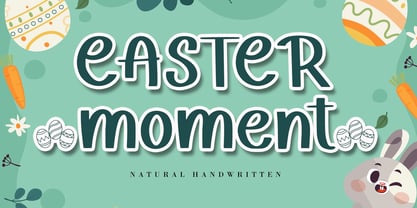
  27. Mevada SRF by Stella Roberts Fonts, $25.00
    Mevada SRF and its oblique partner are a remix of the Ray Larabie design Devama SRF, another exclusive from Stella Roberts Fonts. The net profits from my font sales help defer medical expenses for my siblings, who both suffer with Cystic Fibrosis and diabetes. Thank you.
  28. Roasted lime by Gassstype, $27.00
    Roasted Lime is a Cartoon Display Font with alot of ligature. it will make your designs look modern, unique and fun. It’s perfect for labels, quotes, posters, DIY projects, branding, packaging, greeting cards, websites, photos, photography overlays, signs, window art, scrapbooking, tags and so much more!
  29. Chunder by Chank, $49.00
    Created in Minneapolis in 1996, Chunder is inspired by the hand-painted cursive signage of urban boutiques where a shopkeeper can't afford to hire a very good sign painter. Kinda clunky, kinda flowery. Like beer spilled on a daffodil. "It's not pretty, but it's mine," says Chank.
  30. Kurye by Arodora Type, $30.00
    Kurye, is an extremely elegant and emotional font. You can choose its large family for your magazine, brochure, catalog designs, furniture and architectural presentations. In this way, you can add a more aesthetic and unique atmosphere to your designs. Kurye, ligatures, alternative glpyhs and multilingual support.
  31. Nimbo TTW by Talavera, $10.00
    This is a playful collection of 135 diagrams based on letterforms from different styles. You can use this symbols as bullets, ornaments, but also to make your own mandala-like exercises and release some stress out! Nimbo, by the way, is the word for "halo" in spanish.
  32. Bobbin Cyrllic by Typoforge Studio, $25.00
    To design the font Bobbin Cyrillic I was inspired by the You And Me Monthly published by National Magazines Publisher RSW Prasa that appeared from Mai 1960 till December 1973 in Poland. In the Bobbin Cyrillic family, every variety contains 3 alternative characters with automatic replacement.
  33. Merlo by Typoforge Studio, $25.00
    Font Merlo is the younger sister of Cervo. Font Merlo is characterized by eight different varieties – lower and uppercase characters. It is inspired by a You And Me Monthly published by National Magazines Publisher RSW "Prasa” that appeared from May 1960 till December 1973 in Poland.
  34. Houschka Rounded by G-Type, $72.00
    Houschka Rounded is the companion family to Houschka Pro, featuring CE, Baltic, Turkish & Cyrillic language support plus small caps, stylistic sets, contextual alternates, ligatures and 4 sets of numerals. Houschka Rounded may be a softer & cuter sans serif than her big sister but she's equally versatile.
  35. Bluesman JNL by Jeff Levine, $29.00
    The classic blues album "I'm Jimmy Reed" released on the legendary Vee-Jay label out of Chicago featured title lettering in a bouncy, fun, casual take on the classic Latin Wide style of alphabet. Bluesman JNL offers a full digital typeface based on that album titling.
  36. "Child's Play" isn't just a font; it's a joyride back to the days of yore, when the toughest decision of the day was choosing between crayons or markers. This font mimics the erratic yet sincere hand...
  37. The Thief Bird by Lemur, $14.00
    The Thief Bird is an informal grotesque font. Although informal and grotesque may seem to be two quite different ideas, we have to dig into the origin of this typeface in order to understand the matter. The concept behind The Thief Bird was inspired by the adaptation that the vintage sign painters made when they took the grotesque style characters they saw in newspapers and magazines and reproduced them using a brush, aiming to make the prices of the products displayed on wooden boards stand out, as opposed to highlighting large headlines (such as the idea behind fonts like Franklin Gothic). The Thief Bird takes the language from sign painters and turns it into a font --this time around not aiming to set prices but to bring children stories to life. Thus, some legibility features from grotesque fonts were mixed with the brush calligraphy to add grace and zest to a font intended for children. The Thief Bird is a playful display font, with cheerful ligatures and alternate characters. It is really attractive for setting short paragraphs that tell stories for little people. The Thief Bird has one single weight and it’s ideal to be used in storybooks, candy packaging, films, toys, logos, labels, etc. The font has an extended set of 643 characters supporting 219 Latin languages. It has a complete set of small caps, sensitive cases, more than 30 pairs of ligatures, alternate characters and much more. This cool, informal and laid back typeface will be the perfect match for illustrations of fairy tales, comics for children and any product or publishing for the little ones. The Thief Bird supports this languages: Abenaki, Afaan Oromo, Afar, Afrikaans, Albanian, Alsatian, Amis, Anuta, Aragonese, Aranese, Aromanian, Arrernte, Arvanitic (Latin), Asturian, Atayal, Aymara, Bashkir (Latin), Basque, Bemba, Bikol, Bislama, Bosnian, Breton, Cape Verdean Creole, Catalan, Cebuano, Chamorro, Chavacano, Chichewa, Chickasaw, Cimbrian, Cofán, Corsican Creek,Crimean Tatar (Latin),Croatian, Czech, Dawan, Delaware, Dholuo, Drehu, Dutch, English, Estonian, Faroese, Fijian Filipino, Finnish, Folkspraak, French, Frisian, Friulian, Gagauz (Latin), Galician, Ganda, Genoese, German, Gikuyu, Gooniyandi, Greenlandic (Kalaallisut)Guadeloupean, Creole, Gwich’in, Haitian, Creole, Hän, Hawaiian, Hiligaynon, Hopi, Hotcąk (Latin), Hungarian, Icelandic, Ido, IgboI, locano, Indonesian, Interglossa, Interlingua, Irish, Istro-Romanian, Italian, Jamaican, Javanese (Latin), Jèrriais, Kala Lagaw Ya, Kapampangan (Latin), Kaqchikel, Karakalpak (Latin), Karelian (Latin), Kashubian, Kikongo, Kinyarwanda, Kiribati, Kirundi, Klingon, Ladin, Latin, Latino sine Flexione, Latvian, Lithuanian, Lojban, Lombard, Low Saxon, Luxembourgish, Maasai, Makhuwa, Malay, Maltese, Manx, Māori, Marquesan, Megleno-Romanian, Meriam Mir, Mirandese, Mohawk, Moldovan, Montagnais, Montenegrin, Murrinh-Patha, Nagamese Creole, Ndebele, Neapolitan, Ngiyambaa, Niuean, Noongar, Norwegian, Novial, Occidental, Occitan, Old Icelandic, Old Norse, Oshiwambo, Ossetian (Latin), Palauan, Papiamento, Piedmontese, Polish, Portuguese, Potawatomi, Q’eqchi’, Quechua, Rarotongan, Romanian, Romansh, Rotokas, Sami (Inari Sami), Sami (Lule Sami), Sami (Northern Sami), Sami (Southern Sami), Samoan, Sango, Saramaccan, Sardinian, Scottish Gaelic, Serbian (Latin), Seri, Seychellois Creole, Shawnee, Shona, Sicilian, Silesian, Slovak, Slovenian, Slovio (Latin), Somali, Sorbian (Lower Sorbian), Sorbian (Upper Sorbian), Sotho (Northern), Sotho (Southern), Spanish, Sranan, Sundanese (Latin), Swahili, Swazi, Swedish, Tagalog, Tahitian, Tetum, Tok Pisin, Tokelauan, Tongan, Tshiluba, Tsonga, Tswana, Tumbuka, Turkish, Turkmen (Latin), Tuvaluan, Tzotzil, Uzbek (Latin), Venetian, Vepsian, Volapük, Võro, Wallisian, Walloon, Waray-Waray, Warlpiri, Wayuu, Welsh, Wik-Mungkan, Wiradjuri, Wolof, Xavante, Xhosa, Yapese, Yindjibarndi, Zapotec, Zulu, Zuni.
  38. 99 Names of ALLAH Compact by Islamic Calligraphy75, $12.00
    We have transformed the “99 names of ALLAH” into a font. That means each key on your keyboard represents 1 of the 99 names of ALLAH Aaza Wajal. The fonts work with both the English and Arabic Keyboards. We call this Calligraphy "Compact" because as you can see everything is very close and decorative symbols are at a maximum. The first "alef" has neither a "hamzit wasel" nor a "fatha", this indicates to skip that first alef so instead of saying "AR-RAHMAAN" you say "R-RAHMAAN". (in the zip file you will find a pdf file explaining the differences in the "harakat", pronunciation and spelling according to the Holy Quran). The calligraphy is anything but traditional & we have used all the decorative letters except for the "Ye". In other calligraphy you don't usually find the decorative letters: "Dal, Ra & Ye" but we like them and we use them, the important thing is that they don't change the pronunciation or the meaning. Decorative letters used in this calligraphy: "Mim, Aain, Sin, HHe, He, Kaf, Alef, Ta, Dal, Ra & Saad". Purpose & use: - Writers: Highlight the names in your texts in beautiful Islamic calligraphy. - Editors: Use with kinetic typography templates (AE) & editing software. - Designers: The very small details in the names does not affect the quality. Rest assured it is flawless. The MOST IMPORTANT THING about this list is that all the names are 100% ERROR FREE, and you can USE THEM WITH YOUR EYES CLOSED. All the “Tachkilat” are 100% ERROR FREE, all the "Spelling" is 100% ERROR FREE, and they all have been written in accordance with the Holy Quran. No names are missing and no names are duplicated. The list is complete "99 names +1". The +1 is the name “ALLAH” 'Aza wajal. Another important thing is how we use the decorative letters. In every font you will see small decorative letters, these letters are used only in accordance with their respective letters to indicate pronunciation & we don't include them randomly. That means "mim" on top or below the letter "mim", "sin" on top or below the letter "sin", and so on and so forth. Included: Pdf file telling you which key is associated with which name. In that same file we have included the transliteration and explication of all 99 names. Pdf file explaining the differences in the harakat and pronunciation according to the Holy Quran. Here is a link to all the extra files you will need: https://drive.google.com/drive/folders/1Xj2Q8hhmfKD7stY6RILhKPiPfePpI9U4?usp=sharing
  39. 99 Names of ALLAH Complete by Islamic Calligraphy75, $12.00
    We have transformed the “99 names of ALLAH” into a font. That means each key on your keyboard represents 1 of the 99 names of ALLAH Aaza Wajal. The fonts work with both the English and Arabic Keyboards. We call this Calligraphy "complete" because this is the only calligraphy where the complete set of decorative letters have been used. The calligraphy is more on the traditional side, letters don't overlap, the "ye" at the end of the names doesn't have the two dots, and a decorative "ye" has been included. The first "Alef" doesn't have a "hamzit wasel" nor a "fatha", this indicates to skip the pronunciation of that first letter. So instead of saying "AR-RAHMAAN" you say "R-RAHMAN". (in the zip file you will find a pdf file explaining the differences in the "harakat", pronunciation and spelling according to the Holy Quran). In other calligraphy you don't usually find the decorative letters: "Dal, Ra & Ye" but we like them and we use them. Decorative letters used in this calligraphy: "Mim, Aain, Sin, HHe, He, Kaf, Tah, Dal, Ra, Alef, Ye & Saad". Purpose & use: - Writers: Highlight the names in your texts in beautiful Islamic calligraphy. - Editors: Use with kinetic typography templates (AE) & editing software. - Designers: The very small details in the names does not affect the quality. Rest assured it is flawless. The MOST IMPORTANT THING about this list is that all the names are 100% ERROR FREE and you can USE THEM WITH YOUR EYES CLOSED. All the “Tachkilat” are 100% ERROR FREE, all the "Spelling" is 100% ERROR FREE, and they all have been written in accordance with the Holy Quran. No names are missing and no names are duplicated. The list is complete "99 names +1". The +1 is the name “ALLAH” 'Aza wajal. Another important thing is how we use the decorative letters. In every font you will see small decorative letters, these letters are used only in accordance with their respective letters to indicate pronunciation & we don't include them randomly. That means "mim" on top or below the letter "mim", "sin" on top or below the letter "sin", and so on and so forth. Included: Pdf file telling you which key is associated with which name. In that same file we have included the transliteration and explication of all 99 names. Pdf file explaining the differences in the harakat and pronunciation according to the Holy Quran. Here is a link to all the extra files you will need: https://drive.google.com/drive/folders/1Xj2Q8hhmfKD7stY6RILhKPiPfePpI9U4?usp=sharing
  40. Areplos by Storm Type Foundry, $53.00
    To design a text typeface "at the top with, at the bottom without" serifs was an idea which crossed my mind at the end of the sixties. I started from the fact that what one reads in the Latin alphabet is mainly the upper half of the letters, where good distinguishableness of the individual signs, and therefore, also good legibility, is aided by serifs. The first tests of the design, by which I checked up whether the basic principle could be used also for the then current technology of setting - for double-sign matrices -, were carried out in 1970. During the first half of the seventies I created first the basic design, then also the slanted Roman and the medium types. These drawings were not very successful. My greatest concern during this initial phase was the upper case A. I had to design it in such a way that the basic principle should be adhered to and the new alphabet, at the same time, should not look too complicated. The necessary prerequisite for a design of a new alphabet for double-sign matrices, i.e. to draw each letter of all the three fonts to the same width, did not agree with this typeface. What came to the greatest harm were the two styles used for emphasis: the italics even more than the medium type. That is why I fundamentally remodelled the basic design in 1980. In the course of this work I tried to forget about the previous technological limitations and to respect only the requirements then placed on typefaces intended for photosetting. As a matter of fact, this was not very difficult; this typeface was from the very beginning conceived in such a way as to have a large x-height of lower-case letters and upper serifs that could be joined without any problems in condensed setting. I gave much more thought to the proportional relations of the individual letters, the continuity of their outer and inner silhouettes, than to the requirements of their production. The greatest number of problems arose in the colour balancing of the individual signs, as it was necessary to achieve that the upper half of each letter should have a visual counterbalance in its lower, simpler half. Specifically, this meant to find the correct shape and degree of thickening of the lower parts of the letters. These had to counterbalance the upper parts of the letters emphasized by serifs, yet they should not look too romantic or decorative, for otherwise the typeface might lose its sober character. Also the shape, length and thickness of the upper serifs had to be resolved differently than in the previous design. In the seventies and at the beginning of the eighties a typeface conceived in this way, let alone one intended for setting of common texts in magazines and books, was to all intents and purposes an experiment with an uncertain end. At this time, before typographic postmodernism, it was not the custom to abandon in such typefaces the clear-cut formal categories, let alone to attempt to combine the serif and sans serif principles in a single design. I had already designed the basic, starting, alphabets of lower case and upper case letters with the intention to derive further styles from them, differing in colour and proportions. These fonts were not to serve merely for emphasis in the context of the basic design, but were to function, especially the bold versions, also as independent display alphabets. At this stage of my work it was, for a change, the upper case L that presented the greatest problem. Its lower left part had to counterbalance the symmetrical two-sided serif in the upper half of the letter. The ITC Company submitted this design to text tests, which, in their view, were successful. The director of this company Aaron Burns then invited me to add further styles, in order to create an entire, extensive typeface family. At that time, without the possibility to use a computer and given my other considerable workload, this was a task I could not manage. I tried to come back to this, by then already very large project, several times, but every time some other, at the moment very urgent, work diverted me from it. At the beginning of the nineties several alphabets appeared which were based on the same principle. It seemed to me that to continue working on my semi-finished designs was pointless. They were, therefore, abandoned until the spring of 2005, when František Štorm digitalized the basic design. František gave the typeface the working title Areplos and this name stuck. Then he made me add small capitals and the entire bold type, inducing me at the same time to consider what to do with the italics in order that they might be at least a little italic in character, and not merely slanted Roman alphabets, as was my original intention. In the course of the subsequent summer holidays, when the weather was bad, we met in his little cottage in South Bohemia, between two ponds, and resuscitated this more than twenty-five-years-old typeface. It was like this: We were drinking good tea, František worked on the computer, added accents and some remaining signs, inclined and interpolated, while I was looking over his shoulder. There is hardly any typeface that originated in a more harmonious setting. Solpera, summer 2005 I first encountered this typeface at the exhibition of Contemporary Czech Type Design in 1982. It was there, in the Portheim Summer Palace in Prague, that I, at the age of sixteen, decided to become a typographer. Having no knowledge about the technologies, the rules of construction of an alphabet or about cultural connections, I perceived Jan Solpera's typeface as the acme of excellence. Now, many years after, replete with experience of revitalization of typefaces of both living and deceased Czech type designers, I am able to compare their differing approaches. Jan Solpera put up a fight against the digital technology and exerted creative pressure to counteract my rather loose approach. Jan prepared dozens of fresh pencil drawings on thin sketching paper in which he elaborated in detail all the style-creating elements of the alphabet. I can say with full responsibility that I have never worked on anything as meticulous as the design of the Areplos typeface. I did not invent this name; it is the name of Jan Solpera's miniature publishing house, in which he issued for example an enchanting series of memoirs of a certain shopkeeper of Jindrichuv Hradec. The idea that the publishing house and the typeface might have the same name crossed my mind instinctively as a symbol of the original designation of Areplos - to serve for text setting. What you can see here originated in Trebon and in a cottage outside the village of Domanín - I even wanted to rename my firm to The Trebon Type Foundry. When mists enfold the pond and gloom pervades one's soul, the so-called typographic weather sets in - the time to sit, peer at the monitor and click the mouse, as also our students who were present would attest. Areplos is reminiscent of the essential inspirational period of a whole generation of Czech type designers - of the seventies and eighties, which were, however, at the same time the incubation period of my generation. I believe that this typeface will be received favourably, for it represents the better aspect of the eighties. Today, at the time when the infection by ITC typefaces has not been quite cured yet, it does absolutely no harm to remind ourselves of the high quality and timeless typefaces designed then in this country.In technical terms, this family consists of two times four OpenType designs, with five types of figures, ligatures and small capitals as well as an extensive assortment of both eastern and western diacritics. I can see as a basic text typeface of smaller periodicals and informative job-prints, a typeface usable for posters and programmes of various events, but also for corporate identity. Štorm, summer 2005
Looking for more fonts? Check out our New, Sans, Script, Handwriting fonts or Categories
abstract fontscontact usprivacy policyweb font generator
Processing