10,000 search results
(0.015 seconds)
- Parallax by Gleb Guralnyk,
$13.00 Parallax is a modern, creative, geometric typeface with random contrast changes in the characters. It includes 26 contextual alternates that will help you to avoid similar letters in most cases. You can always exchange the letters using stylistic alternates feature. Parallax font have a multilingual support of west european languages, please check out all available characters on screenshot. Thank you and have a nice day!
 - Codex by Linotype,
$29.99 Codex was designed by Georg Trump and introduced by the font foundry C.E. Weber in 1954. Based on the German Gothic script of the 13th century, this font has the character of handwriting. Its capital letters are extremely big in comparison with the lower case, hence good for contrast in short text, however, this characteristic makes the font better suited to languages which use fewer capital letters.
 - Mail Route JNL by Jeff Levine,
$29.00 It’s not often a vintage cartoon can inspire a type design, but such is the case when the name “Daffy Duck” is hand lettered on a mailbox in the 1946 Warner Brothers cartoon “The Great Piggy Bank Robbery” (famously being a send-up of the popular Dick Tracy comic strip by Chester Gould). Mail Route JNL is available in both regular and oblique versions.
 - Merlandio by FadeLine Studio,
$14.00 Introducing! Merlandio is a hand painted font with a style natural, sweet and simple. Made with great care to provide the natural and modern elements. This font will look great if used single even with other pairing fonts. The great thing about this font is you can find some style when you use it, examples such as natural handwriting style, unique, simple, elegant, and bold.
 - P22 Sneaky Pro by IHOF,
$39.95 P22 Sneaky is the newest font by award winning type designer Michael Clark. Sneaky is a connecting-script and sibling of his popular Pooper Black type which shares a similar flow and casual elegance. It features shared details and relative size so that with careful design, the two can be mixed and matched. Sneaky Pro features over 500 glyphs with alternates and a Central European character set.
 - Party Doodles by Outside the Line,
$19.00 Party Doodles: the perfect font for that quickie party flyer. Six party words in script and hand printing as well as 24 party drawings of gifts, party hats and party crowns, a sundae, a cupcake, fancy cakes, drinks, party horn and noisemakers, candles and a gift tag. One font, many possible party flyers. It can also be found in the book "1000 Fonts" by Bob Gordon.
 - Spicy Hour by PizzaDude.dk,
$17.00 Spicy Hour can be used for all your dishes and designs that needs that extra seasoning. Just mix, and you are ready to go! The ingredients includes contextual alternates, which in this case means that every letter has 5 different versions, which automatically cycles as you type. In other words, it spices up your text! Multilingual support is also a part of the dish!
 - Kunstschau by Hanoded,
$15.00 The 1908 art exhibition in Vienna (Kunstschau 1908) featured works by Josef Hoffmann, Cark Otto Czeschka and Gustav Klimt, who showcased his famous painting 'The Kiss'. Kunstschau font was modeled on a stamp, designed by Austrian artist Bertold Löffler, for the 1908 exhibition. Kunstschau is a loose, handwritten font which comes with a distinct all caps upper and lower case, plus an extensive language support.
 - Conspirator by Arendxstudio,
$22.00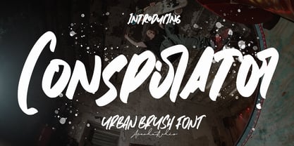 Conspirator - Urban Brush Font with its distinctive character that can be easily implemented in your various design projects . Conspirator came with opentype features such stylistic alternates, stylistic sets & ligatures good for logotype, poster, badge, book cover, tshirt design, packaging and any more. Features : • Character Set A-Z • Numerals & Punctuations (OpenType Standard) • Accents (Multilingual characters) • Ligature There it is! I really hope you enjoy it .
 - Thinset by Josh Grzybowski,
$19.99 The original intent for Thinset was to be used strictly as a display font only, but this single weight typeface can at times work great as a body of text as well. It's a clean, legible, and light font which is ideal for publications like fashion and editorial magazines. In addition to ligatures and fractions, Thinset’s other OpenType features include old style numbers and small caps.
 - Bocadillo by Hanoded,
$22.00 A Bocadillo is a sandwich. I guess I was craving one when I had to name this font! Bocadillo is a sweet Brush script. It is all caps, but upper and lower case are different and like to mingle. It is an ideal font for product packaging, posters, book covers, postcards and big ‘I love you’ billboards. Comes with a generous helping of diacritics.
 - Conspiracy by Arendxstudio,
$18.00 Conspiracy - Urban Brush Font with its distinctive character that can be easily implemented in your various design projects . Conspiracy came with opentype features such stylistic alternates, stylistic sets & ligatures good for logotype, poster, badge, book cover, tshirt design, packaging and any more. Features : • Character Set A-Z • Numerals & Punctuations (OpenType Standard) • Accents (Multilingual characters) • Ligature There it is! I really hope you enjoy it
 - Commuters Sans by Dharma Type,
$19.99 Commuters Sans is a daily type. Classic but Modern. Very simple geometry and wide type with warm clearness. Useful for both body-text and titling by their minimal glyph shapes and slightly wide and eye-catching proportion. Consists of eight weights and their matching italics. Supporting almost all latin languages. All-caps text for one line or a few is as wonderful as normal mixed-case typesetting.
 - Komunidad Hebrew Script by Jonahfonts,
$42.00 Komunidad is the Hebrew version of ”Quintana Light”. Suitable for logos and packaging statements. Invoking the OpenType / CONTEXTUAL variant produces the word terminals for all lower-case letterforms as well as diacritic letters. Final Hebrew Glyphs are also added. This can be done individually for each letter as well. Komunidad also contain alternative Swashes and TabOldstyle numerals. (OpenType-Variants may only be accessible via OpenType-aware applications.)
 - British Empire by Alan Meeks,
$45.00 British Empire is an attempt to re-create some of the typographic characterisics of countries within the former British Empire. It is a sans-serif with unusual up-facing serifs on some of the caps and the lower case round characters have flick round terminals Though designed as a headline face it still works well in limited text. There are four weights with four corresponding italics.
 - Madita by Hubert Jocham Type,
$39.00 Madita started with the idea of an upright sans script. Unlike other script typefaces, some of the characters look fairly constructed. The endings are either vertical or horizontal. On the other hand there are the swashes of a flowing script woven into the sans stroke that create an interesting tension. Madita is surprisingly legible, even in smaller sizes. The upper case letters even work in all caps.
 - Mission Accomplished by Hanoded,
$15.00 Mission Accomplished is a fast and furious kind of font. I started jotting down letters with a marker pen as fast as I could to see what would come out. Well, this font came out. Mission Accomplished can be used virtually anywhere, but single origin coffee bean packaging and artisan marmalade labels come to mind. Comes with a bunch of cute discretionary ligatures as well!
 - Skeleton Slab by Studio K,
$45.00 Skeleton Slab brings a new elegance to a classic form. I was thinking of calling it Ozymanidias, after Shelley’s poem, because it evokes memories of ancient runic inscriptions, but then I thought that was maybe a bit pretentious, and I decided I'd keep it simple and descriptive. Besides, I wasn't sure how to spell Ozymandias! Skeleton Slab has small caps in place of lower case.
 - Griffon by Dharma Type,
$24.99 Griffon, titling face with influence from classic letterforms, inspired by retro faces in the early 20th century. This font family was all redesigned from scratch and now released ranging in 5 weights with small caps from Light to Bold. The powerful letterforms can make a strong impression on everyone. Try this HANDSOME serif that reminds you of the old days, about one hundred years ago.
 - Grayson 1940s Art Deco Typeface by Hipfonts,
$18.00 Grayson is a 1940s art deco typeface. The inspiration came from vintage store signs in London, New York, and other major cities. The font is clean, easy to read, and its letterforms are memorable which makes it perfect for branding. You can use this font for a wide variety of projects, possibilities are endless. The downloads comes with OTF and TTF versions of the font. Enjoy!
 - Weirdtopia by Invasi Studio,
$19.00 Weirdtopia - is retro, fun, and playful. It really ties together your piece to make it feel retro. Perfect for making any project like header, quote, layout magazine, and others. Even better if used on the 60s and 70s design projects. A mix of psychedelia and groovy, it came with open-type features such as stylistic alternates that you can modify to fit your own style.
 - Knitting And Sewing Doodles by Outside the Line,
$19.00Knitting & Sewing Doodles are just that. If you type all caps you get 15 knitting icons and lower case is 15 sewing doodles. Knitting items include yarn, knitting, needles, ball winder, spinning supplies, stitch counter, etc. Sewing machine, buttons, thread, pin cushion, bobbin, thimble and needles, scissors, label, tape measure, darning egg, zipper, seam ripper, and pins, all in the Outside the Line style. - Lastero by Larin Type Co,
$15.00 Lastero this amazing handwritten font duo is light and elegant, will emphasize your personality in any project and will charm you with its signature. This font includes alternates for Uppercase and Lowercase, also a lot ligatures for lower case make your signature with them. You can use it to create logos, branding, t-shirts, book covers, stationery, marketing, blogs, magazines, cosmetics, signage, and more.
 - Totemic by Canada Type,
$29.95 Jim Rimmer’s first typeface was originally published in 1970 as a basic film type alphabet through a small, independent type house in central California. Its sources of influence (now calligraphic type standards by Dair, Goudy and Zapf) are ones that remained with Jim for the rest of his career. If you squint at Totemic in just the right way, you can see some recognizable themes Jim would later flesh out and make his own in later works throughout his career as a type designer and printer. Totemic is now available for the first time as a digital font, of the refined and expanded kind now expected from Canada Type. It comes with quite a few standard advanced typography features: Small caps, caps-to-small-caps, automatic fractions and standard ligatures, stylistic alternate sets, six kinds of figures, case-sensitive forms, and extended Latin language support. It also comes with a very unique and unprecedented feature: Variably stackable totem poles. Simply enable the discretionary ligatures feature, type any unique three-digit combination using numbers between 1 and 4, and watch the magic happens. With a name like Totemic, we just couldn't help ourselves. Many thanks to Andrew Steeves of Gaspereau Press for finding Jim’s lost gem in a most unexpected place, and for helping us bring it back to life 45 years after its analog birth. 20% of Totemic’s revenues will be donated to the Canada Type Scholarship Fund, supporting higher typography education in Canada.
 - Rough Print JNL by Jeff Levine,
$29.00 The Superior Marking Equipment Company was originally located in Chicago, Illinois and over the years produced a line of both commercial and toy rubber stamp printing sets which were used for making signs, posters, tickets and other printed items. Rough Print JNL reproduces the scanned images printed from one of the toy rubber stamp sets. The sample characters were smaller than one half inch in height and were further reduced during scanning. This gives the end result of a typeface which looks like rubber stamp imprints at small sizes, and very angular, distorted, somewhat grunge type when printed at larger sizes. There is a limited character set consisting of alphabet, numerals, some punctuation and currency symbols. No kerning was added to keep the hand-made appeal. Rough Print JNL is an all caps font with the letters and numbers jogged randomly on both the caps and lower case keystrokes. For a similar design with lower case, Amateur Printer JNL is recommended.
 - Dufour by Scholtz Fonts,
$19.00 Dufour was named in honor of an art deco font called "Independent" designed in the 1930s by Collette and Dufour. "Dufour" is influenced by the original font, however, there are substantial differences: instead of small caps, a true lower case was created, the upper case character proportions and shapes have been greatly modified, and all missing characters have been created to make a truly modern font which nevertheless has all of the panache of the original. A related font is Collette, designed by Anton Scholtz, however, Dufour has a softer feel that is more true to the original art deco period. Dufour comes in four styles: Dufour Regular, Dufour Regular Outline, Dufour Condensed, and Dufour Condensed Outline. The font has been carefully kerned and best results are obtained if kerning is switched on. (All-caps passages work well.) It is best used to create a retro feel and in headings, subheads and in short passages of text. Very effective in marketing for products for children.
 - Charman Serif by Propertype,
$12.00 The Charman Serif Font Family Pack is an Elegant serif font that comes in 20 different weights. Designed to reflect nature, creating a sense of softness and natural expression. The concept is pushed in a usability-focused direction, to serve as both a bold tool and a classy communicator. Charman Serif is encoded with Unicode PUA, which allows full access to all additional characters without having to design any special software. Mac users can use Font Book, and Windows users can use Character Map to view and copy any additional characters to paste into your favorite text editor/app. The Charman Serif character set combines many of the features of open type - additional symbols, both standard and optional, as well as punctuation in case and lower case - resulting in a stable workhorse set ready to handle projects of any size. I hope you enjoy using the Charman Serif font and that it will be a perfect addition to your font collection!
 - Ribbonetter by Ingrimayne Type,
$5.00 Ribbonetter is an experimental font playing with the calt or contextual alternatives feature of OpenType. This feature alternates letters in ovals with letters in hourglass shapes to create a banner. The letters in the ovals will be determined by the start of the line, whether it starts by typing an upper-case or lower-case letter. Using layers, background color can be added (dot accent and ring characters) or the outline color can be changed (sterling and yen characters). The font may also be useful with the contextual alternatives turned off. Different amounts of character spacing may give interesting results. With default character spacing, ovals with will overlap. If you are typing numbers and want the start to be an oval, switch on OpenType style set 2. In at least one word processor (Pages 5 for Macintosh) the carriage return adds the shape assigned to the space character. If you encounter this, try adding a nonbreaking space (option-space on the Macintosh) before the carriage return.
 - Big River by Ana's Fonts,
$15.00 Big River is an elegant sans serif and handwritten font duo with lots of extras. It includes: - A wide sans serif font in three weights (with caps and small caps); - A handwritten font with a regular and slant version, and bonus swashes to give your designs a more natural look. Each font includes: - A-Z, a-z, 0-9, accents, punctuation and symbols - Contextual alternates (script) - Ligatures (script) This font duo makes it so easy to achieve beautiful and eye-catching designs, and is perfect for both short and longer texts. It can be used for making postcards and notes, creating logotypes, social media posts, branding and packaging, etc. Please note: No special software is needed in order to access the extras, as they are in a different font file. You can simply access them directly in your font bar (a-z for terminals in regular, A-Z for terminals in italic, and 0-1 for squiggles).
 - Metal Cry by Fabulous Rice,
$25.00 Metal Cry is a font family that was inspired by countless hours spent playing video games, watching old movies or reading comic books. And even more hours closely analysing the design of all these things. The art of creating beautiful letters has slowly declined with the rise of the digital age and its solid-colour, 2D fonts. And most of the time, the care given to typography in cultural products just isn't what it used to be anymore. This was the inspiration for Metal Cry, a family of 4 layerable fonts that can bring a feeling of depth to its letters, and offers endless possible combinations. Metal Cry Outlands is the basic shape of all the characters, it can be used as the bright side of the bevel. Metal Cry Front is the inline border font that can be used as the front side of the bevel. Metal Cry Shadow can be used as the dark side of the bevel. Metal Cry Depth can be used to flash out the inside shape of the letter. But of course, any font can be combined with any other font(s) to obtain various results. The planets in the above visuals are courtesy of 3D artist Thomas Veyrat / veyratom.com
 - Yolk by Monotype,
$31.99 Yolk is an Eggcentric Sans Serif Typeface consisting of nine weights in both roman and italic. Essentially, this is a geometric sans typeface that has been inspired by the shape and proportions of an egg. With its bottom-heavy glyphs, Yolk has an unusual personality – it’s not too awkward to be off-putting, and it’s not too uniform to be associated with the myriad of generic geometric sans fonts that are available. Yolk has a distinctive presence in its upright form, while the italics exude a more flamboyant nature. When combined, your typographic results will be pleasing and perhaps a little quirky too. This 18-font type family achieves a good balance of personality, versatility, and usability. Small Caps are available at the click of a button, then add Stylistic Set 1 to achieve Petite Caps. The petite caps harmonise with the regular lowercase forms, so that you can create unicase-style typography too. All Latin-based languages are covered within the 1000+ glyphs of each Yolk font. Key Features: • 18 font family – 9 weights in Roman and Italic • Small Caps, Petite Caps, with Proportional, Old Style, and Small Cap figures, plus Fractions, Numerators, Denominators, Superiors, and Inferiors • Full European character set (Latin Extended) • 1,000+ glyphs per font.
 - Hoofer by Scholtz Fonts,
$15.00 Light and flexible, slightly retro, casual and readable, Hoofer combines 28 brush script, mono line script and sans-serif styles with ornaments into one Mega-Family. The different styles of the Hoofer Mega-family have been chosen to work together and to harmonize in a pleasing way. The Hoofer Mega-Family of fonts can be divided into three sub-families: Hoofer BRUSH subfamily: An eclectic group of five fonts. These are mainly joined scripts. Hoofer LINE subfamily: Seven mono-line scripts with joined letters in a number of weights, widths and styles. Hoofer SANS subfamily: Sixteen casual, Sans-Serif fonts. They are very readable and in a variety of weights & styles The mood of the Hoofer mega-family is light and flexible, slightly retro, casual and readable. It combines script and many sans-serif styles with ornaments into one Mega-Family. The different styles of the Hoofer Mega-family have been chosen to work together and to harmonize in a pleasing way. The Brush Sub-Family is designed for titling, packaging and display purposes, The Line Sub-Family can also be used for titling, packaging and display, however, it is less “showy”, and conveys an air of informality. The Sans Sub-Family is designed to shine as sub-heads and as body text. The wide range of Hoofline styles gives you, the designer, great flexibility in creating just the mood or impression that you want. Most of the fonts can use one or more OpenType Features. These can be accessed in a number of ways. The reason for this is that the major software producers provide different (and often conflicting) ways of accessing OpenType Features. In some cases such software manufacturers provide NO way of accessing certain OpenType Features. We have tried to remedy this by providing a highly flexible family of fonts. OPENTYPE (these OpenType features are only available in the “otf” fonts and not in the “ttf” fonts.) OpenType features that Hoofer makes use of are: Swashes (Word-Begin and Word-End Features); Alternate Numerals; and True Small Caps. ORNAMENTS In addition the Hoofer family has a font containing 94 ornaments. ALTERNATE NUMERALS You can access two sets of figures (numbers) in Hoofer Sans fonts. Both sets are tabular and lining but they differ in the height (but not the width) of the figures. The height of the alternate figures has been chosen so that they are compatible with the small caps. However, these alternate figures are available in ALL Hoofer Sans fonts, whether they feature small cap fonts or not. Hoofer has all the features usually included in a fully professional font. Language support includes all European character sets, Greek symbols and all punctuation. Opentype features include automatic replacement of some characters and discretionary replacement of stylistic alternatives.
 - Favarotta by Eurotypo,
$24.00 Favarotta was a small settlement on the medieval times. in the Gulf of Castellammare near Palermo, Sicily. Favarotta font is inspired on the style of writing based on Carolingian models, which continued to be used for handwritten liturgical works in Italy. The style show close affinities with the Italian printed books of the period. It combines Roman cursive writing ideas with some of the Celtic innovations in insular writing, including four guide lines, with strokes that flow smoothly from the ascending and descending. Favarotta font family contain five weigh and its corresponding italics. The Italic style are clearly legible and attractively set out, without obvious idiosyncratic tendencies. These fonts can be read and display with pleasure. Each font of the family contain standard ligatures, small caps, old style numerals and support CE languages.
 - Fungis by Ivan Petrov,
$30.00 Fungis is a somewhat �brother� of Fungia. These two typefaces were conceived simultaneously as an experiment on designing typeface based on natural shapes. In both cases it was mushrooms. Of course the main theme of these typefaces is not mushrooms itself (it was just a start point) but the interaction between form and counterform. In spite of unquestioning individuality the font has some associations with wood typefaces from wild west, typefaces from circus posters of 19th century and even slight feeling of gothic. The font can be useful in different cases: posters, titles, book covers, billboards, street signs, magazine spreads and all situations that demand expressive typography.
 - Dro by KC Fonts,
$25.00 The Dro family is an all uppercase handmade font that resembles cut-out construction paper; Both fonts have 6 glyphs for each letter & 2 per number which are accessed by uppercase, lowercase, small caps & Contextual Alternates. Each font has 550+ glyphs total. When using Opentype applications Dro and Dro Fill take the handmade look further by cycling through Contextual Alternates, Small Caps & Double Letter Ligatures for a unique and authentic look to your creative. When not using the Contextual Alternates feature, you can still alternate between uppercase and lowercase letters and using Stylistic Sets to switch up the flow. The Dro family has an extended character set for multilingual support.
 - Cassius by W Type Foundry,
$23.00 Cassius & Cassius Italic are a postmodern typeface system from the Garaldes family. The main characteristic of this type family is its inverted anatomy and projected terminals. Cassius was meticulously designed with special focus on its structure. With its proposal for a fresh, attractive and rhythmic system, Cassius gives great personality to all kinds of composition. The family consists of 5 weights from regular to black, with respective Italics. Each instance includes; Case sensitives Accents, Ligatures, Fractions, Small Caps, Old Style Figures, Case Sensitives (symbols and punctuation) and more. This font is perfect for books and magazines compositions, and in general for the construction of immersive printed or digital texts.
 - Omniscient by Comicraft,
$19.00 Omniscient is a narrative font that sees all… it’s everywhere and nowhere, the storyteller and the story, upper and lower case. This godlike font can be first person AND third person, friendly or serious, personable AND impersonal. It knows all the details but will only reveal them when it serves the narrative. The classical characters in Omniscient are all knowing, all seeing, and can even be all singing, all dancing on occasion. Even gods like to let their hair down and have fun. Features three weights with upper & lowercase alphabets, language support for Western & Central Europe, Automatic alternates, Stylistic Alternates & Crossbar I Technology™.
 - AT Move Decoupe by André Toet Design,
$39.95 Découpé Based on a French children’s play from 1906. In a car boot sale André Toet found a funny looking box containing a lot of cut out cardboard figures, in fact it looked a bit like a geometric puzzle! He played around a bit and succeeded to create a workable typeface with it ! The interesting thing about this particular font is, that in fact it’s organized chaos. The 26 letters of the alphabet are a mix between caps and lowercases, so within one word caps and lowercases will be used next to each other. It’s a very useful font for different projects. Concept/Art Direction/Design: André Toet © 2017
 - Hanisha Lovely by Cooldesignlab,
$15.00 Hanisha Lovely - a modern calligraphy font designed with skill and care with strokes of love. Perfect for greeting cards, branding materials, business cards, shirt mockups, quotes, posters, and more! Hanisha Lovely includes a complete set of international uppercase letters, numbers, punctuation, and binders. All lowercase letters including the start and end of the attack. The script is coded with Unicode PUA, which allows full access to all additional characters without any special design software. Mac users can use Letter Book, and Windows users can use Character Map to view and copy additional characters to include in your favorite text editor / application. Thank you and have a nice day. CooldesignLab,
 - Cullion by Greater Albion Typefounders,
$9.95 Cullion is a new departure for Greater Albion, being a modern Fraktur, embodying future trends sch as highly stylised glyphs, a single case of lettering and highly evolved letterforms. At the same time it can trace its inspiration back to blackletter traditions, and is inspired by the sort of ironwork to be found in a medieval portcullis. The resulting typeface can sit happily in traditional, modern or futuristic design work. As the gallery images suggest, it does rather lend itself to work with a 'horror' theme, but it could have many other uses too-even in religious work. Cullion is particularly effective in poster headings.