4,635 search results
(0.027 seconds)
- Garnet Euro Typewriter by Coniglio Type,
$19.95Garnet is a rare TT typewriter face, made digital from analog samples gathered with great care by Coniglio Type. A time and place; type and life. Garnet Euro Typewriter is the first new release by designer Joseph V Coniglio in over 5 years. It is contemporary designer type, made from the struck steel hammers of an art deco san serif face transferred from a mechanical 1926 Royal Portable typewriter. It has an obsessively complete commercial roman character set ––for the pre-opentype environment of the late 1990's. Yes, it has that great “Monopoly Game” question mark -- and all on a period-piece typewriter! You should have no trouble grafting that sorely needed Euro symbol.” –And he very well did! - Illuminated Initials by Kaer,
$24.00 Illuminated Initials font family has Regular and Colored styles and inspired by medieval initials. It's all you need to precisely imitate dark-ages style text. Use this font as a decorative element at the beginning of a paragraph or section, other part of the paragraph should be in regular black letter font. You’ll get Drop Caps & Numbers set. --- *You can use color fonts in PS CC 2017+, AI CC 2018+, ID CC 2019+, macOS 10.14 Mojave+ * *Please note that the Canva & Corel doesn't support color fonts!* *Please download this test file with only A letter ( https://www.dropbox.com/s/fbt3wpu2j3t0ymv/IlluminatedInitials-Test.otf?dl=0 ) to check your app & system.* --- Please feel free to request any help you need: kaer.pro@gmail.com Best, Roman.
 - Analogia by George Tulloch,
$21.00 Analogia is a digital interpretation of types used in the mid-18th century in books printed at Leuven by Martin van Overbeke. It is intended primarily for use in running text. The roman is businesslike, yet with a distinct personality; it has a generous x-height and is slightly condensed, though without appearing cramped. It is complemented by a more lively italic, which retains some irregularities in the angle of slant that are characteristic of the original. Analogia provides wide support for west, central, and east European languages that use the roman alphabet. Among its OpenType features are ligatures, small caps, several sets of numerals, contextual alternates, intelligent implementation of long ‘s’, and fractions. For more detail, please see the pdf available in the Gallery.
 - Zona Pro by Intelligent Design,
$10.00 Zona Pro is a geometric sans-serif type family of 8 styles plus matching italics, designed by Kostas Bartsokas in 2013/14. It draws inspiration from 1920’s geometric style faces, having clean and highly readable shapes, and mixes it up in the heavier weights with a slight variance in the stroke widths, lending it a grotesque-ish unique and distinctive look. Zona Pro is multifunctional and versatile. With its modern yet elegant form it performs amazingly in display sizes and headlines. At the same time its really tall x-height makes Zona Pro equally suited for editorials and shorter lines of text in smaller sizes (magazines, newspapers). Zona Pro supports Greek, Western, Central and Eastern European languages, ligatures and special characters.
 - Medieval Knots by Kaer,
$21.00 Medieval Knots font family has Regular and Colored styles. It inspired by Celtic knots initials and lines. It's all you need to precisely imitate medieval style text. Use this font as a decorative element at the beginning of a paragraph or section, other part of the paragraph should be in regular black letter font. You’ll get Drop Caps & Numbers set. --- *You can use color fonts in PS CC 2017+, AI CC 2018+, ID CC 2019+, macOS 10.14 Mojave+ * *Please note that the Canva & Corel doesn't support color fonts!* *Please download this test file with only A letter ( https://www.dropbox.com/s/w6n0zmga231xng1/MedievalKnots-Test.otf?dl=0 ) to check your app & system.* --- Please feel free to request any help you need: kaer.pro@gmail.com Best, Roman. Thank you!
 - OMEGA Old Face - Unknown license

- Rettaya by Griyotype,
$10.00 Rettaya is a cool, bold display font. It will elevate a wide range of crafting ideas, from cards, to branding, labels and much more.
 - Grenale #2 by insigne,
$24.00 Grenale #2 shapes the new standard of elegance within the Grenale family. Not your typical sans, this pure, geometric structure with its glamorous sensitivity draws much inspiration still from Grenale's didone sans and the haute couture influence. Independently attractive, though, the form abandons the original's high contrast for its own minimal stroke variation, achieving proper balance through its graceful strokes. Grenale's thin weights are simple but vibrant--elegant forms that naturally lend themselves to designer journals and high-end branding along with upscale applications. With added energy and power, the thicker weights give your work a firmer, statlier look. Grenale #2's upright versions are also matched by optically adjusted italics. While unique in appearance, any of #2's weight also provide a well-matched companion to its original counterpart. The fashionable typeface includes a multitude of alternates that may be accessed in any OpenType-enabled application. The stylish features include a large group of alternates, swashes, and meticulously refined details with ball terminals and alternate titling caps to accessorize the font. Also included are capital swash alternates, old style figures, and small caps. Peruse the PDF brochure to see these features in action. OpenType enabled applications such as the Adobe suite or Quark can take full advantage of the automatic replacing ligatures and alternates. This family also offers the glyphs to support a wide range of languages. It's time to think high-class. Graceful and assured, the carefully crafted forms of Grenale #2 step pleasantly onto each page with elegant charm. Include its range of alternate glyphs, and this chic font is a superb choice for bringing a far more refined look to your projects.
 - Minotaur by CastleType,
$59.00 Minotaur is an original monoline design based on an Oscan (http://en.wikipedia.org/wiki/Oscan_language ) votive inscription from the second century B.C.E. The letterforms immediately caught my eye in the wonderful book, Lettering by Hermann Degering, and I decided to create a typeface based on them with only enough compromises to make it usable as a modern alphabet. Not quite as straightforward as I had hoped. For example, the Oscan language (the predominant language in the Italian peninsula before the ascendance of Latin), has no letter "O", so the distinctive curve of the "D" was used as the model for the rounded letters "C" and "G" and more subtly for "O" and "Q"; this shape is also echoed in the original design of "B", "P" and "R". Also, the Oscan letterforms for A, K, L, M, N, S, and U are rather quaint, so I've included modern forms as alternates. Minotaur offers the best of both worlds: Just as the mythical Minotaur is half man and half bull, the font Minotaur is half modern and half ancient. Thanks to OpenType features (stylistic sets), you can easily switch from ancient letterforms to modern (if you have an OpenType-savvy application such as Adobe InDesign) for Latin, Greek, and Cyrillic alphabets. Minotaur supports all modern European languages, including Modern (monotonic) Greek and those that use the Cyrillic alphabet. And, yes, it supports Oscan, both right-facing and left-facing. Minotaur includes 3 OpenType Stylistic Sets: 1 - converts ancient (default) letterforms (A, K, L, M, N, S, and U) to modern alternates; 2 - converts Latin letterforms to equivalent left-facing (standard) Oscan letterforms; 3 - converts Latin letterforms to equivalent right-facing Oscan letterforms.
 - Offense by Reserves,
$49.00 Offense is an unyielding rectangular slab-serif face designed with consistently balanced letterforms and a refined finish. It’s extremely angular geometric form commands attention in display settings, yet is also legible in short text blocks. Numerous alternate character sets allow room for customization, while the expanded ligatures push letter combinations to the limit. Stylistically, Offense’s almost crude, sharp-cornered construction is balanced by it’s sophisticated finish and attention to detail, often unrealized in similar faces of this genre. The upright weights are complimented by pairings of true italics, completely rebuilt, slightly narrower in width with modified letterforms, increasing their contrast and flow. Features include: Precision kerning Standard Ligatures set including 'f' ligatures (fi, fl, ff, fh, fj, ffl, ffi, ffj) Discretionary Ligatures set including (ft, rt, ae, oe, st, ft, ct, oc, oo, ry, AE, OE, AL, TH, HE, AK, AN, TT, HD, AM, AP, AR, NF, NE, NH, NL, NB, FL, ND, FE, AB, OB, OD, OF, OG, OH, OK, OL, OM, ON, OO, OP, OQ, OR, OU, AH, UE, UF, UB, UD, UH, UK, UL, UM, UN, UP, UR, UU, MP, XY, YX, KY, WY, VY, AF, FF, FI) Alternate characters (O, o, S, s, a, h circumflex, @, ®, ¶, $, &, _, and various ligature alternates) Case forms (shifts various punctuation marks up to a position that works better with all-capital sequences) Capital Spacing (globally adjusts inter-glyph spacing for all-capital text) Slashed zero Full set of numerators/denominators Automatic fraction feature (supports any fraction combination) Extended language support (Latin-1 and Latin Extended-A) *Requires an application with OpenType and/or Unicode support.
 - Genotype BRK Pro by CheapProFonts,
$10.00 A stylistic and square outline font suitable for headlines and logos. The original font contained no diacritics at all, so I have designed these to match. I also made the descenders on "g/j/p/q/y" a bit longer - so they would balance better with the letters with diacritics below the letter... I redesigned the "t", but have included the original "t" as an alternate, available via your programs' glyph palette or using the OpenType functions "Stylistic Alternates"/"ss01". Genotype S BRK Pro is the perfect companion for Genotype H BRK Pro (The H stands for Hollow and the S stands for Solid). Can be used as a fill for its companion (using layers), but is also quite a usable font on its own. ALL fonts from CheapProFonts have very extensive language support: They contain some unusual diacritic letters (some of which are contained in the Latin Extended-B Unicode block) supporting: Cornish, Filipino (Tagalog), Guarani, Luxembourgian, Malagasy, Romanian, Ulithian and Welsh. They also contain all glyphs in the Latin Extended-A Unicode block (which among others cover the Central European and Baltic areas) supporting: Afrikaans, Belarusian (Lacinka), Bosnian, Catalan, Chichewa, Croatian, Czech, Dutch, Esperanto, Greenlandic, Hungarian, Kashubian, Kurdish (Kurmanji), Latvian, Lithuanian, Maltese, Maori, Polish, Saami (Inari), Saami (North), Serbian (latin), Slovak(ian), Slovene, Sorbian (Lower), Sorbian (Upper), Turkish and Turkmen. And they of course contain all the usual "western" glyphs supporting: Albanian, Basque, Breton, Chamorro, Danish, Estonian, Faroese, Finnish, French, Frisian, Galican, German, Icelandic, Indonesian, Irish (Gaelic), Italian, Northern Sotho, Norwegian, Occitan, Portuguese, Rhaeto-Romance, Sami (Lule), Sami (South), Scots (Gaelic), Spanish, Swedish, Tswana, Walloon and Yapese.
 - AJ Quadrata by Adam Jagosz,
$25.00 Once, Blackletter was a calligraphy style. Full of ligatures, with letters bumping into each other to create an unapologetic picket-fence pattern. Some even claimed that the regularity improved legibility! But then Blackletter was cast into metal, and only a handful of established ligatures survived, while most interletter connections were disentangled. Everyone since followed suit, and hundreds of years later, digital Blackletter fonts were modelled mostly on the metal fonts that prevailed rather than the original handwriting. Up until now! AJ Quadrata is an authentic revival of the textura quadrata hand, and its major inspiration is a 15th-century Latin manuscript of the Bible from Zwolle, the Netherlands. The typeface is delivered in two flavors. The default cut is a modern take on textura quadrata that can be useful for today and tomorrow. The standard ligatures feature employs nearly all letters. The tittle of i retains its original, hasty squiggle form (except for the Turkish localization). Discretionary ligatures include medieval ligatures da, de, do, pa, pe, po (and their mixed-case counterparts!). Stylistic sets allow to use historic letter variants such as long s and rotunda r, closed-counter a, and alternate capitals. AJ Quadrata Medieval is perfect for setting Latin. Default forms of capital F, H and O are swapped with the alternates. The squiggles above i only appear for disamibiguation nearby m, n or u, as in original manuscripts. Discretionary ligatures and historic variants are promoted to the standard ligatures feature to make room in the discretionary ligatures feature for a variety of scribal abbreviations. Dedicated stylistic sets include medieval punctuation and justification alternates — glyphs with elongated terminals used for lengthening lines that end up too short. The Rubrum styles can be layered and colored to create the illuminated effect on the capital letters. Besides a faithful rendition of extended Latin including Vietnamese, numerous synthetic additions are included: polytonic Greek, Armenian, and Cyrillic (with Bulgarian and Serbian/Macedonian localizations). Both flavors of the typeface can be considered a starting point that can be further customized using OpenType features, including Stylistic Sets (some features differ between AJ Quadrata and AJ Quadrata Medieval): ss01 Alt E ss02 Descending F / Roman F ss03 Uncial H / Roman H ss04 Angular O / Round O ss05 Contextual closed-counter a ss06 Diamond-dot i j / Always dotted i, j ss07 Contextual rotunda r / No r rotunda ss08 Contextual long s / No long s ss09 Dotless y ss10 Serbian Cyrillic ss11 Alt Cyrillic de ss12 Alt Cyrillic zhe ss13 Alt Cyrillic sha ss14-ss17 [reserved for future use] ss18 Scribal punctuation ss19 Alt linking hyphen ss20 Justification alternates
 - Imagine if your favorite whimsical old uncle, the one who somehow pulls off wearing mismatched socks and a bow tie to every family gathering, decided to dabble in typography. That's the spirit you'll...
- Gelato Script by Eclectotype,
$40.00 The original Gelato Script has been updated and improved, not once, but twice. This version is kept here for legacy and compatibility issues, but I would encourage new users to check out Gelato Luxe or Gelato Fresco instead. Gelato Script is a smooth-flowing typeface with an air of familiarity. Influenced by both formal scripts and mid-Twentieth Century hand lettering. The power of OpenType is used with precision in the Contextual Alternate feature to make sure letters connect seamlessly, t’s cross where they can and swashes don't crash into neighboring glyphs. 781 glyphs make up this font, which is capable of speaking in many different languages. Alternate forms are grouped into stylistic sets to make it easy to change the mood of the text. For example, ss01 makes droopable letters drop below the baseline to break it up a little if required. I recommend using it sparingly, one glyph at a time, but if you do enable it for a whole chunk of text, the clever OpenType programming ensures that it doesn't go overboard. Sets 2, 3 and 4 bring about alternate forms of S, s, B and Q. Set 5 changes AE and OE to some perhaps controversial Upper/lowercase ligatures. Engage ss06 for the underline feature. After a word, simply type two or more underscores and a line extends backwards under the word you just typed. Don't worry if you have to break for a descender, the OpenType programming will take care of making sure it connects properly to the preceding character. Sets 7 and 8 are for alternate ampersands, and ss09 swaps the script r for a regular shaped r. There are swash capitals available for most uppercase letters, and the OpenType programming makes sure there is room for them under or over the following letters. There’s also a good amount of ligatures thrown in. The localised forms feature can be set for Polish, where acutes get steeper and lslash takes on its script form; Dutch, where IJ and ij digraphs become cool ligatured combinations; and Romanian and Moldovan, where cedillas are subsituted for comma accents. The stylistic alternates feature groups together a few of the stylistic sets for users that can't get to them directly. Gelato Script is a highly usable, powerful typeface. Perfect for everything from food packaging to wedding invitations, sports team logos to magazine headings. Use it however you see fit. Just one thing - it’s not designed for all-caps settings, so avoid that at all costs!
 - Nasty Graffiti by Mvmet,
$12.00 Nasty Graffiti is a very cool graffiti tag font, inspired by California street art movement scenes mixed with horror and Halloween vibes. It will elevate a wide range of design projects to the highest level. You can use this font for many design ideas such as stickers, t-shirt designs, amazing logo designs, magazine or book covers, comics, cartoon drawings, and many more. This font will add a cool touch to your designs!
 - Parasight - Unknown license

- Allnoob by Skiiller Studio,
$20.00 Allnoob Typeface is one of the elegant decorative fonts neatly arranged and cool, you can also use it for business, clothing, movie titles, and more
 - Adolescent by Krakenbox Studio,
$12.00 Adolescent is a cute and playful handwritten font. Use this font to add that special cool touch to any design idea you can think of!
 - Hakaze by Phoenix Group,
$13.00 Hakaze is a font that symbolizes strength and is trendy, this font is depicted in a Japanese style with a modern, cool, and contemporary touch.
 - Redmoon by Krakenbox Studio,
$9.00 Redmoon is a cute and playful handwritten font. Use this font to add that special cool touch to any design idea you can think of!
 - Nicko by Zealab Fonts Division,
$14.00 Nicko is a bold and friendly typeface. Nicko has a unique style with stylistic, alternates, ligatures and supports multilingual languages. Create unique & beautiful logotype, use it as an elegant solution for your next magazine layout, or choose Nicko for any graphics that require a sleek look with a elegant flair.
 - Monschone by Zealab Fonts Division,
$18.00 Monshcone is a minimalist luxury and gorgeous font that is both classically elegant and inherently modern. Create unique word mark logo, beautiful wedding invitations, use it as an elegant solution for your next magazine layout, or choose this font for any graphics that require a sleek look with an elegant flair.
 - Chumpsy by PizzaDude.dk,
$17.00 Chumpsy is clumsy - I did my best to make an awkward and bouncy hand-written font that was funky, but still legible. I added 11 slightly different versions of each lowercase letter, which automatically cycle as you type, or you can manually choose the one that suits you the best.
 - Brunches by Trustha,
$18.00 Brunches is a sans serif font family with five different styles. Basically this font is designed with geometric principles. There are several possibilities of styles to choose from as needed. Suitable for all creative project. Brunches will make each project easier and more colorful because it has several different styles.
 - Monkeywrench by Burghal Design,
$29.00Burghal Design's mission, should we choose to accept it: design a typeface whose characters consist only of hexagons, circles, triangles, squares and crescents. Mission accomplished, and voila! Monkeywrench is the result. Monkeywrench includes upper and lower case letters, numbers, symbols, punctuation, and accented foreign characters, as well as 7 lucky dingbats. - Chalulai by Jipatype,
$17.00 Chalulai, a serif typeface, seamlessly merges the aesthetics of stencil letters with a meticulously crafted high-contrast letter structure. Emanating a sense of beauty and delicacy, it offers 18 styles to choose from, supporting both Latin 1 and Thai letters. Ideal for diverse publications that prioritize headlines or a distinctive tagline.
 - Blont by 160 Std,
$22.00 Blont is a simple, minimal and techno looking sans serif font. Add it confidently to your favorite creations and let yourself be amazed by the outcome generated. Perfect for logos. and also suaitable for headlines, titles and posters. comes with alternates to make unique, you can choose the best for you.
 - Neima by Zealab Fonts Division,
$12.00 Neima is high contrast serif font features a mixed modern-classic design. Neima support multilingual languages, numbers, punctuation and alternative-ligatures. Create unique & beautiful logotype, use it as an elegant solution for your next magazine layout, or choose Neima for any graphics that require a sleek look with a elegant flair.
 - Meave Multipurpose Display Typeface by Eotype,
$12.00 Meave is high contrast serif font features a mixed modern-classic design. Meave support multilingual languages, numbers, punctuation and alternative-ligatures. Create unique & beautiful logotype, use it as an elegant solution for your next magazine layout, or choose Meave for any graphics that require a sleek look with a elegant flair.
 - Sterling Script by Canada Type,
$54.95 Sterling Script was initially meant to a be digitization/reinterpretation of a copperplate script widely used during what effectively became the last decade of metal type: Stephenson Blake's Youthline, from 1952. The years from 1945 to 1960 saw a heightened demand for copperplate faces, due to post-war market optimism, as well as the banking and insurance industries booming like never before, which triggered the need for design elements that express formal elegance and luxury. The name Sterling Script is a tip of our hat to England, the Stephenson Blake foundry's country of origin. It is also a historical hint about copperplate scripts having been used mainly for banking and bonds in the 19th century. Originally we just wanted to resurrect a gorgeous metal type from the ashes of forgotten history. But after the main font was done we saw that the original s really needed an alternate. We made one. But we felt sorry for the original s and didn't want to see it dropped from use altogether, so we saved it by building a set of ligatures that solve the minor connection problem with the s at large sizes. Before the completion of the ligatures, a few different alternates were also drawn, and we were faced by the fact that the single font we set out to do was now a much larger set than we anticipated. While thinking about how to split up our unexpected bundle of large characters, we drew a few more alternates and some swashes. This abundance "problem" reached a certain point where there was no looking back, so we just decided to go all the way with this font. We added many more alternates, swashes, ligatures, and two full sets of each beginning and ending lowercase letter. The result is over 750 characters of sheer elegance. Sterling Script has many features that set it above and beyond other copperplate scripts: - It has 2 beginning and 2 ending alternates for every single lowercase character. The beginning and ending variants on the vowels are also available in accented form in the appropriate cells of the character map. - Sterling Script is the ultimate elegant font choice for luxury design. Very elegant, but not too soft. Its strong and confident shapes convey a message that is real, comforting and assuring. - One of the eventual purposes of expanding Sterling Script this extensively was to create a script that finds the middle ground between formal and informal without compromising either trait, a script where the degree of formality can be gauged, tweaked, cranked up or toned down depending on the layout's needs. Aside from beginnings and endings, there are multiple variations for the majority of the basic characters. This is a formal script on steroids, where twirls and swashes can be set to come out unexpectedly from any place in the word, which is great for reducing the inherent rigidity of words set in copperplate scripts and "humanizing" them whenever needed. This is especially useful for wedding, postcard and invitation design, where not every viewer of the collateral material has something to do with banking or insurance. - With such an extensive character set, a designer can easily set a word or a sentence in 10 or more different ways, and choose the perfect one for the task at hand. This is particularly useful for work where details are of utmost importance, like logos, slogans, or elegant engravings that consist of one to three words. Let those swashes and twirls intertwine for maximum elegance. The Sterling Script complete package consists of 7 fonts: Sterling Script, Alternates, Beginnings, Endings, Swashes, Swash Alternates, and Ligatures. Sterling Script is available in five different purchase options and price ranges. But with such a massive offering of variation, the Sterling Script complete package is definitely the most value-laden set in its class. Once you use Sterling Script, you will never want to go back to other copperplates.
 - Wishkey by Letterafandi Studio,
$17.00 Wishkey is a cool and interestingly designed display font. It will elevate a wide range of crafting ideas from cards to branding, labels, and much more.
 - Rongjam by Motokiwo,
$15.00 Cool hand drawn font crafted from textured dry brush, this is Rongjam. An all caps typeface that very recommended for outdoor projects, sport, hipster, and youth.
 - Levarolls by Jehansyah,
$9.00 this is a cool sans serif font with a casual and complete with unique icons that you can make a logo or decoration on your design
 - TXT HunkaSpunk by Illustration Ink,
$3.00The name says it all. HunkaSpunk is whimsical, eye-catching, and fun. Download and use this cool TrueType font for lively scrapbook journaling and paper crafting. - Witchat by Rashatype,
$9.00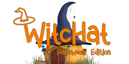 Witchat is a cool and spooky display font. It is perfectly suitable for any Halloween-related project or crafty idea! The only limit is your imagination.
 - Leonel Px by Letradora,
$12.00 Based on aa architect friend's handwriting with a calligraphic pen, this cool all-caps font comes with lots of alternates and a very complete character set.
 - Bellatrix by Rockboys Studio,
$19.00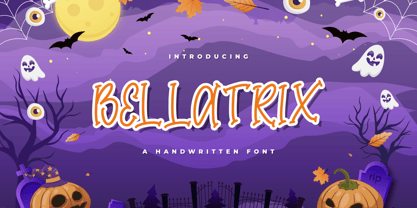 Bellatrix is a cool and spooky display font. It is perfectly suitable for any Halloween-related project or crafty idea! The only limit is your imagination.
 - Notebook BH by BluHead Studio,
$20.00Notebook BH Black was inspired by the block lettering we used to draw on our school binders. Notebook is a unicase design, with the lowercase drawn to the cap height, and each "case" having a distinctly different flavor. The fun and seemingly unlimited combinations of the upper and lowercase forms make it difficult to stop typing innocuous phrases and, if you're mobile, can even make boring lectures tolerable! - Isagi Blue by Lurinzu Studios,
$10.25 A techy, sci-fi condensed typeface that is inspired by the mixture of futuristic and athletic vibes into one out of this world headline typeface. This headline font best fits in large scale design when you want to immediately capture the attention of the viewers. This also fits with school-related, athletics, sports, future and science themed designs. *This font includes letters, numbers, multi-language, and all essential marks needed.
 - Northash by Arterfak Project,
$17.00 Introducing Northas the vintage stencil font inspired by the old-school signage and military design. This font has a bit condensed letterform that gives a strong look and dignified. Perfect for many themes such as sports, military, urban, wildlife, vintage, and more! Fonts featured : Uppercase Small caps Numbers Symbols & punctuation Accented characters Alternates Catchwords: in, out, the, with, de, of, at, and, etc. Thank you for your support and happy designing!

