10,000 search results
(0.223 seconds)
- Plz Print Bold Cond by Outside the Line,
$19.00 A bold, energetic, friendly font with a little bounce to it. A good, casual headline font. Works back well with Plz Print or Plz Script.
 - Cartoonist JNL by Jeff Levine,
$29.00 Cartoonist JNL was modeled from a casual brush lettering style found in a catalog of lettering templates sold by the Wright-Regan Instrument Company (Wrico).
 - Horror Hustle by Seemly Fonts,
$14.00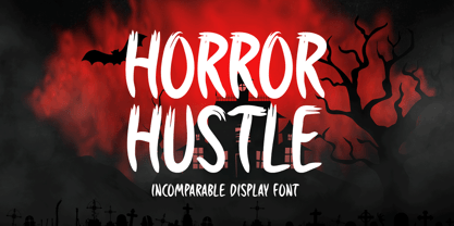 Horror Hustle is a casual display font. It is perfectly suitable for any Halloween-related project or crafty idea! The only limit is your imagination.
 - Loose Leaf JNL by Jeff Levine,
$29.00Loose Leaf JNL is a handwritten script with a disconnected, scrawled look as if either written by a child or done as a casual notation. - Simple Serif by Gerald Gallo,
$20.00 The Simple Serif fonts are designed as hand-lettered serif fonts. They are casual and informal and are ideal for use in conveying these qualities.
 - Reinert by E-phemera,
$12.00Reinert is a casual script font inspired by a few words in a magazine ad layout from the mid-1930s hand-lettered by Allen Reinert. - Coupon Clipper JNL by Jeff Levine,
$29.00Coupon Clipper JNL is a fun, playful, casual sans serif font that evokes some of the lighthearted typography of the late 50s and early 60s. - Pleasant Hand by Gerald Gallo,
$20.00 Pleasant Hand is designed as a condensed hand-lettered font. The family is casual and informal and is ideal for use in conveying these qualities.
 - Dr Slab by Dharma Type,
$14.99 Extraordinary impact and visual conspicuousness. Dr Slab is a super 3D serif family for posters, logos and all display. The basic idea is not a brand new. Stacking type system have been used since before wood type age. As you imagined, colored wood type(woodcut), many other engravings and contemporary printer machine print many colors separately with different printing plates for each colors. Dr Slab uses the same system for 3d effect. Please use Photoshop or Illustrator, or your favorite graphic design apps that can handle layers. Layers are the printing plates of wood type. You should be able to change text color for each layers. Dr Slab "Base" style is the core of this font family. You can add effects by using the other styles(Rim, Shadow, Ext). Instruction 1. Type your text as you like. 2. Set font-name "Dr Slab" and font-style "Base" 3. Set color for "Base". 4. Duplicate the layer which includes "Base" text. 5. Set font-style and color for new layers. 6. Stacked layers in different font-style and color make the text in 3D. For further detail, https://www.dropbox.com/s/9p9083zv2855bcq/DrSlab.pdf Dr Slab "Base" style can be used solely. Rounded slabs add soft, cute and casual impressions to your design. Spec: OpenType Format (.otf) with over 500 glyphs! Basic Latin ✓ Western Europe ✓ Central Europe ✓ South Eastern Europe ✓ Mac Roman ✓ Windows 1252 ✓ Adobe Latin 1 ✓ Adobe Latin 2 ✓ Adobe Latin 3 ✓ Almost all Latins are covered.
 - Kazincbarcika Script by Roland Hüse Design,
$9.00 An elegant calligraphy script. I named it after my hometown, Kazincbarcika. I think it looks interesting written down.The first letter I designed was the initial "K" and I have built the whole set around that.
 - Craft String by Putracetol,
$24.00 Craft String - Display Script Font. This script is a special script or typeface whose emphasis is reversed from general thinking. Craft String is a casual script font inspired by monoline hand written, pop cultures and urban culture Craft String is casual and fun script that stands out from the crowd, Craft String font that perfect for story books, illustrations, comic books, t-shirts, posters, greeting cards, logos, branding, stickers, svg, crafting and all for display purposes. The alternative characters were divided into several Open Type features such as Swash, Stylistic Sets, Stylistic Alternates, Contextual Alternates, and Ligature. The Open Type features can be accessed by using Open Type savvy programs such as Adobe Illustrator, Adobe InDesign, Adobe Photoshop Corel Draw X version, And Microsoft Word. This font is also support multi language.
 - Smokehouse by Dear Alison,
$24.00Have you ever wondered what sign painters and rib joints have in common other than the fact that they can both make a mess? What do they know that you don't which would have them pair a sexy casual script with a down south barbeque restaurant? Smokehouse is all about association. You'll find that this sexy casual script pairs well with a wide range of associations, from barbeque shacks to fairy princesses and everywhere in-between. It makes choosing the right font for the job an easy one, and for those that need to fill a little more space you'll find Smokehouse Wide is up to the task. Discover the power of association, and see how Smokehouse fits into your font collection. Buy both Smokehouse and Smokehouse Wide together as a family and save! - Cowboya Tuscan by deFharo,
$15.00 Cowboya is a typography with concave Tuscan serif very contrasted and modernist inspiration with letters in small caps, includes 4 versions of the font that can be used by superimposed layers which results in multicolored typographic titles. For the design of this typeface I was inspired by the credit titles used in the black film directed by Frizt Lang in 1950 called "The House of the River", to the drawing of the original forms of the letters i added decorative elements to give the fonts a festive character, traditionally this type of decorative fonts that emerged in Italy in the nineteenth century were used in large headlines and posters that were closely related to circus shows, carnival or environments of the Far West American. I have also rounded the sharper joints of the antlers and counterforms to create a contrast with the sharp Tuscan serifs which brings a modern background of retro inspiration and soft shapes.
 - Tractatus by Kaer,
$24.00 These initials set I collected from “Tractatus sacerdotalis de sacramentis”, published in the city of Lugrun, printed by Arnaldum Guillermum de Brocario in 1503. Tractatus font family has Regular and Colored styles. It's all you need to precisely imitate medieval style text. Use this font as a decorative element at the beginning of a paragraph or section, other part of the paragraph should be in regular black letter font. You’ll get Drop Caps & Numbers set. --- *You can use color fonts in PS CC 2017+, AI CC 2018+, ID CC 2019+, macOS 10.14 Mojave+ * *Please note that the Canva & Corel & Affinity doesn't support color fonts!* *Please download this test file with only A letter ( https://www.dropbox.com/s/1lr7fify0n520ms/Tractatus-Test.otf?dl=0 ) to check your app & system.* --- Best, Roman. Thank you!
 - Air Superfamily by Positype,
$29.00 In B-movie awesomeness, Air began as Grotesk vs. Grotesque. I was trying to unify the prevailing traits of German and English Grotes(que/k)s in order to make something different but familiar. I am NOT trying to reinvent Helvetica (snore), so get that out of your system. From the onset, I intended this typeface to be a true workhorse that offers infinite options and flexibility for the user. At its core, it is the maturation of the Aaux Next skeleton I developed years ago. I worked out Aaux Next to settle my issues and love for Akzidenz. With Aaux Next, I strove to be mechanical, cold and unforgiving with it. I was single, young, cocky and it fit. Now I'm married, kids, dog and have found that I've turned into a big softy. When I look at Aaux Next (and have for the past few years) I see another typeface trying to eek out. I wanted it to avoid the trappings of robotic sans, quick tricks and compromises. The typeface’s DNA needed to be drawn and not just generated on a screen — so I set aside a year. I love type. I love working with type. I hate when my options for a slanted complement is only oblique or italic. I set out to produce both to balance usage — there are more than enough reasons to prepare both and I want the user to feel free to consciously choose (and have the option to choose) the appropriate typeface for print, web, etc. That flexibility was central to my decision-making process. The Oblique is immediate and aggressive. The Italic was redrawn at a less severe angle with far more movement and, as a result, is far more congenial when paired with the Uprights. Condensed and Compressed. Yep, why not? I know I would use them. There are nine weights currently available. The logical progression of weights and the intended flexibility demanded I explore a number of light weights and their potential uses — this has produced a number of ‘light without being too light’ options that really work based on the size. The result is a robust 81-font superfamily that is functional, professional, and highly legible without compromising its personality. Pair that with over 900 characters per font that includes ligatures, discretionary ligatures, stylistic alternates, fractions, proportional/tabular lining and proportional/tabular oldstyle figures, numerators, denominators, ordinals, superiors, inferiors, small caps, case-sensitive functionality and extensive language support and you have a versatile superfamily well-suited for any project.
 - The Vaguer by Rillatype,
$15.00 The Vaguer is a very special font. because this font takes some time in the manufacturing process because I want to make a font that can adapt to modern design needs and can also look organic with the rounded version. In addition, The Vaguer has tons of Opentype features to choose from, such as alternates characters, ligatures and swashes and is equipped with multilingual support. This font is very able to meet your needs to create designs ranging from logos, quotes, branding, you name it! That's all from me, I really hope you like it!
 - Brown Fox by Wilton Foundry,
$29.00BrownFox was created because I saw a need for a condensed, loose handwriting - I used my trusty nylon marker to create this font - it is rough, yet thin and elegant. BrownFox has a few surprises like some serious ascenders and descenders with an exaggerated x-height. Caps are intentionally simple to maintain an even rhythm. BrownFox works very well in caps, upper-lowercase, lowercase only, small and large. This font will be useful in many applications from invitations through CD album covers. The name was inspired by the other ipsum lorem.:-) - Alt Wet by ALT,
$20.00 Wet is a experimental typeface -- I drew all the glyphs by hand. I came up with this font idea after all the positive comments I received from my Type Treatments project I publish recently on Behance.
 - Thaun by Scholtz Fonts,
$19.00 I can best describe the Thaun family as a general purpose display family, inspired by Scholtz Fonts' " "Delikat". I wanted to produce a display font that was more robust than Delikat, without losing the delicacy of the original. In order to do this I thinned solid, curved strokes toward the baseline, and let them dwindle to gently rounded points. As a graphic designer I became aware that designs that used a number of styles from the same family seemed to work well. This was easily done using a standard sans serif font such as Arial or Helvetica. However, when a different look is needed, display fonts do not always have a the variety of different styles that are necessary to produce a coherent design. Thus with Thaun, the challenge was to create a coherent family based on a display font. The archetype of this family is Thaun Regular with six different widths forming closely related styles. There are also two variants of the archetype i.e. Thaun Black & Thaun Rough to add variety to the primary style. An additional sub-family, Thaun Accord, appears in two widths. Thaun Jazz is a wide three dimensional variation. Thaun has all the features usually included in a fully professional font. Language support includes all European character sets, Greek symbols and all punctuation. Opentype features include automatic replacement of some characters and discretionary replacement of stylistic alternatives.
 - Posh by Lián Types,
$49.00 I've always been in love with fat didones. That’s the reason of Posh. In search of something unique, I started this family back in 2013 with the aim of creating the fattest yet readable bodonian typeface in the market: It was a challenge, because roman fonts need generous counters (or what some call white spaces) and taking them to the extreme of inexistence attempted against the construction of many glyphs. Ears, dots, terminals and serifs always need some extra space so I had to find the exact point of boldness to make characters which have those attributes work well in the middle of those which haven't. (1) After a while, I felt I was again ‘in my element’: Big contrasted letters, sexy and elegant curves, and that Lubalinesque feeling that characterise my fonts. (2) Words written with Posh are a explosion of elegance and sensuality due to the fact that its didone attributes were exaggerated. Since it’s full of alternate glyphs, one can change and choose them until a nice block of ‘‘black’’ is achieved. (3) To accompany the regular style, I designed Posh Inline, a font with the same quantity of glyphs than the regular one; an all caps style called Posh Capitals, and also a really playful Italic version. I hope you find this one delicious like I do! This font is dedicated to all who understand letters are not just meant to be read, but also to be appreciated in group and individually. Enjoy it. NOTES (1) In example, it can be easy to design a fat letter ‘n’ with almost no counter, but really tough to make a satisfactory letter ‘s’ with serifs to match that ‘n’. (2) Also, it wasn't my first attempt in fat didones. Take a look at my font Reina, made in 2012. (3) Posters above show many words with ball terminals that seem to dance above and below the words in order to fill those “undesired” blank spaces.
 - Boxy by Hackberry Font Foundry,
$24.95 In my on-going quest for display fonts to be used with my books and on my book covers, I decided I need a squared sans serif. I started the build off of Fiscal, a font I designed back in 2006. I never liked the font, plus my tastes have changed. So, I opened it, made it narrower, increased the x-height, and various stuff like that. I made it much heavier—an ended up with Boxy. Then my brain slapped me and said, "Why don't you make a sorta modern version?" So, I did and decided to call that style Chic. But then I wanted a thin version also. Fiscal was always too heavy and ponderous for me. So, I made the Thin style. Finally, I felt I needed an italic of Chic. OpenType features didn't seem to work well with the family, so all I added was oldstyle figures. So, I ended up with another of my unique families—with two unmodulated fonts: Thin and Medium, and two modulated fonts: Chic and Chic Italic. But, I'm pleased with it. My hope is that you will like it also.
 - Bambino by Mindburger Studio,
$29.00 Bambino Font Family is a typography project by Milos Mitrovic and affiliates. Bambino has an influence of 1920s Futura-like fonts and art deco look and feel. Combining its vintage character with clean geometric form and organic flow, Bambino is shaped to fit modern aesthetics. There are 12 fonts (six weights with italics) included in the family. Bambino weight range spreads from almost hairline lightness to extreme bold style.
 - Gambling Resort JNL by Jeff Levine,
$29.00 Sheet music for the song "Beyond the Blue Horizon" from the motion picture "Monte Carlo" had the movie title in hand-lettering reminiscent of the Futura Black style, but with an inline stripe through each character. These few letter examples were the basis for Gambling Resort JNL and conjure up the Nouveau Riche spending their nights in Monte Carlo packing the roulette wheels, blackjack tables and slot machines.
 - Dinky Rink NF by Nick's Fonts,
$10.00Handlettering on a 1934 WPA poster promoting skating in Central Park provided the pattern for the uppercase letters of this typeface, while the lowercase letters take their inspiration from Paul Renner’s Steile Futura. The result is a warm, friendly face that is both quaint and modern. Available in Roman and Italic versions. Both versions of the font include 1252 Latin, 1250 CE (with localization for Romanian and Moldovan). - Air Factory by Khaito Gengo,
$22.00 Air Factory was originally designed for a merchandise company, and ordered to design iconic but plain forms. Air Factory is a very simple and modern sans-serif font inspired by early 1900’s typefaces, like Futura, and consisting of 5 weights and stencil type(free). This contemporary typeface would be good used for restaurant, retail, book, poster etc. Air Factory also features various ligatures, stylistic alternates, fractions, and languages as well.
 - Letterpress Text by Chris Costello,
$22.75 This font is based on the popular and timeless Caslon design and was carefully digitized from the pages of an early 19th century book. I was excited to see some unique design treatments of characters such as the lower case italic 'p', the question mark, and various swash caps that I had never seen before. During the conversion process, I made sure to preserve the worn look of faded ink on old paper by maintaining a subtle level of decay and opacity with each character. For missing characters not found in the book, I created new characters that were faithful to the style of the rest of the family. Used as a text font, The Letterpress Text Family successfully reproduces the appearance of old letterpress lithography.
 - MickeyMono by Mussett,
$2.99As as a computer programmer, it is my job to stare at screens of text all day. For my first font, I completed a simple monospaced font, Debug, based on my own handwriting. Mickey Mono is much more ambitious: I wanted a humanist design - something with organic curves. It had to be clean and fresh. It had to have the advantages of Debug, like distinctive numerals (to distinguish between 8 and 3) and huge punctuation characters (so I could read complicated Perl one liners). Mickey Mono would be a good friend to me as I struggled through difficult coding tasks. It has a wide range of Latin Extended characters and diacritics, so it can speak French, Portuguese, and Ruby. Enjoy! - Grungy Old Typewriter by FontFuel,
$14.00 Grungy Old Typewriter is based on two typed letters, each on two pages and dated 1901. The results are eroded, rough, irregular and grungy. The final results are a vintage look. As a designer, I wanted as much flexibility as possible, so there are six versions that are designed to work together. Additionally, I decided to keep the grunge and irregularities within the shape and not include surrounding typewriter or paper marks. I leave it to the design to add those elements as desired. One note, the letter spacing is much tighter than an old typewriter. I felt that readability for modern readers suffered from the added space. Of course, you can get that same look by increasing the letter spacing in your favorite design program.
 - Bargain Hunter by Hanoded,
$15.00 I am somewhat of a bargain hunter. Not at all cost, mind you, but I like a discount! Having said that, I guess I am not a true bargain hunter, because I only buy stuff I need; not because it is a bargain. I also refuse to buy fake items or products that are unsustainably produced. Bargain Hunter is a font I made with a cheap pencil (a bargain!) and my trusted Chinese Ink (environment friendly). It comes with a set of alternates and all the accents you need. And at this price, it is a genuine bargain!
 - Lemonite by Typotheticals,
$3.00 Lemonite (Regular and Expanded) is a self examination in whether, after five years without attempting to design any new fonts, I was still capable of creation. Lemonite is the result, and even though its plain, it showed me I could still work. I have made two of the face free to anyone who wishes to have a look, so please feel free, no obligations, to take them and use them if you have a use. Why so long ? Well, we do age, and with age comes the usual benefits, like Glaucoma and a touch of Arthritis in the old digits, and that's made computer work a little… interesting for me over the past couple of years. Anyway, if you don't find my humble offering of any use, please search the fontbase on Myfonts, and you will sure to find a suitable font from one of the fantastic designers there.
 - Montague Script by Stephen Rapp,
$59.00 Montague Script takes its name from a small hilltown of western Massachusetts rich in culture and history. I lived in this beloved community for a number of years and it’s where I first began my study of calligraphy and lettering. While most brush scripts take their cue from mid-twentieth century samples, Montague Script is a fresh, contemporary alternative. It comes directly from lettering written with a #3 sable brush on smooth vellum and is digitized with the same sensibility a lettering artist writes with. Montague reflects a dynamic interplay between form and rhythm not usually associated with type. Words suggest a baseline, yet are not bound by it. Beginnings, endings, alternates and ligatures come in as needed while you type. Many more alternates are available in the glyph palette of most current graphic software. Exuberant swash versions of upper and lowercase letters, as well as ligatures can be accessed through both the type and glyph palettes. Montague Script is a natural for advertising, point of purchase displays, packaging and logo design, cards, invitations, journals and much more. You will be delighted at how well it can dress up a project and how easily it sets.
 - Bodoni Classic by Wiescher Design,
$55.00 I became interested in designing Bodoni Classic because of a lazy graphic designer at Jacques Damase publishing house. He had to change a single letter on a bookcover about J. B. BODONI. The French call him Jean Baptiste instead of Giambattista! And that unknown graphic designer just took any old “J” from some newly cut Bodoni. All the new Bodoni cuts have square serifs, whereas the originals had rounded serifs and slightly concave feet. The single letter “J” with the squared off serif was for me like a road sign to start redesigning the entire Bodoni family. That’s exactly what I started in 1993 and a dozen years later I am finished. Okay, I am still adding new Bodoni Classics, but those are my personal additions. Recently I designed a family of seven »Bodonian Script« fonts, that can be mixed with most of my Bodonis. Yours very retro, Gert Wiescher
 - Mama Bunny by Beary,
$12.00 Mama Bunny was inspired by a playful style in combination with Hand Lettering. Every single letters have been carefully crafted to make your text looks beautiful. I hope this can inspire you for your work. Font is PUA encoded so you can access the extras from the character map in most design software. Files Include : Alternate Stylistic Character Multilanguage Support PUA Encoded To enable the OpenType Stylistic alternates, you need a program that supports OpenType features such as Adobe Illustrator CS, Adobe Indesign & CorelDraw. There are additional ways to access alternates, using Character Map (Windows), Nexus Font (Windows), Font Book (Mac) or a software program such as PopChar (for Windows and Mac). Happy Creating!
 - Fave by Aerotype,
$48.00 The hand-brushed Fave™ Set has ten informal scripts and other handwritten fonts made up of two subfamilies: Fave and the even-more informal Fave Casual, each have a primary script with a bold version and three other handwritten faces for a total of ten typefaces spanning the casual spectrum. All are optimized for large type use too so they look as good up close as they do set at smaller sizes. OpenType features The Fave family has a few features that happen largely in the background. All of the fonts use the OpenType Standard Ligature feature to automatically differentiate consecutive lowercase letters and numbers (using separate glyphs) and like our previous release Turbinado, they also automatically differentiate like characters that are separated by another letter. Alternate characters The script fonts have alternate uppercase and lowercase characters including multiple t (and double t) crossbar alternates that can be selected from the OpenType glyph table. Enable Contextual Alternates feature to automatically insert a bigger crossbar as the surrounding letters allow throughout a text box or document. You can also make your own custom lowercase t and crossbar to fit any situation–all of the lowercase t ascenders and crossbars are available separately in the OpenType glyph table, and can be combined and moved around manually. Stylistic sets and other goodies Fave Script and its bold counterpart have two Stylistic Sets. When enabled, one automatically substitutes non-connecting alternate characters at the ends of words, the other substitutes even bigger t crossbars than the Standard Ligature feature does. Smart apostrophes and ligatures Other subtle but hopefully helpful features include smart apostrophes, which insert themselves between two script characters in common situations without breaking their connection, and a few ligatures that also make character connections more seamless.
 - Gianis by Obelisk Gestalt,
$34.00 OBL Gianis is a family of compact geometric sans-serif typefaces designed with a strong focus on headline utility while infusing a touch of subtle naivety. We drew inspiration from the rigid yet rhythmic construction principles found in late 20th-century geometric classics like Avant-Garde, Futura, and Kabel. OBL Gianis seeks to salvage and build upon the legacy of geometric typefaces as they continue to evolve in the 21st century. We've considered various real-world scenarios and use cases, adapting to the ever-changing visual culture. This evolution has given OBL Gianis its unique quirks, including a larger x-height to accommodate bold usage in tighter typesetting, a compact double contour to balance the larger x-height, and shorter descenders and ascenders in lowercase characters. With extensive Latin character support (over 1000 glyphs) and 18 different weights and accompanying italics, OBL Gianis is well-equipped to meet the ever-changing demands and trends in headline typesetting.
 - Falling Love by Haksen,
$13.00 Introducing the elegant Falling Love quirky Font! If you are needing a touch of casual chic calligraphy for your designs, this font was created for you! This font works best in a program that supports OpenType features such as Adobe Indesign, Adobe Illustrator CC and CS, or Adobe Photoshop CC and CS also CorelDraw More Questions? Here are some (potential) answers! Multilingual Support is included for Western European Languages Cheers!
 - ATTACK OS by OS CORP,
$25.00 ATTACK OS font version: 1.0 is the first version, including 340 characters, there are 4 types of handwriting that are: Regular; Italic; Bold; Bold Italic. We work with agencies and brands on visual identities and custom type design. Do you need a new font? Or an adjustment of the existing one? We can handle it on a best technological and creative level. New font design We create a concept and drawing of a completely new font to emphasise the character of your brand or project. Modifications to our fonts We adjust one of our retail fonts to your needs. It usually means a small change in design, an extension of the language set or icons. Let’s discuss how we can work together
 - Bumble OS by OS CORP,
$3.00 BUMBLE OS font version: 1.0 is the first version, including 340 characters, there are 3 types of handwriting that are: Regular (Regular); Italic (Italic); Bold (Bold). We work with agencies and brands on visual identities and custom type design. Do you need a new font? Or an adjustment of the existing one? We can handle it on a best technological and creative level. New font design We create a concept and drawing of a completely new font to emphasise the character of your brand or project. Modifications to our fonts We adjust one of our retail fonts to your needs. It usually means a small change in design, an extension of the language set or icons. Let’s discuss how we can work together
 - PR Swirlies 10 by PR Fonts,
$10.11 This font is a collection of simple calligraphic ornaments suitable for invitations, gift tags, and anything that can benifit from a "spoonful of sugar" visually.
 - PR Swirlies 04 by PR Fonts,
$10.40 This font is a collection of simple calligraphic ornaments suitable for invitations, gift tags, and anything that can benefit from a "spoonful of sugar" visually.