10,000 search results
(0.04 seconds)
- Neugen by Minor Praxis,
$20.00 Inspired by retro movies and theatre display design. A very condensed font made by Minor Praxis. Perfect for headlines, tall-format prints, posters, and displays which can utilize space of a medium. Neugen is a condensed type of font with a very dense kern. Give a strong impression which can be matched with basic sans serif fonts as a body copy that can make it more casual and modern looks. Available in medium and medium-rounded style with multi languages support. Ligatures, alternates, and stuff like icons and symbols.
 - Buum by Ondrej Chory,
$70.00 The Buum typeface evolved from the explosive lettering originally designed as part of a house style for an interactive science centre for kids. Beside its usual application as a strong display font in print and on screen, the bold angular shapes of glyphs are adapted for negative machine- or laser-cutting into structural materials such as iron sheets, plywood, or stone ... and for creating tactile expressive surfaces and 3D objects. This pictogrammic and dazzling font remotely echoes the morphology of the lettering of futurism and constructivism, when avant-garde typography was once an exciting adventure. It is a lettering building kit with a number of stylistic alternatives of glyphs that enable a user to shape the same word differently each time. Buum is recommended by nine out of ten old school futurists, favored by steampunk CNC operators and respected by the majority of infantile anarchists.
 - EasyPeasyLemonSqueezy by lgtm,
$25.00 There is an addiction to symmetry. When I draw, when I write, when I take pictures, when I design. So in this font. Best use in Headlines.
 - Ata Rounded by Bülent Yüksel,
$19.00 My son’s name is Ata Caner Yüksel. After building this character, I wanted to honor him by using his name for this font. I think it fully reflects the character I created in my mind. Ata Rounded, only one of the four other deep end with rounded corners consist of sharpened flat plate. Matched to one another and are optimized for screen. The family, with eight weights plus matching italics, was designed by Bülent Yüksel in 2016. Ideally suited for advertising and packaging, editorial and publishing, logo, branding and creative industries, poster and billboards, small text, way-finding, and signage, as well as web and screen design. ATA provides advanced typographical support for Latin-based languages. Case-sensitive forms, classes and features, small caps from letter cases, fractions, superior, inferior, denominator, numerator, old-style figures, stylistic alternates; just one touch easy In all graphic programs. You can enjoy using it.
 - Clairveaux Demo - Unknown license

- GloucesterInitialen - Personal use only

- GEOspeed SC - Personal use only

- Uchrony Cube - Personal use only

- Green Fairy by Maria Montes,
$39.00 Green Fairy is a chromatic font family highly ornamented for display purposes. Green Fairy’s characters have been specifically designed to accommodate its loops and ornaments following a modern typeface structure. Green Fairy has four chromatic weights: 1. Green Fairy Outline 2. Green Fairy Dots 3. Green Fairy Stencil 4. Green Fairy Full The outline weight has been created as the base or structure for the other weights. You can combine these weights as well as add colours to obtain multiple effects and type styles. Green Fairy has also three combined weights (combos) to simplify your work flow, for these occasions when you only want to use one single colour in your font: 5. Green Fairy Dots Combo 6. Green Fairy Stencil Combo 7. Green Fairy Full Combo GREEN FAIRY ORIGINS The origin of this typeface is the lettering I designed in October 2015 as part of my illustrated cocktail artwork called “Absinthe. La Fée Verte (The Green Fairy)”. Originally, this lettering only featured eight letters “AB·SINTHE” vector drawn in Illustrator. Right after creating the full-colour artwork, I designed a fountain-letterpress print version of it, in collaboration with Ladies of Letters, A.K.A. Carla Hackett and Amy Constable from Saint Gertrude Fine Printing. At the beginning of 2016 –and thanks to the project @36daysoftype– I found the motivation, and most importantly the deadline, to draw the rest of the twenty-six letters of the uppercase alphabet using Illustrator. I started 2017 having my first two calligraphy courses sold out, so I took this amazing opportunity to devote myself to Green Fairy for a few months. In February 2017, I purchased the font software Glyphs and I started to re-draw all twenty-six letters of the uppercase alphabet again. PRODUCTION PROCESS Green Fairy started being one weight, but quickly turned into a layered/chromatic font. Things were going more or less fine till I arrived to the Dots weight: 1) I started drawing squares following a grid; 2) Then, the squares turned into diamonds following the same grid; 3) Then, the grid wasn’t working so well on the round letters so I tried randomising the position of the diamonds but it didn’t work; 4) So I went back to the grid, and this time scaled down the size of the diamonds creating a visual half-tone effect. I spent over four weeks working on the Dots weight and I felt like I was in the middle of a very long tunnel and I couldn’t see the light at the end. I encountered many other problems along the way but by June 2017, I felt I was back on track again. I kept working, tweaking, re-drawing and re-adjusting, and then the diacritics came on board… And then more re-drawing, re-tweaking, re-adjusting and then numbers… And then spacing, symbols, and currencies… And then more spacing, kerning, contextual kerning for triplets… In September 2017 I told myself “that’s it, I’m going to finish it now!” But guess what? More re-tweaking, testing, hinting, testing, rendering, testing… For those of you not familiarized with typeface design, it is extremely time consuming and it requires a lot of hard work, focus and determination. This project could not have been possible without the help of these generous professionals: Jose Manuel Urós, typeface designer based in Barcelona and my teacher twice in the past; Jamie Clarke, freelance letterer and typeface designer who has released a couple of chromatic fonts recently; Troy Leinster, Australian full-time typeface designer living and working in New York City; Noe Blanco, full-time typeface designer and hinting specialist based in Catalonia; And Nicole Phillips, typographer currently relocating from Australia to New Zealand. To all of you: THANK YOU VERY MUCH!
 - Hoffers by Konstantine Studio,
$17.00 Say hello to Hoffers. A bold and casual script typeface with implementation of markers handwriting vibes. Some are connected and the others aren't. Perfectly fit for casual logotype, food and beverage branding, book covers, anytime you need to tell fun stories, Hoffers is the answer. Packed up with 30 ligatures to make it look seamlessly handwritten. Carefully crafted click by click to keep it clean in every strokes.
 - Art Museum JNL by Jeff Levine,
$29.00 Art Museum JNL is yet another take on the classic Art Deco "solid letter" fonts that emulate the style of Futura Black. This version comes to you through the courtesy of a vintage WPA (Works Progress Administration) poster promoting national parks and Winter sports. Take note of the unusual inverted middle crossbar on the 'E' and 'F' as inspired by the poster's hand lettering.
 - Chesna Grotesk by Horizon Type,
$- Chesna grotesk is a geometric form-based sans serif typeface. It has 20 weights 10 uprights and 10 italics. Bringing a new approach to the classic grotesque design, Chesna was inspired by typefaces such as Avenir, Futura and Circular. Each weight includes extended language support, fractions, tabular numbers, arrows, alternative characters and ligatures. (Please see the pdf specimen for more information.) PDF Specimen, Horizontype.com
 - Amateur Stencil JNL by Jeff Levine,
$29.00With all of the stencil fonts created by Jeff Levine from various vintage sources, you would think everything had already been covered. Not so. Along comes Amateur Stencil JNL. Modeled from a child's stencil set from the late 1950's or early 1960's, it vaguely resembles Futura, but its irregular widths and semi-stencil appearance sets it off greatly from that classic typeface. - Badora by Twinletter,
$15.00 BADORA, a display font with a Japanese flair, is now available. We created this typeface using natural handwriting that has been modified in visual form so that it may be used in a variety of applications. This font will enhance any of your projects, particularly those with a casual and fun theme. Logotypes, food banners, branding, brochure, posters, movie titles, book titles, quotes, and more may all benefit from this font. Of course, using this font in your various design projects will make them excellent and outstanding; many viewers are drawn to the striking and unusual graphic display. Start utilizing this typeface in your projects to make them stand out.
 - Molhim by Ethar Elaagib,
$79.00 About Molhim: I first designed Molhim in 2016 as a personal project to digitalize my handwriting. Molhim 2016 was a static typeface, including two weights, and supported basic Arabic only. Since it was my first typeface to design, it had several issues regarding letterform design and aesthetics, good curve drawing, proportions, font programming, and correct OpenType features. So, in 2019 I started redesigning my handwriting font from the beginning to produce a neat Multi-lingual typeface suitable for diverse purposes. Arabic letterforms are redrawn with a focus on proportions and unity. Molhim Variable characteristics: Supports basic Arabic, and Arabic script-based languages, such as Persian and Urdu. Supports Basic and extended Latin characters. Includes 200+ ligatures and alternate styles for a natural flow of letters. Latin small letters have both separated and connected script forms. The variable font comes in two axes, Weight (wght) and Softness (SOFT): The Weight axis ranges from thin to bold, while Softness changes the stroke's cap from a round cap to a sharp projecting cap. Although I see the new Molhim Variable as a different typeface, I decided to keep the name 'Molhim' for the new typeface with the addition of 'Variable'. Molhim is an Arabic word that means 'inspiring'; this is how I hope people would perceive my handwriting.
 - Plinc Kerpow by House Industries,
$33.00 Inspired by the hand-lettered sound effects found in comic books, Dave West takes a three-dimensional deep dive into the genre with his extensive onomatopoeic alphabet originally designed for Photo-Lettering, Inc. The sonorous voice of Kerpow’s caps captures “cartoon” brilliantly, while the accompanying lowercase provides options for broader applications. Turn to Kerpow for eye-catching children’s book covers, fast casual restaurant marketing, or family fun centers, and…BAM!…all eyes will be on your design. Originally drawn in the late 1960s, Kerpow was digitized by Allen Mercer in 2011. Please note that the shaded version of the typeface is composed by layering the Regular font and a separate Drop Shadow font. Some assembly required. Like all good subversives, House Industries hides in plain sight while amplifying the look, feel and style of the world’s most interesting brands, products and people. Based in Delaware, visually influencing the world.
 - Hypers Techno by Sipanji21,
$24.00 "Airwars" is a display font with a modern, space, and futuristic theme. This font reflects elements of technology and innovation often associated with modern and futuristic designs. The use of a space theme can also add a sense of space exploration and cosmic wonder to your design. "Airwars" is suitable for a variety of design projects that aim to emphasize these aspects, including space-themed designs, advanced technology, advertisements for futuristic products, and much more. With "Airwars," you can create designs that reflect a vision of the future and space exploration.
 - Fright Hours by Sarid Ezra,
$15.00 Fright Hours is a rough handwritten font with horror & freaky vibes! This font contains the regular and the bloody versions that you can combine to get the best result. This font is very suitable for poster movies especially thriller & horror movies. With unique lowercase, this font will make your poster or your craft more creepy and stunning! You also can use this font for any design because of the versatility in this font. Also, this font support multi language. This is your next halloween font for your future event!
 - Uniform Pro by Miller Type Foundry,
$29.00 THE SPARK Uniform started as a spark of inspiration one day while I was shopping at the store. I was looking at some typography on a can of dog food and the idea popped into my head, “What if there was a geometric typeface with a circular O that when condensed, the O became straight sided, instead of becoming an oval?” I quickly sketched out the concept of Uniform and liked what I saw, the only problem was I was working full time as a graphic designer, and as a newly married husband, I didn’t have any time to make the extensive typeface. LETDOWN A year and a half later, shortly after the birth of my first child, my boss cut my hours in half. Although stressful, I saw this event as an opportunity to finally have time to complete the typeface I had in my head. I spent a couple months putting together a Kickstarter campaign, thinking it would be a smashing success, and I would be able to live off the donations long enough to complete the typeface. Wrong! The campaign was a flop and I was left discouraged and dejected, thinking that the great idea I had in my head would never become a reality... PERSEVERANCE At the end of the year, in December 2013, I decided to go for it and make this new type family no matter what it took. I began waking up a few hours before work each morning (getting only four hours of sleep each night) carefully crafting each individual glyph day by day. After nine months of hard work (and just about killing myself in the process!) in October 2014, I finally had a finished product ready to be released to the public! THE PINNACLE Fast forward a few years and now Uniform has reached it's pinnacle, Uniform Pro. Uniform Pro now offers extended language support including Cyrillic and Greek character sets, integrated italic styles, additional weights, and additional OpenType features.
 - Wide House by Letterhend,
$16.00 Introducing Wide House, a playful and charming hand-written font that will add a touch of whimsy to your designs. This font has a casual and relaxed vibe that makes it perfect for projects that require a friendly and approachable feel. The letters are slightly wider than usual, giving it a modern yet comfortable appearance. Wide House works well for various design projects especially in logo, and the other various formal forms such as invitations, labels, logos, magazines, books, greeting / wedding cards, packaging, fashion, make up, stationery, novels, labels or any type of advertising purpose. Features : Uppercase & lowercase Numbers and punctuation Alternates & Ligatures Multilingual PUA encoded We highly recommend using a program that supports OpenType features and Glyphs panels like many of Adobe apps and Corel Draw, so you can see and access all Glyph variations.
 - Feel Script by Sudtipos,
$79.00 Feel Script is based on lettering that calligrapher and logo designer Rand Holub created for Intertype for his face Monterey. Fortunately, I didn’t have the technological limitations today that Intertype had back then. Holub’s lettering is presented in its entirety within Feel Script. Some letterforms were redrawn from vintage American magazine ads (some by Holub himself), along with many new alternates, ligatures, ending forms, and strangely beautiful character combinations. The experience I’ve accumulated from my previous calligraphy typefaces (Ministry Script, Affair, Buffet Script, Burgues Script, et al.) made it easier for me to apply Holub’s lettering in a new context using OpenType technology. The usual extended treatment was given to Feel Script, all the way into the implementation of three-letter ligatures and the dreamiest swashes I could imagine. I changed some of the connections between the lowercase letters in order to fit Holub’s calligraphy as opposed to the limited Intertype metal attempt. I hope you like Feel Script. I also hope what I contributed to this particular Holub design is somewhat of a happy ending to a calligraphy story that crosses many technologies. From the pen to computer Bézier. My part of this story stops here ... and yours begins. Feel Script has more than 1200 glyphs including: stylistic alternates, contextual alternates, titling alternates, swashes, and ligatures. Check out the PDF!
 - Silent Noise Font Duo by Dora Typefoundry,
$19.00 Silent Noise has two font types, namely serif and handwritten script with a thin size, adding to the impression of elegance and class, both of these fonts have a subtle touch Silent Noise is versatile enough to add an elegant element to almost any project that requires a special touch of class.,perfect for casual type on greeting cards, illustrations, quotes, old branding, cover books, social media posts, packaging and many others :) Features : Uppercase & lowercase Numbers and punctuation Alternates & Ligatures Multilingual PUA encoded WHAT'S INCLUDED Silent Noise Serif Silent Noise Script Once you download this romantic, handwritten font duo you will be able to start creating straight away. Enjoy! We highly recommend using a program that supports OpenType features and Glyphs panels like many of Adobe apps and Corel Draw, so you can see and access all Glyph variations. This type of family has become the work of true love, making it as easy and fun as possible. I really hope you enjoy it! Thak you.
 - Penang by AdultHumanMale,
$20.00 Penang is a modern take on an old piece of Art Deco signage I had discovered in Penang Malaysia. The font is available in four styles: Regular, Bold and Italics of both. It looks great as All Caps but works equally well in standard copy. The font is loaded with plenty of extras and glyphs (256 but who is counting). I have various cuts of certain letters available as alternates to enhance whatever design you’re working on. I’m really happy with how this font finished, so I hope you enjoy using it.
 - Cubenzis by Illuminaut Designs,
$12.00 Attempting to marry the warm friendliness of the Cubano typeface with the versatility, functionality, and geometry of Eurostile has resulted in Cubenzis. After finishing the regular weight, I realized that it reminded me of old Soviet military hardware, something you might see on the outside of a tank or rocket, so i made the decision to include a full Cyrillic alphabet as well. It feels very sci-fi to me and i can imagine it being used as signage on a ship or as a warning label on machinery.
 - Kisik by Kisla,
$19.99 Kisik is a handwritten font. I got a request to put my handwriting into a font, so I decided to take the challenge and design a whole typeface with three different weights (light, regular, bold) and 638 glyphs to cover all 104 Latin languages. This is my first time making a font. Hope you'll enjoy it. I sure did making it. Check out the listing of glyphs if you can use this font in your work. Otherwise don’t hold back writing to tanjagawish@gmail.com and I’ll create them.
 - Ongunkan Ogham by Runic World Tamgacı,
$50.00 This font is a latin based version of the ogham alphabet used in the writing of the old irish language. It can be used on Latin keyboards. I will make a unicode font version of this font in the future. Ogham (/ˈɒɡəm/ OG-əm, Modern Irish: [ˈoː(ə)mˠ]; Middle Irish: ogum, ogom, later ogam [ˈɔɣəmˠ] is an Early Medieval alphabet used primarily to write the early Irish language (in the "orthodox" inscriptions, 4th to 6th centuries CE), and later the Old Irish language (scholastic ogham, 6th to 9th centuries). There are roughly 400 surviving orthodox inscriptions on stone monuments throughout Ireland and western Britain, the bulk of which are in southern Munster. The largest number outside Ireland are in Pembrokeshire, Wales. The vast majority of the inscriptions consist of personal names. According to the High Medieval Bríatharogam, the names of various trees can be ascribed to individual letters. For this reason, ogam is sometimes known as the Celtic tree alphabet. The etymology of the word ogam or ogham remains unclear. One possible origin is from the Irish og-úaim 'point-seam', referring to the seam made by the point of a sharp weapon.
 - Motora Sans by Hubert Jocham Type,
$39.00 Many of my typefaces like Narziss and Mommie and also NewLibris or Verse are rather feminine. With Motora Sans I wanted to be the opposite. Masculine with a smell of gasoline and sweat. Technical and angular. Strong and self-confident. The weights are laid out in the usual way I create my families. 9 weights up to a strong UltraBold, all with italics. What was the inspiration for designing the font? A typeface you would long for in a men's magazine. What are its main characteristics and features? Legible constructed sans serif with German industrial and heritage. Usage recommendations: Corporate branding and magazines and other publications.
 - Something Beautiful by IRF Lab Studio,
$11.00 Galista is a modern and casual script font. It has beautiful swashes and it’s perfect for logos, wedding invitations, branding and much more.
 - Bangke by Typefactory,
$14.00 Bangke is a textured brush font with rough and casual letters. It’s great for logos, branding, print projects and any attention drawing headline.
 - Outside by PintassilgoPrints,
$24.00 Alternates, ornaments, ligatures and two casual stylish faces. This is Outside. Where we'd absolutely rather be. * Released during the inside times of 2020 *
 - Chiba Script by Brainware Graphic,
$12.00 Chiba Script is a casual script font inspired by hand lettering and vintage sign painting. Chiba Script has only single weight, bold weight.
 - Mad World by Maulana Creative,
$13.00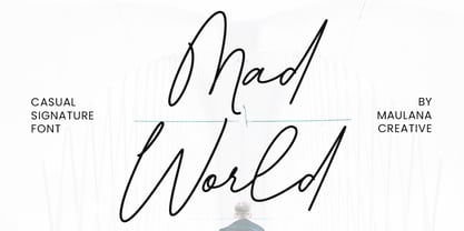 Give your designs an authentic handcrafted feel. �Mad World Casual Signature Font� is perfectly suited to stationery, logos and much more. Many Thanks!
 - Lambola by ARToni,
$12.00 Lambola is a casual and smooth handwritten font with a playful vibe. Us it to add a personal touch to any design idea!
 - Macchiato by Okaycat,
$29.95 Okaycat presents "Macchiato". This playful casual font is fashion forward. Elegant simple line serifs pair well with line drawings or simple ink drawings.
 - Cinque Donne by Debi Sementelli Type Foundry,
$44.99 Cinque Donne means “Five Women” in Italian. It was inspired by the five sisters in my family as well as a group of five high school friends I have known for 46 years, aka “The Club Girls”. The Pro version has 3370 glyphs with all the bells and whistles! Women are connectors, encouragers and supporters. Young, old, shy, extroverted, when you put us together, somehow we make a beautiful impact on each other’s lives. This is what Cinque Donne does in a visual way. Some letters are simple and prefer to sit quietly. Others are flourished and proud and like the limelight in the middle of a word. And then there are alternates that are flexible and work in any number of surprising places. Stylistic sets can add a vivacious feel while contextual alternates bring better understanding. Classic or contemporary, subdued or flamboyant, these letters represent the variety of women that make life interesting for us all. Within the varied glyphs, I hope you find characters that remind you of the special women in your life. Let Cinque Donne salute them on the page! The Cinque Donne Family includes: Cinque Donne, Cinque Donne Bold, Cinque Donne Swash and Cinque Donne Pro. Check out the Buying Choices tab to see special discounted combinations! Crafters: All of my fonts have been specially coded for PUA (Private Use Area) so you can access all of the swashes and alternates using Character Map (PC) or Character Viewer (Mac) or with any number of apps including PopChar. If you would like to purchase PopChar at a special discount email me and I will send you the link. Cinque Donne Pro and Cinque Donne Swash include Swash, Stylistic and Titling Alternates, Contextual Alternates, Standard and Discretionary Ligatures, Roman Numerals & Fractions.
 - Savinder by Dora Typefoundry,
$17.00 SAVINDER - ALL CAPS Serif! Savinder is a modern and elegant, classy all-capital typeface with unique curves and cuts making it one of the most memorable fonts, perfect for a magazine brand or title. You can also use this font for logos, branding, and it's versatile for any project too! FEATURES: • Uppercase • Numbers & Punctuation • Characters with accents • Supports Languages This type of family has become a work of true love, making it as easy and enjoyable as possible. I really hope you enjoy it! I can't wait to see what you do with Savinder! Feel free to use the #Dora Typefoundry tag and the # Logo Font Savinder font to show what you've been up to!
 - Friendly by Positype,
$29.00 Friendly is an homage to Morris Fuller Benton's adorable Announcement typeface. It is not a strict interpretation, digital revival or reverent reproduction of the original letterforms… but I would be remiss and shady to not acknowledge the letterforms that inspired this typeface. If you are looking for a more accurate 'scanned revival' I would recommend searching "Announcement" on MyFonts. As stated earlier, it is an homage to the original letterforms of the typeface but takes a great bit of freedom tightening the construction up in order to loosen up the movement of the variant letterforms to allow a great deal of usable personality. I enjoy stating this dichotomy… "loosen up to tighten up the forms" and vice versa. It seems counterintuitive or silly but by allowing the letterforms to normalize, I felt more comfortable going back and adding rather indulgent personality. Infused with stylistic alternates, swashes, titling, many many contextual alternates, 9 stylistic sets and 2 stylistic sets with wordmarks, the typeface became far more 'friendly' for me… how could it not? With so many loops, swashes and typographic indulgences, it was bound to be fun. The more elaborate and 'overdone' Friendly got, the more I wanted to slant it. Here's where my thinking differs from MFB's original. I like slanted romans… especially ones with long ascenders, but I do not like much of a slant. It has to be the lettering person in me. It's hard for me to do a completely upright serif and not pair it with an angle, but I did not feel Announcement's 'Italic' offered much and the actual slant needed to be far less. If it's not an italic, I prefer the letters to slant with an angle equivalent to the thickness of the vertical stroke. The Slanted version of Friendly is set at 3.6 degrees, is quite subtle, and very fitting for me. You will find that most characters have a contextual, stylistic, swash and titling alternate assigned to them and some have an echoed alternate to the swash and titling options if the stylistic alt has been selected in tandem. Additionally, all of these are accessible in the glyph palette directly from the base glyph typed or through selecting options through the Stylistic Sets 1–9. Stylistic Sets 10 & 11 are a little different. They are actually configured as complex majuscule ligatures… a result of me getting carried away. Other features like a default old style numeral set and coordinating glyphs have been produced along with case support, ordinals, and more have been added to make it more relevant for contemporary use.
 - Truth FB by Font Bureau,
$40.00 In 1994, Apple® Computer, Inc., asked David Berlow for “a future gothic” to replace Chicago®, their system font. Now called Charcoal®, the design was released with Mac® OS 8 in 1996. Through operating system bundles it found its way into every form of design. Released from constraint, Berlow designed Truth FB, a radical series with a spectrum of seven weights. Like its forbear, Truth FB opens new design avenues; FB 2005
 - Starline by Letterfreshstudio,
$15.00 Starline Script is a sweet monoline font, with a casual and dynamic baseline, This font can be used easily and simply, perfect for branding, logos, greeting cards, wedding stationery, quotes and more. It comes with a handy set of OpenType Stylistic Alternates, Ligatures and multiple language support. To enable the OpenType Stylistic alternates, you need a program that supports OpenType features such as Adobe Illustrator CS, Adobe Indesign & CorelDraw X6-X7, Microsoft Word 2010 or later versions. These coded with PUA Unicode. Mac users can use Font Book and Windows users can use Character Map to view and copy any of the extra characters to paste into your favourite text editor/app. How to access all alternative characters, using Windows Character Map with Photoshop: https://www.youtube.com/watch?v=Go9vacoYmBw How to access all alternative characters using Adobe Illustrator: http://youtu.be/iptSFA7feQ0nn
 - Odelette by BBA Key,
$16.00 Odelette is a modern calligraphic script. This font is casual and pretty with a sweeping look. It can be used for various purposes such as logos, product packaging, wedding invitations, branding, titles, signs, labels, signatures, book covers, posters, quotes and more. Odelette features alternative OpenType styles, ligatures and International support for most Western languages included. To enable alternative OpenType Stylistic, you need a program that supports OpenType features like Adobe Illustrator CS, Adobe Indesign & CorelDraw X6-X7, Microsoft Word 2010 or later. Odelette Script is encoded with PUA Unicode, which allows full access to all additional characters without having any special design software. Mac users can use Font Books, and Windows users can use Character Map to view and copy one of the additional characters to paste into your favorite text editor / app. Thanks & Happy Designing!


