10,000 search results
(0.012 seconds)
- Contouration by Intellecta Design,
$19.90 - Arabic Typesetting by Microsoft Corporation,
$49.00 - Neue Werner Paperclip by Funk King,
$5.00
- Hobo No2 by SoftMaker,
$9.99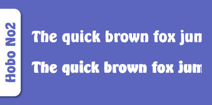
- Bluff No2 by SoftMaker,
$9.99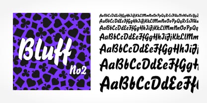
- Portobello by Red Rooster Collection,
$45.00
- Dom by SoftMaker,
$9.99
- Looking Glass by SoftMaker,
$9.99
- Durango No2 by SoftMaker,
$9.99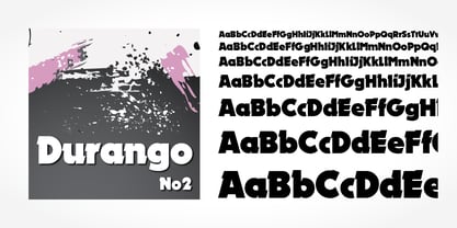
- Glossy by Volcano Type,
$19.00 - Fraktur No2 by SoftMaker,
$9.99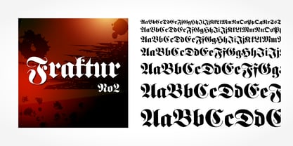
- Harlekin by SoftMaker,
$9.99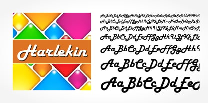
- Japanette by SoftMaker,
$9.99
- Disco by SoftMaker,
$9.99
- Balloon No2 by SoftMaker,
$9.99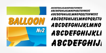
- Hudson by SoftMaker,
$9.99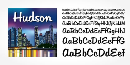
- Mister Big by SoftMaker,
$9.99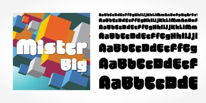
- Elektronik - Personal use only

- ALIENS GT - Unknown license

- KG Holocene - Personal use only

- HAWAIIAN DREAMS PERSONAL USE - Personal use only

- Santa'sSleighFull - Unknown license

- Promocyja - 100% free

- MY TURTLE - Personal use only

- Gypsy Tarot-Major Arcana - Unknown license

- Skratch - 100% free

- FARSCAPE - Personal use only

- Cubiculo Gallery) - Personal use only

- Cubiculo Gallery) - Personal use only

- Utusi Star - Unknown license

- Behrensschrift - Unknown license

- Nostra 2003 J - Unknown license

- Alfabetix - Unknown license

- Scalactic J - Unknown license

- Inverness by Red Rooster Collection,
$45.00
- Behrens Schrift by Solotype,
$19.95 - Syntax by Linotype,
$29.99
- Lino by Kmaz,
$10.00
- Paz by Sudtipos,
$29.00
- RMU Omega by RMU,
$30.00


