1,048 search results
(0.026 seconds)
- FranklinGothicHandCond by Wiescher Design,
$39.50 FranklinGothicHandCond is another part of a series of hand-drawn fonts from way back in time – before computers changed the way we worked in advertising. When I was in advertising – before computers – a very time consuming part of my daily work was sketching headlines. I used to be able to sketch headlines in Franklin Gothic, Times, Futura, Helvetica and several scripts. We had a kind of huge inverted camera – which we called Lucy. We projected the alphabet onto a sheet of transparent paper, outlined the letters with a fineliner and then filled them in. It was very tedious work, but the resulting headline had its own charm and we had a permanent race going on who was best and fastest. I won most of the time! They used to call me the fastest "Magic Marker" this side of the Atlantic. Great days, just like today! Your sentimental type designer from the past, Gert Wiescher.
 - Brocha by Latinotype,
$26.00 I made the first sketches for Brocha when I first visited Easter Island in 2011. I took inspiration from pre-Columbian art for such sketches, but I must say that they were kind of rough and clumsy; it was an experimental and limited-use typeface. It took a long time, but thanks to my learning about type design gained over the years, I have finally been able to complete my project. I have made sure to preserve the Latin American spirit of my original designs in order to give my final typeface an expressively handmade, highly humanist look. Brocha is a display sans with friendly design ideal for high-impact headlines, logotypes or use on cookies packaging designs. Brocha consists of 2 subfamilies: one basic and one alternative. Each subfamily comes in 8 weights plus italics. The Alt version is highly recommended for those art directors who look for more varied fonts when designing.
 - ITC Hedera by ITC,
$29.99ITC Hedera's roots can be traced to a suite of initials intended for book design. Olivera Stojadinovic, the face's designer, made the first sketches for the initials with a handmade tool consisting of two flexible metal strips tied to a wooden handle. This makeshift pen created the distinctive uneven double strokes of the letterforms. Stojadinovic says that she tried to keep the original flavor of the sketches in the finished font. Stroke roughness has been preserved in final execution, though the characters had some cleaning and polishing," she notes. Based on Renaissance letterforms, ITC Hedera has a classical quality that complements its calligraphic exuberance. The name Hedera? According to Stojadinovic, "It's the name of a common ivy. I chose it because of the organic image of the character strokes, which, to me, resemble shapes from nature's leaves or stems of plants." Rough-hewn yet elegant, ITC Hedera is an exceptional display design." - FranklinGothicHandBold by Wiescher Design,
$39.50 FranklinGothicHandBold is another part of a series of hand-drawn fonts from way back in time – before computers changed the way we worked in advertising. When I was in advertising – before computers – a very time consuming part of my daily work was sketching headlines. I used to be able to sketch headlines in Franklin Gothic, Times, Futura, Helvetica and several scripts. We had a kind of huge inverted camera – which we called Lucy. We projected the alphabet onto a sheet of transparent paper, outlined the letters with a fineliner and then filled them in. It was very tedious work, but the resulting headline had its own charm and we had a permanent race going on who was best and fastest. I won most of the time! They used to call me the fastest "Magic Marker" this side of the Atlantic. Great days, just like today! Your sentimental type designer from the past Gert Wiescher
 - Luxus Brut Sparkling by phospho,
$25.00 Luxus Brut Sparkling developed from sketches for a bolder version of Luxus Brut that I made for a poster design. Interventions like slightly tightening the (still generous) spacing and amplifying the contrast between thick and thin strokes ended in a complete rework of the original font. All the shapes have been redrawn in respect of their distinctive origin in mid 1900’s signage lettering. It has now even more timeless elegance!
 - Hem And Haw SRF by Stella Roberts Fonts,
$25.00 Hem and Haw SRF is another Ray Larabie original for Stella Roberts Fonts. Rebuilt from Ray's former freeware design "Stitchen", the lettering looks as if it were stitched into fabric. The font now is more complete with foreign characters and additional accents, punctuation and currency symbols. The net profits from my font sales help defer medical expenses for my siblings, who both suffer with Cystic Fibrosis and diabetes. Thank you.
 - Joost by Type-Ø-Tones,
$60.00 This is a relaunch version of Joost, a milestone of the Type-Ø-Tones catalogue. This revival of Joost Schmidt’s typeface now has a capital set, a new weight and some OpenType features. Not to mention alternate glyphs for M, N, Ñ, and W characters. The inspiration came from the 'bauhaus dessau im gewerbemuseum' basel exhibition poster, designed in 1929 by Franz Ehrlich after a sketch by Joost Schmidt.
 - WILD2 Keetoowah by Fontry West,
$10.00 Keetoowah evolved from a just a few letters in a sketch for a sorority t-shirt design. They loved it and kept asking for more of the same. The only solution was to make a font. These characters were made to be broken up, two toned, rotated, merged and jammed together. But, Keetoowah has a serious side. It has a great Southwestern flavor like smokey BBQ and patterned blankets.
 - Lowbridge Hand by Blake Cotterill,
$- I designed Lowbridge Hand for product designers, fashion designers, architects, garden designers and anyone who wants to annotate their sketches and drawings. This is something I wish I had when I was a design student. It has different weights allow you to better match your pen size used on your drawings or to emphasise text. It is an all caps font. I hope you enjoy using Lowbridge Hand for your drawings.
 - Mentah 1 by Sulthan Studio,
$10.00 This sketch font Sans serif was born from the lines in the font that we created for the (Rajin) font and we redeveloped it into a different style with a more minimalist and more powerful setting and looks stunning for any smooth and bold writing that can be used anywhere in your work This font has complete uppercase and lowercase letters with 4 thicknesses, numbers, punctuation, and also language support
 - grotto Med - Personal use only

- Hartsinger by Maulana Creative,
$12.00 Hartsinger is a fancy handwritten font. With cartoon vibes or notes on the book scratch, had a fun character with a bit of ligatures and fun swashes. To give you an extra creative work. Hartsinger font support multilingual more than 100+ language. This font is good for logo design, Social media, Movie Titles, Books Titles, a short text even a long text letter and good for your secondary text font with sans or serif. Make a stunning work with Hartsinger font. Cheers, MaulanaCreative
 - ALS Kraft by Art. Lebedev Studio,
$63.00 A simple rough font. Kraft is a rough techno-style sans serif meant for setting text in all capitals. Instead of lowercase letters there are capitals of smaller height but with the same stroke width. They make tighter type. Characters are pressed really close together which creates the visual rhythm of very narrow and very wide openings. The wide strokes allow free use of graphics. This font is designed for putting on coarse surfaces, for breaking, crumbing, scratching, or making stencils on concrete.
 - Elvian Andreani by Scratch Design,
$9.00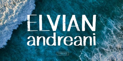 Elvian Andreani is a handwritten font with board marker style, and an authentic texture and casual look and vintage style. This font is useful in various designs such as quotes, menus, logos, branding, clothing and other designs with casual or vintage concept. Elvian Andreani also includes support for multiple languages. Feature: - Uppercase & Lowercase - Numbers - Punctuation - Multilingual Support (ÀÁÂÃÄÅÇDÐEÈÉÊËIÌÍÎÏNÑOØÒÓÔÕÖUÙÜÚÛWYÝŸỲŸÆŒßÞþ) Support in Mac and Windows OS, Easy to install We hope you like it and thank you so much for purchase :) Scratch Design
 - Adagio Serif by Borutta Group,
$25.00 The Adagio Family is a part of Mateusz Machalski’s, Warsaw Academy of fine arts Master Degree Diploma in multimedia studio, conducted by Professor Stanisław Wieczorek and his brave PHD Jakub Wróblewski. Adagio is a modern type family. It consists of 3 main varieties: sans, serif and slab. Each one of them has its own “true italic” set. All of the styles together have over 400 characters in 9 different thicknesses. The Adagio family was created mostly for company identities. The idea was to create a wide range of different varieties which are stylistically consistent. Adagio Serif - Characterises with strong contrast and high detail in calligraphic character cuts, what gives it a light feeling. Unlike the Slab version, serif variety has asymmetrical serifs. Thanks to large X length, and highly stretched descenders, it also works correct in longer text, while its strong detail is good for headlines. The Serif version is a great complement for Adagio Sans and Adagio Slab.
 - Adagio Sans by Borutta Group,
$25.00 The Adagio Family is a part of Mateusz Machalski's, Warsaw Academy of fine arts Master Degree Diploma in multimedia studio, conducted by Professor Stanisław Wieczorek and his brave PHD Jakub Wróblewski. Adagio is a modern type family. It consists of 3 main varieties: sans, serif and slab. Each one of them has it's own “true italic” set. All of the styles together have over 400 characters in 9 different thicknesses. The Adagio family was created mostly for company identities. The idea was to create a wide range of different varieties which are stylistically consistent. Adagio Sans - In its character, inspired by classical English typefaces. Sharp chamfers add a strong character. Thanks to delicate contrast and proportions of capitals, this variety has features of humanist grotesque. Thanks to large x length, and highly stretched descenders, it also works correct in longer text, while it’s strong detail is good for headlines. The Sans version is a great complement for Adagio Serif and Adagio Slab.
 - Adagio Slab by Borutta Group,
$25.00 The Adagio Family is a part of Mateusz Machalski’s, Warsaw Academy of fine arts Master Degree Diploma in multimedia studio, conducted by Professor Stanisław Wieczorek and his brave PhD student Jakub Wróblewski. Adagio is a modern type family. It consists of 3 main varieties: sans, serif and slab. Each has its own “true italic” set. All of the styles together have over 400 characters in 9 different thicknesses. The Adagio family was created mostly for company identities. The idea was to create a wide range of different varieties that are stylistically consistent. Adagio Slab - Slab variety combines qualities of the Sans and Serif varieties. It has the same contrast as Sans. As distinct from Serif, Adagio Slab contains strong, beamy and symmetrical serifs in the form of pillows. Thanks to large X height, and highly stretched descenders, it also works correctly in longer text, while its strong detail is good for headlines. Slab version is a great complement for Adagio Serif and Adagio Sans.
 - Neil Bold by Canada Type,
$49.95 This is the one and only Neil Bold, designed by Wayne Stettler in 1966 and originally published as a Typositor typeface. An award-winner and instant celebrity upon its release, Neil Bold became synonymous with magnified modernism for a whole generation. It was a jazz record packaging favorite, especially at Blue Note records, and made regular appearances on science fiction book covers during the last stretch of the genre's golden age. This digital version greatly expands on the film type one. New small caps and biform styles were added to the authentically revived main face (for a set of three fonts), and language support has been extended to include all Latin-based tongues. Neil Bold Pro, the OpenType version, comes in a single font that combines all three fonts into a single file, with programmed features for small caps, stylistic alternates (for biform shapes), a few extra alternates, class-based kerning, and additional language support for Cyrillic and Greek scripts.
 - Steiner Special by Canada Type,
$24.95 Steiner Special is a revival and expansion of an art nouveau face called Swing, originally designed by Peter Steiner in 1974. Some of the original film type letters were slightly normalized and toned down for concept consistency, though this digital version lacks none of the original face's charm and sunny disposition. This particular kind of art nouveau face is one that appeals very much to kids. Steiner Special can be used in upper-lower or all-upper, and can maintain its enthusiasm and excitement through any bending, stretching, squeezing, warping or any thinkable filter your favourite design program has. Children book covers, candy and cereal packaging, fun headlines and posters for kid events are but few of the possible uses of this font. If you're designing anything for kids, give this font a try and you won't regret it. Steiner Special comes with over 500 glyphs and support for the majority of Latin languages. A full set of ligatures in included, as are a few stylistic alternates.
 - Splatterpunks by Wing's Art Studio,
$10.00 Splatterpunks - A Halloween Brush Font Introducing a fresh terror this Halloween, Splatterpunks is a hand-drawn brush font inspired by the blood-soaked pages of horror comics from the 1970s and 80s. This textured all-caps lettering evokes a spine-tingling tension that will leave your readers on tenterhooks. With a creeping, stretched look like that of a surprised cat, it offers of set of diabolical tools worthy of any horror fan! The Splatterpunks font family includes all-caps uppercase and lowercase characters, along with numerals, punctuation, symbols and language support. Also included are a complete set of alternative characters and additional paint marks, drips and splashes. Wingsart Studio Design Tip! The uppercase and lowercase characters work great when mixed in an alternating fashion, with shapes that combine to create a dynamic, almost unhinged look that's perfect for the Halloween season. Add the alternatives and paint marks into the mix and you'll have yourself a title or header design that looks truly custom-made.
 - Galano Classic by René Bieder,
$30.00 Galano Classic is the display companion of the Galano Grotesque family. Like the Grotesque family, it also pays tribute to the geometric shapes of Futura, Avant Garde, Avenir and the like. However, instead of that family’s modern interpretation of the geometric genre, Galano Classic prefers to stay in the past, a tendency characterized by a moderate x-height and details like the long stretched leg of uppercase “R”, as well as the traditional shaped lowercase “g”, to mention only a few details. Galano Classic, compared to Galano Grotesque, includes lots of redesigned glyphs and consequently adjusted kerning pairs, an extended number of alternative characters, ligatures and opentype features to match a great many design applications. It comes in 10 different weights with matching italics containing 555 glpyhs per font. Although Galano Classic was planned to be the display version of Galano Grotesque, it feels great in small sizes and long text passages, too.
 - Hothir by RCKY Studio,
$16.00 Hothir is a font that was scratched with a brush to get a natural texture, so this font will display the characteristics of the hand. Beautiful textured brush fonts, contemporary approach to design, natural handmade and with a cool underline. It also has several ligatures and alternatives that make your design more attractive. Suitable for use in watercolor designs or as hand-brushed bold letters. Perfect for novels, clothing, invitations, quotes, title books, stationery designs, branding, logos, greeting cards, T-shirts, packaging designs, posters and much more.
 - Smoke Signals by Ana's Fonts,
$18.00 Smoke Signals is a calligraphy font handmade using a real dip pen and ink with lots of bonus goodies. Smoke Signals includes: tons of ligatures for a smother text small caps that act as an all caps font a bonus set of ornaments a bonus set of grunge elements, such as splatters, ink blots, scratches Smoke Signals is perfect for any design that needs a vintage calligraphy look. Use it in signatures and logos, notes and quotes, social media posts, and branding and packaging.
 - Shinemoon by Scratch Design,
$14.00 Introducing, Shinemoon, a futuristic font by Scratch Design Shinemoon is a sans-based font with futuristic hi-tech lowercase & uppercase that will make your design look futuristic and modern. This font will be suitable for science-fiction movie posters, advertising, or projects that match with hi-tech, robots, space, future, planet or race. You can mix and match the uppercase and lowercase to make your design more stunning and stand out. This font is also included with ligatures, alternates and multi-language. Enjoy this futuristic font!
 - Brunette by DearType,
$29.00 The Brunette font was created with the sole purpose to serve companies that want to express character, emotion, and personal touch through their logotypes (think Bakeries, Juice Bars, Cafes, Jewelry stores, etc.) Brunette was made entirely from scratch (handwritten letters on paper), which were then vectorized and tweaked to gain consistency. The charm of the font is in its irregularity and resemblance to real handwriting. Brunette is perfect for businesses that want to convey a casual and organic image while making their products more human and approachable.
 - Saskatoon Stencil JNL by Jeff Levine,
$29.00 Inspiration for font design takes on many shapes and forms. It can be vintage source material, visualized concepts or simply suggestions made by others. In an email conversation with Kevin Redekop (the Principal Designer for FabArts Creative Fabricators in Canada) who had purchased a number of Jeff Levine Fonts, a sample sketch of a desired stencil font was provided. This set the wheels into motion for the drawing and production of Saskatoon Stencil JNL.
 - Hesster Mofet by JOEBOB graphics,
$20.00 Hesster Mofet is what I got after writing with an old and weathered calligraphic marker on textured paper. The characters were smoothened for a clean result, but since the original sketches had such a nice rough, edgy feel to them, they were also made into a complete font set. A couple of ligatures and a Hannibal Lecter reference were thrown in the mix as well. You can get both versions at a discount.
 - ITC Ziggy by ITC,
$29.99ITC Ziggy was designed by Bob Alonso, who says it started out as phone doodles in the early 1970s." Alonso rediscovered the sketches years later, thought they revived the feel of the 70s, and decided to digitize the typeface. He liked the form of the letter Z best, so named the font Ziggy. ITC Ziggy reminds its designer of "elephant bellbottoms" and its style as a display face instantly evokes a nostalgia for the 1970s. - Calorie Suit by PizzaDude.dk,
$17.00 Calorie Suit is a clean and super sharp comic font. Actually the use of Calorie Suit is quite wide. I'd like to dare you to use this font for massive texts, even though the real force of the font is for one liners or catchwords. Originally drawn in hand, and then cleaned up beyond recognition - but keeping the characteristics of the original sketch. You may notice influences from graffiti here and there too! :)
 - Tactical by Positype,
$25.00 Tactical is nothing more than a testosterone-laced typeface. Rigid, mechanical and unforgiving. Originally conceived in 2007 while I was working through the early sketches of Ginza, Tactical features hard 45-degree angles and the presence of a curve for curve’s sake is just not there. Complimenting the original is a Stencil variant (inspired by the military, marathon video game, explosion-influenced name) and matching Obliques—altogether creating a sharply coordinating family.
 - Spina by OhType!,
$28.00 The 225 glyphs that make “Spina Typeface” are the result of experience with hundreds of drawings, sketches and digital tests in seeking to achieve a typeface that represents the fluidity of the script and elegance of the modern roman. Thereby, based on this principle and a unique style, an infinitely versatile typeface was designed that evokes both the beauty and finesse of the plant as power its thorns and its deadly poison.
 - Skylines by Zamjump,
$19.00 Skylines- a chic modern serif with letters that seem to accentuate their character.Lots of ligatures for both uppercase and lowercase, as well as several alternates, to add typographical style to your designs.To access these OpenType features, you need software that supports Opentype such as: Word, Textedit, Photoshop, Sketch, Pages, Keynote, Numbers, iBooks Author, QuarkXPress, Indesign, and Illustrator. A wide variety of useful glyphs are included - see preview images of all glyphs. Thank you
 - Prism by Stereotypes,
$- Prism was mainly inspired by two things, the sketches of Rudolf Koch for Prisma and the proportions of Avant Garde by Herb Lubalin. Even when the proportions and widths stay the same from ExtraLight to Black, you get the opportunity to change the weight and get a complete new look for that typeface by changing the grayscale or color. It is a modern combination for headlines, that want to have a different look.
 - Far Space AT by Andrew Tomson,
$10.00 Hi, friends! Sitting under the starry sky, I thought about extraterrestrial life and was inspired. I imagined if there was extraterrestrial life and their means of communication. The outline of this font popped up in my mind and I quickly sketched it out so I wouldn't forget it! This font is great for logos, quotes, space-themed inscriptions, it's also just pleasing to the eye and makes you think about the extraterrestrial!
 - Twist Cloud by Archer Wood,
$12.00 Twist Cloud Font Handwriting is the most expressive form of writing. Each letter has its own personality, which is what makes it so much fun to use in your branding. This Twist Cloud Font is unique handwriting font. Created with original handmade sketch. This font suit for personal & commercial project such a poster, letter, headline, web blog, social media post, stories, banner, Packaging, T-shirt design, pillow, wedding invitation, or even for logo design.
 - LAMPOH by Afkari Studio,
$13.00 LAMPOH - The Handmade Scratch Display Font LAMPOH is an artistic and captivating handmade display font, meticulously crafted by a talented type designer to bring uniqueness and authenticity to your creative projects. With its scratch-inspired design, LAMPOH stands out as a one-of-a-kind font that exudes a raw and artisanal charm, making it perfect for various artistic endeavors. Every character in LAMPOH has been meticulously hand-drawn with love and passion, ensuring that each glyph carries a distinct and organic feel. The imperfections and irregularities of the scratch strokes add an element of human touch, providing a genuine and authentic character to the font. LAMPOH comes in both regular and bold styles, giving you the flexibility to choose the perfect weight for your design needs. The regular style boasts elegance and subtlety, while the bold style makes a powerful statement, ideal for headlines and emphasis. LAMPOH's versatile design makes it an ideal choice for a wide range of projects. Whether you're creating eye-catching headlines, attention-grabbing posters, logo designs, merchandise branding, or anything that requires a touch of artistic flair, LAMPOH will effortlessly enhance the visual appeal of your work. The uppercase characters of LAMPOH are bold and expressive, demanding attention with their captivating presence. On the other hand, the lowercase letters bring a touch of playfulness, offering quirky alternatives to add delightful variations to your text. LAMPOH comes complete with a set of thoughtfully crafted standard characters and ligatures, allowing you to elevate your designs even further. These unique elements enhance the font's versatility, making it easy to create visually engaging and harmonious compositions. LAMPOH is designed to seamlessly integrate into various design software, making it effortless to use in your preferred creative tools. From Adobe Illustrator to Photoshop, InDesign, and beyond, the font's compatibility ensures a smooth and hassle-free design process. LAMPOH's high-quality design ensures that it looks equally stunning in both print and digital formats. Whether you're producing posters, brochures, social media graphics, websites, or any other project, this font will consistently deliver outstanding results. LAMPOH is not just a font; it's a work of art that adds a touch of human craftsmanship to your creative projects. With its handmade scratch-inspired design, versatile usage, and expressive characters, LAMPOH brings a unique and authentic flair to any design. Unlock your creativity and let LAMPOH illuminate your artistic vision with its captivating charm. Choose between regular and bold styles to create striking and memorable designs that leave a lasting impression on your audience.
 - The font "Waiting for the Sunrise" by Kimberly Geswein is a striking example of how typography can capture emotion and artistic expression. At its core, this font embodies a sense of anticipation and...
- Okiku by Hanoded,
$15.00 The tale of Okiku Of The Nine Plates is an old Japanese story full of lust, deceit, murder and revenge. It tells of Okiku, a beautiful servant whose master lusts after her. After she refuses his amorous advances, he accuses her of stealing a costly plate and has her thrown down a well, where she dies. She then turns into an Onryō (a vengeful spirit). Okiku font is a thin, all caps, scratched typeface. Upper and lower case differ and can be interchanged. Okiku comes with an afterlife of diacritics.
 - Brigette by insigne,
$21.99 This frilly script has been acid dipped, scratched and destroyed for use in grungy design jobs or any other use that calls for a ragged script. Three different degrees of deconstruction are available. The Alternate Two variant is highly distressed, and when rasterised by many programs at smaller point sizes appears almost illegible, but prints just fine. OpenType features include 64 OpenType ligatures that can be used to extend the natural appearance of the lettering oldstye figures and ending swashes. Brigette works great in conjunction with insigne Splats!
 - Coffeeshop by Vozzy,
$10.00 Introducing the new 2024 font "Coffee Shop"! This is a strict and at the same time playful serif font. It will look great on any of your designs - T-shirts, posters, promotional materials. Introducing the new font "Coffee Shop"! This is a strict and at the same time playful serif font. It will look great on any of your designs - T-shirts, posters, promotional materials. The font contains many additional characters, there is multilingual support, as well as styles with support for layers - Shadow FX and Scratch Shadow FX.
