10,000 search results
(0.055 seconds)
- Bellisa Script by Matra Creative,
$10.00 Bellisa Sript is inspired by classic typography and brings its own unique style to every design project. This fantastic script font is best suited for headers of all sizes, and for blocks of text that have maximum and minimum variations. Be it for the web, printing, moving images or whatever - Bellisa Sript will look spectacular. This font is PUA encoded which means you can access all the funny glyphs and swash easily! It also has many special features including alternative glyphs and ornaments.
 - Brushtones by PintassilgoPrints,
$29.00 Freely hand-painted with a flat brush, this font conveys spontaneity both through its typeface design and the numerous alternates it delivers. There are four different glyphs for each lower and uppercase letter and two variations for figures (and yet some punctuation marks). All these alternates are programmed to easily cycle at the click of a button - yes, the absolutely amazing Contextual Alternates one. Brushtones, a bold brush font, nice and handy, just perfect to color your message. Give it a try!
 - Brigker by Letterara,
$16.00 Brigker is a bold, distinct and elegant blackletter font. This font is imposing and features uniquely shaped letters, and as a result, it will easily match a wide range of creations that require a distinct touch. Use it for product packaging, branding, or other projects that need bold and daring typography! It is PUA encoded which means you can access all of the glyphs and swashes with ease! Add it confidently to your projects, and you will love the results.
 - Browking by Letterara,
$18.00 Browking is a bold, distinct and elegant blackletter font. This font is imposing and features uniquely shaped letters, and as a result, it will easily match a wide range of creations that require a distinct touch. Use it for product packaging, branding, or other projects that need bold and daring typography! It is PUA encoded which means you can access all of the glyphs and swashes with ease! Add it confidently to your projects, and you will love the results.
 - Nightwear Script by Amarlettering,
$30.00 Nightwear Script come with 300+ glyphs. The alternative characters were divided into several Open Type features such as Swash, Stylistic Sets, Stylistic Alternates, Contextual Alternates. The Open Type features can be accessed by using Open Type savvy programs such as Adobe Illustrator, Adobe InDesign, Adobe Photoshop Corel Draw X version, And Microsoft Word. And this Font has given PUA unicode (specially coded fonts) so that all the alternate characters can easily be accessed in full by a craftsman or designer. Happy Designing!
 - Brand by Lián Types,
$37.00 Jam jars; Warhol’s “Tomato Soup”; chalk lettering and baseball. Those were the triggers to make this soft chancery cursive turned into a script font. Brand is thought mainly for packaging but can be used in magazines and invitations also. It can be easily converted into a logo when using it and its features. Pro styles are loaded with the most complete sets of alternates, ligatures and ornaments; while Std styles are smaller versions of the font, with no decorative alternates.
 - Colfige by Alcode,
$20.00 Collge is a serif typeface with ligatures also complete multilingual glyphs. Collge come with Regular style, it will make this typeface can be used in all design projects and works perfectly for pairing with script typeface or handmade fonts, Headlines, Posters, Packaging, T-shirts, Postcards, Invitation, Wedding Sign, Sign Painting, Signboard, and much more. Try Collge, enjoy the richness of OpenType features and let her fun and elegant excitement make you happy and enhance your creativity! You can use this font very easily.
 - Ainslie by insigne,
$- Get your Aussie on! The new typeface, Ainslie, with its mix of influences from Oz, makes its mark as the first semi-serif from insigne Design. Ainslie, named for Mt. Ainslie and Canberra’s inner suburb of the same name, was originally developed for the Canberra Australia Centennial Typeface Competition. Canberra is Australia’s capital, and it’s a planned city designed by American Walter Burley Griffin, a contemporary and one-time associate of Frank Lloyd Wright. Griffin’s plan involved a distinctly geometric design with several focal points--one of which was Mt. Ainslie. This same purely geometric scheme is now the basis for insigne’s new release. Similar to the Chatype project in its scope, its challenge, and the way its concept was developed, Ainslie incorporates influences from Canberra and surrounding areas to form a font that is uniquely Australian. In comparison, Chatype was developed for the city of Chattanooga, Tennessee by insigne in conjunction with designer Robbie de Villiers. Chatype took elements from Chattanooga’s industrial character and Cherokee past and merged them with the area’s technological influences. Likewise, Ainslie takes Canberra’s distinct, geometric design and blends it with the organic, flowing effect of aboriginal art. Add in touches from the smooth, aerodynamic design of the boomerang and Ainslie gives you a look uniquely Australian yet usable in a wide range of applications. The fashionable typeface includes a multitude of alternates that can be accessed in any OpenType-enabled application. These stylish alternates along with a number of swashes as well as meticulously refined details with ball terminals and alternate titling caps keep the font well accessorized. Also included are capital swash alternates, old style figures, and small caps. Peruse the PDF brochure to see these features in action. OpenType enabled applications such as the Adobe suite or Quark can take full advantage of the automatic replacing ligatures and alternates. This family also offers the glyphs to support a wide range of languages. While Ainslie wasn't selected as the final font in the Canberra competition, the outcome allowed for additional adjustments to the typeface. Several approaches were attempted for the final product including a technological hexagonal concept, which may still be developed to another form later. Some of the organic forms were removed and substituted with more abrupt endings, leaving the face looking pretty spiffy and a fair bit more legible. In the end, Ainslie was pulled back to the basic forms from which it was started. Give it a go for your next project. It’s guaranteed to be anything but a barbeque stopper.
 - Flink Neue by Identity Letters,
$45.00 Geometric typefaces are a staple in every typographer’s toolbox since the 1920s. It was a time when iconic faces such as Futura, Erbar, and Kabel appeared on the scene and turned the world of type upside-down. Inspired by those early giants as well as later epigones with a legacy of their own (such as 1970’s Avant Garde Gothic), Flink Neue is the Identity Letters take on this genre, characterized by a clean and focused appearance. With neat shapes and the look of pure geometry, Flink Neue adapts to a vast range of applications and topics, from the fine print in contract to website body copy to logo design to billboard-size slogans. Its x-height is considerably larger than in classic geometric sans-serif fonts; its proportions are harmonized as opposed to strictly constructed. This makes for a more contemporary look, setting it apart from the classics. With three different widths, Flink is a true all-rounder. Geometric fonts are usually quite wide, which often leads to text-settings problems with headlines or small print. The Condensed and Compressed variants of Flink Neue solve this problem easily. This font family comes along in 18 weights from Thin to Black with matching Italics. There are almost 1400 characters per style, including nine stylistic sets that offer variations to the look and feel of Flink Neue, making it even more versatile. Besides the default mood of Flink Neue, there is also a Text and Bauhaus variant, where different letters have been changed to create a new mood. In theory, you just need one single font file to change between all three moods, but to make it easier for you, we also exported each mood within a separate file. Plenty of additional Open Type Features like ligatures, small caps, case sensitive forms, old-style figures, tabular figures and symbols make Flink Neue a valuable tool for the discerning typographer. Flink Neue is the reimagination of a classic genre, designed to suit the needs of our time.
 - Arialic Hollow is a distinctive typeface designed by GemFonts | Graham Meade, a creation that stands out for its unique approach to the visualization of letters and words. This font is part of the br...
- Nascent, a font created by The Type Fetish, stands out as a remarkable addition to the diverse world of typography. This typeface exudes a unique blend of modernity and functionality, making it a ver...
- P22 Parrish by P22 Type Foundry,
$24.95 Maxfield Parrish (1870-1966), whose career spanned nearly ninety years, holds a unique place in American art and culture. He was enormously accomplished and successful in both fine art and commercial endeavors. Parrish's hand-drawn letters were a significant part of his works, which bridged the familiar with a startling otherworldliness. P22 has created the Parrish font set in cooperation with the National Museum of American Illustration.
 - Justine Handwriting by SoftMaker,
$15.99 Digitized handwriting fonts are a perfect way to give documents the “very special touch”. Invitations look simply better when handwritten than when printed in bland Arial or Times New Roman. Short handwritten notes look authentic and appealing. There are numerous occasions where handwritten text makes a better impression. “Justine Handwriting” is a beautiful typeface that mimics true handwriting closely. UseJustine Handwriting to create stunningly beautiful designs easily.
 - Okay A by Okaycat,
$24.95 Okay-A lets you make 3D letters that look to be fastened down with screws. Inspired by the angular futuristic shapes of Japanese Katakana letters, this angular font is bold and square. Okay-A lets you easily make multicolour logos or signs as the styles can be overlaid. It features extended characters, containing West European diacritics & ligatures, making it suitable for international environments & publications.
 - Conspirator by Arendxstudio,
$22.00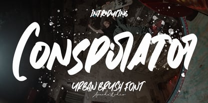 Conspirator - Urban Brush Font with its distinctive character that can be easily implemented in your various design projects . Conspirator came with opentype features such stylistic alternates, stylistic sets & ligatures good for logotype, poster, badge, book cover, tshirt design, packaging and any more. Features : • Character Set A-Z • Numerals & Punctuations (OpenType Standard) • Accents (Multilingual characters) • Ligature There it is! I really hope you enjoy it .
 - Conspiracy by Arendxstudio,
$18.00 Conspiracy - Urban Brush Font with its distinctive character that can be easily implemented in your various design projects . Conspiracy came with opentype features such stylistic alternates, stylistic sets & ligatures good for logotype, poster, badge, book cover, tshirt design, packaging and any more. Features : • Character Set A-Z • Numerals & Punctuations (OpenType Standard) • Accents (Multilingual characters) • Ligature There it is! I really hope you enjoy it
 - HighJinkies by Comicraft,
$19.00 It’s jaunty and flaunty and up to no good! It’s a child born of fairly odd parents and always looking for the good kind of trouble. It'll get you out of the red and into the pink like a panther pawning diamonds! Comicraft’s John Roshell has slipped his hands into the gloves of the Phantom Font Finagler and there’s HighJinks ahead to be sure!
 - Body Pretty by Create Big Supply,
$15.00 Body Pretty is a Monoline Bold Script. Perfect for all your design needs such as branding designs, logos, and more. This font is PUA encoded which means you can access all the amazing glyphs and ligatures easily Features: Uppercase & lowercase Numbers and punctuation Multilingual Ligatures Alternates PUA Encoding Full Character Set !"#$%&'()*+,-./0123456789:;?@ABCDEFGHIJKLMNOPQRSTUVWXYZ[\]^_`abcdefghijklmnopqrstuvwxyz{|}~¡¢£¤¥§¨©ª«®¯°±²³´¹º»¿ÀÁÂÃÄÅÆÇÈÉÊËÌÍÎÏÑÒÓÔÕÖ×ØÙÚÛÜÝÞßàáâãäåæçèéêëìíîïñòóôõö÷øùúûüýþÿ•†‹›?–ˆ?˜€“‘ŸœŒš?”’?žŠ
 - Razumec by Igor Petrovic,
$29.00 Razumec is a carefully crafted display serif typeface with a highly unique personality. Its epic yet warm sentiment is established by a skillful blend of slab and wedge serifs, tapered stems, curves with raised center, and creative weight distribution. Proper pronunciation of these style elements influenced wide proportions and medium-to-high contrast. Besides its main typology, it incorporates subtle allusions to a spectrum of typographic and visual traditions, from calligraphy, ordinary handwriting, blackletter, and medieval uncial script to the neoclassical Didone and industrial typefaces. All of these flavors are combined tastefully and consistently throughout the whole set. With its rich visual identity, Razumec is primarily intended for display usage, as shown in the promo images. It's perfect for branding and packaging. Fantastic for projects focusing on storytelling like fairy tales, epic fantasy books, board and video games with historic or adventurous themes. Superb for theme magazines, quotes, headlines, museum and concert brochures. On the other side, its authentic historical voice works great as a strong counterpart point in ultra-modern contemporary designs for print and screen. Web design, motion graphics, conceptual art, posters, and social media material are just the first few ideas. The laborious production process focused on achieving a high level of classical typographic virtues rather than having an extensive character set. Beautiful stylistically consistent characters with balanced weight and width, high-quality curves, meticulous spacing and kerning, well-articulated diacritics, and punctuation were priorities. Special attention is given to solving problematic letter pairs through contextual alternates, which enable better spacing and smooth joints (hence the recommendation to always keep the Contextual alternates feature on for this font. Learn more about it HERE). Razumec is a small but well-executed and thoroughly tested font. Font family comprises nine weights plus variable font.* * Variable font lets you access all the weights through the single font file. In apps that support it, you will find a slider where you can pick any number from 100 to 900 corresponding to 800 possible font weights. Learn more about variable fonts and their support on the following two links: VF ABOUT and VF SUPPORT.
 - Typek by Agnieszka Ewa Olszewska,
$25.00 Typek is a sans serif typeface for the lovers of minimal design and great curves. Typek outlines' professional shapes are perfect for large display usage.. Perfect for branding, posters, web and publications. The idea is to treat the letters' stroke create absorbing and interlaced shape. The design of small interfering in letters' construction makes Typek unique. Typek contains uppercase, diacritics and digits. The Typek Family is in two versions: Regular and Outline. Outline version can be an interesting addition and decoration for the Regular version.
 - FF Marselis Slab by FontFont,
$62.99 Danish type designer Jan Maack created this slab FontFont in 2013. The family has 8 weights, ranging from Light to Black (including italics) and is ideally suited for advertising, packaging, logo, and branding as well as web and screen design. FF Marselis Slab provides advanced typographical support with features such as ligatures, alternate characters, case-sensitive forms, fractions, super- and subscript characters, and stylistic alternates. It comes with a complete range of figure set options – oldstyle and lining figures, each in tabular and proportional widths.
 - Afiga by Degarism Studio,
$30.00 Afiga is a is humanist sans-serif a modern type family inspired form British typography of the early 20th century, Simple and fresh typeface for visual identities, book covers, magazines, and advertisement. Afiga typeface consists of 7 style plus “true italic” set. All of the styles together have over 700 characters, supports more than 50 languages – in Latin based languages Afiga supports OpenType features for fine typography, including Alternate characters, old style figures, Tabular Numbers, proportional figures, ligatures, superscript and subscript figures and support for fractions.
 - Silo Slab by TypeUnion,
$25.00 Designed and built in London by TypeUnion, Silo Slab is a fluid slab serif typeface embodying energetic curves and a clean, functional structure. The Silo Slab Family is made up of 6 weights, which range from a delicate Extra-Light, all the way through to a punchy, loud Extra-bold and each carry a versatility for multiple applications and uses. Each weight has a matching italic. Silo Slab features open type alternate characters, and extensive language support to provide a flexible, substantial user experience.
 - Clever by 1871 Project,
$9.00 Introducing Clever, our first serif family! Featuring 5 weights making it super versatile for almost any project! I started creating this at the beginning of quarantine and just recently finished up! Clever is inspired by timeless packaging from a forgotten era. It has a beautiful range of stylistic alternates with unique characters making it a powerhouse for logos, headlines, posters, shirts, you name it! More ligatures/alternates on the way in the coming weeks/months! What do you get? Clever in 5 weights 109 Alternates + 27 Ligatures
 - Valsity by Ingrimayne Type,
$9.00 Valsity is a squarish slab-serif family with five weights and two widths, each with an italics for a total of twenty members. With negligible contrast, it is almost monoline. It is for decorative uses; it is too square and lacks the contrast to make it a good choice for extensive text. Valsity began with a blending of two other squarish slab-serifs, Valgal and Kwersity, and its name reflects that ancestry. From there it took on a life of its own, often diverging from its parents.
 - Epitet by Tour De Force,
$25.00 Epitet, a subtle compact type family with a modern mixture of geometrical and simple shapes, comes in 6 weights, from Thin to Bold. It is a clean elegant sans serif typeface, with a small x-height. Epitet is highly legible in all sizes. Very versatile and easy to use, Epitet can be used in a wide range of corporate and editorial applications. I'm sure Epitet could get even more epitets, but the appropriate use of Epitet would be the biggest one it could get.
 - Shàngó Chiseled by CastleType,
$59.00 Based on the elegant and somewhat delicate Shàngó "Classic", Shàngó Chiseled goes to the other extreme with a bold and emphatic design that continues the legacy of the beautiful classic proportions of Dr. Schneidler's original titling typeface. Warm, cheerful, open, and sensitively masculine, Shàngó Chiseled can give you the impact you need. Perfect for an embossed look, or of classic lettering in stone. A complete character set that supports most European languages. Shàngó Chiseled is a member of the extended Shàngó family (Classic, Chiseled, Sans, Gothic).
 - FF Angkoon by FontFont,
$47.99 French type designer Xavier Dupré created this serif FontFont in 2003. The family has 8 weights, ranging from Light to Bold (including italics) and is ideally suited for advertising and packaging, festive occasions as well as editorial and publishing. FF Angkoon provides advanced typographical support with features such as ligatures, small capitals, alternate characters, and case-sensitive forms. It comes with a complete range of figure set options – oldstyle and lining figures, each in tabular and proportional widths. In 2004, FF Angkoon received the TDC2 award.
 - Goldbarre by Greater Albion Typefounders,
$19.95 Goldbarre is a finely engraved slab serif face in the spirit of ‘between the wars’ commercial confidence. It’s a solid and dependable face of distinction for use on certificates and posters which need to convey an emphatic yet refined message. The letterforms of Goldbarre combine finely hatched shading with and embossed, three-dimensional, quality. The utility of the family is further enhanced with Goldbarre No 2 - a solid shaded face, Goldebarre No 3 - an open embossed face, and Goldbarre No 4 - a basic black slab-serif face.
 - Pelinka by Jehoo Creative,
$18.00 Upholding aspects of geometric shapes Created Pelinka. Pelinka is a Sans serif Family that has a solid foundation of geometric shapes designed to be bold and flexible. This typeface has all the widths needed to meet various design needs, Condensed, Normal and Expanded each width has 9 weights. Pelinka also includes support for Cyrillic and Greek Alphabets. Opentype feature: aalt, frac, liga, locl, numr, onum,ordn, salt, sinf, ss01, ss02, subs, sups, kern, mark. Language support for the Americas, most of Europe,Cyrillic and Greek.
 - FF Blur by FontFont,
$68.99 British type designer Neville Brody created this display FontFont in 1991. The family contains 3 weights: Light, Medium, and Bold and is ideally suited for advertising and packaging, festive occasions, editorial and publishing, logo, branding and creative industries as well as poster and billboards. FF Blur provides advanced typographical support with features such as ligatures, alternate characters, and case-sensitive forms. It comes with tabular lining and proportional lining figures. In 2011, FF Blur was added to the MoMA Architecture and Design Collection in New York.
 - FF Avance by FontFont,
$65.99 Dutch type designer Evert Bloemsma created this serif FontFont in 2000. The family contains 4 weights: Regular, Italic, Bold, and Bold Italic and is ideally suited for book text, editorial and publishing, small text as well as web and screen design. FF Avance provides advanced typographical support with features such as ligatures, small capitals, alternate characters, case-sensitive forms, fractions, and super- and subscript characters. It comes with a complete range of figure set options – oldstyle and lining figures, each in tabular and proportional widths.
 - Royal Crescent by Sharkshock,
$100.00 Royal Crescent is an all caps display sans with an emphasis on elegance and simplicity. The uniform width is consistent throughout creating low contrast in all three weights. There are slight variations, between a few upper and lowercase characters which can be used interchangeably. Titling was its primary purpose but will prove useful in a variety of situations. Use it for web headers, a magazine, or a luxury logo. This family is equipped with Basic/Extended Latin, punctuation, symbols, diacritics, Cyrillic, kerning, and fractions.
 - Nazari by RodrigoTypo,
$25.00 Nazari is a typeface for titles with personality, character and multiple alternatives to design. Nazarí is inspired by Arabic lettering and calligraphy, but updates its shapes through games of high contrast, geometric design and rounded terminals. The family has 4 styles: Regular, Regular Inline, Sans and Sans Inline. In turn, Nazari is divided into a basic set and an extended set. The basic set supplies all the essential characters to design any graphic piece. The extended set also contains different contextual alternatives, ligatures and swashes.
 - FF Schmalhans by FontFont,
$47.99 German type designer Hans Reichel created this sans FontFont in 1996. The family has 6 weights, ranging from Light to Black and is ideally suited for advertising and packaging, book text, film and tv, editorial and publishing as well as small text. FF Schmalhans provides advanced typographical support with features such as ligatures, alternate characters, case-sensitive forms, fractions, and super- and subscript characters. It comes with a complete range of figure set options – oldstyle and lining figures, each in tabular and proportional widths.
 - FF Chambers Sans by FontFont,
$68.99 German type designer Verena Gerlach created this sans FontFont in 2008. The family has 8 weights, ranging from Regular to Black (including italics) and is ideally suited for festive occasions, editorial and publishing, logo, branding and creative industries as well as sports. FF Chambers Sans provides advanced typographical support with features such as swashes, ligatures, small capitals, alternate characters, case-sensitive forms, and stylistic alternates. It comes with a complete range of figure set options – oldstyle and lining figures, each in tabular and proportional widths.
 - Narevik by ParaType,
$30.00 Narevik consists of 7 styles -- 4 uprights (including black) and 3 italics. It’s a type of dynamic low contrast design with slightly rounded triangle serifs and drops which conveys to it a certain peculiarity. The vertical strokes have gentle intasis that brings additional softness to the shapes. The family was created by Armenian designer Manvel Shmavonyan and got its name after his daughters Nare and Arevik. It can be used in text composition as well as in display matters. Released by ParaType in 2011.
 - Albus by Gustav & Brun,
$20.00 Albus is bold and friendly. It is your wizard when you're lost in communication. Perfect for the not so serious statements, or maybe for the very serious ones? Maybe it fits on your next children’s book, or maybe on your webshop? The Albus Friends (ornaments) includes speech bubbles, clouds and other fluffy stuff. You can also buy the whole family for an extra friendly price. Let Albus be your wand and let it help you create the kind of message you want. Let’s create some magic!
 - Movella by Greater Albion Typefounders,
$8.00 Remember those 1970s science fiction dramas which had such charming futuristic sets and backdrops? Remember the intriguing future lettering and signage the set designers would devise-often coupled with interesting futuristic spellings? Movella is a family of three typefaces inspired by that design ethos. The three faces- regular, italic and the 3D solid form are all capitals faces which combine a feeling of retro-futuristic design with easy legibility. Take your next project into the age of the Apollo Launches, sci-fi action drama and fun!
 - Le Monde Livre Classic Std by Typofonderie,
$59.00 A Renaissance style typeface in 4 series Le Monde Livre Classic works beautifully on text and titling settings. Designed as an extension of Le Monde Livre, this family distinguishes itself by its historical forms and by its numerous stylistic effects. Le Monde Livre Classic’s italics follow the models of the Renaissance and feature italic capital and lowercase swashes. Le Monde Livre Classic works beautifully for book typography, magazine settings from text to display. Le Monde Livre Classic revisited Type Directors Club .44 1998 European Design Awards 1998