10,000 search results
(0.096 seconds)
- Fact by ParaType,
$29.00 Fact is a workhorse open sans serif type system. It is inspired by the great Frutiger typeface. While the Regular style is slightly modernized but still quite close to Frutiger, changing the weight or width makes differences of the design more pronounced. The style range of Fact is wider than of any cognate type family, including weights from Thin to Black and widths from Compressed to Expanded. Fact type system contains 48 upright styles and 48 italics with variations in width and weight. The font was designed by Alexandra Korolkova and Manvel Shmavonyan and released by Paratype in 2018-2019.
 - 1483 Rotunda Lyon by GLC,
$38.00 Towards the end of the 1400s, in Lyon (France), was living Barthélémy Buyer, descendant of a rich family of merchants. In the end of 1472, he engaged a typographist from Liège (Belgium): Guillaume Le Roy. The first book stemming from their print shop was the Compendium breve ( by Pope Innocent III.) using Blackletter “textura”. Many books followed, most often illustrated with wood carving. In 1483, to print a French translated “Eneide”, they used a venetian “Rotunda” blackletter. Our font was inspired by this “Rotunda” set, with historical forms and ligatures enriched with accented letters and other characters not existing in the original.
 - Conglomerate by Typetanic Fonts,
$39.00 Sans or serif? Square or rounded? Calligraphic or geometric? Conglomerate is both all and none of these things — a subtle yet unorthodox blend of typographic traits resulting in a clean, unique, and versatile font family with large, open counters for legibility in text yet crisp, sharp details that sparkle at display sizes. Conglomerate is sturdy but never stiff, crisp but never stark — perfect for projects that require a more contemporary feel than either a traditional serif or geometric sans might bring. Conglomerate received a PRINT Magazine Best in Class award, and was one of Typographica’s Favorite Typefaces of 2016.
 - Budare by fragTYPE,
$14.00 Budare is a geometric font family that rebelled to find its own identity within an ocean of other typefaces of the same style. Its design is based on the shape of the wrought iron plate used in Venezuela and other countries to make arepas and other foods. Its appearance is strongly defined by basic geometric shapes such as the circle and its upright style is accompanied by rotated italics "rotalics" that complement its rebellious spirit. Because of its strong display characteristics, its best uses are focused on posters, branding, titles and anything that needs a strong graphic emphasis.
 - Romeo by Latinotype,
$45.00 Romeo is a perfect couple of Julieta , they are a condensed, unicase family full of swashy love. Inspired by romanticism, Romeo is a charming and versatile typeface. By alternating uppercase and lowercase, and mixing them with alternate characters, ligatures, swashes and endings, you obtain endless possibilities of composition, with 810 glyphs available in the Pro font. In case you don’t need all these alternatives, there is also an Essential version consisting of 247 characters. In addition, Romeo has an affordable set of ornaments, connectors and catchwords to complete this attractive display system. Photography by Damien Vignaux (www.elroy.fr)
 - Redaktor by Spinefonts,
$10.00 My friends didn't use capitals when sending me text messages, e-mails and using all their digital toys. At the beginning, I was feeling ignored. But after time I thought, that... I can do something for them. And so, I've made Redaktor. Redaktor is a cute monospaced family of four fonts, which has only lowercase characters and large x-height. If you want to write an uppercase character, you can't do it. (OK, to be fair, there will be small underline, just to show you, what you have done...) You may find Redaktor useful for posters, titling, info-graphics or websites.
 - Dezen Stencil 01 by DizajnDesign,
$39.00 Dezen is a contemporary, mechanical grotesque typeface. Its letters were first constructed from individual modules and then optically refined to enhance its rhythm. Its tight letter spacing and narrow proportions make the typeface particularly well suited for display sizes and headlines. When you add spacing, font can be used for shorter amount of text, bigger than 12 points. Dezen type family consists of a wide variety of styles – solid and stencils. Dezen Pro subfamily combines all 4 styles (Solid, Stencil 01, Stencil 02, Stencil 03) in a specific sequence, which originates a “pattern” for the alphabet (or dezen, in Slovak).
 - Bhostra Lala by Ekahermawan,
$15.00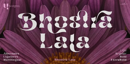 Bhostra Lala is an unique and versatile font family. Bhostra Lala comes with alternates characters (PUA Encoded) and ligatures in 4 weights that will support your creativity in creating the perfect design result for many different projects such as logo, branding, poster, magazines, labels, merchandise, invitation, presentation, advertising, quotes and so much more! FEATURES: OpenType support Playfull to use (with ligatures and alternates options) Multilingual support PUA Encoded If you need support or more information about this item please kindly contact me: ekahermawanputu@gmail.com Thank you so much I really hope you enjoy when using it!
 - Castrelon by Ekahermawan,
$15.00 Castrelon is a elegant serif family with a bunch of alternates and ligatures. Castrelon including with more than 200+ alternative characters (PUA Encoded) that give you a wide range of typographic design results. Castrelon is a versatile font for many different projects such as logo, branding, posters, magazines, label, merchandise, presentation, advertising, cards, quotes and so much more! FEATURES: OpenType support Playful to use (with ligatures options and alternates options) Multilingual support PUA Encoded If you need support or more information about this item please kindly contact me : ekahermawanputu@gmail.com Thank you so much I really hope you enjoy using it!
 - Obvia Narrow by Typefolio,
$29.00 'Obvia' appeared as a result of direct observation on typefaces classified as geometric and the plan to explore for the first time width axes Condensed, Narrow, Normal, Wide and Expanded. The idea behind 'Obvia's design was to create a distancing from geometrically pure shapes, in this case, square shapes. Then some details were added, such as subtle inktraps, concave endings of the stems and carefully drawn alternate characters, giving a 'geohumanist' tone to the font. This first family of 'Obvia' has 9 weights ranging from Thin to Black, delivering a strong typographic identity, from the paper to the pixel.
 - Keyboard by Red Rooster Collection,
$45.00 Keyboard is a condensed and elongated Egyptian font family with thin serifs and a large x-height. Its original design was created in 1951 by Stephenson Blake. International TypeFounders, Inc. gained exclusive licensing rights to the Stephenson Blake Collection, and then Paul Hickson (P&P Hickson) and Steve Jackaman (ITF) created its digital form in 1994. Keyboard excels in display and subhead sizes, and brings a formal feel to any project. Its condensed nature gives it great visual density in the bolder weights, and the lighter weights allow it to retain legibility at both small and massive sizes.
 - Poster Brush by Fenotype,
$18.00Poster Brush is a hand drawn font pair with lots of character. Poster Brush is packed with OpenType features - Contextual Alternates changes prevents identical double letters from being next to each other. With Stylistic Alternates you can manually change the letters. When you turn on Discretionary Ligatures you’ll get interlocking ligatures when typing with caps. Poster Brush Script is equipped with Standard Ligatures and Contextual Alternates to keep the flow smooth. It also has Swash alternates for certain letters. Poster Brush & Poster Brush Script work great together or as themselves. For the best price purchase the whole family. - PGF Dinos by PeGGO Fonts,
$29.00 “PGF Dinos” is a low contrast round typeface that resembles handmade American ‘Sign Painting’ in such the upper portion of the characters is bigger than the lower one, what gives the font a more playful and friendly personality. Another remarkable feature is its hooked terminals in characters such as C, G or S, heightening the differences between similar characters. “PGF Dinos” Family is composed of 10 different weights ranging from Hairline to Extra Black plus Italics and a full set of Dingbats. Early version was originallly called as “Globa” and was developed under the supervision of the Latinotype Team. Designer: Pedro González.
 - Kapra Neue Pro by Typoforge Studio,
$39.00 Kapra Neue Pro is a younger sister of Kapra Neue – he was the #1 bestselling Grotesque Sans released in 2017 on MyFonts and grandson of Kapra. Now you really have a lot of options to choose! New family is full of everything – 96 weights contain a wide range of instances, from Condensed to Expanded, everything with rounded corners or with sharp ones. Now, font has also: small caps, cyrillic script, and old-style figures. Kapra Neue Pro is inspired by a “You And Me Monthly” magazine, published by National Magazines Publisher RSW "Prasa” in Poland, from May 1960 till December 1973.
 - Neue Frutiger Arabic by Linotype,
$79.00 Neue Frutiger Arabic was created by Nadine Chahine and a team of designers and font engineers from the Monotype Studio, under the direction of Monotype type director Akira Kobayashi. The family is available in 10 weights from Ultra Light to Extra Black. Neue Frutiger Arabic embodies the same warmth and clarity as Adrian Frutiger's original design, but allows brands to maintain their visual identity, and communicate with a consistent tone of voice, regardless of the language. It is part of the Neue Frutiger World collection, offering linguistic versatility across environments – suited to branding and corporate identity, advertising, signage, wayfinding, print, and digital environments.
 - Showcase by Latinotype,
$40.00 Showcase, the new typeface of Daniel Hernandez and Paula Nazal is a handmade font consisting of a set of types that are composed of four styles, one script, one sans, a slab, sans mini and finally a set of ornaments and dingbats, all made to work together in the same language. It’s inspired by a pen that writes different typefaces and ornaments, and casually reaches into a harmonious family. Showcase is very easy to use and allows great versatility, can be used both in a magazine as a restaurant, through windows, cafes, and really anyway you can think of! Photography by Mauro Andrés
 - FreeSet by ParaType,
$30.00 The type family in four basic styles was designed in ParaType (ParaGraph) in 1992 by Tagir Safayev. Based on Frutiger, of Mergenthaler Linotype, 1976 by Adrian Frutiger. Frutiger font was originally designed for use on signs at the new Charles de Gaulle Airport at Roissy. The straightforward sans serif shapes are suited well for both text and display setting. Six additional styles were added in 1998-2000. Multilingual versions of 6 styles (Light, Demi and Extrabold) include Armenian alphabet designed by Manvel Shmavonyan in 1997. Two condensed Cyrillic styles (Demi Condensed and Bold Condensed) designed by Manvel Shmavonyan in 2005.
 - Victorixel by Quatype,
$35.00 Victorixel is a pixel font that incorporates the Victorian wood-type style. In order to organically combine these two styles, I abandon the exaggerated and ornate shape, yet the essence of the wood type was retained, such as the forked serif at the beginning and end of the letter stem. Victorixel family has over 800 glyphs (including emojis) and it supports lots of Latin-alphabet-based languages. It is suitable for the title, poster, etc. *EASTER EGG* Turn on the ligature OpenType features and input MBTI+emoji will output the MBTI emojis. For instance: ENTPemoji Enjoy!
 - Monotype Ionic by Monotype,
$29.99 The earliest form of Ionic was brought out by Vincent Figgins in 1821 and was intended for display work. In 1863 a more refined version appeared which had more contrast between thick and thin strokes and the serifs were bracketed. Further developments were made, however the robustness of the Egyptian style was retained making the face suitable for newspaper text setting. With a large x-height and strong hairlines and serifs, the Ionic font family became widely used by the newspaper industry as a body type and provided a model for many twentieth century newspaper typefaces.
 - Julieta by Latinotype,
$45.00 Julieta is a perfect couple of Romeo , they are a condensed, unicase family full of swashy love. Inspired by romanticism, Julieta is a charming and versatile typeface. By alternating uppercase and lowercase, and mixing them with alternate characters, ligatures, swashes and endings, you obtain endless possibilities of composition, with 810 glyphs available in the Pro font. In case you don’t need all these alternatives, there is also an Essential version consisting of 247 characters. In addition, Julieta has an affordable set of ornaments, connectors and catchwords to complete this attractive display system. Designed by Paula Nazal Selaive.
 - Ingrid Mono by Jörg Schmitt,
$35.00 The birth of the monospaced types dates back to the past. There was a need for the creation of typesets for typewriters. The difficulty was to align the different glyphs in the same width. This led to particular problems with letters like "M" and "l"; the former seemed to be squeezed into the same width of all letters and the second one appeared way too stretched. Despite - or perhaps because of - the impression of the typewriter it is still popular with Graphic Designers. The Ingrid Mono font family with a high range of glyphs and symbols has that special appearance.
 - Editors Note by Jen Wagner Co.,
$17.00 Say hello to the Editor's Note Family, an editorial serif display that includes 16 fonts, regular and italic, from Hairline weight to Bold, and still has all the clean lines, tight curves, and trendy minimalist vibes! I've been loving the clean, editorial type trend happening in design right now (let's be real, there's always a place for timeless editorial type). Editor's Note is a stunningly crisp upper and lowercase typeface that looks incredible in both large settings as a display text (think big headers, pretty quotes, calls to action, etc.). I've been loving combining the regular and italic, especially in big, bold quotes.
 - Monotype Old Style by Monotype,
$29.99 Monotype Old Style is a nineteenth century update of Caslon Old Face with characteristics of the moderns built in. Monotype Old Style was recut by Monotype in 1901 from a Stephenson Blake & Company version. The design originated at the Miller and Richard foundry in 1860. In some respects it can be seen as transitional between old style and modern, but the spirit of the old styles predominates. By the turn of the century it had become a successful rival to the moderns. The Monotype Old Style font family is an attractive design which gives a light, airy feel to text.
 - Ragik Sans by Hurufatfont,
$29.00 Ragik; It is a low-contrast sans serif font family with two accents. The letters are designed with a clear and simple elegance, devoid of ornaments. The open terminals of the letters “S, C, G, s, a, c, e” are elegant and legible with their large open areas. It consists of 16 styles, from thin to heavy, with true italics. Ideal for modern typographic posters, packaging and branding designs. It comes with rich OpenType features. Alternating glyphs, elegant and functional ligatures. All number sets (tnum, onum, lnum, numr, denom, sinf, sups etc.) have a rich symbol library with ornaments and arrows.
 - Exec by Wiescher Design,
$35.00 I created my new »EXEC« sans font during the years 2018 to mid 2020. The Normal »EXEC«-family has 7 weights, ranging from Thin to Bold (plus 7 italics). This elegant Sans is suited for editorial, book text, advertising and packaging, logo, branding, small text as well as web and screen design. »EXEC« has advanced typographical support including ligatures, small caps, alternate characters, case-sensitive forms, fractions, super- and subscript characters. »EXEC« comes with a range of figures—oldstyle and lining figures, each in tabular and proportional widths. »EXEC« supports Basic-, Western-, and Central-European Latin-based languages.
 - Niveau Grotesk by HVD Fonts,
$40.00 Niveau Grotesk—the companion of Niveau Serif —is a type family of six weights plus matching italics and small caps. It was designed by Hannes von Döhren in 2013. Influenced by classical nineteenth-century faces, the fonts are based on geometric forms. Because of its straight architecture, Niveau Grotesk has a “punch” in big sizes but is very legible in smaller sizes and longer texts—in print or on screen. Niveau Grotesk is equipped for complex, professional typography with alternate letters, arrows, fractions and an extended character set to support Central and Eastern European as well as Western European Languages.
 - Ingleby II by David Engelby Foundry,
$25.00 Ingleby II is a typeface with firm roots in the classic stroke of the pen. The digital design of Ingleby II is legible and distinct in small sizes as well as expressive when used for larger display design. It contains small caps, an innovative range of subtle ligatures, dingbats and adjusted variations of numerals. The glyphs have many detailed designs for better legibility and precise kerning. Also, the italic glyphs are designed with optical accuracy in relation to the skewing of stem width and height. I hope you will welcome the Ingleby II family as a part of your personal font toolbox.
 - Letterpress by FaceType,
$18.00 Meet the Letterpress! Jakob Erbar’s Phosphor was released by the Ludwig & Mayer Foundry before 1923. The origins of Aurora date back to 1912 (Johannes Wagner Foundry). Permanent Headline was designed by Karlgeorg Hoefer, also known simply as Headline. It was fun making a mix out of the three classics – with Letterpress Bastard you will quickly get astounding results. To complete the family we added a font containing random symbols we also found in the metal type boxes. Please note that we provided loads of ligatures for double-letters to make your design look as authentic as possible.
 - Virtue Serif by Jehoo Creative,
$19.00 Virtue Serif is a variation of the Virtue Script which is more friendly to use as the body of your design without losing its unique and authentic features while still being a workhorse in display use. The rugged and spacious look is armed with a stylish set that is easy to control due to the simple design of the nodes. with a full range of weights from thin to black, it also includes multilingual support this typeface is truly complete. Used for logo design needs, posters, magazines, mockups, web ui, branding, Cover art and more Virtue Serif font family is ready for that.
 - Fou Serif CN by URW Type Foundry,
$49.99 The "Fou" typeface family was designed as an alternative to "Trade Gothic condensed bold". During the design process of a normally wide font variant a system developed that responds to white space and changing proportions. Thus, round transitions become rectangular and vice versa, space is made and space is taken away. This system and the associated changes are continued on a model with semi-serifs. "Fou" can also be used as an alternative to Din or the wider Q-Type, but in comparison offers more room for emphasis with its italics and condensed styles, expert sets and numerous special characters.
 - Black Quality by Alit Design,
$14.00 Black Quality is an elegant and certainly cool Black Letter styled font family. The process of making this font from sketching to the final file takes up to 5 months. Black Quality can be used as a font layer but can also be used alone without a layer, many styles that you can combine from the outline to the Rough style. Black Quality is perfect for Victorian, Classic, Elegant and vintage designs. This font is very well used for design wine, packaging, beer logos, tattoo studios, and more. Besides you get letter fonts you also get "BONUS" ornament sets in the form of font formats. You can combine all ornament elements as in the Black Quality font display. For those of you who like to collect or have design projects that are victorian, black letter or awesome designs, you must and must have a Black Quality font on your device. Best regards Alit
 - Esm by Harvester Type,
$15.00 Esm is a font that tries to convey the reinterpreted aesthetics of German and Swiss typography along with a new trend of unusual shapes. The font has a different approach to the internal elements of letters-ovals that have a straight line on one side, drawing the glyph "a" example. I wanted to diversify the font with different styles to avoid the effect of triviality of machine text. The font has a large language support and contains 626 characters. And a large number of special characters. The font family is universal. It is suitable for large text, magazines, posters, logos, and headlines. Thanks to 6 different font styles and customized kerning, the font will look just fine. The thin print is incredibly elegant. The regular is great for a large amount of text. And bold for posters and headlines. Named by the French feminine name Esm. The name itself has a meaning: dear and beloved. I hope my font will convey these feelings.
 - HGB Unik by HGB fonts,
$23.00 For many years I had repeatedly written names on certificates or designed texts for certificates of honor with a pen. I later digitized a font written with a broad pen from 1988 to make it easier to use. After the technical possibilities for this had developed, I made a PostScript font out of this document font. The "HGB-Unik" is a humanistic antiqua that arose from this written type. In 2009 Unik was chosen as the text font for a book. However, the book designers wanted to have an italic and a bold style as well. The cursive was developed from written texts that I also wrote for various occasions in the 1980s. The resulting font family was thoroughly revised several times until a usable text font with four weights was created. Although the Unik looks very idiosyncratic in display size, it shows a surprisingly balanced, pleasant typeface in read size.
 - Vintage Genial Variables by Typeskets,
$25.00 Introducing Vintage Genial, a captivating vintage script font that brings depth and dimension to your designs with its extrude version. This font family and variable package offers a timeless charm and retro-inspired style, perfect for creating visually striking and nostalgic designs. Vintage Genial's extrude version adds a three-dimensional effect to the classic script font, creating a visually stunning illusion of depth. This variant enhances the elegance and character of the original script styles, giving your design a distinctive and captivating aesthetic. Customize each variant of Vintage Genial using the variable font feature to align with your brand identity. Adjust the thickness or width of the letters to create a unique look that sets your design visual Elevate your visual design with Vintage Genial's vintage script font and its extrude version. Experience the captivating allure of this font and give your designs a mesmerizing vintage aesthetic.
 - Cloudy Arolse by Rhd Studio,
$20.00 Is your branding missing something that makes people going WOW? Have you thought about how you can add that touch of magic to your branding and projects? What if we told you that we have solution to maximize your designs? Cloudy Arolse - A Sans Serif Font Family This font is more than just another sans serif font. Cloudy Arolse is a package that will delight you. With elegance, passion, and dreamy look you’ll be sure to boost your sales and make best impressions. This font become more special with many weights option. You will get so many alternatives to maximize your design. Use it for headings, logos, business cards, printed quotes, invitations of all sorts, cards, packaging, and your website or social media branding. Our font always includes Multilingual Options to make your branding globally acceptable. Features: PUA Encoded Numerals and Punctuation Thank you for downloading premium fonts from Rhd Studio
 - Medieval Leaves by Kaer,
$19.00 Once I found a pretty H letter initial on an ancient book. The letter was illuminated by beautiful engraved leaves. Based on it, I designed A-Z and 0-9 sets and assembled Medieval Leaves font. Medieval Leaves font family has Regular and Colored styles. It's all you need to precisely imitate medieval style text. Use this font as a decorative element at the beginning of a paragraph or section, other part of the paragraph should be in regular black letter font. You’ll get Drop Caps & Numbers set. --- *You can use color fonts in PS CC 2017+, AI CC 2018+, ID CC 2019+, macOS 10.14 Mojave+ * *Please note that the Canva & Corel doesn't support color fonts!* *Please download this test file with only A letter ( https://www.dropbox.com/s/03e7i78j4bz4mnm/MedievalLeaves-Test.otf?dl=0 ) to check your app & system.* --- Please feel free to request any help you need: kaer.pro@gmail.com Best, Roman.
 - Mingolia Display by Mega Type,
$15.00 Mingolia Display - A modern serif font family (Variable Font) with a unique and classy style. It looks amazing at display size and is easy to read in text size. Mingolia Display comes in 8 weights from Extra Light to Black with matching Oblique. Mingolia Display also offers many alternative fonts and beautiful ligatures, which allow you to replace standard fonts with alternative fonts/ligatures to make your designs more unique and attractive. Mingolia Display is a display font created primarily for headlines, titles and other short text and is perfect for advertising, vintage mood boards, branding, logo type, packaging, titles, editorial design, and modern and vintage designs. Feature · All Uppercase and Lowercase · Alternates and Ligatures · Numbers & Symbols · Supported Languages · Substitutes and Binders · PUA Encoded Have fun using Mingolia Display!!! I really hope you enjoy it! Feel free to follow, like and share. Thank you so much for checking out my shop!
 - FF Softsoul by FontFont,
$41.99Dutch type designer Donald Beekman created this display FontFont in 2006. The family has 10 weights, ranging from Light to Ultra and is ideally suited for festive occasions, music and nightlife as well as poster and billboards. FF Softsoul provides advanced typographical support with features such as ligatures, case-sensitive forms, fractions, and super- and subscript characters. It comes with proportional lining figures. - Amiga by Volcano Type,
$19.00 The Amiga is a family of home computers originally developed by Amiga Corporation as an advanced game console. Development on the Amiga began in 1982. Commodore International introduced the machine to the market in 1985, after having bought Amiga Corp. The machine was ahead of its time, sporting a custom chipset with advanced graphics and sound capabilities, and a sophisticated multitasking operating system.
 - ITC Kallos by ITC,
$29.99ITC Kallos is the work of British designer Phill Grimshaw, a text typeface family with traditional calligraphic flair. It is the result of Grimshaw's first experiments with text typeface design. The long ascenders and descenders of the lowercase alphabet lend them a look of sophisticated elegance. The capitals display the unmistakable influence of the pen and the proportions of classic inscriptional forms.