10,000 search results
(0.035 seconds)
- Channel - Personal use only

- Throwupz - Personal use only

- Roskrift - Personal use only

- Funkygraphy - Personal use only

- IRONGATE - Unknown license

- Balinda by TM Type,
$12.00 Balinda is a distinct and graceful script font. Fall for its ravishing style and use it to create gorgeous designs. This font is PUA encoded which means you can access all glyphs and swashes with ease!
 - Balina by Fanart Studio,
$15.00 Balina is a distinct and graceful script font. Fall for its ravishing style and use it to create gorgeous designs. This font is PUA encoded which means you can access all glyphs and swashes with ease
 - Early Christmas by Letterafandi Studio,
$12.00 Early Christmas is a lovely script font featuring charming, playful characters that seem to dance along the baseline. This font is PUA encoded which means you can access all of the glyphs and swashes with ease!
 - Riangriung by Gartype Studio,
$13.00 Fun and friendly characters gave us the inspiration to make this funny layered font family called Riangriung, which means fun, happy, joyful, colorful. Riangriung comes in 4 different styles for you to enjoy and play with!
 - Orange Pumpkin by Letterafandi Studio,
$14.00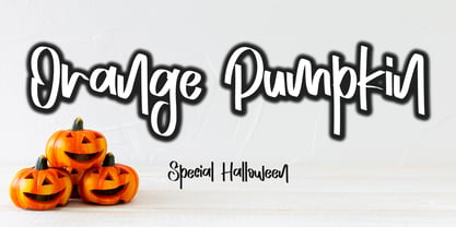 Orange Pumpkin is a handwritten display font. It is perfectly suitable for any Halloween-related project or crafty idea! This font is PUA encoded, which means that you can access all of the glyphs with ease!
 - Aqille by Creaditive Design,
$12.00 Aqille is an elegant script font with a contemporary atmosphere and impeccable form, inspired by timeless classic calligraphy. This font is PUA encoded which means you can access all of the glyphs and swashes with ease!
 - Nosara by Never Better,
$9.00 Inspired by a trip to Costa Rica and named after its famous beach town, Nosara is a layered vector font that's perfect for projects that require a realistic, hand-painted desert-island look. It comes in three styles: Regular, Outline, and Fill. The styles can be layered to create authentic-looking hand-painted letters and icons—in vector! You can create outlines from this font in order to customize to your heart's desire. Millions of bespoke combinations are possible. This typeface was made by hand, meaning each letter was painted with real paint and digitized, not created on an iPad, which is why this font looks great and has a warm natural quality even at large sizes. Nosara is perfect for packaging, parties, signage, and even looks great in long-form text! Nosara Xtra is a set of pictograms, also in 3 styles that can be layered for the same effect, evoking the imagery and happy vibes of a sunny tropical vacation.
 - Apolline Std by Typofonderie,
$59.00 A Venetian serif in 6 styles The Apolline typeface family was created by Jean François Porchez as a means to study the transition from Renaissance writing into the first printing types. Rather than sticking to the method commonly used these days for the creation of revivals of Jenson or Bembo types, it seemed more interesting to try and get in the same mindset as those exceptional designers during this pivotal period in the history of typography. Thus Apolline is an exploration of the design methods used by people like Nicolas Jenson and his contemporaries for adapting handwriting with its multiple occurrences (a, a, a, b, b, b…) into single, unique signs (a, b…). Initially Jean François made drawings modelled after his own calligraphy. They were done at a very small size on tracing paper (2 cm high for the capitals) to preserve the irregularity of human handwriting. Besides emphasising the horizontal parts of the letter forms, the serifs were designed asymmetrically to reinforce the rhythm of the writing. The final drawings were produced at a large size (10 cm high for the capitals) to allow for subtle optimisation of specific details. The very narrow and fluid Apolline italic Influenced by various concepts for an ideal italic by Van Krimpen, Gill, etc. Apolline italic was designed at 8° degrees. Although the structure of the letterforms were informed by chancery scripts, the italic has full serifs like the roman. Very narrow and fluid, its unique design creates a good contrast when used in combination with its upright counterparts. Thanks to the presence of the serifs similar to roman typefaces it sets very neatly in large sizes. The next step was digitising the drawings with Ikarus (the pre-Bézier-curves era) to create the final roman and italic fonts. Two years later, when the family was expanded to six series the same method was used, this time with Fontographer. This was necessary for correcting a few problems caused by the conversion to Bézier outlines, and to add intermediate weights. Before the advent of feature-rich OpenType, quality type families consisted of several separate fonts for each weight to provide users with various sets of numerals, an extended ligature set and alternates, ornaments, and so on. Introducing Apolline Morisawa Awards 1993
 - Monoment - Personal use only

- JWX Western by Janworx,
$19.95 The term Old West conjures up memories of vintage movies and TV shows featuring saloons and dancehall girls. Old wanted posters and cowboys. Rowdy prospectors in the Goldrush, mountains and lots of wide open space. Many of the lettering styles of those days are still in use, reflecting the past, present, and probably the future here. Western style fonts appear in the signage of bars, restaurants, casinos and ski areas. It's a style that speaks of the way it once was in a nostalgic way. This family of three fonts pays tribute to the Old West and its colorful history, with a semi-plain style, a decorated style, and a really lively rendition of our gaudy and raucous history from a century or more ago.
 - Esca by Monotype,
$50.99 Esca is a display typeface designed by Jim Ford with highly compressed proportions yet with a subtle calligraphic touch. This Lite version of the typeface was designed as part of a font marathon over the course of 3.5 days in Monotype’s NY office. The design started with the aim of fitting 4 letters onto one sheet of paper and the resulting typeface keeps that tight proportion. The Esca design is mixed case and is ideally suited for logos, short headlines, and album covers. It has a great architectural feel to it that makes it suitable in signage applications and large scale settings. Monotype is proud to support Room to Read’s work in literacy and girls’ education through our font marathon initiative.
 - Wood Nouveau JNL by Jeff Levine,
$29.00 The hand cut wood type which was the inspiration for Wood Nouveau JNL conjures up images of the artistic period between the Victorian Era and 1920s Moderne, as well as the hippie counterculture active in the later part of the 20th Century. During the late 1960s and early 1970s, rock posters, fliers, store signs and other printed ephemera of "the love generation" borrowed heavily from the Art Noveau style in both art and typography. An Alphonse Mucha-inspired flower girl could adorn a concert poster that also combined both vintage wood type and hand-lettered elements. Although this particular type design might well have preceded the actual start of the Nouveau period, the softer, rounder lines of each character lent themselves well to this emerging style.
 - Lets Sparkle by Lucky Type,
$12.00 Let’s Sparkle is a brand-new handwritten font that will be perfect for books, wedding invitations, greeting cards, logos, posters, or anything else that needs a fun and happy look!
 - Gobsmacked by Hanoded,
$15.00 Gobsmacked is a rather new English word. It has been around since 1959 and was used mostly around Liverpool at that time. The word means: ’astounded’, ‘flabbergasted’ (another nice word!) or ‘speechless’. Gob could be of French or Scottish Gaelic origin and means ‘mouth’. Gobsmacked font was created using a brush and black gouache. The result is a very eroded, very legible and quite unique brush font. I have created alternates for the lower case letters, plus two double letter ligatures (oo and ss). Use it for any design that needs a little brushwork; I am sure the result will leave you gobsmacked!
 - Maduki by Hanoded,
$15.00 This time the font's name is meaningless. Maduki doesn't mean 'cool' in Swahili, nor does it mean 'cup cake' in Sranantongo. It is just a nice name. Maduki is a playful font, created with one of my 2 year old son's marker pens (the 'no stain, wash-out' variety), a couple of cups of coffee and a whole bunch of 'speculaas' cookies. Now you're wondering what speculaas is, right? I'll tell you later - in a couple of fonts... Anyway, there's not much meaningful to say about Maduki font. It is nice, it is cute and it comes with alternates!
 - Chizz - Unknown license

- LaBrit - Unknown license

- Chizz Wide High - Unknown license

- Denigan - Unknown license

- Squareworm - Personal use only

- PixelZoo by Just in Type,
$20.00PixelZoo gathers over 70 animal species turned into pixels. They are wild and domestic animals, mixing mammals, fishes and birds. - Comic Boys by Stringlabs Creative Studio,
$25.00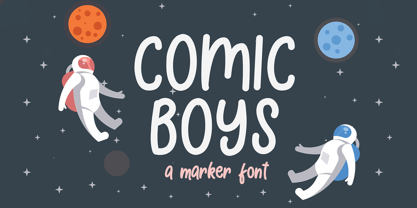 Comic Boys embodies fun, quirkiness and authenticity. This enchanting display font will turn any creative idea into a true standout.
 - Roman Tyres by Red Rooster Collection,
$45.00An original design, based on a very early turn-of-the-century typeface from the defunct Keystone Type Foundry, Philadelphia. - Bendina Sambat by Aldedesign,
$13.00 Bendina Sambat features an incredibly sophisticated and classy feel. Use it to turn any design project into a true standout!
 - KG All Things New by Kimberly Geswein,
$5.00 This font was born of a desire to play with super thin and super thick lines in a script font.
 - FF Kaytek Headline by FontFont,
$50.99 Kaytek™ Headline completes the Kaytek typeface family with seven weights optimized for display purposes. Like the Kaytek Sans it is a fresh take on the correspondence typefaces of the 90s - which were originally designed for the demands of office environments. Just like its predecessors, this text typeface is robust and hard-working - meaning it works well in challenging design or printing environments - but it’s not without personality. Look closer at the lowercase g and a, especially in the italic, and you can see some unexpected elements of subversiveness within the design Every style of the typeface takes up exactly the same amount of space, thanks to the careful creation by Radek Lukasiewicz. This means designers can switch between styles without the text being reflowed, making it particularly useful in magazines, where space might be limited, and also on the internet, where hover links appear in a different style Kaytek Headline comes in seven weights, from Thin to ExtraBlack. Kaytek Sans, Kaytek Slab, and Kaytek Rounded, are also available.
 - Hinnual by Jipatype,
$27.00 Hinnual เป็นฟอนต์ที่ผสมผสานระหว่างรูปทรงสี่เหลี่ยมและทรงกลมเพื่อสร้างสไตล์ที่ไม่เหมือนใคร ชื่อมาจากคำไทย 2 คำ คือ Hin แปลว่า หิน และ Nual แปลว่า อ่อน ผสมผสานองค์ประกอบที่แข็งและอ่อนนี้สะท้อนให้เห็นในแบบอักษร ซึ่งมีเส้นที่สะอาดตาและเส้นคมซึ่งถูกทำให้อ่อนลงด้วยมุมโค้งมน ฟอนต์มีให้เลือกถึง 18 แบบ มีตัวเลือกหลากหลายให้คุณได้เลือกใช้ Hinnual เหมาะอย่างยิ่งสำหรับใช้ในพาดหัวและพาดหัวย่อย ซึ่งลักษณะที่โดดเด่นสามารถช่วยดึงดูดความสนใจของผู้อ่านได้ เส้นสายที่สะอาดตาและสไตล์ที่เป็นเอกลักษณ์ยังทำให้เป็นตัวเลือกที่ยอดเยี่ยมสำหรับแบรนด์ โลโก้ และงานออกแบบอื่นๆ ที่ต้องการภาพลักษณ์ที่น่าจดจำ โดยรวมแล้ว Hinnual เป็นฟอนต์อเนกประสงค์และสะดุดตาที่ผสมผสานองค์ประกอบทั้งความแข็งแกร่งและความนุ่มนวล การออกแบบที่เป็นเอกลักษณ์ทำให้เป็นตัวเลือกที่ยอดเยี่ยมสำหรับนักออกแบบที่ต้องการสร้างผลงานที่น่าจดจำ Hinnual is a font that combines the square and rounded shapes to create a unique visual style. Its name comes from two Thai words - Hin, which means stone, and Nual, which means soft. This juxtaposition of hard and soft elements is reflected in the font's design, which features clean, sharp lines softened by rounded corners. The font comes in 18 styles, providing a range of options for designers to choose from. Hinnual is particularly well-suited for use in headlines and sub-headlines, where its bold and distinctive appearance can help to grab the reader's attention. Its clean lines and unique style also make it a great choice for branding projects, logos, and other design elements that require a memorable. Overall, Hinnual is a versatile and eye-catching font that combines elements of both strength and softness. Its unique design make it an excellent choice for designers looking to create impactful visual content.
 - Gizmo - Unknown license

- Dual Line Stencil JNL by Jeff Levine,
$29.00 A set-aside work file featuring a bold sans serif typeface that may or may not have had a vintage source history was given a new treatment. Initially, the solid design was converted to a stencil format and an experiment was undertaken to see what the alphabet would look like with a dual line treatment. Surprisingly, it turned out quite well and the end result is Dual Line Stencil JNL; available in both regular and oblique versions.
 - Scapegoat by Hanoded,
$15.00 I have been making some clean, connected fonts lately and when I was working on another one of these, I felt the need for something chaotic. So, Scapegoat was born. I used a round nibbed steel pen and Chinese ink and the result is quite a messy font. It may look chaotic, but as Nietzsche once said: ‘from chaos comes order’. Amen to that! Comes with double letter ligatures for the lower case and a whole lot of diacritics.
 - Worriment by The Ampersand Forest,
$20.00 Worriment is a simple, one-off typeface; part of the Dreads collection from the Ampersand Forest. He was born of a whimsical sense of queasiness and unease — he's not just scary, he's Scary Fun! A little kitsch, a little horror. Great for use on Halloween-themed designs, and reminiscent of a "wizarding" look. In terms of letterforms, Worriment is a quirky blackletter-latin hybrid with a sharp, slightly bouncy baseline, and jangly angles, suitable for display use.
 - Kustom Culture by Scratch Design,
$10.00 Kustom Culture font was born from an inspiring vintage old paint display. This font gives a vintage, classic, and old feel, inspired by authentic old paint effects. Kustom Culture font is perfect for you looking for a vintage and logotype. Suitable for any graphic designs such as branding materials, t-shirts, badges, print, packaging, label, business cards, logos, posters, t-shirts, quotes .etc Features: Stylistic Alternates, Numerals & Punctuation Accented characters, Format File: TTF, OTF, Multiple Languages Supported
 - KillJoy by Comicraft,
$19.00 S P O I L E R A L E R T ! We don't want to be a drag, a wet blanket or a spoilsport, but we're here to tell you that everything before “but” is bulls*it! Yep, if you're a merrymaker, a carouser, a jester, a reveler or a live wire, we're here to poop your party with our latest knicker-twister, KILLJOY! Call us cynics, call us crabs, grouches, grumpy old men, sourpusses or bores, but we're the kind of Killjoys who just have to make some noise... sound effects (sic) everybody, so listen up even if you can't handle the truth... and here’s OUR truth; Keep Calm and be a Fabulous Killjoy! Yes, it’s easy to be mean -- but why should anybody else have all the fun? Or all the fonts?
 - The Glasten by TM Type,
$12.00 The Glasten is a distinct and graceful script font. Fall for its ravishing style and use it to create gorgeous designs. This font is PUA encoded which means you can access all glyphs and swashes with ease!
 - Rosha Keylin by Letterena Studios,
$17.00 Rosha Keylin is a stylish and elegant serif font. It is PUA encoded which means you can access all of the glyphs and swashes with ease! Add it to any of your designs, and enjoy the results!


