10,000 search results
(0.026 seconds)
- Atyp BL by Suitcase Type Foundry,
$39.00 The sources of inspiration for the Atyp typeface are spread out widely both stylistically and chronologically. The basic proportions of the uppercase refer to the elementary geometric constructions of the Bauhaus. The subtle details in the drawing of the characters and the microscopic adjustments, which evoke the illusion of uniformity and mechanical purity, pay homage to the rationalism of the typefaces popular in the International Style. The increased contrast of the joints of the bowls and shoulders in the Display weight, which in certain diagonal curves transition into almost deconstructive permutations. For a change these take delight in doing things on purpose, teasing readability and breaking the rules of the new millennium's typography. Atyp was created by adapting a typeface originally made for a commercial television station. The potential of the neutral grotesque, proven by its excellent readability on screens, gave the impetus for its preparation into an extremely wide character set. Coherence across all eight key masters lays the groundwork ideally for using the variable font format. The key benefits of this technology are a significant reduction in data consumption in the case of web fonts, as well as an unlimited access to the full range of styles, which in turn is a significant benefit in the area of responsive design.
 - Clockmaker by Sudtipos,
$49.00 Sudtipos is proud to announce the release of Clockmaker, an 8-weight family that takes initial inspiration from typography around the turn of the twentieth century. Clockmaker takes aesthetic references from Victorian, Art Nouveau and Art Deco advertising and typography, taking special influence from John F. Cummings’ all-caps – and never digitized – type design Elandkay. Clockmaker is a robust multi-weight family that includes an array of ligatures as well as alternate characters and support for all latin languages. The design process began with developing and modernizing the uppercase letterforms, followed by designing the lowercase and additional weights. Creating a diverse and playful set of uppercase ligatures was an almost endlessly enjoyable task; they are one of Clockmaker’s most charming features. Clockmaker is an impeccable choice for designs requiring a vintage flair such as a luxury liquor labels, restaurant identities, lavish hotels and many other applications where elegance and grace are needed. In addition to its historical references, Clockmaker is an homage to my grandfather who was a master craftsman, repairing antique clocks and fine watches with great skill and mathematical precision. Watching him work was fascinating and it has been a joy to remember those quiet and curious moments from my childhood while designing this font.
 - MMC Grafik by MMC-TypEngine,
$37.00 Modular Matrix «Calligraffiti» Robotic Letterform Typeface! New Edition. Redesigned with Obliques and OT Features! This Typeface was inspired by Graffiti Calligraphic Broad Markers and Underground Lettering Technic and Style, grid based by squares perpendiculars and Diagonals… Is Part of a juxtaposed “Type-Game” based on inversions and rotations… Type cool legible digital manuscript Aesthetics body text, scripts, lyrics, articles; Plus, Create Fancy Display’s Branding designs, Packaging, Publishing, Advertisement, Posters, Art Support, Motion, Games, tastes good to text on everything! Experiment Automatic and Responsive OpenType Features, like Fractions, Ordinals, Nominators, Denominators, Scientific Inferiors, Numerators, Localized forms and Kerning. Previous Released by MMC-Typo* 2020. Post Released by MMC-TypEngine 2022. Tip 1: Combine styles into infinite possibilities of Digital Monochromatic or Color Typesetting, by ‘central pasting’ or you may dislocate layers for improvisations! TIP 2: *BLIND BLOCKS ‘FREE-STYLES’ Use Block «Free Styles» 1 & 2 also to add 3D, change 3D directions by switching Block 1 to Block 2, that way you can Zig-Zag words and lines. *Also shift the block layer up to bottom limit, it makes the 3D direction turn upside down. *All Styles have 917 Glyphs. Follow the Groove!! & Power to The Pixel!! Greetings !! André, MMC-TypEngine.
 - Quayside by Eclectotype,
$40.00 Quayside is a deliciously thick and bulbous baseball script, with a wealth of OpenType features. Features include: Contextual alternates - I would suggest having these on by default; they make letters connect more smoothly (uppercase letters like M and H, which are normally non-connecting for all-caps purposes, connect to lowercase letters. The swash variant of J, and all o and b characters connect to any e character at a lower junction for a smoother join). Contextual alternates also make sure special end-forms of lowercase letters are used at the ends of words. Ligatures - A nice collection of useful ligatures which make the text flow smoother. Swash - Gives you more exuberant capitals. Not recommended for all-caps usage! The swash function also gives a variation of the ampersand and turns # into a nice numero symbol. Oldstyle Figures - lining figures are default but with the flick of a switch in OpenType savvy applications, you get expressive oldstyle figures. Quayside is a versatile typeface. Depending on the mood you're after, it can easily be retro or modern, fun or (fairly) serious. I'm often pleasantly surprised by the wide variety of uses my fonts get put to, and I can't wait to see what you do with this one!
 - Baudi by MKGD,
$13.00 Bauhaus is a style of art that was born in Weimar Germany in the early part of the 20th century. The font that bears the bauhaus name was constructed in accordance with this style by making use of spheres and squares with little or no added flourishes. Since this typeface was already minimalistic in appearance, it was difficult to produce a similarly styled font. So I went back to bauhaus’ architectural roots for inspiration. The result contains a more detailed composition, but is still focused on the basic aesthetics that continue to make bauhaus a popular art form. Baudi has a glyph count of 388 and supports the following languages Afrikaans, Albanian, Asu, Basque, Bemba, Bena, Bosnian, Catalan, Chiga, Colognian, Cornish, Croatian, Czech, Danish, Embu, English, Esperanto, Estonian, Faroese, Filipino, Finnish, French, Friulian, Galician, German, Gusii, Hungarian, Icelandic, Indonesian, Irish, Italian, Kabuverdianu, Kalaallisut, Kalenjin, Kamba, Kikuyu, Kinyarwanda, Latvian, Lithuanian, Low German, Lower Sorbian, Luo, Luxembourgish, Luyia, Machame, Makhuwa-Meetto, Makonde, Malagasy, Malay, Maltese, Manx, Meru, Morisyen, North Ndebele, Norwegian Bokmål, Norwegian Nynorsk, Nyankole, Oromo, Polish, Portuguese, Romanian, Romansh, Rombo, Rundi, Rwa, Samburu, Sango, Sangu, Scottish Gaelic, Sena, Shambala, Shona, Slovak, Slovenian, Soga, Somali, Spanish, Swahili, Swedish, Swiss German, Taita, Teso, Turkmen, Upper Sorbian, Vunjo, Walser, Zulu
 - Baka Expert by Positype,
$25.00 Why Baka Expert? There’s actually a simple answer. The original Baka was done as an experiment of sorts. I wanted to quickly capture a rough, frenetic handwriting style that broke normal conventions. Commercially, it was successful, received some accolades ... but I wasn’t completely satisfied, so I went back to the master art and the lettering explorations and produced Baka Too. This addressed some of the line items I wanted to refine in Baka. I liked it. Each font has been out for a few years now, and I have seen them in use. I’m very critical of my work, and I could still see things—modulations of strokes, angle of the nib, ink swell, and so on—that I wanted to change, refine, and reorder. For me, it is typographic indulgence, but I wanted to take this handwriting ‘font’ and turn it into a robust ‘typeface.’ So I did just that and a bit more by adding back more of my initial flourish concepts; attaining tighter, consistent control of the modulation; optimizing points; adding titling options; and expanding the character language set. Baka and Baka Too had to exist to produce this entirely new re-envisioning of an old friend ... and they all play well together :)
 - OBO Classic by Juri Zaech,
$19.00 OBO Classic is the second installment of the OBO series, a type collection based on a square. Every character is mapped on a 1x1 ratio which allows for horizontal and vertical settings alike. Or mixed, like crosswords. OBO Classic is a display interpretation of a traditional Old-style Serif. The “distortion” which maps each character to a square creates unusual proportions to what we are used to from classic serif typefaces. The result is a monospaced font. While each individual letter feels conventional on its own, when brought together in words the result feels contemporary. Thanks to the square base vertical and horizontal – and mixed – settings are possible and easy to apply. There are a few exceptions for certain punctuation and special characters that are half the width for better spacing; and the word space’s width can easily be adjusted through OpenType stylistic sets. Talking about spacing, for strictly horizontal typesetting there is the option to turn on kerning for a number of characters to create a cleaner texture across words and phrases. OBO Classic is best set in large sizes and is most comfortable in editorial and display settings. A series of icons complete the character set. A selection comes as pixel graphics which adds further contrast to the traditional legacy of the typeface.
 - Audace Std by Typofonderie,
$59.00 Between geometry & shapes inspired by nature, in 4 fonts Audace was born as a response to a simple brief: how to visually express human interaction and technology with abstract forms? The starting point is a humanistic sanserif, to which are added external references: design pieces, furniture, buildings. Architects shape our world with the intention to reconnect nature, human and address a perfect functionality. Not so far to typeface design which combines a personal vision and ensures good legibility in a certain context. Audace — like the works of those artists, designers, architects — is clearly influenced by the tension of the line, the play with negative space, the dynamics, the surprise, the nature that will influence the shapes of the letters. So if a v is asymmetrical, and the y based on similar asymmetry but in reverse, these two shapes help to distinguish from one to the other. This is a consequence of the influence of forms from design and art in the design of the Audace. And this small example illustrates the confrontations of the designer’s influences: the search for the most unique shapes, but without compromising on function: to be read, to be legible, even at very small size in the worst conditions. Audace, between geometry and shapes inspired by nature
 - DT Paperside by Dragon Tongue Foundry,
$15.00 Paperside: Neither Papyrus nor SSI Countryside. Inspired in some ways by the Papyrus form, but untextured and smoother, with the dimensions and proportions more open, like that of Countryside SSi, with its larger easily readable lowercase body, and more consistent, shorter stems. Paperside has an open scripted feel which is pleasing on the eye and easy to read. Paperside can enhance the first letter of most sentences automatically, and changes other letters to suit their position within words, and the letters they appear beside. Now comes in 5 weights plus italic. For best results, use this ‘smart font’ with Contextual Ligatures turned on. Mulitiple Stylistic Alternatives are included. Inspiration for this font came from two other fonts. Papyrus: was designed by Chris Costello and created in 1982, it is a hand-drawn textured typeface, emulating texts written in biblical times. One of the most used (and misused) fonts of all times. Owned by Letraset, and currently published by the Internation Typeface Corporating (ITC). Countryside SSi: The serif font of an unknown designer, is currently licensed by Southern Software Inc. Feel free to preview some of the Dragon Tongue fonts that are yet to be released, at https://www.dragon-tongue.com/fonts
 - Poultry Sign by Ingrimayne Type,
$5.95 While searching through microfilm of an old, 1932 newspaper, I stumbled on the word "Poultry" written with trapezoidal letters. I did not recall seeing lettering like this and it inspired me to design a typeface that could produce a similar result. Poultry Sign has two widths each with three weights giving the family six styles. It is monoline, monospaced, and all caps. The letters on the lower-case keys reverse the trapezoid of those on the upper-case keys. The designer's expectation is that the most common use for this typeface will alternate upper-case and lower-case keys, and to make this effect easy, included in the font is a contextual alternatives (calt) OpenType feature that automatically produces this result if your word processor supports this feature. To get text with all letters with big bottoms or all letters with with big tops, this feature must be turned off. The spacing of the letters is identical within each width so the styles can be layered to produce bi-colored or tri-colored letters. There is a second set of numbers that can be accessed with an OpenType stylistic alternative. Also accessible with OpenType stylistic alternatives are variations of letters T, N, L, Y, and V.
 - Dog Days by Fenotype,
$45.00 Dog Days is an American hand lettering style brush script family. Dog Days is swift, strong and full of bursting energy. Due to its clean features it’s legible even in small sizes. Dog Days is great for any display use -from poster to packaging and logo to t-shirt. Dog Days is also great for lettering works. Dog Days Brush boasts with more than 700 glyphs and plenty of OpenType features: Keep Standard Ligatures on - it adds variety in hand lettering style and keeps the flow steady. If you need more action try turning on Swash, Stylistic or Titling Alternates in any OpenType savvy software. Dog Days Brush is also equipped with Old Style Numerals if you need your numbers to fit more into text. Dog Days Brush uppercase letters are designed to work as initials so if you need to write all caps you might want to use Dog Days Caps or Dog Days Small Caps. Dog Days Caps can also be used as uppercase letters for the script. Dog Days Extras is a set of badges, swashes and swirls designed to play with the font. Dog Days is inspired by a hand lettering sample in a vintage American swimsuit advertisement.
 - Abelina by Sudtipos,
$69.00 «Abelina» is a typeface that can be used in display sizes for titles where part of the central premise is to emulate certain features of gestural handwriting. Concepts like spontaneity, speed and fluidity, associated with the use of certain calligraphic tools – in this case the pointed brush – led to a typographic result based on the pattern-like structure coming from the chancery and italic calligraphic models. «Abelina» - initially designed by Yanina Arabena (Calligrapher, Graphic Designer and Typographer) - is reborn to make way for “Abelina Pro” through the solid work of Guillermo Vizzari working together with Ale Paul from Sudtipos. Throughout its use, “Abelina Pro” maintains the structure of a firm style, integrating a dynamic rhythm in the composition of short texts and offering personality to each of the words it builds. It has over a thousand glyphs, including several alternates, ligatures combination, initials and miscellaneous to reinforce the idea of the author of merging a calligraphic project in the typographic world; allowing new ways to capture this great universe of italic faces. «Abelina» project was initially born as a typographic project developed by Yanina Arabena – tutored by Ale Paul and Ana Sanfelippo – under completion of the Specialization in Typography Design at University of Buenos Aires, Argentina, during the years 2011 and 2012.
 - Feuerfeste - Unknown license

- Friendly Yellow by PizzaDude.dk,
$16.00 Friendly Yellow is my sketchy/scratchy handmade sans font. I've made several layers for you to play around with, in order to get that feel-good handmade-sketch-font-look! I've also added ligature substitution for the most common double letters
 - Belisha by Nissa Nana,
$20.00 Belisha is a beautiful script with a modern vibe. It has a classy, elegant, and modern look which can be used for logos, branding, invitations, stationary, wedding designs, social media posts, and any other design in need of a handwritten touch.
 - TXT Tough Love by Illustration Ink,
$3.00Add character to your paper crafts and publications. Download this cool Tough Love font to create lettering with a scratched or brush-stroke look. Design titles, captions, journaling and more, or simply give your publication an off-beat, handwritten appeal. - The Glamz by Just Font You,
$16.00 Meet The Glamz, a brand new auto-chic font. Designed to fulfil your trend-catching things with the edgy style and undeniable artsy look. Perfectly fit for your fashion branding stuff, handwriting logo, inspirational quote poster, oh well you name it.
 - Spooky Witch by Arkrist Letter,
$13.00 Spooky Witch is the latest Halloween font from Arkrist Letter studio. A serif font designed with elegant characters, but looks scary. Spooky Witch font is suitable for design, logo, greeting card, invitation, etc. make your day more spooky with Spooky Witch!
 - Kigelio by Ivan Rosenberg,
$15.00 KIGELIA is a stylish display serif font inspired by fashion magazines and romance. It is great for short headlines and titles, but it looks great in advertising, vintage mood board, branding, logotypes, packaging, titles, editorial design and modern and vintage design.
 - Blink Urgent Display by Tebaltipis Studio,
$15.00 Blink Urgent - Modern Bold Serif Font is a stylish font It has both modern and retro look. Comes with alternatives and ligatures, helps to create stunning logos, quotes, posts, blog posts. branding projects, magazine imagery, wedding invitations, and much more.
 - Silk Display by Luhop Creative,
$18.00 Silk Display is a serif retro and bold display font. This font is PUA encoded which means you can access all of the glyphs and alternates with ease! It would look great on headlines, magazines, logos, branding and so much more!
 - Namex by BaronWNM,
$14.00 Namex is a handwritten font with serifs. It tends to be a slab serif style while maintaining the hand-drawn shape, making it look original and non-standard. We recommend you use this font for retro and warm decoration designs.
 - Bokeseni by AukimVisuel,
$9.00 Bokeseni is a cute and casual sans serif font with an undeniably clean feel. It includes a condensed, and expanded version. With its neat and beautiful arrangement of letters, this typeface will look outstanding in both formal and non-formal designs.
 - Frontiersman JNL by Jeff Levine,
$29.00 The pages of the Speedball® Lettering Textbook have yielded a number of classic typefaces for digital designers. Frontiersman JNL and Frontiersman Black JNL have the wonderful hand-lettered look that adds just the right touch of nostalgia to any layout.
 - Polythem by Haksen,
$13.00 "Polythem" is a beautiful high bold script font that makes for gorgeous logos, posters, wedding invitations, blog posts, social media, and more! Polythem Script includes ligatures to make everything look totally hand-done, and alternates for each letter. Thanks for visited
 - Estonia Nouveau Pro by TypeSETit,
$39.95 Estonia Nouveau is based on the calligraphic style found in the East European country of Estonia. The traditional lowercase forms are combined with the more non-traditional script uppercase alternates to give a truly up-to-date, yet traditional look.
 - Little Knight by Almarkha Type,
$22.00 Little Knight is a Fun Slab font that will make your designs look unique and fun. It’s perfect for labels, quotes, posters, DIY projects, branding, packaging, greeting cards, websites, photos, photography overlays, signs, window art, scrapbooking, tags and so much more!
 - C&lc Uncial Pro by Hackberry Font Foundry,
$24.95 This is a radically modernized uncial with many OpenType features and 415 characters: Caps, lower case, small caps, numerators, denominators, accents characters and so on. There are 21 ligatures. It is an experimental look at medieval writing for the 21st century.
 - Rockstyle by Letterafandi Studio,
$16.00 Rockstyle is a natural, dry brush display font. It is a tough-looking font with a strong brush touch, ready to rock every design you are willing to create. It’s perfect for logos, quotes, posters, clothing, and so much more!
 - Walentiny by Stringlabs Creative Studio,
$25.00 Walentiny is a Script Font with Handwritten Style. The Walentiny font made with digital brush pen strokes that making this font look authentic. This font is perfect for fashion brand, wedding invitation, business card, logo brand, signature, and then calligraphy.
 - Submarine Beach by Brittney Murphy Design,
$12.00 Submarine Beach is a funloving & carefree mono height font with alternates and ligatures. Mix and match between upper and lowercase and alternates for a custom look! With over 500+ characters, the font includes extended Latin as well as Greek and Cyrillic.
 - Bricius by Typefactory,
$14.00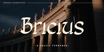 Bricius is a celtic style display font combined with a modern design, this font is modern, elegant and looks aesthetic. This unique display typeface is inspired by celtic styles. Use it for any design project that requires a personalized appearance!
 - Webcomic by Gassstype,
$22.00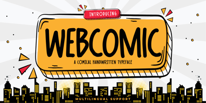 Webcomic - Comical Handwritten Typeface Font that will make your designs look modern, unique and fun. It’s perfect for labels, quotes, posters, DIY projects, branding, packaging, greeting cards, websites, photos, photography overlays, signs, window art, scrapbooking, tags and so much more!
 - Amoeba by SparkyType,
$19.00If you look into the past to see what was expected of us in the future, Amoeba is where we wanted to be by now. Amoeba is a constrained but quirky future font, designed on a computer by a human. - Thievery by Hanoded,
$15.00 The idea behind Thievery… is that there is no idea behind it. Thievery is just a nice, legible, happy typeface. It is hand made, has lots of curly swirly bits and looks good as well. So… grab it and run!
 - Protonema by Tigade Std,
$25.00 Protonema is inspired by a strong and sharp motivational spirit to always look positively for achieving goals. It is suitable for any sports and related theme for widely range of usage. Such as logos, branding, magazine, label and many more
 - Disans by SimpleType Studios,
$15.00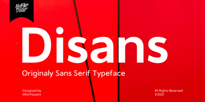 Disans is collection font with natural movement make looks elegant, classy and beauty for your project. Disans is perfect for branding projects, logo, wedding designs, social media posts, advertisements, product packaging, product designs, label, photography, watermark, invitation, stationery and any projects
 - American Writer by Typadelic,
$19.00American Writer is suitable for many types of designs. It is meant to be used for body text and is very readable at small text sizes. It looks similar to the type you would see on blueprints or an architect's drawings. - Arionna by Stringlabs Creative Studio,
$25.00 Arionna is a Script Font with Calligraphy Style. The Arionna font made with modern digital brush pen strokes that making this font look beautiful. This font is perfect for fashion brand, wedding invitation, business card, logo brand, signature, and then calligraphy.
 - Grunge Decay by Okaycat,
$29.50 Grunge Decay is an urban font with a unique look. It creates a rugged and unusual feel to with its own character & stylization. Grunge Decay is extended, containing West European diacritics and ligatures, making it suitable for multilingual environments & publications.
