10,000 search results
(0.02 seconds)
- Story Tales by Resistenza,
$39.00 A fairy tale, is a folklore genre that takes the form of a short story. Story tale, is a new type family for wonderous, romantic, magical and playful narratives brought to you by Resitenza. The 1970s were wild and whimsical times. Book covers from this time were iconic, innovative and enduring; bold colour and stylised pattern dominated. Story Tales forms were inspired by 70s books covers, and aims to encapsulate the zeitgeist of the time, but the typeface is by no means constrained to revivals of this era. There are nods to 60's flower power & psychedelia, chromatic type and decorative queues from the 1800s and the spirit of post-war era children's almanacks. It is also perfectly suited to inspiring curiosity, imagination and fantasy in today's audiences. Each of Story Tales 8 styles (4 upright and 4 italics) stack on top of one another giving the designer broad aesthetic range. This layering of styles and the ornamental illumination allows striking multi-coloured typography for your book covers, editorial and poster designs.
 - Scribonius GTSLB by Intellecta Design,
$30.00 Blackletter typefaces, also known as Gothic, Fraktur, or Old English, have been used in the headings and initial chapters of books. This style of typeface is recognizable by its dramatic thin and thick strokes, and in some fonts, the elaborate swirls on the serifs. Blackletter typefaces are based on early manuscript lettering and evolved in Western Europe from the mid twelfth century. They are best used for headings, logos, posters, and signs, as they are not easy to read in body texts. Blackletter was type that emulated the most common handwritten scripts of the era and was used for books of hours and initial chapters of books Brazilian type designer Paulo W created this font ideally suited for advertising and packaging, festive occasions, editorial and publishing, logo, branding and creative industries as well as poster and billboards. An elegant and clean typeface, with two harmonic blackletters styles, the bold lowercases with beaufitul ornamented initials. A classic decorative design around an antique theme: The headings of gothic texts, this font works great in display purposes. ENJOY
 - Stash by J Foundry,
$30.00 Your Stash of fonts for that custom hand-lettered look. Stash comes in two styles; a clean modern and a worn vintage look, each in five weights. Stash features hundreds of alternates to make every setting look crafted and unique. The fonts are programmed with a smart set of contextual alternates that handle initial and final forms, as well as a few connecting pairs, making each word look polished. Tails and underlines round out the character set. With Stash you can craft solid logotypes with a unique look, set posters and ads, and even run longer lines of copy on packaging. Pick it up for your next craft beer label, chocolate pack, café logo, or good old social media posts!
 - Kitsch by Zetafonts,
$39.00 Designed by Francesco Canovaro with help from Andrea Tartarelli and Maria Chiara Fantini, Kitsch is a typeface happily living at the crossroads between classical latin and medieval gothic letterforms. But, rather than referencing historical models like the italian Rotunda or the french Bastarda scripts, Kitsch tries to renew both its inspirations, finding a contemporary vibe in the dynamic texture of the calligraphic broad-nib pen applied to the proportions of the classical roman skeleton. The resulting high contrast and spiky details make Kitsch excel in display uses, while a fine-tuned text version manages to keep at small sizes the dynamic expressivity of the design without sacrificing legibility. Both variants are designed in a wide range of weights (from the almost monolinear thin to the dense black), and are fully equipped with a extended character sets covering over two hundred languages that use latin, cyrillic and greek alphabets. Special care has been put in designing Kitsch italic letterforms, with the broad-nib movements referencing classical italian letterforms to add even more shades to your typographic palette. The resulting alternate letter shapes have also been included in the roman weights as Stylistic Alternates - part to the wide range of Open Type features (Standard and Discretionary Ligatures, Positional Numerals, Small Caps and Case Sensitive Forms) provided with all the 32 weights of Kitsch. Born for editorial and branding use, Kitsch is fashionable but solid, self-confident enough to look classic while ironic enough to be contemporary.
 - Aeonian by Adorae Types,
$40.00 Aeonian, designed by Emilia Adorno, was mostly inspired by the iconic morphology adopted by the arts of the 1920s. One hundred years later we can still see the resemblance between the wants and the needs of now and then to reach for the sky, to look ahead and enter the future in style. Now as then, we seek the right tools to do so, then once again, we embrace the rational, yet elegant and stylish forms of simplicity, geometry and symmetry. At the same time, there is a strong and growing need for a warmer approach to creating lovemarks. For that, Aeonian’s alternates hold attractive, soft and inviting shapes to an emotional appeal. Aeonian is a combination of all of them. A rational side entwined with an emotional one. Born a geometric sans, Aeonian ended up being a 2 in 1 font with a sans serif set and alternates reaching over 1200 glyphs. The entire family contains 6 weights, from thin to black, with its matching italics. It features a variety of ligatures to be used as connectors, specially for display. It also offers multilingual support, even for certain display ligatures. Later, Aeonian kept growing, with stylistic alternate sets of initial, mid and final glyphs. These are its arms to reach for infinity with a warm heart. The wide range of possibilities that Aeonian offers, makes it the best font for creating vast design systems with a rich visual language.
 - 1510 Nancy by GLC,
$20.00 This set of decorated initial letters was inspired by those used in 1510 in Nancy (France, Lorraine) for printing of "Recueil ou croniques des hystoires des royaulmes d'Austrasie ou France orientale[...]" Author Symphorien Champion, unknown printer. There were three sorts of initials family, but only one complete and clear, except a very few characters. The printer used some letters to represent others, as V, turned over to make a A, D to make a Q, M for E, So, the reconstruction was a little less difficult. Thorn, Eth, L slash and O slash were also added. The original font's letters was only drawn in white on a black background only, but it was tempting to propose a negative version in black on white. A few letters have multiple appearance, but only the A was clear enough to be reproduced. It can be used as variously as web-site titles, posters and flyer design, publishing texts looking like ancient ones, or greeting cards, all various sorts of presentations, as a very decorative, elegant and luxurious additional font... This font supports strong enlargements revealing its fine details and remaining very smart. Its original medieval height is about one inch equivalent to about three to four lines of characters. This font may be used with all our blackletter fonts, but as well with "1543 Humane Jenson", "1557 Italic" and "1742 Civilite", without any fear about anachronism.
 - Minea by Bistatype,
$35.00 A characteristic of the Minea font family is the achievement of the calligraphic handwriting effect. In addition to basic, simple letter forms, it contains a large number of additional stylistic alternatives and ligatures that, by combining and changing without repetition, give the effect of calligraphic writing. Some of these characters can be changed by automatically turning on a particular OpenType function, when ligatures replace the combination of letters that are part of them, the letter is replaced by a certain alternative when found in a given context, and capital letters are replaced with decorative initials. Letter swap functions can be used in all programs that support OpenType programming. Minea is an attractive font that is sleek, clean, feminine, sensual, glamorous, simple and very easy to read. The Minea font family, based on original calligraphic sketches, contains a total of six weights. Thin, regular and medium weights have ligatures and alternate letter shapes, which help make the syllable look like an authentic calligraphic print. Semi-bold, bold, and black weights contain only basic letter shapes. The font family contains Latin and Cyrillic. Includes Russian and Serbian alternative letter forms. The family of calligraphic fonts Minea can be used on various occasions, and is intended for use in print and online. Can be used in the realization of certain tasks, unusual advertisements, packaging and invitations, diplomas ... as well as for all purposes where this type of letter is needed.
 - Mahalini by Putracetol,
$28.00 Mahalini - Serif Font Mahalini is a luxurious serif font that adds a touch of elegance and sophistication to any project. Its timeless and classic design makes it a perfect choice for high-end fashion, beauty, and luxury branding. Mahalini was created with the idea of a sophisticated and versatile typeface that can be used in various design projects. For those who are looking for a font that will elevate their design and branding, Mahalini is the perfect choice. It is ideal for logos, book covers, posters, flyers, digital design, and any other projects that require a touch of luxury and elegance. The font's stylish and sophisticated look will make any product stand out and create a lasting impression on the audience. Mahalini comes with various features that make it a versatile and reliable choice for designers. The font includes uppercase and lowercase letters, as well as opentype alternates and ligatures. Additionally, it supports multiple languages and includes number, punctuation, and symbols. These features make it easy to create a professional and elegant design with ease. The Mahalini font package comes with three different file formats to ensure compatibility with various design software. The package includes the otf, ttf, and woff file formats. These files can be easily installed and used with Adobe Creative Suite, Microsoft Office, or any other design software. If you are looking for a font that will add elegance and luxury to your design, Mahalini is the perfect choice. Its timeless and classic design, combined with its versatility and sophistication, makes it a reliable and valuable addition to any designer's toolkit. In summary, Mahalini is a luxurious serif font that is perfect for high-end fashion, beauty, and luxury branding. Its classic design and versatile features make it a reliable choice for any design project. With its multiple file formats and multilanguage support, Mahalini is the perfect choice for any designer looking for an elegant and sophisticated font.
 - Space Armada by Wing's Art Studio,
$10.00 Space Armada - A Science-Fiction Font for Out of this World Designs! Space Armada is inspired by a 1980s interpretation of the future, referencing blockbuster sci-fi action movies of the period, along with the emerging video-game consoles and home computer technologies. It's nine unique fonts are designed to work together in a variety of ways, so you can layer it's different styles on top of each other to retro-futuristic effect!* Here's an example of how it works: Start by placing the Regular font on top of the Bold for a simple base outline. Add contrasting gradients to both fonts for an instant metallic or chrome effect. Take it a step further with one of the readymade Outlines for an embossed look. Overlay the Wireframe font for a glimpse inside the machine! This looks particularly good when you apply a glow effect and reduce it's opacity so the other layers show through. That's just one way to use it. Check out my visuals for more usage ideas! You can also follow my short tutorial! Space Armada is an all-caps font with unique uppercase and lowercase characters, along with a range of alternatives for experimentation with different looks. It also includes punctuation, numerals and language support, plus a selection of underlines and symbols. It's a highly customisable font, perfect for retro designs such as movie titles, posters, games, book covers and more! Every care has been taken to ensure that all fonts align perfectly when layering. Due to the variations in how different software handles text tracking, some minor tweaking may be required for pixel perfect alignment.
 - Magicjar by Beary,
$13.00 Are you looking for a unique elegant font? You came to the right product. Magicjar is an elegant hand lettering look attractive and natural! Every single letters have been carefully crafted to make your text looks beautiful. Magicjar is PUA encoded, which means you could access all of the glyphs! Every letter has a unique and beautiful touch, which will make your design come alive! Thanks
 - Sukkergris by Bogstav,
$15.00 Need a catchy headline font with a clear handmade and organic look? Look no further, because Sukkergris is here to do the job! Each letter is handmade and manually cleaned up, but keeping the original quirky curves. I have added 6 different versions of each letter, which automatically cycle as you type. I also added a set of small caps, just because I think they look awesome!
 - Nothing So Childish by PizzaDude.dk,
$20.00 If you're looking for cuteness, something whimsical and unpredictable madness - then Nothing So Childish is something for you. The font is 100% handmade with a slightly dry pen. With a closer look, the font reveals several scribbles and scratches - only to make the font look more authentic! Your next birthday- or greeting card will love this font! :) Comes with ligatures which substitutes double letters!
 - Lord Rat AOE by Astigmatic,
$19.95 LordRat is a rugged unicase typestyle built for childish and off kilter purposes. A mix of heavy and light with quickcut appearance makes this typestyle offbeat and even festive. Put some dignified childish offbeat flavor into your designs today with LordRat. If you've been looking for a playful yet bold typestyle with papercut looks, LordRat is what you've been looking for. Get it today!
 - Fondest by Prioritype,
$19.00 Introducing. Fondest: A modern and classic look font that is simple and looks luxurious. Great for branding, social media posts, logos, quotes, magazines etc. Features: Uppercase, Lowercase, Numeral, Punctuation, Multilingual, Ligature, Alternates & PUA Encoded. Thanks.
 - Axeleon Abstract by Sipanji21,
$16.00 Axeleon is great looking with a futuristic, rough, and metal-themed Display font. It will look great in death metal music projects, poster, logo band, band apparel, metal music logo, music album and much more!
 - Yogyakarta by Letterafandi Studio,
$10.00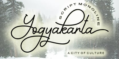 Yogyakarta is a handwritten script font, with an elegant and beautiful look. It looks stunning on invitations, thank you cards, quotes, greeting cards, logos, business cards and every other design which needs a handwritten touch.
 - Cocleng Brush by Realtype,
$12.00 INTRODUCE COCLENG HANDWRITING FONTS. Cocleng is a natural brushed font with a dirty textures. This font will give you a fresh and edgy looking design and will look beautiful with offers, fashion magazines, logos & more.
 - Veneto by Scriptorium,
$18.00An attractive antique-looking script font. - Oh Sweet Pea by BA Graphics,
$45.00A fun, goemetric, rounded new look. - Journal Hand by Typadelic,
$9.95 Journal Hand was inspired by a 45-year-old travel diary I bought at an estate sale. The carefully constructed all-uppercase letters indicated that this traveler cared about style and legibility. Each picture, postcard and brochure that was glued into the diary had a neatly written caption and I admired the care this day tripper took to record his European trek. While the pages are now yellowed and falling apart, the handwriting is still legible and stylish. Because his handwriting totally suits today's uses, I re-created it in modern journalistic style that looks like it was written with a technical pen. Use this typeface when you need a neatly handwritten style. Uppercase only!
 - Theory Of Signature by Aminmario Studio,
$20.00 This font was created to look as close to a natural handwritten script as possible by including some alternates lowercase, ligature and underlines. Perfect for any awesome projects that need hand writing taste. Comes with regular and italic. Built in Opentype features, this script comes to life as if you were writing it yourself. Also support multilingual. It's highly recommended to use it in opentype capable software - there are plenty out there nowadays as technology catches up with design ... Other than Photoshop, Illustrator and Indesign, many standard simple programs now come with Opentype capabilities - even the most basic ones such as Apple's Text Edit, Pages, Keynote, iBooks Author, etc. Even Word has found ways to incorporate it.
 - Abygaer by Sealoung,
$25.00 Abygaer - a stylish OpenType rich serif with letters that seem to dance and twist harmoniously together - to form unique & elegant typography designs. A large selection of interwoven Opentype ligatures and alternates, means ample selection and variety in your finished look. To access these OpenType features, you will need Opentype capable software such as : Word, Textedit, Photoshop, Sketch, Pages, Keynote, Numbers, iBooks Author, QuarkXPress, Indesign and Illustrator. A wide range of useful glyphs are included - see preview image of all glyphs. Abygaer is also included full set of: -uppercase and lowercase letters -multilingual symbols -numerals -punctuation -stylish alternates -ligature Wish you enjoy our font and if you have a question, don't hesitate to drop message & I'm happy to help :)
 - Signature Zetterd by Aminmario Studio,
$20.00 This font was created to look as close to a natural handwritten script as possible by including lowercase swash, ligature and underlines. Perfect for any awesome projects that need hand writing taste. Comes with regular and italic. Built in Opentype features, this script comes to life as if you were writing it yourself. Also support multilingual. It's highly recommended to use it in opentype capable software - there are plenty out there nowadays as technology catches up with design ... Other than Photoshop, Illustrator and Indesign, many standard simple programs now come with Opentype capabilities - even the most basic ones such as Apple's Text Edit, Pages, Keynote, iBooks Author, etc. Even Word has found ways to incorporate it.
 - Smooth Buggaloo by URW Type Foundry,
$39.99 Just like my previous typefaces, my new one, Smooth Buggaloo, also finds its roots in music. The Boogaloo was a popular music style in the 60s, a mixture of Latin and Rock and Roll music. Later Salsa took over this genre. Latin music represents a vibrant, lively and an uncontrollable need to move. In Smooth Buggaloo, you will recognize a swing, flair and a hint of seduction. But despite its vibrancy it can also be understood as a serious, simple and clean typeface. The characters vary between a handwritten and a designed look. Smooth Buggaloo is very suitable for any graphic purpose, like logo- and poster design and it can also be used for longer texts.
 - Ford's Folly by Ascender,
$50.99Ford's Folly is a lively yet sophisticated handwriting font designed by Ascender's Jim Ford. It captures the look and spirit of the designer's handwriting using a using a Sharpie™ Extra Fine felt pen. This casual script font evokes an energetic feeling, and has very legible letterforms without quirky distractions. Jim Ford took his hand global by creating a massive multilingual character set. The font features the WGL Pan-European character set (Eastern Europe, Cyrillic, Greek and Turkish) and advanced typographic features for use with OpenType-savvy applications. The font is a fun and attractive handwriting font that is great for greeting cards, menus, advertisements, scrapbooking and many other projects that can benefit a personal appearance. - Ammer Handwriting by Schriftlabor,
$18.99 Austrian Cartoonist Wolfgang Ammer lent his handwriting to this font, which was produced by Miriam Surányi. Wolfgang already uses the font in his daily routine: It facilitates corrections and translations of his cartoons for international newspapers. Rich in contextual alternates, Ammer contains about 1800 glyphs. Each character has multiple alternates. And a complex OpenType substitution feature makes sure that the same variant does not appear twice in a line. As a special gimmick, the font contains a Tic Tac Toe game: To activate it, type a # and turn on stylistic set 20. Then use digits 1–9 for setting the naughts and crosses on their places. The enclosed TT variant has a reduced glyph set and therefore a smaller file size, hence it is better suited for use on the web.
 - Bimbo by Zetafonts,
$39.00 Bimbo is a monoline script font family created in 2018 by Francesco Canovaro for Zetafonts as an extension & redesign of the original Arsenale White typeface created with italian illustrator Jonathan Calugi. Bimbo expands the original design with six new weights and over 300 new characters to cover over 70 languages using the latin, greek and cyrillic alphabets, while keeping the handmade aesthetic that made successful the original font. Bimbo is essentially a display font, born for minimal lettering and logos, with a handwritten sensibility enhanced by the built-in letter swapping open type feature that makes sure double letters are always different one from another. Open counters and a monoline design allow for great readability at small sizes, making Bimbo the ideal font for creating fake handwritten notes and meta-textual jokes.
 - Noemi Slab by Brackets,
$22.00 Noemí is a broad typeface based on a formally classic skeleton, but with a strong Meccano character, where its quadrangular serifs are the protagonists of the slab style. It is a typeface designed to solve the basic problems of newspaper printing, adapted to a novel and strong communication, in the case of a wide typeface and with generous ink traps making the impression. Noemí was born from the need to create a broad, functional typeface family with a strong compact character intended for use in the press. Intended for editing and layout in a newspaper / magazine with a wide range of subfamilies thought and designed to achieve a diverse graphic functionality; designed from the same common skeleton, with a style based on the mix between the Mecan characters of traditional typewriter fonts and Roman fonts.
 - Vastago Grotesk by Sudtipos,
$39.00 We are pleased to announce the launch of Vástago Grotesk, a nine-weight sans serif font family, inspired by the traditional grotesque designs of the 20th century. The particular ink traps, result of the G drawing, create it a visual universe that is replicated throughout the system, generating personality and a functional distinctive in multiple contexts. Vástago Grotesk was born out of an interest in exploring the possibilities of Sans Serif font design, a process that is complemented by the advice of excellent typographers throughout the world thanks to the Type Crit Crew initiative. The design was carefully constructed, achieving functionality in different sizes, ranging from a subtle Thin to a Heavy weight that projects grandeur and character. Vástago Grotesk is a challenge come true. We hope you enjoy it.
 - Monstro by PintassilgoPrints,
$24.00 Monstro is a carefully hand-crafted typeface with different lettershapes on upper- and lowercase slots, although being an all-caps font. When working in OpenType savvy applications, the contextual alternates feature can take care of alternating the glyphs, preventing double letters from showing the same lettershape while bringing more spontaneity to your designs. There is also a set of stylistic alternates for added amusement: just turn on the stylistic alternates feature or pick the glyphs manually. Monstro comes in 2 versions: sketchy and solid, both hand-drawn. And yet there is the matching picture font that brings a big bunch of irresistible monsters and other very cool graphic elements. Sans-serif and bold, useful and friendly, these fonts are quite perfect for a monsterful of purposes. I can tell that you are gonna be friends!
 - Fleischman BT by Bitstream,
$50.99Charles Gibbons' Fleischman BT Pro revives J.M. Fleischman's quirky and elegant text faces of the 1730s. Born in Germany, Fleischman worked in Holland, primarily at Enschedé en Zonen where he cut dozens of faces. His types represent some of the earliest examples of the Transitional style, predating and influencing the work of Fournier, Baskerville, and Bodoni. They were wildly popular in their day, used for everything from newspapers to currency, and Fleischman himself has enjoyed a renaissance of late. Fleischman BT Pro preserves the feel of the printed metal types while expanding the original to include four OpenType fonts: roman, italic, bold, and bold italic. They all include small caps, old style and lining figures, discretionary and historical ligatures, ornaments, and superiors. Fleischman Pro also supports Western, Central European, and Eastern European languages. - Backspacer by Emigre,
$39.00 Years ago, by happenstance, designers Nancy Mazzei and Brian Kelly found an old decrepit typewriter in an abandoned lot with tall grass in Brooklyn. They kept it around their apartment for two years. Then one day they decided that it was time to move and they planned to throw the old typewriter away. But it was so beautiful they wanted to keep at least a part of it. So they decided on keeping the keys. They kept the keys in a brown bag until one fine day the keys were introduced to a camera. It was a match made in heaven that resulted in some beautiful quirky images of typewriter keys. These images were the inspiration for Backspacer. They were scanned, traced and turned into a working typeface by Zuzana Licko.
 - Ongunkan Radloff Viking by Runic World Tamgacı,
$100.00 Vasili Vasilyevich Radlof or Wilhelm Radloff (Russian: Василий Васильевич Радлов; German: Wilhelm Radloff; 17 January 1837 - 12 May 1918) was a German-born Russian orientalist and founder of Turcology. Radloff is a Russian Turkologist of German origin, who researches the Turkish world from different aspects, opens a new era in the history of Turkology by bringing them to light, and has devoted 60 years of his 81-year long life to these studies. In his work known as Radloff Atlas, it was published with a runic font that he developed specifically for the Old Turkish Runic Alphabet. I made the Turkish Runic Font using Radloff's Atlas. I developed this viking font based on this font and adapted it to Viking writing. I will adapt other runic versions when I have the opportunity.
 - Novin Shadow by Naghi Naghachian,
$105.00 Novin-Shadow is an outline Font with Shadow. It is based on Novin font family but as a separate headline font with Arabic and Latin characters. It is a typeface that gives the typographer and other graphic artists the possibility to use modern headline. It enables, moreover, the use of this typeface for decorative headlines and is suitable for manipulations in both vector-based and pixel-based graphic programs. Typographies in countries worldwide, whose alphabets derive from the Roman and Arabic, are dependent on such innovations in order to meet the increasing demands of modern communication. This typeface implies at the same time an enrichment of the possibilities for typographical design, which in turn increases the delight in such design. It gives me great pleasure to present this new typeface to my creative colleagues worldwide.
 - Frieze by Fine Fonts,
$29.00 The origin of this font was a frieze in the RAF Chapel in Westminster Abbey which Michael Harvey was commissioned to design and create. It was comprised of the names of the top brass in wartime Bomber Command, namely Dowding, Harris, Newall, Tedder, Portal and Douglas. The Brief was to cut the letters in bronze and gild them. Instead, they were cut in perspex and gilded. To sit comfortably within the long and narrow vertical space available beneath the chapel’s stained glass window, extended letterforms were used with many vertical serifs omitted and with lengthened horizontal serifs. Some twenty years later, the missing upper-case letters were drawn together with the lowercase letters and Frieze, the font, was born. Subsequently, additional weights and styles were added to create a font family of six styles.
 - Nougat Script by Sudtipos,
$59.00 The first glyphs of Nougat Script were born in 2010 to honor the birth of my first chubby and charming daughter, Siena. The ongoing project with significant progress was presented at Tipos Latinos, the biennal of Latin America typography where Nougat Script was selected among 70 of the best fonts. After a long pause, the project had a powerful restart at the begining of 2018. In those days, it not only grew in number of signs but in complexity of behavior. There are 4 different types of writing within the same font file accesible via opentype features: Script (base or normal), two glyphic alternatives with well differentiated swashes and finally a small cap version. Nougat Script has a fresh and relaxed lettering attitude combined with the typographic harshness for elegant text compositions.
 - Itacolomi by Eller Type,
$35.00 Itacolomi is a font family conceived for editorial purposes. Based on historical models, it is well placed in the present time, turning classic proportions into contemporary letter shapes. It is robust and clean in small sizes, keeping the consistency in both print and digital environments. Itacolomi is a result of an extensive investigation into Scottish style types produced in Brazil around 1820. A possible connection between Brazil and Scotland. In short, it preserves the qualities of the famous 19th-century Scotch Roman types while adding a personal approach with unique features from the early Brazilian models. It has six weights, romans plus respective italics, which makes twelve fonts with an extensive character set that supports over two hundred languages and includes small caps, ligatures, old-style and tabular numerals.
 - Cascadeur by NaumType,
$19.00 Cascadeur is a variable modular sans with 3 axes, a modernistic hommage to space-age typography. It was designed by Peter Bushuev and released in April of 2020. Cascadeur was born from a type design study and went a long way to its final form. The main feature is a structure of the font: it based on 4 lines grid, has very tight spacing to achieve maximum space coverage and set of inventive letterforms. It is also a variable font and has 3 axes: weight, slant, and roundness. Cascadeur has alternates for almost every letter (2-4) so you can find a rhythm and a unique pattern for your design piece. It is a perfect choice for posters, album covers, big headlines, oversize typography, identity and packaging, editorial design.
 - Kobely by Partnrz,
$15.00 Kobely is a reproduction of a local broadcaster's real handwriting. My daughter thought her boss's handwriting was so neat and uniform, it would make a great font and asked if I would be willing to create it. I agreed. She had him write out all the basic characters, which he gladly did with both a standard ink pen and a Sharpie¨ marker. I then turned it into a three weight family, perfect for use on post-it notes, shopping and to-do lists - anywhere you need the natural feel of real handwriting. I created it in various weights to spare you from adding a stroke to make it bolder. Adding a stroke can often compromise the small details of a font. Kobely is designed to be readable in even the boldest weight!
 - AT Move Billiard by André Toet Design,
$39.95 BILLIARD was born from the numerous sketches André Toet did for the design of a series of postage stamps in 2011. It’s a capital monospaced and ‘fun’ alphabet, based on the classic billiard play with two white and one red ball. Actually snooker and pool were derived from this rather old sport! In Europe it used to be a sport played by elderly people, practiced in traditional bars, including the smell of beer and the at that time prevalent smell of cigarettes and cigars. These days billiard, snooker and pool are quite popular once again with young people. Hopefully our new font will get the same attention the ‘old sport’ deserves and who knows it might even be used in a sportive way. Concept/Art Direction/Design: André Toet © 2017