10,000 search results
(0.1 seconds)
- Barley Script by Mans Greback,
$59.00 Barley Script is a round and flowing script typeface. It is handmade by Måns Grebäck and works perfectly for logotypes and slogans. The font contains a lot of alternate characters and ligatures to make the script simulate a handpainted logo. With its hundreds of glyphs it also has support for a wide range of languages. Write underscores before any word to make an underline. Example: _Barley If your software supports ligatures, you can write multiple underscores for a longer line. Example: __Bakeries
 - LiebeGerda by LiebeFonts,
$29.00 Go out into the wilderness. Cut down a tree. Stop and smell the roses. And then treat yourself with this unplugged, hand-lettered typeface. LiebeGerda is an effortless-but-refined, spontaneous-but-elegant brush font. She is ready for your next project, and she wants to add that little crafty something that makes the difference. Her natural breath of fresh air lets you escape those same old monotonous script fonts you’ve been using. After our successful first brush font, LiebeDoris, and our first interconnected script, LiebeLotte, we’re combining both genres and taking them to the next level: an interconnected brush script. OpenType magic varies LiebeGerda’s letterforms: Most characters have no less than three different variations that are automatically shuffled and inserted as you type. Plus, the “All-Caps” OpenType feature exchanges uppercase letters with less-swashy variants. Now you know why every one of the four styles contains more than 1,200 characters! Ulrike of LiebeFonts painted LiebeGerda’s four styles individually from scratch and carefully adjusted every detail by hand. Rather than being one typeface with different weights, LiebeGerda is a package of four individual fonts that go together really well. Ulrike’s high level of type-nerdy craftsmanship shows. When you use LiebeGerda, your designs will easily convince your audience that they’re looking at a hand-crafted piece of lettering. Feel free to add a few of the stacked ligatures like “the”, “for”, and “new” to round off the illusion. Last but not least, LiebeGerda has a lot more detail than most other brush fonts. That means there’s no ugly, lazy bézier artifacts in the brush traces. You can print words at billboard size, and people will still believe they smell the paint from your brush!
 - Rae's Monogram Family by Outside the Line,
$19.00 Rae's Monogram Family is a contemporary take on monograms. Rae's Monogram One letters are best used as the right and left letters. You can add Rae's Monogram Two for the middle letter. Rae's Monogram Doodles One are 50 small illustrations to use with the monogram. If you don't see the one you want take a look at over 1,000 others in Outside the Line's Doodle font library. Of course just because it was planned this way doesn't mean you have use them this way. Use your imagination! You can use just one font, or two or all three. Commercial Licensing: Rae's Monogram Doodles One uses Outside the Line's normal licensing if you are using an illustration alone or not in a monogram on commercial goods. Plz read the http://www.outside-the-line.com/license/ Rae's Monogram One and Two offers Impression Licensing. If you don't intend to sell any items made from these fonts you don't need an additional license. But if you do, to make it easier Outside the Line offers the added ability to buy this license upgrade at the time you place your order. Plz contact Rae directly to do that. By default, you're allowed to sell 250 items in total without any additional licensing required and should you intend to sell more items, additional levels of licensing can be purchased now or at any time in the future. To be clear, 250 items doesn't refer to how many different items you may create but rather refers to the number of total sales of any item or items created with these fonts. If you have any questions or need additional commercial licensing feel free to contact Rae at hello@outside-the-line.com She is always happy to hear from you.
 - FS Kim by Fontsmith,
$80.00 Unconventional beauty FS Kim is bold and intriguing – exuberant and unmissable, but playing a supporting role when needed. This typeface shines brightest as a display font, and is perfect for applications across fashion, theatre, cultural projects and pretty much any brand that wants to make a statement. While FS Kim is dramatic, it’s incredibly versatile, too, and works to showcase content in a stylish, striking way. This font makes you look, and makes you curious – perfect for brands and publishers that relish unconventional beauty. A playful text version While FS Kim’s text version is more constrained than the display, the strength and playfulness remain. Modifications for the text version include larger x-heights, longer ascenders and descenders, wider proportions and spacing, longer and more defined serifs and a lower contrast. “The overall idea is that it’s not an optical size,” Radoeva explains. Text and display maintain a strong connection that mean they can be used together. A display with a twist The calligraphic starting point helped to create familiar forms, while a contemporary display feel is achieved through short wedge serifs, with bold touches added through the font’s exaggerated forms and details. FS Kim’s narrow proportions, short ascenders and descenders, and tighter spacing make the font suitably compact for display use. The overall aesthetic feels bold and sharp, but closer inspection reveals that all the corners are softened. Decorative inlines In an unusual twist, FS Kim’s display version was first drawn using a broad-nib pen to create familiar forms and elegance while still breaking from serif traditions and making it all about standout character. There are also two additional styles, based on the Regular and Black with inlines – in uppercase, figures and symbols. The inline brings an extra option for an even stronger, more decorative display use.
 - FS Kim Variable by Fontsmith,
$349.99Unconventional beauty FS Kim is bold and intriguing – exuberant and unmissable, but playing a supporting role when needed. This typeface shines brightest as a display font, and is perfect for applications across fashion, theatre, cultural projects and pretty much any brand that wants to make a statement. While FS Kim is dramatic, it’s incredibly versatile, too, and works to showcase content in a stylish, striking way. This font makes you look, and makes you curious – perfect for brands and publishers that relish unconventional beauty. A playful text version While FS Kim’s text version is more constrained than the display, the strength and playfulness remain. Modifications for the text version include larger x-heights, longer ascenders and descenders, wider proportions and spacing, longer and more defined serifs and a lower contrast. “The overall idea is that it’s not an optical size,” Radoeva explains. Text and display maintain a strong connection that mean they can be used together. A display with a twist The calligraphic starting point helped to create familiar forms, while a contemporary display feel is achieved through short wedge serifs, with bold touches added through the font’s exaggerated forms and details. FS Kim’s narrow proportions, short ascenders and descenders, and tighter spacing make the font suitably compact for display use. The overall aesthetic feels bold and sharp, but closer inspection reveals that all the corners are softened. Decorative inlines In an unusual twist, FS Kim’s display version was first drawn using a broad-nib pen to create familiar forms and elegance while still breaking from serif traditions and making it all about standout character. There are also two additional styles, based on the Regular and Black with inlines – in uppercase, figures and symbols. The inline brings an extra option for an even stronger, more decorative display use. - TOMO Joseph by TOMO Fonts,
$12.00 Joseph is a slab-serif face designed by TOMO. With a wood type look - letterpress print, this fatty comes in handy when is time to design an informal —yet strong—looking communication piece. Imagine this typeface on a T-shirt, even a mug! Sweet.
 - Goombah by Cool Fonts,
$24.00 Goombah is a cosmic journey to those cheezey cartoons of the early 60's. It can be used for a modern look or a retro look. It comes in 3 styles: regular, outline and generator (which has a filled outline with a space between).
 - Ballpoint Marker by Crumphand,
$18.00 Introducing the new handwriting font Ballpoint Marker. Ballpoint Marker is made 100% ballpoint. Still looks fun, cute. make your design looks better. What's Included Inside The Font ? Uppercase Lowercase Numbers Symbols European Multilingual Stylistic Alternates 1 Stylistic Alternates 2 PUA Encoded Thank You, Regards!
 - MedicineShelf by Ingrimayne Type,
$7.95 MedicineShelf has old-fashioned looking letters on old-fashioned looking bottles. The letters are taken from the typeface NeuAltisch . The MedicineShelf-Blank and MedicineShelf-Outline styles can be used in layers with the base MedicineShelf font to increase the coloring possible with this typeface.
 - Local Goods by HRDR,
$10.00 Local Goods is a font combinations with a three different style, these font can include a modern vintage look and elegant look. Local Goods It is perfect for product logo, signage, branding projects, headlines, posters, packaging, clothing brand logos, Vintage design and much more.
 - Pendraw JNL by Jeff Levine,
$29.00The look and feel of pen lettering is captured in this nostalgically-styled font from Jeff Levine. Add a touch of the 1920's or 1930's to your projects with Pendraw JNL to evoke the look of old-time show cards and signs. - FG Typical by YOFF,
$14.95FG Typical is inspired by typewriting. But the letters got skewed in processing making it look a bit corny, but it looks great at small sizes as well as large. the characters all have the same height except for the i, å, ä etc. - Cosmic Lager by Vozzy,
$5.00 A vintage look label font named "Cosmic Lager".Typeface includes four styles for clean version and four styles for rough version, for sample look at 4th preview. This font will good viewed on any retro design like poster, t-shirt, label, logo etc. Thank you!
 - Kursk 105 by Talbot Type,
$19.50 A text and display font with square proportions, inspired by the type styles of soviet-era Russia. Very shallow ascenders and descenders and a large relative x-height, exaggerate the compact and geometric look. Related to Kursk 205 , its cousin with a rounder look.
 - Karine by Mightyfire,
$10.00 If you're looking for a simple, clean and modern font, here is Karine. We have three styles that can be used in any writings. The looks of the font is feminine yet tough since it has neat and clean style. Enjoy in using Karine! :)
 - Jerky Tash by PizzaDude.dk,
$20.00Jerky Tash is supposed to look somewhat handwritten, that’s why it has got jumpy letters, different sized serifs and a loose kerning. The font is spaced to look okay when used without kerning, but the font definitely deserves to be viewed using the kerning pairs! - Lido STF by Storm Type Foundry,
$39.00Times with a Human Face: In my article of the same name which appeared in the magazine Font, volume 2000 I described the long and trying story of an order for a typeface for the Czech periodical Lidové noviny (People’s Newspaper). My task was to design a modification of the existing Times. The work, however, finally resulted in the complete re-drawing of the typeface. The assignment, which was on the whole wisely formulated, was to design a typeface which would enable “a smooth flow of information in the reader’s eye”, therefore a typeface without any artistic ambitions, from which everything which obstructs legibility would be eliminated. A year later Lidové noviny had a different manager who in the spring of 2001 decided to resume the cooperation. The typeface itself definitely profited from this; I simplified everything which could be simplified, but it still was not “it”, because the other, and obviously more important, requirement of the investor held: “the typeface must look like Times”. And that is why the above-mentioned daily will continue to be printed by a system version of Times, negligently adjusted to local conditions, which is unfortunately a far cry from the original Times New Roman of Stanley Morison. When I was designing Lido, the cooperation with the head of production of Lidové noviny was of great use to me. Many tests were carried out directly on the newspaper rotary press during which numerous weak points of the earliest versions were revealed. The printing tests have proved that the basic design of this typeface is even more legible and economical than that of Times. The final appearance of Lido STF was, however, tuned up without regard to the original assignment – the merrier-looking italics and the more daring modelling of bold lower case letters have been retained. The typeface is suitable for all periodicals wishing to abandon inconspicuously the hideous system typefaces with their even more hideous accents and to change over to the contemporary level of graphic design. It is also most convenient for everyday work in text editors and office applications. It has a fairly large x-height of lower case letters, shortened serifs and simplified endings of rounded strokes. This is typical of the typefaces designed for use in small sizes. Our typeface, however, can sustain enlargement even to the size appropriate for a poster, an information table or a billboard, as it is not trite and at the same time is moderate in expression. Its three supplementary condensed designs correspond to approximately 80% compression and have been, of course, drawn quite separately. The intention to create condensed italics was abandoned; in the case of serif typefaces they always seem to be slightly strained. I named the typeface dutifully "Lido" (after the name of the newspaper) and included it in the retail catalog of my type foundry. In order to prevent being suspected of additionally turning a rejected work into cash, Lido STF in six designs is available free of charge. I should not like it if the issuing of this typeface were understood as an “act out of spite” aimed against the venerable Times. It is rather meant as a reminder that there really are now alternatives to all fonts in all price categories. - Gotika by Mans Greback,
$69.00 Gotika, designed by Mans Greback, is a collection of blackletter fonts that masterfully blend Gothic influences with modern sensibilities. Comprising Gotika Black, Gotika Strict, and Gotika Ornament, this font family showcases the craftsmanship of calligraphy and the elegance of the medieval era. Gotika Black is a bold, street-inspired typeface, while Gotika Strict combines the historic charm of blackletter calligraphy with geometric precision. Gotika Ornament is a decorative font with Middle Ages-inspired floral designs, perfect for creating intricate and eye-catching visuals. Each font within the Gotika family is built with advanced OpenType functionality and has a guaranteed top-notch quality, containing stylistic and contextual alternates, ligatures, and more features; all to give you full control and customizability. The family has extensive lingual support, covering all Latin-based languages, from Northern Europe to South Africa, from America to South-East Asia. It contains all characters and symbols you'll ever need, including all punctuation and numbers. Mans Greback is a Swedish typeface designer, dedicated to crafting diverse and versatile fonts. With a passion for design and typography, he has developed a broad range of fonts that are utilized by designers around the world.
 - VVDS Sunshine Bridge by Vintage Voyage Design Supply,
$12.00 Sunshine Bridge is a retro modern font family, featuring a retro brush script with an artistic modern bold sans serif. They complement each other perfectly. You can use the Sans as main and Script as additional, or vice versa. This family gives you a modern look with a vintage mood. So, you can use it both as in vintage-look projects - Beer bar or Brewery logo etc, or as Modern magazine headline or any modern print. It includes a lot of OpenType Features in Script with Swashes and Alternates to give you a little more hand-touch look. The family includes: Clean and Pressed versions Well Kerned Multilingual Support OpenType Features Modern / Vintage look
 - Huskeseddel by Bogstav,
$17.00 Huskeseddel is to-do list or memo in English. If you not already guessed it, the font is based upon my own handwriting. Actually not my everyday handwriting, but the kind I use when I make my to-do lists. But it wouldn't look right with a simple font with the same letters repeating all the time, and that's why I added 12 different hastily written versions of each letter. These 12 different versions cycle as you type, making your text look...well, like hastily written letters...you'll have to take a real close look to find out that you are looking at a font, and not a genuine hastily written to-do list! :)
 - Dirty Deo Hand Ink by TypoGraphicDesign,
$19.00 CONCEPT/CHARACTERISTICS Experimental analog handwritten style. Handwritten in ink in a conventional roll-on deodorant. The dirty, grimmy Grunge-Look and the sloppy, rough Handwritten-Look script character, gives the typeface a high recognition value and uniqueness. The motto is handmade, rough & experimental. APPLICATION AREA The rough, ink-like, handwritten look of the handmade font „dirty deo hand ink“ would look good at logos, display size for poster, flyer, comics and graphic novel lettering, headlines in magazines or websites, packaging, music covers or webbanner etc. TECHNICAL SPECIFICATIONS Headline Font | Display Font | Raw Trash Script Font „dirty deo hand ink“ OpenType Font with & 282 glyphs & 1 style (regular). Symbols and ligatures (with accents & €)
 - Belluga by Nicky Laatz,
$20.00 Slip into something a little more sophisticated with Belluga - A stylish, fresh new handwritten brush script. Oozing with Opentype Features, this script comes to life as if you are hand-brushing it yourself. Belluga Script was created to look as close to a natural handwritten script as possible by including over 80 natural-looking opentype ligatures, and a full set of lowercase alternates. From the Glyph Palette you’ll also find 11 swashes that can be used as underlines and for emphasis. Perfect for bold statements and sophisticated branding , Belluga helps set your designs apart by adding a custom-lettered look. A smooth , solid version of the font is also available for those who require a less textured look.
 - Ainslie Sans by insigne,
$- Say g'day to Ainslie Sans, insigne Design’s new typeface. Like its big brother, the new face incorporates a mix of influences from Oz, although Sans is pared down from the original semi-serif. The original Ainslie was inspired by Mt. Ainslie and the city of Canberra’s inner suburb of the same name. Canberra is Australia’s capital--a planned city designed by American architect Walter Burley Griffin. Griffin’s style and geometric design for the city, which include Mt. Ainslie, are now also the same structure that make up the foundation of Ainslie Sans. Unlike the original Ainslie family member, though, Ainslie Sans does away with much of the aboriginal-inspired touches by eliminating the semi-serifs, forcing the font to borrow more heavily than its predecessor from Canberra’s distinct, geometric design and style. The result’s a spiffy Australian font that’s usable within a wide array of applications. The trendy typeface incorporates a multitude of alternates. You can access these in any OpenType-enabled application. Alternates, swashes and alternate titling caps allow you to customize the look and feel. Also incorporated are capital swash alternates, old style figures, and compact caps. Check out the PDF brochure to view these options in action. OpenType enabled applications can take complete benefit of your automatic replacing ligatures and alternates. This font also presents the glyphs to help a wide array of languages. Try it for copy. Try it for a headline. Try it alongside the original Ainslie. Whichever way suits you best, give it a burl. You won't be sad you did.
 - Rizado Script by Kostic,
$40.00 Rizado Script is a classy one-weight script typeface, made with “dolce vita” in mind. Its high contrast and pointy tone are recalling the fine nib handwriting of a meticulous and decisive person that hasn’t got free time to spare but surely knows how to enjoy his life. No quick and dry strokes, but rather wide, elegant and strong-minded temper that will bring a long-lasting touch to your packaging layouts. Sure, if you are looking for a good fit for some more ephemeral design such as a weekend high-class cocktail promotion, or a wedding invitation – this handy display typeface won’t let you down for a second. If you happen to go to Venice and enjoy their popular Aperitivo, you’ll be asked to choose between three types of bitter-reddish base drink. Rizado will bring you the same amount of pleasure, authority and uniqueness while you pick out one of the three ampersands or other alternate characters. According to the concept of Fellini’s lifestyle, “la dolce vita” is a luxury lifestyle full of cheerful worldly pleasure. But don’t let yourself be fooled by this moto, because Italians are famous for their modesty and sagacity as well. That’s why you’re always supposed to turn on the Contextual Alternates (to activate extra positional forms — isolated, initial and final) and keep your voice down and never set this typeface in all Capital letters. There are 391 total glyphs made to support West European, Central European and South East European languages.
 - Distinct Style by Set Sail Studios,
$14.00 Get stylish with Distinct Style, a fashionable and contemporary pair of signature & sans fonts designed to perfectly compliment one another. With a fast-flowing script font and a two-weight modern sans serif, the Distinct Style duo offers typographic harmony for your professional design projects, including; logos, branding, magazines, blog posts, social media, advertisements & product designs. Distinct Style includes 4 font files, designed to work as perfect companions or simply as strong standalone typefaces; 1. Distinct Style Script • A classy fast-flowing signature font containing upper & lowercase characters, numerals and a large range of punctuation. 2. Distinct Style Script Alt • This is a second version of Distinct Style Script, with a completely new set of upper & lowercase characters. If you wanted to avoid letters looking the same each time to recreate a custom-made style, or try a different word shape, simply switch to this font for an additional layout option. 3. Distinct Style Sans Light • A stylish, modern sans-serif font containing uppercase only characters, numerals and a large range of punctuation. Creates a perfect pairing contrast with the Disticnt Style Script fonts. 3. Distinct Style Sans Bold • A bolder version of the Distinct Style Sans font. Add some contrast to your text by pairing this with the Sans Light version, or use at smaller sizes. Distinct Style Script contains 64 Ligatures, accessible by turning on 'Discretionary Ligatures' with any software supporting OpenType features. Fonts include multilingual support for; English, French, Italian, Spanish, Portuguese, German, Swedish, Norweigen, Danish, Dutch, Finnish, Indonesian, Filipino, Malay.
 - Busted by Canada Type,
$24.95 Busted is the very strange and out-of-character outburst of Bill Troop, a guy who was classically trained in everything, from classical piano and literature to classical photography and type design. As far as we could tell, Bill Troop is the kind of guy whose appearance and voice instantly trigger thoughts of black and white photos, fedoras, and pre-industrial age Europe. A few years ago, he even moved from the United States to England, where it took him less than a week to feel at home and start sounding like a Norwich native. Then something happened and the poor dude just snapped. Busted is the controversial result of the blood rushing to his head. If you know what exactly happened to him, please let us know. Concern, consideration and human interest story aside, Busted is a fascinating thing. It is a set of four interchangeable thick outline fonts where the same letter forms turn from wild to wilder to broken to somewhat clean. Mix them up in a setting and you have words that snarl with a sneer. Life's too short. Take it all with a grain of salt. Scream whenever you feel like it. Busted Pro is a single font combining all four character sets, and rigged with an OpenType pseudo-randomizer in the contextual alternates feature, which you can disable or enable anywhere in your setting for maximum visual shock just the way you like it. Works just as well in PAL or SECAM. Don't be fooled by imitations, and don't get caught with your drawers down.
 - Aretino by Eurotypo,
$24.00 Pietro Aretino (1492 – 1556) Was an Italian author, playwright, poet, satirist and blackmailer, who wielded influence on contemporary art and politics. The most vigorous and versatile vernacular writer of the 16th century He was a very versatile writer, famous for his Lascivious Sonnets – which caused great scandal at the time – but also for his satirical verses, addressed to all the powerful people in Italy, without forgetting the many plays that he wrote for the theatre. Part of the charm of his letters is that through them you may know the whole of Venetian society from the top to the bottom. The little-known church of San Luca in Venice (in St Mark's district) has been a place of pilgrimage for centuries for people who are decidedly not devout: journalists, writers, free thinkers. In 1556 Pietro Aretino, a unique character of the Italian and Venetian Renaissance period was buried there. Such strong of personality, has contributed to generate the powerful wind of change that emerged from the italian renaissance. We have inspired on that talent searching for a new sight the famous Venetian typefaces. Probably looking for more vigour and contemporary digital style. This typeface is slightly condensed, lighter and has more contrast between the thick and thin letter-strokes, it has concave bracketed serif. Their ascender and descenders strokes are very shorts. Aretino family is completed by four weigh: Regular, SemiBold, Bold and ExtraBold, while Italics has three weighs. These fonts came with a full OpenType features and CE languages.
 - Neuzeit Office by Linotype,
$50.99 The Neuzeit Office family is designed after the model of the original sans serif family Neuzeit S™ , which was produced by D. Stempel AG and the Linotype Design Studio in 1966. Neuzeit S itself was a redesign of D. Stempel AG’s DIN Neuzeit, created by Wilhelm Pischner between 1928 and 1939. Intended to represent its own time, DIN Neuzeit must have struck a harmonious chord. DIN Neuzeit is a constructed, geometric sans serif. It was born during the 1920s, a time of design experimentation and standardization, whose ethos has been made famous by the Bauhaus and De Stijl movements in art, architecture, and design. Upon its redesign as Neuzeit S in the 1960s, other developments in sans serif letter design were taken into account. Neuzeit S looks less geometric, and more gothic, or industrial. Separating it from typefaces like Futura, it has a double-storey a, instead of a less legible, single-storey variant. Unlike more popular grotesque sans serifs like Helvetica, Neuzeit S and especially the redesigned Neuzeit Office contain more open, legible letterforms. Neuzeit Office preserves the characteristic number forms that have been associated with its design for years. After four decades, Neuzeit has been retooled once again, and it is more a child of its age than ever before. Akira Kobayashi, Linotype’s Type Director, created the revised and updated Neuzeit Office in 2006. His greatest change was to retool the design to make its performance in text far more optimal. Additionally, he created companion oblique to help emphasize text.
 - LD Hazard by Illustration Ink,
$3.00LD Hazard is a great handwritten looking font with bold strokes. - Cobblestones by Funk King,
$5.00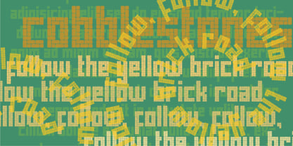 Cobblestones is inspired by the look of cobblestone streets and pavers.
 - Stuyvesant by Image Club,
$29.99The Stuyvesant fonts include delicate incline alphabets with an engraved look. - Avishag MF by Masterfont,
$59.00 So free so fresh, this personal handwriting will always look unique.
 - Champ Ultra by BA Graphics,
$45.00 A real powerful look great for headlines, a true heavy weight.
 - Altemus Roughcuts by Altemus Creative,
$11.00 A collection of 174 rough, hand-made and rough-looking designs.
 - Captain Blackbeard by Joanna Rzezak,
$14.90 Captain Blackbeard is a bold headline font with a western look.
 - Stuyvesant Engraved by Monotype,
$29.99The Stuyvesant fonts include delicate incline alphabets with an engraved look. - LDJ Elf Writing by Illustration Ink,
$3.00This whimsical font will look like an elf wrote for you. - As of my last update in April 2023, "Winob" does not appear to be a widely recognized font within the traditional or digital typography communities, so my depiction will lean into imaginative interpr...
- Art Lesson JNL by Jeff Levine,
$29.00The hand-lettered title of a vintage Walter Foster "how to draw" book inspired the Deco-influenced alphabet of Art Lesson JNL. Bold and retro in nature, this typeface gets the message across in a straightforward way, yet still has a bit of a casual feel to it. - Negro by Storm Type Foundry,
$32.00 Dark, spicy & distinctive display typefaces from the nineteenth century I had in mind when creating this font family. Extreme contrasts and sharp endings may remotely remind some blackletters, especially in narrowed styles. The range of interpolated widths is useful for designing a provoking poster, magazine, music or book cover.