10,000 search results
(0.051 seconds)
- Amitale by Hackberry Font Foundry,
$24.95 Amitale (A-mi-tah'-lay) is the union of Amitale Book and Amitale Wide into a new 8-font book family in my continuing objective of designing a better font family for readability in booklets. My goal here is for a full range of styles from light, regular, bold, and black without the plugged counters and clunky feel of most bold fonts. In my use, personally. I do not use Amitale Book Bold. I use Wide for the bold and Wide-Bold for the black style. In many ways, Amitale is Brinar with bracketed serifs. Many people find Brinar to be an exceptionally readable and beautiful humanist sans. This new serif font family has many of the same characteristics. This is also the debut of my new OpenType features set for 2009. There are more and more ligatures for your fun and enjoyment: bb gg ff fi fl ffi ffl ffy fj ft tt ty Wh Th and more. Like all of my fonts, there are: caps, lowercase, small caps, proportional lining figures, proportional oldstyle figures, & small cap figures, plus numerators, denominators, superiors, inferiors, and a complete set of ordinals 1st through infinity.
 - Heirloom Artcraft by Baseline Fonts,
$29.00 Presenting Heirloom Artcraft-- by Baseline Fonts within the Grit History B series. Like an auntie who insists on baking cookies from scratch every time you visit, Heirloom Artcraft is a beacon of tradition and consistent delight with every letterform. Gentleness and subtlety keep this font far away from kitsch. This font sincerely says "ma'am" and "sir" and is perfect for business cards, custom stamps, coffeetable books, letterhead, invitations and anywhere you or your client wish to make an extremely well mannered and charming statement. There are many alternate ligatures available within the font including capital alternates for T, A, P, B, D, and N. It also boasts a full symbol set and the most darling little swashes scattered tastefully throughout the character map you ever did key. Heirloom Artcraft is available in Thin, Thin Italic, Book, Book Italic, Demi Italic, Black, and Black Italic. It also features Metrics and Optical kerning - metrics displays characters with letterpress-traditional spacing that is pleasantly askew, or more rigid optical kerning which displays characters at identical distances for times when the importance of readability exceeds that of stylistic merit.
 - Eloquence by Monotype,
$31.99 Eloquence has a modern aesthetic with a strong classical influence – this is the “Renaissance Remixed”. While being inspired by the first printed texts of the Renaissance period, this typeface has contemporary features such as a high x-height, open bowls and counters, along with razor-sharp serifs and terminals. It has been designed specifically for creating a pleasant reading experience. With a comprehensive character set, Eloquence can comfortably handle printed documents such as novels, magazines, annual reports, along with their equivalent online/digital formats. This 14-font family also has a few tricks up its sleeve by means of some neat, complementing discretionary ligatures and alternates that will prove to be useful embellishments to your typography. Small Caps are included too, along with corresponding diacritics meeting the Latin Extended specification. You can view more details, design examples, and a specimen PDF at eloquence-font.com Key Features: • 14 font family – 7 weights in Roman and Italic • Small Caps, Alternates, Ligatures, with Proportional, Old Style, Small Cap, Fractions, Numerators, Denominators, Superior, and Inferior Figures • Full European character set (Latin Extended) • 900+ glyphs per font.
 - Lamia by Atelier laia,
$50.00 The Lamia font is inspired by the work of the most famous calligrapher of the Basque Country, Jose Francisco de Iturzaeta Eizaguirre (Getaria1788-Madrid 1853). His writing method was compulsory in Spanish schools since 1835. His "unpolished Spanish font" tried to be more effective than the more commercial English version by avoiding embellishments and excessive rear tearing. More akin with the liberal values imported by the French, his offerings sought uniformity, speed and efficiency to ensure that those in the less-favored echelons of society had an effective communication tool. From his "general collection of characters of European Letters" published in Madrid in 1833, we have chosen the "lower case pancilla reformed" represented in one of the prints. We have tried to reinterpret it by keeping its essence but also ensuring that it is viable for potential contemporary uses which, thanks to its good readability and effectiveness in longer texts, basically means as a decorative or display font. The upper case was generated using the lower case as a reference.
 - Daitengu by Hanoded,
$15.00 I have always been fascinated by Tengu - a mythical creature from Japan. Tengu are usually depicted with a red face, a very long nose, white moustaches and a funny hat. They used to be regarded as harbingers of war, but over the centuries, their image softened and they became the protective spirits of mountains and forests. Daitengu means ‘greater tengu’ and stems from the Genpei Jōsuiki - an extended version of the ‘The Tale of the Heike’ - an epic account of the struggle between the Taira and Minamoto clans for control of Japan. So, now you know about tengu, end of the history lesson! Daitengu is an epic brush font. I made it with a soft brush and China ink (like most of my brush fonts), but instead of forming the glyphs I saw in my head, I let the brush do the work. A more ‘zen’ approach to brushwork if you will! The result is a messy, organic brush font with a lot of spirit. Comes with diacritics and double letter ligatures.
 - Finalist Round Slab by Bülent Yüksel,
$19.00 The font was intended primarily to have a stronger body. It has a simple geometrical surface. This font has a strong personality, that makes it perfect for use in headline sizes but means it also works gracefully within text blocks. "Finalist Round Slab" is carefully crafted and a unique slab serif. Use for websites, print, motion graphics, logo design, packaging design, t-shirts and more. The designation “Finalist Round Slab Regular” forms the central point. The first figure of the number describes the stroke thickness: Thin to Black. "Finalist Round Slab" comes 7 weights and italics total 14 types. The family contains a set of 450+ characters. Case-Sensitive Forms, Classes and Features, Fractions, Superior, Inferior, Denominator, Numerator, Old Style Figures just one touch easy In all graphic programs. You can enjoy using it. UPDATES: - 30 December 2015 Opentype Feature (fractions) and some kerning. - 11 June 2018 Solving some UNICODE problems on the internet. - 12 March 2019 Some error has been fixed. - 19 November 2019 Some error has been fixed. - 16 August 2021 New Version - 2.0 Some error has been fixed.
 - Kuma by L'île Foundry,
$35.00 In Ancient Greek, Kuma means wave. This wavy, dynamic and poetic all-caps display typeface is useful for headlines or short texts. Kuma is the result of a graphic and perceptual game that, using experimentation as a working method, explores the possibilities of writing as an image. This grid-based typeface creates different shapes and directions, never predictable. There are different types of waves created by the wind. That's why there are three different versions of Kuma: Kuma, Kuma Rounded and Kuma Square. Each version is available in seven weights which can be combined together. In their black and white rhythm, they guarantee global readability and balance. Kuma was designed by Jérémy Ruiz. Supported languages: Afrikaans, Albanian, Basque, Bosnian, Breton, Catalan, Croatian, Czech, Danish, Dutch, English, Esperanto, Estonian, Faroese, Fijian, Finnish, Flemish, French, Frisian, German, Greenlandic, Hawaiian, Hungarian, Icelandic, Indonesian, Irish, Italian, Latin, Latvian, Lithuanian, Malay, Maltese, Maori, Moldavian, Norwegian, Polish, Portuguese, Provençal, Romanian, Romany, Sámi (Inari), Sámi (Luli), Sámi (Northern), Sámi (Southern), Samoan, Scottish Gaelic, Slovak, Slovenian, Sorbian, Spanish, Swahili, Swedish, Tagalog, Turkish, Welsh.
 - ITC Caslon No. 224 by ITC,
$40.99 The Englishman William Caslon (1672-1766) first cut his typeface Caslon in 1725. His major influences were the Dutch designers Christoffel van Dijcks and Dirck Voskens. The Caslon font was long known as the script of kings, although on the other side of the political spectrum, the Americans used it as well for their Declaration of Independence. The characteristics of the earlier Renaissance typefaces are only barely detectable. The serifs are finer and the axis of the curvature is almost or completely vertical. The overall impression which Caslon makes is serious, elegant and linear. Next to Baskerville, Caslon font is known as the embodiment of the English Baroque-Antiqua and has gone through numerous new interpretations, meaning that every Caslon is slightly different. ITC Caslon 224 was designed by Edward Benguiat and appeared with ITC in 1982. It is the text font which expanded upon the title font ITC Caslon 223. The alterations in the proportions of the letters make this Caslon 224 a noticeable departure from the original, but make the font overall more legible.
 - DeBorstel Brush Pro by Ingo,
$49.00 A personalized cursive written with the pointed brush The strange name of this font means nothing other than ”brush,“ but only the Dutch understand it. The typeface is spirited, amusing and flashy. I made the handwritten original of DeBorstel Brush quickly and without interruption with a pointed brush. In the capitals, DeBorstel Brush appears to be almost too balanced for handwriting. In contrast, the lower case letters are intentionally very individual and uneven. A bit more life is added to the typeface with ligatures activated which are constructed with alternative letter forms — and as a result, a number of problematic letter-combinations are improved. And if this typeface is still not lively enough for you, the additional alternative character forms a e g i j l n o s t u z are available with the Open Type-Function ”Discretional Ligatures“. DeBorstel Brush is suitable for all European languages. It includes ”Unicode Latin Extended-A,“ for Central and Eastern Europe incl. Turkish, and even Cyrillic and Greek, too.
 - State Machine by Barnbrook Fonts,
$30.00 State Machine is a display typeface inspired by lettering applied to American and Russian Cold War-era military vehicles. It also features an alternate character set inspired by 1970s hand-made political banners. The name State Machine is a term found in both political theory and computer programming. The theoretical definition describes the political and bureaucratic organisation of a state as well as the repressive state apparatuses such as the military and police. Max Weber describes the state as "a human community that (successfully) claims the monopoly of the legitimate use of physical force within a given territory". In computer programming, a state machine is a mathematical model of computation used to design computer programs. It is conceived as an abstract machine that is in one of a finite number of states. It can change from one state to another when initiated by a triggering event or condition. Taken at a wider conceptual level, when these two definition are combined the meaning becomes analogous to a tool (such as a philosophical idea) with which to transform a society.
 - Brokve by MKGD,
$13.00 Brokve is a Croatian word used along the Dalmatian coast. It means “nails", as in the; hammer and nails, variety. It’s tall thin strokes and jutting points give it a very spike-like appearance; suitable for any uses that are intense, jarring or just plain edgy. There is no lower case for Brokve as it is a display font. The upper case serves as both the upper and lower case letters. Brokve has a glyph count of 392 and supports the following languages; Afrikaans, Albanian, Asu, Basque, Bemba, Bena, Bosnian, Catalan, Chiga, Colognian, Cornish, Croatian, Czech, Danish, Embu, English, Esperanto, Estonian, Faroese, Filipino, Finnish, French, Friulian, Galician, German, Gusii, Hungarian, Icelandic, Indonesian, Irish, Italian, Kabuverdianu, Kalaallisut, Kalenjin, Kamba, Kikuyu, Kinyarwanda, Latvian, Lithuanian, Low German, Lower Sorbian, Luo, Luxembourgish, Luyia, Machame, Makhuwa-Meetto, Makonde, Malagasy, Malay, Maltese, Manx, Meru, Morisyen, North Ndebele, Norwegian Bokmål, Norwegian Nynorsk, Nyankole, Oromo, Polish, Portuguese, Romanian, Romansh, Rombo, Rundi, Rwa, Samburu, Sango, Sangu, Scottish Gaelic, Sena, Shambala, Shona, Slovak, Slovenian, Soga, Somali, Spanish, Swahili, Swedish, Swiss German, Taita, Teso, Turkmen, Upper Sorbian, Vunjo, Walser, and Zulu.
 - Ouido by Hanken Design Co.,
$30.00 The Ouido typeface has tastefully narrow characters with enough default spacing for comfortable reading at small sizes. Equipped with features like letter-spaced small caps and conservatively drawn italics for emphasizing words that maintain the reading speed—providing the reader a pleasant overall experience. Ouido (pronounced as “widow”) is derived from the Portuguese word OUVIR which means to hear or to listen. Ouido refers to the ability to play a song on any musical instrument after listening to it a couple of times and without reading the notes. The Ouido typeface is a modernized nostalgia for music enthusiasts, a whimsical revamp of the classic serif font. It bears resemblance with printed classical music scores, characterized by each letter’s rounded strokes like how one drew clefs with passion. Each dot is a twin of the quarter note minus the stem, so weaving sentences together could feel like composing a melody. Inspired by the astounding phenomenon of absolute pitch, the visual appeal of this typeface may hone your imaginative ability to embellish your creation without needing a reference.
 - Nyata by Marsnev,
$14.80 Nyata™ — Clearly Visible, No Matter What. I love London for its finest visual branding, especially its Johnston typeface spreading all over the city. It inspired me to create this new font family: Nyata™. Nyata means clearly visible in Indonesian. The typeface is designed to be clean, unique, and legible. It is a great combination for any display requiring high legibility, such as city’s way finder. Long ascenders help some characters more obvious. You will never confuse wether it is an h or an n. Moreover, I tried to create all the letters are distinguishable. Of course, no time for people to doubt between Uppercase “I” and lowercase “l” when seeing a way finder. Last but not least, it is equipped with tons of OpenType features such as slashed zero to help the words more obvious, or stylistic sets if you don’t fancy the serifed uppercase I. Nyata™ is also delivered in Variable Font format. Enjoy all the styles and everything in between in one variable font only sized less than 150kb.
 - Pagewalker by Kostic,
$40.00 The name of the font is chosen to suggest its main purpose—setting multiple pages of text. All the features in this family were made with that in mind—legibility, distinct italics, small caps and various OpenType features, all make this font a useful tool for typographers. On the other hand, for packaging, posters, logotypes, etc. setting heavier weights in large size brings out its display qualities. Pagewalker is very legible and appears to be larger than other text typefaces. That is because the lower-case characters are made large compared to the capital letters. This means it can be used for setting text in, e.g. 9 pt size—while appearing to be 10 pt, but occupying less space. Pagewalker has a character set to support Western and Central European languages, and an extended set for monetary symbols which, in combination with tabular numbers, is perfect for financial reports. Each weight includes small caps, ligatures, proportional lining and oldstyle numbers, tabular figures, fractions and scientific superior/inferior figures.
 - Absurdies by Typephases,
$25.00 Absurdies is a trilogy of pictorial typefaces with lots of mischief, fun, weirdness, black humour and amusement. It includes 143 digitized illustrations. You will find many inexplicable behaviours, madmen, strange occupations, absurd and chaos-loving characters, and general whimsy. This little crowd can be used in many ways, from spot illustration to big illustration work or graphic designs, taking advantage of the vectorial format of the font file. The characters in Absurdies (together with their kin, the Illustries, Whimsies, Ombres, Bizarries and Genteta dingbats) are drawings from the sketchpad of Joan M. Mas, drawn from imagination and with no reference, except in a handful of cases pulled from historical photography. He wanted an easy-to-use format to collect his hundreds of imaginary ink drawings and he realized a digital typeface was an ideal solution. Having the illustrations gathered in a font file means you can use them instantly in any program you like. You may choose to use the images out of the box, or further customize them with colours and textures. The possibilities are endless.
 - Binario by Tarallo Design,
$14.99 Binario is a simple and friendly font with three weights and matching obliques. The geometric and modular characteristics of this typeface subtly reference the Art Deco and early modernist periods. It is an ideal choice for achieving a clean, distinctive, and contemporary aesthetic, making it suitable for branding, posters, and screen-based designs. The light weight of Binario is good for body text. The regular weight exudes confidence, making it suitable for both body and heading text. For impactful headlines, the bold weight is superb. The clear weight distinction of this family make it easy to create organized text. Binario was designed in Siena, Italy taking some inspiration from train stations and shop signage. The name Binario means train platform in Italian. Other aspects that informed the design of this font are modularity and efficiency. The interior rounded forms of the letters (counterforms) are based on shape of the Roman arch. Binario has a sibling, Binario Soft. This version has gently rounded stroke ends, which make a softer impression on the page.
 - Ansage by Sudtipos,
$49.00 Ansage does not claim to be neutral; it escapes from the rationalist sans of closed strokes and regular forms. Meaning Announcement in German, Ansage is versatile and communicates effectively across a broad range of media and formats such as branding, posters, websites, apps, titles and compositions with little spacing). Ansage is a sans serif font with a strong personality that emerges from an interest in and the study of a wide variety of typographic specimens of Gothic fonts from the nineteenth century. The design process behind Ansage brought about constant transformations in form; the result is a compact and robust font, with a large x-height, small ascenders and descenders, and open terminals that grow in expressiveness as it increases in weight. It is available in 10 weights, ranging from Hairline to Black, and 3 widths – Condensed, Regular and Expanded – plus italics, which make a total of 60 perfect variables to combine and contrast with each other. In addition, it also includes multiple open-type functions such as alternative styles, Old Style Figures, Tabular Forms, fractions, case sensitive, ligatures and more.
 - User Stencil by DSType,
$30.00 User is a monospaced type family with 30 styles, from Hairline to Bold, divided in Regular, Upright and Stencil, with five weights (Hairline, ExtraLight, Light, Medium and Bold) all with Cameo versions. Complexity and versatility are the keywords for this type family. Despite being a monospaced font, which means there's no kerning, all the glyphs were designed in order to sit comfortably in the 600 points width, a hard task because some glyphs are too narrow ('i' and 'l'), while others are too wide ('m' and 'w'), but they must fit the same width. The desire for keeping a comfortable readability in User was one of the key elements, therefore we designed several ligatures that fit both single and double space width, allowing to maintain a certain idea of proportional design. In this digital booklet you will find a detailed vision of the anatomy of the typefaces, the amount of characters available, the styles and weights, along with a series of features, specially designed to make User a very versatile and usable type system.
 - User Upright by DSType,
$30.00 User is a monospaced type family with 30 styles, from Hairline to Bold, divided in Regular, Upright and Stencil, with five weights (Hairline, ExtraLight, Light, Medium and Bold) all with Cameo versions. Complexity and versatility are the keywords for this type family. Despite being a monospaced font, which means there's no kerning, all the glyphs were designed in order to sit comfortably in the 600 points width, a hard task because some glyphs are too narrow ('i' and 'l'), while others are too wide ('m' and 'w'), but they must fit the same width. The desire for keeping a comfortable readability in User was one of the key elements, therefore we designed several ligatures that fit both single and double space width, allowing to maintain a certain idea of proportional design. In this digital booklet you will find a detailed vision of the anatomy of the typefaces, the amount of characters available, the styles and weights, along with a series of features, specially designed to make User a very versatile and usable type system.
 - Kuma Square by L'île Foundry,
$35.00 In Ancient Greek, Kuma means wave. This wavy, dynamic and poetic all-caps display typeface is useful for headlines or short texts. Kuma is the result of a graphic and perceptual game that, using experimentation as a working method, explores the possibilities of writing as an image. This grid-based typeface creates different shapes and directions, never predictable. There are different types of waves created by the wind. That's why there are three different versions of Kuma: Kuma, Kuma Rounded and Kuma Square. Each version is available in seven weights which can be combined together. In their black and white rhythm, they guarantee global readability and balance. Kuma Square was designed by Jérémy Ruiz. Supported languages: Afrikaans, Albanian, Basque, Bosnian, Breton, Catalan, Croatian, Czech, Danish, Dutch, English, Esperanto, Estonian, Faroese, Fijian, Finnish, Flemish, French, Frisian, German, Greenlandic, Hawaiian, Hungarian, Icelandic, Indonesian, Irish, Italian, Latin, Latvian, Lithuanian, Malay, Maltese, Maori, Moldavian, Norwegian, Polish, Portuguese, Provençal, Romanian, Romany, Sámi (Inari), Sámi (Luli), Sámi (Northern), Sámi (Southern), Samoan, Scottish Gaelic, Slovak, Slovenian, Sorbian, Spanish, Swahili, Swedish, Tagalog, Turkish, Welsh.
 - Seuchter Experimental by HiH,
$10.00 Seuchter Experimental is a product of the fertile Jugendstil period in Austria. Drawn by Bruno Seuchter, about whom little biographical information is available, the design first appeared in Seuchter’s publication, Die Fläche, in 1902. Die Fläche means “surface or expanse,” presumably a reference to a “tabula rasa” or clean slate. The implication is one of starting anew, rejecting the past and searching for fresh, different modes of visual expression — which is exactly what Art Nouveau attempted to do. Seuchter Experimental is a quirky and light-hearted font. Ligatures include AT, AV, CH, CK, FJ, LO and ST. Although basically an all-cap font, several of the accented letters in the lower case position represent the oft-seen desire to keep the accents below cap-height. The a-umlaut at 228 and u-umlaut at 252 reflect Seuchter’s original design. For a discussion of the difference between a diaresis and an umlaut, see Appendix B of Bringhurst’s The Elements of Typographical Style. In the meantime, give this font room to breathe.
 - User by DSType,
$30.00 User is a monospaced type family with 30 styles, from Hairline to Bold, divided in Regular, Upright and Stencil, with five weights (Hairline, ExtraLight, Light, Medium and Bold) all with Cameo versions. Complexity and versatility are the keywords for this type family. Despite being a monospaced font, which means there's no kerning, all the glyphs were designed in order to sit comfortably in the 600 points width, a hard task because some glyphs are too narrow ('i' and 'l'), while others are too wide ('m' and 'w'), but they must fit the same width. The desire for keeping a comfortable readability in User was one of the key elements, therefore we designed several ligatures that fit both single and double space width, allowing to maintain a certain idea of proportional design. In this digital booklet you will find a detailed vision of the anatomy of the typefaces, the amount of characters available, the styles and weights, along with a series of features, specially designed to make User a very versatile and usable type system.
 - Kuma Rounded by L'île Foundry,
$35.00 In Ancient Greek, Kuma means wave. This wavy, dynamic and poetic all-caps display typeface is useful for headlines or short texts. Kuma is the result of a graphic and perceptual game that, using experimentation as a working method, explores the possibilities of writing as an image. This grid-based typeface creates different shapes and directions, never predictable. There are different types of waves created by the wind. That's why there are three different versions of Kuma: Kuma, Kuma Rounded and Kuma Square. Each version is available in seven weights which can be combined together. In their black and white rhythm, they guarantee global readability and balance. Kuma Rounded was designed by Jérémy Ruiz. Supported languages: Afrikaans, Albanian, Basque, Bosnian, Breton, Catalan, Croatian, Czech, Danish, Dutch, English, Esperanto, Estonian, Faroese, Fijian, Finnish, Flemish, French, Frisian, German, Greenlandic, Hawaiian, Hungarian, Icelandic, Indonesian, Irish, Italian, Latin, Latvian, Lithuanian, Malay, Maltese, Maori, Moldavian, Norwegian, Polish, Portuguese, Provençal, Romanian, Romany, Sámi (Inari), Sámi (Luli), Sámi (Northern), Sámi (Southern), Samoan, Scottish Gaelic, Slovak, Slovenian, Sorbian, Spanish, Swahili, Swedish, Tagalog, Turkish, Welsh.
 - Mifelin by Nathatype,
$29.00 Mifelin is a well-defined serif font. Serifs are small ornaments that appear at the ends of the lines of letters, giving them a neater, more structured appearance. The well-defined serifs in this font create an elegant and professional impression. This serif font has a balanced and harmonious proportion of height and width. The proportions ensure that each letter looks proportional and easy to read. The line of letters in this font has a smoothness and clarity that distinguishes each character. Sharp, clear lines give off a professional and organized impression. This clarity also helps strengthen the legibility of the font in a variety of design settings. This serif font with an elegant look has a classic style that remains relevant in modern designs. Despite having strong roots in traditional typographic design, this font is able to adapt to more contemporary design contexts and give it a touch of elegance and class. Even though it has a touch of elegance, this serif font still prioritizes good readability. Each letter is carefully designed to ensure that the text remains easy to read and understand for the reader. Prominent readability is the hallmark of this font. Enjoy the various features available in this font. Features: Stylistic Sets Ligatures Multilingual Supports PUA Encoded Numerals and Punctuations Mifelin is suitable for any designs that require a formal and official impression. This font is can be used in the design of books, magazines, reports, formal invitations, brand identities, and other design projects that require elegance and professionalism. Find out more ways to use this font by taking a look at the font preview. Thanks for purchasing our fonts. Hopefully, you have a great time using our font. Feel free to contact us anytime for further information or when you have trouble with the font. Thanks a lot and happy designing.
 - Buffalo Bill by FontMesa,
$35.00 Buffalo Bill is a revival of an old favorite font that’s been around since 1888, the James Conner’s Sons foundry book of that same year is the oldest source I've seen for this old classic. If you're looking for the font used as the logo for Buffalo Bill’s Irma Hotel in Cody Wyoming please refer to the FontMesa Rough Riders font. New to the Buffalo Bill font is the lowercase and many other characters that go into making a complete type font by today’s standards. The Type 1 version is limited to the basic Latin and western European character sets while the Truetype and OpenType versions also include central and eastern European charcters. William F. (Buffalo Bill) Cody called America’s Greatest Showman was one of the United State’s first big celebrity entertainers known around the world, millions of people learned about the Old West through Buffalo Bill’s Wild West shows which traveled throughout the United States and Europe. William Cody, at age eleven, started work on a cattle drive and wagon train crossing the Great Plains many times, he further went on to fur trapping and gold mining then joined the Pony Express in 1860. After the Civil War Cody went on to work for the Army as a scout and hunter where he gained his nickname Buffalo Bill. In 1872 William Cody started his entertainment career on stage in Chicago along with Texas Jack who also worked as a scout, the Scouts of the Prarie was a great success and the following year it expanded to include Wild Bill Hickok and was eventually named The Buffalo Bill Combination. By 1882 Texas Jack and Wild Bill Hickok had left the show and Buffalo Bill conceived the idea for the traveling Wild West Show using real cowboys, cowgirls, sharpshooters and Indians plus live buffalo and elk. The Wild West shows began in 1883 and visited many cities throughout the United States. In 1887 writer Mark Twain convinced Cody to take the show overseas to Europe showing England, Germany and France a wonderful and adventuruos chapter of American history. The shows continued in the United States and in 1908 William Cody combined his show with Pawnees Bill’s, in 1913 the show ran into financial trouble and was seized by the Denver sheriff until a $20,000 debt (borrowed from investor Harry Tammen) could be paid, Bill couldn't pay the debt and the loan could not be extended so the assets were auctioned off. William Cody continued to work off his debt with Harry Tammen by giving performances at the Sell’s-Floto Circus through 1915 then performed for another two years with other Wild West shows. William F. Cody passed away in 1917 while visiting his sister in Denver and is buried on Lookout Mountain joined by his wife four years later. Close friend Johnny Baker, the unofficial foster son of William Cody, began the Buffalo Bill Memorial Museum in 1921, over the years millions of people have visited William Cody’s grave and museum making it one of the top visitor attractions in the Denver area. William F. Cody romantisized the West creating the Wild West love affair that many still have for it today through books and cinema.
 - Mega by BA Graphics,
$45.00A bold engraver type style with a Wall Street look. - Amfost by PizzaDude.dk,
$20.00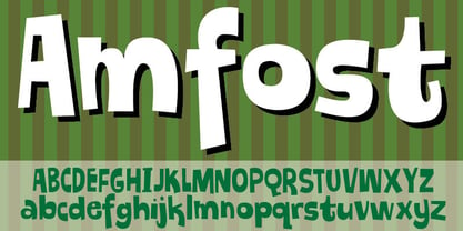 A comic font with that casual and funky pizzadude-look!
 - Serendipity by BA Graphics,
$45.00An arts and craft design with that trendy retro look. - KG Attack Of The Robots by Kimberly Geswein,
$5.00 This squared font is designed to look robotic in style.
 - Donut by Vladvertising,
$20.00 Yummy dönut ya? Does this type make me look fat?
 - Taxi MF by Masterfont,
$59.00 A tender serif font with a round and soft look.
 - Thesis Typewriter by Ana's Fonts,
$15.00 Thesis typewriter is a typewriter font collection that includes 3 typewriter fonts, sampled from three different thesis and reports from the 60s and 70s. Thesis Typewriter Weary has a textured look, while Thesis Typewriter and Thesis Typewriter Bold are smooth and include math symbols and Greek letters that will look great in digital collages. This collection is perfect for authentic vintage designs and digital collages, but will also look great in modern logo design, in branding and packaging.
 - Abiah by Creativetacos,
$15.00 Abiah Sans Serif Typeface is a minimal sans serif font, which contains 5 weights and It features unique and modern sans serif look and feel. Perfect for gorgeous logos, titles, web layouts and branding. It looks gorgeous in all caps with a wide-set spacing if you want to try a classy look, or beautiful on its own in capital and lowercase letters for something completely timeless. Included Features: Font Weight: Regular, Thin, Light, Bold and Distorted
 - Volcano by Match & Kerosene,
$40.00 Volcano is titling family of four is broken down into a gothic and island style. The island style features a "toothed" look that gives it a very unique look that can be used for a variation of project styles: Jungle, Island, Cruise, Vacation, Tiki, Retro, and Comicbook. The gothic style features a more industrial look and was inspired by gaspipe lettering styles. Each style features a different inline font file that can be layered over to produce striking headlines.
 - Side Note Variable by Jamie Clarke Type,
$199.00 Hello! I’m SideNote Variable. I specialize in: Annotations Headings Friendly dialogue Social media marketing Looking both smart & casual I’m perfect for descriptions and explanatory text. Use me to deliver tricky information in a helpful, reassuring manner. I look friendly and relaxed but professional enough to make you look awesome. I add personality to otherwise dry information making it fun and easier to understand. I come with all sorts of useful features, like emoji, arrows, and underlines.
 - Devil Kalligraphy by Lián Types,
$17.00Devil Kalligraphy was performed by Argentina Lián Types in 2007. The shapes of each caracter have a strong personality. It was based on antique writings. Devil Kalligraphy was inspirated in calligraphy styles. Gothic and Uncial themselves. A mix with lots of personal qualities. Devil Kalligraphy has ligatures which look evil. Ascendents and descendents were designed to look that way too. Kerning was designed taking into account the way calligraphers used (and still use) to write: Pattern looking. - Auzhera by Floves Type,
$39.99 Looking to take your design game to the next level? Look no further than Auzhera Brush Font! Handmade from a real analog fude brush pen, this stunning handwritten font boasts a unique brushed texture that adds a natural, hand-written feel to any project. From bold headlines to understated designs, Auzhera Brush Font’s versatility is unmatched. Crafted with meticulous attention to detail, this font is perfect for creatives looking to add a touch of personality to their work.
 - Black Forest by Haksen,
$12.00 Black Forest is a beautiful high fashion font duo that makes for gorgeous logos, posters, wedding invitations, blog posts, social media, and more!I love using them together with layer masks in Photoshop, so it looks like the script is running through the lines of the sans. The sans looks stunning. Black Forest Script includes ligatures to make everything look totally hand-done, and alternates for each letter. What Includes: Black Forest Script OTF Black Forest Sans OTF Thanks
 - KG Primary Penmanship by Kimberly Geswein,
$5.00 I come from a family of educators- my mom, husband, stepmom, brother-in-law, and sister are all currently teaching and I have taught in the past. This font was created after speaking to several elementary school teachers who were struggling to find just the right font to use on worksheets and projects in their classroom. They liked many features of other fonts, but needed small things altered in order to make a "perfect fit" for their class. Hand-drawn by me, this font hopefully addresses several of those issues. As penmanship styles vary across the globe, I am sure this font will not work in every classroom. But hopefully this style will work for many teachers to give their early readers a highly legible, neat, accurate font. It is best used with kerning turned on to allow for accurate letter spacing.
 - Networkand Family by yasireknc,
$14.00 Description This is Networkand Family. World's best graffiti and non-graffiti marker-styled font ever. Networkand marker font family, carefully selected from hundreds of letters. Signature-styled Networkand Script perfectly fits next to the Networkand Font. Besides all this, the Networkand Swashes Font is designed to customize your designs to another level. You can read Medium article here. FEATURES: Original: Networkand Fonts and swashes created for your special designs. You can turn your dreams into reality and customize them. Unique Creation: An unprecedented experience a creation that no one has ever had before and will uncover your awareness. Create your Brand: Unlike a standard font to create a new brand concept. Be different. Be different in life. Your own. Create your own mark: That’s the most special part of this font. A brand new identity for your personal signatures.