10,000 search results
(0.038 seconds)
- Activity by Arendxstudio,
$16.00 Activity is an energetic hand styled script. It is beautiful for wedding card design, logotype, website headers, fashion design and much more. It includes multi-lingual and swash characters. There it is! I really hope you enjoy it - comments and likes are always welcome and accepted. More importantly, don't hesitate to send a message if you have a problem or question. Now just read this, go there and make it happen :)
 - Nistiver by Aga Silva,
$24.99 This font works beautiful for headers and signature looks. There are plenty of alternate letters to fine tune your creations. If required - there is an extra number of initial/end swashes which give that beautiful flowy look to your wording. Also please note that some of the short swashes if placed together make beautiful ornaments as well. Nistiver can write in other languages if such is your demand :)
 - Personlighed by Bogstav,
$16.00 Personlighed was originally a handdrawn font, but I decided to trace each glyph and make this super clean font instead. The idea of the font is about making a hybrid between the handdrawn lines and the “computerized” vector. If you look closely, I have some uneven lines here and there (not many, but are here and there!) I’ve also added some alternative versions of j, k, q, r and the ampersand
 - Schnorr Gestreckt by HiH,
$12.00 Peter Schnorr was a German artist/illustrator of Art Nouveau period (called Jugendstil in Germany and Austria). He was quite adept at calligraphy and did a variety of commercial work, including business signs. He designed at least four different alphabets and collaborated with Bruce Rogers on advertising work and title page designs for books. One of their clients was the publishing house of Houghton Mifflin. I have not been able to discover anything else about him, but I suspect he might be the grandson of the Bavarian artist Jules Schnorr von Carolsfeld, who was once commissioned to do a mural by Ludwig II of Bavaria (whose famous castle was copied by Disneyland). Schnorr did not give individual names to his fonts. Where there is no historical name, we like to follow the tradition initiated by Bauer and name fonts after their designer, with a descriptive adjective in the designer’s native language. Gestreckt is German for stretched or elongated. An interesting deign detail of this typeface is the cross bar of the “T” --it is NOT symetrical. The right hand side extends only 88% as far as the left hand side (a ratio of 9:8). I presume this was done for a more pleasing letter fit. Today Schnorr’s design is frequently offered under the name “Ambrosia.” However. close inspection will usually reveal that the serifs have been treated differently. I believe our font has a greater fidelity to the original design. Please also compare the design of the various auxiliary characters to those in other fonts. Often they are either borrowed from an inappropriate font of a different period or are missing altogether. We make every effort to design characters that are in keeping with the overall design and spirit of the typeface. For example, see the superscript Registered Trademark symbol (0174) and the Double s (0223). I think both are quite successful. Schnorr Gestreckt ML represents a major extension of the original release. In addition to the standard 1252 Western Europe Code Page with character slots up to decimal position 255, there are glyphs for the 1250 Central Europe, the 1252 Turkish and the 1257 Baltic Code Pages. There are also two alternate letter forms, one ornament and seven ligatures with Unicode codepoints (Private Use Area) and OpenType aalt, ornm & liga GSUB layout features. There are a total of 318 glyphs and 351 kerning pairs. Please note that some older applications may only be able to access the Western Europe character set (approximately 221 glyphs). This release also incorporates a redesign of several glyphs: the comma, quotes, acute accent, and grave accent.
 - Queulat Condensed by Latinotype,
$- This font is the condensed version of Queulat, but keeping the same features as the original typeface. Queulat Cnd is a hybrid typeface that combines different styles, reflecting charm, freshness and, especially, a strong personality.. Since it is a condensed font, it is well-suited for publishing and subheadings. The font is inspired by Modern and Grotesk styles. The former is shown in some characteristic features such as teardrop terminals, which give the typeface an attractive unique look, making it an ideal choice for logotypes and labelling. The latter, with its rationality, makes Queulat Cnd a stable and strong face for headings and subheadings. The combination of styles can be clearly seen by comparing the Regular with the Alt version. The Regular version is more simple than the Alt one. Differently, the alternative version possesses more features of the Modern style, like teardrop terminals in ‘k’ and ‘v’.
 - PR Xmas Doodles 01 by PR Fonts,
$10.00 This font includes elements of snowy landscapes, holly borders, bells, candles, reindeer, and tree ornaments.
 - Shelf Tags JNL by Jeff Levine,
$29.00 Before the mid-to-late 1970s, when retailers started to embrace UPC (universal price code) technology on a grand scale, pricing merchandise took on many forms. One method especially popular with variety stores (such as Woolworth's, McCrory's, Kress, etc.) were pre-printed price tags that came in small pads and were inserted into metal holders. Shelf Tags JNL recreates a vintage price tag based on examples seen online, and allows the user different ways to create their own vintage-style price tags. You can either utilize the round pen nib style numbers and price marks to place on any size or type tag, or type out prices using the reversed characters (white on black) along with the two end caps provided to form a complete tag unit. For the more adventurous, a complete blank tag is also provided in case the desire is to print a solid color tag background and [using the regular numbers] crate prices in custom colors. Two sets of smaller number (for "floating" cents prices) are also provided in regular numbers and reverse panels. As an extra bonus, there is a set of 1 through zero, dollar sign, cents sign and decimal point individual black-on-white outlined panels for making individual pricing numbers. The keyboard layout for the various characters is as follows: asterisk key - regular cents sign (no panel) dollar sign key - regular dollar sign (no panel) period key - regular decimal point (no panel) left and right parenthesis keys - panel end caps (to form price tags) colon key - reverse decimal point on black panel 1 thru 0 keys - regular numbers (no panels) A through J keys - small regular numbers (no panels) K and L keys - truncated [shorter width] end caps M through Y keys - individual price numbers (black on white with black border a through j keys - reverse numbers on black panels k key - reverse dollar sign on black panel l key - reverse cents sign on black panel m through v keys - reverse small numbers on black panels w through z keys - blank rectangular panels of varying widths equal sign key - full black panel price tag hyphen key - blank rectangular black panel based on the width of most number panels
 - Mashq by Arabetics,
$29.00 The Mashq script is the oldest documented Arabic Jazm calligraphy style. It was invented by the early Muslims in the Arabian cities of Mecca and Medina, exclusively for writing the Quran and other Islamic religious texts. The Mashq style employed complex ligature and multi-level baseline rules, and therefore it went through a continuous simplification process. Around the time period Mashq was developed, the early Arab Muslims experimented with another short-lived Mashq-like style with heavily slanted vertical stems, which closely resembled the common Ḥijazi style. This style is commonly referred to as the Ma’il (slanted) style. Eventually, the early complex Mashq style was replaced as the main Islamic Arabic script, by a more simplified Mashq-derived calligraphy style that was developed in the city of Kufa, modern day Iraq, which was commonly referred to as Kufi. The Kufic style became the official Arabic script style for centuries before it was replaced by the more developed Naskh, the modern Arabic script style used today. The Mashq font family by Arabetics includes three styles of Mashq. The first is Mashq regular, which closely follows the script style of Musḥaf ‘Uthman (currently displayed in the Topkapi Museum in Turkey) with only the initial and final Haa’ baselines shifting. The second is Mashq Maail, which emphasizes the features of the Ma’il style shared with Mashq. The third is Mashq Kufi, which closely follows the script style in an adequate sample from the Quran manuscripts of the Bergstraesser Archive. All three fonts include two styles, with and without Tashkeel (dots). The Mashq and Mashq Kufi fonts include two more styles, with and without Harakat (soft vowels), and Hamza. Only three soft vowels are implemented along with their Tanween (double) forms. The Sukoon vowel is the default shape before inserting a soft vowel. Hamza was treated as a vowel in the Mashq and early Kufi manuscripts. Kashida is a zero width character. In the Mashq fonts, inserting one Kashida before the final ‘Ayn glyph group will trigger alternative shapes. In the Mashq Kufi fonts, inserting one Kashida (or two) before the final Yaa’, ‘Ayn, and Ḥaa’ glyph groups will trigger alternative shapes. The Mashq font family by Arabetics was designed to be as compatible as possible with the Arabic keyboard and Unicode alphabet used in computers today. Calligraphic variations were implemented only when they marked significant and permanent script features.
 - Pargrid by Linotype,
$29.99Pargrid is a grid-based typographic experiment from the young Swiss designer Michael Parson. In the Pargrid family, which contains three separate weights, Parson has created an intriguing system of small circles-similar to LED's or light bulbs-that live separately on a grid, creating unique letterforms. In small sizes, these circles blend together to create seemingly fluid lines, giving Pargrid's letters a wide, rectangular appearance. In larger sizes, the letterforms transform themselves into objects d'art-virtual and ordered communities populated by various points. Fantastic in both display settings as well as short strings of text, Pargrid may offer the exact look that your next project is looking for. Pargrid and nine other constructed type designs from Parson are included in Take Type 5 collection, from Linotype GmbH." - Banner by URW Type Foundry,
$39.99 Jan Koller designed the Banner typeface family especially for the creation of animated web banners. Banner is best used at 80p without antialiasing. The family comes in 24 styles which, in combination, create great, unusual screen effects. Three different animation modells provide the basis: extrusion, cutting in/out by ‘pixelation’, outline pixel rotation. The available flash clip listed in the Related Links below demonstrates some of the effects. Take a look! The swf clip runs in any web browser (drag & drop) but you need the flash player plugin. Apart from animation use, Banner also works well in print. Since all 24 styles are identical in width and kerning, you can set several styles on top of each other, maybe using different colours for each style. Look at the nice effects yourself!
 - Naive Deco Sans by S&C Type,
$8.00 Naïve Deco Sans is a layered sans serif handwritten font designed by Fanny Coulez and Julien Saurin in Paris. Our goal was to draw a font with finely irregular lines that give a human and whimsical feeling. It is available in two versions: double or triple lines. The font is also decomposed in three different parts that you can use to improve your designs with multiple colors, giving to the font a deco touch. To do so, you can simply superimpose the parts with a compatible software like Photoshop and choose a color for each. This font is part of our Naïve superfamily that contains lot of variations: Line, Inline, Serif, Sans Serif... Just click on our foundry name to see them all! We hope you will enjoy our work. Merci beaucoup!
 - Galiba by Juraj Chrastina,
$29.00 Give your voice an eye-catching hand-drawn look thanks to this playful font family. You'll get three styles, along with OpenType features including alternates, ligatures and stylistic sets. Galiba Regular works very well with his small brothers Light and Thin. In addition Galiba Light can be used at smaller size along with the other styles to keep the same line thickness. To achieve a random-like effect, the regular style is packed with 4 different variants of each glyph, that automatically cycle if stylistic alternates are turned on. Also you can choose from 5 stylistic sets to easily change the look of a given string, or pick alternates by hand. Not to mention that we've attentively fine-tuned the kerning that’s crucial for this kind of typeface.
 - ZT Kloftel by Khaiuns,
$10.00 ZT Kloftel has three variants of handwriting with different auras and also gets one variant of icons with a sketch style, this helps add depth to the art of handwriting. ZT Kloftel Stalle is a well-matched and Beautiful Style with natural lines, with a very large difference between uppercase and lowercase letters, and can produce a very natural writing style. ZT Kloftel Wortugo with a wider groove, with a messier concept, it also has its own uniqueness, such as children's writing which is suitable for branding explanations, or graffiti explaining your designs. ZT Kloftel Zlamora with a small and chubby style exudes a relaxed aura, perfect for vintage branding or your sad sunset caption I hope you have fun using ZT Klotin Thanks for using this font ~ Khaiuns X zelowtype
 - CA Negroni by Cape Arcona Type Foundry,
$29.00 A dinner is not complete without a fine appetizer. Whatever you dinner will be, CA Negroni is the perfect introduction. Delivered in three flavors, Normal (Light + Black + Fill), Inline and Round. Versatility is proved by the extensive language support, covering whole Central Europe. CA Negroni is the well aged and improved version of a typographic classic: in the beginning of the 20th century, type in advertising was mostly drawn by hand. A master of this art and pioneer in logo-design was Wilhelm Deffke (1187–1950). CA Negroni is inspired by his kind of bold and solid letterings, picking up some of the charming details while leaving away other that might have a disturbing effect on the general look. Two stylistic sets let you choose between a more serious or a more playful look.
 - Marian Churchland Journal by Comicraft,
$39.00 Tall, thin and elegant, Marian Churchland’s fonts are very much like her.. and now available from those awfully nice chaps at Comicraft to allow you to pretend that you are too! Marian Churchland was born in Canada in 1982, and was raised on a strict diet of fine literature and epic fantasy video games. She has a BA in Interdisciplinary Studies (English Literature and Visual Arts) from the University of British Columbia, and has been doing professional illustration work, including book covers and magazine articles, since she was 17. Last year, she became the first woman to solo-illustrate a CONAN story, and this year she’s illustrating three issues of ELEPHANTMEN for Image Comics. Artwork by Marian Churchland from Elephantmen #20. See the families related to Marian Churchland Journal: Marian Churchland .
 - MFC Peony Monogram by Monogram Fonts Co.,
$19.95 The inspiration source for Peony Monogram was a unique stackable monogram design with floral accents from a vintage embroidery publication. Originally intended to adorn handkerchiefs, this simple pattern has so many design possibilities, from colorizing to formatting options. You can really play around with this monogram font! Peony Monogram can create one, two, or three letter monograms, even basic titling due to its unique design. Because of Peony's unique stackable monogram formatting, make certain that the point size of the font is the same as the leading being applied to the font in order to minimize gapping between stacked forms. While we've adjusted this within the font, your program may override these settings. Download and view the MFC Peony Monogram Guidebook if you would like to learn a little more.
 - Sevigny by Harald Geisler,
$49.00 Sevigny is for the poetic eye. It sings to readers - luring and promising - sweet like candy. Even though it is different, you feel that you've already seen it. Sevigny seduces you to look. Look twice. Déjà vu Ease the lure. Allow your eyes to follow the rhythmic ribbon. Enjoy the wavy ride on the weavy patterns. Let Sevigny enrich your design ideas. Recommended for Christmas windows, ribbon candy packaging, lingerie labels, book covers, everything that smells good, everything for grown ups, everything for kids, Christmas carol titles, wedding invitations and wedding magazines. Sevigny is offered in three versions: standard latin letters (upper and lowercase), numbers and symbols. Sevigny PRO is packed with extra ligatures, alternate letters, OT features, more symbols, extended support for foreign languages. Sevigny CAPS has only uppercase letters & numbers.
 - Rig Sans by Jamie Clarke Type,
$25.00 Rig Sans is a streamlined geometric typeface, that speaks in a confident, affable tone. Its open, clean structure lends text a neutral, transparent quality. Distinct features enable Rig Sans to thrive, both in print and on screen: Minimalist Design Terminals clipped at 90º Generous x-height Wide apertures Distinct I,l,1 (uppercase i, lowercase L, Number 1) Rig Sans’ sturdy characters produce text settings with excellent clarity and readability. Their shape has been adapted from robust letterforms originally designed to withstand 3D distortions. This unique approach has resulted in an original sans serif rendition and an adaptive, durable type family. Rig Sans is comprised of eight weights and accompanying italics. Each weight contains 514 glyphs. OpenType features include: Alternate characters Three figure styles All caps punctuation Fractions Ordinals Superscript Subscript
 - Dingos by Antipixel,
$18.00 Dingos is a display typeface specially handcrafted for potent usage. It is compact, solid, and dense, with a heavy-built structure, tight internal space, and a versatile touch. Dingos is perfect for large settings due to its precise shapes. The 'Display' and 'Display Outline' styles have sharp and clean paths with angular ink traps, while 'Stamp' and 'Stamp Outline' have round ink traps and irregular, soft, curvy outlines optimized to ensure high-quality contours. Stamp textured styles have three sets of alphabets that slightly differ from one another. Thanks to the Contextual Alternates, these alphabets are automatically alternated to avoid repeating the same curvy textures. Some of Dingos' features are ligatures, discretionary ligatures, stylistic sets, numerators, fractions for any number combinations, arrows, special decorative characters, and a glyph coverage that ensures extended language support.
 - Kobely by Partnrz,
$15.00 Kobely is a reproduction of a local broadcaster's real handwriting. My daughter thought her boss's handwriting was so neat and uniform, it would make a great font and asked if I would be willing to create it. I agreed. She had him write out all the basic characters, which he gladly did with both a standard ink pen and a Sharpie¨ marker. I then turned it into a three weight family, perfect for use on post-it notes, shopping and to-do lists - anywhere you need the natural feel of real handwriting. I created it in various weights to spare you from adding a stroke to make it bolder. Adding a stroke can often compromise the small details of a font. Kobely is designed to be readable in even the boldest weight!
 - The Bouquet List by Nasir Udin,
$16.00 Introducing the Bouquet List - an ultimate handwriting script font. Inspired by the beauty of flower bouquets and the aesthetic of handwriting when you write some bucket list or itinerary on your journal while you travel. The Bouquet List is a handwritten font featuring 70+ ligatures that gives you beautiful typographic in organic, authentic, and natural handwriting style. Perfect for magazines, social media posts, travel blog, travel vlog, signatures, sticky notes, journal, quotes, restaurant menus, websites, women products, calendar marks, book covers, advertisements, wedding designs, even for a logo and branding! Its OpenType Features provides you an easy swash and magic underline (please see the instruction in the last two preview images). • How to add swash easily: type space three times after the word. • How to add underline: type underscore 2 or 3 or 4 times.
 - Brim Combined by Jamie Clarke Type,
$20.00 Brim Combined packs all of the character of the popular layered typeface, Brim Narrow, into three eye-catching font styles. Inspired by antique wood type from the 1800s, Brim is warm and tactile. Its innovative styles produce both striking headlines and sophisticated titles, making it perfect for posters, packaging and logotypes. Brim Combined makes it even easier to achieve punchy headlines on the web. This flattened version of Brim does not require professional design software to use and is compatible with Microsoft Word. • Combined 1 features Brim’s elegant, handmade line work • Combined 2 includes a drop shade with an outline • Combined 3 has an offset shade and a reversed-out face Brim is an all-caps typeface with Western European, Central European and South Eastern European language support.
 - BIG Slant Black UltExp - Personal use only

- Etewut Serif by Etewut,
$35.00 Proudly introducing Etewut Serif family. Each font supports extended latin and basic cyrillic alphabet. There are many alternative symbols ligature and special characters.
 - Rectilinear Ornaments by Gerald Gallo,
$20.00 Rectilinear Ornaments are radiating geometric shapes composed of straight lines. There is an assortment of 47 ornaments located under the character set keys.
 - Blooming Ornaments by Gerald Gallo,
$20.00 Blooming Ornaments was inspired by patterns of the Middle Ages. There is an assortment of 47 ornaments located under the character set keys.
 - SG Rogibogy by Studio Gulden,
$20.00 SG Rogibogy is a playful font, suitable for your design that needs a cute touch. There are several alternative choices of letters available.
 - Xesy by Dharma Type,
$19.99 Odd and funny script for happy, fun time. There are two other fonts designed by in the same concept. -Ekistra -Deluta Black -Xesy
 - Cinnamon Peach by Abbasy Studio,
$8.50 Let me introduce my first ever product on my shop. Cinnamon Peach - Layered Font After 2 years of learning how to create a fonts, learn about the anatomy of typography, features of the OpenType fonts, and all of the experience on my collaborations with many friends, Finally I just launched my first personal product with the name Cinnamon Peach. Cinnamon Peach is beauty combinations of layered font. It has a Serif and Script style inside. Both of them are layered font, which is you can express the style on both of it. You can add shadow, inline or hatch on Serif style. Changing the color of the other layer as just easy as change standard color of the fonts but it’s more deep in detail. On the Script style, I give you more freedom of choosing which style do you want, if you want a deep style of layer, you can choose regular and inside with different color. but if you want the outline style, it also available as a single fonts. Looks like on the display that I Created, You can see the most of combinations font in there are perfectly matched even on script version doesn’t include the Uppercase character. Because of the strong characteristic of this fonts you can see the combinations are great with or without layer, monochrome or multi color, pastel or watercolour. It’s great for posters, display, logos, header website, magazine, animation text, etc. Thank You very much, hope you enjoy this fonts !
 - Sabon Paneuropean by Linotype,
$45.99Jan Tschichold designed Sabon in 1964, and it was produced jointly by three foundries: D. Stempel AG, Linotype and Monotype. This was in response to a request from German master printers to make a font family that was the same design for the three metal type technologies of the time: foundry type for hand composition, linecasting, and single-type machine composition. Tschichold turned to the sixteenth century for inspiration, and the story has a complicated family thread that connects his Sabon design to the Garamond lineage. Jakob Sabon, who the type is named for, was a student of the great French punchcutter Claude Garamond. He completed a set of his teacher's punches after Garamond's death in 1561. Sabon became owner of a German foundry when he married the granddaughter of the Frankfurt printer, Christian Egenolff. Sabon died in 1580, and his widow married Konrad Berner, who took over the foundry. Tschichold loosely based his design on types from the 1592 specimen sheet issued by the Egenolff-Berner foundry: a 14-point roman attributed to Claude Garamond, and an italic attributed to Robert Granjon. Sabon was the typeface name chosen for this twentieth century revival and joint venture in production; this name avoided confusion with other fonts connected with the names of Garamond and Granjon. Classic, elegant, and extremely legible, Sabon is one of the most beautiful Garamond variations. Always a good choice for book typography, the Sabon family is also particularly good for text and headlines in magazines, advertisements, documentation, business reports, corporate design, multimedia, and correspondence. Sabon combines well with: Sans serif fonts such as Frutiger, Syntax. Slab serif fonts such as PMN Caecilia, Clairvaux. Fun fonts such as Grafilone, Animalia, Araby Rafique. See also the new revised version Sabon Next from the Platinum Collection." - Rose Garden Deluxe by Fenotype,
$25.00 Rose Garden Deluxe is an elegant type collection including a luscious high contrast serif in three weights and an ethereal pen script also in three weights. Together the fonts form an effective all-around set for sophisticated display purposes. The fonts are best used for imposing headlines, as a logotype, in packaging and posters. Rose Garden Serif has an extra high contrast giving it a sophisticated look, suitable for fashion or luxurious high-end products, magazines and anything such. Rose Garden Pen has no contrast, as if it was written with a steady and precise inking pen. Rose Garden Pen is equipped with plenty of useful OpenType features: it has Contextual Alternates and Standard Ligatures to enliven the flow of “writing” and to keep the connections between letters smooth. In addition it has Stylistic and Swash Alternates for every standard uppercase and lowercase characters, as well as for ampersand and few ligatures. On top of that it has initial and terminal swashes - a feature that is set in Titling Alternates. The feature works following: click it on and write normally. Type a space before a word and after it to get a special swash character in the beginning and in the end of the word. If that isn’t enough seek for even more alternates in the Glyphs Palette. Each weight has over 650 glyphs in total. Rose Garden Ornaments is an extension to Rose Garden Pen. It’s a set of Ornaments with the same weight and handwriting style as the font. The swooshes can be combined with the font for even more ornamental looks and the swashes set in lowercase letters can be used as additional terminal swashes, combined with any lowercase character.
 - Reply by TOMO Fonts,
$18.00 Discover TOMO Reply, a typeface that breaks the mold, offering a fresh perspective in the realm of sans-serif fonts. Reply seamlessly blends early 20th-century roots with contemporary flair. Ideal for modern graphic design applications, from editorial masterpieces to dynamic web designs. Reply offers an unorthodox yet harmonious font family that stands out in the corporate and digital realms. Experience the fresh perspective!
 - Pixel Pants by PizzaDude.dk,
$18.00 Pixel Pants is my wanna-be 1980-ies pixelfont. Well, it really looks like a pixel font, but it's kid of fake - at larger sizes you will notice the wacky and uneven lines, but it sure do bring back memories of the 80-ies! I've made 5 different versions of each letter - just to break the monotony of the usual pixel font! Insert coin and enjoy!
 - Groovadelic NF by Nick's Fonts,
$10.00Break out the love beads and fire up the lava lamps, and make way for this hippy, dippy homage to the Sixties. Finely tuned letterforms and extensive, thoughtful hand-kerning means your headlines will ride with the tide and go with the flow. All versions of this font include the Unicode 1250 Central European character set in addition to the standard Unicode 1252 Latin set. - Ink Spots JNL by Jeff Levine,
$29.00 For decades, spot illustrations - whether by hot type, photoengraving, clip art or (in later years) digital means provided decorative and often lighthearted breaks in reading printed copy. This collection of twenty-six cartoon images has been meticulously re-drawn in digital format from 1920s-1930s era source material. By adding a simple caption underneath a design, your ad copy can be enhanced with these wonderful period pieces.
 - Chill Script by Eclectotype,
$40.00 Looking for a break from modern calligraphy? Tired of skinny scripts? Here's something seriously relaxed. Chill Script is a totally new typeface, it eschews any brush influence, but maintains a warmth that comes from not being rigidly constructed. It's a sans serif script, with a nice top-heaviness that makes it friendly. As you expect from fonts today, it's loaded (but not pointlessly overloaded) with OpenType features.
 - Fashion History by Timurtype,
$14.00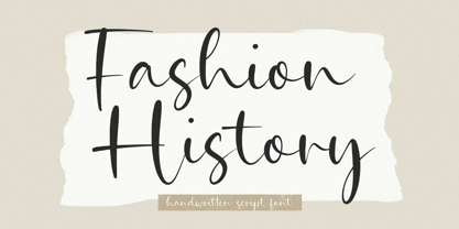 Introducing by Timur type Proudly Present, Fashion History Fashion History A Handwritten Script Font Fashion History is perfect for product packaging, branding project, megazine, social media, wedding, or just used to express words above the background. This Bread Forest font includes: -Full Set of standard alphabet and punctuation & symbol -Extra set Alternate ending lowercase -multilingual support. Embelish your designs with our original fonts.Enjoy the font,Thank you!
 - Rails by Superfried,
$32.50 Rails is an experimental, retro, outline display typeface designed by Superfried. Rails is available in four styles: display, broken, solid and solid broken. As the name suggests they are constructed from parallel tracks with the broken versions featuring distinct breaks for added impact. Combination of the two results in clean, flowing type with sudden and unexpected moments of disruption. Rails has been featured in Computer Arts magazine.
 - Darling Butter by Timurtype,
$14.00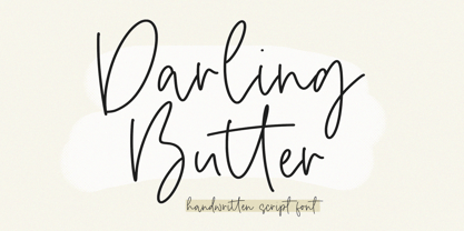 Introducing by Timur type Proudly Present, Darling Butter Darling Butter A Handwritten Script Font Darling Butter is perfect for product packaging, branding project, megazine, social media, wedding, or just used to express words above the background. This Bread Forest font includes: -Full Set of standard alphabet and punctuation & symbol -Extra set Alternate ending lowercase -multilingual support. Embelish your designs with our original fonts.Enjoy the font,Thank you!
 - Rosalina by Supfonts,
$15.00 Hello, friends. Here's my new experiment. This font breaks the boundaries even more. Rosalina combines all these qualities: simple and clear, looks at ease. It is perfect for signatures or design, wedding invites and cards, where you do not need a strict style :) Test it out below to see how it could look for your next project! Check out my blog: https://www.instagram.com/zloillev pinterest.com/dmitriychirkov7 Enjoy
