10,000 search results
(0.14 seconds)
- Bousni Carre by Linotype,
$29.99The Bousni family's six faces display links unexpected by most readers of western alphabets. Inspired by both by Arabic calligraphy, and contemporary bitmap design, Bachir Soussi Chiadmi created this playful series of faces. Letters in each of the six typefaces link together, but not in the ways normally expected from script fonts. Suited for a wide array of fun functions, Bousni Carre and Bousni Ronde (each available in Light, Medium, and Bold weights) bring new a style and flavor to your collection. All six fonts in the Bousni family are included in the Take Type 5 collection from Linotype GmbH. The Bousni family espouses similar construction traits with other fonts from Linotype. Specifically, the straight lines and joints in the three Bousni Carre fonts are based off of a grid system similar to Anlinear, another member of the Take Type 5 collection from Linotype GmbH. The letter connections throughout the Bousni family are similar to Arabic kashidas, a typographic feature found recently in many non-Arabic typefaces, such as Linotype Atomatic." - Nu Sans by Typecalism Foundryline,
$30.00 Nu Sans is a modern and stylish sans-serif font product that was created in 2020. It is a versatile typeface that comes with three different axis options: weight, width, and slant, allowing users to create a wide variety of unique and dynamic typography designs. With a total of 90 complete static fonts, Nu Sans offers an extensive range of options for designers looking for a clean and contemporary font choice. The font family features a bold, geometric design with sharp angles and clean lines, giving it a distinct and modern. Nu Sans is perfect for use in a range of design applications, including advertising, branding, editorial design, and web design. Its dynamic and versatile nature makes it a great choice for any project that requires a strong and bold visual impact. a high-quality font product that offers designers a wide range of options and possibilities. Its modern and stylish design, combined with its triple axis options, makes it a great choice for anyone looking for a versatile and unique sans-serif font.
 - VTC Bloke by Vintage Type Company,
$19.00 VTC Bloke is a revival of Miller & Richard’s classic metal typeface, ‘Egyptian Expanded’, including the three-dimensional, ‘Open’ style that was later introduced to the family. The roots of this typeface stem from the UK, where William Miller and his son-in-law Richard had their initial foundry in Edinburgh, Scotland. In addition to the beautiful and timeless type designs, the foundry gained a reputation for offering super small type sizes, designed for Bibles, dictionaries, documents, etc. Slab Serifs (or Egyptian Serifs) started to gain popularity in the early 19th century. It’s around this time, due to emerging industrial technologies, and an ever-expanding advertising industry, that type designers started to really experiment with letterforms that could help their clients distinguish themselves from the competitor, and catch people's eyes. The size of posters and advertising space was getting bigger, and bigger, and so was the type. All original letterforms have been re-drawn and cleaned up, with some more modern glyphs and characters added in. VTC Bloke supports Adobe Latin 1 Language Support.
 - Oman by Par Défaut,
$35.00 With five weights and four contrasts, all grouped in three version : sans-serif, slab, serif and all this doubled by a true italic, Oman regroup 120 different styles declined in four variables. Perfect from headlines to text, Oman will meet your needs with a many languages to support (Latin pro, Cyrillic), 14 OpenType features (Fraction, Numerator, Denominator, Tabular figure, Oldstyle figure, Small capital, Small capital from capital, Ordinal, Stylistic set, Case sensitive, Discretionary ligature, Contextual alternate and All access alternate). • Numerator and Denominator includes numerals and currency • Tabular Figure includes : numerals, currency, OldStyle numerals, small capital numerals, small capital currency. • Small Capital features includes the Latin & Cyrillic alphabet with the accents. • Ordinal feature includes the Latin & Cyrillic alphabet. • Two Stylistic set for “a” & “g” includes accents. • Discretionary Ligature includes “AE”, “AÉ”, “IJ”,“OE”, available in lowercase, small capital and ordinal. • Contextual Alternate includes ligatures for arrows : <-->^|v|<->v^|. Add n, d or +, for numerator, denominator or case arrows. All Case sensitive characters become after the uppercase and number.
 - Garota Sans SC - Personal use only

- SF Old South Arabian by Sultan Fonts,
$9.99Historical Background Old South Arabian Script (OSA) was used before the Islamic era not only in the southwest corner of the Arabian Peninsula, but actually in the entire Peninsula. In addition, samples of OSA have been found as far as Uruk in Mesopotamia, Delos in Greece, and Giza in Egypt. Archaeological finds show that as far back as the 8th century BCE, OSA was used in trade, religious writing, and in civil records. Following the spread of Islam in Yemen, the decline of OSA began in the 7th century CE as it was gradually supplanted by Arabic script. OSA was typically known by the name of the then-dominant peoples in the Southern Peninsula. At various times, it was known as Sabaean, Qatabani, or Hadramite, among others. Although it was used for a variety of languages, OSA is most strongly associated with Sabaean. Many Peninsular languages borrowed OSA before introducing further changes of their own. Prime examples are the Thamudic, Safaitic, and Lihyanite scripts which eventually developed into independent scripts. The westward migration of the Sabaean people into the Horn of Africa introduced the South Arabian consonantal alphabet into the region. The transplanted script formed the roots of the Geez script of Ethiopia, which, in time and under presumably external influences, developed into a rich syllabary unlike any other Semitic script in history. Even a cursory examination of the letter forms of Modern Ethiopic writing reveal a striking similarity to South Arabian Script. OSA inscriptions typically reveal a dominant right-to-left directionality, although there are also many cases of alternating directions, known as boustrophedon writing. Figure 1 is a fine example of this style of writing. OSA inscriptions were discovered early in the 19th century. Soon thereafter, two orientalists, Gesenius and Rödiger, made great strides towards deciphering the script. Styles of Writing Old South Arabian inscriptions have survived primarily on stone, ceramic, and metallic surfaces. Hundreds of artifacts have been found and, to this day, continue to be discovered. Some of the best examples number of inscriptions on softer materials, such as wood and leather, have also been discovered. Although there is a significant difference between the styles of letters on the hard surfaces and those on the soft. Old South Arabian (Musnad) is composed of 29 letters , that is one letter more than the Arabic alphabet, which is between “S” and “Sh”, and names “Samekh”. Aspects of difference between Musnad and the present Arabic writing is that Musnad is written in separate letters, and the shape of the letters do not change according to its place in the word. However, some letters change according to the beginning of the writing. Musnad is either prominent, or deep. Prominent writings are for important writings and deep writings are for ordinary. The material on which the Musnad was written were stones, rocks, wood, and metal. In the course of its development the Musnad use appeared in the “Lehyanite’, “Thamudic”, “Safaitic”, pen to which many changes and amendments were made. And from it “Habashi’ writing was born. As regards his place among the Arabs of the Peninsula , when we look at the internet and its role in cultural dialogue , the Arabs of the Peninsula considered Musnad inscription which was indisputably their national writing until the dawn of Islam. It was used by people in all parts of Arabia in their homeland and abroad . It was their means of chronology and record of their glories and history.2- Features of Musnad Script: 1. It is written from right to left and vice versa. 2. Its letters are not joined. 3. Shape of letters are uniform despite their positions in the word. 4. Words are separated by vertical lines. 5. A letter is doubled in case of assertion. 6. No points and punctuations. 7. Easy to be learned by beginners. My OSA Musnad Font My design and technical work is only a treatment of the OSA Musnad as a symbol of writing. And it is possible to use in computer.. My design is not aimed at demonstrating the linguistic and intellectual structure of the Old South Arabian (Musnad). It is so simple that it could be easy to learn by learners and those who are interested in the OSA Musnad letters in computer. The basis of such importance is that it spares a lot of time and effort for researchers and students in this field. Formerly they used to write the Musnad texts either by handwriting or scan them , But now they can easily write its texts in OSA Musnad by using keyboard directly, so that they can change , amend and fulfill easily and accurately . So, we made use of speed, easiness and accuracy. And anyone interested in the South Arabian history in any part of the world can due to this design read and write OSA Musnad letters most easily. This design will also be used by historians and archeologists. , as well as specialist linguistics . The design also demonstrates the aesthetics of the Himyarit writing. About this font family Old South Arabian is An Arabic, Old South Arabian and Latin typeface for desktop applications ,for websites, and for digital ads. Old South Arabian font family contains two types: Old South Arabian and Old South Arabian serif. The font includes a design that supports Arabic, Old South Arabian and Latin languages. Old South Arabian typeface comes with many opentype features. - Kanagif Personal Use - Personal use only

- Kingthings Willow - 100% free

- Kingthings Willowless - 100% free

- KR Twink Two - Unknown license

- Mistress Script - Alternates - Unknown license

- KrazyKool - Unknown license

- Reznor - Unknown license

- TF Gaelic by Fontdation,
$20.00 Introducing TF Gaelic, a vintage serif that heavily inluenced by the form of Gaelic letters. We incorporate some twist on the letters to keep this font relevant to todays designing needs.
 - Bigfoot by K-Type,
$20.00 Bigfoot K-Type is a whole font based on the slab capitals used by Victor Moscoso in his 1960s psychedelic rock posters. Capital A alternatives can be found at keystrokes ± and §.
 - Square Line Icons Insurance by Howcolour,
$17.00 The square icons focus on maximizing the meaning by minimizing the symbols. Let your viewers understand your data without disorientation. Use a metaphorical icon library, designed for fast, intuitive human recognition.
 - Mystery Writer JNL by Jeff Levine,
$29.00 Mystery Writer JNL is based on the hand lettered title from the cover of a 1947 issue of “Ellery Queen’s Mystery Magazine”, and is available in both regular and oblique versions.
 - Plenti by MADType,
$19.00 Plenti is the fat font to add to your visual communication toolbox. Friendly, square, and quirky all at the same time. It is itching to get used on posters and websites.
 - Blop77 by osialus,
$15.00 Blop77 is a geometric sans-serif type family, consisting of 3 weights. It is based on the Blop11, being its expanded version. Blop77 is well-suited to headlines and short text.
 - Square Line Icons Medical 1 by Howcolour,
$17.00 The square icons focus on maximizing the meaning by minimizing the symbols. Let your viewers understand your data without disorientation. Use a metaphorical icon library, designed for fast, intuitive human recognition.
 - Square Line Icons Interface by Howcolour,
$17.00 The square icons focus on maximizing the meaning by minimizing the symbols. Let your viewers understand your data without disorientation. Use a metaphorical icon library, designed for fast, intuitive human recognition.
 - Square Line Icons Design by Howcolour,
$17.00 The square icons focus on maximizing the meaning by minimizing the symbols. Let your viewers understand your data without disorientation. Use a metaphorical icon library, designed for fast, intuitive human recognition.
 - Tant Britta by Cercurius,
$19.95 A bold condensed caps-only cross-stitch font, based on an embroidery pattern from the middle of the 20th century. Use it in large sizes for advertising, posters, greeting cards, etc.
 - DB Pit Stop by Illustration Ink,
$3.00DB Pit Stop is a must have for this summer season! These DoodleBats make for great adornments or embellishments on your scrapbook page, or a fun card. The possibilities are endless! - Kalligraaf Arabic by Hanifonts,
$- Kalligraaf is an Arabic typeface and the main focus is on blending traditional and modern rules in the formulation and design of the typeface. Designed with powerful OpenType features in mind.
 - Harmony by Solotype,
$19.95A handsome German art deco design that fits in well with other types of the 1920s and 1930s. Originally without a lowercase, so we drew one for it, extending its usefulness. - Tant Gertrud by Cercurius,
$19.95 A cross-stitch font based on a classical pattern, including capital and lower-case letters. It is suitable for posters, signs, ads and greeting cards in the Thanksgiving and Christmas season.
 - Harleyquin by Letterara,
$12.00 Sweet, charming and full of authenticity: Harleyquin is a one-of-a-kind typeface with a personal feel. Use titling to give different letter effects, making your project even more elegant!
 - Holiday Penguins by Deniart Systems,
$24.00 It's always holiday time with this frolicking bunch of penguins. Whether celebrating the end of year holidays or prancing around on vacation, these 52 Holiday Penguins are always having a blast.
 - Square Line Icons Indus by Howcolour,
$17.00 The square icons focus on maximizing the meaning by minimizing the symbols. Let your viewers understand your data without disorientation. Use a metaphorical icon library, designed for fast, intuitive human recognition.
 - Cherrywood JNL by Jeff Levine,
$29.00 Based on the classic “Columbian” from the William H. Page Wood Type Company (circa 1870), Cherrywood JNL is a bold slab serif type design available in both regular and oblique versions.
 - Kurly by Bogusky 2,
$34.50I was working on an unrelated job with curls and wondered how I could apply them to a font. Well, here it is, all pair-kerned. A little silly but fun. - Tacora by Volcano Type,
$19.00Bounded on its western flanks by the Peru-Chile frontier, Tacora is the northernmost volcano in Chile and is the youngest and most southerly of a twin system with Co. Chupiquina. - Square Line Icons Politics by Howcolour,
$17.00 The square icons focus on maximizing the meaning by minimizing the symbols. Let your viewers understand your data without disorientation. Use a metaphorical icon library, designed for fast, intuitive human recognition.
 - Hey Sweety by Stringlabs Creative Studio,
$29.00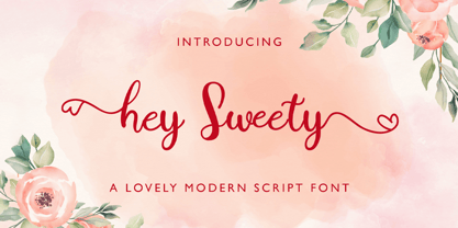 Hey Sweety feels equally charming and elegant. It looks stunning on wedding invitations, thank you cards, quotes, greeting cards, logos, business cards and every other design which needs a handwritten touch.
 - Cattle Call JNL by Jeff Levine,
$29.00 Cattle Call JNL is reminiscent of Old West posters and broadsides. The design is based on an extra condensed antique wood type and is available in both regular and oblique versions.
 - Old Russian by Grummedia,
$20.00Old Russian is a fake Cyrillic alphabet, based on old Slavic characters universally adopted in the old days of the Russian empire. Offering an opportunity to create a unique historical look. - Moritz by Solotype,
$19.95Loosely based on an early 20th century type from the Brussels foundry of Van Loey-Nouri. Many European foundries had fonts of this general design. Schelter & Gieseke of Germany had several. - Square Line Icons Eye by Howcolour,
$17.00 The square icons focus on maximizing the meaning by minimizing the symbols. Let your viewers understand your data without disorientation. Use a metaphorical icon library, designed for fast, intuitive human recognition.
 - Square Line Icons Business by Howcolour,
$17.00 The square icons focus on maximizing the meaning by minimizing the symbols. Let your viewers understand your data without disorientation. Use a metaphorical icon library, designed for fast, intuitive human recognition.


