9,053 search results
(0.033 seconds)
- Roundkey by 38-lineart,
$18.00 Roundkey Is the font sans serif family for branding and text. Comes with two basic characters, namely "sharp" and "soft", each character consists of 6 weight with matching oblique. A total of 24 fonts with basic condensed shapes and unique curves. the soft version has a different degree of softness. medium and bold have wider curves because they are suitable for displays, while thin to regular have smaller curves for easier reading. With these sharp and soft version make it can be applied more widely
 - Gilly Fleurs by Maulana Creative,
$14.00 Gilly Fleurs Signature is casual signature font, with clean thin mono-line stroke, slanted, condensed and fun character. It has Opentype features ligatures of character and lowercase alternates, To give you an extra creative work. Gilly fleurs font support multilingual more than 100+ language. This font is good for logo design, Social media, Movie Titles, Books Titles, a short text even a long text letter and good for your secondary text font with sans or serif. Make a stunning work with Gilly Fleurs Signature font.
 - Terrakota by Maulana Creative,
$13.00 Terrakota is casual signature and Sans font duo, with clean thin mono-line stroke, slanted, condensed and fun character. It has Opentype features ligatures of character and lowercase alternates, To give you an extra creative work. Terrakota font duo support multilingual more than 100+ language. This font is good for logo design, Social media, Movie Titles, Books Titles, a short text even a long text letter and good for your secondary text font with sans or serif. Make a stunning work with Terrakota font duo. Cheers, MaulanaCreative
 - Pelinka by Jehoo Creative,
$18.00 Upholding aspects of geometric shapes Created Pelinka. Pelinka is a Sans serif Family that has a solid foundation of geometric shapes designed to be bold and flexible. This typeface has all the widths needed to meet various design needs, Condensed, Normal and Expanded each width has 9 weights. Pelinka also includes support for Cyrillic and Greek Alphabets. Opentype feature: aalt, frac, liga, locl, numr, onum,ordn, salt, sinf, ss01, ss02, subs, sups, kern, mark. Language support for the Americas, most of Europe,Cyrillic and Greek.
 - Bonaventure by Greater Albion Typefounders,
$9.95 Bonaventure is a Roman display family full of the spirit of the Art Nouveau era, and joins our popular related group of families which also includes Bonning, Bonnington and BonaVia. Three weights are offered, including a shadowed black form, in a choice of three widths: regular, condensed and Expanded. It's the ideal family for signage with a period feel, as well as for posters, headings and certificates. A combination of Bonaventure with Bonning and its other related faces will bring a harmonious design ethos to any project.
 - Tecnica by Graviton,
$20.00 Tecnica font family has been designed for Graviton Font Foundry by Pablo Balcells. It is a modular, geometric, sans serif typeface with a slightly condensed design and subtle rounded angles. It has been conceived to be most suitable for all sized headlines, as well as short and middle length text blocks. The standard styles give texts a classic appearence while alternate styles give texts a playfull one. Tecnica consists of 4 styles, 2 weights plus alternates, each containing small caps and glyph coverage for several languages.
 - Klartext Mono by Fonts With Love,
$20.00 Klartext [plain talking, clear words] A modern monospaced type family of 10 weights. Klartext Mono combines a classical monospaced font and modern monolined sans-serif with a humanistic touch. It is characterized by a large x-height, slightly condensed glyphs with well shaped curves and soft strokes. As a special feature, Klartext contains a bunch of uncommon glyphs like the German capital sharp S, a nice arrowset and a basic phonetic alphabet (20 letters in IPA Extensions, some more in Latin Basic thru Extended B).
 - Silent Drama JNL by Jeff Levine,
$29.00 An ad in the April 19, 1919 edition of Motion Picture News for the (now lost) silent drama "Josselyn's Wife" featured some wonderfully stylized Art Nouveau hand lettering. Primarily a condensed character set with rounded serifs, there are a number of letters that take liberties in both width and character shape. Adding to this, [mostly vertical] parallel lines are cut through the characters to create a "striped' type of "double engraved' effect. Silent Drama JNL is available in both regular and oblique versions. **Uppercase
 - Fuller Brush NF by Nick's Fonts,
$10.00A snappy single-stroke alphabet from The New Lone Pine ABC of Showcard and Ticketwriting, which Aussie author C. Milnes suggested should be executed with a well-loaded brush, provided the inspiration for this loose, lilting retro script. Its condensed letterforms and tight spacing allow for larger headlines than most brush scripts, and its bouncing baseline adds an extra dollop of visual fun. The PC Postscript, Truetype and Opentype versions contain the complete Latin language character set (Unicode 1252) plus Central European (Unicode 1250) languages as well. - Tourist Postcard JNL by Jeff Levine,
$29.00 Alf Becker graced many issues of “Signs of the Times” (a trade magazine for the sign industry) with his innovative hand lettered alphabets for others to use as design inspirations. His 134th submission was titled “Post Card Type”, a condensed thick-and-thin stylized Art Deco design. This served as the inspiration for Tourist Postcard JNL, which is available in both regular and oblique versions. Thanks to Tod Swormstedt of S.T. Media Group and the American Sign Museum for providing the work image for this type revival.
 - Magnitudes by DuoType,
$29.00 Magnitude is a font inspired by classics like Eurostyle and Bank Gothic, with geometric characteristics and dynamics style. Designed to be used in a wide variety of applications such as advertising, corporate projects, branding and retail product design. The font is well-suited for headings, display use and short text. The Magnitudes family is available in 36 weights, ranging from Extra light to heavy, to condensed and expanded with matching italics . The font contains a character set of 401 characters supporting 206 different languages.
 - Silkocy by Say Studio,
$12.00 Silkocy is a beautifully MOdern Condensed uppercase and lowercase typeface that works best as a focal display text (think logos, headers, pretty quotes, calls to action, etc.). The upper and lowercase give it great versatility, but I honestly just can't get over a tightly kerned all caps. It's too good. Silkocy also has 61 alternative uppercase and lowercase unique letters which you can use according to your needs or desires. Includes : Alternates Letter (Uppercase and Lowercase) Numbers & punctuation Foreign language support Thanks, Have a Wonderful Day Saystudio
 - Rick's Cafe by NorFonts,
$30.00 Rick's Cafe font is my emulation of those typefaces used in newspapers, it's being inspired from my "NorB TypeWriter" typeface. You may want to use this font with any word processing program for text and display use, print and web projects, apps and ePub, comic books, graphic identities, branding, editorial, advertising, restaurant menus, newspapers, scrapbooking, cards and invitations and any casual lettering purpose… or even just for fun! Rick's Cafe font comes in 4 styles, Normal and Bold each with Italic and Condensed versions.
 - Inversi by Hanken Design Co.,
$30.00 Inversi is a reverse-stress typeface that may be used as a display or text-face font for a wide range of subjects. Compared to other reverse-stress/reverse-contrast typefaces, Inversi's linear contrast is much lower which, at lower sizes, makes it a good options for text or captions. It has good language support, unique design, fractions, and three different widths. Inversi pairs well with HK Requisite. Use the narrow or condensed style when mixing with HK Requisite to give more contrast to the composition.
 - Mediator by ParaType,
$30.00 Mediator is a balanced contemporary sans serif typeface that performs well both in display sizes and body text. The family contains 30 fonts in 3 widths: 8 romans with matching italics, of slightly extended proportions, from Thin to Black; 7 narrow and 7 condensed, from Thin to ExtraBold. The character set in normal upright faces was expanded to include small caps and all faces include old style figures. The typeface was designed by Manvel Shmavonyan with the participation of Alexander Lubovenko and released by ParaType in 2016.
 - Jazz Beat Stencil JNL by Jeff Levine,
$29.00 The 1960 British film “Beat Girl” (released in the U.S. as “Wild for Kicks”) was a typical [for its time] story of a teenage girl looking to have some fun by hanging out with SoHo beatniks and going against parental authority. One of the posters for the film features the title in a condensed slab serif stencil form, with eroded edges. The basic letter forms were smoothed out and cleaned up resulting in Jazz Beat Stencil JNL, which is available as in both regular and oblique versions.
 - Rambla Alt by TipoType,
$- Rambla Alt is a variation of Rambla, which has certain modifications without altering its main structure (Rambla is also available in Myfonts). For this reason Rambla Alt is great when used together with Rambla. Rambla Alt is a humanist sans for medium-long texts. It’s slightly condensed, with a generous x-height and short ascender/descenders. Its proportions have the objective of gaining space in height and width. It’s elegant in large sizes and legible at the same time, with a lot of rhythm in small sizes.
 - Alter Aves by Glen Jan,
$30.00 Alter Aves type is the first part of AlterType project – the serie of small display typefaces based on letterings, left-off types and altered foundry typefaces. Alter Aves is display condensed sans-serif typeface with couple of geometric-round letters, serif-styled elements and flat brush strokes. It supports Latin Extended-A (Western, Central Europe, Baltic, Turkish) and Cyrillic encoding languages and minimal opentype features – oldstyle digits, case sensitive punctuation, small-numeric forms and scripted fractions. Fully functional Demo style is distributed free for non-commercial using.
 - FF QType by FontFont,
$62.99 German type designer Achaz Reuss created this display and sans FontFont in 2004. The family has 26 weights, ranging from Extra Light to Black in Compressed, Condensed, Normal, Semi Extended, and Extended and is ideally suited for advertising and packaging, logo, branding and creative industries, poster and billboards as well as sports. FF QType provides advanced typographical support with features such as ligatures, alternate characters, case-sensitive forms, fractions, super- and subscript characters, and stylistic alternates. It comes with tabular lining and proportional lining figures.
 - Heavy Duty by Gerald Gallo,
$20.00 Heavy Duty is a bold condensed sans serif font set. Heavy Duty Solid is crisp and clean while Heavy Duty Sketch suggests characters that could have been sketched with a pen or pencil. Both fonts have the same uppercase and small caps lowercase alphabet, numbers, punctuation, symbols, and miscellaneous characters. The Heavy Duty fonts are ideal for making a bold statement in headlines, titles, or text. Heavy Duty Solid and Heavy Duty Sketch are to be sold only as a set priced at $20.
 - Halokia by Locomotype,
$18.00 Introducing Holakia, a monoline script font based on the condensed style that is trendy, elegant and stylish. Supported by many OpenType features such as discretionary ligatures, swashes, contextual alternates etc. It has the potential to create interesting, beautiful and eye-catching typography combinations. Halokia is available in upright and italic versions. This font is perfect for use on packaging designs, quote prints, wedding invitations or personal logos. It is ideal for displaying something that is old-fashioned to make it look more modern and bold.
 - Square Slabserif 711 by Bitstream,
$39.00A contemporary revival of early 20th century fonts, the Square Slabserif 711™ typeface family from the Bitstream library is perfect for contemporary print and interactive design projects. Its geometric structure of right angles and opposing round corners are ideally suited to current imaging devices. An added benefit is that they also give the design an enduring industrial strength demeanor. Available as three weights with relatively condensed proportions, the Square Slabserif 711 family will surely be a valuable addition to any professional collection of fonts. - Bayview JNL by Jeff Levine,
$29.00Around the turn of the 20th Century, the Inland Type Foundry produced a display face named Studley. It was a variation on a design by another foundry called Florentine. A condensed face with a bold, clean look, the design resembled the warmth and feel of a classic wood type. Best applied to headlines and titles, the font reads amazingly well at even 18 point renderings. Jeff Levine had added his own personal touch to his digital version of this old favorite and renamed it Bayview JNL. - Osande TXT by XdCreative,
$29.00 About Osande-TXT Neo-Grotesques Sans Osande TXT was created and inspired by Osande Pro (by. faldykudo), which carries a modern sans style with a touch of neo-grotesques / neo-gothic These include a large x-height, simpler forms and more static, low contrast, and often a condensed width. Osande TXT comes with enhancements characters and more complete language support, so you will be more flexible to use this font family for your various design, both for body text or displays. Thank you in advance _xdCreative
 - Jefferys York by Maulana Creative,
$15.00 Jefferys York is a signature script font With clean monoline stroke, condensed, upright and fun character. It has Opentype features of ligatures and lowercase alternates, To give you an extra creative work. Jeffreys York script font support multilingual more than 100+ language. This font is good for logo design, Social media, Movie Titles, Books Titles, a short text even a long text letter and good for your secondary text font with sans or serif. Make a stunning work with Jeffreys York signature font. Cheers, MaulanaCreative
 - 6th Aniversario by deFharo,
$21.00 6th Aniversario is a rounded condensed typography, handwritten and elegant, perfect for writing good advertising titles in graphic design of posters, flyers or publications in general where space saving and readability is required. Includes the Bitcoin symbol (ligatures): b# The Commercial version includes: - 492 glyphs. Latin Extended-A • OTF & TTF - OpenType Functions: Fractions, Alternate Annotation Forms, All Alternates, Superscript, Superiors, Slashed Zero, Superior letters, Localized Forms, Numbers Small Caps, Inferiors, Scientific Inferiors, Discretionary Ligatures, Numerators, Standard Ligatures, Subscript, Extended Fractions, Ordinals, Denominators, Oldstyle Figures, Historical Forms.
 - Milatones Signature by Maulana Creative,
$15.00 Milatones is casual signature font, with clean thin mono-line stroke, super slanted, condensed and fun character. It has Opentype features ligatures of character and lowercase alternate "t", To give you an extra creative work. Milatones font support multilingual more than 100+ language. This font is good for logo design, Social media, Movie Titles, Books Titles, a short text even a long text letter and good for your secondary text font with sans or serif. Make a stunning work with Milatones font. Cheers, MaulanaCreative
 - Romantic Soulmate by Letterhend,
$17.00 Romantic Soulmate is a sophisticated condensed serif typeface. Perfectly to be applied to the other various formal forms such as invitations, labels, logos, magazines, books, greeting / wedding cards, packaging, fashion, make up, stationery, novels, labels or any type of advertising purpose. Features : Regular & Italic style lowercase uppercase numbers and punctuation multilingual alternates PUA encoded We highly recommend using a program that supports OpenType features and Glyphs panels like many of Adobe apps and Corel Draw, so you can see and access all Glyph variations.
 - The DIG DUG font, masterfully crafted by the enigmatic and presumably arachnid-inspired designer known as SpideRaY, is a delightful, quirky homage to the classic 1982 arcade game of the same name. Th...
- Frollyness by Maulana Creative,
$16.00 Frollyness is a casual signature script font. With a gel pen line stroke, slant and fun character with a bit of ligature and bit lower alternate. To give you an extra creative work. Frollyness font support multilingual more than 100+ language. This font is good for logo design, Social media, Movie Titles, Books Titles, a short text even a long text letter and good for your secondary text font with sans or serif. Make a stunning work with Frollyness font. Cheers, Maulana Creative
 - Contoursy by Maulana Creative,
$14.00 Contoursy is a Fancy Signature script font. With light stroke, slanted and fun character with a bit of ligatures and a bit lowercase alternatives. To give you an extra creative work. Contoursy font support multilingual more than 100+ language. This font is good for logo design, Social media, Movie Titles, Books Titles, a short text even a long text letter and good for your secondary text font with sans or serif. Make a stunning work with Contoursy font. Cheers, MaulanaCreative
 - Chorest by Maulana Creative,
$15.00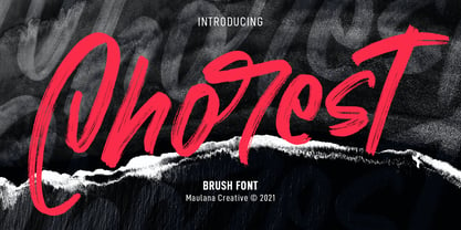 Chorest is an SVG handwritten font. With brush stroke, slant and fun character with a bit of ligatures and bit lowercase alternatives. To give you an extra creative work. Chorest SVG font support multilingual more than 100+ language. This font is good for logo design, Social media, Movie Titles, Books Titles, a short text even a long text letter and good for your secondary text font with sans or serif. Make a stunning work with Chorest SVG font. Cheers, MaulanaCreative
 - Hibagon by Hanoded,
$15.00 Hibagon is the Japanese equivalent of the Yeti from the Himalayas, or Bigfoot from North America. It is usually sighted on Mt. Hiba (Hiroshima prefecture), hence the name. I have never seen Hibagon myself, even though I have visited Hiroshima several times. Hibagon font is a nice, handpainted, all caps font with a mythical feel to it. It probably won’t scare you, but it will look good on anything that needs a bit of brushwork, or a bit of roughness.
 - OffBit by Power Type,
$15.00 OffBit is a font type derived from Bitmap with various variations from each box. The term bitmap comes from computer programming terminology, which means simply a bit map, a spatially mapped array of bits. Now, together with PowerType, it usually refers to a similar concept of an array of pixels that are mapped spatially and into various shapes such as dots and other models. This font matches the theme of computing, graphic design, posters or other media, all of which can be combined.
 - Wandering Pencil by Hanoded,
$15.00 I have a lot of pencils, but when I need one, they seem to have grown legs and have disappeared! When I decided I wanted to create a pencil font, it took me a long time to find the right pencil for the job! Wandering Pencil is a nice, handmade font. It is a bit shaky, a bit rough, but it does have class and will look nice on your designs! Comes with diacritics and double letter ligatures for the lower case.
 - Rivertale by takoliko,
$10.00 Rivertale inspired by the flow of a river. Rivertale have a little bit of a wavy curve on some gliph that give a little psychedelic touch. Rivertale have a flexibility to used as a formal font or a more casual font and it give a little bit feminim style. Rivertale came with Reguler and Oblique fonts. It has a ligature and support multilingual language. It can easily be matched to an incredibly large set of projects, and good for communicating your brands.
 - Belltons by Maulana Creative,
$12.00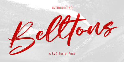 Belltons is an fancy SVG script font. With rough brush stroke, slanted and fun character with a bit of ligatures and a bit lowercase alternate. To give you an extra creative work. Belltons SVG font support multilingual more than 100+ language. This font is good for logo design, Social media, Movie Titles, Books Titles, a short text even a long text letter and good for your secondary text font with sans or serif. Make a stunning work with Belltons SVG font. Cheers, MaulanaCreative
 - Hoffmans by Maulana Creative,
$15.00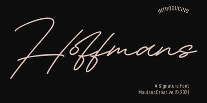 Hoffmans is a Fancy Signature script font. With mono-line stroke, super slanted and fun character with a bit of ligatures and a bit lowercase alternatives. To give you an extra creative work. Hoffmans font support multilingual more than 100+ language. This font is good for logo design, Social media, Movie Titles, Books Titles, a short text even a long text letter and good for your secondary text font with sans or serif. Make a stunning work with Hoffmans font. Cheers, MaulanaCreative
 - Roxfranks by Maulana Creative,
$11.00 Roxfranks is a Fancy Brush Script font. With rough brush stroke, slant and fun character with a bit of ligatures and bit of alt lowercase. To give you an extra creative work. Roxfranks font support multilingual more than 100+ language. This font is good for logo design, Social media, Movie Titles, Books Titles, a short text even a long text letter and good for your secondary text font with sans or serif. Make a stunning work with Roxfranks font. Cheers, MaulanaCreative
 - Hockleys by Maulana Creative,
$11.00 Hockleys is a Cursive script font. With light mono-line stroke, slant and fun character with a bit of ligatures and a bit lower alternates. To give you an extra creative work. Hockleys font support multilingual more than 100+ language. This font is good for logo design, Social media, Movie Titles, Books Titles, a short text even a long text letter and good for your secondary text font with sans or serif. Make a stunning work with Hockleys font. Cheers, MaulanaCreative