9,053 search results
(0.053 seconds)
- Bubble Horns by Sipanji21,
$17.00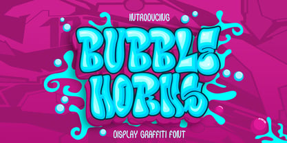 "Bubble Horns" is an urban graffiti font characterized by Bubble edges and a bold look. Ideal for music posters, apparel designs, shirts, and streetwear, this font brings a touch of edginess to your projects. The unique style of "Bubble Horns" makes it the perfect choice any urban graffiti themes. Whether you want to create a strong and powerful statement or simply add a touch of attitude to your designs "Bubble Horns" is the font for you.
 - Fast Blaze Graffiti by Sipanji21,
$19.00 "Fast Blaze" is an urban graffiti font characterized by sharp edges and a bold look. Ideal for music posters, apparel designs, shirts, and streetwear, this font brings a touch of edginess to your projects. The unique style of "Fast Blaze" makes it the perfect choice for death metal or urban graffiti themes. Whether you want to create a strong and powerful statement or simply add a touch of attitude to your designs "Fast Blaze" is the font for you.
 - Under Boom Graffiti by Sipanji21,
$15.00 "Under Boom" is an urban graffiti font characterized by sharp edges and a bold look. Ideal for music posters, apparel designs, shirts, and streetwear, this font brings a touch of edginess to your projects. The unique style of "Black Squad" makes it the perfect choice for death metal or urban graffiti themes. Whether you want to create a strong and powerful statement or simply add a touch of attitude to your designs, "Under Boom" is the font for you.
 - Road Vanders Graffiti by Sipanji21,
$15.00 "Road Vanders" is an urban graffiti font characterized by sharp edges and a bold look. Ideal for music posters, apparel designs, shirts, and streetwear, this font brings a touch of edginess to your projects. The unique style of "Road Vanders" makes it the perfect choice for death metal or urban graffiti themes. Whether you want to create a strong and powerful statement or simply add a touch of attitude to your designs, "Road Vanders" is the font for you.
 - Black Squad Graffiti by Sipanji21,
$16.00 "Black Squad" is an urban graffiti font characterized by sharp edges and a bold look. Ideal for music posters, apparel designs, shirts, and streetwear, this font brings a touch of edginess to your projects. The unique style of "Black Squad" makes it the perfect choice for death metal or urban graffiti themes. Whether you want to create a strong and powerful statement or simply add a touch of attitude to your designs, "Black Squad" is the font for you.
 - Humanism by Prominent and Affluent,
$30.00 Inspired by the urban typography, which later led to a grotesque style. It can be used for bold editorial statements graphic heavy prints or just as a simple logo. This new type will definitely make your designs stand out and unique. Its robust, strong and contemporary form makes it perfect for any project that needs the extra strength. Humanism is available from A to Z in the regular and italic style, developed in an urban style.
 - Wild Graf by Sipanji21,
$17.00 "Wild Graf" is an urban graffiti font characterized by sharp edges and a bold look. Ideal for music posters, apparel designs, shirts, and streetwear, this font brings a touch of edginess to your projects. The unique style of "Wild Graf" makes it the perfect choice for death metal or urban graffiti themes. Whether you want to create a strong and powerful statement or simply add a touch of attitude to your designsWild Graf" is the font for you.
 - Scripton by Tour De Force,
$25.00 Bouncy, slanted and urban brush typeface Scripton combines 2 different glyph weights within single font file which gives an specific rhytm and contrast to titles and paragraphs.
 - Uertas by Sign Studio,
$15.00 Uertas font brings a modern calligraphy feel. It's perfect for freestyle urban typography, modern logotypes, product branding, or just a quote that you want to stand out.
 - Zan Zan by Pitt's Hand,
$20.00 A fun font to create pop and young graphics, with a non-obvious font created starting from a handcrafted line. For an urban, snappy and fresh result.
 - Hedwig Pro by Ingo,
$42.00 A modern sans serif with open round forms. The ”round“ letters emphasize the condensed open oval; the light counter forms provide the rhythm of the typeface, causing the typeface to appear gentle and pleasing. The ”modern“ design of a and g being especially contributive here. All of the letters are recognizably narrow, almost ”condensed,“ the forms being very functionally shaped. The construction of the ”triangular“ upper case letters A M N V W as well as v and w, especially catches the eye with the shafts joined together as beams are stacked upon each other. With this construction Hedwig displays a down-to-earth touch. Contrary to the classical sans serifs, a few letters were given light echoes of serifs which promote fluency: a d l are displayed below the line in a reading direction and end in a compressed but also very short serif style; on m n p r the upstroke is gently displayed and on u the downstroke. For all the typo-maniacs among you designers there are alternative forms for a number of letters in Hedwig: A B D G I M R W and a d f g j l ß u. Even an antiquated ”long“ s and an upper case ß is available. Plus, Hedwig includes numerous ligatures which can save that little bit of space where required and which allow the typeface to appear more variable: ch, ck, ct, fi, fj, fl, ff, ffi, ffl, ft, mm, ti, tt, tz.
 - Hejira by Sudtipos,
$49.00 Hejira means “rupture” and this concept was the primary principle that guided the creation of this typeface: to escape conventions and take up the challenge of designing letters with an unusual and fresh approach. Unlike traditional typefaces, each member of this somewhat atypical family has its own distinct personality and formal features. A thin, spiky font that looks like its sharp serifs could pierce through. A more experimental sibling, based on the same skeleton but taken to the extreme, that is best suited to setting big titles. An odd-one-out, sans-serif style whose shapes mimic those generated by the movement of a calligraphic pen. And a quirky fat-face with a flair for combining round curves with pointy elements. Regardless of how different they may be, all four styles feel part of the same system and can be used alongside each other seamlessly. The Hejira set includes multiple ligatures and supports a wide variety of Latin alphabet-based languages.
 - RuneScape UF - 100% free

- Mister Bones NF by Nick's Fonts,
$10.00Alpha Midnight, reconstructed from an unnamed source by Dick Pape for Solotype, provided the pattern for this big, bold, unconventional stencil face, sure to grab your readers' attention. Both versions include the complete Latin 1252, Central European 1250 and Turkish 1254 character sets, as well as localization for Moldovan and Romanian. - Sportfield Varsity by Rvandtype,
$9.00 Sportfield Varsity is a Sport Font Family. It’s perfect for all your athletic and sports-related designs. With its strong and angular letters, this font conveys a sense of power and motion, making it the ideal choice for logos, headlines, and other graphic elements that need to make a big impact.
 - Bravo ND by Neufville Digital,
$29.60 Designed by José María Cerezo, with a geometric style and futuristic touches. A typeface family that offers good results in labeling, posters and big formats. Inspired by art deco with a sci-fi touch, it is a typeface with a strong character and personality. Bravo is a Trademark of BauerTypes SL
 - Energetics by ITC,
$29.99Energetics is a symbol font that includes 98 different pictograms, each showing figures engaged in athletic pursuit. The characters are drawn with a strong black & white drawing style, which helps stress the dynamic quality of the images. The details in Energetics' symbols come out best when they are used big. - Chubbly by Greater Albion Typefounders,
$10.00 The Chubbly family started life as an alphabet for an illustrated children's book. These big, chubby and friendly letterforms are easy to read and have a sense of fun about them. They're ideal where simple eye-catching geometric letterforms are required, for posters, signs and advertising with a sense of fun.
 - Jungle street by Fidan Fonts,
$19.00 Jungle Street is an uppercase decorative font inspired by street art tag in big city wall. It's works perfectly for headlines, logos, posters, packaging, T-shirts, postcards and many more. Latin-based Language Support. A summary of what's included: Jungle street Regular font (otf) Jungle street Outline font (otf) Happy creating!
 - Mount Gambier And Sidney by HafisHidayat,
$20.00 Introducing Mount Gambier And Sidney this is a very cool brush font that is deliberately made for your various personal and big business design needs such as design logos, business cards, advertisements, etc. - Web fonts EOT, SVG, WOFF, WOFF2 Thank you very much for buying, don't hesitate to contact me!
 - Hoosier Daddy by Parkinson,
$20.00 Hoosier Daddy is based on Foundry Type samples from various mid-19th century specimen books. This shaded slab serif was made by conforming several different cuts of the styles, filling out the character set, and adding a few contemporary touches for freshness. This is a display face. Use it big.
 - Strongheld by Alandya TypeFoundry,
$19.00 Strongheld is a handwritten script that is big beautiful. Strongheld comes with a stylistic alternates, swashes, and multi-lingual support. These features let you make that perfect and unique design, perhaps more simple, intimate, or natural. This font is good for vintage design, t-shirts, logos, labels, posters and more.
 - Babble by Comicraft,
$19.00 Babble go gaga? Babble a liddle baba aba dittle boo-boo? Babble gotta Owie? Babble wanna see dada go bonk? See dada go WAAHHH?! Babble wanna bockle? Babble wanna see mama? Babble wanna have milky milky num-nums? Ahhh... Babble id soooooooo cuuuuuute! Dada and Mama love Babble. Big Hug, babble!
 - Massimo by Borutta Group,
$29.00 Massimo is a semi-serif geometric type family. For as long as I can remember, I've admired the visual style of New York – its architecture, fashion, design, and typography. After spending two weeks in Manhattan this summer, I wanted to prepare a sharp and modern typeface in Big Apple style.
 - Adelle by TypeTogether,
$52.00 While Adelle is a slab serif typeface conceived by Veronika Burian and José Scaglione specifically for intensive editorial use, mainly in newspapers, magazines, and online, its personality and flexibility make it a true multipurpose typeface. Adelle’s superior screen rendering and cross-platform consistency has also made it one of our most popular webfonts. The intermediate weights deliver a neutral look when used in text sizes, providing the usual robustness expected in a newspaper font. The unobtrusive appearance, excellent texture, and slightly dark colour allow it to behave flawlessly in continuous text, even in the most unforgiving editorial applications. As it becomes larger in print, Adelle shows its personality through a series of measured particularities which make it easy to remember and identify. Its energetic character, so inherent to slab serif fonts, becomes evident when used for subheadings and headlines. A condensed series of seven weights with matching italics expand Adelle’s possibilities. This extension provides flexible solutions in situations where saving space is vital but losing legibility is not an option. The new condensed series shares the same personality, proportions, and skeleton of the Adelle family, creating an harmonious texture when combined. Be sure to check out the companion to Adelle, Adelle Sans, to complete the look of your design with the intended personality and flexibility. Awards – Third prize for Latin text typeface in the 2009 Granshan Type Design Competition – Won Gold for Original Typeface in the 2010 European Design Awards – Selected in the first Ukrainian typeface competition in 2010 – Exhibited at the Rutenia Calligraphy & Typography Festival (http://rutenia.org.ua/en/index_u.html) in Kyiv, 2010 – Selected in the 2011 Type Directors Club Tokyo Exhibition – Selected in Communication Arts 2011 Typography Annual – Selected in Yearbook of Type I, 2013 – Part of the exhibition «Call for Type» and subsequent book Neue Schriften (New Typefaces)
 - Punk Rocker by Fenotype,
$18.00 PunkRocker is a bold condensed sans-serif with three versions and plenty of attitude. PunkRocker is awesome for creating strong tight square text boxes that scream for attention: it’s ideal for movie posters, single covers, as a supertool for fast graphic design. PunkRocker has three versions: Regular which is “clean”, Rough which has the worn-out appearance of a punk-poster or a gig poster that has been outside too long, and Stamp which has rugged outlines and print texture inside characters. Textured versions of PunkRocker have double characters for every standard character: Contextual Alternates will automatically replace any double letter with alternate that has different texture to avoid repetition and keep the appearance more authentic. You can also access these alternates by turning on Stylistic Alternates or via glyph palette. PunkRocker is PUA encoded so you can access extra glyphs in most graphic design softwares.
 - Play Day Stencil JNL by Jeff Levine,
$29.00 The typography on a 1964 children’s activity book published by Whitman entitled “Build with Stencils” was in a bold, condensed design. The only problem was that the ‘rails’ [the parts that divide a letter into stencil pieces] were too narrow and would disappear at smaller point sizes. Widening the ‘rails’ just a bit greatly improved the appearance of the stencil characters. Play Day Stencil JNL is now available in both regular and oblique versions. In its day, the Whitman Publishing Company of Racine, Wisconsin published dozens of activity books for children, including a number of them with stencils. The company was a division of Western Publishers from the early 1900s through the 1970s, but went through a number of sales and name changes. Currently [as Whitman once again] it is owned by Anderson Press, and is known for its line of coin folders and books on coin collecting.
 - Artartika by Tour De Force,
$25.00 Artartika contains two Regulars – one Slab and one Sans Serif. Condensed width, geometric shaped, with distinctive stem contrast, Artartika recommends itself for titles, product names, branding, but it's also fully applicable for longer text and paragraph use. Contains Extended Latin character set with Cyrillic support.
 - JustTall by OneSevenPointFive,
$10.00 JustTall is an ultra condensed typeface with open type features, 400+ characters with 80+ languages support made for tight spaces. Useful for - Logos for companies with really long names Different texts with very little space available Very tall design types Give feedback: https://bit.ly/3FlmhDS
 - Handmade Headline JNL by Jeff Levine,
$29.00 Hand lettered titling on the 1945 sheet music for “Don’t Forget To-Night, To-Morrow” is in a simple, condensed sans serif style with a slight hint of Art Deco influence. This is now available as Handmade Headline JNL, in both regular and oblique versions.
 - Quanticoverse by JK Typeface,
$12.00 Semi-condensed sans-serif with expressive curves on the outside and closed on the inside, with diagonal stems to convey modernity and a unique personality. Perfect for titles and headers in graphic and editorial design projects, as well as standing out in digital applications.
 - Athellia Script by Lindstrom Design,
$19.00 An upright condensed formal script. Athellia is right at home on packaging, labels, Menus, Headlines, invitations, and title design. NOTE: MyFonts does not display contextual alternates so many of the ‘o’ combinations do not display correctly here but do with open type alternates activated.
 - Gluten by Andinistas,
$24.67 Gluten is an experimental font family designed by Carlos Fabian Camargo. It includes irregular shadows to communicate craftsmanship. Its multiple upper cases with condensed width and naive lines are notable for their expressive drawing with a high amount of contrast between thick and thin strokes.
 - Restauranteur JNL by Jeff Levine,
$29.00 The 1960 revised edition of Sam Welo’s “Studio Handbook – Letter and Design for Artists and Advertisers” showcased a beautiful, semi-condensed Art Deco alphabet called “Modern Gothic”. It has been digitally redrawn and is available as Restauranteur JNL in both regular and oblique versions.
 - Astoria Sans by Alan Meeks,
$45.00 The Sans serif companion to Astoria. Based heavily on Gill especially in the mid weights and with a consistant series of condensed weights. Designed specifically as a text face it still works very well as a headline font. There are 6 weights with accompanying Italics.
 - Luckmeister PB by Pink Broccoli,
$14.00 From the vintage record cover, "Music from MR. LUCKY", composed and conducted by Henry Mancini, comes this offbeat and full of life condensed serif typeface. A uniform stroke structure and a light baseline bounce give this typeface a festive yet serious duality of a personality.
 - Hollywood and Vine JNL by Jeff Levine,
$29.00 A condensed type design with Art Deco influences was used for titles within the February, 1938 issue of Modern Screen Magazine. The digital version is named for the famous “Tinsel Town” street intersection. Hollywood and Vine JNL is available in both regular and oblique versions.
 - Department Store JNL by Jeff Levine,
$29.00 Amongst a number of items for sale in an online auction was a font of metal type featuring a thin, condensed serif font with decidedly Art Deco styling. This was the inspiration for Department Store JNL, which is available in both regular and oblique versions.
 - Clarendon Jordan by Wooden Type Fonts,
$25.00 Clarendon is the name of a slab-serif typeface that was released in 1845 by Thorowgood and Co. (or Thorowgood and Besley) of London, a letter foundry often known as the Fann Street Foundry. This current design is a somewhat condensed version of the font.
 - LeftheriaPRO by Sea Types,
$29.00 LeftheriaPRO has its structure projected from the capitals of the Greek columns of Ionian order, it is a typography condensed with vertical emphasis composed by 5 weights (light, regular, medium, semibold, bold) including ligatures, alternates, smal caps, old styles figures, fractions, superiors, inferiors. | Download Specimen
