9,053 search results
(0.099 seconds)
- Renathalia Signature by Letterena Studios,
$9.00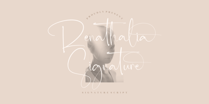 Renathalia Signature is a beautiful signature script font suitable for any projects such as logos, branding projects, homeware designs, product packaging, mugs, quotes, posters, shopping bags, t-shirts, book covers, name cards, invitation cards, and greeting cards. It’s also a perfect fit for labels, photography, watermark, special events, and all your other lovely projects that need a beautiful script taste.
 - Handmade Caslon JNL by Jeff Levine,
$29.00 Handmade Caslon JNL is a somewhat imperfect version of one of the many Caslon faces in use during the late 19th and early 20th centuries. Based on vintage source material, Handmade Caslon JNL is the right typeface for projects reflecting antiquity, a hand-made look or where slightly imperfect lettering adds a bit of the "real world" to the message.
 - Pardon Me Boy! by Greater Albion Typefounders,
$8.00 Pardon me boy, is that the Chattanooga Choo-choo? Well, not quite, but "Pardon Me Boy!" is a set of silhouette based ornaments capturing railway locomotives and rolling stock from around the world. Use it to form up trains to make suitable themed rules and borders, or just for fun anywhere a bit of locomotive power will add life and movement!
 - Kwark by Hanoded,
$15.00 Kwark is a nice, cartoonesque outline font with a bit of grunginess. Yes, it is an all caps font, but upper- and lowercase letters differ in shape, so you can mix and match. The name is not really related to the way the font looks: kwark means 'curd' in Dutch. You think that sounds delicious? Well, then give Kwark a try!
 - Cuteness Persimmon by Abo Daniel,
$17.00 introducing CUTENESS PERSIMMON -unique bouncy script- it is great for branding, packaging, quotes, wedding card, logo, signature, tote bag design, card, banner, and anything craft project. I created some doodles to make this font perfect. you can add underscore twice after a to k. Features: - Uppercase - Lowercase - Numeral - Multilingual - doodles - PUA encoded I hope you love it. regards, Abo Daniel Studio
 - Sintyabelinda by Zeenesia Studio,
$16.00 Sintyabelinda - Sintysbelinda is Signature Font, suitable for any projects such as logos, branding projects, homeware designs, product packaging, mugs, quotes, posters, shopping bags, t-shirts, book covers, name card, invitation cards, greeting cards, label, photography, watermark, special events, and more. stylistic set alternate and swash make this font so classy, this is a font worthy of your collection. Thank you.
 - Anchor by Etewut,
$20.00 I glad to introduce to you my new display font Anchor. I was inspired by Russian fairy tales with cyrillic lettering. So I hope you'll keep a bit of fairy in you upcoming products using my font. Please, mind a spirit! It perfectly fits to making design from corporative identity to Xmas cards. And it has extra symbols for european languages.
 - Challah Display by Typophobia,
$25.00 Challah is a display font containing 295 glyphs. Letters are very diverse, but because they contain several shapes characteristic for each other - they retain a certain coherence. When creating the font, the main inspiration was to take from the Brazilian graffiti trend - Pichação and Korean typography. Most of the letters are the same size and width, however, when designing, we also tried to include at certain moments small "surprises" that will surely interest and surprise the user of the above-mentioned typeface. The font fits very well into the urban structure, therefore it perfectly matches the art on the walls with the art on the billboards, creating a kind of dialogue.
 - Modster Script by Moovied Co.,
$15.00 Modster Script is a collective inspired by urban style created from the style of hand-lettering with love. Modster comes with a set of styles, alternatives, present and extra shadow. This font is ideal for branding, logos, handwritten quotes, product packaging, headers, posters, merchandise, social media books / cover titles, special events, etc. To enable the OpenType Stylistic alternates, you need a program that supports OpenType features such as Adobe Illustrator CS, Adobe Indesign & CorelDraw X6-X7. There are additional ways to access alternates, using Character Map (Windows), Nexus Font (Windows), Font Book (Mac) or a software program such as PopChar (for Windows and Mac).
 - Streetbomber by Din Studio,
$29.00 Hi, Everyone! Want to make your branding bold with graffiti font? Then we’ve got the font for you! Introducing Streetbomber- A Grafiti Font Streetbomber is an urban font that echoes the classic tag lettering style. Use this cool and artistic graffiti font to breathe a street life vibe into your projects. This font is perfect for logos, printed quotes, cards, packaging, website or social media branding, and many more! Streetbomber includes multilingual options to make your branding reach a global audience. Includes: Streetbomber (OTF) Features: Alternates Standart Ligatures Stylistic Set Multilingual Support PUA Encoded Numerals and Punctuation Thank you for downloading premium fonts from Din Studio
 - Jackhill by Sensatype Studio,
$15.00 Jackhill is Modern Unique Display font with stylistic and unique style ready for any project you want, font that you can combine to get any variations and unique shapes easily just in seconds with choose alternates of them. It is a display font with moderate contrast that perfect for branding projects, logo, urban designs, social media posts, advertisements, product packaging, product designs, label, photography, watermark, and any projects, it makes with a high level of legibility. What's Included: Character set A-Z Uppercase & Lowercase Numerals & Punctuation Accented Characters (West Europe) Stylistic alternates Works on PC & Mac Recommended using Adobe Illustrator or Adobe Photoshop. Wish you enjoy our font. :)
 - Chocolatte by Hanoded,
$15.00 Chocolatte font is a yummy, creamy script font, made entirely with chocolate.. No, sorry, that’s not true. It was made with a pen, but I thought I’d create a nice urban myth. Chocolatte is a pretty useful font: you can stick it on your X-mas cards, write a little poem with it and surprise the love of your life with an enormous amount of chocolate, decorate your cake with it (preferably a chocolate cake) or use it for your… well, whatever. Just remember that this delicious font cannot be eaten, but it does come with copious amounts of diacritics for all you chocoholics out there!
 - Gotcha by Nicky Laatz,
$15.00 Say hello to GOTCHA! A versatile new marker font with bounce and vigor and a a super-sexy-casual vibe! The Gotcha fonts are incredibly versatile , from street urban, to styled fashionista, to hearty food branding - whatever the weather, Gotcha! has you covered :) Gotcha! comes with a set of alternate upper and lower case letters, and a second set of lowercase letters - this way you can write one word in a million different ways - and keep things ultra natural looking. A comprehensive set of double letter ligatures are also included. Gotcha! also comes with an “Extras Font” which include textured swashes and splatters/grit to add some pizazz to your design.
 - Luisina by Keristyper Studio,
$14.00 Luisina Script is a handwritten font reflecting calligraphy lettering. This font is inspired by hand-written, pop culture and urban culture. It includes numbers, punctuation, alternates, ligatures, and supports other languages. It is perfect for adding a hand-lettered style to your stationery, headlines, branding, and wedding invitation. Luisina Font multilingual support: Afrikaans, Albanian, Catalan, Danish, Dutch, English, Estonian, French, Finnish, German, Icelandic, Indonesian, Italian, Malay, Norwegian, Portuguese, Spanish, Swedish, Zulu, and many more. What’s Included : Standard & Multilingual glyphs Ligature Works on PC & Mac Simple installations Accessible in Adobe Illustrator, Adobe Photoshop, Adobe InDesign, and even work on Microsoft Word. Hope you enjoy our font!
 - Qintan Script by Moovied Co.,
$15.00 Qintan Script is inspired by urban, streetwear and vintage design. It's made with love! It's a hand-lettering style. Ideal for branding, logos, handwriting quotes, product packaging, headers, posters, merchandise, social media Books / Cover titles, special events, and more. Features: - Basic Latin A-Z and a-z - Numbers - Symbols - Stylistic Set - Ligatures - PUA Encode - Multilanguage Support To enable the OpenType Stylistic alternates, you need a program that supports OpenType features such as Adobe Illustrator CS, Adobe Indesign & CorelDraw X6-X7. There are additional ways to access alternates, using Character Map (Windows), Nexus Font (Windows), Font Book (Mac) or a software program such as PopChar (for Windows and Mac).
 - Geoplace SC - Personal use only

- IL Palamede by Notope,
$25.00 IL Palamede is a typeface with just one style, referring by its name to the French chess magazine Le Palamède. Connects with chess here not only the name. Each symbol is built on a 5x5 grid with 3x3 priority. At the same time, the logic here is higher than optical compensation, so you can observe here quite dense, for example "b". Thanks to this solution, the typed text is balanced in width, and it also creates the feeling of a chess cell, where black and white cells alternate. Connects with chess here not only the name. Each symbol is built on a 5x5 grid with 3x3 priority. At the same time, the logic here is higher than optical compensation, so you can observe here quite dense, for example, "s". Thanks to this solution, the typed text is balanced in width, and it also creates the feeling of a chess cell, where black and white cells alternate. Use this font for any purpose that includes winning or enjoying.
 - Rondey by Craft Supply Co,
$20.00 Introducing Rondey – Display Font A Bold Serif with a Twist Rondey is a captivating Display Font that combines bold serifs with a unique twist, making it ideal for display purposes. Display Elegance Rondey’s design exudes an elegant charm that’s perfect for grabbing attention in various display contexts. Versatility for Diverse Projects Moving beyond its captivating elegance, Rondey’s versatility shines through, allowing it to seamlessly complement a wide range of creative projects. Captivating and Memorable Rondey ensures that your content is not only captivating but also memorable. It leaves a lasting and distinctive impression that sets it apart. In Conclusion In summary, Rondey – Display Font is a font designed to captivate in the world of display typography. Its unique twist on bold serifs adds an elegant touch to your projects. Whether it’s for branding, posters, or a myriad of creative endeavors, Rondey’s versatile and captivating design caters to a broad readership, ensuring your content leaves a memorable and distinctive mark.
 - JAF Facit by Just Another Foundry,
$42.00 Facit is a contemporary sans serif text face. It is designed to be a highly legible and flexible font that does not draw the attention to itself. Instead of being original by itself it is the result of a careful examination of ancient as well as modern formal concepts. “It is by definition impossible to design an un-conventional typeface. Type is pure convention, this is why we can read each other’s written words”, says its designer Tim Ahrens. However, rather than generating an average, existing principles were consciously combined into a unique design solution: The word ‘Facit’, in its German version, means ‘conclusion’. The fonts are provided in OpenType format. Each font contains 720 glyphs. Technically, they follow the Adobe Pro fonts and provide the same glyph set and OpenType functionality. OpenType features include ligatures, true small capitals, superiors, inferiors, numerators and denominators. Every font contains old style and lining figures, both in a proportional and a tabular design. For some letters there alternate characters.
 - Madrea by Craft Supply Co,
$20.00 Introducing Madrea – Friendly Sans Serif Unconventional Charm Madrea – Friendly Sans Serif is anything but conventional; it introduces a unique and friendly twist to your designs. Irregular Shapes What sets Madrea apart is its irregular shapes, which establish a welcoming and friendly atmosphere. This makes it the perfect choice for designs seeking to break free from formality and monotony. A Breath of Fresh Air In the realm of sans serif fonts, Madrea is indeed a breath of fresh air. Its non-uniformity and organic feel breathe personality and approachability into your projects. Breaking Formality Madrea excels at breaking the chains of formality. It’s an ideal choice for design projects that demand a friendly and informal touch, effortlessly transforming the mundane into something captivating. In Conclusion In summary, Madrea – Friendly Sans Serif is your gateway to a non-uniform, friendly design experience. Its irregular shapes infuse character, warmth, and a refreshing departure from conventional design, ensuring that your creations are brimming with life and far from monotonous.
 - Luciferum by Artisticandunique,
$25.00 Luciferum - Serif font family - 6 Styles - Multilingual supports. Luciferum is a stylish serif font family with different alternative character designs. It has a structure that you may encounter especially in horror novels, movies, posters and similar content. This font provides flexibility in all your projects with the alternatives it offers you with its multiple language options, 6 styles and rich glyph options. You will have the opportunity to enrich the content of your projects with alternative characters. Depending on the purpose of use in typographic compositions that you will create with the aesthetic structure of alternative characters; You can enrich your titles in books or magazines, and your logos in branding. Especially for movie titles, posters, album covers, editorials, magazines, books, branding, packaging, logo design, web design, headlines, etc. If you're looking for a font with stylistic alternatives, Luciferum serif font might meet your needs. With this font you can create your unique designs. Have a good time.
 - Talonica by Nantia.co,
$24.00 Greek Signature Font Talonica The Greek Signature Font Talonica is a signature decorative font with which you can achieve a hand-lettering style. Talonica is a multilingual lettering font with Greek (of course), Latin characters, and diacritics. Supports all European languages. This signature style is perfect if you want to achieve a modern-looking graphic design project. In addition, this font has a really nice flow so you can also use it in a larger body of text. It can also be used on social media content, for branding or packaging applications. Also, this is the ideal typeface for organic product wine branding and packaging. You can use it to create logotypes with character and natural flow. Additionally, you can use its romantic vibes for wedding invitation designs. Especially if you are looking for a handwritten font for Instagram quote posts or any other social media content, this signature typeface is for you!
 - Orpheus by Scriptorium,
$18.00In response to many requests for Morpheus, an idea came to us. Why not make a font that looked a bit like Morpheus, but which had more attractive, more consistent character forms, was rendered cleanly and properly spaced and kerned? We took a look at Morpheus and decided to redo the concept from the ground up, replacing some of the amateurish characters, adding a bit of a Celtic look and feel, developing a set of alternate characters and making sure that the design elements were consistent from letter to letter. The result is Orpheus, a font which has the general look and feel of Morpheus, but is a much more complete and fully realized design. In addition, Orpheus is a fully developed font set, with not only regular and bold versions, but with a special customized italic style and a really neat looking heavy weight rough-outlined variant. - Comenia Sans by Suitcase Type Foundry,
$75.00Comenia Sans was designed in the framework of a unique typographic project for all types of schools. It is a complementary face for Comenia Serif, released by our friends at Storm Type Foundry. Comenia Sans has a lot in common with its serif sister: the height of both upper and lower case, the length of ascenders and descenders, and the general weight. This makes the two perfect partners which work well even when set side by side in a single line of text. Comenia Sans does, however, lack all serifs, ornamental elements and stroke stress variation. All these elements freshen up the feel of long texts, but for shorter texts use, they are not necessary. Despite that, Comenia Sans retains the soft, friendly character of its big sister, as well as a few tiny details which lend it its unique character without compromising legibility or utility. Open counters give all letters an airy feel and permit enough variation in construction. This is why the face works well even in multiple-page texts. All its letters are easily distinguished from each other, so the reader's eyes are not strained. Diacritics and punctuation harmonize with both upper and lower case. As usually, all diacritical marks fully respect conventional shapes of accents and they are perfectly suitable for Czech, Slovak, Polish and other Central European languages, where a lot of diacritics abounds. Similarly to the renaissance italics which refers to the cursive forms, Comenia Sans introduces novel shapes of some characters drawing from the hand-written heritage. This is most apparent in the single-bellied a, the simplified g, and the stem of f which crosses the baseline and ends with a distinct terminal. In the text, emphasized words are thus distinguished not only by the slant of letters, but also by the shapes of the letters themselves. All twelve styles contain set of small caps, suitable for the names, in the indexes or the headlines in longer texts. Legibility in small sizes under 10 points was at the center of designers' attention, too. This is why the counters of a, e and g are large enough to prevent ink spread in small sizes, both on-screen and in print. After all, the font was specifically optimized for screen use: its sober, simple forms are perfectly fit to be displayed on the computer screen and in other low-resolution devices. When used in the context of architecture, the smoothness of all contours stands out, permitting to enlarge the letters almost without limit. A standard at the Suitcase Type Foundry, each style of Comenia Sans boasts a number of ligatures, an automatic replacement of small caps and caps punctuation, a collection of mathematical symbols, and several types of numerals which make it easy to set academic and other texts in an organised, well-arranged way. For the same purpose, fractions may come in handy, too. Apart from the standard emphasis styles, the family also contains six condensed cuts (each set has the same number of characters), designated for situations where space is limited or the need for striking, poster-like effect arises. Comenia Sans is the ideal choice for the setting of magazines, picture books, and navigation systems alike. Its excellent legibility and soft, fine details will be appreciated both in micro-typography and in poster sizes. Although it was designed as a member of a compact system, it will work equally well on its own or in combination with other high-quality typefaces. - DingMaps, envisioned and crafted by the imaginative mind of Thomas E. Harvey, is a unique typographic endeavor that merges the practical functionality of maps with the artistry of font design. This i...
- "Distant Galaxy Condensed" is a distinctive typeface designed and released by ShyFoundry, a known creator of unique and varied fonts. This particular font is a condensed variant of the "Distant Galax...
- Rolphie by Aah Yes,
$9.95 Rolphie can be your go-to sans-serif, with 16 easy-to-read weights and 10 versions for each weight, and the subtlety of choice that represents. The versions contained in each weight are: Regular; Condensed; Half-Condensed; Expanded; Small Capitals: and their italic counterparts. (At heavier weights particularly it seemed to be justified to have two Condensed versions). Plus there's 20 funky versions with the letters all shook up (that would make a good title for a song), or jumbled around, plus some Shadow, Doubled-Up, College, and other FX versions. In total there's 180 variations, giving a comprehensive selection of both standard and funky fonts, and that subtle degree of choice of weight. To make things easier, the weights are put in ascending numerical order from 01 to 16, and the FX versions have been stuck in the 80s and 90s, (like two musicians I know). There are grouped packages available for certain weights (which have 10 fonts in them) and the complete family package (180 fonts) which represent better value than the individual fonts, and there's a basic package containing the Normal and Italic versions of all 16 weights (32 fonts). A limit of 5 sub-family packages has been imposed, unfortunately, which precludes a more comprehensive selection. To let you know what's in the font that you might otherwise never know about . . . With Discretionary Ligatures on, you get special characters if you type Mc St. Rd. Bd. Ave. c/o No. (p) (P) - include the full-stop/period. With Stylistic Alternates switched on, you get plenty of extra characters - including a WiFi symbol (type Wifi or WiFi) / bullet numbers instead of ordinary numbers / that different U-dieresis / special characters for c/o No. Mc / an upside down ~ / a huge bullet, and different forms for cent, dollar, percent, per-thousand. As you'd expect, there's all the accented characters for all Western European scripts using Latin letters, and standard ligatures, plus other Open Type features including Class Kerning, Slashed-Zero, Historical Forms, Sub- and Superscript numbers, fractions for halves, thirds and quarters, Ornamental forms giving bullet numbers, etc. There's also the main mathematical operators, symbols like card-suits and male/female signs and so on, and some more obscure stuff like schwa and O-horn, U-horn - and there's lots more if you can Access All Alternates. Much will depend on what your software recognises. The Small Caps versions have (intentionally) lost the ligatures for lower case ff, fi, fj, fl, fr, fu, ffi, ffj, ffl, ffr, ffu. The names for the weights are not absolute - we had to make up some names to make them stretch out to sixteen - so rather - see them as relative to each other, being in ascending numerical order by weight.
 - El&Font is not just a single typeface, but it's part of a larger collection created by the designer Jérôme Delage, with a unique trait that makes it stand out: its inclusion of graffiti style. When d...
- As of my last update, the specific font named "Nickerbocker-Normal" is not a widely recognized standard typeface in the vast landscape of typography. However, based on its naming convention, we can d...
- FS Untitled Variable by Fontsmith,
$319.99Developer-friendly The studio has developed a wide array of weights for FS Untitled – 12 in all, in roman and italic – with the intention of meeting every on-screen need. All recognisably part of a family, each weight brings a different edge or personality to headline or body copy. There’s more. Type on screen has a tendency to fill in or blow so for each weight, there’s the choice of two marginally different versions, allowing designers and developers to go up or down a touch in weight. They’re free to use the font at any size on any background colour without fear of causing optical obstacles. And to make life even easier for developers, the 12 weight pairs have each been designated with a number from 100 (Thin) to 750 (Bold), corresponding to the system used to denote font weight in CSS code. Selecting a weight is always light work. Easy on the pixels ‘It’s a digital-first world,’ says Jason Smith, ‘and I wanted to make something that was really functional for digital brands’. FS Untitled was made for modern screens. Its shapes and proportions, x-height and cap height were modelled around the pixel grids of even low-resolution displays. So there are no angles in the A, V and W, just gently curving strokes that fit, not fight, with the pixels, and reduce the dependency on font hinting. Forms are simplified and modular – there are no spurs on the r or d, for example – and the space between the dot of the i and its stem is larger than usual. The result is a clearer, more legible typeface – functional but with bags of character. Screen beginnings FS Untitled got its start on the box. Its roots lie in Fontsmith’s creation of the typeface for Channel 4’s rebrand in 2005: the classic, quirky, edgy C4 headline font, with its rounded square shapes (inspired by the classic cartoon TV shape of a squidgy rectangle), and a toned-down version for use in text, captions and content graphics. The studio has built on the characteristics that made the original face so pixel-friendly: its blend of almost-flat horizontals and verticals with just enough openness and curve at the corners to keep the font looking friendly. The curves of the o, c and e are classic Fontsmith – typical of the dedication its designers puts into sculpting letterforms. Look out for… FS Untitled wouldn’t be a Fontsmith typeface if it didn’t have its quirks, some warranted, some wanton. There’s the rounded junction at the base of the E, for example, and the strong, solid contours of the punctuation marks and numerals. Notice, too, the distinctive, open shape of the A, V, W, X and Y, created by strokes that start off straight before curving into their diagonal path. Some would call the look bow-legged; we’d call it big-hearted. - FS Untitled by Fontsmith,
$80.00 Developer-friendly The studio has developed a wide array of weights for FS Untitled – 12 in all, in roman and italic – with the intention of meeting every on-screen need. All recognisably part of a family, each weight brings a different edge or personality to headline or body copy. There’s more. Type on screen has a tendency to fill in or blow so for each weight, there’s the choice of two marginally different versions, allowing designers and developers to go up or down a touch in weight. They’re free to use the font at any size on any background colour without fear of causing optical obstacles. And to make life even easier for developers, the 12 weight pairs have each been designated with a number from 100 (Thin) to 750 (Bold), corresponding to the system used to denote font weight in CSS code. Selecting a weight is always light work. Easy on the pixels ‘It’s a digital-first world,’ says Jason Smith, ‘and I wanted to make something that was really functional for digital brands’. FS Untitled was made for modern screens. Its shapes and proportions, x-height and cap height were modelled around the pixel grids of even low-resolution displays. So there are no angles in the A, V and W, just gently curving strokes that fit, not fight, with the pixels, and reduce the dependency on font hinting. Forms are simplified and modular – there are no spurs on the r or d, for example – and the space between the dot of the i and its stem is larger than usual. The result is a clearer, more legible typeface – functional but with bags of character. Screen beginnings FS Untitled got its start on the box. Its roots lie in Fontsmith’s creation of the typeface for Channel 4’s rebrand in 2005: the classic, quirky, edgy C4 headline font, with its rounded square shapes (inspired by the classic cartoon TV shape of a squidgy rectangle), and a toned-down version for use in text, captions and content graphics. The studio has built on the characteristics that made the original face so pixel-friendly: its blend of almost-flat horizontals and verticals with just enough openness and curve at the corners to keep the font looking friendly. The curves of the o, c and e are classic Fontsmith – typical of the dedication its designers puts into sculpting letterforms. Look out for… FS Untitled wouldn’t be a Fontsmith typeface if it didn’t have its quirks, some warranted, some wanton. There’s the rounded junction at the base of the E, for example, and the strong, solid contours of the punctuation marks and numerals. Notice, too, the distinctive, open shape of the A, V, W, X and Y, created by strokes that start off straight before curving into their diagonal path. Some would call the look bow-legged; we’d call it big-hearted.
 - Bekuri by Twinletter,
$17.00 The Bekuri font is the perfect visual harmony for music-style projects, festivals, and special events. With seductive and graceful characteristics, this font carries a special tone suitable for celebrating historical moments in your designs. With a family that includes regular, shadow, outline, and distort, Bekuri provides unlimited flexibility to depict your message with a powerful style. However, what makes this font stand out is the ligatures that add a unique and artistic feel to each character, giving you the freedom to explore your creativity in every project. Its ability to support multiple languages makes it an invaluable asset in reaching a global audience. Bringing visual beauty and musical charm to every touch, Bekuri is the key to bringing the feel of festivals and big events to every design. So, if you are looking for a font that celebrates the musical style in all its glory, Bekuri is an undeniable choice.
 - 1925 My Toy Print Deluxe Pro by GLC,
$42.00 This family was created inspired from two French (one so common and a very rare large one) "toy print" boxes, named Le petit imprimeur, with rubber stamp characters from the 1920's. The big difference from our 1920 My Toy print is that this font is complete, with upper and lower cases, accented, complete punctuation and some symbols. The doubly of each usual character in each style (A-Z/a-z and numerals) allow to give a rich and variously uneven appearance, looking like the results of the real use of those old rubber stamps, with bad kernings and alignement. The font is containing West (including Celtic), Central, East European, Turkish and Cyrillic characters. The bold style may be used as a reinforcement, mixed with normal style without disadvantage, allowing finally four choices for each usual letter... The original size is 6mm (about 17 pts).
 - Girltalk by Scholtz Fonts,
$10.00 Cute, curly, & very "little missy", Girltalk was specially designed for the pre-teen & young-teen market. Its design was inspired by the kind of curly handwriting that junior school girls use for notes to each other, diary entries, autograph books etc. Pretty & feminine, with a large dose of cheek, Girltalk is a must for all marketing media aimed at the 7-14 age group: -- “girl style” stationery -- diary covers -- clothing hang-tags -- party invitations -- greeting cards -- book covers -- movie posters -- CD covers -- toy and game advertising media Girltalk can also be used for "big girls"! Great for hen parties, baby showers, pamper parties and other occasions that bring out the "girl in" women. Think pink, think hearts & flowers, think ribbons & bows, add Girltalk to the mix, and you have a winner! Girltalk has been carefully letterspaced and kerned. All upper and lower case characters, punctuation, numerals and accented characters are present.
 - Medyan Script by Din Studio,
$20.00 Ready to make your branding spark? If you need to create a big, bold logo for your business, work on a poster for an event, or whatever your project may be-then this is the perfect font for you. Medyan Script-A Script Font Medyan Script is a captive font designed with strong outlines and fat strokes to bring your branding to life and add a touch of modernity, fun and style. This font features thick and angular letters that easy on the eyes and nice to look while it’s also easy to read. Medyan Script becomes more special with extruding version option. Perfect to create amazing headings, logos, menus, social media graphics, and many more. Our font always includes Multilingual Support to make your branding reach a global audience. Features: Ligatures Stylistic Sets Swashes PUA Encoded Numerals and Punctuation Thank you for downloading premium fonts from Din Studio
 - Salty Milky by Yumna Type,
$15.00 Salty Milky is a display font in thick weights to be your best choice for showing casual, charming, fun expressions. The uneven proportions and forms of the artistic letters add more attractiveness to this font. Furthermore, Salty Milky gives you a special bonus called the clipart. Use this font for big text sizes for a legibility reason and you can make use of the interesting features available here as well. Features: Multilingual Supports PUA Encoded Numerals and Punctuations Salty Milky fits for various design projects, such as posters, banners, logos, magazine covers, quotes, headings, printed products, merchandise, social media, etc. Find out more ways to use this font by taking a look at the font preview. Thanks for purchasing our fonts. Hopefully, you have a great experience using our font. Feel free to contact us for further information when you have a problem using the font. Thank you. Happy designing.
 - Jute Basket by Yumna Type,
$12.00 A beautiful and easy-to-style font duo to elevate your design, Jute Basket. What sets this font duo is the display font that is made all in caps characters. This design choice is sure to give title and header text a big presence on any pages. Unlike the display style, the script font less domineering though you can use it to express a feeling of joy, cute, and serene You also get 15 illustrations as special extra that you can use as you wish. Features: Multilingual Supports Uppercase and lowercase PUA Encoded Numerals and Punctuation This font would looks great on your branding, logos, social media quotes, stickers, posters, wall art, merchandise, social media, and many more. Get more inspiration about how to use it by seeing the font preview. Thank you for purchasing our fonts. If you have any further questions, don't hesitate to contact us. Happy Designing.
 - Mighty Party by Nathatype,
$29.00 Mighty Party is a display serif font in thick weights to express friendly, modern nuances. It has a high contrast in curvy final wipe details on some of the letters. Its heights and proportions are not the same, but its simple forms are legible in both small and big text sizes. You can also enjoy the lovely features available in this font. Features: Stylistic Sets Multilingual Supports PUA Encoded Numerals and Punctuations Mighty Party fits for various design projects, such as posters, banners, logos, magazine covers, quotes, headings, printed products, invitations, name cards, merchandise, social media, etc. Find out more ways to use this font by taking a look at the font preview. Thanks for purchasing our fonts. Hopefully, you have a great experience using our font. Feel free to contact us for further information when you have a problem using the font. Thank you. Happy designing.
 - Humanex by Sébastien Truchet,
$40.00 Humanex is the first text typeface of Sébastien Truchet. He created it during the year of postgraduation ‘Systèmes graphiques, typographique & language' in Amiens. The beginning stages of the font development involved calligraphic research based on humanistic ductus. Sébastien’s goal was to introduce modules in a lineal structure. Downstrokes and upstrokes are homogeneous. Links between stem and curve are straight. It gives solidity and thickness to the typographical composition. The first version was a Semi Bold version and its italic. This typeface gave a blackest text. You can see the first display typeface, Humanex Ultralight. Sébastien kept the Semibold structure in order to make a thin typeface. Its goal is to give support to the Semibold version. It is a good typeface in big sizes. In order to add a better legibility, Sébastien built a Book version to have a brightest grey of text. The reading is more comfortable.
 - Crushine Brush by Siwox Studios,
$49.00 Crushine is a casually and quickly written brush script Fonts. Letters are made with brush pen on a paper. Then scanned and carefully drawn into vector format. There is just a handmade typeface so it looks good in small and big sizes. These elements gives Crushine its organic, authentic and laid-back characteristics. Crushine is not textured brush font. It's contemporary approach to design, handmade natural with an less regular baseline. Suitable for use in title design. Such as apparel, invitations, books tittle, stationery design, quotes, branding, logos, greeting card, t-shirt, packaging design, poster and more. Crushine includes a complete set of uppercase and lowercase letters, as well as multi-language support, numbers, punctuation, ligatures. Crushine has 2 versions. Crushine Brush Script & Crushine Brush Alternative. It has small differences in each character to add natural nuances on fonts. This is not a family typeface. Thank you!
