10,000 search results
(0.032 seconds)
- Ornery Polecat JNL by Jeff Levine,
$29.00 In January of 2006, Jeff Levine fonts debuted with ten releases. Many of those first fonts were based on vintage lettering stencils, which were the "school years" catalyst for Jeff's interest in lettering and type design. Eight years later, his collection of fonts has become a giant catalog of display type ranging from Wood Type revivals to Art Nouveau, Art Deco to stencil, reinterpretations of old favorites, experimental fonts, dingbat fonts and typefaces reflecting a particular decade's styles of cultural popularity. Designs from old lettering books, type catalogs and advertising have also been fodder for many alphabets not previously available in a digital format. Along the way, many unusual lettering sources were also mined for type ideas. Vintage packaging, hand-lettered signage, sign making kits, rubber stamp type, water applied decals and at times just a singular letter example inspired many of the releases within this collection. It was a source of pride for Jeff Levine Fonts to reach 500 releases and a determined goal to grow the type library as far as possible. With this in mind, February 2014 brings forth many new releases. This one in particular, Ornery Polecat JNL, is the 800th typeface release from Jeff.
 - Headlight Blue by Kitchen Table Type Foundry,
$16.00 Several roads have been closed around my village, so I need to drive alongside narrow country roads ro get my groceries done. The roads are so narrow that two cars cannot pass, so you need to use the (muddy) kerbs. A lot of cars these days have Xenon lights and they shine really bright and blue. I am non xenon-phobic, but I can tell you that the ‘old’ yellowish headlight were softer on the eyes, especially when you’re trying to navigate narrow country roads! Yes, I know, a long story leading nowhere, but a little personal story (in my opinion) is better than a boring text full of technical bla bla. A font is a font after all and I don’t need to explain what it looks like, because you can see that for yourself! Headlight Blue is a handmade, all caps display font. It comes with all the trimmings, including two sets of alternates that cycle as you type.
 - Clytone by Logofonts,
$10.00 Clytone is Script fonts Vintage looks and feel inspired by the 1980s lettering design made stronger and bolder for today's projects that look more vintage. The goal was to take the simple but effective designs from this era. Clytone are fonts are great for product logo, poster, headline, card logo, clothing brand logo, lettering artwork, t-shirt designs, Vintage design, magazine, packaging, stationery and much more. Easily creates your own logo type with fonts. Clytone has an Open Type feature to access a large selection of unique alternative letters and many ligatures to make it easier for you to create. Clytone can be accessed perfectly on design applications such as Adobe Illustrator, Adobe Photoshop, Corel Draw, Affinity Designer but does not rule out the possibility that it can also be accessed using web-based applications such as kittl, canva, artboard studio and others.
 - Hickertown by Konstantine Studio,
$21.00 Hey there, cats and kittens! Are you tired of the same old fonts cramping your style? Well, look no further than Hickertown - The Cat's Pajamas of Retro Comical Fonts! Hickertown will transport you straight to the Roaring Twenties, where flappers and dapper gents ruled the scene! 🍸✨ It's the bee's knees for all your design needs! These fonts are the real McCoy, capturing the essence of the speakeasy era. Your designs will be the talk of the town! Whether you're jazzing up your posters, covers, websites, social media, logo, branding, or invitations, Hickertown Fonts will add that authentic touch of yesteryear. Your projects will be the duckiest thing since sliced bread! Packed up with many Ligatures and Stylistic Alternates to elevate your design experience furthermore. Don't be a flat tire. Get Hickertown now and let the good times roll!
 - ITC Elan by ITC,
$29.99 ITC Élan combines a gothic simplicity with elegance in a distinctive yet subtle typeface design. There is also a feeling of architectural strength which is derived primarily from an optically even line-weight and a sense of vertical stress. The small, almost Latin, serifs add distinction at both display and text sizes. The large x-height, minimum stroke variance, and open counters are ideal design traits for typeface legibility. Additional characteristics which distinguish ITC Élan are the splayed M" and bowls which do not quite close in the "a," "b" and several other letters. In contrast to the roman, there is almost a calligraphic playfulness to the italic. ITC Élan is the second ITC typeface from Albert Boton of France, who also designed ITC Eras. ITC Élan comes in four weights, book, medium, bold, and black, each with a corresponding italic."
 - Bourgeois Slab by Barnbrook Fonts,
$75.00 Bourgeois Slab is built upon the framework of Bourgeois, our popular geometric type family. As with the sans-serif Bourgeois, Slab’s letter forms are thoroughly contemporary in look and feel. Echoing mid-century modernism in style, Slab’s overall look is friendly and businesslike, more expansive and expressive than Bourgeois’s pared-down asceticism. The slab-serif’s development and vigorous uptake during the early-Victorian-era Industrial Revolution, means that we endow slab-serif faces with characteristics of sturdiness, durability and trustworthiness. At the same time, we appreciate the slab-serif’s raison d’etre: They’re made to grab your attention. Bourgeois Slab and Slab Condensed when combined, offer 24 styles suited for text of all kinds and sizes. Both are particularly good for for text-heavy projects and for designers seeking a robust, authoritative-but-genial voice for branding and logo work.
 - More Printing Helpers JNL by Jeff Levine,
$29.00More Printing Helpers JNL gathers another assortment of vintage printing embellishments and ornaments from the late 1800s. Within the standard twenty-six alphabet keys are pointing hands, corner pieces, border elements and decorative center and end pieces. On the lower case, certain elements have been flipped or inverted for matching effects. Some additional positions are available on the 1 through 9 keys and on the colon and semicolon. A bonus to this font: three expandable panels. the first (with decorative end caps) is attained by typing the left parenthesis for the left side, the hyphen for the center lines and the right parenthesis for the right side. The second one features ribbon ends, and the combination of the less than-equal-greater than keys creates this panel. The third design can be made by typing the left brace/vertical bar/right brace keys. - The Romantic Absolute Duo by Lettersams,
$12.00 The Romantic Absolute Script and Sans are a beautiful and romantic combination of two fonts that have a lot of lovely characters that are very interesting. This font has a beautiful and balanced character, making it suitable for a variety of purposes. such as posters, wedding invitations, logos, product packaging, branding, titles, signs, labels, mugs, book covers, quotes, and others. The Romantic Absolute Script Script features 700+ glyphs covering characters, alternatives and ligatures, including start and end letters, alternates, binders and multiple language support. The Romantic Absolute Sans features 190+ glyphs including binding characters and multiple language support. To access all OpenType Stylistic alternates, you need a program that supports OpenType features such as Adobe Illustrator, Adobe Photoshop, CorelDraw and Microsoft word. This font is PUA encoded which means you can access all glyphs and swashes with ease! Happy designing!
 - Talbot by Suomi,
$25.00 Talbot is a connecting script with influence of car logo design.
 - LHF Grants Antique by Letterhead Fonts,
$33.00 Nice for an authentic old fashioned flavor without being over-bearing.
 - As You Wish by Dismantle Destroy,
$9.00 This font was inspired by music from the band Dropout Year.
 - Picture this: you're cruising through the cosmic expanse of fonts, navigating the nebula of serifs and the black holes of sans, when suddenly, out of the playful void, JptBubbles by Jpt Design Studio...
- Ah, the Grave Digger font, a delightful little morsel from the imagination of Dieter Schumacher, falls into a category that could be described as "Halloween chic" meets "Zombie apocalypse signage." I...
- Praxis Next by Linotype,
$57.99 Praxis® Next has the same robust shapes and proportions as the original 1976 Praxis design. Its large x-height, substantial counters and open apertures guarantee high levels of legibility and reading ease in print and on screen. More weights, condensed designs and true cursive italics differentiate Praxis Next from the older design. Praxis Next shines where space is at a premium. The regular designs are modestly narrow while the condensed typefaces perform with grace in the most crowded of environments. The bold designs create powerful headlines and banners and the lighter weights are ideal for both long and short-form text copy. Because of its many weights and proportions, Praxis Next is also an ideal design to build a brand identity. Praxis Next Variables are font files which are featuring two axis and have a preset instance from Light to Ultra and Condensed to Roman. Pair Praxis Next with old-style designs like Bembo® Book and Stempel Garamond™ to create a dynamic typographic contrast. Or complement the design with its serifed counterpart, Demos® Next . Unger also drew ITC Flora® as an alternative italic design. Looking for something a little different? Pair Praxis Next with Masqualero™ .
 - Passport48 by Coniglio Type,
$19.95 Passport48 exclusively in otf. opentype format, originally debuted in 1997 as Passport, close to the beginning of the indie typographer boom. Almost 25 years have passed since it was introduced at MyFonts as PS1 and later in 2003 in TT TrueType.** It was designed by Joseph Coniglio of Coniglio Type as a revival. Historically, Passport was digitized from a shiny black enamel 1948 Royal Silent Deluxe portable. Kept on the ship of merchant marine, Captain John O’Learn, it was a salty manual typewriter with no intrinsic value as a collectable, even though it is awash as a work horse and a fine communicator of it’s time.. **NOTE: Little Passport family leaves the nest: The old weight variations, styles and formats have been eliminated to allow the original face to be stand alone, on its own attributes. For those purchasing their first typewriter fonts and to our diehard collectors as well, Passport presents a friendly new port-of-entry. A simple set, that is freed of many of the normal distressed points and paths that had made most “typewriters” authentic looking, but difficult to print and manipulate in layouts back in the day. It’s smooth nature comes from its impressions struck directly onto a piece of carbon paper bypassing the silk ink ribbon and going directly from metal to carbon paper transferring to a piece paper with very little tooth. Examine the glyphs to be certain you have what you need from this minimalist set, Passport48 is intended for ease of use and affordability. This is a warm font in a cold cruel world and a real port in the storm! It is versatile in today’s layouts with 24 years of worldwide sales. …Please enjoy the fruits of its travels, hoping your destinations and explorations into graphic design and letter composition are happy ones. -Joe Coniglio, the Pacific Northwest (2021).
 - Shlop by Typodermic,
$11.95 Welcome, dear victim, to the terrifying world of Shlop! Behold, as the letters drip with wickedness and ooze with horror. Shlop is not for the faint of heart—it’s a font that will leave you trembling with fear. But don’t stop there, my dear. Meet Shlop’s shloppy brother, the ultimate nightmare, Shlop Shloppy! Shlop Shloppy is not for the weak-willed, as it is even more shloppy than its sibling. When you use this font, you’ll be engulfed by the horrific sight of the letters melting into each other, forming a grotesque amalgamation of terror. It will make your skin crawl, and your mind will scream with horror. But that’s not all, my dear. When you use Shlop Shloppy in an OpenType savvy application, it will automatically replace common letter pairs with custom pairs, creating a more realistic and terrifying shloppy effect. Imagine the letters joining together in a monstrous dance of horror, leaving a trail of slime and terror behind them. Gross? Absolutely! So, dare to enter the nightmare that is Shlop and Shlop Shloppy. Let these fonts take over your design, and watch as your audience shivers with terror. Be warned, once you use these fonts, you’ll never look at typography the same way again. Don’t say I didn’t warn you! Most Latin-based European writing systems are supported, including the following languages. Afaan Oromo, Afar, Afrikaans, Albanian, Alsatian, Aromanian, Aymara, Bashkir (Latin), Basque, Belarusian (Latin), Bemba, Bikol, Bosnian, Breton, Cape Verdean, Creole, Catalan, Cebuano, Chamorro, Chavacano, Chichewa, Crimean Tatar (Latin), Croatian, Czech, Danish, Dawan, Dholuo, Dutch, English, Estonian, Faroese, Fijian, Filipino, Finnish, French, Frisian, Friulian, Gagauz (Latin), Galician, Ganda, Genoese, German, Greenlandic, Guadeloupean Creole, Haitian Creole, Hawaiian, Hiligaynon, Hungarian, Icelandic, Ilocano, Indonesian, Irish, Italian, Jamaican, Kaqchikel, Karakalpak (Latin), Kashubian, Kikongo, Kinyarwanda, Kirundi, Kurdish (Latin), Latvian, Lithuanian, Lombard, Low Saxon, Luxembourgish, Maasai, Makhuwa, Malay, Maltese, Māori, Moldovan, Montenegrin, Ndebele, Neapolitan, Norwegian, Novial, Occitan, Ossetian (Latin), Papiamento, Piedmontese, Polish, Portuguese, Quechua, Rarotongan, Romanian, Romansh, Sami, Sango, Saramaccan, Sardinian, Scottish Gaelic, Serbian (Latin), Shona, Sicilian, Silesian, Slovak, Slovenian, Somali, Sorbian, Sotho, Spanish, Swahili, Swazi, Swedish, Tagalog, Tahitian, Tetum, Tongan, Tshiluba, Tsonga, Tswana, Tumbuka, Turkish, Turkmen (Latin), Tuvaluan, Uzbek (Latin), Venetian, Vepsian, Võro, Walloon, Waray-Waray, Wayuu, Welsh, Wolof, Xhosa, Yapese, Zapotec Zulu and Zuni.
 - Roller Poster by HiH,
$12.00 Roller Poster is named after Alfred Roller. In 1902, Roller created a poster to advertise the 16th exhibit of Austrian Artists and Sculptures Association, representing the Vienna Secession movement. The exhibit was to take place in Vienna during January & February 1903. The location is not mentioned because everyone in Vienna knew it would be held at the exhibit hall in the Secession Building at Friedrichstraþe 12, a few blocks south of the Opernring, near the Naschmarkt. Designed by Joseph Maria Olbrich in 1897, the buiilding has been restored and stands today as one finest of the many fine examples of Art Nouveau architecture in Vienna (see vienna_secession_bldg.jpg). Because of its dome, it is called “the golden cabbage.” The poster itself is unique. The word “secession” is in one type style and takes up two-thirds of the elongated poster. At the bottom of the poster are the details in a different lettering style. It is this second style at the bottom that is the basis for the font Roller Poster. In keeping with our regular naming conventions, we were going to call it Roller Gezeichnete (hand-drawn), but the wonderful play on both words and the shape of the three S’s in secession was too compelling. In November 1965 there was an exhibit of Jugendstil and Expressionist art at the University of California. Alfred Roller’s Secession Poster was part of that exhibit. Wes Wilson was designing promotional material at Contact Printing in San Francisco. Among their clients was a rock promoter named Bill Graham, staging dance-concerts at Fillmore Auditorium. Wilson saw the catalog from the UC exhibit and Roller’s lettering. Wilson adapted Roller’s letter forms to his own fluid style. The result was the poster for the August 12-13, 1966 Jefferson Airplane/Grateful Dead concert at Fillmore put on by Graham (BG23-1). Wilson continued to use Roller’s letter forms on most of the posters he did for Graham through May 1967, when he stopped working for Graham. The posters were extremely successful and the lettering style along with Roller’s letter forms were picked up by other artists, including Bonnie MacLean, Clifford Charles Seeley, James Gardner, and others. The Secession poster and the Fillmore posters have inspired a number of fonts in addition to ours. Among them are JONAH BLACK (& WHITE) by Rececca Alaccari, LOVE SOLID by Leslie Carbarga and MOJO by Jim Parkinson. Each is different and yet each clearly shows its bloodlines. Our font differs in two ways: 1) the general differences in the interpretation of the letter forms and 2) the modification of the basic letter form to incorporate the diacriticals within the implied frame of the letter, after the manner of the original design by Roller. We borrowed Carbarga’s solution to the slashed O and used it, in a modified form, for other characters as well to accomplish the same purpose. We recommend that you buy ours and at least one of the other three. According to Alaccari, a version called URBAN was released by Franklin Lettering in the 70’s (and is shown on page 51 of The Solotype Catalog). For comparison of our font to original design, see image files roller_poster_2s.jpg of original poster and roller_poster_2sx.jpg showing reconstruction using our font for the lower portion (recontructed area indicated by blue bar). Please note the consistency of character width. In the lower case, 23 of the basic 26 letters are 1/2 EM Square wide. The ‘i’ is an eighth narrower, while the ‘m’& ‘w’ are one quarter wider. All the Upper Case letters are 1/8 EM wider than the lower case. This is to make it easier to fill a geometrical shape like a rectangle, allowing you to capture a little of the flavor of Wes Wilson’s Fillmore West poster using only a word processor. We have also included a number of shapes for use as spacers and endcaps. If you have a drawing program that allows you to edit an ‘envelope’ around the letters to distort their shape, you can really get creative. I used Corel Draw for the gallary images, but there are other programs that can accomplish the same thing. The image file “roller_poster_keys.jpg” shows the complete character set with the keystrokes required for each character (see “HiH_Font_readme.txt” for instruction on inserting the non-keyboard characters). The file “roller_poster_widths.jpg” shows the exact width of each character in EM units (based on 1000 units per EM square). You will notice that the font is set wide for readability. However, most programs will allow you to tighten up on the character spacing after the manner of Roller & Wilson. In MS Word, for example, go to the FORMAT menu > FONT > CHARACTER SPACING. Go to the second Drop-Down Menu, labeled ‘Spacing’ and select "condensed' and then set the amount that you want to condense ‘by’ (key on the little arrows); two points (2.0) is a godd place to start. Let your motto be EXPLORE & EXPERIMENT. Art Nouveau has always been one of my favorite movements in art -- I grew up in a home with a couple of Mucha prints hanging on the living room wall. Perhaps because of that and because I lived through the sixties, I have enjoyed researching and designing this font more than any other I have worked on. Let’s face it (pardon the pun), Roller Poster is a FUN font. You owe it to yourself to have fun using it.
 - Dexy by Zang-O-Fonts,
$25.00Dexy is an interesting font that seems reminiscent of car model brandings. - Bronto Burger by Comicraft,
$19.00 Eight tons of Meat-eating TYRANNOSAURUS REX vs. one Vegetarian BRONTOSAUR? CRUNCHTIME!
 - Nefertiti by JAB,
$12.00As you can see, Nefertiti is a font based on ancient Egyptian hieroglyphs and could be classified as a fun-font. I've always been really interested in Egyptology and a couple of years ago I thought it would be great to be able to write in hieroglyphs. I started to study them but soon realized it would take me a long time to be able to do this. Still, I was determined to find a way around this problem. At some point I came up with the idea of rearranging and reforming the hieroglyphs so as to resemble the English alphabet. During this process I tried as much as possible to preserve their ethos and appearance. However, since they are designed to write in English with, it's obvious that they are not always going to look like the real thing. Despite this, I'm really happy with the final result and I think many Pharaohphiles who just want to have some fun will be also. The only difference in this font between lower and upper case characters, is that the latter are set between two parallel, horizontal lines. These are for use with brackets (motif ends) to form cartouches - elongated ovals for names and/or titles. Try typing the following using the upper case in the sample text box. e.g. (JOHN} The zigzagged vertical lines at each end, separate the motifs from the hieroglyphs. Note the three types of ends/brackets. These lines are also used to separated words from one another and to give a more authentic appearance. So pressing the space bar gives a zigzagged line - not a space. They can also be used at any point within a cartouche to separate first and last names or titles. e.g. ; (JOHN;BROWN} walked straight home after work. Notice the eye glyph (period/full stop) at the end of the sentence. This is the only punctuation mark which can be used within a cartouche, e.g. after Mr. or to add a more Egyptian appearance to a name or title. e.g. (MR>;JOHN;BROWN} Parallel lines dividing hieroglyphical inscriptions and writing into rows or columns are very common. To incorporate these in a body of text, simple use the underline U. e.g. (OSIRUS) and {ISIS} were important gods of the ancient Egyptians. (HORUS) {HATHOR} and [RA],the sun god, were also highly revered deities. The punctuation marks available are shown below. . , " " ' ! ? "where is the king?" The font also includes the numbers 0-9, the following mathematical symbols and the hash sign(Scarab beetle). Once again, I've tried to make them look as Egyptian as possible; whether I've succeeded or not is open to debate. e.g. + - x / = # This font is named after Akhenaten's beautiful wife, Nefertiti, who's image can be seen in the graphic on this page. - Imagine diving headfirst into a vibrant, eccentric carnival where every letter is doing its own funky dance, and you'll start to capture the essence of the Messaround font by dincTYPE. Conceived in t...
- Imagine, if you will, a font that captures the whimsical essence of a sunny afternoon spent lying in the grass, musing about the mysteries of life with your best friend—a friend who just happens to b...
- The California Personal Use font by Billy Argel is an emblem of creative elegance and casual flair, embodying the laid-back, sunny vibe of its namesake state while still delivering a stroke of artist...
- "Peach Sundress" by Teagan White is a font that embodies a sense of delightful whimsy and gentle nostalgia, capturing the essence of sunny days, carefree afternoons, and the soft, welcoming embrace o...
- Martin Luther by Harald Geisler,
$59.00 ❧ Useful links: Luther’s Manuscripts at the UNESCO Memory of the World at Google Arts and Culture Martin Luther font on Kickstarter (with Film about the creation) Each letter of the Martin Luther font is strictly based on original samples found in Martin Luther’s 500 year old handwritten manuscripts. Letters that occur more often for example vowels have two or more different versions stored in the font. (➶ Figure 4) These alternative forms are exchanged automatically by the font as you type, and create a vivid look that comes close to actual handwriting. The font avoids that two identical letters are placed next to each other like, for example the two “o” in the word “look”. ➸ What Historic Sources is the Font based on? Two historic documents were used to base the font on. The notes Luther took before giving his speech in Worms in 1521 and a 6 page letter he wrote immediately after to Emperor Charles V., summarising his speech (➶ Figure 2). Both documents have been added to the UNESCO “Memory of the World” and can be seen at the Google Arts and Culture website. ➸ The Creation of a Handwriting Font The creation of a handwriting font is very different from the creation of a regular font. Harald Geisler has specialised in recreating handwriting in preceding projects with Albert Einstein’s, Sigmund Freud’s and his own handwriting. His experience working with Archives and Museums has gone into this project. First Geisler analyses the movement in the writing to understand how each letter is drawn. This involves partially learning how to write like a person. In this process not the outlines of the sample are reproduced but the original movement path of the handwriting (➶ Figure 3). In a second step width and contrast is added to reproduce Martin Luther’s characteristic impetus and the writing tools used at the time. (Link: Youtube Playlist showcasing the creation of individual letters) How about signs that can’t be found in archives? Some Glyphs can not be found in 500 year old manuscripts, for example the @-sign. Towards the end of the creation one collects a profund amount of details about how a writer moves on paper and addresses certain tasks moving the pen. Keeping this knowledge in mind an improvisation can be based on similar letter forms. For example the @ sign is based on of the movement of a lowercase a and parenthesis. ➸ Features of the Martin Luther font ❶ Extensive Documentation of the creation of the font, including high quality reproduction of the used manuscripts. ❷ Additional texts from Historian Dr. Henning Jürgens and Palaeographer (and Luther handwriting expert) Prof. Ulrich Bubenheimer ❸ Alternating Letters - in handwriting every word looks a bit different. To avoid that two identical letterforms are placed next to each other (for example in the word look) the font actively changes between different versions of letters as you type. ❹ Ligatures - characteristic writing forms when two letters are combined (for example “ct”) (➶ Figure 5) ❺ Terminal Letterforms - renders a special letterform when letter is at the end of a word. (➶ Figure 8) ❻ ‘’’Initial and Medial Letterforms''' - some letterforms are different when placed in the beginning or middle of a word, for example the lowercase s. ❼ Luther Rose - is a seal Luther used to authorise his correspondence. Today it is a widely recognized symbol for Luther. When you enter the numbers of Luthers year of birth and death 14831546 using the Martin Luther PRO font, it will render a stylised version of the Luther Rose. (➶ Figure 7) ❽ Historic letter-forms - letter-forms that are specific to medieval writing around 1500. For example the long-s or h with a loop at the bottom. (➶ Figure 6) ⚑ Multi language support - see the technical information tab for a full list of supported languages. (➶ Figure 11) ➸ The different Styles explained ❋ Martin Luther PRO - this includes all features listed above and is geared towards writing texts that are more readable today. It features alternating letters to create a natural handwriting look as well as two stylistic sets accessible through the OpenType menu. Historic forms are available through the glyph picker. ❋ Martin Luther Historic - this font creates a historically correct reproduction (i.e. with long-s) of Luther’s medieval latin handwriting. It features alternating letters to create a natural handwriting look as well as two stylistic sets accessible through the OpenType menu. ❋ Martin Luther Expert-1 - Dedicated access to the first set of letters only. ❋ Martin Luther Expert-2 - Dedicated access to the second set of letters only. ❈❈❈ Family Pack - recieve all fonts at a discounted price. ❈❈❈ ➸ Kickstarter The creation and development of the Martin Luther font was financed by 500 supporters on ➸Kickstarter.
 - ITC Noovo by ITC,
$29.99ITC Noovo is from British designer Phill Grimshaw and grew out of his work on ITC Rennie Mackintosh. He says, I still had 'Nouveau' coming out of my ears" and he drew it after a series of computer-intensive projects, "when I was missing the smell of permanent marker pens and the feel of paper." ITC Noovo is highly stylized yet works as both a text and display typeface." - DEADman by Volcano Type,
$29.00The font family "DEADman" is mostly inspired by the weird style of the British illustrator Ralph Steadman. He had a long partnership with the American journalist Hunter S. Thompson, drawing pictures for several of his articles and books e.g. "Fear and Loathing in Las Vegas." Like Steadman's artwork all the letters are painted with ink. The best ones were selected out of hundreds of variations to get the whole character set complete and look uniform. By combining the regular weight with one (or both) of the additional weights "Blotting" and "Squirting" you can achieve a more freaky and psychadelic look. - Circulaire by Canada Type,
$24.95 Circulaire is a set of initial caps designed by Sjoerd Hendrik de Roos in 1926, and digitized in 2009 by Hans van Maanen. Unusual serifs, spurs and swashes make for interesting continuity points in the familiarly angled shapes, while adding a unique calligrapher's touch to the beheld forms. As far as initials go, this set contains the extra touch of personality needed to lead into a paragraph, which is preferable to the usual swashed italics that are widely used. Circulaire is available in all popular font formats and includes extended support for a wide variety of Latin-based languages.
 - Artographie by Mans Greback,
$49.00 Artographie is a Art Deco sans-serif family. The lettering was designed by Måns Grebäck during 2019 and 2020. It gives any project a moderist appearance, as a reinvention of the hundred-year-old style of design, adapted and adjusted to fit in present-time purposes and technology. The typeface is a family containing five styles: Thin, Light, Medium, Bold and Black. The weights are top quality and created to balance perfectly against each other. It has a very extensive lingual support, covering all European Latin scripts. The font contains all characters you'll ever need, including all punctuation and numbers.
 - Silex by Our House Graphics,
$14.00 A different kind of beauty. Silex began life in the labs of R.U.S.S.T Institute a number of years ago, starting with a skeleton of C.A.D./C.A.M system fonts, a disused tungsten carbide blade off an old milling machine for a soul and a little box of OpenType features for brains. This family of 3 solid, Silex is a hard-edged, hard-working display fonts. Suitable for headlines, logos, heavy equipment and... If you are a wrestler or mixed martial arts fighter, your resume. OpenType features include stylistic alternates, discretionarily ligatures, case sensitive glyphs, small caps, dozens of standard and discretionary ligatures.
 - Module by Sébastien Truchet,
$40.00 Sébastien Truchet designed a modular typographic system during his last year in the School of Fine Arts of Besançon. The system is made of a unique grid and 6 modules which are the components to build several typefaces. The most radical is the "2-2". The last one is the "10-12".This is the "2-3". The goal is to use a grid made of 2 modules in width and three in height. This version is the most pertinent minimalist typeface which keeps plasticity and legibility. There is a character set of capitals tied to the origin of the project
 - Cairlinn by Fontdation,
$15.00 New year, new font. Let us introduce our first font on 2019: Cairlinn. A clean serif that is forged with the spirit of vintage typography. It is heavily inspired by the old letters that are used in classic advertisements. This 300+ glyphs monster is packed with wide variation of letters, accessible via OpenType features. If you're a fan of vintage/classic typography (like me), this font is a precious addition to your design arsenal. Suits best for any project that requires a vintage touch, such as: labels, t-shirt design, typographic quotes, packaging, wedding invitations, and many more. THANKS AND ENJOY!
 - Shuterstone by MJB Letters,
$16.00 Shuterstone is a modern handwritten script with a natural handwritting touch, all the uppercase character are designed to be unique, so it will give great impression to the design, this font is perfect logo design, signature, wedding deisgn, fashion design, branding material, posters, business card, stationery, watermark, and more. Shuterstone has multilanguage support and it’s PUA encoded which means you can access all glyphs and alternates with ease! Works on PC & Mac Simple installations Accessible in Adobe Illustrator, Adobe Photoshop, Adobe InDesign, even work on Microsoft Word. PUA Encoded Characters – Fully accessible without additional design software
 - Sign Painter by Vintage Voyage Design Supply,
$10.00 The Sign Painter – a layered type system with a lot of decor stuff. Inspired by Victorian era signs of IX and XX century. Traditional sans with moonlike script are cool pair to give you really vintage touch, especially with Decoration, which one you find inside. Simple layered system give you easy way to get really cool result. You will get many variations of your inscription with layered system (PDF "How To Use" instruction inside). The Sign Painter script has stylistic alternate with swashes for each letter (Initial, Middle and Final) so you can have swashes for any length of your inscription.
 - Ersatz by Galapagos,
$39.00Ersatz has its vibrant roots in the Mediterranean climate of Spain. Tired of the functional monoline sanserif fonts used throughout Europe from road signage to corporate identity, Richard Dawson and Dave Farey, British type designers who crave color and sunlight, created a style that is refreshing and lively. The basic constructions are simple and attractive, mixing lower case shapes into the capitals - and unique letterforms into the lower case. There's a raunchy feel to Ersatz, soft curves and back kicks, if you listen very carefully you can hear the sharp guitars and the soft tambourine of the Flamenco. - Human Sans by Ian Farnam,
$20.00 Human Sans is a humanist sans serif font created as an experiment. The goal, how much a simple substitution of a small set of characters could change a font's nature. In its base form, Human Sans is a humanist sans serif geared toward text. However, through stylistic sets, it can adopt a myriad of different visual styles. This includes geometric alternates, uncials alternates, contextual swash caps, and the high and low midlines, typically seen in Art Deco lettering. These features are combinable for whatever look you may need. Human Sans comes with a full set of diacritics, in 9 weights and corresponding Italics.
 - Helmswald Post by Sharkshock,
$125.00 Helmswald Post is a handsome Blackletter that's been years in the making. There's a mix of wispy terminals, flamboyant caps, and the use of negative space to create contrast. Elements from High German, Old English, and many other styles make their way into this gorgeous display font. The result is a medieval looking script with cleaner, more modern feel. In addition to European accents Helmswald Post is equipped with Cyrillic, alternates and ligatures. Old world numerals are present by default but may be substituted by accessing the stylistic sets. Use it for a book cover, web headings, or a restaurant logo.
 - Technojunk by Hanoded,
$15.00 I came across an article in which the author warned about the growing pile of technojunk. It appears we throw away 50 million tonnes of unwanted gadgets EVERY YEAR - and, yes, that number is growing as these are the figures for 2012. 50 million tonnes - just think of that! The new font I was working on had a squarish look - almost computer like, so I decided to call it technojunk. Hopefully you won't throw it away… Technojunk is a 3D font, every glyph was drawn by hand. It is fat, fun and very useful. Try it out!
 - Sainthorn by Maculinc,
$18.00 Sainthorn Script is a typeface thick and easy to read, it would be so comfortable to wear .You can use it as a logo, badge, headline, and on insignia, packaging, posters, t-shirts/apparel, greeting cards, business cards, wedding invitations and more. The flowing characters are ideal to make an attractive messages to your taste. Mix and match with many alternative characters to fit your project.It will be more interesting if you add swash / alternative swash. The alternative characters in this font were divided into several OpenType features such as Stylistic Alternates, Ligature and Ligature Alternates. Mail support : maculinc@gmail.com Thank you! Maculinc
 - Beneficha by Almarkha Type,
$35.00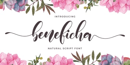 Hello Font lovers, Introducing New Collections Beneficha – Natural Script Font Beneficha – is a Natural Script Calligraphy font with a natural handwritten feel. It has lovely ligatures and alternates that are perfect for any creative design. This handmade font will make your design has a beautiful natural touch for each details. It is perfect for any design project as Invitation,logo, book cover, craft or any design purposes. This font is PUA encoded which means you can access all of the magical glyphs and swashes with ease! It also features a wealth of special features including alternate glyphs and ligatures.