10,000 search results
(0.045 seconds)
- Bank Gothic by Bitstream,
$29.99 A set of square capitals developing from the interest in geometric forms stimulated by the Bauhaus, Bank Gothic was designed by Morris Fuller Benton for ATF in 1930, the same year that Georg Trump designed City for Berthold.
 - TXT Antique Italic by Illustration Ink,
$3.00Bring your scrapbook page to life with unique journaling and titles made possible with this cool italic font. It'll add instant flavor to posters, signs, bulletin boards, and word art that call for an old-fashioned, antiqued flair. - Joyscript Two by Jonahfonts,
$35.00 Joyscript-Two is an upgrade of the 'Plain-Joyscript' Font containing many more ligatures which makes it much more versatile and may be applied to many applications including headlines, logos, ads, captions, packaging, bulletins, posters, books and greeting cards.
 - Occidental Tourist JNL by Jeff Levine,
$29.00Occidental Tourist JNL is based on a set of die-cut cardboard letters used by teachers. They were primarily found on classroom bulletin boards or felt boards. The font's name is a pun on the movie The Accidental Tourist. - Chamber Of Commerce JNL by Jeff Levine,
$29.00Chamber of Commerce JNL is loosely based on a type style used for some rubber stamp letters and numbers from a vintage child's printing set. Originally a cast shadow design, Jeff Levine felt the lettering merited a direct treatment in both regular and oblique styles without the shadow effect. - Monotype Engravers Old English by Monotype,
$29.99 The rather wide, caps-only Monotype Engravers family imitates scripts that evolved from copperplate and steel plate engravers hands of the nineteenth century, which were a quite expressive medium! Monotype Engravers' letters show a strong contrast between thick and thin strokes and have sharply cut serifs. In 1899, Robert Wiebking (who worked for a number of foundries in his time) designed an all-caps typeface named Engravers Roman."" Shortly thereafter, American Type Founders, Inc. (ATF) released another successful ancestor of this design in 1902, ""Engravers Bold,"" designed by Morris Fuller Benton. Engravers Bold was also released by the Barnhart Brothes & Spinder foundry. Also made available by Lanston Monotype at the beginning of the twentieth century, the Engravers faces soon became a popular choice for letter heads, advertising and stationery.
 - Monotype Engravers by Monotype,
$40.99 The rather wide, caps-only Monotype Engravers family imitates scripts that evolved from copperplate and steel plate engravers hands of the nineteenth century, which were a quite expressive medium! Monotype Engravers' letters show a strong contrast between thick and thin strokes and have sharply cut serifs. In 1899, Robert Wiebking (who worked for a number of foundries in his time) designed an all-caps typeface named Engravers Roman."" Shortly thereafter, American Type Founders, Inc. (ATF) released another successful ancestor of this design in 1902, ""Engravers Bold,"" designed by Morris Fuller Benton. Engravers Bold was also released by the Barnhart Brothes & Spinder foundry. Also made available by Lanston Monotype at the beginning of the twentieth century, the Engravers faces soon became a popular choice for letter heads, advertising and stationery.
 - Actium by Type Mafia,
$45.00 Actium is a contemporary multilingual sans serif typeface developed to help perfect typography automatically. Type Mafia has focussed on words with odd combinations of capital letters and numbers, such as product names and postal codes such as WD40 and H1N5, jump out of the text. They sit awkwardly together as the numerals have been designed to work with the lowercase, not the uppercase letters – affecting readability.To fix this Type Mafia invented Smart Capo™. Smart Capo™ Smart Capo is a feature that automatically activates once you type an uppercase letter together with a number. When a capital letter is sat next to a numeral, Smart Capo converts the letter to a mid-cap — a contemporary alternative to small caps — and the default old-style numeral to a lining numeral. Actium’s mid-caps and lining numerals have been designed with the same height (between cap and x-height) so they sit comfortably next to each other and fit more harmoniously into text. Smart Capo applies equal attention to capitalised words without any numbers, such as NAVO and USA, and are also automatically set into mid-capitals. Working on its own, Smart Capo saves time and money for the typographer — taking the pain out of text formatting — and makes it a more pleasurable experience for the reader. This feature is made possible by the use of ‘contextual alternates’, an OpenType feature used in modern font software, working with a set of characters specially designed at mid-cap height. By default these changes automatically take place so it doesn't need to be switched on, it will just work. Actium Actium’s design has an unusual diagonal contrast — much more common in a serifed face than in a sans serif — giving it more bite. The typeface looks elegant when set in large sizes and remains very legible when shown in small sizes. The family consists of six weights in two styles, making a dozen fonts. Weights range from light to black in roman and true italic. All fonts are fully loaded with functional elements. Actium boasts an extended Latin character set and with Greek. This means a wide range of Western languages are supported: perfect for use in bilingual publications and packaging. For numerals, each font includes old-style and lining figures in both proportional and tabular widths, with superiors and inferiors. These allow you to select the right set of numbers for the right task.
 - Hobo by Linotype,
$29.99Hobo font was designed in 1910 by Morris Fuller Benton for American Type Founders. This unusual Art Nouveau-inspired design contains no straight lines and no descenders. It imparts a friendliness to display work such as invitations, menus, signage, and packaging. - Hey Insomnia by Dhan Studio,
$20.00 Hey Insomnia is a modern handwriting, organic style, dynamic and energetic and has a ligature, also has an a-z alternative. Can be used for various purposes such as titles, signatures, logos, correspondence, letterhead, signage, labels, bulletins, posters, badges, etc.
 - Bill Smith by Ghuroba Studio,
$20.00 Bill Smith is a fast writing brush script with textures and swashes. This will make your design or project look perfect with authentic characteristics. It's perfect for branding, marriage invitations, poster designs, business cards, bulletins, stationery, logos, packaging, design and more.
 - LTC Broadway by Lanston Type Co.,
$24.95 Originally designed by Morris Fuller Benton for ATF in 1927, Sol Hess added a lower case in 1929. Hess also drew Broadway Engraved in 1928 for Lanston Monotype. Broadway has become somewhat of a classic icon as an "Art Deco" typeface.
 - Argentina Cursive NF by Nick's Fonts,
$10.00 Here's an elegant addition to Argentina NF, carefully crafted after the pattern provided by master type designer Morris Fuller Benton in 1919. Both versions of this font support the Latin 1252, Central European 1250, Turkish 1254 and Baltic 1257 codepages.
 - Wedge Gothic by HiH,
$12.00 Bold, muscular, vaguely oriental, Wedge Gothic ML is the original name of this font released by Barnhart Bros. and Spindler of Chicago in 1893. The straight-forward, no-nonsense name tells us exactly what to expect: sans-serif letterforms based on wedge-shaped vertical strokes. The typeface was dropped for awhile -- it does not appear in the 1907 catalog for example -- but reappeared in 1925 as Japanette. What is the opposite of "straight-forward" anyway? According to McGrew, Wedge Gothic was originally created for the Chicago Herald newspaper. The designer is unknown. A distinctive display face, useful when a strong and unusual statement is desired. Wedge Gothic ML features: 1. Glyphs for the 1250 Central Europe, the 1252 Western Europe, the 1254 Turkish and the 1257 Baltic Code Pages. Total of 335 glyphs. 2. OpenType GSUB layout features: pnum, ornm, hist & salt. 3. 66 kerning pairs. 4. Both tabular & proportional numbers. 5. Alternate bullets. The zip package includes two versions of the font at no extra charge. There is an OTF version which is in Open PS (Post Script Type 1) format and a TTF version which is in Open TT (True Type)format. Use whichever works best for your applications.
 - ocr-t by FaceType,
$7.00 Being a geometric sanserif ocr-t comes in eleven weights from ultrawhite to infrablack (brightwhite, white, silver, lightgrey, grey, darkgrey, anthracite, black, jetblack). With more than 600 glyphs it covers all your typographic needs and manages to stay at the same place no matter which width you’re using. Its readability and legibility is more than fine although it needs no kerning. The infrablack is really black, in order to achieve this, the form of letters change from darkgrey to anthracite from upright to some kind of upright italic. This also gives opportunity to mix two weights with same colour but different architecture. Find also stylistic sets, alternate letters, lots of bullets, different arrows, hands and well: kind of hearts.
 - 1968 GLC Graffiti by GLC,
$38.00 This font was inspired by the paint brushed letters in use in the 60 - 70s for protest slogans tagged on the cities walls. In those days, we didn't commonly use aerosols like today, so we used paint brushes, with paint or tar cans, drew the letters, and ran away quickly ! Capitals and lower case have the same size, and a lot of alternates characters or ligatures allows the user to vary each letter (until tree alternates for single letters) in each word of a text . Likewise, the words may be easily underscored or intersected by a few stains looking like paint spots, substituted to the following standards characters: [greater], [less], [dagger], [backslash], [bullet], and [underscore].
 - Innamoramento - Unknown license

- Zigatos Graffiti by Sipanji21,
$15.00 This Fonts designed so that users can use it more easily and make graffiti designs easier. Zigatos is very suitable for use in various media such as; packaging, logos, labels, posters, shirt designs, bulletins, typography, and many other media, especially with graffiti look.
 - Deconstructed JNL by Jeff Levine,
$29.00 Deconstructed JNL is another set of rubber stamp alphabet letters and numbers from a 1930s toy printing set. The original typeface of this set is Cheltenham Open. The stamps were printed out and scanned, creating this limited-character font with dual characteristics. At small point sizes it replicates inked rubber stamp impressions, but in larger format it shows angular lines and erratic character shapes as if made from cut paper or lettering that was intentionally made to look damaged.
 - News Gothic by Linotype,
$40.99News Gothic was created by Morris Fuller Benton in 1908 and presented by the American font foundry American Typefounders. Despite, or perhaps because of, the font’s unconventional relationships in proportion and form, News Gothic has long been a popular typeface for almost any use. - Benton Gothic Thin NF by Nick's Fonts,
$10.00 This typeface takes its inspiration from Lightline Gothic, designed by Morris Fuller Benton for ATF in 1908. This version is even lighter, making it suitable for headlines. Both versions of this font support the Latin 1252, Central European 1250, Turkish 1254 and Baltic 1257 codepages.
 - Bank Sans Caps EF by Elsner+Flake,
$35.00 Based on Bank Gothic designed by Morris Fuller Benton in the 30th, Bank Sans Caps from Elsner+Flake offers a wide variety of weights from Light to Bold with Compressed, Semi Condensed and Condensed widths. All weights are also available with Cyrillic character sets.
 - Christmas Melisya by Yoga Letter,
$18.00 "Christmas Melisya" is a unique and elegant blackletter font. This font is equipped with uppercase, lowercase, numerals, punctuation, and multilingual support. Very suitable for Christmas, weddings, winter, Valentine's, invitations, photography, spring, summer, fall, and others.
 - Kametha by Selvia Design,
$12.00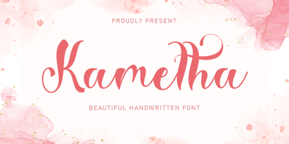 "Kametha" is a beautiful and elegant handwritten font. This font is equipped with uppercase, lowercase, numerals, punctuation, and multilingual support. It is suitable for Christmas, summer, the 4th of July, graduation, a wedding, and others.
 - Christmas Sabila by Yoga Letter,
$18.00 "Christmas Sabila" is an elegant and simple blackletter font. This font is equipped with uppercase, lowercase, numerals, punctuation, and multilingual support. very suitable for Christmas, weddings, invitations, certificates, Valentine's, spring, summer, winter, parties, and others.
 - Nobody Home JNL by Jeff Levine,
$29.00 Nobody Home JNL is unusual in nature as it combines two vintage typestyles into one font. Both have been used for home and property identification for decades and still remain popular. Over the years the letters and numbers have been made of cast steel, aluminum, brass and plastic. The alphabet is in a distinctly bold, asymmetrical style, while the numbers almost take on a calligraphic feel. There is just a basic character set - alphabet, numerals and simple punctuation. While the font has been reasonably spaced and kerned, it's best to remember that neither type design was made with digital technology in mind, so it's suggested to adjust your layout manually for optimum results. Nobody Home JNL is best-suited for replicating street addresses, apartment numbers on doors, and homeowner (or apartment house) names on buildings - whether in print design or as plotter-cut vinyl graphics.
 - The Archies Typeface by IKIIKOWRK,
$17.00 Proudly present The Archies Typeface, created by ikiiko. A summer mood typeface that has a vintage style & holiday vibes. This typeface is perfect for an holiday greeting, summer camp poster, vacation title, beach & tropical design, and so much more. What's Included? Uppercase & Lowercase Number & Punctuation Ligature Multilingual support Format File : TTF & OTF Works on PC & Mac Get also a good offer & FREEBIE at our site : www.ikiiko.com Enjoy our font and if you have any questions, you can contact us by email : ikiikowrk@gmail.com
 - Clearface Gothic by URW Type Foundry,
$35.99 Clearface Gothic was designed by Morris Fuller Benton for American Typefounders. The design was released between 1907 and 1910 for text and display use. Since then, many variations have been released. An interesting typeface, Clearface Gothic is useful in advertising for display and small quantities of text.
 - Phoenix Pro by Red Rooster Collection,
$60.00 The original Phenix typeface was produced in 1935 by Morris Fuller Benton for ATF. Utilizing the original proofs, we have added three additional complementary weights with all the alternate glyphs. Our Phoenix Pro contains all the high-end features expected in a quality OpenType Pro font.
 - Monotype Broadway by Monotype,
$29.99For many type lovers, Broadway is the quintessential Art Deco typeface. Designed as an all-caps typeface in 1927 by Morris Fuller Benton for ATF, it was expanded two years later with a lower case designed by Sol Hess, who also drew the inline version, Broadway Engraved. - Industrial Arts JNL by Jeff Levine,
$29.00 In 1935, Morris Fuller Benton designed Phenix American for American Type Founders. For 2017, the classic Art Deco design has been reinterpreted in an all-caps display version with an ever-so-slight "hand made" feel. Industrial Arts JNL is available in both regular and oblique versions.
 - Neuville by Poetic Poetical,
$29.00 Neuville is a geometric and low-contrast sans serif for everyday use related to typography. The shapes of the characters are clear, simple and balanced to allow for legibility and help the typeface deliver the contents with a neutral and objective voice. The Neuville family includes three weights and has a wide range of OpenType features such as tabular figures, numerators and denominators, superscript and subscript numbers, and case-sensitive forms.
 - Brocks by Par Défaut,
$9.00Square in appearance but with soft vertices, Brocks is composed of more than 400 characters. From Latin Pro for multiple language usable. The latin alphabet is available, for uppercase and lowercase, in numerator, denominator and ordinal version. The same for the numbers with fraction features until 10 figures on each side. Exist in Light, Regular and Bold weights, in Right and Left slant version. All of this available in Variable version. - WallAxe by Nocturnal Workspace,
$17.00 WallAxe Typeface is the first commercial typeface from illusletra Co. A Victorian font with a classic, elegant, vintage, luxury, and clean feel. It comes in 2 styles, inline and bold. Released since 2018. FEATURES Standard Ligature Stylistic Alternate Fraction, Numerator, Denominator Number Styles, Lining Figures, Old Style Ordinals Multi-lingual Characters WallAxe Typeface is suitable for various purposes like logotypes, signage, labels, posters, titles, letterhead, book covers and more. Thank you!
 - Juliette Signature by Ferry Ardana Putra,
$10.00 Juliette Signature is natural hand-lettered font manufactured by Bluetype. You will get full set of lowercase and uppercase letters, numerals and punctuation, multilingual symbols, alternate lowercase, and pack of ligatures.This font that is suitable for branding, signature, wedding invitation, promotion, product packaging, and other needs. This font is natural, simple, but still authentic and very stylish. FEATURES Ligatures Uppercase and Lowercase letters Numbering, Symbols, and Punctuations Multilingual Support
 - Ballpen by Aga Silva,
$15.00 This font is packed with over 1,100 glyphs and gives you vast possibilites to give handwritten feel to your text - be it in English, Íslenska, Russian, Cymraeg or Čeština. Apart from featuring great number of letters there are also dingbats, roman numerals and mathematical operators included. Recommended to use in projects where personalized, legible, cheerful and straightforward look is required. The design is inspired by mature handwriting, unisex in expression.
 - Matita Geometric by Trine Rask,
$30.00 Matita Geometric is part of a larger type family developed from 2005-2019 with handwriting and teaching in mind. A humanistic geometric sans serif in five weights containing mathematical symbols, roman numerals, fractions, superior-& inferior numerals, tabular & proportional figures. The family share proportions and weights to ensure all fonts (family members) work together well. Matita Geometric is also a very basic typeface suitable for many purposes.
 - Monthly Calendar JNL by Jeff Levine,
$29.00Monthly Calendar JNL is a companion font to Calendar Blocks JNL, and features classic wood type lettering and numerals from the 1800s. A set of large numbers are on their own keys, while the numbers 1-31 reside on the A-Z and a-e keys respectively. The days of the week are on the lower case “f” through “l” keys, while the names of the months are found on the “m” through “x” positions. An open rectangle is on the lower case “y” key, and a solid black rectangle is on the “z”. For those who wish to use the 23/30 and 24/31 configurations, they can be found on the left and right parenthesis. - Suiren by Scratch Design,
$9.00 Suiren is a handwritten font with a casual style. Suiren made for a casual design theme like summer vibes, sports, kids, food, beverage, quote, novel, book, etc. Feature: Uppercase & Lowercase Number Punctuation. Multilingual Support (ÀÁÂÃÄÅÇDÐEÈÉÊËIÌÍÎÏNÑOØÒÓÔÕÖUÙÜÚÛWYÝŸỲŸÆŒßÞþ) Support in Mac and Windows OS Easy to install We hope you like it and thank you so much for your purchase :) Scratch Design
 - Comp Sans 226 by Type Associates,
$24.95 Once upon a time, in the days BC (that's Before Computers) there lived a very talented group of men and women whose job it was to render ads by hand. So skillful were these people that some say it was possible to actually identify the typefaces that the layout artists were emulating. Their renderings were swift and slick, no time for detail as it was necessary to do a whole bunch of variations, usually within ridiculous deadlines. Their only tools: bullet-tip markers and bond paper - often mistakes resulted but no time to re-do and white paint was totally unacceptable - just let the slipups be. Here's a simulation of their craft, we don't really know what typeface this was supposed to represent… any ideas?
