10,000 search results
(0.036 seconds)
- Hobo by Bitstream,
$29.99Morris Fuller Benton’s 1910 contribution to the Art Nouveau sanserif, designed for ATF, with all descenders eliminated to encourage combinations of this typeface with other shapes. - PL Tower by Monotype,
$29.99The original Tower Condensed font design is attributed to Morris Fuller Benton (1934). PL Tower Condensed is a tall, condensed slab serif typeface; good for headlines. - Al Bavistage Norm by Aluyeah Studio,
$150.00 Hallo Aluyeaholic! Introducing Bavistage, a broken smile typeface. Inspired by the vintage vibe of a girl's broken smile. It gives you past memories, disappointments and happiness at the same time. Coming with 3 styles, and each style has stunning 130+ alternatives, 30+ ligatures and it's super easy to use. Very suitable for magazine, headline, website, ads, product package and all type of design project you have. Features: OpenType support Multilingual support (15 languages) PUA Encoded Super Easy to Use alternates - It's OpenType support but you can easily call alternates character using special combination like A.2 R.3 h.5 etc. so you don't need special software. To get results like the preview just type B.4av.3is.2.tag.2e.3 You will receive: Al_Bavistage_Normal Al_Bavistage_Stamp Al_Bavistage_Vintage Thanks for checking out my font. I really hope you enjoy using it! If you have any questions I'd be more than happy to answer them, just send me a message!
 - Display Digits One by Gerald Gallo,
$20.00 Display Digits One is a display number font with eight sets of variations of the same digits. The digits 0 through 9, with period and comma in appropriate variations, are prepared as (1) solid, (2) outline, (3) solid with contour outline, (4) outline with 3-D shadow, (5) 3-D shadow only, (6) outline with drop shadow, (7) positive in circle, (8) negative in circle.
 - Display Digits Six by Gerald Gallo,
$20.00 Display Digits Six is a display number font with eight sets of variations of the same digits. The digits 0 through 9, with period and comma in appropriate variations, are prepared as (1) solid, (2) outline, (3) solid with contour outline, (4) outline with 3-D shadow, (5) 3-D shadow only, (6) outline with drop shadow, (7) positive in circle, (8) negative in circle.
 - Display Digits Four by Gerald Gallo,
$20.00 Display Digits Four is a display number font with eight sets of variations of the same digits. The digits 0 through 9, with period and comma in appropriate variations, are prepared as (1) solid, (2) outline, (3) solid with contour outline, (4) outline with 3-D shadow, (5) 3-D shadow only, (6) outline with drop shadow, (7) positive in circle, (8) negative in circle.
 - Display Digits Seven by Gerald Gallo,
$20.00 Display Digits Seven is a display number font with eight sets of variations of the same digits. The digits 0 through 9, with period and comma in appropriate variations, are prepared as (1) solid, (2) outline, (3) solid with contour outline, (4) outline with 3-D shadow, (5) 3-D shadow only, (6) outline with drop shadow, (7) positive in circle, (8) negative in circle.
 - Display Digits Nine by Gerald Gallo,
$20.00 Display Digits Nine is a display number font with eight sets of variations of the same digits. The digits 0 through 9, with period and comma in appropriate variations, are prepared as (1) solid, (2) outline, (3) solid with contour outline, (4) outline with 3-D shadow, (5) 3-D shadow only, (6) outline with drop shadow, (7) positive in circle, (8) negative in circle.
 - Display Digits Ten by Gerald Gallo,
$20.00 Display Digits Ten is a display number font with eight sets of variations of the same digits. The digits 0 through 9, with period and comma in appropriate variations, are prepared as (1) solid, (2) outline, (3) solid with contour outline, (4) outline with 3-D shadow, (5) 3-D shadow only, (6) outline with drop shadow, (7) positive in circle, (8) negative in circle.
 - Display Digits Five by Gerald Gallo,
$20.00 Display Digits Five is a display number font with eight sets of variations of the same digits. The digits 0 through 9, with period and comma in appropriate variations, are prepared as (1) solid, (2) outline, (3) solid with contour outline, (4) outline with 3-D shadow, (5) 3-D shadow only, (6) outline with drop shadow, (7) positive in circle, (8) negative in circle.
 - Display Digits Eight by Gerald Gallo,
$20.00 Display Digits Eight is a display number font with eight sets of variations of the same digits. The digits 0 through 9, with period and comma in appropriate variations, are prepared as (1) solid, (2) outline, (3) solid with contour outline, (4) outline with 3-D shadow, (5) 3-D shadow only, (6) outline with drop shadow, (7) positive in circle, (8) negative in circle.
 - Display Digits Two by Gerald Gallo,
$20.00 Display Digits Two is a display number font with eight sets of variations of the same digits. The digits 0 through 9, with period and comma in appropriate variations, are prepared as (1) solid, (2) outline, (3) solid with contour outline, (4) outline with 3-D shadow, (5) 3-D shadow only, (6) outline with drop shadow, (7) positive in circle, (8) negative in circle.
 - Display Digits Three by Gerald Gallo,
$20.00 Display Digits Three is a display number font with eight sets of variations of the same digits. The digits 0 through 9, with period and comma in appropriate variations, are prepared as (1) solid, (2) outline, (3) solid with contour outline, (4) outline with 3-D shadow, (5) 3-D shadow only, (6) outline with drop shadow, (7) positive in circle, (8) negative in circle.
 - Saguenay by Jonahfonts,
$29.00 Saguenay ia very versatile font which apply to many applications including headlines,web, logos, ads, captions, packaging, bulletins, posters, and greeting cards as well as short texts.
 - Applaud by Jonahfonts,
$20.00 Applaud is a very versatile font which apply to many applications including headlines, logos, ads, captions, packaging, bulletins, posters, and greeting cards as well as short texts.
 - Cloister Open Face by Bitstream,
$29.99Designed for ATF in 1913, Morris Fuller Benton’s version of Nicholas Jenson’s roman, the best of the Venetians and a model for regularity in color and fit. - Steletto OS Flair by Jonahfonts,
$42.00 Condensed Oldstyle Gothic with flair. Great for tight-fitting headlines and other condensed titling situations such as headlines, ads, invitations, captions, packaging, bulletins, posters, and greeting cards.
 - Manual Typewriter JNL by Jeff Levine,
$29.00 Manual Typewriter JNL was modeled from an example of the 1933 design originally created by Morris Fuller Benton, and is available in both regular and oblique versions.
 - Full of Wonder by Jordyn Alison Designs,
$8.00 Full Of Wonder is a smooth and thick font perfect for crafting with! Full Of Wonder features: • Set of alphabet characters, numbers, punctuation, and symbols • 3 standard ligatures & 3 discretionary ligatures • 2 alternate characters • Multilingual support
 - Sheepman by Dharma Type,
$19.99 Sheepman inspired by and based on retro William Page’s No.506 typeface which is popular wooden type fonts of the 19th century. To make soft and natural impressions, the original polygonal design was changed to rounded design. All glyphs had been designed carefully to be retro-looking of the old time and to fill all with nostalgia. This modern wood type includes 3 weights and their matching slanted style and all style have sprayed ends(beginning) alternates for F, H, L, M, N, P, U, f, h, j, m, n, p, q, and u which can be accessed by using OpenType Stylistic alternates or swash alts. Sheepman will be the best solution for posters, titles and anywhere you need vintage lettering.
 - Wedge Gothic by HiH,
$12.00 Bold, muscular, vaguely oriental, Wedge Gothic ML is the original name of this font released by Barnhart Bros. and Spindler of Chicago in 1893. The straight-forward, no-nonsense name tells us exactly what to expect: sans-serif letterforms based on wedge-shaped vertical strokes. The typeface was dropped for awhile -- it does not appear in the 1907 catalog for example -- but reappeared in 1925 as Japanette. What is the opposite of "straight-forward" anyway? According to McGrew, Wedge Gothic was originally created for the Chicago Herald newspaper. The designer is unknown. A distinctive display face, useful when a strong and unusual statement is desired. Wedge Gothic ML features: 1. Glyphs for the 1250 Central Europe, the 1252 Western Europe, the 1254 Turkish and the 1257 Baltic Code Pages. Total of 335 glyphs. 2. OpenType GSUB layout features: pnum, ornm, hist & salt. 3. 66 kerning pairs. 4. Both tabular & proportional numbers. 5. Alternate bullets. The zip package includes two versions of the font at no extra charge. There is an OTF version which is in Open PS (Post Script Type 1) format and a TTF version which is in Open TT (True Type)format. Use whichever works best for your applications.
 - TG Praktikal by Tegami Type,
$30.00 TG Praktikal is new modern geometrics sans with 8 styles & 1 variable font. Inspired by geometrics and gothic typefaces like Bell Centinel, Whitney and Metric, with an additional touch of monospace characters. That makes that TG Praktikal has a unique character set and fit perfectly for body text. Coupled with 3 flavors that can provide different impressions, including approximately 90 multilingual with various OpenType features.
 - Toyster by Sharkshock,
$115.00 Toyster is an all caps display font designed with playfulness in mind. The childlike characters are defined by their rounded corners, low contrast, and pudgy weight. Smooth contours ensure this will look great for large print projects. Use it for a children's' book, toy packaging, cartoon, or store signage. With 3 different versions Toyster is sure to resonate with kids and the young at heart.
 - Bakersfield by Arendxstudio,
$19.00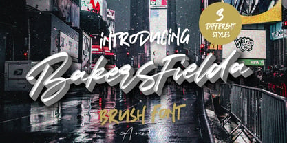 Bakersfield is a combination font with 3 different style variations that will make you feel easy to apply in your various design projects. Bakersfield comes with OpenType features such as stylistic alternates, stylistic sets and ligatures. Bakersfield is perfect for logotypes, posters, badges, book covers, tshirt designs, packaging and much more. Features : • Character Set A-Z • Numerals & Punctuations (OpenType Standard) • Accents (Multilingual characters) • Ligature • Alternate
 - Burner by Graffiti Fonts,
$29.99 Burner is an advanced, connecting, wildstyle graffiti font family including over 200 unique letters, numbers & symbols. The family includes outlines, fills, details and more. Mix and match glyphs from 3 alphabets, add end pieces and more. Repeating flames, arrows & flourishes & other embellishments are included. The Burner family includes 3 full alphabets in each of the 4 styles as well as numbers, punctuation and a wide array of arrows, bars , begining & end pieces. Like some of our earlier wildstyle typefaces such as RaseOne or WildStyle, the Burner font family is a layered type system made to work as a team. In nearly any application 2 or more styles can be easily layered to create advanced, multicolor, wildstyle pieces. This layering system provides a shortcut to time consuming effects such as sharp corners & variable widths on outlines, fills & details. The original glyphs were all drawn by hand taking inspiration from actual painted & drawn wildstyles from RaseOne spanning the late 90's to about 2006.
 - Battlefield - Unknown license

- Zaftig Pro by Typeco,
$49.00Many current poster artists like to reference the graphic type styles that were popular in the ’60s and ’70s. Zaftig is a contemporary font that takes the geometric and blocky inspiration from that era but then steps off in a modern direction. At first glance, it may appear that the capitals of Zaftig all take up the same amount of space, but certain letters have been designed proportionally for a better flow. However, if the designer would prefer to stack the capital letters in even columns, like blocks, then one can use the Titling Alternates feature. In this feature the metrics of all the capital letters are the same, and certain letters have been designed narrower, allowing for seamless stacking. The space, bullet, asterisk have also been given the same monospaced metrics in this feature to make stacking easy. The Small Caps feature in Zaftig is designed so that the small cap glyphs are the same height as the lowercase. This allows the graphic designer not only the option of small caps, but also the ability to mix and match both kinds of letters to create a distinctive style. There are also alternate numerals in the Small Caps feature that match the height of the small caps. In Stylistic Alternates 1 you will find alternate designs for the Q, A, I, J, L, n, and u glyphs. Or you can find alternates in the Glyph Pallet of your favorite OpenType savvy application. Zaftig is more than it appears on the surface. This OpenType font contains over 1200 glyphs and language support. That makes it an international font which contains letters for most languages that use Latin, Central European, Cyrillic, and Greek scripts. - Shelflife by Aah Yes,
$6.95 Shelflife is a display typeface with some extras under the lid. It features all the Standard Open-Type features you'd expect, like Class Kerning and Ligatures, plus some other useful additions and of course accented characters for most European languages and others. In essence it's an easy-to-read headline font with clean lines and a bit of character. There's an outline version that can be layered with the standard version to give the shadow effect seen in the accompanying graphics, simplicity itself to do. There's boxed headlines for SALE, SPECIAL, DISCOUNT (20 in total) all ready-made, plus some which can be tilted at an angle, and done automatically - just easily typed in; easy-to-do bullet numbers; a choice of square or rounded dots on j,ffi, and so on in Stylistic Alternatives; and shorter alternatives for U and N with accents. Details are included in the zip files. The zip file will contain both the OTF and TTF versions of the font. Install only one version, either the OTF or TTF, but not both - otherwise you will get all sorts of incompatibility issues and problems.
 - Monthly Meeting JNL by Jeff Levine,
$29.00 A set of plastic pin-back letters served as the model for Monthly Meeting JNL. Pin-back letters were primarily used on cork bulletin boards for changeable notices and announcements.
 - Century Oldstyle by Bitstream,
$29.99Century Oldstyle is Linn Boyd Benton’s and Morris Fuller Benton’s renovation of Phemister’s Miller & Richard Old Style for ATF forty-five years later, using the Century name for marketing purposes. - MFC Decatur Monogram by Monogram Fonts Co.,
$19.95 The source of inspiration for MFC Decatur Monogram is a beautifully styled blackletter from JM. Bergling’s 1914 book on Monograms and Engraving Alphabets. This elegant decorative style was shown only displayed as Capital letters, so we took it further by crafting matching Smallcaps, Numerals, and lined Capitals, Smallcaps, and Numerals. MFC Decatur Monogram can create one, two, or three letter monograms as well as basic headline and titling settings. It is a refined look that is as darling as it is elegant. Decatur Monogram's numeral set and bullet dividers allow for even more detailed and personalized monograms. If you want to create a more customized look, you can add any of a handful of complimentary brackets to surround your monogram setting. Any monograms or typesettings surrounded by brackets, braces, or parenthesis will auto line the middle lettersets. And lastly, due to its traditional smallcaps - Capitals - smallcaps composition, Decatur Monogram can also type unique headings & titles.
 - Melodia by PintassilgoPrints,
$29.00 This one may look rather strange at a first sight, but it has the true power of coolify written pieces. (Please don’t use it to say “Attorneys’s Conference”, nor “Annual Statement of Accounts”, unless you mean them to be cool, which is very unlikely.) Melodia has 3 glyph drawings for each uppercase letter, 3 more for each lowercase and 2 for the numerals. There are even alternates for punctuation, go figure: there are 3 commas and 3 periods. Surprising. To activate the automatic cycling of all these alternates, simply turn on the Contextual Alternates feature in your application. And it doesn’t hurt to remind: use it only on cool stuff.
 - GoudyMedieval - Unknown license

- Uni Magnetic by Substance,
$10.00 Hand drawn, photocopied, scanned, printed and rescanned x 3.
 - Tingle by Jonahfonts,
$14.95 Tingle has that quick pen look popular with many designs, I have also added the various discretionary ligatures. Usage recommendations: Captions, fliers, packaging, cards, posters, ads, book jackets, manuals, menus, bulletins.
 - Promocyja - 100% free

- Estravaganza by Scholtz Fonts,
$19.95 Estravaganza is an elegant, finely crafted script, with an uneven, drizzled paint line. It has the delicacy of gossamer while boasting the extravagance of bold swashes and loops. Think "ballet-like femininity offset by the distressed paint drizzle of a jackson Pollock canvas." Use Estravaganza to brand perfume, clothing, jewelry, and to enhance wedding invitations, greeting cards and book covers. Language support includes all European character sets.
 - Tinakori by Hendriks Studio,
$26.00 Inspired by a bustling village within Aotearoa New Zealand’s capital city of Wellington, Tinakori is an elegant and sophisticated serif font that invokes art deco, classical art and thin balletic structures. It’s been a passion project that’s finally come to fruition. The simple italic and bold versions help accentuate the individuality of the serif which is precise but holds a fluidity that makes it feel inventive.
 - Norwich Aldine ML by HiH,
$12.00 Norwich Aldine ML is a all-cap typeface with enlarged serifs, designed and produced in wood by William Hamilton Page of Norwich, Connecticut in 1872. Norwich Aldine ML is a fine example of the strength of decorative wood types: large, simple type forms that provide the visual boldness sought by advertisers of the Victorian period. While our marketing has gotten so very sophisticated, there is always a place for a simple, visually strong typeface. Although about 14 miles inland, Norwich, Connecticut lies at the head of the Thames River. The river is both wide and deep, and therefore was not bridged in the early 20th century. Until then, if you wanted to get from Groton on the west bank to the whaling port of New London on the east bank by land, you had to go by way of Norwich. Because of its size, the Thames is navigable all the way from Norwich to New London. Docks were built in Norwich around 1685 and the city became Connecticut’s 2nd largest port by 1800. With the construction of the Norwich & Worcester Railroad in 1835, Page could easily ship his wood type north by rail or south by coastal schooner. Included with our font, Norwich Aldine ML, are two 19th century printer’s ornaments of sailing ships similar to those that sailed up the Thames to Norwich. Reference: Moon’s Handbooks, Connecticut 2nd Edition (Emeryville CA 2004) The family has expanded from one to four fonts: 1. Norwich Aldine ML: the concept font, computer-sharp corners and smooth curves, as we imagine it was designed. 336 Glyphs including some reduced-width alternatives for better letter spacing. 2. Norwich Aldine Worn ML: the way actual wooden type would look after have been used for a while. 332 Glyphs 3. Norwich Aldine Distressed ML: the way the wooden type would look after it had really been used, perhaps abused. Alternatives to the more popular letters reflect the damage that typically occurs on a well-wormn font, with nicks, cuts and scratches and the overall wear that reduces the overall height and leads to uneven inking due to varying heights in the chase. A couple of bullets look like bullet holes. 345 glyphs. 4. Norwich Aldine Cyrillic: Cyrillic includes alll English and Cyrillic letters for MS Windows Code Page 1251, ISO 8859-5 and MacOS Cyrillic. 235 glyphs. We did Cyrillic because is was fun and we felt the basic design cried out for Cyrillic. While obviously subjective, we hope you will agree.
 - Hwaiting Sans by Konstantine Studio,
$20.00 Inspired by the emerging Korean culture that grabbing the worldwide actuation in so many realms of the industry. To bridge the vibes and to make it easier to consume, we found the gap to fill with simple things in life that are useful for it, and yes, it’s a new day it’s a new font. So without any further ado, please welcome Hwaiting Sans. 2/3 series of Korean vibes typefaces. It’s a sans-serif font with bold and strong vibes to catch up with today’s graphic design trends. Crafted with deep research about Korean traditional letters, shaped up with the approach of universal Latin letters. This is the second drop of 3 series from the Hwaiting family. So stay tuned for the upcoming release.


