10,000 search results
(0.03 seconds)
- Reliquaire AOE by Astigmatic,
$24.95 Historical elegance finds its place in the digital era with Reliquaire AOE. Reliquaire AOE is the historical revival and elaboration of the "Memorial" typeface created by Boston Type Foundry in January of 1881. What began as a basic character set of Capitals, lowercase, numerals, and a small handful of punctuation characters has been expanded to a full character set including unlimited fractionals, superiors & inferiors, ordinals, tabular & proportional figures, and an expanded language glyph set. History has found new life.
 - Evuschka by Petra Sucic Roje,
$33.00 A dramatic contrast between thick and thin strokes, “ball” shapes at stroke terminals, and straight hairline serifs are main Evuschka characteristics. In this font, the x-height is specifically accentuated in relation to body height. In spite of its extreme geometrical shape, Evuschka exudes fairytale romance. Belonging to decorative type fonts, it is best suited for headlines, titles, and small amounts of text in large sizes. Evuschka was selected for TDC Certificate of Typographic Excellence 2017.
 - Forever Loved by Joanne Marie,
$19.99 Forever Loved is a delightful new handwriting font which is full of character and suitable for every occasion. It has OpenType features such as alternates (two sets of uppercase alternates), swashes, ligatures, terminal forms in lowercase, and a European language support. This wonderful script font is perfect for wedding stationery, engagements, and baby, family and friends orientated themes. Not only that - it can be used for logos, tattoos, delicious food and drink, mugs, clothing, the list is endless!
 - Fineprint by Monotype,
$29.99The script typeface named Fineprint is based on its designer's own handwriting, or at least as Steve Matteson saw his handwriting on a really good day. Unlike many digitizations of handwriting, Fineprint maintains a consistent harmony and balance across its letters in a line of text. The Fineprint family includes a number of swash and alternate letterforms, which helps pull this quirky personal nature off. Use Fineprint whenever you want to make something appear personal, friendly, or informal! - The great by Sulthan Studio,
$14.00 The great display font. The great -This font is perfect for modern projects, quotes, shirt designs, websites, branding, children's designs, svg designs, blogs, logos, invitations and more! The great - includes alternative characters. Coded with Unicode PUA, which allows full access to all additional characters without having special design software. Mac users can use Font Book. Windows users can use the Character Map to view and copy one of the additional characters to paste into your favorite text editor.
 - Rosiecated by sizimon,
$20.00 Introducing our New Collection, she is really pretty and sweet. Let's call Rosiecated, she's a stylish modern calligraphy with casual chic flair. She's perfect for packaging, wedding invites and cards, and branding. She will show you with a full set of lower & uppercase letters, a large range of punctuation, numerals, and multilingual support. What she have : Web Font PUA encode Multilingual support If you have any question please do not hesitate to contact me. Thank You!
 - Bokar by Pelavin Fonts,
$25.00 I am inspired by imagery that technology has rendered obsolete. I treasure anachronistic packaging and design which has somehow evaded obliteration by focus groups.I especially admire the packaging for A&P coffee brands Eight O'Clock, Red Circle and Bokar whose eccentric yet elegant typography harkens back to an earlier, less complicated era. The font Bokar is my nod of appreciation to those robust and full-bodied blends spared from the bland, tasteless scourge of corporate branding.
 - Darling Duo Script by Haksen,
$13.00 Darling Duo include two font styles with full set of handwritten style draw for script and cute style letters for sans. Numerals, a large range of punctuation and ligatures giving realistic hand-lettered style. In order to use the beautiful ligatures for script also all uppercase for sans serif, you need a program that supports OpenType features such as Adobe Illustrator CS, Adobe Photoshop CC, Adobe Indesign and Corel Draw. Thanks and have a great day :) Haksen
 - Black Stay Script by madjack.font,
$15.00 Black Stay Script is a signature collection font with natural movement creating an elegant, classy and beautiful look for your latest project. Black Stay Script is perfect for branding projects, logos, wedding designs, social media posts, advertising, product packaging, product design, labels, photography, watermarks, invitations, stationery and any project that requires a handwritten feel. Full set of standard alphabet and punctuation Additional set of brushed lowercase letter endings Handwriting binder. Thank you so much for checking out my shop!
 - Wedding Doodles Too by Outside the Line,
$19.00Wedding Doodles Too is the follow-up font to the popular Wedding Doodles. This font gives you all you need to make your own invitations, announcements, RSVP cards, save your date cards and thank you notes. Font includes 3 sets of hand-lettered words… save our date, thank you and RSVP. Just add a wedding cake, flowers, top hat, wedding bell, heart or flower and you are done. Check out Wedding Doodles, you may need both. - Retroteen by Ask Foundry,
$19.00 Meet "Retroteen," the font that takes you on a nostalgic journey back to the vibrant 80s and 90s. The striking contrast between horizontal and vertical strokes adds a unique touch, exuding a bold and dynamic personality. From funky posters and album covers to retro-themed branding and advertisements, this font brings an air of nostalgia and playfulness to any artwork. It is also provides language support for the full Latin alphabet along with Western and Eastern European characters.
 - P22 Torrone by IHOF,
$29.95 Precursors to Torrone, the fonts are found among the type experiments of Art Deco artists in 1930’s Europe. Fonts of this type with chunky, geometry-driven lower case letters combined with somewhat flamboyant, brush-influenced upper case can be found in the logotypes for Mignon Chocolate Factory in Germany and Baci bon-bons still in use today by Italy’s Perugina Candies. Torrone includes alternate lower case characters and full Central European glyph sets with over 550 characters included!
 - Alaskano by Maulana Creative,
$14.00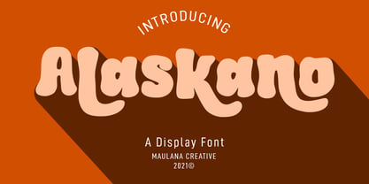 Alaskano is a handwritten Display font. With chunky bold stroke, bulb and fun character with a bit of ligatures and lowercase alternate. To give you an extra creative work. Alaskano font support multilingual more than 100+ language. This font is good for logo design, Social media, Movie Titles, Books Titles, a short text even a long text letter and good for your secondary text font with sans or serif. Make a stunning work with Alaskano font. Cheers, MaulanaCreative
 - Sardo by SD Fonts,
$34.00 Not serif, nor sans, partly soft, partly crude, but highly individual. Sardo comes with a vivid slanted look resulting from the contrast of its common classic stroke difference and straight thin serifs, adding a rigid component to its appearance. Thus Sardo shows a strong character projecting a huge amount of individuality. A new display font made to draw attention where classic serifs and sans serifs appear just dull. So please meet Sardo, a cosy wild cat showing Sharpe claws.
 - Collean by Create Big Supply,
$15.00 Collean is a handwritten, monoline-style Signature typeface. Be mesmerized by its beautiful style and use it to create beautiful wedding invitations, beautiful stationary art, eye-catching social media posts and more! This font is PUA encoded which means you can access all the amazing glyphs and ligatures easily Features: Uppercase & lowercase Numbers and punctuation Multilingual Ligatures Alternate PUA Encoding Full Character Set !"#$%&'()*+,-./0123456789:;?@ABCDEFGHIJKLMNOPQRSTUVWXYZ[\]^_`abcdefghijklmnopqrstuvwxyz{|}~¡¢£¤¥§¨©ª«®¯°±²³´¹º»¿ÀÂÃÄÅÆÇÈÉÊËÌÍÎÏÑÒÓÔÕÖ×ØÙÛÜÝÞßàáâãäåæçèéêëìíîïñòóôõö÷øùúûüýþÿ•†‹›‒–ˆˇ˜€“‘ŸœŒš˚”’ıžŠ
 - Zalea by Eurotypo,
$42.00 Zalea script is an expressive and dynamic font. It has an appealing "punch" characteristic that gives it its charm and strong visual impact. Zalea was specially thought for labelling and packaging design. It has also good legibility for body text, useful in magazines and web pages. We recommended it for headlines, logos or where a friendly script is needed. Zalea font includes a full international character compliment, alternate characters, swash and ligatures to allow flawless typesetting in OpenType format.
 - Oh, diving into the whimsical world of fonts, are we? Let me tell you about Wiggly – it's quite the charmer. Imagine a font that decided to throw caution to the wind and dance to its own rhythm. That...
- TE Classic 2 by Tharwat Emara,
$79.00 TE Classic2 Tharwat Emara is an exquisite Arabic Thuluth font that is designed to add a touch of elegance and sophistication to any project. This font is named after the renowned calligrapher Tharwat Emara, who is widely celebrated for his outstanding work in the field of Arabic calligraphy. One of the most remarkable features of TE Classic2 Tharwat Emara is its impeccable balance between the thick and thin lines. The font's curves and strokes are carefully crafted to create a seamless and harmonious flow, giving it a unique and mesmerizing appearance. The intricacies and details of the font's characters reflect the skill and artistry of the calligrapher and demonstrate the perfect balance between tradition and modernity. TE Classic2 Tharwat Emara is a perfect choice for designers and artists who want to add a touch of Arabic culture and tradition to their projects. The font comes with a full set of Arabic characters, including ligatures, diacritical marks, and numerals. The characters are designed to be easily legible and readable, making it suitable for use in both print and digital media. One of the most striking aspects of TE Classic2 Tharwat Emara is its versatility. It can be used for a wide range of applications, from branding and advertising to editorial and publishing. Its unique and captivating design will make any project stand out and attract customers, making it a valuable investment for designers and artists. The font's exquisite design is not only limited to its characters, but it extends to its overall layout and spacing. TE Classic2 Tharwat Emara has a perfect balance between its characters' shapes and spaces, giving it a smooth and consistent look. The font's spacing is also carefully crafted to ensure that the characters are well-organized and easy to read. TE Classic2 Tharwat Emara is not just a font; it's a work of art. Its unique design and intricate details make it stand out from other Arabic fonts in the market. The font's exquisite design is a result of the meticulous attention to detail paid by the calligrapher, which is evident in every stroke and curve of the font's characters. Overall, TE Classic2 Tharwat Emara is a font that celebrates the beauty and elegance of Arabic calligraphy. Its captivating design and versatility make it an excellent choice for designers and artists who want to add a touch of tradition and culture to their projects. With its unique and mesmerizing appearance, TE Classic2 Tharwat Emara is sure to attract customers and make any project stand out.
 - Heading Now by Zetafonts,
$39.00 Heading Now is the new incarnation of Heading Pro, developing the original typeface family designed by Francesco Canovaro for Zetafonts into a superfamily with 160 variant combinations. Built around 10 different widths, ranging from ultra-compressed to ultra-wide, and eight weights from thin to heavy, Heading Now provides a full spectrum of sans serif type solutions to your design problems. Born as a space-optimizing typeface for headers and titles, Heading Now can be used in its compressed widths to manage space on the printed page and on the screen. In these widths Heading Now excels in titles and subheadings, timetables, infographics and in situations of exuberant and excessive copywriting. On the other side of the width spectrum, you can find extended width variants, ready to be used for titling where style and energy matter more than pixel or paper economy. Heading family is not only made of extreme widths: you can use the medium width range to design body text. Matching italics provide versatility in text use, as well as a dynamic display alternate to the bolder weights. Heading Now keeps the original design of Heading, but extends the width and weight range while keeping its (post) modernist attention to readability and details. Each Heading Now font includes over 1100 characters with coverage for 200+ languages using Latin, Cyrillic and Greek alphabets. A full array of open-type features is included in each weight featuring also stylistic alternates, small caps, old-style and tabular numerals and positional figures. • Suggested uses: born as a space-optimizing typeface for headers and titles, Heading Now can be used in its compressed widths to manage space on the printed page and on the screen. Perfect for contemporary branding, web design, packaging and countless other projects; • 162 styles: 8 weights + 8 italics x 10 different widths + 2 variable fonts; • 1100 glyphs in each weight; • Useful OpenType features: Access All Alternates, Small Capitals From Capitals, Case-Sensitive Forms, Glyph Composition / Decomposition, Denominators, Fractions, Kerning, Standard Ligatures, Lining Figures, Localized Forms, Mark Positioning, Mark to Mark Positioning, Numerators, Oldstyle Figures, Ordinals, Proportional Figures, Stylistic Alternates, Scientific Inferiors, Small Capitals, Stylistic Set 1, Stylistic Set 2, Stylistic Set 3, Stylistic Set 4, Subscript, Superscript, Tabular Figures, Slashed Zero; • 220 languages supported (extended Latin, Cyrillic, Greek alphabets): English, Spanish, Portuguese, French, Russian, German, Javanese (Latin), Vietnamese, Turkish, Italian, Polish, Afaan Oromo, Azeri, Tagalog, Sundanese (Latin), Filipino, Moldovan, Romanian, Indonesian, Dutch, Cebuano, Igbo, Malay, Uzbek (Latin), Kurdish (Latin), Swahili, Greek, Hungarian, Czech, Haitian Creole, Hiligaynon, Afrikaans, Somali, Zulu, Serbian, Swedish, Bulgarian, Shona, Quechua, Albanian, Catalan, Chichewa, Ilocano, Kikongo, Kinyarwanda, Neapolitan, Xhosa, Tshiluba, Slovak, Danish, Gikuyu, Finnish, Norwegian, Sicilian, Sotho (Southern), Kirundi, Tswana, Sotho (Northern), Belarusian (Latin), Turkmen (Latin), Bemba, Lombard, Lithuanian, Tsonga, Wolof, Jamaican, Dholuo, Galician, Ganda, Low Saxon, Waray-Waray, Makhuwa, Bikol, Kapampangan (Latin), Aymara, Zarma, Ndebele, Slovenian, Tumbuka, Venetian, Genoese, Piedmontese, Swazi, Zazaki, Latvian, Nahuatl, Silesian, Bashkir (Latin), Sardinian, Estonian, Afar, Cape Verdean Creole, Maasai, Occitan, Tetum, Oshiwambo, Basque, Welsh, Chavacano, Dawan, Montenegrin, Walloon, Asturian, Kaqchikel, Ossetian (Latin), Zapotec, Frisian, Guadeloupean Creole, Q’eqchi’, Karakalpak (Latin), Crimean Tatar (Latin), Sango, Luxembourgish, Samoan, Irish, Maltese, Tzotzil, Fijian, Friulian, Icelandic, Sranan, Wayuu, Papiamento, Aromanian, Corsican, Breton, Amis, Gagauz (Latin), Māori, Tok Pisin, Tongan, Alsatian, Atayal, Kiribati, Seychellois Creole, Võro, Tahitian, Scottish Gaelic, Chamorro, Greenlandic (Kalaallisut), Kashubian, Faroese, Rarotongan, Sorbian (Upper Sorbian), Karelian (Latin), Romansh, Chickasaw, Arvanitic (Latin), Nagamese Creole, Saramaccan, Ladin, Kaingang, Palauan, Sami (Northern Sami), Sorbian (Lower Sorbian), Drehu, Wallisian, Aragonese, Mirandese, Tuvaluan, Xavante, Zuni, Montagnais, Hawaiian, Marquesan, Niuean, Yapese, Vepsian, Bislama, Hopi, Megleno-Romanian, Creek, Aranese, Rotokas, Tokelauan, Mohawk, Onĕipŏt, Warlpiri, Cimbrian, Sami (Lule Sami), Jèrriais, Arrernte, Murrinh-Patha, Kala Lagaw Ya, Cofán, Gwich’in, Seri, Sami (Southern Sami), Istro-Romanian, Wik-Mungkan, Anuta, Cornish, Sami (Inari Sami), Yindjibarndi, Noongar, Hotcąk (Latin), Meriam Mir, Manx, Shawnee, Gooniyandi, Ido, Wiradjuri, Hän, Ngiyambaa, Delaware, Potawatomi, Abenaki, Esperanto, Folkspraak, Interglossa, Interlingua, Latin, Latino sine Flexione, Lojban, Novial, Occidental, Old Icelandic, Old Norse, Slovio (Latin), Volapük;
 - WolfieBoy - Unknown license

- David Hadash Sans by Monotype,
$50.99Monotype Imaging is pleased to present David Hadash (New" David), the full family of typefaces by Ismar David, in its intended authentic form. The Estate of Ismar David has sought to revive this jewel of Twentieth-Century design by granting an exclusive license to Monotype Imaging to implement it in industry-standard format. Never before has the typeface in its full set of sub-styles been made available to the design community. David Hadash consists of three style families, Formal, Script, and Sans. Each of these appears in three weigths: regular, medium, and bold. Originally devised as a companion to the upright Formal style, the Script style has a beauty and grace all its own that allows it to be used for full-page settings also. While it is forward-leaning and dynamic, it does not match any of the existing cursive styles of Hebrew script. Ismar David created an eminently readable hybrid style which is like no other by inclining the forms of the upright while blending in some features of Rashi style softened with gentle curves. One can say that the Script style is the first truly italic, not just oblique, typeface for Hebrew script. Although the proportions of the Sans style are very similar to those of the Formal style, its visual impression is stunningly different. If the Formal style is believably written with a broad-point pen, the Sans is chiseled in stone. Rounded angles turn angular and stark. The end result is an informal style that evokes both ancient and contemporary impressions. David Hadash (Modern) supports the writing conventions of Modern Hebrew (including fully vocalized text) in addition to Yiddish and Ladino. David Hadash Biblical is a version of the Formal style that supports all the complexities of Biblical Hebrew, including vocalization and cantillation marks. " - Swank by ITC,
$29.99Jill Bell's typefaces are energetic, highly decorative, and refreshingly unpredictable. Some are friendly and childlike, while others are rough and nervous. Her latest creation is ITC Swank, a connected script whose shabby-chic" sophistication communicates a worn elegance. Bell begins the design process "with black stuff on white paper," she explains, preferring to draw letters before she digitizes them. Often the inspiration for her typefaces comes from a piece of hand-lettering. "Bruno began as a reminder to buy cat food," she says, "and ITC Swank started out as a small bit of lettering for Wurlitzer Pianos." Bell finds that working with blocks of lettering is a good start for script typefaces. "If I'm drawing a script typeface, I have to write out sentences in the letters first," she explains. "Drawing each letter separately doesn't establish the flow and spontaneity that scripts deserve." Bell's newest design is ITC Swank. It's a somewhat tattered formal script with definite links to early copperplate scripts. Though probably not for wedding invitations, Swank's elegant underpinnings are evident, with its slightly narrow proportions and a baseline that can best be called "bouncy." Graphic designers will appreciate the abundance of swash letters, making it easy to create distinctive headlines and short blocks of copy. Bell has a fondness for the "open, genuine" quality of Chinese and Japanese calligraphy. "Eastern styles incorporate the natural flow of the hand," she says. "Natural, human qualities shine through. Mistakes are accepted, not scorned as in the 'white-out' Western culture." This philosophy is evident in Bell's own designs. Whether it's ITC Clover 's carefree spirit, the slightly spooky Hollyweird, Caribbean 's< rustic charm or the weathered elegance of ITC Swank, there is a natural honesty in her work." - Aviano Gothic by insigne,
$22.00 The Aviano collection returns, refined into a new, mid-contrast sans-serif inspired by the design and style of early 1900ís American engravers. Engravers would meticulously carve lettering into copper plates for printing, and often these letters, for more impact, would be extended and only utilize capitals. While taking inspiration from the past, Aviano Gothic is distinctly one-of-a-kind, and is not a revival, but instead is based on the structure of pre-existing Aviano type families for interchangeability and interoperability. Aviano Gothic has been diligently honed to be sinuous and seductive, making it great for high-end work such as including jewelry, beauty, and other luxury products. The full Aviano Gothic family presents you with six distinct weights and is full of OpenType options. Available with the face are deco alternates for replicating inscriptions and signage of the í20s and í30s. Style sets are offered, together with four full sets of art deco-inspired alternates, swashes, and titling, in addition to an expansive range of other alternates to help ìunique-ifyî your layouts. Aviano Gothic also features forty discretionary ligatures for inventive typographic compositions. Begin planning your work with Aviano Gothic by looking at these options in the instructive .pdf brochure. OpenType-able applications, including Quark or the Adobe suite, allow for the comprehensive benefit of the ligatures and alternates. This typeface also features the glyphs to aid a broad number of languages. Several variants have been made to extend the usefulness of the typeface, and it makes for a fine substitute for Copperplate, ITC Blair or Engravers Gothic. Aviano Gothic also pairs perfectly with the other members of the Aviano collection, including the original Aviano, Aviano Serif, Aviano Sans, Aviano Didone, Aviano Flare, Aviano Future, Aviano Wedge, Aviano Contrast and Aviano Slab.
 - David Hadash Script by Monotype,
$50.99Monotype Imaging is pleased to present David Hadash (New" David), the full family of typefaces by Ismar David, in its intended authentic form. The Estate of Ismar David has sought to revive this jewel of Twentieth-Century design by granting an exclusive license to Monotype Imaging to implement it in industry-standard format. Never before has the typeface in its full set of sub-styles been made available to the design community. David Hadash consists of three style families, Formal, Script, and Sans. Each of these appears in three weigths: regular, medium, and bold. Originally devised as a companion to the upright Formal style, the Script style has a beauty and grace all its own that allows it to be used for full-page settings also. While it is forward-leaning and dynamic, it does not match any of the existing cursive styles of Hebrew script. Ismar David created an eminently readable hybrid style which is like no other by inclining the forms of the upright while blending in some features of Rashi style softened with gentle curves. One can say that the Script style is the first truly italic, not just oblique, typeface for Hebrew script. Although the proportions of the Sans style are very similar to those of the Formal style, its visual impression is stunningly different. If the Formal style is believably written with a broad-point pen, the Sans is chiseled in stone. Rounded angles turn angular and stark. The end result is an informal style that evokes both ancient and contemporary impressions. David Hadash (Modern) supports the writing conventions of Modern Hebrew (including fully vocalized text) in addition to Yiddish and Ladino. David Hadash Biblical is a version of the Formal style that supports all the complexities of Biblical Hebrew, including vocalization and cantillation marks. " - David Hadash Biblical by Monotype,
$50.99Monotype Imaging is pleased to present David Hadash (New" David), the full family of typefaces by Ismar David, in its intended authentic form. The Estate of Ismar David has sought to revive this jewel of Twentieth-Century design by granting an exclusive license to Monotype Imaging to implement it in industry-standard format. Never before has the typeface in its full set of sub-styles been made available to the design community. David Hadash consists of three style families, Formal, Script, and Sans. Each of these appears in three weigths: regular, medium, and bold. Originally devised as a companion to the upright Formal style, the Script style has a beauty and grace all its own that allows it to be used for full-page settings also. While it is forward-leaning and dynamic, it does not match any of the existing cursive styles of Hebrew script. Ismar David created an eminently readable hybrid style which is like no other by inclining the forms of the upright while blending in some features of Rashi style softened with gentle curves. One can say that the Script style is the first truly italic, not just oblique, typeface for Hebrew script. Although the proportions of the Sans style are very similar to those of the Formal style, its visual impression is stunningly different. If the Formal style is believably written with a broad-point pen, the Sans is chiseled in stone. Rounded angles turn angular and stark. The end result is an informal style that evokes both ancient and contemporary impressions. David Hadash (Modern) supports the writing conventions of Modern Hebrew (including fully vocalized text) in addition to Yiddish and Ladino. David Hadash Biblical is a version of the Formal style that supports all the complexities of Biblical Hebrew, including vocalization and cantillation marks. " - David Hadash Formal by Monotype,
$50.99Monotype Imaging is pleased to present David Hadash (New" David), the full family of typefaces by Ismar David, in its intended authentic form. The Estate of Ismar David has sought to revive this jewel of Twentieth-Century design by granting an exclusive license to Monotype Imaging to implement it in industry-standard format. Never before has the typeface in its full set of sub-styles been made available to the design community. David Hadash consists of three style families, Formal, Script, and Sans. Each of these appears in three weigths: regular, medium, and bold. Originally devised as a companion to the upright Formal style, the Script style has a beauty and grace all its own that allows it to be used for full-page settings also. While it is forward-leaning and dynamic, it does not match any of the existing cursive styles of Hebrew script. Ismar David created an eminently readable hybrid style which is like no other by inclining the forms of the upright while blending in some features of Rashi style softened with gentle curves. One can say that the Script style is the first truly italic, not just oblique, typeface for Hebrew script. Although the proportions of the Sans style are very similar to those of the Formal style, its visual impression is stunningly different. If the Formal style is believably written with a broad-point pen, the Sans is chiseled in stone. Rounded angles turn angular and stark. The end result is an informal style that evokes both ancient and contemporary impressions. David Hadash (Modern) supports the writing conventions of Modern Hebrew (including fully vocalized text) in addition to Yiddish and Ladino. David Hadash Biblical is a version of the Formal style that supports all the complexities of Biblical Hebrew, including vocalization and cantillation marks. " - RQND Pro V.2 by Tondi Republk,
$25.00 Introducing RQND Pro 2 - The Futuristic and Industrial Sans Serif Font Welcome to the world of RQND Pro 2, a cutting-edge sans serif font designed to elevate your designs to new heights. With its industrial aesthetic and futuristic appeal, this font is the perfect choice for projects seeking a bold and contemporary look. Key Features: 1,201 Glyphs: RQND Pro 2 boasts an extensive character set, offering you a vast array of design possibilities. Supports 123 Languages: No matter where your audience is, this font ensures that your message is conveyed clearly and effectively. 20 Font Styles: With 5 font weights and 5 font widths, RQND Pro 2 offers 20 unique styles to suit every creative vision. Expanded to Extra Condensed: Whether you need a spacious layout or a compact design, this font delivers unmatched versatility. 18 OpenType Features: Unlock the full potential of RQND Pro 2 with various OpenType features, including small caps, alternate characters, standard numerals, circled numerals, fractions, and more. All Caps Font: Embrace the power of uppercase letters with this font, enhancing the impact of your message. Full Character Set: From standard numerals to punctuation marks, mathematical symbols to special characters, RQND Pro 2 has everything you need for seamless communication. Latin and Cyrillic Support: Perfect for international projects, this font provides complete support for both Latin and Cyrillic languages. RQND Pro 2 empowers designers, creatives, and typographers to explore new design territories. Its sleek and modern appearance makes it ideal for tech branding, UI design, editorial projects, advertisements, web design, and more. Discover a font that combines sophistication with contemporary flair. Elevate your designs with RQND Pro 2 and leave a lasting impression on your audience. Explore the full range of styles and unleash your creativity today.
 - 112 Hours by Device,
$9.00 Rian Hughes’ 15th collection of fonts, “112 Hours”, is entirely dedicated to numbers. Culled from a myriad of sources – clock faces, tickets, watches house numbers – it is an eclectic and wide-ranging set. Each font contains only numerals and related punctuation – no letters. A new book has been designed by Hughes to show the collection, and includes sample settings, complete character sets, source material and an introduction. This is available print-to-order on Blurb in paperback and hardback: http://www.blurb.com/b/5539073-112-hours-hardback http://www.blurb.com/b/5539045-112-hours-paperback From the introduction: The idea for this, the fifteenth Device Fonts collection, began when I came across an online auction site dedicated to antique clocks. I was mesmerized by the inventive and bizarre numerals on their faces. Shorn of the need to extend the internal logic of a typeface through the entire alphabet, the designers of these treasures were free to explore interesting forms and shapes that would otherwise be denied them. Given this horological starting point, I decided to produce 12 fonts, each featuring just the numbers from 1 to 12 and, where appropriate, a small set of supporting characters — in most cases, the international currency symbols, a colon, full stop, hyphen, slash and the number sign. 10, 11 and 12 I opted to place in the capital A, B and C slots. Each font is shown in its entirety here. I soon passed 12, so the next logical finish line was 24. Like a typographic Jack Bauer, I soon passed that too -— the more I researched, the more I came across interesting and unique examples that insisted on digitization, or that inspired me to explore some new design direction. The sources broadened to include tickets, numbering machines, ecclesiastical brass plates and more. Though not derived from clock faces, I opted to keep the 1-12 conceit for consistency, which allowed me to design what are effectively numerical ligatures. I finally concluded one hundred fonts over my original estimate at 112. Even though it’s not strictly divisible by 12, the number has a certain symmetry, I reasoned, and was as good a place as any to round off the project. An overview reveals a broad range that nonetheless fall into several loose categories. There are fairly faithful revivals, only diverging from their source material to even out inconsistencies and regularize weighting or shape to make them more functional in a modern context; designs taken directly from the source material, preserving all the inky grit and character of the original; designs that are loosely based on a couple of numbers from the source material but diverge dramatically for reasons of improved aesthetics or mere whim; and entirely new designs with no historical precedent. As projects like this evolve (and, to be frank, get out of hand), they can take you in directions and to places you didn’t envisage when you first set out. Along the way, I corresponded with experts in railway livery, and now know about the history of cab side and smokebox plates; I travelled to the Musée de l’imprimerie in Nantes, France, to examine their numbering machines; I photographed house numbers in Paris, Florence, Venice, Amsterdam and here in the UK; I delved into my collection of tickets, passes and printed ephemera; I visited the Science Museum in London, the Royal Signals Museum in Dorset, and the Museum of London to source early adding machines, war-time telegraphs and post-war ration books. I photographed watches at Worthing Museum, weighing scales large enough to stand on in a Brick Lane pub, and digital station clocks at Baker Street tube station. I went to the London Under-ground archive at Acton Depot, where you can see all manner of vintage enamel signs and woodblock type; I photographed grocer’s stalls in East End street markets; I dug out old clocks I recalled from childhood at my parents’ place, examined old manual typewriters and cash tills, and crouched down with a torch to look at my electricity meter. I found out that Jane Fonda kicked a policeman, and unusually for someone with a lifelong aversion to sport, picked up some horse-racing jargon. I share some of that research here. In many cases I have not been slavish about staying close to the source material if I didn’t think it warranted it, so a close comparison will reveal differences. These changes could be made for aesthetic reasons, functional reasons (the originals didn’t need to be set in any combination, for example), or just reasons of personal taste. Where reference for the additional characters were not available — which was always the case with fonts derived from clock faces — I have endeavored to design them in a sympathetic style. I may even extend some of these to the full alphabet in the future. If I do, these number-only fonts could be considered as experimental design exercises: forays into form to probe interesting new graphic possibilities.
 - ChrisMaster - Personal use only

- Neon Goo by Hanoded,
$16.00 I’m a bit of a sucker for neon lights, especially in big cities. My favourite city is Tokyo, with its brightly coloured billboards and its back alleys full of neon-lit eateries. At first sight, Neon Goo is a slightly warped font, with some funny looking glyphs and a generous spacing. When you start using it, you’ll find out that the glyphs do complement each other! Neon Goo comes with all diacritics and a set of alternates for the lower case letters.
 - Dez Squeeze by Dezcom,
$29.00 When you don't want to speak softly, Squeeze can shout above the crowd. Say it loudly and proudly, this face does not have a weight problem. The Dez Squeeze Pro Family is also now available from Dezcom in seven widths. http://www.myfonts.com/fonts/dezcom/dez-squeeze-pro/ Dez Squeeze has 483 glyphs with uppercase, lowercase, proportional lining figures, unicase, stylistic sets, alternates, ordinals, and case specific punctuation. It has a full range of diacritics and covers all European languages using the Latin script.
 - Symbah by Hashtag Type,
$19.00 Symbah is fun, a carefree hand drawn typeface with a child-like spirit. Made with a brush and ink, and then converted into a digital format for you to enjoy. The design is fresh, organic and produced purely by hand and brush, a technique not replicated by digital methods alone. Symbah is full of personality and is ideal for projects that need creativity with an imaginative, and unique feel. Details include manual edited kerning and spacing, ligatures and case-sensitive punctuation.
 - ABC Idea by Alphabets by Chileans (A.B.C.),
$18.00 ABC Idea is a contemporary geometric sans full of opentype features in Regular, Bold and very "fast" Italic. The design is an experimental fusion or mix between Humanist, Geometric and Grotesque models. The fine drawing in all letters and signs has precise ink traps to highlight contrast jus like lettering and calligraphy does, then ABC Idea re-creates this exquisite graphic details into the digital world. Designed by Miguel H. Montoya Fonts in Use Images by letargo.cl Magazine. Art Direction by studioprado.cl
 - Heart love by Amarlettering,
$25.00 Heart Love come with 320+ glyphs. The alternative characters were divided into several OpenType features such as Swash, Stylistic Sets, Stylistic Alternates, Contextual Alternates. The OpenType features can be accessed by using Open Type savvy programs such as Adobe Illustrator, Adobe InDesign, Adobe Photoshop Corel Draw X version, And Microsoft Word. And this Font has given PUA unicode (specially coded fonts), so that all the alternate characters can easily be accessed in full by a craftsman or designer. Happy Designing
 - P22 Typewriter by IHOF,
$24.95 This font is not overly distressed, nor is it overly clean. It is a typewriter font. It is perfect when you want a document to look like it was made on a typewriter. This font is primarily based on the typewriter used for a typographic conference document from 1966 in Mainz Germany. The model and age of the typewriter used is not known. Additional characters were sourced from other vintage typewriters and others were designed to complete the full character set.
 - Centola by Supfonts,
$12.00 Centola - a perfect clean modern serif Font is an open type with clean shapes and precise kerning. Centola Font Features: - Full Set of standard alphabet and punctuation - Ligatures - PUA Encoded - no special software needed to access extra characters - Language support: All European languages - Multilingual Characters AÁĂÂÄÀĀĄÅÃÆBCĆČÇĊDÐĎĐEÉĚÊËĖÈĒĘẼFGĞĢĠḠHĦIIJÍÎÏİÌĪĮĨJKĶLĹĽĻŁMNŃŇŅÑ OÓÔÖÒŐŌØÕŒPÞQRŔŘŖSŚŠŞȘẞTŤŢȚUÚÛÜÙŰŪŲŮŨVWẂŴẄẀXYÝŶŸỲỸZŹŽŻ aáăâäàāąåãæbcćčçċdðďđeéěêëėèēęẽfgğģġḡhħiıíîïìijīįĩjȷkķlĺľļłmnńňņñoóôöòőōøõœpþ qrŕřŗsśšşșßtťţțuúûüùűūųůũvwẃŵẅẁxyýŷÿỳỹzźžż Thanks so much for checking out my shop, and please get in touch if you have any questions! Don't forget to subscribe so you don't miss out on the new awesome fonts Dima
 - Medieval Times by Celebrity Fontz,
$24.99 Medieval Times is a digital revival of an illuminated alphabet dating back to a text from the medieval period. Each letter is made up of several different human or mythological animal figures engaged in activities that reflect the beliefs and myths of that enchanted era. Some examples of the beings that you will find in this font are: griffins, dragons, chimeras, lions, gargoyles, unknown mythical winged creatures, peasants, priests, saints, and warriors battling with spears. Comes with a full set of accented letters.
 - Fabejan by Supfonts,
$12.00 Fabejan a perfect mixed calligraphy and modern serif Font is an open type with clean shapes and precise kerning. Fabejan Font Features: - Full Set of standard alphabet and punctuation - PUA Encoded - no special software needed to access extra characters - **Language support**: All European languages - Multilingual Characters AÁĂÂÄÀĀĄÅÃÆBCĆČÇĊDÐĎĐEÉĚÊËĖÈĒĘẼFGĞĢĠḠHĦIIJÍÎÏİÌĪĮĨJKĶLĹĽĻŁMNŃŇŅÑ OÓÔÖÒŐŌØÕŒPÞQRŔŘŖSŚŠŞȘẞTŤŢȚUÚÛÜÙŰŪŲŮŨVWẂŴẄẀXYÝŶŸỲỸZŹŽŻ aáăâäàāąåãæbcćčçċdðďđeéěêëėèēęẽfgğģġḡhħiıíîïìijīįĩjȷkķlĺľļłmnńňņñoóôöòőōøõœpþ qrŕřŗsśšşșßtťţțuúûüùűūųůũvwẃŵẅẁxyýŷÿỳỹzźžż Thanks so much for checking out my shop, and please get in touch if you have any questions! Don't forget to subscribe so you don't miss out on the new awesome fonts Dima
 - Wirophant by Youngtype,
$18.00 Wirophant are modern font sets featuring an organic, dynamic and energetic style. They can be used for a variety of purposes, such as titles, signatures, logos, correspondence, wedding invitations, letterheads, nameplates, labels, newsletters, posters, badges and much more. To enable the OpenType Stylistic alternative, you need a program that supports OpenType features such as Adobe Illustrator CS, Adobe Indesign & CorelDraw X6-X7, Microsoft Word 2010 or a later version. Contains full set: Uppercase Lowercase Ligatures Punctuation number multilingual support. Thank You
 - Goddess by Device,
$39.00 Decadent, baroque and refined. Sinuous curves, ornate swashes and alternates that can be customized to suit your burlesque ball, bodice-ripping romance novel or high-fashion label. The “Swash” version includes swash capitals that can be toggled on or off using the ‘swash’ option in Adobe apps. The “Title” version includes drop-caps that connect with an underline that runs under the regular characters. These again can be toggled on and off using the ‘swash’ option. Also includes optional stylistic alternates and ligatures.

