10,000 search results
(0.059 seconds)
- Argone LC by Graphite,
$22.00 Argone LC is a handmade organic typeface family. It is a variant of Argone typeface, but has lower case letters. It comes in four weights– light, regular, bold and black, which is a feature not seen much in handmade typefaces. This makes Argone LC a versatile and flexible type family. There is also a version of Argone LC which only has upper case letters – Argone
 - Lusto by Inumocca,
$20.00 Lusto display typeface , come from mexican style and atmosphere. Bold, Powerfull and unique glyphs character. with some unique Alternates for covering your Project, like Branding, Movie Title, Headline Letter, Bookcover or Book Content, Magazine cover, Poster, Quotes Lettering, Logos, and more your project design. - Unique glyphs - Multilingual Characters - UPPERCASE - Lowercase - Numeric - Symbol - Punctuation Character - Ligature - Stylistic Alternates (ss01, ss02, ss03, ss04, ss05) inumocca type Studio
 - ITC Stenberg by ITC,
$29.99ITC Stenberg was designed by Tagir Safeyev based on the forms characteristic of the Constructivism in the early days of the USSR. The brothers Vladimir and Georgii Stenberg were two of the creative artists of this movement who were turning older forms to revolutionary use. ITC Stenberg has a caps and small caps alphabet and is available in a bold and an inline version. - Byra by Mariana Sousa,
$28.31 Meet Byra! A new approach to a decorative typeface. This typeface has asymmetrical terminals (round), which means than has serifs, but not in every side of the letterforms. The mix between both classic and modern elements, as terminals and the inverted contrast, gives the typeface a strong personality. Byra contains two weights, regular and bold, it’s a display typeface and great for headlines, branding and editorial proposes
 - Weekend Date JNL by Jeff Levine,
$29.00 Sheet music from 1910 with another one of those ridiculous thirteen word titles (“I Love My Steady but I’m Crazy for My “Once-in-a-While’”) had the lengthy verbiage hand lettered in a bold serif typeface with slightly spurred serifs. This has been recreated in a digital typeface with a much shorter name: Weekend Date JNL, which is available in both regular and oblique versions.
 - Climora Duo by XdCreative,
$29.00 Introducing Climora Duo CLIMORA SERIF is a typeface with a feminine taste, with a touch of old style paired with an elegant Climora Script its a perfect combination for your various design needs. CLIMORA Serif has 14 style and 7 weights, - from Thin to Bold and Matching oblique. and 1 Elegant Climora Script that supports multiple languages. Hope you enjoy with Climora Family Thank you
 - Airo by LetterMaker,
$28.90 Airo is a monospace type family with inverted contrast. The distinct shapes and detailing give Airo a strong typographic voice. The family comes in six carefully selected weights, from Light to Extra Bold, making it a versatile typographic tool. The family works best as a display typeface for creating a strong visual impact, but you can use the lighter weights for medium length text as well.
 - MVB Aunt Mildred by MVB,
$39.00 MVB Aunt Mildred has a vintage charm that evokes hand-lettered postcards or advertising. Akemi Aoki drew the letterforms with a fine-tip felt pen and named it after her great aunt. Since its release in 1995, Aunt Mildred has been a popular choice for children’s books. Italics and bold weights have been added, making it even more useful for publications, packaging, and greetings of all sorts.
 - Big Bright by loryn ipsum,
$14.00 Meet Big Bright, a (very) tall sans serif inspired by some photo of a vintage mid-century furniture catalogue I saw on instagram. It's perfect for logos, headings and posters. Big Bright has a vintage edge yet and modern feel and can sway from soft and gentle to striking and bold depending on how it's styled. Hope you have big love for Big Bright
 - M Stiff Hei PRC by Monotype HK,
$523.99 Stems (豎) and crossbars (橫) are direct and simple, dots (點) are short but authoritative, downstrokes (撇、捺) are no longer curvy but straight and sharp, thus, a smart and straightforward typeface. Bold in this family is rough and tough, demonstrating a high extent of muscularity. Meanwhile Light is neatly, naturally and nicely crafted, aiming to achieve high legibility. A popular choice for advertising with diverse usages.
 - Glodok by Sudtipos,
$39.00 Glodok is a single-weight display typeface. It is bold, heavy and fun to play around with. It’s eye catching but also blends well when in use. It is retro-inspired and strikes a nice balance between formal and playful. The name itself comes from the oldest Chinatown in Jakarta that is also considered the biggest in Indonesia, the place from where the designer took many inspirations.
 - Locke by North Type,
$- Locke is a stylish slab serif with a modern twist. Currently, it has 6 weights, ranging from ExtraLight to Bold. The presence of ball terminals on certain glyphs and its unusually high x-height give it a unique look, perfect for large titles or body copy. Locke has extensive multi-language support, counting over 390 glyphs per weight. Try out Locke Regular for free!
 - Pulp Magazine JNL by Jeff Levine,
$29.00 For a pulp magazine called Spicy Western Stories, it was unusual that the January 01, 1939 issue had its cover title hand lettered in an extra bold Art Deco style rather than Western influenced lettering. This did not stop the lettering from being used as the design model for a digital type revival. Pulp Magazine JNL, is available in both regular and oblique versions.
 - Crunold by Trustha,
$17.00 Crunold is a bold hand-drawn with dingbats as his mate. Inspired by today's popular designs, abstract shapes as an important element in both digital and print designs. Crunold is perfect for your creative projects. Because, a combination of typography, and the abstract shape of art. Makes your design perfect, also easier in the process. Crunold is perfect for branding, headlines, packaging, and many more.
 - Estravaganza by Scholtz Fonts,
$19.95 Estravaganza is an elegant, finely crafted script, with an uneven, drizzled paint line. It has the delicacy of gossamer while boasting the extravagance of bold swashes and loops. Think "ballet-like femininity offset by the distressed paint drizzle of a jackson Pollock canvas." Use Estravaganza to brand perfume, clothing, jewelry, and to enhance wedding invitations, greeting cards and book covers. Language support includes all European character sets.
 - Blue (Not) Mono by Volcano Type,
$35.00 As a binary system, at the junction to two antagonist drawings, the Blue (Not) Mono typeface is a hybrid between the monospace and the humanistic sans-serif families. Declined to several variants and weights: a true monospace and a proportional one, a roman and italic style, bold and the main purpose is obviously to maintain in the same time a calligraphic identity, and a computing legacy.
 - Brookley by Danielle Eneh,
$15.00 Brookley is a hand-crafted, monoline script typeface designed to add a beautiful, modern touch to your designs. Available in 3 weights: light, regular and bold. Brookley comes with 372 glyphs including uppercase, lowercase, numerals, punctuation and includes OpenType alternates and ligatures for easy customization. It's perfect for branding projects, logos, wedding designs, social media posts, advertisements, product packaging, product designs, labels, photography, and invitations.
 - Bazoo Tow NF by Nick's Fonts,
$10.00Here's a faithful rendering of the slightly quirky, but thoroughly yeomanlike headline face Basuto, designed by Stanley Baxter and released by the Stephenson Blake Type Foundry in 1927. Bold, brassy and a little sassy, this one will perk up your headlines fer sure. Both versions include the complete Latin 1252, Central European 1250 and Turkish 1254 character sets, as well as localization for Moldovan and Romanian. - Candida by Bitstream,
$29.99German designer Erbar drew the Candida typeface for the Ludwig & Mayer foundry shortly before his death in 1935. The typeface was released posthumously in 1936. An italic designed by Walter Höhnisch was published the following year and a reworked version was produced in 1945. Bold weights followed in 1951. Thanks to its clarity and readability in small sizes, the Candida family remained popular in the digital age. - Corkboard JNL by Jeff Levine,
$29.00Corkboard JNL is a bold, yet fun rounded-ends typeface that was popular in the 1970s and enjoying a revival amongst students and teachers via die-cut bulletin board letters. Five variations are offered—Regular, Slanted, Shadow, Shadow Slanted and Kiddies. Corkboard Kiddies JNL has a limited character set and eccentric spacing that emulates the way a child might put letters onto a bulletin board. - ID Grotesk by ID Typeface,
$20.00 ID Grotesk is a contemporary typeface that combines modern design with a classic feel. Its unique inktraps add an intriguing touch, enhancing both aesthetics and legibility. Suitable for various projects, ID Grotesk is a versatile choice that brings a fresh twist to traditional typography. ID Grotesk boasts a comprehensive collection of 14 styles, including Thin, Light, Book, Regular, Medium, Semibold, Bold, and their corresponding italic variants.
 - Leyton by The Colour Grey,
$35.00 A bold, friendly, impactful typeface. Ideal for filling with graphics and textures and layering with other type. Named in reference to the generously proportioned Alfred Hitchcock (born in Leytonstone). Leyton was designed to be as fat and punchy as possible without losing legibility. Each character fills up the space – throwing away counters in the process. Discounts available for certain projects – particularly charities and students.
 - LineDrive by Ingrimayne Type,
$12.95 LineDrive was inspired by an obscure 19th century type design. It has no curved lines and what are normally circular elements in the lower-case letters are diamond-shaped. It might work best with only upper-case letters, which have a Victorian feel to them. In addition to the two weights of plain and bold, the family includes a shadowed version and an inline (or outlined) version.
 - Lunda Modern by MAC Rhino Fonts,
$36.00 Based on the typeface Lunda originally made by Karl Erik Forsberg , (1914–1998) in 1941. The name Lunda was a tribute to Berlingska Stilgjuteriet in Lund, a Swedish type foundry (1837–1980) which supported him from the start. The design is close to the original but some significant details have been changed. Several signs are designed from scratch. An additional bold weight has been added.
 - FF FontSoup by FontFont,
$41.99 Spanish type designers Andreu Balius and Joan Carles Pérez Casasín created this display FontFont in 1997. The family has 6 weights, ranging from Regular to Extra Bold and is ideally suited for festive occasions, editorial and publishing as well as poster and billboards. FF FontSoup provides advanced typographical support with features such as ligatures, alternate characters, and case-sensitive forms. It comes with proportional lining figures.
 - Magica by K-Type,
$20.00 MAGICA is a book and display face that is both distinctive and legible – clear letterforms and a generous x-height make Magica a good choice for text or titles. The typeface has elegantly chamfered serifs and a confident, vivacious character that is equally suited to formal and informal usage. Magica is available in three weights – Regular, Medium and Bold – each supplied with a free italic.
 - FF Atlanta by FontFont,
$41.99 Slovakian type designer Peter Bil'ak created this display FontFont in 1995. The family contains 3 weights: Extra Light, Regular, and Extra Bold and is ideally suited for festive occasions, logo, branding and creative industries, music and nightlife as well as sports. FF Atlanta provides advanced typographical support with features such as ligatures and case-sensitive forms. It comes with proportional oldstyle and proportional lining figures.
 - Latin #2 by Monotype,
$29.99Typefaces designated as Latins were popular during the last half of the nineteenth century. One of the styles that continued to be popular into the twentieth century is the bold condensed typeface Latin. Readily identifiable by its triangular serifs and sharp terminals on the strokes of some of the lowercase letters, Latin Condensed makes an interesting display type and its condensed proportions easily solve copyfitting problems. - Suggestion Box JNL by Jeff Levine,
$29.00 The 1929 sheet music for Cole Porter's "You Do Something to Me" (from the musical stage comedy "Fifty Million Frenchmen") has the name of the play hand lettered in a bold sans with an intersecting inline. This design was the inspiration for Suggestion Box JNL. Not quite Art Nouveau, and not yet Art Deco, the typeface is nonetheless timeless in its clean, appealing style.
 - Reverie by District,
$15.00 Reverie is a cheerful band of letters that bounce across the page and get together to create words in three weights. Generous spacing and a modest x-height project an airy typeface that's open but not frail. Quirky without being too whimsical. Use the regular weight for surprisingly readable text or put the light and bold weights to use for decorative headlines and titles.
 - Elmcourt by Greater Albion Typefounders,
$20.00 Elmcourt is a clear and simple display slab-serif typeface family. It's offered in two weights and regular and italic forms. An extensive range of opentype features are included in all typefaces, including small capitals, ligatures, and old-style numerals. It's an ideal family for bold headlines and eye catching poster work. The simplicity of its outlines make it ideal for carved and cutout work.
 - East India Company NF by Nick's Fonts,
$10.00Put the kettle on and break out the biscuits. This no-nonsense stencil face is a faithful recreation of Tea Chest, released by the Stephenson Blake Type Foundry in 1939. Its bold strokes and slender profile retain their freshness, even seventy-plus years on. Both versions include the complete Latin 1252, Central European 1250 and Turkish 1254 character sets, as well as localization for Moldovan and Romanian. - ITC Liverpool by ITC,
$29.99Fat, bold, and comfortably bulbous; that's ITC Liverpool, designed by Kevin Bailey. The letterforms are soft and mildly eccentric, characterized by tiny counters that shift around from letter to letter like the highlights on cartoon eyeballs. Some of Liverpool's letters are reminiscent of display lettering from the '30s, yet this exuberant face would also be right at home in the '60s. Not for the typographically timid. - Monotype New Clarendon by Monotype,
$29.99The first Clarendon was introduced in 1845 by R. Besley & Co, The Fan Street Foundry, as a general purpose bold for use in conjunction with other faces in works such as dictionaries. In some respects, Clarendon can be regarded as a refined version of the Egyptian style and as such can be used for text settings, although headline and display work is more usual. - Quillstone by Letterara,
$26.00 calligraphy with a rebellious edge. Its meticulously crafted bold lines exude modern sophistication while ensuring effortless readability, making it ideal for tattoos or diverse design projects. With its PUA encoding, Quillstone offers a plethora of intricate glyphs and swashes, unlocking endless creative possibilities. Make a statement and adorn your work with the timeless charm of Quillstone Typeface, where versatile design meets the allure of tattoo-inspired script.
 - FF Scribble by FontFont,
$41.99 German type designer Ole Schäfer created this display FontFont in 1995. The family has 6 weights, ranging from Regular to Bold and is ideally suited for film and tv, editorial and publishing as well as poster and billboards. FF Scribble provides advanced typographical support with features such as ligatures, small capitals, and case-sensitive forms. It comes with proportional oldstyle and proportional lining figures.
 - Wood Gothic JNL by Jeff Levine,
$29.00 One of the classic designs of the wood type era is Hamilton Gothic Bold [from the Hamilton Wood Type Foundry circa 1889]. Clean and timeless, it even had found a resurgence during the rock and roll posters of the 1960s, where vintage wood types and Art Nouveau influences merged with the “Hippie Counterculture”. Wood Gothic JNL is available in both regular and oblique versions.
 - Matao Serif by Identitype Co,
$15.00 Mataö is a bold and gorgeous and is great for headlines and elegant designs with a vintage and classic flair. Mataö's contrasting lines and curved terminals give a sleek, elegant look to logos, holiday cards, wedding invitations, quotes, advertisements, and more. Mataö is a versatile typeface that's full of character and one you'll come back to time and again. Make your awesome design layout with Mataö.
 - Latin by Monotype,
$29.99Typefaces designated as Latins were popular during the last half of the nineteenth century. One of the styles that continued to be popular into the twentieth century is the bold condensed typeface Latin. Readily identifiable by its triangular serifs and sharp terminals on the strokes of some of the lowercase letters, Latin Condensed makes an interesting display type and its condensed proportions easily solve copyfitting problems. - Glevancy by Ironbird Creative,
$16.00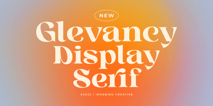 Glevancy is a stylish display and bold serif with high contrast, making it a versatile and elegant typeface. With a touch of vintage vibes, it will make your presentation looks amazing and sophisticated! You can use this typeface for logo, poster, event, or your social media post. Features Uppercase & Lowercase Number & Symbol Multi language Ligatures Alternates If you have any questions, please contact (ironbirdcreative@gmail.com)