6,190 search results
(0.012 seconds)
- P22 Zaner Basic by IHOF,
$24.95 P22 Zaner is based on ornamental penmanship from the turn of the 20th century. The Zaner font set includes four unique fonts that complement the other fonts in the set. Each font is available in PostScript and TrueType formats as well as OpenType which offers even more characters, options and overall functionality. Set options include PostScript and TrueType with a bonus set of extras and a “super” pro set containing over 3,000 characters. Zaner is perfect for wedding invitations and documents that require a touch of elegance.
 - Basic Monoline JNL by Jeff Levine,
$29.00 On page 34 of the 1930 Samuel Welo publication “Lettering - Practical and Foreign” is a simple, basic Art Deco monoline design. This hand lettered type style is now digitally available as Basic Monoline JNL in both regular and oblique versions.
 - Cross Stitch Basic by Gerald Gallo,
$20.00 Cross Stitch Basic is based on upper case characters 7 stitches tall and contains the upper case characters A-Z, lower case characters a-z, numbers 0-9, ampersand, exclamation and question marks, comma, period, colon, and semi-colon.
 - YT basic Latin by Yangtype,
$9.00 The reason you should buy this font is simple and clear. This is because we have accumulated experience in realistic typography. This typeface exists as a unity with diversity. The intuitive form of letters and the subtlety of letter spacing create artistic value in the combination of words and sentences.
 - Wild Style Basic by Graffiti Fonts,
$14.99Wild Style basic is a simpler version of our Wild Style font with outlined letters on the capital keys and filled letters on the lowercase keys. This font also includes several symbols & foreign language characters. - Basic Nouveau JNL by Jeff Levine,
$29.00 The 1913 sheet music for "You’ll Be Welcome When You Get Back Home" had its title hand lettered in a simple, yet attractive Art Nouveau sans serif design which has been preserved as digital type. Basic Nouveau JNL is available in both regular and oblique versions.
 - Basic Lettering JNL by Jeff Levine,
$29.00 Sometimes lettering without any frills or formality gets a message across better than the use of fancier typefaces. The simple charm of the hand-lettered phrase "Safety Comes First" found on a vintage WPA (Works Progress Administration) poster served as the model for Basic Lettering JNL.
 - Basic Stencil JNL by Jeff Levine,
$29.00 Basic Stencil JNL was inspired by a lettering stencil sold by Dymo around 1968 that featured a sans serif design with rounded corners and an overall square look to the characters. This bold stencil design is available in both regular and oblique versions.
 - HU Basic Round by Heummdesign,
$15.00 English HU Basic Sans is a body text font with simple Sans structure. It is well used in medias that are appropriate to use sensible font types. yet, its shows it's stylish aspects with it's wide main body. Greek Το HU Basic Round είναι μια γραμματοσειρά κειμένου σώματος με απλή δομή Sans. Χρησιμοποιείται καλά σε μέσα που είναι κατάλληλα για χρήση λογικών τύπων γραμματοσειρών. Ωστόσο, δείχνει ότι είναι κομψές πτυχές με το μεγάλο κύριο σώμα του. Υπάρχουν 1 βάρη του HU Basic Round : light Cyrillic HU Basic Round - это шрифт основного текста с простой структурой Sans. Он хорошо используется в средствах массовой информации, которые подходят для использования разумных типов шрифтов. тем не менее, это показывает его стильные аспекты с его широким основным корпусом. HU Basic Round имеет 1 толщины: light
 - Básica-Unicode - Personal use only

- Sudbury Basin - Unknown license

- Bakic Shomeryg by Imoodev,
$20.00 Bakic Shomeryg is vintage typography, this typeface has smooth curves and a visual style a can embodies charm and elegance in every lettering, making your work look stunning and attractive. A versatile font that works in both large and small sizes, suitable for a wide variety of projects such as a display for headings, logos, invitations, branding, magazine, photography, card, product packaging, product mockup, mugs, posters, labels, signatures, editorials, art deco, any type of advertising purpose.
 - Basim Marah by Hiba Studio,
$59.00 Basim Marah is an Arabic display typeface and is useful for titles and graphic projects. The font is based on the simple lines of free style calligraphy. A collaborative effort, Basim Marah was designed and drawn by Basim Salem Al Mahdi from Iraq and then digitalized as a typeface by Hasan Abu Afash from Palestine. In November, 2008, Basim Marah was upgraded by working with Mirjam Somers an award-winning Arabic type designer to the DecoType font format for use in WinSoft Tasmeem which is now bundled with InDesign CS4.
 - Typewriter BasiX by Matthias Luh,
$29.99 I found an old typewriter and well... Typewriter BasiX is the result. Enjoy this rough retro looking design to use for your digital or print project and also check out Typewriter Revo, the clean version of Typewriter BasiX, and Typewriter DirtY, an even rougher and dirtier version.
 - Retro Stereo Thin - Unknown license

- Retro Rock Poster - Unknown license

- Retro Resort JNL by Jeff Levine,
$29.00 Retro Resort JNL contains twenty-six Deco-style hotels signs for recreating the flavor of the 1940s.
 - Retro Checkbook JNL by Jeff Levine,
$29.00 By the 1990s, the availability of font creation software opened the door to an explosion of creativity, experimentation and exploration into the world of digital typography by amateur and professional alike. The undisputed king of the freeware fonts was Ray Larabie through his Larabie Fonts website. It seemed at the time that Ray’s output was endless, and he amassed dozens upon dozens of fonts that ranged from the ridiculous to the sublime. In fact, Ray was the driving force of encouragement and a behind-the-scenes “mentor” who helped Jeff Levine Fonts get underway in January of 2006. As Larabie’s focus changed to higher-quality commercial type design with the launch of Typodermic, Inc., many of his “less than perfect” font experiments were withdrawn and shelved. Ray eventually turned those lost (and sometimes questionable) typefaces into a bundled zip archive released into the public domain through Creative Commons. One particular design “Boron” (circa 1996) featured computer-oriented lettering as if etched onto a circuit board. Running with this idea, and with Ray's approval, the electronic elements were stripped away, the characters cleaned up and modified, and the font reworked in Retro Checkbook JNL, which is available in both regular and oblique versions.
 - Retro Packaging JNL by Jeff Levine,
$29.00 A vintage rubber stamp alphabet and star printing set had a package header with Art Deco-inspired lettering describing the product. Sold by a company called Elvin [circa late 50's-early 1960s], these Japanese-made sets were one of many distributed by independent toy importers and made in various configurations including [at times] tiny animal stamps. The type design on this particular item was the model for Retro Packaging JNL, available in both regular and oblique versions.
 - Norden Retro Round by Asgeir Pedersen,
$14.99 Norden Retro Round is based on Norden Round, but Retro comes with an added perspective, giving it a "retro-futuristic" look. It has a lower x-height than its parent, due to it being slightly tilted. Norden Retro Round can be used in any setting, but given its lively style, it will excel as a display font; in headings, titlings, logos and so on.
 - Brookvale Retro Condensed by Get Studio,
$25.00 Brookvale - Retro Condensed Font is a nostalgic typeface that channels the essence of the past with a contemporary twist. It's condensed letterforms and retro flair evoke a sense of vintage charm, making it an ideal choice for projects seeking a dash of retro coolness. Perfect for posters, branding, and designs that celebrate the enduring appeal of yesteryears.
 - Inline Retro JNL by Jeff Levine,
$29.00 Inline Retro JNL is Art Deco in style, featuring condensed characters and its namesake inline. While not a true revival of a vintage design, the same influences are utilized throughout the font to give it retro appeal. Inline Retro JNL is available in both regular and oblique versions.
 - Techno Retro JNL by Jeff Levine,
$29.00 Techno Retro JNL looks like a design straight out of the 1980s, but it actually appeared as hand lettering on a sheet music cover for the circa-1940s edition of the song "To You Sweetheart, Aloha", proving the old saying that "everything old is new again".
 - Retro Signs JNL by Jeff Levine,
$29.00 Retro Signs JNL collects nearly 50 designs modeled from old water transfer sign decals once manufactured by the Duro Decal Company of Chicago, Illinois and adds in a generous amount of additional phrases newly-drawn in the same hand lettered style. These vintage sign panels are perfect for creating nostalgic signage to fit projects centered around the 1950s and early 1960s.
 - 19th Century Retro by Matthias Luh,
$35.00 19th Century Retro is a re-design of an official German font style (called ‘Fraktur’) which was used in official documents in the 19th and early 20th century. There is an alternative small letter ‘s’ which you generate by typing the @ sign. This alternative letter was the original small letter s which was printed in the middle and at the beginning of a word originally (for example in the words ‘slightly’ and ‘best’). However, if the s was at the end, the normal small letter s was used (for example in the words ‘it's’ and ‘columns’). For readability reasons I decided to put the normal small letter s onto the s-key on your keyboard.
 - Letterpress Retro JNL by Jeff Levine,
$29.00 More treasures from the heyday of letterpress printing are found in Letterpress Retro JNL, with plenty of great cartoons, catch words, embellishments and more.
 - Retro Nouveau JNL by Jeff Levine,
$29.00 Because of the large influx of Irish immigrants during the late 1800s and early 1900s, it was not unusual for songwriters of the day to craft songs around Irish themes, offering a nostalgic link to their homeland. One such 1917 piece entitled "You Brought Ireland Right Over to Me" had the title hand lettered on the sheet music cover in a sans serif design reflecting the popular Art Nouveau movement of the day. This design is now available digitally as Retro Nouveau JNL, in both regular and oblique versions.
 - Retroline. Retro Style by Luxfont,
$18.00 Introducing color Retro font family. Modern retro design dictates its own rules and graphic techniques - one of which is fonts with outlines. Retroline font family embodies this. 4 fonts with black stroke and white fill, and 4 fonts with only black stroke are perfect for retro illustrations. Color scheme of colored fonts is convenient and easy to recolor in graphics programs. Retroline fits comic illustrations or designs from the 90s Features: 8 fonts in family: - 4 color fonts with fill & outline - 4 fonts with outline only 2 weights of fonts 2 weight of outline Kerning IMPORTANT: - OTF SVG fonts contain vector letters with gradients and transparency. - Multicolor OTF version of this font will show up only in apps that are compatible with color fonts, like Adobe Photoshop CC 2017.0.1 and above, Illustrator CC 2018. Learn more about color fonts & their support in third-party apps on www.colorfonts.wtf - Don't worry about what you can't see the preview of the font in the tab "Individual Styles" - all fonts are working and have passed technical inspection, but not displayed, they just because the website MyFonts is not yet able to show a preview of colored fonts. Then if you have software with support colored fonts - you can be sure that after installing fonts into the system you will be able to use them like every other classic font. Question/answer: How to install a font? The procedure for installing the font in the system has not changed. Install the font as you would install the classic OTF | TTF fonts. How can I change the font color to my color? · Adobe Illustrator: Convert text to outline and easily change color to your taste as if you were repainting a simple vector shape. · Adobe Photoshop: You can easily repaint text layer with Layer effects and color overlay. ld.luxfont@gmail.com
 - Specta Retro Script by Identitype Co,
$20.00 Specta Typeface Inspired by Retro style and combination with Hand Lettering style. I'm made with personality touch every single curve. I hope this can make inspire you from your work. and a very bouncy baseline It has a perfectly paired complimentary marker font , and a super handy set of bonus Swash. Ideal for logos, handwritten quotes, product packaging, header, poster, merchandise, social media & greeting cards.
 - Retro Frames 2 by Edyta Demurat,
$28.00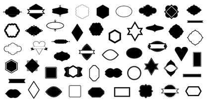
- Chinta Retro Font by Khoir,
$15.00 Launched Chinta, new serif type modern fonts wrapped in a soft classic touch combined with crooked and crooked alternative fonts, will make it one of the conveniences to explore various types of designs. With a soft touch but does not leave an elegant impression, this font is suitable for using logos, food design, weddings, branding needs, posters, emblems, advertising and much more. so what are you waiting for? FEATURES CHINTA ONE CHINTA TWO So what are you waiting for? immediately purchase this font.
 - B-Movie Retro by Die Typonauten,
$19.00
- Metro Nova by Linotype,
$57.99 Metro Nova comprises seven weights, from ultra thin to extra black in regular proportions, and six weights as condensed designs. Each has an italic counterpart for a total of 26 fonts. The family is available as OpenType® Pro fonts, which provide for the ability to easily insert typographic features such as ligatures, fractions and alternate characters. Pro fonts also offer an extended character set to support most Central European and many Eastern European languages.
 - Paris Metro by Studio K,
$45.00 Nothing is more iconic of Paris than its antique Metro signs, which are the inspiration for this typeface. The signs vary from station to station, some featuring plain block capitals, others the most exquisite Art Nouveau. This example falls somewhere in between. and should inject a strong gallic flavour into any design or publishing project. To recreate the Metro effect in Photoshop, set your text white on red, then go to Layer Style> Inner Shadow. Or with Paris Metro Reverse set your text red on white, then go to Layer Style> Drop Shadow.
 - Retiro Std by Typofonderie,
$59.00 Full of life Hispanic Didot in 2 optical sizes Retiro is a daring interpretation of Spanish typography. Severe, austere and yet, full of life, Retiro is a vernacular version of Castilian and Andalusian in a typical Didot. Named after a lovely park in Madrid, Retiro started life as a a bespoke typeface designed to give a unique voice to the magazine Madriz. In 2006, the founder of Madriz was looking for a Didot for his new magazine. The Didot is the archetypal typeface used in high-end magazines. Retiro is a synthesis of these high contrast styles mixed with an Hispanic mind. Result is then, after 2-3 years of work, a typeface with countless variations to establish typographic shades adapted to different sections and pages of the Madriz. In 2014, it was necessary to further revise the typeface before its launch at Typofonderie. In order to keep its originality, the unique weight was retained, but complemented with optical size variants to set highly contrasted headlines into various sizes, visually balanced. How to use Retiro optical sizes? Each font provided in Retiro family is named according to the scale of body size: 24 pt and 64 pt. Of course, these names are referring to the body sizes used in typographic design. In the “glorious old days,” the letterpress period, it was customary to cut punches directly to the size at which typefaces would be used. The punchcutter had to visually adapt his design to the engraving size. The aim was to optimize the best contrast and general weight, but also to respect both design’s and reader’s needs. In Retiro’s case, intended for large titling sizes, it’s an adaptation of this ancient practice for our contemporary uses. Although each font is named by a typographic point size, do not feel obliged to use this font at this precise size, but why not, in larger or smaller. It’s rather the concept of gradients that must be preserved in layouts, rather than strictly size numbers. It’s up to the designer to select the right font size for his own designs. Granshan Awards 2012 Creative Review Type Annual 2011 Designpreis 2011 Club des directeurs artistiques, 41e palmarès Type Directors Club 2010 Certificate of Type design Excellence
 - Metro Gothic by BA Graphics,
$45.00An up-beat gothic with that trendy retro look. - Metro Sans by Studio Few,
$12.00 The result of a study into the Paris Metro system; Metro Sans is a Grotesk typeface with personality. It bridges the gap between the stern terminals of a Swiss Neo-Grotesk, and the smooth curves of a modern day Geo-Grotesk. The two combine to give a versatile typeface that works well in both body and display weights.
 - Light Metro by Nathatype,
$29.00 Ready to make your branding spark? If you need to create a big, bold logo for your business, work on a poster for an event, or whatever your project may be-then this is the perfect font for you. Light Metro-A Script Font Light Metro is a captive font designed with strong outlines and fat strokes to bring your branding to life and add a touch of vintage, fun, but still stylish. Inspired from pop 1960-1970s. This font features thick and angular letters that easy on the eyes and nice to look while it’s also easy to read. Light Metro becomes more special with extruding version option. Perfect to create amazing headings, logos, menus, social media graphics, and many more. Our font always includes Multilingual Support to make your branding reach a global audience. Features: Ligatures Stylistic Sets Swashes PUA Encoded Numerals and Punctuation Thank you for downloading premium fonts from Natha Studio
 - Metro Office by Linotype,
$50.99The Metro Office family is designed after the model of the original sans serif family – Metro No.1 – produced by W.A. Dwiggins and Mergenthaler Linotype’s design studio during the late 1920s and 1930s. A distinctly new interpretation of the sans serif idea, Metro was a thoroughly “American” sans serif when it was released. However, over the ensuing decades, it became a favorite the world over. Moreover, it is one of the first “humanist” sans serif typefaces designed. While redesigning Metro in 2006, Linotype’s Type Director Akira Kobayashi drew from his own knowledge of humanistic letterforms. The result is a redefined Metro; a typeface that is finally ready for heavy text setting. The original Linotype Metro No.1 never had italic variants. Kobayashi has created oblique variants, extending its use in document setting. A double-storey a and g, as well as a wider w were features of Dwiggins’ original Metro design that were filtered out by Mergenthaler Linotype in the 1930s. Kobayashi remedied this historical slight, retooling Dwiggins’ original forms and optimizing their legibility. Kobayashi has additionally retooled some of Metro’s more troublesome letters, which has black elements that became too dense. By opening up the troublesome joins (like that on the Q), Kobayashi has given his new Metro a more even color in text, improving its legibility while retaining its original spirit. - Metro Capitals by Letterhend,
$19.00 Introducing, Metro Capitals, a fun handwritten typeface. This font is perfectly made for branding, packaging, headline, logos, magazines, books, greeting / wedding cards, packaging, fashion, make up, stationery, novels, labels or any type of advertising purpose. Features : uppercase & lowercase numbers and punctuation multilingual alternates PUA encoded We highly recommend using a program that supports OpenType features and Glyphs panels like many of Adobe apps and Corel Draw, so you can see and access all Glyph variations.


