9,513 search results
(0.013 seconds)
- TA Bankslab by Tural Alisoy,
$33.00 The building of the Northern Bank of St. Petersburg's Baku branch was built in 1903-1905. It was the first Art Nouveau-style building in Baku, Azerbaijan. Later the bank was transformed into the Russian-Asian Bank. After the oil boom in Baku in the 19th century, branches of many banks and new banks were opened in the city. The branch of the Northern Bank of St. Petersburg was among the first banks that was opened in Baku. N.Bayev was the architect of the building for the branch of the Northern Bank of St. Petersburg located at Gorchakovskaya 3 in 1903-1905. The building currently houses the Central Branch of the International Bank of Azerbaijan. My purpose in writing this is not to copy and paste the information from Wikipedia. What attracted me to the building was the word "Банкъ" (Bank) written in Cyrillic letters, which was also used in Azerbaijan during the Soviet era. The exact date of the writing is not known. Every time I pass by this building, I always thought of creating a font of this writing someday. I had taken a photo of the building and saved it on my phone. I did a lot of research on the font and asked a lot of people. However, some did not provide information at all and some said they did not have any information. I was interested in the history of this font but I do not know if this font really existed or it was created by the architect out of nowhere. If there was such a history of this font, I wanted to recreate this font and make it available. If not, I had to create it from scratch in the same way, using only existing letters on the building. Finally, I made up my mind and decided to develop the font with all letters I have got. It was difficult to create a font based on the word, Банкъ. Because in the appearance of the letters, the midline of the letters on A, H, K was very distinct, both in the form of inclination and in more precise degrees. The serif part of the letters, the height of the upper and lower sides, differed from each other. I don't know whether it was done this way when the building was constructed or it happened over time. I prepared and kept the initial version of the font. I took a break for a while. I started digging on the story of the font again. Meanwhile, I was researching and got inspired by similar fonts. Unfortunately, my research on the font's history did not yield any results. I decided to continue finishing up the font. After developing the demo, I created the font by keeping certain parts of these differences in the letters. In addition, I had to consider the development of letters in the Cyrillic, as well as the Latin alphabet, over the past period. Thus, I began to look at the appearance of slab-serif or serif fonts of that time. In general, as I gain more experience in developing fonts, I try to focus on the precision of the design for each font. In recent years, I specifically paid attention to this matter. YouTube channel and articles by Alexandra K.'s of ParaType, as well as, information and samples from TypeType and Fontfabric studios on the Cyrillic alphabet were quite useful. I gathered data regarding the Latin alphabet from various credible sources. I do not know if I could accomplish what I aimed at but I know one thing that I could develop the font. Maybe someday I'll have to revise this font. For now, I share it with you. I created the font in 10 styles. 7 weight from Thin to Extra Black, an Outline, Shadow, and Art Nouveau. The Art Nouveau style was inspired by the texture in the background used for the text on the building. The texture I applied to capital letters adds beauty to the font. If you like the font feel free to use it or simply let me know if your current alphabet doesn't support this font.
 - TA Bankslab Art Nouveau by Tural Alisoy,
$40.00 TA Bankslab graphic presentation at Behance The building of the Northern Bank of St. Petersburg's Baku branch was built in 1903-1905. It was the first Art Nouveau-style building in Baku, Azerbaijan. Later the bank was transformed into the Russian-Asian Bank. After the oil boom in Baku in the 19th century, branches of many banks and new banks were opened in the city. The branch of the Northern Bank of St. Petersburg was among the first banks that was opened in Baku. N.Bayev was the architect of the building for the branch of the Northern Bank of St. Petersburg located at Gorchakovskaya 3 in 1903-1905. The building currently houses the Central Branch of the International Bank of Azerbaijan. My purpose in writing this is not to copy and paste the information from Wikipedia. What attracted me to the building was the word "Банкъ" (Bank) written in Cyrillic letters, which was also used in Azerbaijan during the Soviet era. The exact date of the writing is not known. Every time I pass by this building, I always thought of creating a font of this writing someday. I had taken a photo of the building and saved it on my phone. I did a lot of research on the font and asked a lot of people. However, some did not provide information at all and some said they did not have any information. I was interested in the history of this font but I do not know if this font really existed or it was created by the architect out of nowhere. If there was such a history of this font, I wanted to recreate this font and make it available. If not, I had to create it from scratch in the same way, using only existing letters on the building. Finally, I made up my mind and decided to develop the font with all letters I have got. It was difficult to create a font based on the word, Банкъ. Because in the appearance of the letters, the midline of the letters on A, H, K was very distinct, both in the form of inclination and in more precise degrees. The serif part of the letters, the height of the upper and lower sides, differed from each other. I don't know whether it was done this way when the building was constructed or it happened over time. I prepared and kept the initial version of the font. I took a break for a while. I started digging on the story of the font again. Meanwhile, I was researching and got inspired by similar fonts. Unfortunately, my research on the font's history did not yield any results. I decided to continue finishing up the font. After developing the demo, I created the font by keeping certain parts of these differences in the letters. In addition, I had to consider the development of letters in the Cyrillic, as well as the Latin alphabet, over the past period. Thus, I began to look at the appearance of slab-serif or serif fonts of that time. In general, as I gain more experience in developing fonts, I try to focus on the precision of the design for each font. In recent years, I specifically paid attention to this matter. YouTube channel and articles by Alexandra K.'s of ParaType, as well as, information and samples from TypeType and Fontfabric studios on the Cyrillic alphabet were quite useful. I gathered data regarding the Latin alphabet from various credible sources. I do not know if I could accomplish what I aimed at but I know one thing that I could develop the font. Maybe someday I'll have to revise this font. For now, I share it with you. I created the font in 10 styles. 7 weight from Thin to Extra Black, an Outline, Shadow, and Art Nouveau. The Art Nouveau style was inspired by the texture in the background used for the text on the building. The texture I applied to capital letters adds beauty to the font. If you like the font feel free to use it or simply let me know if your current alphabet doesn't support this font.
 - ALS Tongyin by Art. Lebedev Studio,
$63.00 ALS Tongyin is a bit rough and square-built with a pronounced oriental touch (Chinese word "tongyin" means "bronze molding"). Tongyin declares its ties to Russian constructivism and has 4 font styles. It matches well the rustic accident type frequently used for ads and announcements in Russian newspapers.
 - Softrobo by Koval TF,
$10.00 Fine-built, straight but not official, with soft corners is suitable for short texts, placards and advertising. It was inspired by 1970s when people were mad about robots, space and so on. I decided to create a font as if it was a progressive font of the 1970s.
 - Erigo by Neoflix Studio,
$25.00 Erigo Typeface!!! Erigo is a hight-contrast and eyecathing display typeface. Erigo is perfect for poster, t-shirt, cover books, headline and manymore. Already matched up and ready to be used together for your next design! Erigo was built +420 glyphs with numbers, punctuation and supports other languages.
 - Big Softie by HouseOfBurvo,
$24.99 A cute, fun, soft bubblegum font in one fatty flavor. Perfect for club posters, flyers and packaging, Big Softie is sure to tingle your clients' taste buds. The font was built on a geometric skeleton, and then rounded and softened, carefully adding character without kitsch. Designed in 2011.
 - Alardo by MysticalType,
$12.00 Alardo is intended for branding that is synonymous with sports. The initial character was built in bold with a bold personality, but thin strokes and flowing italics provide a flexible and unique family series. Glyphs are made in low contrast strokes, short ascenders and descenders, and low caps.
 - Reso by JCFonts,
$30.00 Reso is an experimental geometric typeface built from a pointed arch module. Its minimal and contemporary letter shapes makes it well suited for logo design, headers and short texts. Five weights are available in OpenType format. The fonts include some standard OpenType features and support for most European languages.
 - Ballard Avenue by Turtle Arts,
$20.00Ballard Ave is inspired by old vintage signage found in Ballard, Washington, an old neighborhood of Seattle. Ballard Avenue is a protected historical district filled with turn of the century brick buildings that have been converted into quaint shops and independent businesses. This alphabet is based on the antique signage that still exists on the sides of many of these buildings. - Diaria Sans Pro by Mint Type,
$- Diaria Sans Pro is a sans-serif counterpart of Diaria Pro. With its extensive 9 weights and corresponding italics, extensive language support, and various OpenType features it is meant to build visual heirarchies of any detail and complexity in editorial design. This modern sans-serif typeface designed as a universally legible medium for both titles and paragraph text. Its large x-height and static exteriors allow comfortable reading in printed narrow columns as well as in screen graphics. Some of the styles of Diaria Sans Pro can be found in Mint Type Editorial Bundle together with other fonts which make some great pairs. Check it out!
 - Rahayu by Shaltype Co,
$12.00 RAHAYU is Monoline Script Font that is well-produced by hand and generates into a clean form, that will be best when used in any placement like logo, poster, t-shirts, or any display. Build manually, and reform into a clean Typeface. Natural stroke from original hand-lettering. It can be used for just Titles or even writing. In this font, you will get: Over 289 glyphs 43 Ligatures in 2 OpenType features Support for 66 languages Please contact for files package Get RAHAYU now! It will be best used for any design requirement, many fonts will come with a unique concept. Thank you! Best Regards, PUDJI PANGESTOE STUDIOS
 - Irvinesa by Shaltype Co,
$12.00 IRVINESA is a hype Font that's well-produced by hand and generated into a pure form, that will be best when used in any placement like logo, poster, t-shirts, or any display. --- Build manually by hand, and reform into a clean Typeface. Natural stroke from original hand-lettering. It can be used for just Titles or even writing. --- In this font, you will get: Over 226 glyphs 19 Ligatures in 7 OpenType features Support for 65 languages. --- Get IRVINESA now! It will be best used for any design requirement, many fonts will come with a unique concept. --- Thank you! Best Regards, PUDJI PANGESTOE STUDIOS
 - Synth2 by Pasternak,
$15.00 The font has a truly futuristic nature. It perfectly conveys the atmosphere of technology and futurism and it's the best choice for sci-fi and hi-tech topics and pictures. The font letters are unrounded, it's build is very simple and straight. The font includes 7 styles: thin, extra light, light, regular, medium, bold, and black. With the variety of font widths, there is the ability to make different combinations in graphic or web design projects as well. Carefully kerned letters look well in paragraphs and titles. Special attention to uppercase headings. The font counts 477 glyphs for each style. The thin style is free to use.
 - BUNK by AdultHumanMale,
$20.00 BUNK is an 11 font system that can be layered in different ways to create various classic titling effects, think Old Timey signage 'COME IN WE'RE OPEN'. It's a display font that produces the different results by mixing and matching the various fonts together. Bunk's layer combos give you the control to create brilliant bevel, convex and 3-D styles. Each font contains the same metrics, so when your title is set, copy and paste-in-place to create layers of different weights/styles to build out your desired effect. Unlike other Layered Fonts out there, BUNK has upper case and lower case as well as currency symbols and lots of foreign characters too. Over 180 glyphs!. Five of the fonts (Shades 1,2,3,4,5) are clearly dependent on each other to create a complete font, so theses are only available in the Full family pack (11 fonts) or in the Layer Kit Family pack (7 fonts).
 - Fragment Pro by (v) design,
$49.00 Fragment Pro is a part of a larger OpenType font family (see also Fragment Pro Inline). It is an elegant, soft and decorative typeface built on classical proportions. Its outlines have been carefuly crafted with a high attention to detail, so it could be used even at very large sizes. Fragment Pro is derived from the separately sold layered Fragment Pro Inline, however it has been significantly optimized for standalone use. Fragment has been conceived to be used as a display typeface in publications, titles, logotypes etc., but it is surprisingly legible even in smaller print sizes. Thanks to its strictly onefold oulines, Fragment can be also used as a stencil typeface. Fragment supports many OpenType features and offers great multilingual support for most of the Latin-based languages. Feel free to download the detailed PDF Specimen.
 - Allister Rough by Ksenia Belobrova,
$29.00 Allister Rough is a handmade font family based on Oldstyle English and Transitional fonts, modern typography and lettering. It’s a kit of joyful fonts that can be used for cards, posters, books, t-shirts, etc. Allister Rough has three font Styles and Extras. “Decor 1” is an expressive font which has three sets for each letter. “Decor 2” has two sets and “Caps” has Capital letters and Small Capitals. So you can choose what you need or combine Styles to create different typography compositions. All contextual alternates are built into the ‘Liga’ feature and duplicated into the ‘Calt’ feature. So when you work with the fonts, please make sure that ‘Liga’ or ‘Calt’ is turned on. Font family also supports OpenType features like Titling, Oldstyle Figures, Fractions, Ordinals. Please take a look at the User Guide in the Gallery.
 - Mixed Tape by Ksenia Belobrova,
$35.00 Mixed Tape is a brush typefamily inspired by music and based on calligraphy. It has 3 different styles so that you can choose which you need or combine them as you like. Mixed Tape Regular is a casual neutral brush script, Mixed Tape Small is a more elegant variation and Mixed Tape Capitals is an energetic, probably even brutal brush script. You can freely play with the three of them creating your typographic compositions. You can use Mixed Tape for posters, prints, menus, packaging, book covers and headlines, cards and as a starting point for logotypes. Mixed Tape has a lot of alternates and ligatures which are built into the ‘Liga’ feature that is turned on by default. It also has swashes, titles, fractions, ordinals and case sensitive forms. Let’s all enjoy good music and typography!
 - Luzern by Gumpita Rahayu,
$- Inspired by the most common grotesque heights and boxed sans serif typefaces, Luzern Typefaces was built with low-mid contrast sans serif and was designed in quite tall caps height and lower x-height which represents the flavor of the dynamic typefaces and is subtle for the display typefaces. The typefaces comes with five weights, from light to extra bold, plus matching italics in each weights. And Luzern Typefaces is loaded with OpenType features such as some stylistic alternates in uppercase, case-sensitive forms, fractions, and another numerals features such as super and subscript characters, tabular figures, numerator-denominator, etc. It’s highly usable for display text titles such as editorial magazine headline, websites heading, poster, advertising, logo, also it works well for medium body text. It comes with more 400+ glyph support including more latin european diacritics language.
 - ZT Grafton by Zeune Type Foundry,
$30.00 ZT Grafton is a neo-grotesque typeface based on geometric shapes with contemporary, friendly, and strong emotion. ZT Grafton was built from scratch to be calm, smooth, and clean, while subtle humanist influences add warmth to this typeface. It's available in 8 weights and includes the exciting variable font format.
 - Singularity Type by Davide Mascioli,
$15.00 Singularity Type is a Modern sans-serif Geometric font with homogeneous thickness, based on essential geometric shapes. Built around 4 different widths, ranging from Extra Light up to Bold, the font contains 744 glyphs and supports more than 30 Latin alphabet languages. Singularity Type is Designed by Davide Mascioli ©2021
 - Wakel by NamelaType,
$29.00 Wakel is a Bold display font that consisting on bilingual scripts, Latin and Arabic. The Arabic script was built based on the Naskh style. Wakel has approachable, fashionable and humanist look with low contrast and attractive curvature terminal. Wakel is great for large display projects, branding, package designs & much more!
 - Sillium by ATK Studio,
$15.00 Inspired by blackletter type styles. Sillium is built on modular basis. As a result, it excels in a wide range of display settings, logotypes, and short text. Determine the grid and create a complete set of cohesive characters (a-z) and multilanguage characters (latin based) in either lowercase or uppercase.
 - Black Sirkka by Volcano Type,
$39.00 The idea of the font Black Sirkka was, to develop a modern interpretation out of the general blackletter typefaces. Black Sirkka is a bastard with the typical characteristics of the blackletters, mixed up with modern, simple shapes from grotesk typefaces. The whole typeface was built up in a modular construction system.
 - Axionhero by PizzaDude.dk,
$20.00Axionhero is an experiment which include a simple grid built font. I took the font, and smashed it into grunge letters. Believe me, it works very well - maybe that's because the font has got almost 400 different ligatures! You will need to use OpenType supporting applications to use the autoligatures. - Abrupt by Akifatype,
$21.00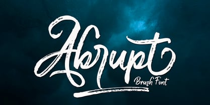 Abrupt is a textured brush font, a contemporary approach to design, naturally handmade and with underscores. It also has alternatives and ligatures that make your design more attractive.Suitable for use in title design such as clothing, invitations, tittle books, stationery designs, quotes, branding, logos, greeting cards, t-shirts, packaging designs, posters and more.
 - Brushstroke by Gatype,
$14.00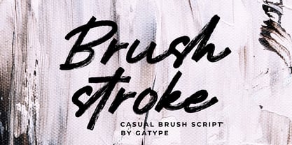 Brushstroke is a unique textured brush font, because this brush font is made digitally. contemporary approach to design, and has underlines and also has several ligatures. Suitable for use in title designs such as tittle books, stationery designs, quotes, branding, logos, clothing, invitations, greeting cards, t-shirts, packaging designs, posters and more.
 - Valkyrie Brush by Gatype,
$18.00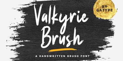 Valkyrie Brush is a unique textured brush font, because this brush font is made digitally. contemporary approach to design, and has underlines and also has several ligatures. Suitable for use in title designs such as tittle books, stationery designs, quotes, branding, logos, clothing, invitations, greeting cards, t-shirts, packaging designs, posters and more.
 - Kailash by Akifatype,
$14.00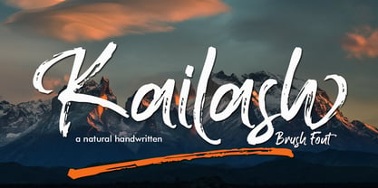 Kailash is a textured brush font, a contemporary approach to design, naturally handmade and with underscores. It also has alternatives and ligatures that make your design more attractive.Suitable for use in title design such as clothing, invitations, tittle books, stationery designs, quotes, branding, logos, greeting cards, t-shirts, packaging designs, posters and more.
 - Baver Brush by Akifatype,
$14.00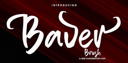 Baver Brush is a textured brush font, a contemporary approach to design, naturally handmade. It also has alternatives and ligatures that make your design more attractive. Suitable for use in title design such as clothing, invitations, book tittles, stationery designs, quotes, branding, logos, greeting cards, t-shirts, packaging designs, posters and more.
 - Dosty by Dhan Studio,
$18.00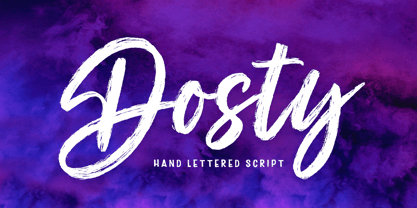 Dosty is a unique textured brush font because this brush font is made digitally. It's a contemporary approach to design, and has underlines and also several ligatures. Suitable for use in title designs such as book tittles, stationery designs, quotes, branding, logos, clothing, invitations, greeting cards, t-shirts, packaging designs, posters and more.
 - Awesome Brush by Gatype,
$10.00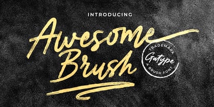 Awesome Brush is a unique textured brush font, because this brush font is made digitally. contemporary approach to design, and has underlines and also has several ligatures. Suitable for use in title designs such as tittle books, stationery designs, quotes, branding, logos, clothing, invitations, greeting cards, t-shirts, packaging designs, posters and more.
 - Bollofora by Akifatype,
$14.00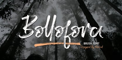 Bollofora is a textured brush font, a contemporary approach to design, naturally handmade and with underscores. It also has alternatives and ligatures that make your design more attractive.Suitable for use in title design such as clothing, invitations, tittle books, stationery designs, quotes, branding, logos, greeting cards, t-shirts, packaging designs, posters and more.
 - Lafleur by Resistenza,
$45.00 Inspired by the iconic Fenoglio-Lafleur Liberty building in the city of Turin, in an area with significant Stile Liberty buildings and New Gothic architecture. Lafleur is a decorative face with a remarkable art nouveau flair from 19th century. Perfect for creative contemporary uses in print and on screen. We recommend it for book covers, packaging, branding, editorial, web, advertising, apparel, purposes are endless.
 - African Patchwork by Scholtz Fonts,
$12.00African Patchwork was inspired by my observation that many traditional African patterns have strong similarities to the patterns of the American quilting tradition. I chose one of the patterns from the African Pattern Font 04 - Mali (based on traditional bogolan mud cloth designs) that reminded me of quilting patterns and superimposed it onto the Zim Black characters, to create a fusion of African and American design. - Wappenbee by Kenn Munk,
$15.00Wappenbee is a 28 pixel bitmapped dingbat system for building crests for the modern, noble life. The dingbat allows you to build memorable crests like the skatepark crest, the smelly sock crest, the mixtape crest and many more. Vowels are mythical shield-holding creatures (upper- and lowercase are right- and leftfacing beasts), consonants are the various shields and numerals are 'crowns' above the crests. - C-Nation by URW Type Foundry,
$39.99 Marit Otto about C-Nation: The building typeface. Although the 70ties were very liberating and progressive, still girls played mainly with dolls and sweet things and boys with all kinds of challenging stuff. They did all sorts of basic scientific experiments in mini labs and of course built cool things with Meccano building sets. As a girl I was perfectly happy with the toys I had access to. But at the same time I was very curious about all the adventure toys and discoveries my brother did. It also made me wonder why the grown up people thought that our world could be separated so easily by separating our toys in pink and blue sections. At this day of age Meccano is probably hopelessly old fashioned and far to manual. Children of today are fed by fast images and cool animations on screen, they learn, play, communicate and relax in the same space, the digital space. The special feature of Meccano was that even though it was very basic there was the promise you could create anything. It might even contribute to a logical mind. The typeface I designed refers to the Meccano feel. It is a creative typeface. A bit masculine and bold looking perhaps but after the first impression a subtle and refined female touch is revealed. It has links to architecture and associations with metal constructions like ‘The Eiffel Tower’ and (old railway) bridges. I am convinced that we all think of that as very charming man-made objects.
 - Palatino Nova Paneuropean by Linotype,
$67.99Palatino® Nova is Prof. Hermann Zapf's redesign of his own masterpiece, Palatino. The original Palatino was cut in metal by August Rosenberger at D. Stempel AG typefoundry in Frankfurt, and released in 1950. Palatino was later adapted for mechanical composition on the Linotype machine, and became one of the most-used typefaces of the 20th Century. Palatino was designed for legibility, and has open counters and carefully weighted strokes. The type was named after Giambattista Palatino, a master of calligraphy from the time of Leonardo da Vinci. Palatino is a typeface based on classical Italian Renaissance forms. A modern classic in its own right, Palatino is popular among professional graphic designers and amateurs alike, working well for both text and display typography. Hermann Zapf and Akira Kobayashi redeveloped Palatino for the 21st Century, creating Palatino Nova. Released by Linotype in 2005, the Palatino Nova family is part of Linotype's Platinum Collection. Palatino Nova includes several weights (Light, Regular, Medium, and Bold), each with companion italics. Four styles (Regular, Italic, Bold, and Bold Italic) have Greek and Cyrillic glyphs built into their character sets. The Palatino Nova family also includes revised versions of Aldus (now called Aldus Nova), as well as two titling weights. The first titling weight, Palatino Nova Titling, is based on Hermann Zapf's metal typeface Michelangelo, including Greek glyphs from Phidias Greek. The heavier titling weight, Palatino Nova Imperial, is based on Sistina. The fonts in the Palatino Nova family support all 48 Western, Central, and Eastern European languages. Additional features: ligatures and historical ligatures, Small Caps, ornaments, and a range of numerals (proportional & tabular width lining and Old style Figures, fractions, inferiors, and superiors)." - Palatino Nova by Linotype,
$50.99 Palatino® Nova is Prof. Hermann Zapf's redesign of his own masterpiece, Palatino. The original Palatino was cut in metal by August Rosenberger at D. Stempel AG typefoundry in Frankfurt, and released in 1950. Palatino was later adapted for mechanical composition on the Linotype machine, and became one of the most-used typefaces of the 20th Century. Palatino was designed for legibility, and has open counters and carefully weighted strokes. The type was named after Giambattista Palatino, a master of calligraphy from the time of Leonardo da Vinci. Palatino is a typeface based on classical Italian Renaissance forms. A modern classic in its own right, Palatino is popular among professional graphic designers and amateurs alike, working well for both text and display typography. Hermann Zapf and Akira Kobayashi redeveloped Palatino for the 21st Century, creating Palatino Nova. Released by Linotype in 2005, the Palatino Nova family is part of Linotype's Platinum Collection. Palatino Nova includes several weights (Light, Regular, Medium, and Bold), each with companion italics. Four styles (Regular, Italic, Bold, and Bold Italic) have Greek and Cyrillic glyphs built into their character sets. The Palatino Nova family also includes revised versions of Aldus (now called Aldus Nova), as well as two titling weights. The first titling weight, Palatino Nova Titling, is based on Hermann Zapf's metal typeface Michelangelo, including Greek glyphs from Phidias Greek. The heavier titling weight, Palatino Nova Imperial, is based on Sistina. The fonts in the Palatino Nova family support all 48 Western, Central, and Eastern European languages. Additional features: ligatures and historical ligatures, Small Caps, ornaments, and a range of numerals (proportional & tabular width lining and Old style Figures, fractions, inferiors, and superiors)."
 - Quinoa by Catharsis Fonts,
$29.00 Quinoa is display typeface by Catharsis Fonts that unites the seemingly opposed concepts of clean geometric architecture and organic humanist warmth. While it is designed for display and editorial purposes, its accessible forms make for comfortable reading even at small text sizes. Its exuberant adaptive "f", "j", "Q" and refreshing titling alternates bring display text to life. Quinoa covers multilingual Latin, Cyrillic, Greek, Hebrew, Arabic, and Armenian. The Quinoa family spans four stylistic cuts (Quinoa, Quinoa Titling, Quinoa Round, and Quinoa Text) with matching hand-slanted obliques, each of which comes in nine weights. The Titling cut offers a number of alternate capital letter designs with lowercase-inspired forms for a refreshing unicase look, and the Round cut additionally removes the spurs from arched letters like n. The text cut introduces true diagonals and a two-storey "a" for a more sober, reading-friendly look. A host of other OpenType features including ligatures, contextual alternates, small caps, figure sets, and character variants are built into all cuts. Furthermore, the small caps of Quinoa, Quinoa Titling, and Quinoa Text are available as dedicated font files under the names "Quinoa SC", "Quinoa Unicase" and "Quinoa Text SC" for ease of use. Acknowledgements: I am thankful to the TypeDrawers and the Typografie.info communities for great feedback and support. In particular, Thorsten Daum has been tremendously helpful with suggestions and quality control. Thanks to Craig Eliason and Jan Willem Wennekes for their help with the Latin, Alexander L. Stetsiuk for Cyrillic, Ofir Shavit and Jonathan N. Washington for Hebrew, Khaled Hosny for Arabic, and Hrant H. Papazian for Armenian.
 - Simple Elevation by Funk King,
$5.00 Simple Elevation is a progression of architectural-inspired fonts. The glyphs as font-bats designed as buildings that can be read.