10,000 search results
(0.038 seconds)
- Night Michy by Zeenesia Studio,
$16.00 Have a great day! My new font was present, Night Michy!! Night Michy is a Bold vintage style serif font with strong character and soft features. modern and classic serif font with a clear and bold look. It’s a very versatile font that works great in large.
 - Roble by Latinotype,
$26.00 Roble is a Slab Serif Font, from a mix between Andes and Sanchez, following a harmony with both fonts one sans and one serif with a fresh and dynamic result. Roble is a family of 16 display fonts 8 weights plus italics.
 - Glypster by Ardyanatypes,
$15.00 Glypster - Bold Aesthetic Serif Fonts is a font that has boldness in every line. This font's robust and bold style conveys a luxurious, elegant, retro, and aggressive feel. The serenity afforded by this font's blend of boldness and subtlety makes Glypster suitable for a wide variety of design choices. Apart from that, the strengths of Glypster are its ability to support multiple languages and additional features that can add interest to every design you make. In terms of marketing, Glypster is very suitable for purposes such as logos, posters, business cards, and many more, so you can explore the potential of this font for various designs. Glypster's simplicity, but still elegant and luxurious, makes it the right choice for all procedures.
 - Fractura ND by Neufville Digital,
$29.60 Fractura ND is a stencil typeface designed by José María Cerezo. It includes, in addition to four fonts of different weights, an outline font, a pair of fonts to make bicolor sets and a dripped font. A geometric sans serif that, with the particularity of being a stencil, provides personality and wide compositional possibilities. Fractura is a Trademark of BauerTypes SL
 - Kohirug by Twinletter,
$15.00 Looking for a font that exudes style and elegance? Look beyond the KOHIRUG Blackletter font. This font evokes a strong, confident personality with striking details on each side of the lettering. Whether you’re creating a vintage-inspired project or want to add a bold classic look to your visuals, this font is a perfect choice.
 - Goversy by Maulana Creative,
$15.00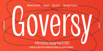 Goversy is a Decorative Condensed Display font. With Regular stroke, fun character with a bit of ligatures. To give you an extra creative work. Goversy font support multilingual more than 100+ language. This font is good for logo design, Social media, Movie Titles, Books Titles, a short text even a long text letter and good for your secondary text font with handwriting and script font. Make a stunning work with Goversy font. Cheers, Maulana Creative
 - Auberge Script by Sudtipos,
$79.00 It took me a long time, but I think I now understand why people of my generation and older feel the need to frame current events in an historical context or precedents, while most of the young couldn't care less about what happened ten years ago, let alone centuries back. After living for a few decades, you get to a point when time seems to be moving quite fast, and it’s humbling to see that your entire existence so far can be summed up in a paragraph or two which may or may not be useful to whoever ends up reading the stuff anyhow. I suppose one way to cope with the serenity of aging is trying to convince yourself that your life and work are really an extension of millenia of a species striving to accept, adapt to, and improve the human condition through advancing the many facets of civilization -- basically making things more understandable and comfortable for ourselves and each other while we go about doing whatever it is we are trying to do. And when you do finally convince yourself of that, history becomes a source of much solace and even a little premonition, so you end up spending more time there. Going far back into the history of what I do, one can easily see that for the most part it was ruled by the quill. Western civilization’s writing was done with quill pens for more than thirteen centuries and with newer instruments for about two. By the mid-18th century, the height of the quill experience, various calligraphy techniques could be discerned and writing styles were arranged in distinct categories. There are many old books that showcase the history of it all. I recommend looking at some whenever the urge comes calling and you have to get away from backlit worlds. Multiple sources usually help me get a better perspective on the range of a specific script genre, so many books served as reference to this quill font of mine. Late 17th century French and Spanish professional calligraphy guides were great aides in understanding the ornamental scope of what the scribes were doing back then. The French books, with their showings of the Ronde, Bâtarde and Coulée alphabets, were the ones I referenced the most. So I decided to name the font Auberge, a French word for hotel or inn, because I really felt like a guest in different French locales (and times) when I going through all that stuff. Because it is multi-sourced, Auberge does not strictly fit in a distinct quill pen category. Instead, it shows strong hints of both Bâtarde and Coulée alphabets. And like most of my fonts, it is an exercise in going overboard with alternates, swashes, and ornamental devices. Having worked with it for a while, I find it most suitable for display calligraphic setting in general, but it works especially well for things like wine labels and event invitations. It also shines in the original quill pen application purpose, which of course was stationery. Also, as it just occurred to me, if you find yourself in a situation where you have to describe your entire life in 50 words or less, you may as well make it look good and swashy, so Auberge would probably be a good fit there as well. This is one quill script that no large bird had to die for. A few technical notes The Auberge Script Pro version includes 1800 glyphs, everything is included there. Also latin language support. We recommend you to use the latest design application to have full access to alternates, swashes, small caps, ornaments, etc. The images from the gallery uses this version. For better results use the fonts with “liga” feature on. Awards During 2014 the early develop of Auberge Script was chosen to be part of Tipos Latinos, the most important type exhibition in South America.
 - Agmena Paneuropean by Linotype,
$103.99Agmena™ has no historical precursor; it was designed from scratch by Jovica Veljovi? whose aim was to create a new book typeface. Although it generally has certain similarities with the group of Renaissance Antiqua fonts, it is not clearly derived from any of these. Clear and open forms, large counters and a relatively generous x-height ensure that the characters that make up Agmena are readily legible even in small point sizes. The slightly tapering serifs with their curved attachments to letter stems soften the rigidity of the typeface, bringing Agmena to life. This non-formal quality is further enhanced by numerous tiny variations to the letter shapes. For example, there are slight differences to the terminals of the b", the "d" and the "h" and minor dissimilarities in the forms and lengths of serifs of many of the letters. The tittles over the "i" and "j" and those of the German umlauts are almost circular, while the diamond shape that is more characteristic of a calligraphic script is used for the punctuation marks. Although many of these variations are only apparent on closer inspection, they are enough to give Agmena the feeling of a hand-made typeface. It is in the larger point sizes that this feature of Agmena comes particularly into play, and individual characters gain an almost sculptural quality. The italic variants of Agmena are actually real cursives. The narrower and thus markedly dynamically formed lowercase letters have a wider range of contrast in terms of line thickness and have the appearance of having been manually produced with a quill thanks to the variations in their terminals. The lowercase "a" assumes a closed form and the "f" has a descender. The italic capitals, on the other hand, have been consciously conceived to act as a stabilising element, although the way they have been inclined does not produce a simply mechanical effect. This visual convergence with the upright characters actually means that it is possible to use letters from both styles in combination. Agmena is available in four weights: Book, Regular, Semibold and Bold, and each has its matching italic variant. Veljovi? designed Book and Regular not only to provide an optical balance between various point sizes, such as between that used for the text and that used in footnotes, but also to take account of different paper forms: Regular for lined paper and Book for publishing paper. Agmena's range of characters leaves nothing to be desired. All variants include small caps and various numeral sets with oldstyle and lining figures for setting proportional text and table columns. Thanks to its pan-European language support, Agmena can be used to set texts not only in languages that use the Latin alphabet as it also features Cyrillic and Greek characters. The set of standard ligatures has been extended to include special combinations for setting Greek and Serbian. Agmena also has some initial letters, alternative glyphs and ornaments. Agmena is a poetic text font with forms and spacing that have been optimised over years of work to provide a typeface that is ideal for setting books. But its letters also cut a good figure in the larger font sizes thanks to their individual, vibrant and, in some cases, sculptural effects. Its robust forms are not merely suited to a printed environment, but are also at home among the complex conditions on terminal screens. You can thus also use Agmena as a web font when designing your internet page."Agmena has received the Certificate of Excellence in Type Design at the Type Directors Club of New York TDC2 competition in 2013. - Nextrue by Asenbayu,
$12.00 Nextrue font is a sans serif font with a sleek and sporty look. This font is shaped as a professional multipurpose font with a strong look in upright and a dynamic look in slant letter. You can use it in modern youth design, adventure, hobbies and sports. This font is perfect for a variety of projects, such as branding, poster displays, logo design, magazine covers, product labels, clothing and more. This font is perfect for taking your designs to the next level! Nextrue fonts feature opentype, kerning, ligatures, and alternative styles packed in 12 fonts (Condense, Extend, Slant). Nextrue fonts include uppercase, lowercase, numbers, punctuation and multilingual support.
 - Beauty Outside by Pixel Colours,
$22.00 A serif font with a hint of retro. Includes a display font for larger words and a text font optimized for reading. Use them alone or pair them together to create amazing compositions and designs. Beauty Outside Text: a serif font with loose letter spacing suited for reading great for larger blocks of text. Beauty Outside Display: a serif font with with tight letter spacing suited for larger type and headlines. Multilingual
 - Brewery No 2 Paneuropean by Linotype,
$103.99An entry in the Second Linotype Design Contest, Linotype Brewery, designed by Gustavs Andrejs Grinbergs, became part of the TakeType Collection in 1997. Brewery No 2 represents a significantly improved version of its precursor, and the typeface has been both extended and enhanced. When asked about prototypes, Grinbergs cites German typefaces of the early 20th century. It is thus not surprising that the characters of Brewery™ No 2 are based on geometrical forms. However, this is no mere synthetic Grotesque-derived typeface. It has significant contrasts in line thickness and triangular line terminals that are not unlike serifs, placing it in the middle ground somewhere between a Grotesque and serif font. The contrast between the features of a synthetic Grotesque and an Antiqua gives the characters of Brewery No 2 their distinctive charm and is the distinguishing attribute of this contemporary typeface. Additional vibrancy is provided by bevelled line endings (as in the case of the 'E' and the 'F'), the circular punctuation marks and the slight curve of the descending bar of the 'k'. Thanks to a generous x-height and its open counters, Brewery No 2 is also highly legible in small point sizes. Only in its bolder versions is another aspect of Brewery No 2 apparent; Grinbergs has here made the linking elements more rectangular and has emphasized the counters, so that the Bold variants of Brewery No 2 exhibit elements typical of a broken typeface. Brewery No 2 is available in seven finely graduated weights, ranging from Light to Black. Every variant has a corresponding, slightly narrower Italic version. In addition, the lowercase 'a' is given a closed form, the 'e' is more rounded and the 'f' has a descender. The character sets of Brewery No 2 leave nothing to be desired. In addition to small caps and ligatures, there are various numeral sets with old style and lining figures for setting proportional text and table columns. In its most extensive form (the Pan-European variant), Brewery No 2 can be used to set texts in many languages that employ the Latin alphabet and also texts in international languages that use Cyrillic or monotonic Greek orthography. Although some of the features of Brewery No 2, such as the tiny serifs, are only evident in the larger point sizes, this typeface is not just at home when used to set headlines. Brewery No 2 also cuts a good figure in short or medium length texts. This contemporary typeface with its formally elegant quality looks good, for example, on posters, in newspapers and promotional material. It can also be used for websites as it is also available as a web font. - Brewery No 2 by Linotype,
$40.99 An entry in the Second Linotype Design Contest, Linotype Brewery, designed by Gustavs Andrejs Grinbergs, became part of the TakeType Collection in 1997. Brewery No 2 represents a significantly improved version of its precursor, and the typeface has been both extended and enhanced. When asked about prototypes, Grinbergs cites German typefaces of the early 20th century. It is thus not surprising that the characters of Brewery™ No 2 are based on geometrical forms. However, this is no mere synthetic Grotesque-derived typeface. It has significant contrasts in line thickness and triangular line terminals that are not unlike serifs, placing it in the middle ground somewhere between a Grotesque and serif font. The contrast between the features of a synthetic Grotesque and an Antiqua gives the characters of Brewery No 2 their distinctive charm and is the distinguishing attribute of this contemporary typeface. Additional vibrancy is provided by bevelled line endings (as in the case of the 'E' and the 'F'), the circular punctuation marks and the slight curve of the descending bar of the 'k'. Thanks to a generous x-height and its open counters, Brewery No 2 is also highly legible in small point sizes. Only in its bolder versions is another aspect of Brewery No 2 apparent; Grinbergs has here made the linking elements more rectangular and has emphasized the counters, so that the Bold variants of Brewery No 2 exhibit elements typical of a broken typeface. Brewery No 2 is available in seven finely graduated weights, ranging from Light to Black. Every variant has a corresponding, slightly narrower Italic version. In addition, the lowercase 'a' is given a closed form, the 'e' is more rounded and the 'f' has a descender. The character sets of Brewery No 2 leave nothing to be desired. In addition to small caps and ligatures, there are various numeral sets with old style and lining figures for setting proportional text and table columns. In its most extensive form (the Pan-European variant), Brewery No 2 can be used to set texts in many languages that employ the Latin alphabet and also texts in international languages that use Cyrillic or monotonic Greek orthography. Although some of the features of Brewery No 2, such as the tiny serifs, are only evident in the larger point sizes, this typeface is not just at home when used to set headlines. Brewery No 2 also cuts a good figure in short or medium length texts. This contemporary typeface with its formally elegant quality looks good, for example, on posters, in newspapers and promotional material. It can also be used for websites as it is also available as a web font.
 - Ebenezer by Typodermic,
$11.95 Welcome to the world of darkness and fear, where shadows dance and nightmares come to life. Introducing Ebenezer, the typeface that will send shivers down your spine and make your message stand out like never before. With Goldburg-inspired letterforms and intricate, eerie details, Ebenezer is the perfect choice for any project that requires a macabre touch. Each character is carefully crafted to evoke a sense of dread and terror, making it the perfect typeface for horror movies, Halloween-themed designs, or any project that requires a dark and ominous feel. But Ebenezer is more than just a typeface. With its OpenType ligatures, common character sequences are automatically substituted with bespoke combos, ensuring that your message has an even more ghastly impact. Each word becomes a work of art, with letters combining and twisting into haunting shapes that will leave your audience speechless. So embrace the darkness and let Ebenezer lead the way. Its spooky, highly detailed design will take your project to the next level, ensuring that your message is unforgettable and truly terrifying. Whether you’re designing a poster, creating a logo, or simply looking to add a touch of macabre elegance to your text, Ebenezer is the perfect choice. Most Latin-based European writing systems are supported, including the following languages. Afaan Oromo, Afar, Afrikaans, Albanian, Alsatian, Aromanian, Aymara, Bashkir (Latin), Basque, Belarusian (Latin), Bemba, Bikol, Bosnian, Breton, Cape Verdean, Creole, Catalan, Cebuano, Chamorro, Chavacano, Chichewa, Crimean Tatar (Latin), Croatian, Czech, Danish, Dawan, Dholuo, Dutch, English, Estonian, Faroese, Fijian, Filipino, Finnish, French, Frisian, Friulian, Gagauz (Latin), Galician, Ganda, Genoese, German, Greenlandic, Guadeloupean Creole, Haitian Creole, Hawaiian, Hiligaynon, Hungarian, Icelandic, Ilocano, Indonesian, Irish, Italian, Jamaican, Kaqchikel, Karakalpak (Latin), Kashubian, Kikongo, Kinyarwanda, Kirundi, Kurdish (Latin), Latvian, Lithuanian, Lombard, Low Saxon, Luxembourgish, Maasai, Makhuwa, Malay, Maltese, Māori, Moldovan, Montenegrin, Ndebele, Neapolitan, Norwegian, Novial, Occitan, Ossetian (Latin), Papiamento, Piedmontese, Polish, Portuguese, Quechua, Rarotongan, Romanian, Romansh, Sami, Sango, Saramaccan, Sardinian, Scottish Gaelic, Serbian (Latin), Shona, Sicilian, Silesian, Slovak, Slovenian, Somali, Sorbian, Sotho, Spanish, Swahili, Swazi, Swedish, Tagalog, Tahitian, Tetum, Tongan, Tshiluba, Tsonga, Tswana, Tumbuka, Turkish, Turkmen (Latin), Tuvaluan, Uzbek (Latin), Venetian, Vepsian, Võro, Walloon, Waray-Waray, Wayuu, Welsh, Wolof, Xhosa, Yapese, Zapotec Zulu and Zuni.
 - Rosalline Handwritten by Ditatype,
$29.00 Rossaline Handwritten is a lovely script font of which characteristics are the connections between letters to look like a naturally connected handwriting that leaves the impression of this font being organically, spontaneously written in order to add a firm personal touch. This font has various line thicknesses to show high letter contrasts to strengthen the font’s firm, clear impressions. Besides, the letters’ height variety, meaning that some of the letters are higher than the others, makes Rossaline Handwritten more interesting and dynamic. However, the connected letters can cause difficulty to read in small text sizes, so that you need to be more careful to use this font by adjusting it to your needs. In addition, you may enjoy the available features here as well. Features: Ligatures Multilingual Supports PUA Encoded Numerals and Punctuations Rossaline Handwritten fits best for various design projects, such as brandings, quotes, invitations, name cards, greeting cards, printed products, merchandise, social media, etc. Find out more ways to use this font by taking a look at the font preview. Thanks for purchasing our fonts. Hopefully, you have a great time using our font. Feel free to contact us anytime for further information or when you have trouble with the font. Thanks a lot and happy designing.
 - UNDERSTOOD by Studio Hello Good,
$12.00 Understood is a cool alternative for you to easily create a logo for your underground metal band. Using alternate front and ending letters brings the font to life, It comes with a basic character set and a small group of symbols and signs often used in the extreme music sector – the classics of Death- and Blackmetal like pentagram drops, roots, spikes and more.
 - KG OnlyHope by Kimberly Geswein,
$5.00 This font is a playful doodled font with a variety of styles.
 - Zeogari by Phoenix Group,
$13.00 Zeogari is a classic style font that has a combination of serif and sans-serif forms, this font depicts a sense of love and loneliness, in addition, the Zeogari font has a bold shape with strong characters.
 - Deception by Typodermic,
$11.95 Introducing Deception—the sub-pixel typeface that’s about to blow your mind! With ten captivating effects, this font is a must-have for anyone looking to create unique and eye-catching designs. Deception Array is the perfect choice for modern architectural themes, with wide blocks reminiscent of a digital VU meter. Deception Bars gives your text a mesmerizing look, like it’s being viewed through lenticular glass. Deception Blocks approximates the heavy JPEG degradation and pixel sharpening glitch effects that are all the rage right now. Looking for something flashy and prestigious? Try Deception Diamonds with a glow effect. Deception Lines can produce a grayscale effect or banding depending on resolution and rendering type, so keep experimenting to see what works best for you. Deception Particles echoes the look of impact printers or laser-etched sell-by dates, giving your text a vintage feel. Deception Plusses radiates positivity with its energetic design. Deception Process simulates grayscale LCD text or a thermal printer on the fritz, perfect for creating a unique and edgy look. Deception Scanline duplicates the appearance of television picture tube text rendering, ideal for recreating a videogame or retro computing vibe. And if you’re feeling daring, Deception System smacks of 1-bit dithering gone completely haywire! Each style of Deception is available in Regular and Bold, with OpenType fractions, numeric ordinals, and plenty of currency symbols included. So what are you waiting for? Try out Deception today and take your designs to the next level! Most Latin-based European writing systems are supported, including the following languages. Afaan Oromo, Afar, Afrikaans, Albanian, Alsatian, Aromanian, Aymara, Bashkir (Latin), Basque, Belarusian (Latin), Bemba, Bikol, Bosnian, Breton, Cape Verdean, Creole, Catalan, Cebuano, Chamorro, Chavacano, Chichewa, Crimean Tatar (Latin), Croatian, Czech, Danish, Dawan, Dholuo, Dutch, English, Estonian, Faroese, Fijian, Filipino, Finnish, French, Frisian, Friulian, Gagauz (Latin), Galician, Ganda, Genoese, German, Greenlandic, Guadeloupean Creole, Haitian Creole, Hawaiian, Hiligaynon, Hungarian, Icelandic, Ilocano, Indonesian, Irish, Italian, Jamaican, Kaqchikel, Karakalpak (Latin), Kashubian, Kikongo, Kinyarwanda, Kirundi, Kurdish (Latin), Latvian, Lithuanian, Lombard, Low Saxon, Luxembourgish, Maasai, Makhuwa, Malay, Maltese, Māori, Moldovan, Montenegrin, Ndebele, Neapolitan, Norwegian, Novial, Occitan, Ossetian (Latin), Papiamento, Piedmontese, Polish, Portuguese, Quechua, Rarotongan, Romanian, Romansh, Sami, Sango, Saramaccan, Sardinian, Scottish Gaelic, Serbian (Latin), Shona, Sicilian, Silesian, Slovak, Slovenian, Somali, Sorbian, Sotho, Spanish, Swahili, Swazi, Swedish, Tagalog, Tahitian, Tetum, Tongan, Tshiluba, Tsonga, Tswana, Tumbuka, Turkish, Turkmen (Latin), Tuvaluan, Uzbek (Latin), Venetian, Vepsian, Võro, Walloon, Waray-Waray, Wayuu, Welsh, Wolof, Xhosa, Yapese, Zapotec Zulu and Zuni.
 - The Lutontown by Teweka,
$15.00 The Lutontown font is a font with a unique style inspired by triangles, there are several triangle shapes in the letters. This font has a opentype simple but elegant. This font is also equipped with Multilingual. This font is perfect for branding, logos, etc
 - Hefuma by Twinletter,
$13.00 Introducing “Hefuma Font” – Where Playfulness Meets Typography! Dive into the world of creativity with Hefuma Font, a playful display font that’s set to infuse charm and imagination into your designs. Hefuma Font adds a delightful twist to your projects, making it ideal for anything from children’s books to eye-catching posters. Its whimsical style captures attention and brings a sense of joy to your work. Crafted with meticulous detail, Hefuma Font’s unique design invites readers to explore your content with curiosity. Its playful appearance radiates creativity, making it the perfect choice for projects that aim to stand out. With Hefuma Font, the possibilities are endless. Use it to inject a sense of fun into your designs and watch as your creations come to life with personality and flair. No matter the creative endeavor, Hefuma Font is your trusted companion for adding a playful touch to your work. Embrace the world of creativity, and let Hefuma Font elevate your designs to new heights. – PUA Encoded Characters – Fully accessible without additional design software.
 - Kungfu Brush by Ditatype,
$29.00 Kungfu Brush is a captivating game-themed display font designed in uppercase, infusing the essence of martial arts and the artistry of brush strokes. It features a distinct brush-style accent that brings a sense of handcrafted artistry to each letter. Inspired by the fluid movements of martial arts, the font captures the energy and elegance of brush strokes. This unique feature adds a touch of creativity and authenticity, making this font stand out from conventional display fonts. Designed with fairly low contrast, Kungfu Brush prioritizes a balanced and harmonious visual experience. The subtle differences in stroke width across the letters create a smooth and comfortable reading experience. With its uppercase design, Kungfu Brush exudes power and strength. Each letter commands attention and showcases the boldness of martial arts. The font's uppercase style adds a sense of authority and captures the spirit of determination found in the martial arts realm. You can also enjoy the available features here. Features: Multilingual Supports PUA Encoded Numerals and Punctuations Kungfu Brush fits in headlines, logos, posters, titles, branding materials, print media, editorial layouts, website headers, and any projects that aim to capture the essence of combat, adventure, and discipline. Find out more ways to use this font by taking a look at the font preview. Thanks for purchasing our fonts. Hopefully, you have a great time using our font. Feel free to contact us anytime for further information or when you have trouble with the font. Thanks a lot and happy designing.
 - Celestial by My Creative Land,
$18.00 Have you ever struggled while creating a quote with all ascenders/descenders getting on the way? When you can't find a perfect placement for a word because the letters on the upper line crossing the ones on the lower one? Well, I have :) If you want to reduce this struggle to a minimum, the Celestial brush font is for you. Full of open type features and alternates it won't stand on your way to get the job done ;) Most of the font's letters have "longer" or "shorter" alternates. Celestial brush font is fully unicode mapped.
 - Starslang Phat by MyAnvil,
$20.00 This is the "Starslang Phat" font, which is similar to the original "Starslang" font featuring starring vowels. The evolved font design has a heavier weighted text body and rounded contours. The result is a font that has a warm, natural, and curvy feel; with a fun urban impression.
 - Soul Leo by Otto Maurer,
$16.00 Soul Leo ist a special Version of my font „Soul“ (soul ultra black). For a long Time i want to make a Font like this. Before FL6 that was impossible. I know it is a big File Size for a Font with all the Graphics but i need a Font like this for a LadyProjekt. And so i did it myself. I hope you like it as i do!
 - Darkwell by Rillatype,
$10.00 Darkwell is a striking signature family. It includes two fonts. Darkwell 1 is a signature font but without loop on the letters, meanwhile Darkwell 2 is a signature font with a loop to make every connection each letters more smooth Both fonts are perfect for branding projects or just to add a stylish touch to your background image.
 - Herkules by Nandatype Studio,
$15.00 Herkules is a whimsical script font with a relaxed theme, with a series of hooking hooks for a beautiful style. Whatever the topic, this font will be a great asset to your font library, as it has the potential to enhance any creation. This font is PUA encoded which means you can access all the glyphs and sweeps easily!
 - Black Gladiator by Letterara,
$16.00 Black Gladiator is a natural dry brush font. a tough-looking font with natural strong brush touch ready to rock every design you make. this font has a striking look and a good flow font that can add style to your designs. It’s perfect for logos, quotes, posters, clothing, and every other design which needs a strong touch.
 - Density by Alandya TypeFoundry,
$15.00 Density Heavy Slab Serif Features a smooth slab serif and a wide surface that makes it especially suitable for horizontal and lengkungan compositions. This is a front view, best used at larger sizes when weight and impact are desired. It's classic with a modern edge and most importantly packed with different styles, and ligatures Density is a heavy slab serif that comes with regular, oblique, outline, outline slanted, rough, rough slanted, extrude and extrude slanted style. this font is perfect for every project. suitable for branding logo, badge design, or apparel design. This font also comes with multilingual support.
 - AL Hermaiona by Aluyeah Studio,
$90.00 Bonjour! Hermaiona a royal and lux display font. This font was carefully crafted and inspired by luxury fashion in the world. It creates a luxurious, rich, exclusive and elegant look in design. Coming to you with 100+ rich and luxury alternate to create a perfectly beautiful, classy, rich, elegant, and luxurious design. Use this font for your luxury brand, fashion brand, resort, cosmetics, invitations, wedding, branding, packaging, magazines, boutique, social media, restaurant, spa, greeting cards, headers, headline and many more. Features: OpenType support Multilingual support (15 languages) PUA Encoded Super Easy to Use alternates - It's OpenType support but you can easily call alternates character using special combination like A.2 B.2 a.2 a.5 b.3 etc so you dont need special software You will receive: Al_Hermaiona.otf Al_Hermaiona.ttf Thanks for checking out my font. I really hope you enjoy using it! If you have any questions I'd be more than happy to answer them, just send me a message! linggarsundoro@gmail.com Stay Healthy & Stay Strong
 - Flow by Hemphill Type,
$17.99 Flow is a relaxed font family that finds a happy balance between work and play. Its a Caps Only Fonts.
 - Jayce by Michael Browers,
$25.00 Jayce is a hand-drawn, upbeat display font family featuring two fonts: a text face and a set of fleurons.
 - Beardman Outline by Jafar07,
$10.00 Beardman is a condensed sans-serif font designed specifically for bold and powerful headlines and titles. With four variants available: regular, italic, regular outline, and italic outline, this font allows you to express yourself with a style that suits your design project. The name "Beardman" is inspired by the meaning of a man who is masculine but has a soft heart, and it is reflected in the font's design. With strong and sturdy letterforms, the font also has a gentle and smooth touch that gives an elegant and modern impression. With its strong and expressive appearance, "Beardman" is suitable for use in graphic design projects such as posters, brochures, magazines, websites, and much more. Add a touch of masculine yet gentle to your design with the "Beardman" font. What did you get? Regular, Italic, Regular Outline & Italic Outline Alternates & Ligatures Numbers & Punctuation Multilingual Support Works on PC & Mac Simple Installations
 - Beardman by Jafar07,
$10.00 Beardman is a condensed sans-serif font designed specifically for bold and powerful headlines and titles. With four variants available: regular, italic, regular outline, and italic outline, this font allows you to express yourself with a style that suits your design project. The name "Beardman" is inspired by the meaning of a man who is masculine but has a soft heart, and it is reflected in the font's design. With strong and sturdy letterforms, the font also has a gentle and smooth touch that gives an elegant and modern impression. With its strong and expressive appearance, "Beardman" is suitable for use in graphic design projects such as posters, brochures, magazines, websites, and much more. Add a touch of masculine yet gentle to your design with the "Beardman" font. What did you get? Regular, Italic, Regular Outline & Italic Outline Alternates & Ligatures Numbers & Punctuation Multilingual Support Works on PC & Mac Simple Installations
 - News Nook by Mix Fonts,
$13.00 Introducing NEWS NOOK – a font family that captures the essence of newspaper headlines and front pages, with a rugged twist. This versatile sans-serif pairing is perfect for creating a modern, professional look that is both eye-catching and easy to read. With its unique ruggedness, it makes it stand out and suitable for outdoor designs. The font family includes two distinct styles: NEWS NOOK, a bold headline font, and NEWS NOOK MINI, a thin and stout sans-serif font. Together, they provide a range of options for creating headlines, subheadings, and body text that are sure to grab attention. The headline font is particularly great for creating bold and sturdy design elements. Inspired by the traditional newspaper style, NEWS NOOK brings a touch of nostalgia to any design project. But this font family is not just a replication of traditional newspaper style, it’s more of a modern take on publishing type with a handwritten spin. This makes it perfect for any print project, including magazines, newspapers, and more, creating a polished and professional look that is suitable for outdoor designs. NEWS NOOK (Regular) comes with the following glyphs: ABCDEFGHIJKLMNOPQRSTUVWXYZ abcdefghijklmnopqrstuvwxyz 0123456789 !@#$%^&*()`~♥❤✿•· ÷×+−±≈=≠≥≤[]:;’”,.|/?{}“”‘’-–—_ …‚„©®™‹›«»°¹²³ªº¡¿₱¢€£¥¶§№† ÁÀÂÄÃÅĂĀĄÆĆĈČĊÇÐĐÉÈÊËĖĒĘḞǴĜǦḠĠĤȞḦḢIÍÌÎÏĪĮĴḰǨŁḾṀŃÑŇ ÓÒÔÖÕŌŐØŒṔṖŔŘṘŚŜŠŞȘŤṪȚÚÙÛÜŨŮŬŪŰŲẂẀŴẄẆÝŶŸŹẐŽŻƵ áàâäãåăāąæćĉčċçðđéèêëėēęḟǵĝǧḡġĥȟḧḣıíìîïīįĵḱǩłḿṁńñň óòôöõōőøœṕṗŕřṙśŝšşșťṫțúùûüũůŭūűųẃẁŵẅẇýŷÿźẑžżƶ NEWS NOOK MINI comes with the following glyphs: ABCDEFGHIJKLMNOPQRSTUVWXYZ abcdefghijklmnopqrstuvwxyz 0123456789 !@#$%^&*()`~♥❤✿•· ÷×+−±≈=≠≥≤[]:;’”,.|/?{}“”‘’-–—_ …‚„©®™‹›«»°¹²³ªº¡¿₱¢€£¥¶§№† ÁÀÂÄÃÅĂĀĄÆĆĈČĊÇÐĐÉÈÊËĖĒĘḞǴĜǦḠĠĤȞḦḢIÍÌÎÏĪĮĴḰǨŁḾṀŃÑŇ ÓÒÔÖÕŌŐØŒṔṖŔŘṘŚŜŠŞȘŤṪȚÚÙÛÜŨŮŬŪŰŲẂẀŴẄẆÝŶŸŹẐŽŻƵ áàâäãåăāąæćĉčċçðđéèêëėēęḟǵĝǧḡġĥȟḧḣıíìîïīįĵḱǩłḿṁńñň óòôöõōőøœṕṗŕřṙśŝšşșťṫțúùûüũůŭūűųẃẁŵẅẇýŷÿźẑžżƶ
 - Bestiful by GlyphStyle,
$16.00 Beautiful is a font with a modern calligraphy style and free form, has a curly end, not found in other fonts. Charming and beautiful font - Font feature Uppercase, Lowercase, Numerals & Punctuations, Stylistic alternate(ending), Ss01(beginning), Ligature, Swashes, Multilanguage
 - Pantera by Lián Types,
$39.00 ROARRR! THE STYLES -Pantera Pro is the most complete style, and although its default look is mono-rhythmic it gets really playful and crazy like the examples of the posters by just activating the Decorative Ligatures button in the Open-type Panel of Adobe Illustrator. However, I recommend using also the Glyphs Panel because there you'll find much more variants per letter. Pantera Pro is in fact, coded in a way the combination of thicknesses will always look fantastic. -Pantera Black Left, and Pantera Black Right are actually “lite” versions of Pantera Pro: They have very little Open-Type code, so what you see here is what you get. Pantera Black Left has its left strokes thick, while Pantera Black Right has its right strokes thick. -Pantera White is a lovely member in this family that looks lighter and airy, hence its name. With the feature Standard Ligatures activated (liga) the font gets very playful. -Pantera Caps is based on sign painters lettering and since it follows the same pointed brush rules as the other styles, it matches perfectly. -Pantera Claws like its name suggests, is a set of icons that were done by our dear panther. THE STORY It is said that typography can never be as expressive as calligraphy, but sometimes it can get close enough. I tend to think that calligraphic trials, in order to work well as potential fonts, need first to go through very strict filters before going digital: While calligraphy is synonym of freedom (once its rules are mastered), type-design, in the other hand, has its battlefield a little tighter and tougher. When I practice pointed brush lettering, there are so many things happening on the paper. And most of them are delicious. The ones who know my work may see that although many of my fonts are very expressive, my handmade brush trials are much more lively than them. With that in mind, this time I tried to go further and rescue more of those things that are lost in the process of thinking type when first sketches are calligraphic. I wondered if I could create something wild, hence its name Panther, by understanding the randomness that sometimes calligraphy conveys and turning it to something systemic: With Pantera, I created an ordered disorder. Like it happens a lot in many kinds of lettering styles, in order to enrich the written word the scribe mixes the thickness of the strokes and the width of the letters. Like one of my favorite mentors say (1), they make thoughtful gestures Some lively strokes go down with a thick, while some do that with a thin. Some letters are very narrow, meaning some of them will need to be very wide to compensate. Why not?. The calligrapher is always thinking on the following letters, and he/she designs in his head the combination of thicks and thins before he/she executes them. He/she knows the playful rhythm the words will have before writing them. It takes time and skill to master this and achieve graceful results. Going back to the font, in Pantera, this combination of varying thicknesses and widths of letters were Open-Type coded so the user will see satisfactory results by just enabling or disabling some buttons on the glyphs panel. I'm very pleased with the result since it’s not very easy to find fonts which play with the words' rhythm like Pantera does, following of course, a strong calligraphic base. I believe that if you were on the prowl for innovative fonts, this is your chance to go wild and get Pantera! NOTES (1) Phrase by Yves Leterme. In fact, it’s the title of a book by him. EPILOGUE Esta fuente está dedicada a mi panterita
 - Artes by Greentrik6789,
$19.00 Proudly present, Artes groovy layered display font. Inspired by bubble letters in graffiti art and retro style design, it produces a display font with a fun style that is perfect for the design needs of posters, flyers, covers, titles, logos, packaging, t-shirts, branding and various needs that require a unique display font. Activate the Contextual Alternates feature so that the shape of the character changes according to the shape of the character in front of it, and Activate the Stylistic Alternates feature to change the number characters into bubbles that you can use as additional elements in your design.
 - Parshanut MF by Masterfont,
$59.00 A modern touch to a Biblical oriented font. High legibility as text font.
 - PN Sharkypants by Illustration Ink,
$3.00 This whimsical font family is a hand-crafted, youthful sans-serif font with three weights and two cute sister fonts...a shadow version and a "showy" version with curls and flourishes.
 - Ps Campen by Fontopia,
$25.00 psCampen is a contemporary font with a medieval experience. The font can be used as a display variant in addition to the font psKampen. It is also useful for short texts.