10,000 search results
(0.06 seconds)
- Daniela Script by Seniors Studio,
$19.00 Daniela Script is a handwritten cursive font. It is a modern and elegant script and can be used for various purposes such as logos, wedding design projects, invitations, heading, t-shirt, letterhead, signatures, greeting card, handwriting and more. Daniela features 370+ glyphs and 184 alternate characters. including initial and terminal letters, alternates, ligatures and multiple language support. To enable the OpenType Stylistic alternates, you need a program that supports OpenType features such as Adobe Illustrator CS, Adobe Indesign & CorelDraw X6-X7, Microsoft Word 2010 or later versions. There are additional ways to access alternates/swashes, using Character Map (Windows), Nexus Font (Windows), Font Book (Mac) or a software program such as PopChar (for Windows and Mac).
 - Marizta Script by Shape Studio,
$10.00 Marizta Script is a new modern script calligraphy font with an irregular baseline. Trendy and feminine style. Marizta Script looks lovely on wedding invitations, thank you cards, quotes, greeting cards, logos, business cards and more. Perfect for using in ink or watercolour. Including initial and terminal letters, alternates, ligatures and multi-lingual support. To enable the OpenType Stylistic alternates, you need a program that supports OpenType features such as Adobe Illustrator CS, Adobe Indesign & CorelDraw X6-X7, Microsoft Word 2010 or later versions. There are additional ways to access alternates/swashes, using Character Map (Windows), Nexus Font (Windows), Font Book (Mac) or a software program such as PopChar (for Windows and Mac).
 - Silvia Script by Zulkhairilettering,
$25.00 Introducing: Silvia Script! A script font with a smooth handwritten style. Comes with 343 glyphs. Simple Script is perfect for branding projects, homeware designs, product packaging, use in name card, invitation cards, etc. Simply as a stylish text overlay to any background image or anything requiring a sprinkle of elegance. To enable the OpenType Stylistic alternates, you need a program that supports OpenType features such as Adobe Illustrator CS, Adobe Indesign & CorelDraw X6-X7, Microsoft Word 2010 or later versions. There are additional ways to access alternates/swashes, using Character Map (Windows), Nexus Font (Windows), Font Book (Mac) or a software program such as PopChar (for Windows and Mac). Thank you for checking! I really hope you enjoy it.
 - Copperplate Script by CastleType,
$39.00 One of the more elegant script fonts available, this design is based on calligraphic handwriting called "Copperplate" because of the copper plates that it was etched into for reproduction. This face is not related to Copperplate [Gothic] by the American type designer, F.W. Goudy. The name Copperplate comes from the fact that writing masters used to hand-write their books and then send them to an engraver who recreated all the subtle details onto copper plates, which where then used to print the handwriting books.
 - Green Fairy by Maria Montes,
$39.00 Green Fairy is a chromatic font family highly ornamented for display purposes. Green Fairy’s characters have been specifically designed to accommodate its loops and ornaments following a modern typeface structure. Green Fairy has four chromatic weights: 1. Green Fairy Outline 2. Green Fairy Dots 3. Green Fairy Stencil 4. Green Fairy Full The outline weight has been created as the base or structure for the other weights. You can combine these weights as well as add colours to obtain multiple effects and type styles. Green Fairy has also three combined weights (combos) to simplify your work flow, for these occasions when you only want to use one single colour in your font: 5. Green Fairy Dots Combo 6. Green Fairy Stencil Combo 7. Green Fairy Full Combo GREEN FAIRY ORIGINS The origin of this typeface is the lettering I designed in October 2015 as part of my illustrated cocktail artwork called “Absinthe. La Fée Verte (The Green Fairy)”. Originally, this lettering only featured eight letters “AB·SINTHE” vector drawn in Illustrator. Right after creating the full-colour artwork, I designed a fountain-letterpress print version of it, in collaboration with Ladies of Letters, A.K.A. Carla Hackett and Amy Constable from Saint Gertrude Fine Printing. At the beginning of 2016 –and thanks to the project @36daysoftype– I found the motivation, and most importantly the deadline, to draw the rest of the twenty-six letters of the uppercase alphabet using Illustrator. I started 2017 having my first two calligraphy courses sold out, so I took this amazing opportunity to devote myself to Green Fairy for a few months. In February 2017, I purchased the font software Glyphs and I started to re-draw all twenty-six letters of the uppercase alphabet again. PRODUCTION PROCESS Green Fairy started being one weight, but quickly turned into a layered/chromatic font. Things were going more or less fine till I arrived to the Dots weight: 1) I started drawing squares following a grid; 2) Then, the squares turned into diamonds following the same grid; 3) Then, the grid wasn’t working so well on the round letters so I tried randomising the position of the diamonds but it didn’t work; 4) So I went back to the grid, and this time scaled down the size of the diamonds creating a visual half-tone effect. I spent over four weeks working on the Dots weight and I felt like I was in the middle of a very long tunnel and I couldn’t see the light at the end. I encountered many other problems along the way but by June 2017, I felt I was back on track again. I kept working, tweaking, re-drawing and re-adjusting, and then the diacritics came on board… And then more re-drawing, re-tweaking, re-adjusting and then numbers… And then spacing, symbols, and currencies… And then more spacing, kerning, contextual kerning for triplets… In September 2017 I told myself “that’s it, I’m going to finish it now!” But guess what? More re-tweaking, testing, hinting, testing, rendering, testing… For those of you not familiarized with typeface design, it is extremely time consuming and it requires a lot of hard work, focus and determination. This project could not have been possible without the help of these generous professionals: Jose Manuel Urós, typeface designer based in Barcelona and my teacher twice in the past; Jamie Clarke, freelance letterer and typeface designer who has released a couple of chromatic fonts recently; Troy Leinster, Australian full-time typeface designer living and working in New York City; Noe Blanco, full-time typeface designer and hinting specialist based in Catalonia; And Nicole Phillips, typographer currently relocating from Australia to New Zealand. To all of you: THANK YOU VERY MUCH!
 - Artifex Regina by Adorae Types,
$29.00 Created for designs that require a handcrafted and handwritten look with a majestic touch. Artifex Regina is a blend of fantasy, wizardry, and charming delight. What's even better? IT'S VARIABLE! Designed to be a fun variable font, it allows Artifex Regina to be used as an animated typography adding a hint of magic through styles & transitions. Need a brighter inline? Need a softer shade? We got you! As an extra feature, you might want to try and play with its sliders and navigate throughout its 2 axes plus a swirly style handler to get a fully customized style! FEATURES: · Alternates: With an easy access at hand and through various stylistic sets that may contain many or a few alternates, leaving the choice to the designer for the right combination of sets and alternate characters. This includes a set of swirly ends available for static fonts as well as an axis for the variable font. · Contextual alternates: a few characters that provide some variety when used together. · Ligatures: Common used connectors with a playful twist. · Swashes: Accesible through OpenType Swashes feature there's a set of initial, final and middle swashes with passionate, elegant, and expressive strokes. Also, through stylistic sets, there's a set of monoline swashes for a cleaner look or limited spaces.
 - URW Grotesk by URW Type Foundry,
$102.99 URW Grotesk was designed exclusively for URW by Prof. Hermann Zapf in 1985. At the same time, Zapf designed URW Antiqua to go with URW Grotesk. At that time, we were working with a large German publishing house (Axel Springer) on type design solutions to replace certain of their newspaper fonts. Test pages of large German newspapers (e.g. Bildzeitung) were printed with URW Grotesk and URW Antiqua font families. For reasons not disclosed to us, the project was dropped and Springer never used URW Grotesk and URW Antiqua for that purpose. Anyway, Zapf finished his designs and URW produced both families. Zapf’s intention for the two typefaces was to design two highly legible, open and classical fonts that could be used for any kind of typography, especially books, newspapers, magazines, etc. However, we realized later on, that URW Grotesk is very well suited for multi media applications on screen.
 - URW Antiqua by URW Type Foundry,
$89.99 URW Grotesk was designed exclusively for URW by Prof. Hermann Zapf in 1985. At the same time, Zapf designed URW Antiqua to go with URW Grotesk. At that time, we were working with a large German publishing house (Axel Springer) on type design solutions to replace certain of their newspaper fonts. Test pages of large German newspapers (e.g. Bildzeitung) were printed with URW Grotesk and URW Antiqua font families. For reasons not disclosed to us, the project was dropped and Springer never used URW Grotesk and URW Antiqua for that purpose. Anyway, Zapf finished his designs and URW produced both families. Zapf's intention for the two typefaces was to design two highly legible, open and classical fonts that could be used for any kind of typography, especially books, newspapers, magazines, etc. However, we realized later on, that URW Grotesk is very well suited for multi media applications on screen.
 - Alfina by Eurotypo,
$39.00 Alfina is a chancery typeface that shows a modern temperament, but is inspired by the eponymous town of Torre Alfina, one of the most beautiful medieval villages of Italy, situated on the edge of the plateau Alfina, a few miles from of Orvieto. The place where is the castle is steeped in history. Its roots date back to the Lombard kingdom (seventh century); later it was under the rule of Monaldeschi (1200-1700) and more recently (1880) the property of the rich French banker Count Edoardo Cahen of Antwerp, who was responsible for the present aspect of the Castle. Alfina has soft lines, very slender upper cases and thin overlapping strokes; The stylistic alternates are particularly important, and the type is enriched by many, different OpenType features.
 - Mohan by Allmo Studio,
$22.00 Mohan is a Bold Minimalist Elegant Fancy typeface font with tons of alternative characters, ornaments, multilingual support and unique ligatures. It's a very versatile font that works great in large and small sizes. Perfectly fit for your logo, headings, branding, magazine, cover album, book cover, movie, apparel design, quotes, invitations, flyer, poster, greeting cards, product packaging, printed quotes, or simply as a stylish text overlays to any background image.
 - Krispiest Signature by Omotu,
$19.00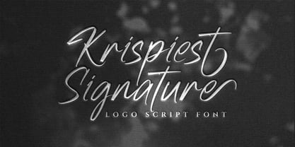 Krispiest Signature! A handwritten script brush font, all caps. Krispiest Signature font is suitable for branding, logotype, apparel, T-shirt, business card, product packaging, quotes, flyer, poster, book cover, advertising, etc. Whats Include? Opentype support Multilingual support PUA encoded Features: Uppercase, lowercase, numerals, punctuations, alternates, and ligatures Thanks for looking, and I hope you enjoy it! Please don't hesitate to drop me a message if you have any issues or queries.
 - Furniture Type by Forme Type,
$19.99 Forme Furniture Type Em and Furniture Type En Designed by using the pieces of letterpress furniture usually hidden, to create letter shapes. The square nature of the type means it could be used as a low resolution type. Forme Furniture Type Em – Low resolution type. Designed using *Furniture and **Em quads from letterpress printing. *Furniture: Pieces of wood or metal placed around or between metal type to make blank spaces and fasten the printed matter in the chase. ** Quads: (originally quadrat) is a metal spacer used in letterpress typesetting. An em quad is a space that is one em wide and one em high. Also available as Em Shadow to be used as a headline or display font. Forme Furniture Type En – Low resolution type. Designed by using *Leads and ** En quads from letterpress printing. *Lead or Reglet is a piece of Lead or wooden spacing material used in letterpress typesetting, to provide spacing between paragraphs. **An En quad is a space that is one En wide half the width of an Em quad, and the same height as the typeface. Also available as En Shadow to be used as a headline or display font.
 - Strak by Kustomtype,
$25.00 Strak is a font that was born out of admiration for the work of E. Vermeulen, a Belgian artist known for his tight, precise line and an unseen masterpiece that is spread around the world. He has published and exhibited his work in London, Liverpool, Angoulême, New York, Geneva, Amsterdam, Lyon and Turku (in Finland) and he even signed for the New York Times. Based on a few characters, a complete font was composed by Kustomtype. After a few sketches, Strak came to life. The name Strak, in this case, refers to the slender, beautiful woman with the correct waistlines and proportions. The font is designed this way; it is completely hand-drawn, digitized and can be used in all modern and graphic media. Strak is available in 8 different styles, has class and will make many people's mouth water when they see it on your designs. Do you want quality and style? Then Strak is the font-perfect solution!
 - Stray Cuts by IKIIKOWRK,
$19.00 Introducing Stray Cuts - Decorative Type, created by ikiiko. Stray Cuts is a raw and expressive brush font with a touch of "Surf Vibes". This type has a freestyle line with a sharp cut shape. This typeface is perfect for an extreme sport event, poster, flyer, magazine cover, street wear brand, fashion youth, quotes, or stylish text overlay to any background image. What's included? Uppercase & Lowercase Number & Punctuation Alternates & Ligature Multilingual Support Format File : TTF & OTF Works on PC & Mac Get also a good offer & FREEBIE at our site : www.ikiiko.com Enjoy our font and if you have any questions, you can contact us by email : ikiikowrk@gmail.com
 - Sailor Vito by IKIIKOWRK,
$17.00 Introducing Sailor Vito - Traditional Serif Type, created by ikiiko. Sailor Vito is a traditional serif typeface with a with a touch of victorian and old english style. This font shape is simple form but has a strong serif hook character. This typeface is perfect for an brand logo, magazine design, travel design layout, flyer design, poster design, inspirational quotes, photography layout, or simply as a stylish text overlay to any background image. What's included? Uppercase & Lowercase Number & Punctuation Alternates & Swashes Multilingual Support Get also a good offer & FREEBIE at our site : www.ikiiko.com Enjoy our font and if you have any questions, you can contact us by email : ikiikowrk@gmail.com
 - Chesterville by Andrew Tomson,
$10.00 Hello, friends! Just this year I went to the United States for the first time. To my surprise, the neighborhoods, streets, and parks that I had only seen in the movies turned out to be true. There is a soul in them. I really enjoyed wandering these endless streets, soaking up this spirit. They feel childishly carefree, as if you were in a movie.Just try this font and understand my feelings. The font will work for almost anything: social media, cards, invitations, announcements. Good luck and love to you!
 - Molianty by Akifatype,
$10.00 Molianty is highly legible script typeface, with a touch of a bold, classic and fun vintage look. It includes OpenType features with stylistic alternates. It can be used for various purposes, such as posters, t-shirt, signage, logos, news, badges etc. To enable the OpenType Stylistic alternates, you need a program that supports OpenType features such as Adobe Illustrator CS, Adobe Indesign & CorelDraw X6-X7, Microsoft Word 2010 or later versions. Molianty is coded with PUA Unicode, which allows full access to all the extra characters without having special designing software. Mac users can use Font Book , and Windows users can use Character Map to view and copy any of the extra characters to paste into your favourite text editor/app.
 - Fallefi Script by Akifatype,
$10.00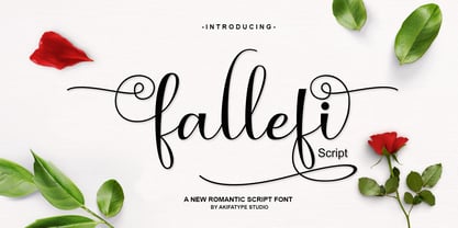 Fallefi Script is highly legible script typeface, with a touch of a bold, classic and fun vintage styling. It includes OpenType features and stylistic alternates. It can be used for various purposes, such as posters, t-shirt, signage, logos, news, badges etc. To enable the OpenType Stylistic alternates, you need a program that supports OpenType features such as Adobe Illustrator CS, Adobe Indesign & CorelDraw X6-X7, Microsoft Word 2010 or later versions. Fallefi Script is coded with PUA Unicode, which allows full access to all the extra characters without having special designing software. Mac users can use Font Book, and Windows users can use Character Map to view and copy any of the extra characters to paste into your favourite text editor/app.
 - Cable beach by Gatype,
$12.00 Cable beach Script is an elegant calligraphy font, it's casual and pretty. Can be used for various purposes. such as logos, product packaging, wedding invitations, branding, headlines, signage, labels, signatures, book covers, posters, quotes and more. Cable beach Script is encoded with PUA Unicode, which allows full access to all additional characters without having to special design. software. Mac users can use Font Book, and Windows users can use the Character Map to view and copy any additional characters to paste into your favorite text. To enable the OpenType Stylistic alternative, you need a program that supports OpenType features such as Adobe Illustrator CS, Adobe Indesign & CorelDraw X6-X7, Microsoft Word 2010 or a later version. and there are additional ways to access alternatives, using the Character Map (Windows),Nexus Font (Windows), Font Book (Mac) or a software program such as PopChar (for Windows and Mac). If you need any help or suggestions please contact me via email "chaidirgata@gmail.com" Thank you for your purchase!.
 - Prillwitz Pro by preussTYPE,
$49.00 Johann Carl Ludwig Prillwitz, the German punch cutter and type founder, cut the first classic Didot letters even earlier than Walbaum. The earliest proof of so-called Prillwitz letters is dated 12 April 1790. Inspired by the big discoveries of archaeology and through the translations of classical authors, the bourgeoisie was enthused about the Greek and Roman ideal of aesthetics. The enthusiasm for the Greek and Roman experienced a revival and was also shared by Goethe and contemporaries. »Seeking the country of Greece with one’s soul«. All Literates who are considered nowadays as German Classics of that time kept coming back to the Greek topics, thinking of Schiller and Wieland. The works of Wieland were published in Leipzig by Göschen. Göschen used typefaces which had been produced by until then unknown punch cutter. This punch cutter from Jena created with these typefaces master works of classicist German typography. They can stand without any exaggeration on the same level as that of Didot and Bodoni. This unknown gentleman was known as Johann Carl Ludwig Prillwitz. Prillwitz published his typefaces on 12th April 1790 for the first time. This date is significant because this happened ten years before Walbaum. Prillwitz was an owner of a very successful foundry. When the last of his 7 children died shortly before reaching adulthood his hope of his works was destroyed, Prillwitz lost his will to live. He died six months later. His wife followed him shortly after. The typeface Prillwitz as a digital font was created in three optical styles (Normal, Book and Display). The typeface Prillwitz Press was created especially for a printing in small sizes for newspapers. »Prillwitz Press« combines aesthetic and functional attributes which make written text highly readable. It was originally designed for a newspaper with medium contrast to withstand harsh printing conditions. Its structure is quite narrow which makes this typeface ideal for body text and headlines where space is at premium. For the Normal – even more for the Book – a soft and reader-friendly outline was created through a so-called »Schmitz« and optimized in numerous test prints. The arris character and the common maximal stroke width contrast of the known classicist typefaces (Didot/Bodoni) were edited by the study of the original prints. This was also done in order to reach a very good readability in small type sizes. This typeface is perfectly suited to scientific and belletristic works. Accordingly it has three styles: Regular, Bold and Italic as Highlighting (1). The typeface Prillwitz is a complete new interpretation and continuing development of the conservated originals from 1790. They have been kept in the German Library in Leipzig. It was always given the priority to keep the strong roughness and at the same time optimizing the readability of this striking font. The type family has all important characters for an efficient and typographic high quality work. ----------- (1) Accentuation of particular words or word orders (e.g. proper names, terms etc.). Typographic means for Highlighting could be Italic, SmallCaps or semi-bold.
 - Sarmytos by Aqeela Studio,
$18.00 Sarmytos is a modern calligraphy font with characters dancing along the baseline and with an elegant touch. Opentype features with stylistic alternates, ligatures and multiple language support. Sarmytos can be used for various purposes.such as logos, wedding invitation, heading, t-shirt, letterhead, signage, labels, news, posters, badges etc. To enable the OpenType Stylistic alternates, you need a program that supports OpenType features such as Adobe Illustrator CS, Adobe Indesign & CorelDraw X6-X7, Microsoft Word 2010 or later versions. How to access all alternative characters using Adobe Illustrator: https://www.youtube.com/watch?v=XzwjMkbB-wQ Sarmytos is coded with PUA Unicode, which allows full access to all the extra characters without having special designing software. Mac users can use Font Book , and Windows users can use Character Map to view and copy any of the extra characters to paste into your favourite text editor/app. Thanks and happy designing :) Enjoy!
 - Mortyni by Aqeela Studio,
$20.00 Mortyni is a modern calligraphy font, with characters that dance along the baseline with an elegant touch. It includes OpenType features with stylistic alternates, ligatures and multiple language support. Can be used for various purposes.such as logos, wedding invitation, heading, t-shirt, letterhead, signage, labels, news, posters, badges etc. To enable the OpenType Stylistic alternates, you need a program that supports OpenType features such as Adobe Illustrator CS, Adobe Indesign & CorelDraw X6-X7, Microsoft Word 2010 or later versions. How to access all alternative characters using Adobe Illustrator: https://www.youtube.com/watch?v=XzwjMkbB-wQ Mortyni t is coded with PUA Unicode, which allows full access to all the extra characters without having special designing software. Mac users can use Font Book , and Windows users can use Character Map to view and copy any of the extra characters to paste into your favourite text editor/app. Thanks and happy designing :) Enjoy!
 - Butterfly Wingz by Ingrimayne Type,
$5.00 IngrimayneType has put letters inside a variety of objects, including bowling pins, book covers, coffee mugs, teapots, pumpkins, Christmas ornaments, train cars, tombstones, old bottles, circles, and rectangles. In each case the letters were placed on a single shape. The use of the Opentype feature of contextual alternatives makes it easy to use two different but alternating shapes. ButterflyWingz puts its letters on the right and left wings of a butterfly. The wings provide a large surface for drawing letters, but they have a odd shape so letters must be distorted to fit. The wings are symmetrical but some letters are not, so the right and left wing versions of the same letter are sometimes quite different. Without the contextual alternative feature one could design a typeface like ButterflyWingz but the user would have to alternate upper and lower case keys. With contextual alternatives turned on, the computer automatically alternates the letters creating a line of complete butterflies. Turning on the Opentype feature stylistic styles one (ss01) replaces the empty spaces with empty wings. However, sometimes an empty wing at the end of a line is unwanted and it can be removed by changing the typeface or by turning off the stylistic style for that character. The family contains two styles, a filled style and an outline style. They can be used separately or together in layers to add color. (Empty wings are on the logicalnot and registered characters.) ButterflyWingz is hard to read and should be used in small doses for decorative effects.
 - Regave by Wahyu and Sani Co.,
$25.00 Introducing Regave, a typeface inspired by Danish style lettering based off the work of Knud Valdemar Engelhardt (1882–1931) who designed the street signs for the Copenhagen suburb of Gentofte. The Engelhardt's design was loosely based on the lettering of two Danish architects of the time: Thorvald Bindesbøll (designer of the Carlsberg logo) and Anton Rosen. The signs were so successful that they’re still in use today. The most noticeable characteristic of Danish style are: a flat apex of the A the widening of diagonal terminals a double-storey g with its loop terminating before it forms the bottom most stroke (Erik Spiekermann coined this a Danish g) a single-story g with a stumpy tail a K with an almost laterally moved crotch, connected to the stem by an extra horizontal stroke widened diagonal connecting strokes forming flat apex or baseline strokes Regave comes in 11 weights from Thin to ExtraBlack with matching italics and also available in Variable Font format for more flexibility in weight selection. This family also equipped with useful OpenType features such as Ordinals, Superscripts, Subscripts, Stylistic Alternates, Stylistic Sets, Proportional Lining, Standard Ligatures, Fractions, Numerators & Denominators. Each font has 490+ glyphs which covers Western & Eastern Europe, and other Latin based languages – over 200 languages supported! Regave will be suitable for many creative projects. This masculine, strong and unique typeface will be suitable for logos, posters, presentations, headlines, lettering, branding, quotes, titles, magazines, headings, web banners, mobile applications, art quotes, advertising, packaging design, book title, and more!
 - Bodoni Classic Ad by Wiescher Design,
$55.00 I became interested in designing Bodoni Classic because of a lazy graphic designer at Jacques Damase publishing house. He had to change a single letter on a bookcover about J. B. BODONI. The French call him Jean Baptiste instead of Giambattista! And that unknown graphic designer just took any old “J” from some newly cut Bodoni. All the new Bodoni cuts have square serifs, whereas the originals had rounded serifs and slightly concave feet. The single letter “J” with the squared off serif was for me like a road sign to start redesigning the entire Bodoni family. That’s exactly what I started in 1993 and a dozen years later I am finished. Okay, I am still adding new Bodoni Classics, but those are my personal additions. Yours very retro, Gert Wiescher
 - Bodoni Classic Initials by Wiescher Design,
$55.00 I became interested in designing Bodoni Classic because of a lazy graphic designer at Jacques Damase publishing house. He had to change a single letter on a bookcover about J. B. BODONI. The French call him Jean Baptiste instead of Giambattista! And that unknown graphic designer just took any old “J” from some newly cut Bodoni. All the new Bodoni cuts have square serifs, whereas the originals had rounded serifs and slightly concave feet. The single letter “J” with the squared off serif was for me like a road sign to start redesigning the entire Bodoni family. That’s exactly what I started in 1993 and a dozen years later I am finished. Okay, I am still adding new Bodoni Classics, but those are my personal additions. Yours very retro, Gert Wiescher
 - Bodoni Classic Chancery by Wiescher Design,
$55.00 I became interested in designing Bodoni Classic because of a lazy graphic designer at Jacques Damase publishing house. He had to change a single letter on a bookcover about J. B. BODONI. The French call him Jean Baptiste instead of Giambattista! And that unknown graphic designer just took any old “J” from some newly cut Bodoni. All the new Bodoni cuts have square serifs, whereas the originals had rounded serifs and slightly concave feet. The single letter “J” with the squared off serif was for me like a road sign to start redesigning the entire Bodoni family. That’s exactly what I started in 1993 and a dozen years later I am finished. Okay, I am still adding new Bodoni Classics, but those are my personal additions. Yours very retro, Gert Wiescher
 - Bodoni Classic Text by Wiescher Design,
$55.00 I became interested in designing Bodoni Classic because of a lazy graphic designer at Jacques Damase publishing house. He had to change a single letter on a bookcover about J. B. BODONI. The French call him Jean Baptiste instead of Giambattista! And that unknown graphic designer just took any old “J” from some newly cut Bodoni. All the new Bodoni cuts have square serifs, whereas the originals had rounded serifs and slightly concave feet. The single letter “J” with the squared off serif was for me like a road sign to start redesigning the entire Bodoni family. That’s exactly what I started in 1993 and a dozen years later I am finished. Okay, I am still adding new Bodoni Classics, but those are my personal additions. Yours very retro, Gert Wiescher
 - Bodoni Classic Hand by Wiescher Design,
$55.00 I became interested in designing Bodoni Classic because of a lazy graphic designer at Jacques Damase publishing house. He had to change a single letter on a bookcover about J. B. BODONI. The French call him Jean Baptiste instead of Giambattista! And that unknown graphic designer just took any old “J” from some newly cut Bodoni. All the new Bodoni cuts have square serifs, whereas the originals had rounded serifs and slightly concave feet. The single letter “J” with the squared off serif was for me like a road sign to start redesigning the entire Bodoni family. That’s exactly what I started in 1993 and a dozen years later I am finished. Okay, I am still adding new Bodoni Classics, but those are my personal additions. Yours very retro, Gert Wiescher
 - Neospace Expanded by deFharo,
$21.00 Neospace Expanded is an avant-garde typeface designed for technology and science fiction lovers. With its elegant geometric minimalism, Neospace redefines typographic aesthetics with a perfect fusion between modern and futuristic. Geometric Inspiration Designed with an expanded proportion and thin thickness, it exudes its own high-tech, futuristic and space style. Each Neospace character has been sculpted from the letter “O”, using the mathematical proportions of the Fibonacci sequence in curves, metrics and kerning, adding a golden ratio to each character. This meticulous approach ensures exceptional readability and a unique aesthetic that evokes a sense of order and precision. Three styles: Regular, which provides a modern and clean look; the Dot Layer, which adds a touch of color and creativity to typographic titles; and the Bold version, which evokes the feeling of futuristic and sophisticated electronic circuits, bringing a sense of avant-garde and advanced technology to your projects. Neospace allows you to create typographic titles in various colors, imitating the sophistication of futuristic electronic circuits. Limitless Versatility Neospace goes further by offering alternative letters and signs, multiple sets of numbers and capital letters, as well as monetary and cryptocurrency symbols. In addition, it incorporates complex OpenType functions that further enrich the design possibilities, allowing even greater customization in your typographic designs.
 - Harmonique by Monotype,
$31.99 Harmonique is an incised serif typeface designed for both text and display purposes. It’s a type family of two styles that work in harmony together to add distinction and personality to your own typographic compositions. Harmonique’s low contrast forms have the appeal of a humanist sans serif typeface. Its subtly flared terminals evoke the craft and skill of a signwriter’s steady hand, creating an authentic and pleasing aesthetic. Harmonique Display is more calligraphic in its structure – as if drawn by a wide-nibbed pen. This style is accentuated by aggressively barbed serifs and chiselled arcs in its counters and bowls. These strong characteristics help to define a flamboyant, confident style that will provide impact and flair to your headlines, titles and identity designs. Practical features include 48 ligatures that will enhance titling possibilities with their all-capital pairings – these are accesssed by turning on Discretionary Ligatures and then selecting either Sylistic Set 1 or 2. There are also a number of alternate caps that will subtly enhance your titles and headlines – access these via Stylistc Sets 3 and 4. Small Caps are included too (along with their matching diacritics) – adding another layer of versatility to this typeface. Proportional Lining figures are available as an option if you prefer them to the default Old Style figures. There are 32 fonts altogether, with 8 weights in roman and italic from Light to Ultra in both text (low contrast) and display (high contrast) styles. Harmonique has an extensive character set (650+ glyphs) that covers every Latin European language. Key features: 8 weights across two styles in both roman and italic 48 Ligatures 11 Alternates Small Caps Full European character set (Latin only) 650+ glyphs per font.
 - VLNL Irish Stew by VetteLetters,
$35.00 Obviously the Irish Stew font finds its origin in Ireland. During a vacation in West Ireland Donald® fell in love with the famous local dish. In fact, he loved Irish stew so much he couldn't wait to create a font dedicated to the stew from Ballymaloe. He found the inspiration for this font on an old shop front sign somewhere in Dublin. The sign only contained a few characters, but the stew had given him more than enough energy and inspiration to complete the whole alphabet!
 - Nika by Typecaste,
$22.00 Nika is a display face with a quirky personality. Born as part of an experiment in contrast within typeface development, Nika has a thin body with chunky serifs. She is simultaneously sleek and playful, legible and distinct. As part of a magazine repertoire, on neighborhood flyers, or a blog, Nika feels at home in various applications.
 - Mongolia by Goodigital13,
$20.00 It can be used in different purposes: lettering and logotype, labels, t-shirts, product packaging, invitations, advertising, and any classic / vintage typography design projects. will be great for any projects including : branding, logo, stationery, business card, signage, flyer, brochure etc. Almost all industries will be match for this typeface: events, music video, makeup artist, travel, promotions, musician, magician etc
 - HaManga Irregular by Linotype,
$29.99This unusual font was designed by Alessio Leonardi, who plays with the difference between content and impression. At first glance the font looks almost like a row of pictograms or Asiatic characters. The forms become Arabic letters when the characters are set together to form words. HaManga Irregular is a good font to use when the reader is supposed to contemplate not only the text but the form of what he or she sees. - Alimentary by Missy Meyer,
$12.00 Alimentary (adjective): relating to nourishment or sustenance. If you've seen my other fonts, you know I tend to lean into food-based names. This name has to do with food and science combined, so it's double nerdy in the ways I like to be nerdy! I started with Alimentary Medium, which was inspired by my shorter, wider font MacGuffin - I wanted something taller, narrower, with a hip and retro feel. When I finished the Medium weight, I felt like I wanted a Light weight. Then a Heavy weight. Then I figured, "what the heck," and made an outline version of the Medium weight too. In the end, I wound up with four members of the Alimentary family, each with over 700 glyphs! Not only do they all have the basics (A-Z, a-z, 0-9, and tons of punctuation), but they also each have 330 characters for European language support, and a limited selection of Greek, Coptic, and Cyrillic characters. Plus a double handful of alternates and ligatures to add a little variety to your designs! And of course, all of the Alimentary fonts are super-smoothed, with reduced nodes and clean curves, so whether you're cutting them out, printing them, engraving them, or using them in a way I haven't even thought of, these fonts will be sharp and crisp!
 - Melinda Script by Gatype,
$12.00 The Melinda is a smooth, elegant and flowing handwritten font. It has a beautifully balanced character, it fits into many designs. Melinda features a varied baseline, smooth lines, gorgeous glyphs, and stunning alternatives. Hand-drawn design elements allow you to create many beautiful typographic designs in an instant like branding, web design and editorial, prints, crafts, quotes, It's great for logotypes, wedding invitations, romantic cards, labels, packaging, spelling of names and others. Add to your most creative ideas and watch how they bring them to life! Melinda includes OpenType stylistic alternates, ligatures and International support for most Western Languages.To enable the OpenType Stylistic alternates, you need a program that supports as Adobe Illustrator CS, Adobe Indesign & CorelDraw X6-X7, Microsoft Word 2010 or later versions. How to access all alternative characters using Adobe Illustrator: https://www.youtube.com/watch?v=XzwjMkbB-wQ Melinda is coded with PUA Unicode, which allows full access to all the extra characters without having special designing software. Mac users can use Font Book , and Windows users can use Character Map to view and copy any of the extra characters to paste into your favorite text editor/app. How to access all alternative characters, using Windows Character Map with Photoshop: https://www.youtube.com/watch?v=Go9vacoYmBw
 - Loncherita by Fabio Godoy,
$29.95 Loncherita is a typeface created by Fabio Eduardo Godoy Angel and has 5 files: Fill, Fill Outline, Shadow 1, Shadow 2 and dingbats variables. Its purpose is to serve as a childish fantasy modular typography useful in logo design and merchandising. It is also recommended to compose expressive titles that need the option in which letters can be colored by layers. In that sense Loncherita is a typeface with logic italic vertical logical and its amount of contrast between thick and thin strokes is monoline, its antlers are mullets and rounded ends. It is also important to note that ii has 26 Dingbats designed to be point of attention and illustrate countless children and playful issues.
 - Cagey by Graphicfresh,
$16.00 Cagey - The Bold Retro Font I named this font cagey. Another picture of the ingenuity of the ancients when they found a masterpiece. Through this font, I want to reminisce and reminisce about the past. This font is synonymous with 70s or 80s style design visuals, Bold and strong. I hope you enjoy using this font and can come up with clever and brilliant ideas in your designs. Thanks Graphicfresh
 - Deco Wood Type JNL by Jeff Levine,
$29.00 When people usually think of wood type, images of bold and ornate designs reminiscent of the Old West or the Victorian Era come to mind. In truth, wood type was manufactured well into the late 20th century, and only fell out of favor when the letterpress was replaced by the offset press and computerized typesetting. Although there are hard-core collectors who have started a small resurgence in the preservation and use of wood type, it's the digital interpretations of these classic faces that see the most use in today's electronic layout work. Deco Wood Type JNL reinterprets one of these later designs, a bold sans with a decidedly Art Deco influence.