10,000 search results
(0.035 seconds)
- Paper-Mache - Personal use only

- Fracture by Scholtz Fonts,
$21.00 Fracture is a broken font -- broken into many pieces -- yet it still conveys a powerful and modern message. It is a funky, in-your-face font that has strong overtones of modern rap and hip-hop culture. Its fragmented look brings to mind graffiti, contemporary youth culture, kids-on-the-move. Fracture is a must for movie posters, event posters, CD & DVD covers, clothing ads & swing tags, funky magazines, in fact, any product aimed at the young, trendy market. The font is letterspaced and kerned and has a complete character set (all upper and lower case, numerals and mathematical symbols and a complete set of accented and special characters).
 - Street Stronger by Sipanji21,
$13.00 "Street Stronger" is a graffiti font with three layers that can be used to create a three-dimensional (3D) effect on your text. By using these three layers in your design, you can add depth and dimension to your typography. Fonts with these layers are often used in street art, posters, or other designs that aim to create a prominent 3D effect. With "Street Stronger," you have the ability to create text that looks different and adds a strong 3D impression by using the various layers. This allows you to customize the text's appearance to fit your design vision and add a powerful three-dimensional touch to your project.
 - Ongunkan Northern Arabian Scrip by Runic World Tamgacı,
$49.99 The Ancient North Arabian scripts Ancient North Arabian is the name given to a group of scripts belonging to the South Semitic script family, which also includes the Ancient South Arabian alphabets (musnad and zabūr) and the vocalized alphabets used in Ethiopia for Geʿez, Amharic, etc. The Ancient North Arabian scripts were used both in the oases (Dadanitic, Dumaitic, Taymanitic,) and by the nomads (Hismaic, Safaitic, Thamudic B, C, D, and possibly Southern Thamudic). There are tens of thousands of inscriptions and graffiti in these scripts which were used in the period roughly between the sixth century BC and the fourth century AD. See the descriptions of the individual scripts below
 - 1672 Isaac Newton by GLC,
$42.00 Isaac Newton, father of the theory of gravity, used several forms of handwriting in his life, in numerous texts about numerous scientific subjects. Here, we propose a handwritten font, using a particularly legible script form, coming from texts written in 1672, the year he presented a new reflecting telescope to the Royal Society. It is a Pro font containing Western, Eastern, Central and Northern European, Icelandic, Baltic, and Turkish diacritics. The alternates and ligatures allow the font to look as closely as possible to the real thing. The features allow OTF software to vary the characters of a word automatically, with no more work than selecting contextual alternates and standard ligatures.
 - Mateo by Linotype,
$29.99 Linotype Mateo is part of the Take Type Library, which features the winners of Linotype’s International Digital Type Design Contest from 1994 to 1997. Jürgen Ellenberger included three styles in his font, roman, bold and outline. The characters of Mateo consist exclusively of lines, giving the font an extremely angular look. However, Mateo retains a certain handwritten style somewhat reminiscent of the graffiti left on wooden grade school desks by previous classes. The bold and outline styles have emphasized stroke contrasts but keep the angular, consciously irregular look. The roman style is best for smaller texts and the bold and outlines styles for headlines.
 - Orkhon by Plastikdna,
$16.00 The Old Turkic script (also known as variously Göktürk script, Orkhon script, Orkhon-Yenisey script) is the alphabet used by the Göktürks and other early Turkic khanates during the 8th to 10th centuries to record the Old Turkic language. Words were usually written from right to left. According to some sources, Orkhon script is derived from variants of the Aramaic alphabet, in particular via the Pahlavi and Sogdian alphabets of Persia, or possibly via Kharosthi used to write Sanskrit The texts are mostly epitaphs (official or private), but there are also graffiti and a handful of short inscriptions found on archaeological artifacts, including a number of bronze mirrors.
 - Dase Signature by Dase,
$25.00 The handwriten script font inspired by Dase’s Signature streetart. Create Calligraffiti Art. This handstyle mixes the quick, confident and contemporary gestures of rebel graffiti tags (usually made with markers and sprays) with the legibility, organic texture and clean edges of modern handbrushed calligraphy. Casual and spontaneous. Elegant yet casual. Simple, clean and contemporary brushpen strokes with some classy hip-hop vibes. Your words become artworks. Just write to create beautiful designs and bold statements. Empower your creative content (Social media posts, quotes, videos, blog and magazine titles), product & branding (logos, patterns, packaging, fashion products, book covers), advertising (banners & posters), event invitations (weddings, releases…) and more.
 - Marker Makers by Colllab Studio,
$19.00 "Hi there, thank you for passing by. Colllab Studio is here. We crafted best collection of typefaces in a variety of styles to keep you covered for any project that comes your way! Making your brand visible, interesting and recognizable without having to get in the way of your customer’s experience is hard. It takes a lot of time, money and effort to make a clear brand. And maintaining it through all your customer touchpoints is even harder. Introducing, Marker Makers is a versatile marker font that takes inspiration from the boldness of graffiti and the playfulness of primary colors. It's a joy to use for any design project where you want your audience to pay attention, this is your go-to font and take your next project from good to WOW! Marker Makers comes with more than 400 glyphs, including punctuation, numbers and upper and lower-case letters you’ll have all the tools you need to create invigoratingly unique content. Whether it’s included on posters at trade shows or on the walls of any room in your office, no one will ever think it was boring! A Million Thanks Colllab Studio www.colllabstudio.com
 - Retrorocket NF by Nick's Fonts,
$10.00 A French lettering chapbook from the 1920s, entitled "Art du Tracé Rationnel de la Lettre," provided the inspiration for this decidedly Deco exercise in alternative letterforms. Both flavors of this font feature the 1252 Latin, 1250 Central European, 1254 Turkish and 1257 Baltic character sets.
 - Patsy PB by Pink Broccoli,
$14.00 Patsy is a quirky sans-serif font inspired by the titling sequence from the 1964 film, "The Patsy", starring Jerry Lewis. Heavyweight, yet fun and full of personality, it was a lettering styles that was so much fun to flesh out and make into a typeface. I've opened up the letter spacing lightly from the original film poster design for better readability at a range of sizes. With an alternating all-caps character set, and offbeat letter weighting, Patsy is fun to typeset with as the font auto-switches between Capitals and Lowercase (alternate capitals) no matter if you type all caps or all lowercase.
 - Autumn Melody by PeachCreme,
$22.00 Autumn Melody is a modern calligraphy font that adds a classy and deluxe touch to your designs. The main pursuit of this font is to give you that authentic hand-calligraphy feel. Autumn Melodycomes with a full set of uppercase and lowercase letters as well as ligatures and beautiful letter alternates. The font provides several (up to15) alternates of some frequently used letters such as a, t, h, n, s, etc. The number and look (length, width) of the swashes vary depending on the frequency of this or that letter's usage. Autumn Melody is suitable for many projects related to the wedding industry (stationery, logo, etc.)
 - Tola by Agnieszka Ewa Olszewska,
$18.00 Tola is a modern, reversed-weight, experimental display font with a spirit of the 70s. Looks better in large sizes but in smaller thanks to the thick bottom makes also interesting effect. It’s based on my letter shape experiment. I was drawing one single letter in the hope to find interesting results. I started Tola font with the letter “G” and based on that shape I created the rest of the alphabet. Tola looks good in modern graphics. It contains uppercase, numbers, and some punctuation signs, and is multilingual. Perfect for logos, posters, and social media graphics that need a super superhero with a sentimental touch.
 - Cristal Text by Johannes Krenner,
$5.00 »Cristal Text« has nice to read lower case letters. It contains 636 letters per font style and some Open Type features: Different stylistic alternates and different sets of numerals. It is not monospaced: Therefor it stays not true to an underlying grid like it’s bigger brother »Cristal True«. But this offers a better legibility. The basis of this font is a Union-Jack or sixteen-segment display (SISD). I have found myself in the need of a precise and well-made font, that simulates the look of such a LCD display. Also it should offer enough letters and language support for the whole European region as well as different font styles.
 - Manteiga by Plau,
$49.00 Julia Child once said: the secret to great french cooking is butter, butter, butter. Thus, we present to you Manteiga - butter in Portuguese! - a typeface for heart-melting, word-spreading goodness. The idea we had was to play with brush lettering - a style we love - and go as far as we can with the shapes of the letters while finding balance between positive and negative space. We wanted biiiig personality. And small inconsistencies - the ones that add texture and life to lettering. We left extensive OpenType features and technical stuff aside for a moment, adding later only what we thought was necessary, like different shapes for the Q, a and g - for example. All caps setting was something we wanted from the beginning. In text case, the x-height is rather short for a brush script, and this lends a quirky voice. Spacing is ultra tiiiiight so don’t go too small, but make it as big as you want! Ah! And there are some fun dingbats thrown in for good measure.
 - Bubbleboy is a charming, lively font that seems to burst with cheerful energy and playful charm, evoking the whimsy of childhood bubble letters yet refined enough for both personal and professional p...
- Growing Garden by Wyarecreatype,
$7.00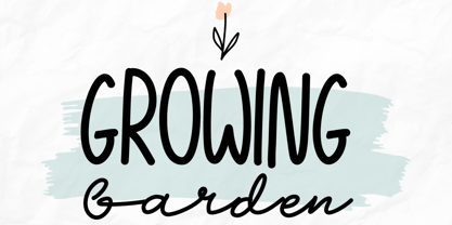 Growing Garden is an elegant and natural trio handwritten font. This original look will appeal to a wide range of crafty ideas. It looks stunning on wedding invitations, thank you cards, quotes, greeting cards, logos, business cards and every other design which needs a handwritten touch. Includes: Uppercase and lowercase For every questions or help, Please contact me. Happy Creating! Thanks!
 - Wordwalker by Cititype,
$16.50 Wordwalker is a freehand casual marker script that designed to appear as if it was written by wide marker. This original look will appeal to a wide range of crafty ideas, from letterheads and titles, to stationery. A clean legible style yet friendly & fun. Wordwalker features extended characters, containing West European diacritics & ligatures, making it suitable for international environments & publications.
 - Gryffensee by Catharsis Fonts,
$30.00 Gryffensee is designed to be the Futura of blackletter, combining the time-honored gravity and relentlessness of the Gothic script with the clean, contemporary freshness of the geometric sans. Built from a tightly controlled inventory of lines, arcs, sharp cuts, and OpenType features, Gryffensee was born and raised in the digital age, yet retains the powerful charisma and human warmth of its mediaeval blackletter ancestors. As a result, it excels in a wide range of display settings, logotypes, and short text. Unlike most conventional blackletters, it even handles all-caps usage with grace, and includes an extensive Cyrillic character set (in the Pro version). Apart from a generous range of automatic ligatures and contextual alternates, Gryffensee offers stylistic alternates that allow users to customize its appearance to their tastes. The capital letters |AGHIKZ| come in alternate cuts that trade traditional shapes for increased legibility, while the letter |s| appears in three cuts, each with a unique, distinct flavor. All these options are accessible through OpenType stylistic sets in the main Latin font, Gryffensee Eins. For easy use in applications without OpenType support, we provide two additional Latin fonts (Gryffensee Zwei and Drei) in which these options replace the default cuts. Finally, Gryffensee Pro offers all the functionality of Gryffensee Eins, plus Cyrillic support. My intention to devise a contemporary geometric blackletter was inspired by four hand-painted letters, |ABCD|, in Sasha Prood�s online portfolio. I later found out that he had, in turn, taken those letters from an existing font, Bastard, by Jonathan Barnbrook. Luckily, by that time my project had taken on a life of its own. Gryffensee is an original design that bears only the most superficial resemblance to Bastard. Gryffensee is a mediaeval spelling of the lake Greifensee near which I grew up. It is pronounced [?gri?f?n?se?], or "GRIEF-un-say" in English approximation. This font is dedicated to Simone.
 - Wacamóler Caps - Personal use only

- Draghord by Alit Design,
$19.00 Introducing Draghord, a bold and dynamic typeface that embodies the essence of superheroic power and adventure. This font is a visual journey into the realm of fire, swords, skulls, and wings, capturing the spirit of mighty heroes and formidable villains alike. Characteristics: Flaming Elements: Each letter of Draghord is adorned with fiery accents, reminiscent of a blazing inferno. The flames dance around the characters, conveying a sense of untamed power and intensity. Sword-Inspired Strokes: The letterforms draw inspiration from the sleek and sharp edges of legendary swords. The angular and precise strokes give the font a cutting-edge aesthetic, symbolizing strength and precision. Skull Motifs: Intricately integrated skull motifs within the font add an element of danger and mystery. The skulls serve as a visual reminder of the challenges faced by our superheroic characters, embodying both mortality and defiance. Dynamic Winged Elements: The font incorporates dynamic winged elements that soar across certain letters, emphasizing the theme of flight and freedom. These wings symbolize the superhero's ability to rise above adversity and transcend limitations. Usage Scenarios: Comic Books: Draghord is perfect for comic book titles, captions, and speech bubbles, adding a dramatic and visually striking element to the narrative. Movie Posters: Use Draghord to create attention-grabbing titles and taglines for superhero movies. Its bold and adventurous design will set the tone for epic storytelling. Gaming Graphics: Ideal for in-game text, Draghord adds a heroic touch to video game interfaces, especially in fantasy or superhero-themed games. Event Promotion: For superhero-themed events, Draghord can be utilized in promotional materials, posters, and banners to convey a sense of excitement and power. In Conclusion: Draghord is not just a font; it's a visual experience that transports you into the heart of superheroic tales. With its fiery, sword-inspired design, skull motifs, and dynamic wings, Draghord is the perfect typographic companion for any project seeking to channel the thrilling energy of the superhero genre. Unleash the power of Draghord and let your words ignite the imagination!
 - Primaria by PeGGO Fonts,
$18.00 Primaria is a display font, inspired on the very first basic handwrite style teaching at primary school, designed in cursive and print styles in three weights each one: light, Regular and Bold, considering stylistic and typographic needs, it also contain OpenType initial lowercase alternative forms in order to get better links in those case where pairs of letters could be look better. Recommended playful and friendly design, teaching and learning stuff, children toys projects, food & drink and soft stuff.
 - Sansduski Mono by Ingrimayne Type,
$9.00 SansduskiMono is a sans-serif decorative/display family that is monospaced. Its very high x-height and tight spacing make it more suitable for use at large point sizes than small point sizes. (There are better options if one wants a readable text font.) The letter O is a rectangle with rounded corners and this shape motif is carried over to other characters that are usually rounded. The origin of this face is in a previous typeface, BigStripesMono. That family was designed to use the OpenType feature Contextual Alternatives (calt) to put stripes on letters. It had only upper-case letters in one weight. SansduskiMono adds lower-case letters and eight more weights plus italics and outline styles for the black weights. For a proportional rather than monospaced version of this design idea, see Sansduski. SansduskiMono is appropriate for titles, posters, advertising, and other uses that benefit from simple letter forms that are geometric and clean.
 - Details Details NF by Nick's Fonts,
$10.00Another gem from the Blandford Press Pen and Brush Lettering and Practical Alphabets, this in-your-face typeface features strong geometric elements, delineated in blueprint fashion. A surefire attention-getter. Both versions of the font include the 1252 Latin and 1250 CE character sets (with localization for Romanian and Moldovan). - Retail Price JNL by Jeff Levine,
$29.00 Redrawn from lettering found on a British publication circa the 1930s, Retail Price JNL is an extra bold display inline sans that’s great for catchy headlines, price cards, banners or any other attention-getters. Retail Price JNL is offered in regular, oblique, solid and solid oblique versions. Caps only Fonts.
 - Disko - Personal use only

- End of Path - Unknown license

- Jangly walk - 100% free

- Ornate Deco by Jeff Levine,
$29.00 Ornate Deco JNL is a thick-and-thin Art Deco serif typeface with diamond shapes inside the thicker parts of the characters. It is based on an alphabet example found in the 1949 French lettering book “Album de Lettres Arti”, and is available in both regular and oblique versions.
 - Fancy Deco JNL by Jeff Levine,
$29.00 This decorative, scalloped thick-and-thin Art Deco type design is one of the many inspirations found within the pages of the 1934 French lettering book “L'Art du Tracé Rationnel de la Lettre”. Now in digital format, Fancy Deco JNL is available in both regular and oblique versions.
 - Summer Macaron by Abo Daniel,
$14.00 introducing SUMMER MACARON -crafty handwritten sans serif- it is a simple, natural, and fun handwritten font. This is an uppercase font designed for crafters. It is great for branding, packaging, quotes, t-shirt design, card, banners, cutting, silhouettes, and anything of craft projects. It looks so natural. Features: - Uppercase - Number & punctuation - Multilingual - PUA encoded I hope you love it. Welcome summer regards, Abo Daniel Studio
 - Portsmooth by Abo Daniel,
$13.00 PORTSMOOTH - signature font- it is great for branding, packaging, card, logo, tote bag design, cup drink design, banner, and anything project with an elegant touch but still looks crafty. I created 38 ligatures to make this font look so natural. This font is perfectly combined with swash Features: - Uppercase - Lowercase - Numeral - Multilingual - 38 Ligatures - swash - PUA encoded I hope you love it... regards, Abo Daniel Studio
 - Love Ready by Epiclinez,
$18.00 Love Ready is the perfect font to express yourself. It's playful, fun, and crafty - just like you! With its quirky letterforms and bold style, Love Ready is perfect for everything from product packaging to letterheads. So what’s included : Basic Latin Uppercase and Lowercase Numbers, symbols, and punctuations Multilingual Support. PUA Encoded and fully accessible without additional design software Simple Installations works on PC & Mac Thank You.
 - The essence of the Graffiti font mirrors the vibrant, expressive, and sometimes rebellious spirit of street art from which it draws inspiration. This type of font captures the raw energy and boldness...
- Freitag Display by Zetafonts,
$39.00 Probably as a reaction to the pragmatism of modernist design, the seventies saw an explosion of buoyant, vivacious typography. Psychedelia fueled a return to the melting, lush shapes of Art Nouveau while Pop culture embraced the usage of funky, joyful lettering for advertising, product design and tv titling. New low-cost technologies like photo-lettering and rub-on transfer required new fonts to be expressive rather than legible, pushing designers to produce, bubbly, high-spirited masterpieces, where geometric excess and calligraphic inventions melted joyfully. Freitag is Cosimo Lorenzo Pancini's homage to this era and its typography. His starting point was the design of a heavy sans serif with humanist condensed proportions, flared stems and reverse contrast, that generated both the main family, and a variant display subfamily. The main typeface family slowly builds the tension and design exuberance along the weight axis - a bit like our desire for the weekend increases during the week. In Light and Medium weights the font shows a more controlled, medium-contrast design, tightly spaced for maximum display effect. The Book weight follows the same design but uses a more relaxed letter spacing to allow usage in smaller sizes and short body copy. As weight increases in the Bold weight the style becomes more expressive, with a visible reverse contrast building up and culminating in the Heavy weight with his clearly visible "bell bottoms" feel. In the display sub-family the design is pushed further by introducing variant letterforms that have a stronger connection to calligraphy and lettering. Also, the weight range becomes a optical one, with weights marked as Medium, Large, XLarge, as bringing the contrast and the boldness to the extreme creates smaller counterspaces that require bigger usage sizes. Another important addition of the display sub-family is the connected italics that sport swash capitals and cursive letterforms, developed with logo design and ultra-expressive editorial design in mind. To balance the extreme contrast in the XL weight, contrast of punctuation is reduced, creating a rich, highly-dynamic texture wherever diacritics and marks are used in the text. The full family includes 16 styles + 4 variable fonts, allowing full control of the design over its tree-hugging design space. All 20 fonts share an extended latin charset with open type features including case sensitive forms, single and double story variants and alternate glyphs. According to its creator, "Freitag is the typeface that sounds like an imaginary Woodstock where on the stage with Jimi Hendrix with Novarese, Motter, Excoffon and Benguiat playing onstage with Jimi Hendrix". Jeepers creepers!
 - Kilburn by Talbot Type,
$19.50 Kilburn is a no-nonsense, condensed Gothic sans-serif. For over a century the condensed sans-serif has been the 'go to' font for gravitas and authority. Kilburn continues in the fine tradition of fonts such as Franklin Gothic, News Gothic and Trade Gothic offering a contemporary interpretation of the condensed sans-serif — functionality with personality. Equally at home as both a text and display font, Kilburn is available in five weights from Thin through to Black.
 - Vala by Monotype,
$29.99 Vala™ dances across printed pages and shines on screen. This is a high-energy design that blends the grace of an English Roundhand script with the gravitas of an extra bold Bodoni. There is even a bit of romance in the design. Vala speaks with a resonant voice – and knows few bounds. The typeface enhances print headlines, subheads, cover art and packaging. The design also brings its distinctive melding of verve and poise to banners, headings, navigational links and branding in web sites, blog posts, games and apps. Oscar Guerrero found inspiration for Vala in shop window lettering near his home in Bogotá, Colombia. “The capital A, R and V caught my attention and I photographed the window for future reference,” he explains. “Later I started to draw more letters inspired by the ones in the window.” Guerrero admits that he has always admired the work of Giambattista Bodoni and allowed his classic Didone designs to infuse Vala. Striking contrast in stroke weights, lively ball-terminals and a large x-height give Vala the grace and force of a Waikiki wave. Not satisfied with just a basic character set, Guerrero also took advantage of OpenType’s capabilities and drew a complete set of swash capitals, a bevy of fancy ligatures, and a suite of lowercase alternative designs. The result is that Vala easily emulates custom lettering in posters, headlines and logotypes. The “romantic” part of Vala? Guerrero dedicated the design to his girlfriend, Valentina, and named it after her.
 - Laca Pro by Nova Type Foundry,
$52.99 Laca Pro now supports Greek and Cyrillic scripts. The letter shapes capture the playful spirit of Laca. The added language support brings even more usefulness for the use of Laca for branding, editorial and other projects. Communication is one of our passions, by supporting other scripts we want to create better communication.
 - Gravicon, as a concept for a font, may not be a universally recognized or standardized font in the realm of typography as of my last update in 2023, so I'll approach this description with a creative ...
- f2 Tecnocratica - Personal use only


