10,000 search results
(0.04 seconds)
- Deco Edition JNL by Jeff Levine,
$29.00 Deco Edition JNL gets its inspiration from the hand lettered title of a 1943 anthology of musical compositions for schools entitled "Junior Laurel Songs - Teacher's Edition", and is available in both regular and oblique versions.
 - Cyra by Intellecta Design,
$27.00 Cyra is a shaded roman serif classic font. Distressed and antique, use this font in display purposes for a stylized type design. Uppercase letter designs only, works best when used for headers and set manually.
 - Kazincbarcika Script by Roland Hüse Design,
$9.00 An elegant calligraphy script. I named it after my hometown, Kazincbarcika. I think it looks interesting written down.The first letter I designed was the initial "K" and I have built the whole set around that.
 - No Manners by Bráulio Amado,
$22.00 Out of step with the world. What was the inspiration for designing the font? Brasilian street art Pixacao. What are its main characteristics and features? strange M and N. Usage recommendations: headlines, caps, hate letters
 - Barclay Outline by Monotype,
$29.99Barclay Outline is a headline font in the style of a modern typeface. The letters of the Barclay Outline font are like a bold modern face with a fine outline contrasted and strong shadow strokes. - Short Subject JNL by Jeff Levine,
$29.00 Loosely based on some hand-lettered title cards from various vintage Columbia Pictures two-reel comedies, Short Subject JNL is a pleasant sans serif typeface that is aptly suited for titling and other similar applications.
 - Cathena by Arttype7,
$12.00 Cathena is a modern script with sweet touches and beautiful curves in each letter. It features a bold, authoritative, luxurious, modern and premium nature. Cathena is great for wedding invitations. magazines, logos, signatures, photography watermarks.
 - Maeva by Autographis,
$39.50 Maeva is a non-joining wide formal 60s script, directly designed and carefully finished by hand on screen, trying to keep the script alive – preventing it from looking mechanical – by drawing each letter from scratch.
 - Sanderling by Atlantic Fonts,
$26.00 Sanderling is irrepressibly cheerful. Turn on discretionary ligatures to access double-letter ligatures for both cases, plus more chirpy ligatures designed to give flight to Sanderling’s lively character. Sanderling has the legs to make waves!
 - PIXymbols Signet by Page Studio Graphics,
$29.00Font with elegant cursive script initials to create two-letter monograms for letterheads. Includes 37 borders, each accessed by a single key-stroke on the computer keyboard.The borders will automatically line up with the initials. - Lake Vacation Doodles by Outside the Line,
$19.00 Lake Vacation Doodles for your camping, sailing, picnicking Summertime vacation needs. With these little graphics your party invitations just design themselves. Add an Outside the Line hand lettered font and you are good to go.
 - Lustig by Juraj Chrastina,
$39.00 In german lustig means funny. Furthermore Mr. Lustig is a character in one of Karel Čapek's miraculous fairy tales. In addition it's also a lively hand-lettered font equipped with playful interlocking ligatures. Have fun!
 - Orange Gush by PizzaDude.dk,
$20.00Orange Gush is a playful font with curls and unpredictable funky and funny curves! Comes in Open Type with different alternate letters! Note: you will need to use OpenType supporting applications to use the autoligatures. - Cabaret by ITC,
$29.00Cabaret was designed by Alan Meeks, a light-hearted, fun font. From the shapes of the letters to the shading within the outline forms, Cabaret displays a variety of details making it unique and appealing. - Sablon Class by Roman Cernohous Typotime,
$29.00 Sablon is back! This time on the edge in Thick & Thin version, keeping its significant features especially in letters B, G, M and N. With new expressive figures best suitable in headlines and packaging graphics.
 - Speedster by Vozzy,
$10.00 Introducing a vintage label font named Speedster. This strong typeface is perfect for lettering on vintage style posters, t-shirts, greeting cards, logo etc. All available characters and styles you can see at the preview.
 - Sandy House by Sronstudio,
$15.00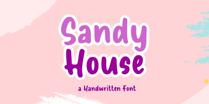 Sandy House is a fun Handwritten Font, this font Is perfect for lproduct packaging, product designs, label, photography, watermark, special events or anything. Sandy House comes with uppercase and lowercase letters, multilingual symbols, numerals, punctuation
 - Passing Stranger by Bogstav,
$17.00 Say hello to my all caps wannabe typewriter font. It’s distressed, but still perfectly legible! I have added 5 slightly different versions of each letter for a more handmade feeling, and of course multilingual support!
 - FM Easter Pro by The Fontmaker,
$24.00 FM Easter Pro consists of 26 hand-lettered Easter greetings like Happy Easter, Easter Joy, Easter Greetings etc. All the words and phrases are original and handwritten - a high quality calligraphy for your holiday projects.
 - Fander by Roman Melikhov,
$23.00 Fander font family is designed to create minimalist logos, wordmarks, titles, taglines. Each letter of the font has up to 12 alternates. You can mix default characters and alternate characters to get the best combinations.
 - Artiste by ITC,
$29.00A casual, open brush script style designed with a shadow effect for a three-dimensional impression by British designer Martin Wait. This typeface looks best with tight letter and word spacing in large display settings. - Merriment JNL by Jeff Levine,
$29.00 Within the pages of the 10th edition of the Speedball Lettering Book (1927) is an alphabet called “Vanitie”. This had been redrawn digitally as Merriment JNL, and is available in both regular and oblique versions.
 - Holo by Missin Glyphs,
$25.00 Inspired by 'Neon Sign' lettering, Holo is a modern, modular, mechanical & industrial display font constructed entirely with polygonal shapes. Holo is suitable for large display settings like sports jerseys, shop fronts, billboards and neon signs.
 - Sightseeing Boat JNL by Jeff Levine,
$29.00 The free form hand lettering comprising the titles and credits for the 1966 romantic comedy “The Glass Bottom Boat” were the model for Sightseeing Boat JNL, which is available in both regular and oblique versions.
 - Merry With Dream by Seemly Fonts,
$12.00 Merry with Dream is a cute and simple lettered handwritten font that can be used for all chalkboard quotes or teaching material! Its authentic look will add a personal and realistic feel to your designs.
 - Shirah Joie by LightHouse,
$49.00The main challenge with Shirah Joie was how not to design just another monoline font, and how to add liveliness while condensing the letters a little bit. Shirah Joie is an OpenType/TTF Unicode font. - Opportoonity JNL by Jeff Levine,
$29.00Opportoonity JNL is loosely based on lettering from 1940s cartoons. It's the perfect typeface for anything representing fun and carefree situations. There is a slightly limited character set and no kerning on this particular font. - Freich by Nasir Udin,
$15.00 Freich is a mighty bold typeface with a vintage vibe and rebellious feeling. Perfect choice for posters with super hero or propaganda themes. Its sharp and strong letter forms will make any statements more powerful.
 - Silent Comedy JNL by Jeff Levine,
$29.00 A poster for the 1917 Charlie Chaplin comedy “Easy Street” had Chaplin’s name hand lettered in thick, round cornered block characters. This inspired Silent Comedy JNL, which is available in both regular and oblique versions.
 - Black Queen by Gleb Guralnyk,
$14.00 Presenting the vintage style typeface "Black Queen". It includes font files for each decorative element which can be useful for manipulating colors and effects. Black Queen font has multilingual support and several alternative letter glyphs.
 - Dead Bear by Sakha Design,
$12.00 Dead Bear is a cool and creepy display font. It is imposing and features uniquely shaped letters, and as a result, it will easily match a wide range of creations that require a distinct touch.
 - Glazed Donuts by DainType,
$15.00 The letters are reminiscent of shiny and tasty glazed donuts. There are three type families, and you can mix them all up to create a decently fun typography. Great for promotional material or package design.
 - Amestina by Aqeela Studio,
$20.00 Amestina’s most recent letter styles are ideal for projects that call for a handwritten aesthetic, including wall displays, wedding invitations, social media post logos, commercials, product packaging, product designs, labels, photographs, watermarks, invitations, and stationery.
 - Summer Holiday JNL by Jeff Levine,
$29.00 Hand lettered production credits for the1930 film “Holiday” inspired the digital type revival Summer Holiday JNL; available in both regular and oblique versions. An Art Nouveau influence is reflected in this pleasant, casual serif typeface.
 - Creepy Events JNL by Jeff Levine,
$29.00 The 1963 German release poster for "What Ever Happened to Baby Jane?" features a creepy, sinister, hand-lettered type design that became the model for Creepy Events JNL, available in both regular and oblique versions.
 - October Story by Sronstudio,
$15.00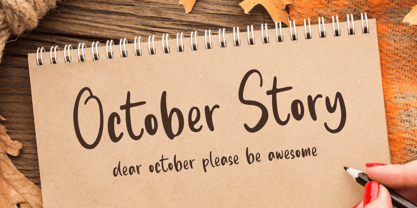 October Story is a fun Handwritten Font, this font Is perfect for product packaging, product designs, label, photography, watermark, special events, or anything. October Story comes with uppercase and lowercase letters, multilingual symbols, numerals, punctuation.
 - Pumpkin Story by Sronstudio,
$15.00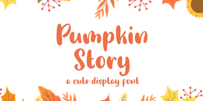 Pumpkin Story is a fun Handwritten Font, this font Is perfect for lproduct packaging, product designs, label, photography, watermark, special events or anything. Pumpkin Story comes with uppercase and lowercase letters, multilingual symbols, numerals, punctuation.
 - Maiola by TypeTogether,
$49.00 Being inspired by early Czech type design, Maiola is clearly a contemporary typeface, that is mindful of its historical heritage, implementing old-style features and calligraphic reminiscence, more frankly so in the Italic. Nevertheless, through its personality, it attempts to create a welcoming tension on the page, without shouting too loudly at the reader. It handles its expressive tendencies with care and in doing so increases its usability, with legibility being of great importance. Subtle irregularities of the letterforms enhance furthermore the dynamic spirit and liveliness of the typeface. With the advent of Opentype, allowing for bigger character-sets and better language support, as a natural consequence, Maiola Multiscript covers Latin A, Cyrillic and Greek. Although basically independent from each other, they are, however, designed in the same spirit as the Latin, and harmonize well in multilingual text settings. The update to this beautiful font family includes the addition of over 240 glyphs featuring new ornaments, stylistic alternates, ligatures, superior letters, fractions and more. Furthermore, several glyphs were significantly improved and the kerning was fine tuned for better performance. Originally released in 2005, Maiola was an immediate success. It won the renowned TDC competition in 2004 where it was also recognized as a “judge’s choice”, was part of the touring exhibition e-a-t, and was selected in the Creative Review design competition in 2005.
 - Hand Scribble Sketch Times by TypoGraphicDesign,
$19.00 CHARACTERISTICS A state-of-the-art OpenType-Feature (like Contextual Alternates (calt) and Stylistic Alternates (salt)) of “Hand Scribble Sketch Times” is, that each uppercase and each lowercase letter has automatically alternated two variations to bring humanly-random characteristics of handwriting to life. The character of the rough, ruggend and raw handwritten classic serif typeface is a very unique warmly atmosphere. An pro-version of the font “Hand TIMES”. APPLICATION AREA warmth, love, handmade. For support of human warmth. Of cooking recipes, menus in the restaurant across party flyer, music cover Art to logo (word marks), headings in magazines and websites. TECHNICAL SPECIFICATIONS ? Font Name: Hand Scribble Sketch Times ? Font Weights: Regular, Rough, Invert ? Font Category: Grunge Serif Display for Headline Size ? Font Format: OTF (OpenType Font for Mac + Win) ? Glyph coverage: 601 ? Language Support: Basic Latin/English letters, Central Europe, West European diacritics, Baltic, Romanian, Turkish ? Specials: Alternative letters, Standard & Discretionary Ligatures, extras like symbols, dingbats, Old-style Digits, Lining Figures, accents & €, incl. OpenType-Features like Contextual Alternates (calt), Glyph Composition/Decomposition (ccmp), Discretionary Ligatures (dlig), Kerning (kern), Standard Ligatures (liga), Numerators (onum), Ordinals (ordn), Stylistic Alternates (salt), Stylistic Set 01 (ss01), Stylistic Set 02 (ss02), Stylistic Set 03 (ss03), Slashed Zero (zero), Lining Figures (lnum), Tabular Figures (tnum), Old Style Figures (onum), Proportional Figures (pnum) ? Design Date: 2013 ? Type Designer: Manuel Viergutz
 - St Croce Pro by Storm Type Foundry,
$29.00 Our eye is able to join missing parts of worn letters back into undisturbed shapes. We tend to see things better than they really are. Thanks to this ability we ignore faults of those close to us as we can’t accept the fact that every once in a while we convene with an impaired entity. Typography is merely a man’s invention, hence imperfection and transience, albeit overlooked, are its key features. This typeface is based on worn-out letterings on tombstones in the St. Croce basilica in Florence. For hundreds of years, microscopic particles of marble are being taken away on the soles of visitors: the embossed figures become fossilised white clouds, fragments of inscriptions are nearing the limits of legibility. First missing are thin joins and serifs, then the main strokes finally slowly diminish into nothingness over time. Unlike an archaeologist, for whom even completely featureless stele is valuable, the typographer must capture the proper moment of wear, when the type is not too “new” but also not too much decimated. Such typeface is usable for catalogue jackets, invitations and posters. Calligraphy is a natural human trait. To write is to create characters of reasonable beauty and content, according to the nature of the writer. A natural characteristic of architecture is to create an aesthetic message very similar to the alphabet. A doric column, the gabled roof, the circle of the well plan: these are the basic shapes from which all text typeface is derived.