10,000 search results
(0.071 seconds)
- Aftermath by Bosstypestudio,
$15.00 AFTERMATH?? has been designed to come in four different widths; Normal, Italic, Narrow and Condensed, additional to add weight to support various uses ranging from Thin, Light, Regular, Medium, Bold, Extrabold, and Black. AFTERMATH It comes in 40 weights with various features that support designer creativity from the Font Menu and extended language support. AFTERMATH will suit many projects: fashion, magazines, logos, branding, photography, invitations, wedding invitations, quotes, blog headers, posters, advertisements, postcards, books, websites, etc. If you have any questions, you can contact us by email: bosstypestudio@gmail.com| Thank you!
 - Slam Rounded by Wiescher Design,
$12.00 »SLAM« is my new, very sturdy but elegant slab-serif font family. I designed this font family with body copy in mind and gave it all the glyphs necessary for use with all latin writing languages. I also gave the fonts all kinds of different numerals as well as a complete set of small caps and overall extensive kerning. It comes in eight rounded weights with corresponding oblique cuts and it comes in a normal version and corresponding obliques as well. Enjoy this original font, it is a real work horse!
 - Sassoon Patterns by Sassoon-Williams,
$48.00 Many children start school with their hands not ready and trained to produce the precise strokes required for forming letters and starting to write. Pattern is essential preparation. It is fun for children, building their confidence as well as training their muscles for the task. Each font has normal letters and pattern characters. Free to download resources: How to access Stylistic Sets of alternative letters in these fonts Purchasers of this font package may use their Order Number to receive a free Copybook PDF by Rosemary Sassoon recommended for effective teaching
 - Nizzoli by Los Andes,
$19.00 This typeface is a tribute to well-known Italian designer Marcello Nizzoli. Nizzoli is a modern sans serif font that offers a wide range of alternatives—a workhorse type well suited for headlines, posters, corporate identity and advertising campaigns. This modular design is based on geometric shapes and combines straight lines with rounded corners. The whole family is composed of four 7-weight subfamilies: one normal and one alternative plus rounded versions. Each subfamily includes matching italics. This typeface is my own interpretation of those curves and shapes found in Marcello Nizzoli’s designs.
 - RF Barbariska by Russian Fonts,
$19.00 Handcrafted typeface with a friendly character. Two weights in three styles. Weights: Regular and Oblique. Styles: normal, rough1, rough2. Weight and shape of the letters allows using the font to solve any graphical problems. Package design for food or cosmetic products. Posters or music cover. Logos. Prints on sweatshirts or t-shirts. Children’s books or comics. Barbariska could be used in all sorts of projects. Features: ligatures, contextual alternates, old style numbers, fina and init for capitals letters. Support: cyrillic, cyrillic extended, latin, latin extended (Western European, Central European, South-East).
 - 1545 Faucheur by GLC,
$42.00 This family was inspired by the set of fonts used in Paris by Ponce Rosset, aka “Faucheur” to print the account of the second voyage to Canada by Jacques Cartier, first edition, in 1545. It is a Garalde set, the punchcutter is unknown, certainly it was not Garamond himself. In our two styles (normal and italic), fontfaces, kernings and spaces are scrupulously the same as in the original. This Pro font covers Western, Eastern and Central European languages (including Celtic) Baltic and Turkish, with standard and long-s ligatures in each of the two styles.
 - Samhain by Hanoded,
$15.00 Samhain is a Gaelic festival marking the end of the harvest season and the beginning of winter. There is no set date, but normally it is held around the end of October and beginning of November. Samhain font was made with a bamboo pen and Chinese ink on rough paper - hence the grungy look. It is quite a heavy font, so I wouldn't set a complete text in it, but it is ideal to create headlines, posters, postcards and invitations. Of course, Halloween comes to mind! Samhain comes with extensive language support.
 - Favela by Borutta Group,
$29.00 Favela is an experimental, geometric and sans serif type family. It is characterised by scalable construction of glyphs – hairline version is at the same time condensed, regular is normal, and black is super extended, with short ascenders. Favela was made mainly for branding and display purposes but middle weights are prefect for short texts. Thanks to characteristic features compilation of extreme styles will work on layouts, websites and prints. Favela type Family consist 18 styles with scalable x-height and width.. All styles include over 500 glyphs with set of small caps.
 - Logx 30 by Fontsphere,
$12.00 LOGX-30 is a geometric, all-caps, display typeface. As a brother of LOGX-10 and LOGX-20 , this is the most narrow version in a series of three related typefaces. LOGX-30 is designed, like other LOGX versions, for a wide range of graphic designs and visual identifications. I think that it works best in works with a technical, geometric style, and rather striving for minimalism. Both the normal and the italic version can be used together to compose graphics, photos, large and small text in an interesting way.
 - Caligor by Letterhend,
$14.00 Caligor is a Display Typeface Family which is suitable for you who needs a typeface for headline, logotype, apparel, invitation, branding, packaging, advertising etc. This typeface is comes in uppercase, lowercase, punctuations, symbols & numerals, stylistic set alternate, ligatures, etc also support multilingual and already PUA encoded. this font come in 3 versions, regular, edge, and stamp. the regular with clean and neat look of the font, edge version is look like a little bit of the normal version with rough edge, and stamp version that gives an aged feel on it.
 - Gogosquat by Bogusky 2,
$34.50Usually, the condensed version of a face comes after the regular design. Not with gogo squat. After gogo big, I thought how strong a regular version would be. A nice clean gutsy face. A "today" Franklin Gothic Extra Bold. I find it ideal for contemporary headlines as well as for logo solutions. As with gogo big, in my terms and conditions, I permit the modification of up to ten of the letter forms for logos and monograms, but logos and monograms only, not the typeface in normal usage. - Mixcase by Roman Melikhov,
$12.00 Mixcase font family is suitable for creating logos, wordmarks, titles, taglines. The properties of uppercase letters, numbers, punctuation and extra characters in Mixcase Mixed font are the same as those of lowercase letters, which allows to combine letters of both cases in different ways. All characters in Mixcase Unmixed font have normal ratios, so it can be used as typesetting font. The combination of both fonts provides additional use cases in the form of small caps and mixed small caps. For any questions about the font please contact: arbuzzu@gmail.com
 - Bernhard Fashion Pro by SoftMaker,
$15.99 Lucian Bernhard designed this typeface for American Type Founders in 1929. Bernhard Fashion sports tall ascenders, stylish embellishments, and much taller than normal capitals that drop below the baseline. This extra light typeface radiates elegance and lightness. SoftMaker’s Bernhard Fashion Pro typeface comes with a huge character set that covers not only Western European languages, but also includes Central European, Baltic, Croatian, Slovene, Romanian, and Turkish characters. Case-sensitive punctuation signs for all-caps titles are included as well as many fractions, an extensive set of ligatures, and separate sets of tabular and proportional digits.
 - Revans by Arterfak Project,
$15.00 Revans is a strong serif font with medium contrast. Inspired by the High Octane Rock genre and modern-classic fashion. Carefully designed with a short ascender to give a solid look, also the sharp serif makes the letters look more strong. Revans is a display-type which perfect for a headline, sub-headline, and short body text for a magazine, books, fashion, quotes, hipster t-shirt, signboard, logo, and etc . Available in 5 weights: Light, Normal - Medium - SemiBold and Bold, complete with the slant style. A great choice for a brave concept!
 - 1676 Morden Map by GLC,
$42.00 This family was created -- inspired from the engraved typeface (Two styles : Normal & Italic) used in the pack of 52 playing cards who was describing the 52 counties forming a small Atlas of England and Wales and depicting English roads for the first time, published by Sir Robert Morden in 1676. Our OTF and TTF versions are covering Western, Eastern and Central European languages (including Celtic), Baltic and Turkish, containing historical and standard ligatures plus specific Old English abbreviations. The MacTT Classic version is containing the basic standard 256 glyphs including some extra ligatures.
 - Overly Sweet by Bogstav,
$16.00 Usually I prefer desserts that aren't overly sweet, but a week ago I lost my sense of tasting - due to Corona, and when I wanted something sweet...I preferred it overly sweet...of course because I hardly could taste the overwhelming sweetness! But now, I have my sense of tasting (and smelling!) back, and everything is back to normal. And since I completed this easy-recipe-inspired handmade font while suffering from Corona, I thought I'd name it Overly Sweet. And...well. because, the font is somewhat overly sweet (without being over the top sweet!)
 - Trečiokas by Rokas Cicenas,
$9.00 I present you Trečiokas typeface. This two font family is based on written letters that were sketched by using paint markers and afterwards pollished digitally. Glyphs mostly are connected, leaving some separate, as a contrast to round and soft letter shapes. It includes extended latin character set. In 2013 I made the Aerofont project, which included custom music instruments that were made based on Trečiokas Normal letter shapes. The main idea was to connect music and typography, by making sound emitting letters. You can watch the project video here.
 - 1906 French News by GLC,
$38.00 We have created this family from the numerous derivatives in use for newspapers since the middle of the 1800s to the 1970s, inspired by the well known Clarendon. Mainly, the patterns are those used to print Le Petit Journal, a popular French Newspaper of the era (published from 1863 to 1937). The present version contains Normal, Italic, Bold and Bold Italic styles, in two sub families: 1906 French News for texts and titlings with upper and lower case, and 1906 French News Caps (Caps, small caps, small numerals, for texts and titlings).
 - NorB Felt Tip by NorFonts,
$32.00 NorB Felt Tip was inspired from the lettering of my grand-brother Med Bahha who taught several kinds of letterings. It is a handwritten text font mimicking a felt pen and can be used with any word processing program for text and display use, print and web projects, apps and ePub, comic books, graphic identities, branding, editorial, advertising, scrapbooking, cards and invitations and any casual lettering purpose… or even just for fun! NorB Felt Tip comes with 6 weights each with their matching italics and in a Light, Normal, Bold and Heavy version.
 - Metronic Slab Narrow by Mostardesign,
$26.00 Metronic Slab Narrow is the condensed version of the Metronic Slab font family. This condensed style is designed for space-saving typography but with high legibility and versatility in mind.This Family also improved the needs of developers and graphic designers looking for width-compatible fonts. As the normal style this font family is an innovative and refreshing semi serif design with a contemporary look for text and headlines. It has six versatile weights from Air to Black with an alternative glyph set to improve its use in different graphic contexts.
 - NorB Pen by NorFonts,
$28.00 NorB Pen was inspired from Arial Round font, I use this font for my jazz lead-sheets. It's a handwritten text font emulating a round marker permanent pen. You can use this font with any word processing program for text and display use, print and web projects, apps and ePub, comic books, graphic identities, branding, editorial, advertising, scrapbooking, cards and invitations and any casual lettering purpose… or even just for fun! NorB Pen comes with 8 weights, each with their matching italics and in a Light, Normal, Bold and Heavy version.
 - Roanne by Tour De Force,
$25.00 Roanne is a sans serif family named after a town in France. This font family contains 2 width variations: Normal and Condensed, and all together counts 44 font styles. Equipped with OpenType features (Tabular Figures, Fractions, Stylistic Alternates, Localization for Serbia, Poland and the Netherlands, Case Sensitive brackets) for extended Latin and Cyrillic character set with a small charming set of Dingbats. For easier usage as webfont, Roanne font files contain numeric values for CSS weight attribute – 100, 150, 200, 300, 400, 500, 600, 700, 800, 850, 900.
 - Ollivette Elite by Chank,
$59.00Fly your inner geek flag with this cool new "Eleet" typewriter font. It's kinda like a wonky internet translator that converts normal text into leet-speak, so you can exchange encoded love notes with cyber-hackers and goofy-gamers. The actual glyphs in this font are interchangeable with the more logical Ollivette typewriter font, but here the characters have all been moved around to create stylized interpretation of similar glyphs. So "ELEET" could also be typed "31337". Except you don't have to think about it. Get it? Got it? Good! 3NJ0¥ TH15 ƒØÑ+ & U53 !† 0FT3N. - Barle by Locomotype,
$18.00 Big is beautiful. Barle font has an extremly heavy weight and wide shape. A sans-serif display font that's perfect for large headlines, posters, packaging and any graphic design that requires a font that will stand out to audiences. Barle font has two faces, a standard character and a sliced version which can be accessed through the Stylistic Alternates feature. This font consists of 4 fonts; upright and italic style in the normal version and the outlined version. If you just want to use the sliced version, you just need to purchase Barle Alt.
 - Gogobig by Bogusky 2,
$25.00I have always been frustrated when looking for a bold condensed face. The choices were the usual? Helvetica Bold Condensed, Univers Bold Condensed or Alternate Gothic #2... all rather dated. I was looking for a really unique, clean, uncluttered sans serif face, so I decided to design one. I have since adapted it to many logo designs. So, in my terms and conditions, I decided to permit the modification of the letter forms for logos and monograms, but logos and monograms only, not the typeface in normal usage. - Beardsons by Arterfak Project,
$20.00 Introducing our new exploration Beardsons, another vintage-inspired font with the additional effect: Normal - Inline - Shadow, packed as the layered font. Collected from many references such as vintage signage, logo, badges, and old fashioned graphics. Beardsons is An all-caps font, carefully crafted with a high ornamental taste. Beardsons is perfect for many display purposes. You can use this font for poster, label, logo, signboard, t-shirt, book cover, decoration, merchandise, and more! Multilingual support with extra ornaments included! Fonts featured: Uppercase Smallcaps Numbers & symbols Stylistic alternates Accented characters: ����������������������������ތ������������������������������������ Thank you for watching!
 - Shicken Zoop JNL by Jeff Levine,
$29.00Shicken Zoop JNL is based on an old lettering stencil from the early 1950s. The A-Z and a-z keystrokes contain the bulk of the Hebrew alphabet. Additional letters are found on the exclamation point, quote and apostrophe keystrokes. Vowels are positioned on the period, comma, hyphen, colon and semicolon. Please note that this is not a normal Hebrew font; it is in effect a latin font with Hebrew letters appearing in place of latin letters. It will not allow you to copy and paste with other samples of Hebrew text. - Banret by Ryzhychenko Olga,
$12.00 Banret is built using simple geometric shapes. It is mostly the result of my experiments on the other font I made earlier in 2016, called Inventor. Font is inspired by old fonts of the beginning of the 20th century. Capital letters are built with one to four proportions. The font has four weights: normal, and bold, and two alternatives: ribbon, and flag. As far as it is a decorative font, it is not designed for large amounts of text. But it is perfect for creating branding elements, logos, slogans and posters.
 - Croasian by MKGD,
$13.00 The main reason I wanted to design this font was because I really didn’t like how poorly some fonts tried to mimic an Oriental appearance. Trying to make western words appear Asian with a font composed of brush strokes is almost always doomed to failure. However, I find Croasian works extremely well with one syllable words that are Asian sounding. A good font to have if you want to express an Asian name or business phonetically in a western alphabet while still retaining an Asiatic feel. Croasian has a glyph count of 397 and supports the following languages Afrikaans, Albanian, Asu, Basque, Bemba, Bena, Bosnian, Catalan, Chiga, Colognian, Cornish, Croatian, Czech, Danish, Embu, English, Esperanto, Estonian, Faroese, Filipino, Finnish, French, Friulian, Galician, German, Gusii, Hungarian, Icelandic, Indonesian, Irish, Italian, Kabuverdianu, Kalaallisut, Kalenjin, Kamba, Kikuyu, Kinyarwanda, Latvian, Lithuanian, Low German, Lower Sorbian, Luo, Luxembourgish, Luyia, Machame, Makhuwa-Meetto, Makonde, Malagasy, Malay, Maltese, Manx, Meru, Morisyen, North Ndebele, Norwegian Bokmål, Norwegian Nynorsk, Nyankole, Oromo, Polish, Portuguese, Romanian, Romansh, Rombo, Rundi, Rwa, Samburu, Sango, Sangu, Scottish Gaelic, Sena, Shambala, Shona, Slovak, Slovenian, Soga, Somali, Spanish, Swahili, Swedish, Swiss German, Taita, Teso, Turkmen, Upper Sorbian, Vunjo, Walser, Zulu
 - Eigerdals Slab by insigne,
$30.00 Introducing Eigerdals Slab - the ultimate font for creating a cozy and inviting atmosphere in your designs. This slab-serif font family captures the essence of the mountains of Norway and the streets of Stockholm, making it the perfect choice for design projects that need a touch of Hygge. With its top-heavy characters, Eigerdals Slab has a more approachable and warm feel that sets it apart from other font choices. Plus, its tall x-height, brushed and smooth look makes it both readable and stylish. But that's not all, Eigerdals Slab comes loaded with practical OpenType features like ligatures, unicase alternates, and a set of upright italic swash alternates, that can be fully utilized in software like Quark and Adobe suite. Not only that, it also includes support for a wide range of languages. Eigerdals Slab is an extension of the Eigerdals family, and its distinctive look pairs perfectly with other text faces. Whether you're using it for display work or longer blocks of text, Eigerdals Slab is the perfect font for adding warmth and friendliness to your designs. Don't wait any longer, try Eigerdals Slab today and elevate your work to the next level!
 - Real Dreams by Gie Studio,
$12.00 Hello Everybody Hurry up and take handwritten works with natural scribble effects to design your product to make it look more memorable & attract everyone's first glance ! Real Dreams is a stylish and brushed handwritten font. This gentle font will look gorgeous on a variety of design ideas. It will add a joyful and romantic touch to each of your projects! Features: – Swash Collection – Unique Ligatures – Special Underline – Multilingual Support 83 Country – PUA Encoded – Numerals and Punctuation Language Support : Afrikaans, Albanian, Asu, Basque, Bemba, Bena, Breton, Catalan, Chiga, Colognian, Cornish, Croatian, Czech, Danish, Dutch, Embu, English, Esperanto, Estonian, Faroese, Filipino, Finnish, French, Friulian, Galician, Ganda, German, Gusii, Hungarian, Inari Sami, Indonesian, Irish, Italian, Jola-Fonyi, Kabuverdianu, Kalaallisut, Kalenjin, Kamba, Kikuyu, Kinyarwanda, Latvian, Lithuanian, Lower Sorbian, Luo, Luxembourgish, Luyia, Machame, Makhuwa-Meetto, Makonde, Malagasy, Maltese, Manx, Meru, Morisyen, Northern Sami, North Ndebele, Norwegian Bokmål, Norwegian Nynorsk, Nyankole, Oromo, Polish, Portuguese, Quechua, Romansh, Rombo, Rundi, Rwa, Samburu, Sango, Sangu, Scottish Gaelic, Sena, Serbian, Shambala, Shona, Slovak, Soga, Somali, Spanish, Swahili, Swedish, Swiss German, Tait, Teso, Turkish, Upper Sorbian, Uzbek (Latin), Volapük, Vunjo, Walser, Zulu. Thank you and happy design !
 - Charpentier Renaissance Pro by Ingo,
$42.00 A very legible Renaissance Antiqua This typeface is based on the desire to create an Antiqua like those which might have existed at the beginning of the »printing age« — the basic form oriented on the classical Roman and early Middle Ages models, the ductus defined completely by writing with a wide pen and much individual expression in detail. In the spring of 2005 I had the opportunity to closely examine a few pages in the famous book »Hypnerotomachia Poliphili« from 1499. The script used here from Aldus Manutius is exemplary. Most of the book, however, is not very carefully printed. The characters do not stay on the line; the print is at times too strong and at times much too weak. And on these imperfect pages the true character of the letters is recognizable; that is, that they are cut with lively detail which is a result of the patterns provided by full-time writers. After all, around 1499 script was written as a rule and the printed type was oriented on this pattern. I prefer the typeface on the lightly printed pages. The characters are not placed neatly on the line, but the distinct and emerging lively ductus of the individual characters automatically presents harmonious word formations in the eye of the beholder, with the non-perfect line stepping into the background. Also in Charpentier Renaissance, the strokes of the wide pen are still noticeable. The font has very defined softly bent serifs. The forms are powerful and stand solidly on the baseline. Charpentier Renaissance is very legible and yields a solid and yet still lively line formation. The accompanying italic, like its historical models, has almost no inclination. The lower case characters of Charpentier Renaissance Oblique have such idiosyncratic figures that they can also form a font of their own. Please visit www.ingofonts.com
 - Moon Child by Angele Kamp,
$28.00 Introducing Moon Child, an elegant collection of two fonts that pair perfectly together. This collection will make designing Instagram quotes, websites & invitations effortless. What's Included Moon Child Script An elegant script font that includes ligatures that give you that gorgeous hand-lettered look. Moon Child Caps This is an all caps font that pairs perfectly with the script font
 - Stay Gladin by IM Studio,
$19.00 Stay Gladin Script Font Trio is a new modern script font with an irregular baseline. Stylish and feminine. Stay Gladin Script looks beautiful in wedding invitations, thank you cards, quotes, greeting cards, logos, business cards and more. Perfect for use in ink or watercolor. Includes start and end letters, alternatives and support for many languages. Thanks You.
 - 1880 Kurrentshrift by GLC,
$38.00 This font was inspired by the old form of the so called "Kurrentschrift" German handwriting, based on late medieval cursive. It is also known as "Alte Deutsche schrift" ("Old German script"). It was taught in German schools until 1941, when Adolf Hitler decided to forbid it. As it is a little hard to read, we are proposing here two versions: the "pure" Kurrentschrift, and an adapted "Easy" one, with simplified difficult characters.
 - Malden Sans by Monotype,
$49.00 Malden Sans is a mischievous grotesque sans serif with charming details that gives designers a solid typographic voice. It was created by Michele Patanè with regular and condensed widths, as a utilitarian typeface family for print and digital environments. It was originally designed as part of a type system for cinema magazines, and embodies the devil-may care attitude of the silver screen. Designer Michele Patanè looked back to an earlier era of typography to create the typeface, embracing unusual details, rather than ironing them out. “There is a very naive way of using typography in the 30s and 40s, something not as clean as how it’s used in the late 50s and 60s when everything passed through a rationalisation of the typographic palette,” he explains. “In film magazines you can still see a bit of roughness, and I like that.” This is a design that’s desperate to be used in editorial environments, and has been created to stand up to lower quality paper. It would be equally at home on posters, packaging, and even in digital environments where designers are looking for something more expressive than another geometric sans serif. Malden Sans includes a Normal and Condensed range, with 7 weights in the normal and 6 in the Condensed, both including italics.
 - Signamaestro by Almarkha Type,
$35.00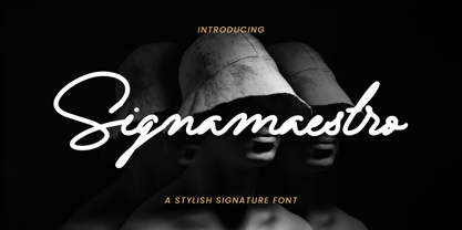 Introducing Signamaestro - Stylish Signature Script is a Quality script that is written casually and quickly Signamaestro is perfect for homeware designs,branding projects, Logo, design, Quotes, Product packaging, Photography, Watermark.
 - Carmine Tango by Monotype,
$29.99Carmine Tango is an elegant script based on a 1934 design by Lucian Bernhard. The Carmine Tango font is a good script for many situations, including invitations, menus and brochures. - Saverny by HKL Studio,
$21.00 Saverny Script This is a Vintage calligraphy script font that comes with beautiful alternative characters. copper plate mixed calligraphy with handttering style. Designed to convey stylish elegance. Saverny Script has a smooth, clean, feminine, sensual, glamorous, simple, and easy to read typeface. Saverny Script comes with a Clean and Aged version, beautiful upper and lower case, binding and favored by many finishes. It has Multilingual support (West European characters) and works with the following languages: English, Danish, Dutch, Estonian, Finnish, French, German, Hungarian, Icelandic, Italian, Norwegian, Polish, Portuguese, Spanish, Swedish. In my example I show how this script can be used. It's perfect for logos, wedding invitations, alcohol labels, romantic cards and more. Products include: Clean & Aged Script Version Alternative Uppercase & Lowercase Font Style Binders Recommended for use in Adobe Illustrator or Photoshop. Custom features don't work in Microsoft Word.
 - Marioline Barnard by Asd Studio,
$14.00 Introducing my Marioline Barnard Script, a passionatly crafted fancy script. Marioline Barnard script fully meets my expectations for a script that gives you luxurious vibes as much as casual vibes, elegant but simple, strong but light vibes. Marioline Barnard comes with beautiful uppercase and lowercase alternates (up to 11 level alternates, ligatures include), and swashes. Marioline Barnard has Multilingual support (Western European characters) and works with following languages: English, French, Italian, Portuguese, German, Swedish, Norweigan, Danish, Dutch, Finnish, Indonesian, Filipino, and Malay. Marioline Barnard is modern script font, every single letters has been carefully crafted to make your text looks beautiful. With modern script style this font will perfect for many different project, example: invitations, greeting cards, posters, name card, quotes, blog header, branding, logo, book cover, fashion, apparel, letter, logotypes, wedding invitations, product labels, and clothing product, stationery and more. Thank you.