10,000 search results
(0.041 seconds)
- Glider Girls - Unknown license

- Calligraphy Double Pencil - Personal use only

- Rosetta Tones - Unknown license

- FirstGrader-Normal - Unknown license

- Vaguely Repulsive - Unknown license

- ITC Bodoni Seventytwo by ITC,
$29.99Giambattista Bodoni (1740-1813) was called the King of Printers; he was a prolific type designer, a masterful engraver of punches and the most widely admired printer of his time. His books and typefaces were created during the 45 years he was the director of the fine press and publishing house of the Duke of Parma in Italy. He produced the best of what are known as modern" style types, basing them on the finest writing of his time. Modern types represented the ultimate typographic development of the late eighteenth and early nineteenth centuries. They have characteristics quite different from the types that preceded them; such as extreme vertical stress, fine hairlines contrasted by bold main strokes, and very subtle, almost non-existent bracketing of sharply defined hairline serifs. Bodoni saw this style as beautiful and harmonious-the natural result of writing done with a well-cut pen, and the look was fashionable and admired. Other punchcutters, such as the Didot family (1689-1853) in France, and J. E. Walbaum (1768-1839) in Germany made their own versions of the modern faces. Even though some nineteenth century critics turned up their noses and called such types shattering and chilly, today the Bodoni moderns are seen in much the same light as they were in his own time. When used with care, the Bodoni types are both romantic and elegant, with a presence that adds tasteful sparkle to headlines and advertising. ITC Bodoni™ was designed by a team of four Americans, after studying Bodoni's steel punches at the Museo Bodoniana in Parma, Italy. They also referred to specimens from the "Manuale Tipografico," a monumental collection of Bodoni's work published by his widow in 1818. The designers sought to do a revival that reflected the subtleties of Bodoni's actual work. They produced three size-specific versions; ITC Bodoni Six for captions and footnotes, ITC Bodoni Twelve for text settings, and ITC Bodoni Seventytwo - a display design modeled on Bodoni's 72-point Papale design. ITC Bodoni includes regular, bold, italics, Old style Figures, small caps, and italic swash fonts. Sumner Stone created the ornaments based on those found in the "Manuale Tipografico." These lovely dingbats can be used as Bodoni did, to separate sections of text or simply accent a page layout or graphic design." - ITC Bodoni Twelve by ITC,
$29.99Giambattista Bodoni (1740-1813) was called the King of Printers; he was a prolific type designer, a masterful engraver of punches and the most widely admired printer of his time. His books and typefaces were created during the 45 years he was the director of the fine press and publishing house of the Duke of Parma in Italy. He produced the best of what are known as modern" style types, basing them on the finest writing of his time. Modern types represented the ultimate typographic development of the late eighteenth and early nineteenth centuries. They have characteristics quite different from the types that preceded them; such as extreme vertical stress, fine hairlines contrasted by bold main strokes, and very subtle, almost non-existent bracketing of sharply defined hairline serifs. Bodoni saw this style as beautiful and harmonious-the natural result of writing done with a well-cut pen, and the look was fashionable and admired. Other punchcutters, such as the Didot family (1689-1853) in France, and J. E. Walbaum (1768-1839) in Germany made their own versions of the modern faces. Even though some nineteenth century critics turned up their noses and called such types shattering and chilly, today the Bodoni moderns are seen in much the same light as they were in his own time. When used with care, the Bodoni types are both romantic and elegant, with a presence that adds tasteful sparkle to headlines and advertising. ITC Bodoni™ was designed by a team of four Americans, after studying Bodoni's steel punches at the Museo Bodoniana in Parma, Italy. They also referred to specimens from the "Manuale Tipografico," a monumental collection of Bodoni's work published by his widow in 1818. The designers sought to do a revival that reflected the subtleties of Bodoni's actual work. They produced three size-specific versions; ITC Bodoni Six for captions and footnotes, ITC Bodoni Twelve for text settings, and ITC Bodoni Seventytwo - a display design modeled on Bodoni's 72-point Papale design. ITC Bodoni includes regular, bold, italics, Old style Figures, small caps, and italic swash fonts. Sumner Stone created the ornaments based on those found in the "Manuale Tipografico." These lovely dingbats can be used as Bodoni did, to separate sections of text or simply accent a page layout or graphic design." - ITC Bodoni Ornaments by ITC,
$29.99Giambattista Bodoni (1740-1813) was called the King of Printers; he was a prolific type designer, a masterful engraver of punches and the most widely admired printer of his time. His books and typefaces were created during the 45 years he was the director of the fine press and publishing house of the Duke of Parma in Italy. He produced the best of what are known as modern" style types, basing them on the finest writing of his time. Modern types represented the ultimate typographic development of the late eighteenth and early nineteenth centuries. They have characteristics quite different from the types that preceded them; such as extreme vertical stress, fine hairlines contrasted by bold main strokes, and very subtle, almost non-existent bracketing of sharply defined hairline serifs. Bodoni saw this style as beautiful and harmonious-the natural result of writing done with a well-cut pen, and the look was fashionable and admired. Other punchcutters, such as the Didot family (1689-1853) in France, and J. E. Walbaum (1768-1839) in Germany made their own versions of the modern faces. Even though some nineteenth century critics turned up their noses and called such types shattering and chilly, today the Bodoni moderns are seen in much the same light as they were in his own time. When used with care, the Bodoni types are both romantic and elegant, with a presence that adds tasteful sparkle to headlines and advertising. ITC Bodoni™ was designed by a team of four Americans, after studying Bodoni's steel punches at the Museo Bodoniana in Parma, Italy. They also referred to specimens from the "Manuale Tipografico," a monumental collection of Bodoni's work published by his widow in 1818. The designers sought to do a revival that reflected the subtleties of Bodoni's actual work. They produced three size-specific versions; ITC Bodoni Six for captions and footnotes, ITC Bodoni Twelve for text settings, and ITC Bodoni Seventytwo - a display design modeled on Bodoni's 72-point Papale design. ITC Bodoni includes regular, bold, italics, Old style Figures, small caps, and italic swash fonts. Sumner Stone created the ornaments based on those found in the "Manuale Tipografico." These lovely dingbats can be used as Bodoni did, to separate sections of text or simply accent a page layout or graphic design." - ITC Bodoni Six by ITC,
$40.99Giambattista Bodoni (1740-1813) was called the King of Printers; he was a prolific type designer, a masterful engraver of punches and the most widely admired printer of his time. His books and typefaces were created during the 45 years he was the director of the fine press and publishing house of the Duke of Parma in Italy. He produced the best of what are known as modern" style types, basing them on the finest writing of his time. Modern types represented the ultimate typographic development of the late eighteenth and early nineteenth centuries. They have characteristics quite different from the types that preceded them; such as extreme vertical stress, fine hairlines contrasted by bold main strokes, and very subtle, almost non-existent bracketing of sharply defined hairline serifs. Bodoni saw this style as beautiful and harmonious-the natural result of writing done with a well-cut pen, and the look was fashionable and admired. Other punchcutters, such as the Didot family (1689-1853) in France, and J. E. Walbaum (1768-1839) in Germany made their own versions of the modern faces. Even though some nineteenth century critics turned up their noses and called such types shattering and chilly, today the Bodoni moderns are seen in much the same light as they were in his own time. When used with care, the Bodoni types are both romantic and elegant, with a presence that adds tasteful sparkle to headlines and advertising. ITC Bodoni™ was designed by a team of four Americans, after studying Bodoni's steel punches at the Museo Bodoniana in Parma, Italy. They also referred to specimens from the "Manuale Tipografico," a monumental collection of Bodoni's work published by his widow in 1818. The designers sought to do a revival that reflected the subtleties of Bodoni's actual work. They produced three size-specific versions; ITC Bodoni Six for captions and footnotes, ITC Bodoni Twelve for text settings, and ITC Bodoni Seventytwo - a display design modeled on Bodoni's 72-point Papale design. ITC Bodoni includes regular, bold, italics, Old style Figures, small caps, and italic swash fonts. Sumner Stone created the ornaments based on those found in the "Manuale Tipografico." These lovely dingbats can be used as Bodoni did, to separate sections of text or simply accent a page layout or graphic design." - Cebreja by Rafaeiro Typeiro,
$29.90 Cebreja is made of “cereja” (Cherry in English) with “br” in the middle, “br” from Brazilian. So called because the font is made with Brazilian cherry wood, which allows thin rods to be carved without breaking and maintaining its shape with use and allowing the ink to spread evenly and precisely, since the density of the wood guarantees this robustness. Its well-polished and minimalistic, works wonderfully on its own for logos, headlines, posters, packaging and smaller applications! And with seven different weights with their correlated italics and all SmallCaps to choose from, your option to create more unique and versatile designs is a lot wider. Have fun and produce more. This typography has the OpenType features that are standard in our type foundry, complete set of numerals, standard ligatures, discretionary ligatures, Stylistic Alternates, Stylistic Sets –ss01 and ss02, in addition these features have been enriched with smarter scrypts, which make fractions form automatically; prevents alternate glyphs from clash. Making composition with this typography even faster and easier.
 - Mr. and Mrs. Peter by Khaito Gengo,
$23.00 Mr. Peter is a warm and friendly handwritten san-serif font which has two weights, Regular and Bold. He also features multi languages, some alternative letters, and 35 ligatures. He is good for an eye catching title, display as well as small text. Mrs. Peter is a handwritten script font based on Mr Peter. She also provides two weights, Regular and Bold, and features multi languages, automatic ligatures, and beginning and end-changing effect. It will be in good taste if you combine and use Mr. & Mrs. Peter together. Jr Peter consists of around 100 unique icons and ornaments. Also you can simply create multiple faces by using this font. The description of how to make a face is on the promotion poster.
 - The font "GIANTS ITALIC PERSONAL USE" by Billy Argel is a distinctive typeface that captures the essence of boldness and creativity. Created by a designer renowned for his ability to infuse personali...
- The font "GHOSTS ITALIC PERSONAL USE" by Billy Argel is a striking and characterful typeface that immediately captures the attention with its unique design. Crafted by the talented type designer Bill...
- Bionic Type Expanded Italic, crafted by the renowned Iconian Fonts, is a font that leaps off the page with its futuristic dynamism and sleek contours, embodying the perfect blend of technology and ar...
- Polias by Esintype,
$23.00 Polias is an all-caps uniwidth typeface inspired by an ancient inscription carved on a monoblock stone in hybrid characters — between no-contrast linear sans to low-contrast flared serif. The inspiring inscription is the dedication by Alexander the Great, discovered in the Temple of Athena Polias in the ancient Ionian city of Priene. Stanley Morison mentioned this inscription in one of his lectures: “The distinctive feature of this inscription consists of a consistent thickening towards the ends of perpendiculars and horizontals.” … “We have not the right to say that the serif was invented for Alexander the Great's inscription, only that this is its first datable appearance.” The letter proportions are almost identical to the original, but the stroke features have been reinterpreted and characterized. Serif-like nodes at the end of the strokes are subtle extensions that serve to accentuate rather than break its monoline elegance. With an analogy, they are not flowers, but like blooming buds. Polias is a flared sans typeface which is closer to sans-serif forms on the spectrum between sans and serif. It’s especially light looking by design to convey rather thin and white typographic color of its original monumental look. It comes in eight weights and a variable font, scaled from Thin to Bold. It is multiplexed, so the weights do not affect text lengths. Light weights are closely based on the actual carving of the inscription. Thicker weights can be used on smaller typesettings to compensate for the weight difference of larger letters’ strokes, and to keeping the monoline appearance of the entire text block intact. This method can be used for any purpose, such as setting a hierarchy between the lines or to justify their lengths. Some of the original letterforms have been preserved and stylistic alternatives such as Ionic four-bar Sigma, dotted Theta, palm Y are provided as open type feature. Some of the other ancient forms, such as the three-bar Sigma (S), the pointed U, were also added for both the Greek and Latin scripts. Polias is preferable for big type settings such as logos and headlines as a modern representation of perennial classical forms. Its a fine fit for product branding, movie posters, book covers, packaging materials, and more, which require an epic look to attracting attention with a distinctive elegance. Polias can be considered for distinctiveness wherever Roman Capitals work. As a noun, Polias is one of the epithets of Athena / Minerva, and in this case referring to her role as the protector of the city of Priene. Polias is one of the seven typeface designs in Esintype's ancient scripts of Anatolia project, Tituli Anatolian series.
 - Polias Varia by Esintype,
$140.00 Polias Varia is an all-caps uniwidth variable weight typeface inspired by an ancient inscription carved on a monoblock stone in hybrid characters — between no-contrast linear sans to low-contrast flared serif. The inspiring inscription is the dedication by Alexander the Great, discovered in the Temple of Athena Polias in the ancient Ionian city of Priene. Stanley Morison mentioned this inscription in one of his lectures: “The distinctive feature of this inscription consists of a consistent thickening towards the ends of perpendiculars and horizontals.” … “We have not the right to say that the serif was invented for Alexander the Great’s inscription, only that this is its first datable appearance.” In Polias Varia, the letter proportions are almost identical to the original, but the stroke features have been reinterpreted and characterized. Serif-like nodes at the end of the strokes are subtle extensions that serve to accentuate rather than break its monoline elegance. With an analogy, they are not flowers, but like blooming buds. Polias Varia is a flared sans typeface which is closer to sans-serif forms on the spectrum between sans and serif. It’s especially light looking by design to convey rather thin and white typographic color of its original monumental look. It comes in eight weights and a variable font, scaled from Thin to Bold. It is multiplexed, so the weights do not affect text lengths. Light weights are closely based on the actual carving of the inscription. Thicker weights can be used on smaller typesettings to compensate for the weight difference of larger letters’ strokes, and to keeping the monoline appearance of the entire text block intact. This method can be used for any purpose, such as setting a hierarchy between the lines or to justify their lengths. Some of the original letterforms have been preserved and stylistic alternatives such as Ionic four-bar Sigma, dotted Theta, palm Y are provided as open type feature. Some of the other ancient forms, such as the three-bar Sigma (S), the pointed U, were also added for both the Greek and Latin scripts. Polias Varia is preferable for big type settings such as logos and headlines as a modern representation of perennial classical forms. Its a fine fit for product branding, movie posters, book covers, packaging materials, and more, which require an epic look to attracting attention with a distinctive elegance. Polias Varia can be considered for distinctiveness wherever Roman Capitals work. As a noun, Polias is one of the epithets of Athena / Minerva, and in this case referring to her role as the protector of the city of Priene. Polias (family) is one of the seven typeface designs in Esintype’s ancient scripts of Anatolia project, Tituli Anatolian series.
 - Picture this: If fonts were a party, Crushed Out Girl would be the one that arrived on a vintage Vespa, wearing a polka-dot dress and oversized sunglasses, effortlessly becoming the life of the party...
- The font named "BLUSH BEAR" by SpideRaY is a charming and playful typeface that captures the essence of fun, creativity, and warmth. Designed with a gentle nod to whimsical storytelling and the light...
- Puma by Canada Type,
$24.95Based on Herbert Thannhaeuser's 1954 Kurier design, Puma is the digital version of what is possibly the friendliest yet least used heavy brush design. Aside from its utilitarian functionality as a poster and sign font, Puma includes some original and artistic shapes, such as the very gorgeous single-stroke take on the letter P, the humorous knot-and-dash Q, the happy fish-eye e, the casual single-looped f, and the welcoming g. Perfect for shop signs, posters, menu heads, children book covers, fun flyers, and loud but friendly messages altogether. The complete character set is complemented with a second font containing various letter alternates and ligatures. - Soulbeat by Keristyper Studio,
$14.00 Introducing Soulbeat Signature Font which has an elegant and natural hand lettering brush style like handmade. This font is best suited for your design projects that are fun, bold, and sporty. Can also be applied to logotype designs, website headers, making multiple letters for quotes, t-shirt designs, etc. Soulbeat Signature Fontmultilingual support: Afrikaans, Albanian, Catalan, Danish, Dutch, English, Estonian, French, Finnish, German, Icelandic, Indonesian, Italian, Malay, Norwegian, Portuguese, Spanish, Swedish, Zulu, and many more. What’s Included : Standard & Multilingual glyphs Ligature Works on PC & Mac Simple installations Accessible in Adobe Illustrator, Adobe Photoshop, Adobe InDesign, and even work on Microsoft Word. Hope you enjoy our font!
 - Stray Cuts by IKIIKOWRK,
$19.00 Introducing Stray Cuts - Decorative Type, created by ikiiko. Stray Cuts is a raw and expressive brush font with a touch of "Surf Vibes". This type has a freestyle line with a sharp cut shape. This typeface is perfect for an extreme sport event, poster, flyer, magazine cover, street wear brand, fashion youth, quotes, or stylish text overlay to any background image. What's included? Uppercase & Lowercase Number & Punctuation Alternates & Ligature Multilingual Support Format File : TTF & OTF Works on PC & Mac Get also a good offer & FREEBIE at our site : www.ikiiko.com Enjoy our font and if you have any questions, you can contact us by email : ikiikowrk@gmail.com
 - Cagrown by Gassstype,
$25.00 Hello Everyone, introduce our new product font Cagrown is a Unique Brush Display Font, This is a Textured Natural Style and classy style with a clear style and dramatic movement. This font Cagrown is great for your next creative project such as logos, printed quotes, invitations, cards, product packaging, headers, Logotype, Letterhead, Poster, Design this font is great for your creative projects such as watermark on photography, and perfect for logos & branding, invitation,advertisements,product designs, stationery, wedding designs,label ,product packaging, special events or anything that need handwritting taste. That is Cagrown has charming, authentic and relaxed characteristic more natural look to your text.
 - Itadakimase by Allouse Studio,
$16.00 Proudly Present, Itadakimase a Brush Font With Style. You can play around with these both to give you an a natural impression. Itadakimase come with Multi-Lingual Support, Underline Styles to fulfill your need. We highly recommend using a program that supports OpenType features and Glyphs panels like many of Adobe apps and Corel Draw, so you can see and access all Glyph variations. Itadakimase is perfect for any tittle, logo, product packaging, branding project, megazine, social media, wedding, or just used to express words above the background. Enjoy the font, feel free to comment or feedback, send me PM or email. Thank You!
 - Gravel Ink by Olivetype,
$18.00 Gravel Ink is the perfect font for rough and tough designs. It has a cool, edgy look that's perfect for logos, headlines, and other creative projects. Gravel Ink is also very fun to use - its brush-style letters are great for creating unique designs that stand out from the crowd. So if you're looking for a tough, gritty, stylish font that's also a lot of fun to work with, Gravel Ink is a perfect choice! So what’s included : Basic Latin Uppercase and Lowercase Numbers, symbols, and punctuations Multilingual Support. Accented Characters : ÀÁÂÃÄÅÆÇÈÉÊËÌÍÎÏÑÒÓÔÕÖØŒŠÙÚÛÜŸÝŽàáâãäåæçèéêëìíîïñòóôõöøœšùúûüýÿžß PUA Encoded and fully accessible without additional design software Simple Installations works on PC & Mac Thank You!
 - Wild Spirit by Set Sail Studios,
$13.99 Introducing: Wild Spirit! A carefree and untamed brush font with a natural flow. Handmade with long organic strokes, Wild Spirit isn't held back by any boundaries or expectations. It's the perfect choice for personal branding projects, handwritten quotes, homeware designs, product packaging - or simply as a modern & stylish text overlay to any background image. Wild Spirit includes two sets of each character, and 25 ligatures (double letters) - which combined offers you a huge range of customisability and layout options, and allows you to produce a very organic and natural handwritten flow to your text. It also comes with a bonus set of 14 swashes & arrows to assist your project.
 - BMX Radical by Eclectotype,
$15.00 BMX Radical is inspired by the titles of the cult 1980s BMX movie "Rad". The characters R, A and D were designed after this, with the rest of the character set being completely made up. The font is uppercase only, but with two different alphabets. In OpenType-capable applications, engaging contextual alternates will make the alphabets automatically switch between each other, meaning double letter combinations always contain two different glyphs to give the text a much more handmade feel. It is a very versatile brush font. It can look cheesy and retro in bright colors with outlines or gritty and modern in more muted palettes.
 - Bizzle-Chizzle by Terry Biddle,
$20.00 Bizzle-Chizzle is an expansion of lettering sketches initially made for my personal website. Each glyph is drawn by hand and inked by brush to simulate the texture of letters chiseled out of stone. Bizzle-Chizzle is meant to be used for dynamic layouts and prefers to be as large as possible. Bizzle-Chizzle is an OpenType font package that consists of four individual fonts: 1. Bizzle-Chizzle Outline 2. Bizzle-Chizzle Front 3. Bizzle-Chizzle Sides 4. Bizzle-Chizzle Solo The first three combine to form Bizzle-Chizzle’s three dimensions, while Bizzle-Chizzle Solo can be used individually. Feel free to mix and match for fun effects!
 - Ruckle by Gassstype,
$25.00 Hello Everyone, introduce our new product Font RUCKLE is a Rough Brush Font.This is a Textured Natural Style and classy style with a clear style and dramatic movement. This font RUCKLE is great for your next creative project such as logos, printed quotes, invitations, cards, product packaging, headers, Logotype, Letterhead, Poster, Design this font is great for your creative projects such as watermark on photography, and perfect for logos & branding, invitation,advertisements,product designs, stationery, wedding designs,label ,product packaging, special events or anything that need handwritting taste. That is has charming, authentic and relaxed characteristic more natural look to your text. You can activate Alternate OpenType panel.
 - Marfimo Signature by Pointlab,
$15.00 Marfimo Signature is handmade brush style font with stunning characters. Ideal for logos, name tag, handwritten quotes, product packaging, merchandise, social media & greeting cards. It contains a full set of lower & uppercase letters, a large range of punctuation, numerals, and multilingual support.The font also contains several alternatives for lowercase characters, accessible in the Adobe Illustrator Glyphs panel, or under Stylistic Alternates in the Adobe Photoshop OpenType menu. But If you don't have any opentype specific software, you can still use Collatin as is with its standard lowercase and uppercase letters.Files Included: If you have any question, don't hesitate to contact me by email. Thank you!
 - Samrose by Letterhend,
$16.00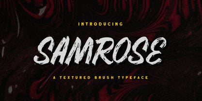 Introducing, Samrose. A unique textured brush typeface with bold and strong feel. This font perfectly made to be applied especially in logo, and the other various formal forms such as invitations, labels, magazines, books, greeting / wedding cards, packaging, fashion, make up, stationery, novels, labels or any type of advertising purpose. Features : uppercase & lowercase (alternates) numbers and punctuation Ligatures and alternates multilingual PUA encoded We highly recommend using a program that supports OpenType features and Glyphs panels like many of Adobe apps and Corel Draw, so you can see and access all Glyph variations. Email us to letterhend@gmail.com if you need something! Happy Designing!
 - The World Of Storyman by Letterhend,
$19.00 The World of Storyman is a condensed hand drawn brush font which is purposely made for headline, display or logotype, and signature which need a standout appearing. This font is also suitable to be applied especially in logo, and the other various formal forms such as invitations, labels, logos, magazines, books, greeting / wedding cards, packaging, fashion, make up, stationery, novels, labels or any type of advertising purpose. Features : uppercase & lowercase numbers and punctuation multilingual PUA encoded We highly recommend using a program that supports OpenType features and Glyphs panels like many of Adobe apps and Corel Draw, so you can see and access all Glyph variations.
 - Broadster by IKIIKOWRK,
$19.00 Introducing Broadster - Classic Brush Type, created by ikiiko. Broadster is a decorative sans serif typeface, inspired by typography from classic 60s American advertising & automotive visual styles of the time. This typeface is designed to give the appearance of a formal yet expressive style. The Broadster has bold, contrasting strokes. A style commonly used in print, magazine, and sign advertisements of the era. This typeface is perfect for an formal layout, poster, newspaper, magazine ads, and also good for vintage product, food & beverages, quotes, or simply as a stylish text overlay to any background image. What's included? Uppercase & Lowercase Number & Punctuation Multilingual Support Works on PC & Mac
 - Restless by Gassstype,
$25.00 Hello Everyone, introduce our new product Font Restless is a Rough Brush Font.This is a Textured Natural Style and classy style with a clear style and dramatic movement. This font Restless is great for your next creative project such as logos, printed quotes, invitations, cards, product packaging, headers, Logotype, Letterhead, Poster, Design this font is great for your creative projects such as watermark on photography, and perfect for logos & branding, invitation,advertisements,product designs, stationery, wedding designs,label ,product packaging, special events or anything that need handwritting taste. That is has charming, authentic and relaxed characteristic more natural look to your text You can activate Ligatures OpenType panel.
 - Grock Marker by Figuree Studio,
$18.00 Grock Marker is a Stylish brush marker font. Made in combination with hand lettering, it comes with dramatic movement and it’s great for any next creative project that needs a handwritten and natural touch. It is ideal for logos, handwritten quotes, product packaging, header, poster, merchandise, social media & greeting cards. With your purchase you get: Uppercase and Lowercase Characters Numbers and Punctuation Marks Support for MAC or PC Simple installation for Adobe Illustrator, Corel Draw, Photoshop, or Procreate (New Updated) Support Multilanguage I hope you make something cool with it. If you have any questions don't hesitate to ask! Stay Classy! Fadhil - Figuree Studio
 - Bestlady by Dhan Studio,
$19.00 Bestlady is a romantic textured brush font suitable perfectly for invitations, brand projects, logos, greeting cards, news, product packaging, posters blogs, everything including personal charm etc. This font is alternates all lowercase,also have equipped with 69 ligatures unique and beautiful: zz yy ww vv uu tt tl th st ss sh rr qq pp oz oy ow ov ou ot os or op oo on om ol ok oj oi og of od oc ob nt nn nl ng mm lt ll lh kk is ii id hh gg ff et el ee cl ck ch cc bl bb aw at ap an am al ah af ab aa
 - Magnite by Tom Chalky,
$12.00 Introducing Magnite - an expressive, handwritten brush font jam-packed with character and authentic charm. Designed to be versatile, Magnite is perfect for branding projects, editorial work, invitation design, product packaging, and everything in between. The original handcrafted font family containing uppercase and lowercase glyphs alongside a large range of punctuation, symbols, numerals, and multilingual support. Also included in this font are discretionary ligature swashes (activated by typing in 1--, 2--, etc, as illustrated in the above presentation). 'Magnite Alt' contains a whole new range of lowercase and uppercase letters. By using this font in combination with the original you can improve the overall authenticity.
 - Selfakia by Muntab Art,
$16.00 Selfakia is a Hand Brush font, perfect for logo design, branding, clothing design, signage, posters, wedding invitations and so much more! Also many more alternative characters, with 70+ ligature. In order to use the beautiful swashes, you need a program that supports OpenType features such as Adobe Illustrator CS, Adobe Photoshop CC, Adobe Indesign and Corel Draw. To access the swash type _1 _2 _3 _4 _5 Please contact us if you have any question, we are happy to help you! Thank you! Do you want a custom logo design? Contact me at muntabart@gmail.com Or you can also contact me on Instagram @muntab_ar
 - Faxnes by Dumadi,
$35.00 Faknes – Handwritten is a design font with a natural brush style and unique texture that can enhance the quality of your designs. Faknes – This handwriting is perfect for designs, logos, social media, brands, advertisements, product designs, handwritten quotes, product packaging, headers, posters, merchandise, and other designs. What’s Included: + Standard glyph + Ligature + Web Fonts + Multilingual Accent + Works on PC & Mac, Simple installation Accessible in Adobe Illustrator, Adobe Photoshop, Adobe InDesign, even works in Microsoft Word. PUA Coded Characters – Fully accessible without additional design software. Fonts include multilingual support + Images used: All photos/images/vectors used in the preview are not included, are meant for illustration purposes only. Thank You
 - Rispek by Gassstype,
$25.00 Hello Everyone, introduce our new product font RISPEK is a Brush Display Font. This is a Textured Natural Style and classy style with a clear style and dramatic movement. This font RISPEK is great for your next creative project such as logos, printed quotes, invitations, cards, product packaging, headers, Logotype, Letterhead, Poster, Design this font is great for your creative projects such as watermark on photography, and perfect for logos & branding, invitation,advertisements,product designs, stationery, wedding designs,label ,product packaging, special events or anything that need handwritting taste. That is RISPEK has charming, authentic and relaxed characteristic more natural look to your text
 - Sakura Town by Letterhend,
$19.00 Sakura Town is a display typeface inspired by japanese type brush. This type of font perfectly made to be applied especially in logo, and the other various formal forms such as invitations, labels, logos, magazines, books, greeting / wedding cards, packaging, fashion, make up, stationery, novels, labels or any type of advertising purpose. Features : uppercase & lowercase numbers and punctuation multilingual & swash PUA encoded We highly recommend using a program that supports OpenType features and Glyphs panels like many of Adobe apps and Corel Draw, so you can see and access all Glyph variations. How to access opentype feature : letterhend.com/tutorials/using-opentype-feature-in-any-software/


