10,000 search results
(0.036 seconds)
- Conundrum by Atom,
$14.00 Conundrum is a cool, rough brush font, quickly painted on paper, so it looks natural and organic. If you want a font character that is unique and different than others, Conundrum is worth a try. With this bold concept it would be suitable if used for movie titles, magazine titles, covers, posters, etc.
 - Bollofora by Akifatype,
$14.00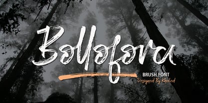 Bollofora is a textured brush font, a contemporary approach to design, naturally handmade and with underscores. It also has alternatives and ligatures that make your design more attractive.Suitable for use in title design such as clothing, invitations, tittle books, stationery designs, quotes, branding, logos, greeting cards, t-shirts, packaging designs, posters and more.
 - Ongunkan Cypriot Linear C Sylla by Runic World Tamgacı,
$100.00 This font is an adaptation of the cyprus syllabic script to a Latin-based font. I tried to assign as many correct letters as possible, but there were too many characters so I had to fit them. Please review the alphabet table of Cypriot syllabic to use the Font. To see all the characters, you can see all the characters and add them to the text by selecting this font from the add character section on the word page. Cypriot syllabary The Cypriot syllabary was used in Cyprus from about 1500 and 300 BC and is thought to have developed from the Linear A. The earliest known inscriptions from between 1500 and 1200 BC are in an unknown language called 'Eteo-Cypriot', or 'True Cypriot', and the script in which they are written is called Cypro-Minoan. From around 1200 BC Cyprus began to be colonised by Mycenaean, Minoan and possibly Cretan Greek settlers, and they probably adapted the existing script to write their own language - the oldest known inscription in Greek dates from the 11th century BC. Cypriot Greek had much in common with Greek dialects of Arcadia and Pamphylia, which corresponds to the province of Antalya in Turkey.
 - Berliana Elemixia by BlackLotus,
$10.00 Berliana Elemixia is a type of display font with nuances of beauty, class, freshness, and softness that best suits your design needs. This font is ideal for headlines and brand identities. Berliana Elemixia also includes a script version, a bold script, and an ExtraBold script. This font is great when you combine your display and script fonts. This font also have interesting alternate features.
 - The font named "Japanese Brush" is designed to emulate the aesthetics and characteristics of traditional Japanese brushwork found in calligraphy and art. Drawing from the centuries-old practice of us...
- Geliat by Wahyu and Sani Co.,
$99.99 Geliat would be the youngest brother of Creo, retaining the letterform and proportion but has more geometric looks. This font family comes in two versions which has some different default glyphs. Geliat family has similar letterform with Creo, while the Alt version has common geometric letterform. Italic styles of Geliat were designed using semi-rotalic method. The round parts have 5 degrees italic angle, while the vertical strokes were made in 10 italic degrees. The result gives the styles look more circular than most geometric typefaces with the same 10 degrees italic angle. Each version of Geliat has 2 variable fonts along with 10 different predefined weights from Thin to Heavy with matching italics. Each family member of Geliat also equipped with useful OpenType features such as Ordinals, Superscripts, Scientific Inferiors, Stylistic Sets, Tabular Lining, Standard Ligatures, Fractions, Numerators & Denominators. Each font has 500+ glyphs which covers Western & Eastern Europe, and other Latin based languages. Geliat will be suitable for many creative projects, from logos, posters, presentations, headlines, lettering, branding, quotes, titles, magazines, headings, web banners, mobile applications, art quotes, advertising, packaging design, book title, and more! Sky is the limit!
 - NorB ARCHITECT LINE by NorFonts,
$35.00 NorB Architect Line architectural fonts will add a beautiful architectural hand-lettering style to all your CAD project drawings. Architects have always wanted their CAD drawings to look more like they were drawn by hand, rather than by a CAD program. These AutoCAD fonts are the first step in bringing back that “artistic hand-drawn” feel to your CAD drawings or any graphic design project that can use true type fonts. They even can be used with any word processing program for text and display use, print and web projects, apps and ePub, comic books, graphic identities, branding, editorial, advertising, scrapbooking, cards and invitations and any casual lettering purpose… or even just for fun! NorB Architect Line is a retracing from scratch of my "NorB Architect" font coming in a sharp and round look, featuring small caps with some long stems of the following letters: b, d, f, h, k, l so resulting in more dynamic lettering font. It comes with 8 weights: Regular Italic Bold Bold Italic Round Round Italic Bold Round Bold Italic Round Note: The Italic versions are intentionally set to 20° rather to 12° for more dynamic lettering look.
 - Blured Stroke by Ditatype,
$29.00 Blured Stroke is a beautiful script font. Every letter in this font looks like it was created with a skillfully swung brush. The subtle and soft brush strokes are clearly visible at every angle and bend, giving the entire font an artistic and expressive feel. The ends of each letter tend to be rounded, giving it a soft and elegant touch. This font is designed with detail and a perfect balance between thick and thin strokes. The thicker lines bring out strength and firmness, while thinner lines add softness and elegance to this font. The perfect combination of these differences creates an eye-catching visual harmony and expresses a unique writing style. The colors used in this font can vary, but to maintain a soft impression, bright colors would be the right choice. The letters remain legible and understandable because they have clear outlines. Enjoy the various features available in this font. Features: Ligatures Multilingual Supports PUA Encoded Numerals and Punctuations Blured Stroke fits best for any design projects that want to convey tenderness, friendliness and creativity. This font can be used in the invitations, greeting cards, brand logos, promotional materials, and many other design projects that require a warm artistic touch and are full of personality. Find out more ways to use this font by taking a look at the font preview. Thanks for purchasing our fonts. Hopefully, you have a great time using our font. Feel free to contact us anytime for further information or when you have trouble with the font. Thanks a lot and happy designing.
 - Korpus Serif Pro by RMU,
$50.00 Inspired by Timeless, Korpus Serif Pro is a completely fresh redesign of this former Typoart font family. All four styles - Regular, Italic, Demibold and Demibold Italic - contain besides the West and Central European glyph tables also those of Greek and Cyrillic as well as Small Caps and Oldstyle figures. All these features make this font family a highly versatile one.
 - Shibe by Linecreative,
$16.00 Shibe - Bold italic font, has a strong, sharp character, and is combined with the font graffiti styles, To make a beautiful combination, simply mix upper and lower case and mix with alternative glyphs Shibe offers you: Shibe- A clean Bold italic font including Upper & Lowercase characters(ALL CAPS), Stylistic alternates Character (2 Character) Supports Multi linguage (Latin Western Europe), Numbers and Punctuation
 - Dorige by Issam Type,
$20.00 Dorige is a modern retro serif typeface for branding, logo design and retro designs, This font comes with joining ligatures that give it a fancy and unique style. Dorige typeface comes with regular, italic, bold and bold italic font styles. Uppercase & lowercase letters, numbers, punctuation, ligatures, alternates Multilingual support. If you have any questions, please feel free to get in touch. Thank you
 - Anderlacht by Typehand Studio,
$12.00 Anderlacht is a vintage serif font with a stamp texture that is perfect for quotes, logos, designs, digital art and more. Also accompanied by several illustrations that make it possible to make designs very easily, and there is also a multilingual language. Anderlacht Regular & Italic Anderlacht Stamp Regular & Italic 12 illustrations in lines, solids and textures PUA Encoded Multilingual Language Support
 - Hermist by Sans And Sons,
$9.00 Hermist - Elegant Serif Font by Sans and Sons Meet our Elegant Serif Font Duo – Extra Light and Italic. The Extra Light variant radiates timeless charm with delicate strokes, while the Italic adds a creative touch with its gentle slant. Together, they bring a natural, graceful beauty to your messages. With Elegant Style this is perfect for branding, logos, invitation, masterheads and more.
 - Miragem by Vanarchiv,
$55.00 This serif typeface was designed to be simple and neutral on text sizes, there descender proportions are short and the x-height is large. The lowercase italics contain different structure from roman characters, but the most differentiation detail is the fact the ascender and descender strokes don’t contain serifs. Italics characters are slightly more narrow and condensed than roman letterforms.
 - Anori by Océane Moutot,
$29.90 Anori is a playful sans serif. Inspired by handwriting and the playfulness of the italic sharp, Anori is a dynamic, high contrast and smooth typeface. It will bring originality to your designs and the large variety of glyphs will give you freedom for all of your projects. Anori is available in 10 styles, from light to black, in roman and italic.
 - Claire Murphy by Sarid Ezra,
$17.00 Introducing, Claire Murphy - a stylish italic serif with bunch of alternates! Claire Murphy is a classic and stylish italic serif with a bunch of alternates that will make your presentation or logo even more stunning and elegant. You can use this font for any purpose, such as a wedding invitations, logo, or instagram post. This font also support multilingual and already PUA Encoded.
 - JabcedHy by Ingrimayne Type,
$5.95 JabcedHy is a serifed, legible typeface in four weights with each weight having both an upright and an italic style. The original four fonts (plain, italic, bold, and bolditalic) were constructed by blending two other typefaces, and because the result seemed better than either parent, the parents were retired. Semibold and extra bold weights were added in a 2019 revision.
 - Ruden by Panatype Studio,
$9.00 RUDEN is a condensed rounded rough typeface, with an organic hand-written style, come with 4 family style ( Regular, Italic, Outline, Outline Italic ) which is perfect for your designs that want a rough style, modern vintage, elegant, soft, and carefully crafted for all graphic design needs. File Includes : Following Language Support : LATIN EXTENDED ( Western European, Central European, South Eastern European ) Thank You
 - Coupler by District,
$25.00 Coupler is a sturdy text face with low contrast, airy counters, and a strong baseline for smaller sizes and extended reading. Lightly bracketed serifs and pleasantly conspicuous italics temper Coupler’s formal demeanor—well suited for financial reports, news magazines, catalogs, academic journals, and any instructional setting. Four weights with italics and advanced typographical support provide design flexibility in any layout.
 - Faithful Colony by Creativemedialab,
$20.00 Faithful Colony is a modern, elegant, classic typeface with a timeless look. It comes with seven weights ranging from thin to black, matching italics, and a variable format. Faithful Colony is perfect for fashion-related concepts, Luxury and Elegant design, Classy or high-end branding, logo, and many more. Try to combine the regular and italic styles for a modern and elegant look.
 - Bulgatin by Muksal Creatives,
$12.00 Bulgatin Script is a new fresh and modern script typeface. It includes Uppercase, Lowercase, Multilingual Support, Numbers, Punctuation, Ligatures and Alternatives.
 - Just Another Hand Pro by Stiggy & Sands,
$29.00 My personal handwriting has changed a number of times over the years. Just Another Hand is a narrow brush drawn handwriting font, inspired very loosely by the handwriting of my high school days. There's a little artistic license taken with Just Another Hand in the sense that while I never really wrote with a brush in high school, I wanted a cleaner stroke for this interpretation. A little personality, a little restraint... a style that works for all sorts of projects across the board. The Just Another Hand Pro family contains 659 characters per font. The expanded SmallCaps option for gives the typestyle a little extra versatility, expanding on the original typeface inspiration. Opentype features include: A collection of ligatures Smallcaps Limitless Fractions Full set of Inferiors and Superiors Proportional figures and Tabular figure sets
 - Sond by Eurotypo,
$34.00 Sond is a casual, modern and hand brushed font. I've designed Sond carefully with the intention to preserve in its glyphs the original tell-tale dry brush imperfections and a bouncy baseline for a more personalized effect even more authentic. As an exclusively Open Type release, with 519 glyphs and ornaments, it has special alternatives for all letters with lots of possibility an infinity of combinations. There are plenty of options to allow you to create something unique and special: standard ligatures, swashes and stylistics alternates for each letter, beginning and ending letters. This lovely fonts have already an extended character set to support Central and Eastern as well as Western European languages. Sond is a good choice for greeting cards, posters, labels, t-shirt design, logos, and more.
 - Bouteilles by Hanoded,
$16.00 Bouteilles is French for bottles. No fancy name this time, just bottles. You’re probably wondering why I chose this name… Well, I was taking out the glass (in Holland we recycle just about everything, glass, paper, plastic, metal, garden and kitchen waste, etc.), which included a number of French wine bottles. As I was throwing them into the underground container one block from where I live, I realised that the word Bouteilles actually sounds great and it would be a nice name for a font! Yes, it is that simple! Bouteilles is a nice brush font I made with my trusted Chinese ink and a really worn brush I found. It comes with all the diacritics you need plus two sets of alternates, which you can play with!
 - Matilost Wikly by Alcode,
$23.00 Matilost Wikly is an elegant handwitten fontinspired by natural brush typography. Written in rapid motion using a slightly dry brush pen. This will give you a fresh and elegant design. Matilost Wikly comes with uppercase and lowercase letters, large sets and small sets, numbers, alternative styles for several lowercase characters are also available that make your text and design more attractive. Try Matilost Wikly, enjoy the richness of OpenType features and let her fun and elegant excitement make you happy and enhance your creativity! You can use this font very easily. - Included multilingual support and special ligatures If you do not have programs that support OpenType features like Adobe Illustrator and CorelDraw X Versions, you can access all alternative flying machines using Font Book (Mac) or Character Map (Windows):
 - Marshmallow Hot Chocolate by Nicky Laatz,
$17.00 Say hello to Marshmallow Hot Chocolate Brush - A super-casual, super-versatile all caps brush font. Great at both Small and large sizes : Fine texture details on its edges make it pop at larger sizes, and at smaller sizes its stays crisp, neatly balanced and nicely legible. Perfect for making a statement - use it in quotes, punchy headers, posters, flyer design, packaging, in your illustrations that need legible handwritten captions - and so much more. Although Marshmallow Hot Chocolate is an all caps font, you will find uppercase and lowercase keystrokes have alternate characters. Opentype Ligatures are included to make it look more naturally handwritten in your designs. Four extra swashes are included in the glyphs set - open your glyphs panel to access them. Play with the letter spacing to get different looks and effects.
 - Angella White by Din Studio,
$29.00 Looking for a font that’ll make your branding radiate elegance? Something that’s versatile, stylish, and eternal? Get ready to transcend to a world of magic, laughter, and butterflies. Your branding will spark delight and engage everyone who sees it! Introducing Angella White-A Brush Font A beautifully handcrafted font combined with brush style that’ll make your guests sing and elevate your projects! Every stroke, and curve was created to entice happiness and elegance. Use it to create standout headings, promote your online sales, Instagram quotes, and even printed materials like business cards, t-shirts, or invitations. Angella White includes Multilingual Options to make your branding globally acceptable. Features: Standard Ligatures Stylistic Sets Multilingual Support PUA Encoded Numerals and Punctuation Thank you for downloading premium fonts from Din Studio
 - Outright Horror by Wing's Art Studio,
$10.00 This new addition to my Video Store font series takes a scratched lettering style and pairs it with a wildly spontaneous brush font with horrific effect! Given life by an unknowable hand, this font clawed into the misty midnight inspired by retro horror movies, ghost stories and unsettling fireside tales. A boiling pot of misspent youth reading Edgar Allen Poe, M.R. James and H.P. Lovecraft. Outright Horror comes with an all-caps scratched style font with a subtly controlled Art Deco feel and a contrasting brush font that ramps up the fear! Consider it’s Regular style the skeleton that holds the Bold creeping flesh, ready for some horrific Halloween designs! It also comes with numerals, punctuation, language support, custom underlines and automatic ligatures. Contents: Outright Horror Regular Outright Horror Bold Underlines
 - Raph Lanok by Alit Design,
$12.00 Introducing Raph Lanok Typeface which has a elegant hand lettering brush style. So it looks natural like a handmade, because Raph Lanok family have a more choice characters. This font is best used for your design project that have the concept of fun, brave and sporty. Can also be applied to the design of a logotype, header website, making some lettering for a quote, t-shirt design etc. Raph Lanok has three font styles that are similar but with a different character, named Raph Lanok Future and Raph Lanok Rusty but that you also get Raph Lanok Swash with a line fast brushed of a used font. Raph Lanok Typeface deserve to be in your fonts collections, because it is unique and has many options of alternative glyphs. Thank you and enjoy :)
 - Crispbake by Hanoded,
$15.00 A crispbake is a kind of cracker or rusk you eat for breakfast. At least, in Holland we do. They are called 'beschuit', they are round and they come in a pack of 13 (which is a baker's dozen). It turns out that this odd number of crispbakes in a pack comes from the fact that the ovens they were baked in held 13 crispbakes in a row and it was easier to pack them like that. So, should this question pop up during a game of trivial pursuit, you now know the answer! Crispbake font is a crunchy brush font. Completely handmade using a brush and Chinese ink. This fresh all caps font comes with a set of alternate glyphs and extensive language support, including Vietnamese and Greek.
 - Kapelka New by ParaType,
$30.00 Kapelka New is a soft and friendly display face based on the principles of writing with a soft pointed brush. Kapelka is suitable for packaging design, children's books headlines and any other domestic and informal purposes. The typeface was designed by Zakhar Yaschin and released by ParaType in 2015. Inspired by the sweetie paper and soft pointed brush writing Zahar Yaschin designed the first version of Kapelka in 2001. It wasn’t on the shelf all these years and even served some time as a corporate identity of “Domashniy” TV channel. But with the benefit of hindsight the author decided to improve, modernize and extend Kapelka. The result was even better than you would expect. The font became even more soft and gentle and also gained some inward nobility due to more evident calligraphic base.
 - Rough Owl - Personal use only

- Ruthless Drippin TWO - Personal use only

- Bubblegum Superstar - Unknown license

- Kinryu_No14 - Unknown license

- Mayfair by Canada Type,
$24.95The long awaited and much requested revival of Robert Hunter Middleton's very popular classic is finally here. Mayfair Cursive was an instant hit for Middleton in 1932, and it went on being used widely until late into the 1970s, in spite of it never having crossed over to film type technology. Like a few of its contemporary designs, most notably the work of Lucien Bernhard, Mayfair is a formal script that is somewhat based on traditional italic forms with swash uppercase, but also employs subsidiary hairline strokes in some of its lowercase as an emphasis to the script's cursive traits. Why these gorgeous letters never made the leap into photo typesetting is a mystery to us. But here they are now in digital form, almost three quarters of a century since they first saw the light in metal. Mayfair was redrawn from original 48 pt specimen. It also underwent a major expansion of character set. Plenty of swash characters and ligatures were added. An alternate set of lowercase was also made, in order to give the user a choice between connected and disconnected variations of the same elegant script. Mayfair ships in all popular font formats. While the Postscript Type 1 and True Type versions come in two fonts (Mayfair and Mayfair Alt), the OpenType version is a single font containing all the extra characters in conveniently programmed features that are easily accessible by OpenType-supporting software applications. We are quite sure today's graphic designers will be appreciative of having access to the face that all but defined menus, romance covers, wine and liquor labels and chocolate boxes for almost two 20th century generations. - Beardman Outline by Jafar07,
$10.00 Beardman is a condensed sans-serif font designed specifically for bold and powerful headlines and titles. With four variants available: regular, italic, regular outline, and italic outline, this font allows you to express yourself with a style that suits your design project. The name "Beardman" is inspired by the meaning of a man who is masculine but has a soft heart, and it is reflected in the font's design. With strong and sturdy letterforms, the font also has a gentle and smooth touch that gives an elegant and modern impression. With its strong and expressive appearance, "Beardman" is suitable for use in graphic design projects such as posters, brochures, magazines, websites, and much more. Add a touch of masculine yet gentle to your design with the "Beardman" font. What did you get? Regular, Italic, Regular Outline & Italic Outline Alternates & Ligatures Numbers & Punctuation Multilingual Support Works on PC & Mac Simple Installations
 - Leuk by Wilton Foundry,
$29.00 The Dutch word “leuk" translates loosely to English as pleasant, jolly, funny, witty, clever, nice, sweet, kind, nice, amusing, entertaining, and funny. Leuk, the font, is a small, highly legible font with a witty, sociable personality that engages it’s readers. My challenge in designing Leuk was to find a unique feature to set apart the font without losing the fundamentals of type design. In the process of doing so, I created a virtual font “smile and wink” in the “o” upper and lowercase with integrated stencil-connecting strokes within the “a,e, k, z, o, ß” to reveal Leuk’s calligraphic roots. Legible and friendly, Leuk is designed for use in advertising, brochures, promotion, book cover design, packaging, and the like. The Leuk family consists of Leuk Light, Leuk Light Italic, Leuk Regular, Leuk Italic, Leuk Bold, Leuk Bold Italic, Leuk Black, Leuk Black Italic in Opentype format.
 - Keiss Title by DSType,
$50.00 The Keiss type family is our interpretation of the popular nineteen century Scotch Roman typefaces. We intended to keep a very classic approach while introducing a couple of new elements that differentiate this type family from it’s ancestors. This design, with short descenders and ascenders, along with three very distinct optical sizes makes this type family well suited for contemporary newspapers. The Title and Big versions range from Thin to Heavy, with matching italics, in order to be used in big sizes and stand out in the design. The Text ranges from Thin to ExtraBold and is a standalone type family for text usage, with narrow proportions and wider and open italics for improved text setting. The Condensed versions, ranging from Thin to Bold, don’t have italics, although they can be matched with the italics of the Title and Big versions, due to the fact they are very condensed.
 - Keiss Big by DSType,
$50.00 The Keiss type family is our interpretation of the popular nineteen century Scotch Roman typefaces. We intended to keep a very classic approach while introducing a couple of new elements that differentiate this type family from it’s ancestors. This design, with short descenders and ascenders, along with three very distinct optical sizes makes this type family well suited for contemporary newspapers. The Title and Big versions range from Thin to Heavy, with matching italics, in order to be used in big sizes and stand out in the design. The Text ranges from Thin to ExtraBold and is a standalone type family for text usage, with narrow proportions and wider and open italics for improved text setting. The Condensed versions, ranging from Thin to Bold, don’t have italics, although they can be matched with the italics of the Title and Big versions, due to the fact they are very condensed.


